Eternal is a mobile application designed for athletes.
I have created a visual language, and design system that will be used to create the Mobile App, Website, Seed Round Pitch Deck, and the brand materials.
Here, I will showcase the journey from problem to solution.
What problems does the app aim to solve?
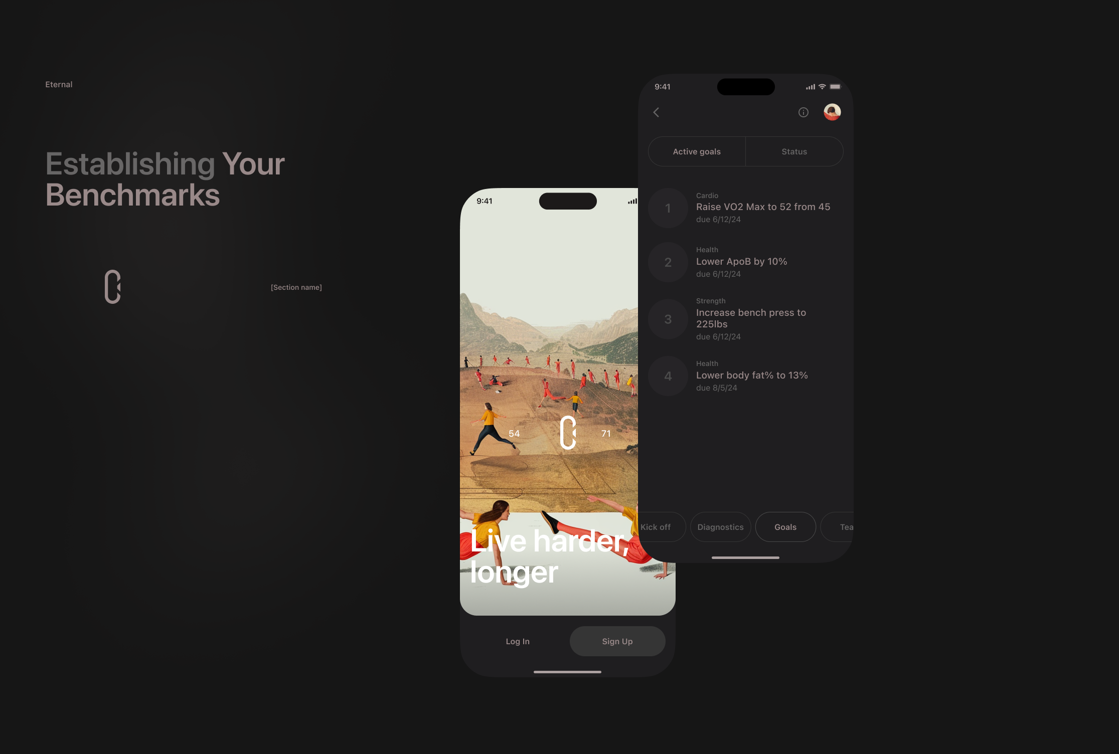
The app helps users track important health & performance numbers as they age. They will take performance tests, get blood tests, and medical scans and we will track their numbers over the years.
Who is the intended audience?
Athletes (cyclists, runners, golfers, surfers, skiers, etc.) over 40 years old.
Essential fragments from the scope planning stage
Alex ⤵️
The goal is to not build these designs, just use them in a fundraising deck so they should be simpler and more vibrant.
Maxim ⤵️
In this case, I would suggest:
- to understand what would be used in the deck
- design only respective parts of the screens
- maybe the focus should be on how the information is presented in the deck. Meaning the overall deck design is not less important than the app screens.
Alex ⤵️
Love this idea. Will send you a draft deck tomorrow.
Maxim ⤵️
The plan:
- Create a visual language (patterns) that will be used to design both the Deck and the App materials.
- Please add the screens (only what is needed for the Deck) to the Deck draft and share with me the Figma file.
- I will design all mocks + unique Deck pages so you will have clear visual language guidelines to create new pages yourself.
Project planning
Due to the limitations of the initial request, it was not possible to develop vital information such as user stories, personas, and more, which are essential for a successful workflow.
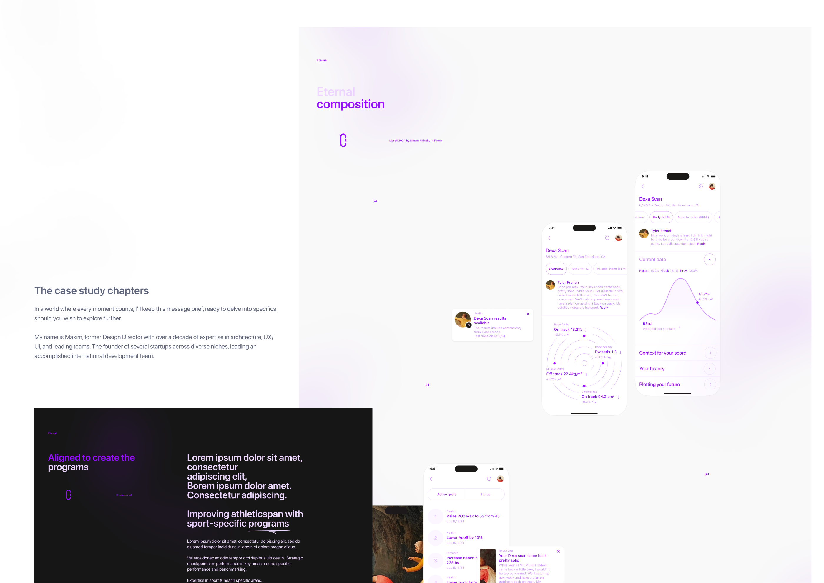
The case study chapters
- Look & feel
- Delivered materials. Overview
- Mobile App mockups
- Seed Deck templates
- Design system foundations
- Design System mark
- Hero illustration
- Brand mark
- Mobile app workflow. Selected views
- Compositions and fragments
- Mobile app views refinement process
- App Store Screenshots and previews
The source of truths—a case study in Figma.
Password: brisk-import-type-grill
Look & feel
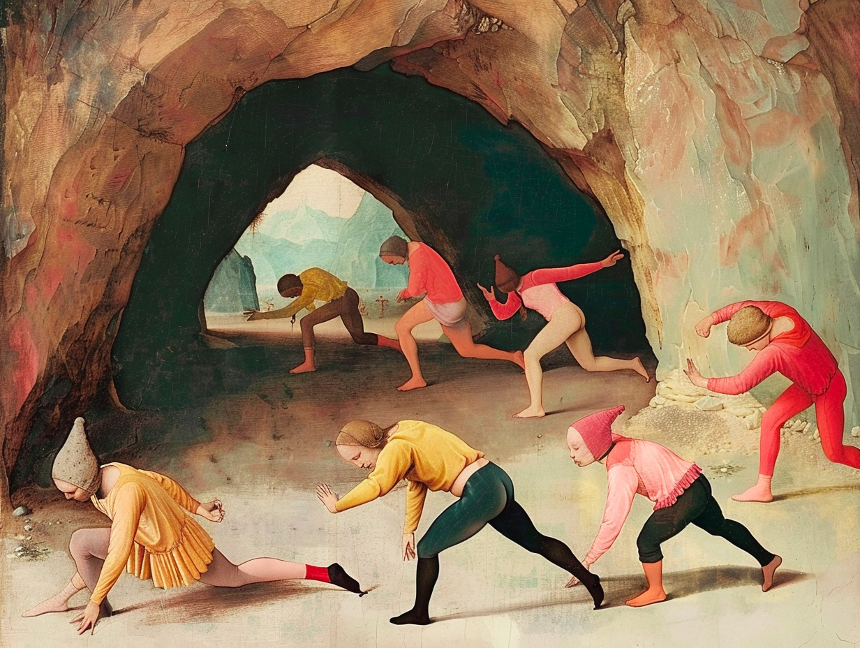
There is no better way to ensure that your design is good than by combining different elements, screens, and patterns. These pieces, like a mosaic, come together to form one composition. This allows you to see if the visual language is efficient and powerful enough. It also helps you to identify any missing elements and areas where improvements are needed.
By combining strong compositions from the materials you develop, you can be confident that you are on the right path.
It's proof that this concept has practical potential.
A good composition is one in which the elements are thoughtfully put together and where any arbitrary area has artistic value. A good composition is a sequence of failures, in which the last failure seems successful due to fatigue.
We must value the time of others as we value our own. Therefore, thoughts put into words must be thought through three times. This principle illustrates my workflow well.
Delivered materials. Overview
Presentations are vital to any growing business, and when you're pitching to potential investors, your presentation documents need to be well thought out and visually well-developed.
By pitching to investors, you demonstrate your level of knowledge, talent, and professionalism. If you have low visual standards, your potential partner may assume that you could also potentially cut corners elsewhere.
To increase your chances of winning this round, good design is critical.
Well, you'd probably asking yourself: what the hell is this about, right? Well, this is simple. Presenting to an investor or a client means the same thing to me.
Mobile App delivery. Cover image
Mobile App delivery. Mockups
Seed Deck Templates delivery. Cover image
Seed Deck Templates delivery. Templates
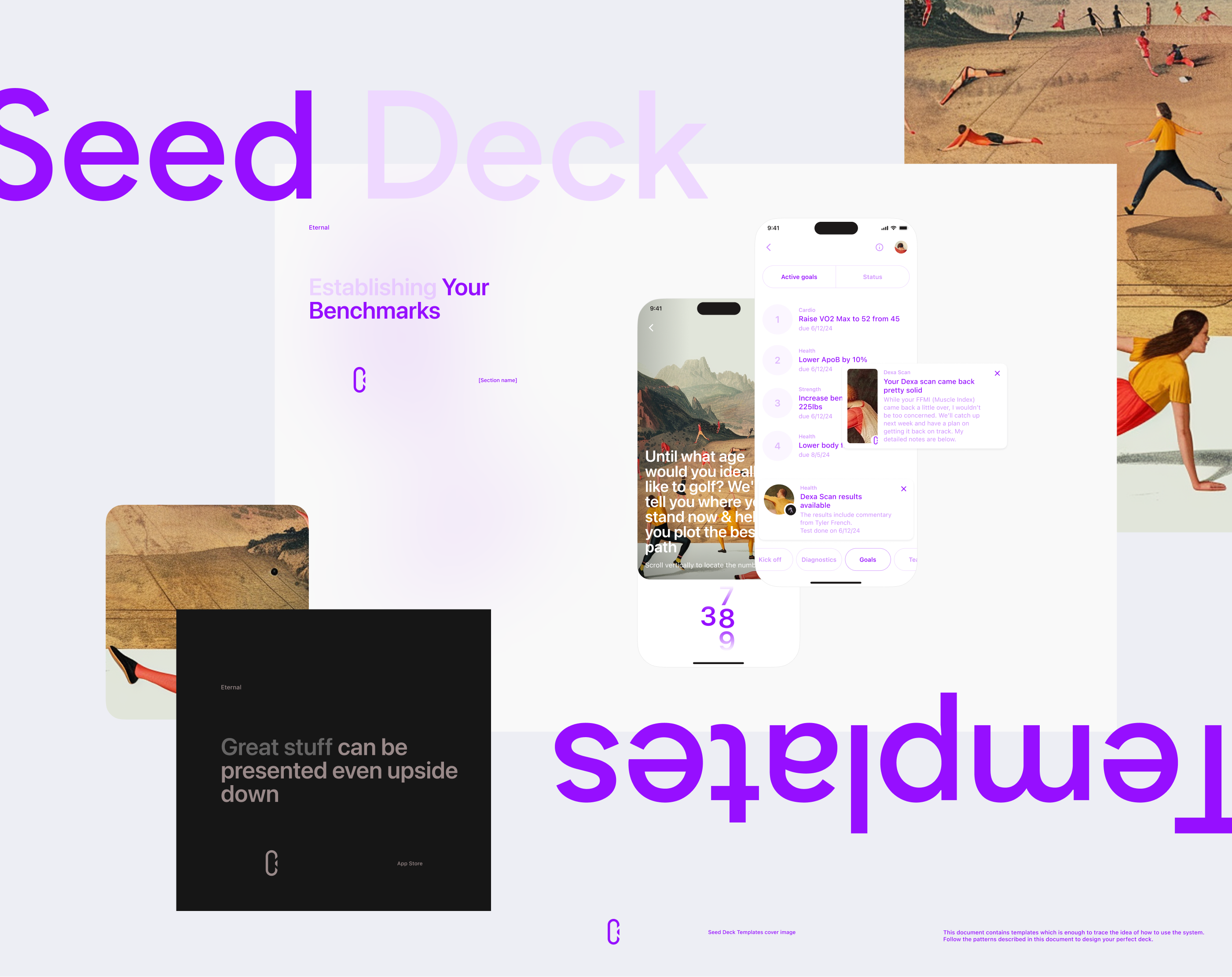
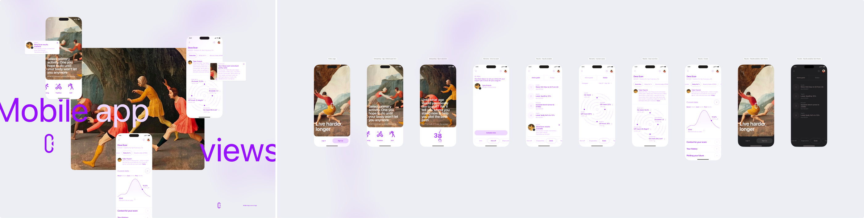
Mobile App mockups
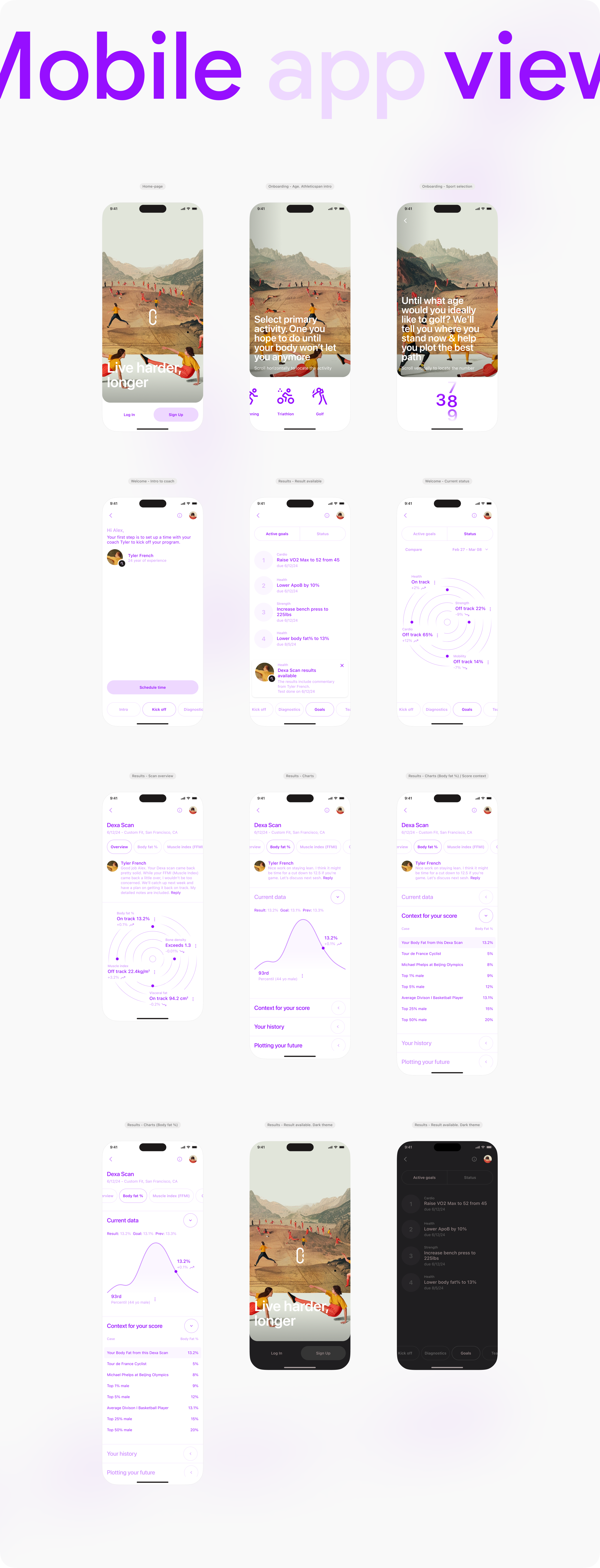
Seed Deck templates
This document provides templates to guide you on how to use the system effectively. Use the examples in this document as a reference to design your ideal deck.
Seed Deck templates. Teaser
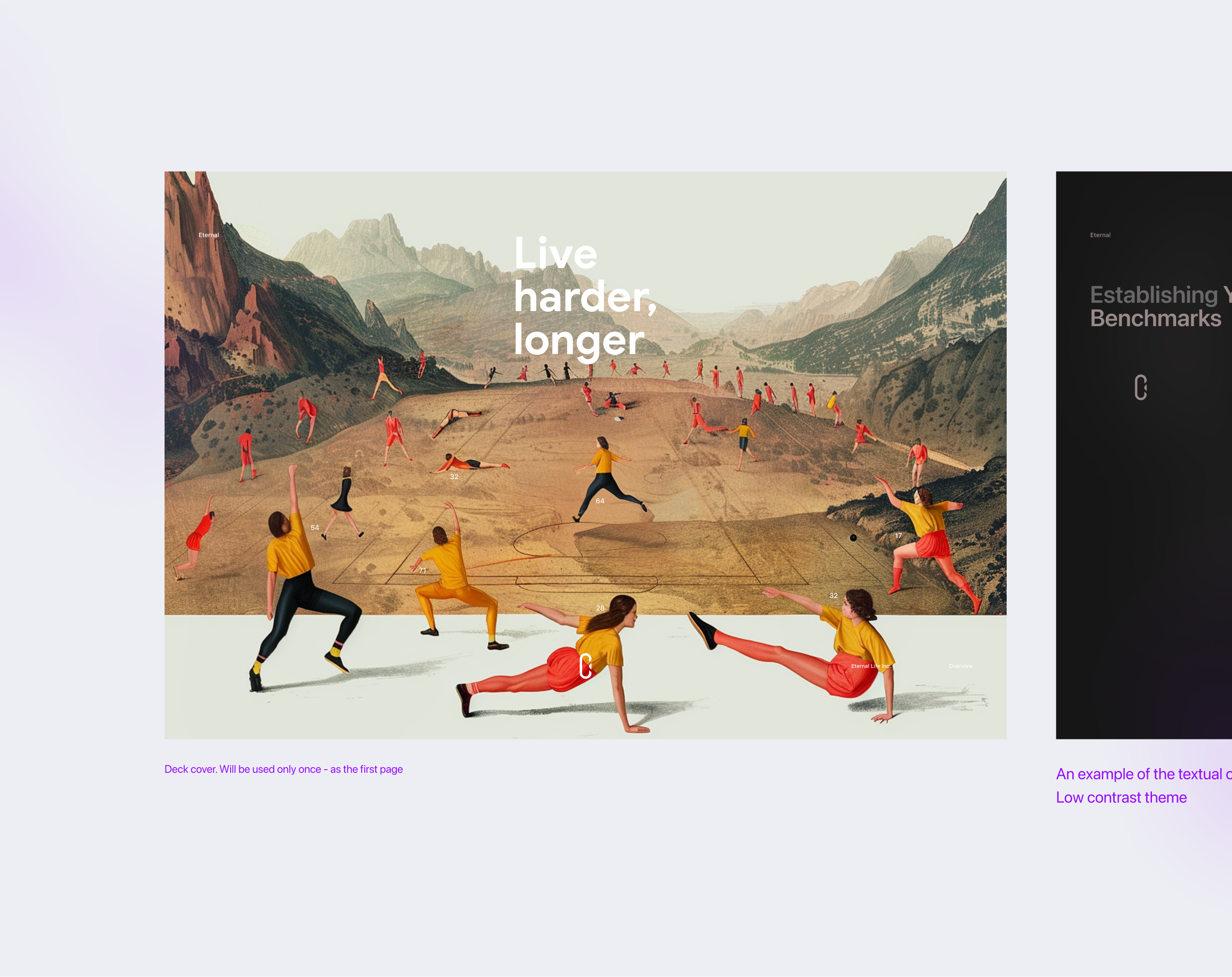
Deck cover. Will be used only once - as the first page
Example with the textual content, an image, and a highlighted (underlined) word or a few words
Mid contrast - default theme
An example of the textual content and mobile app mock
Low contrast - dark theme.
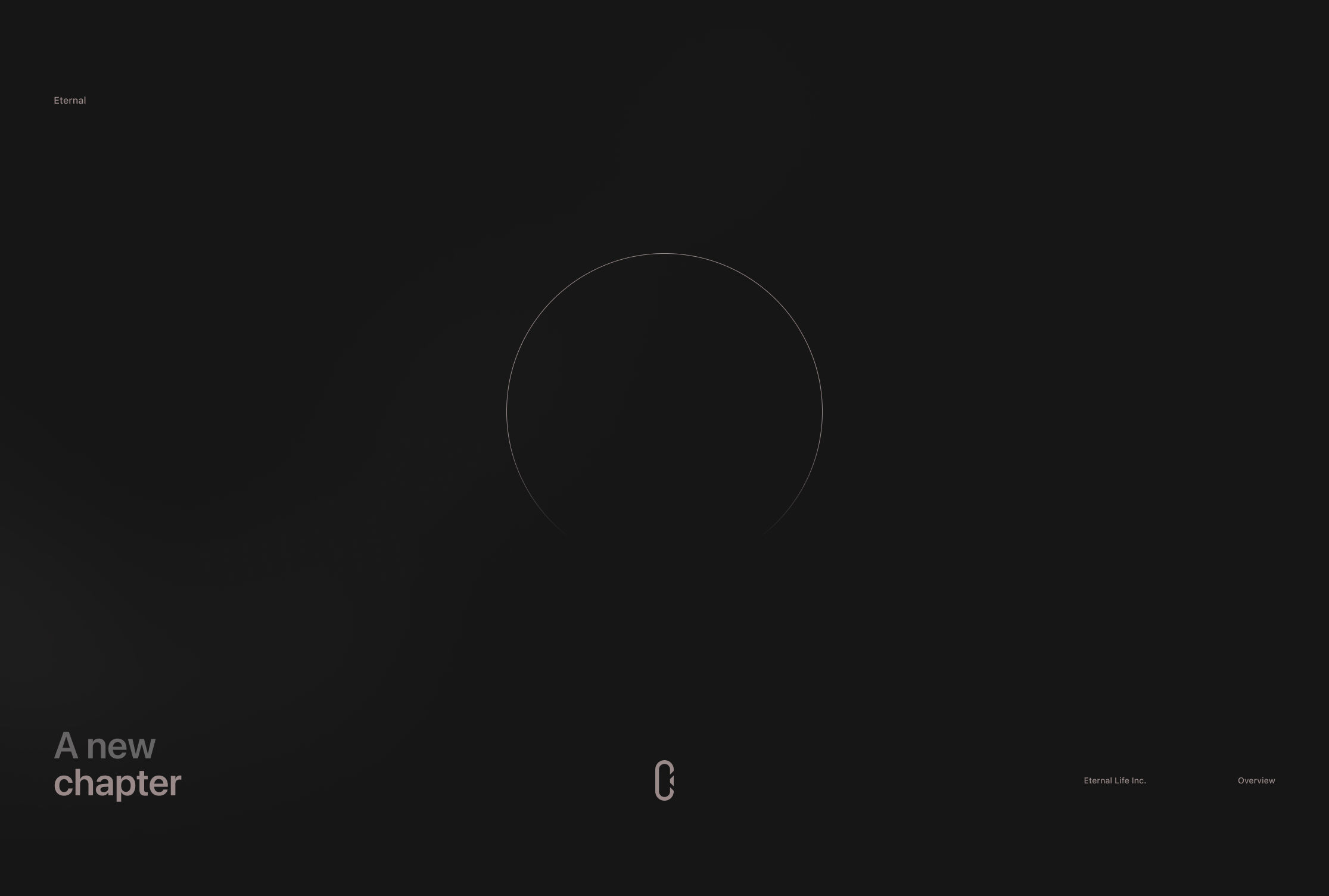
A new chapter
High contrast theme
A new chapter - low contrast theme
An example of the textual content and mobile app dark theme mocks. Low contrast theme
Individual Thank You page. Template "A new chapter"
Individual Thank You page - high contrast theme
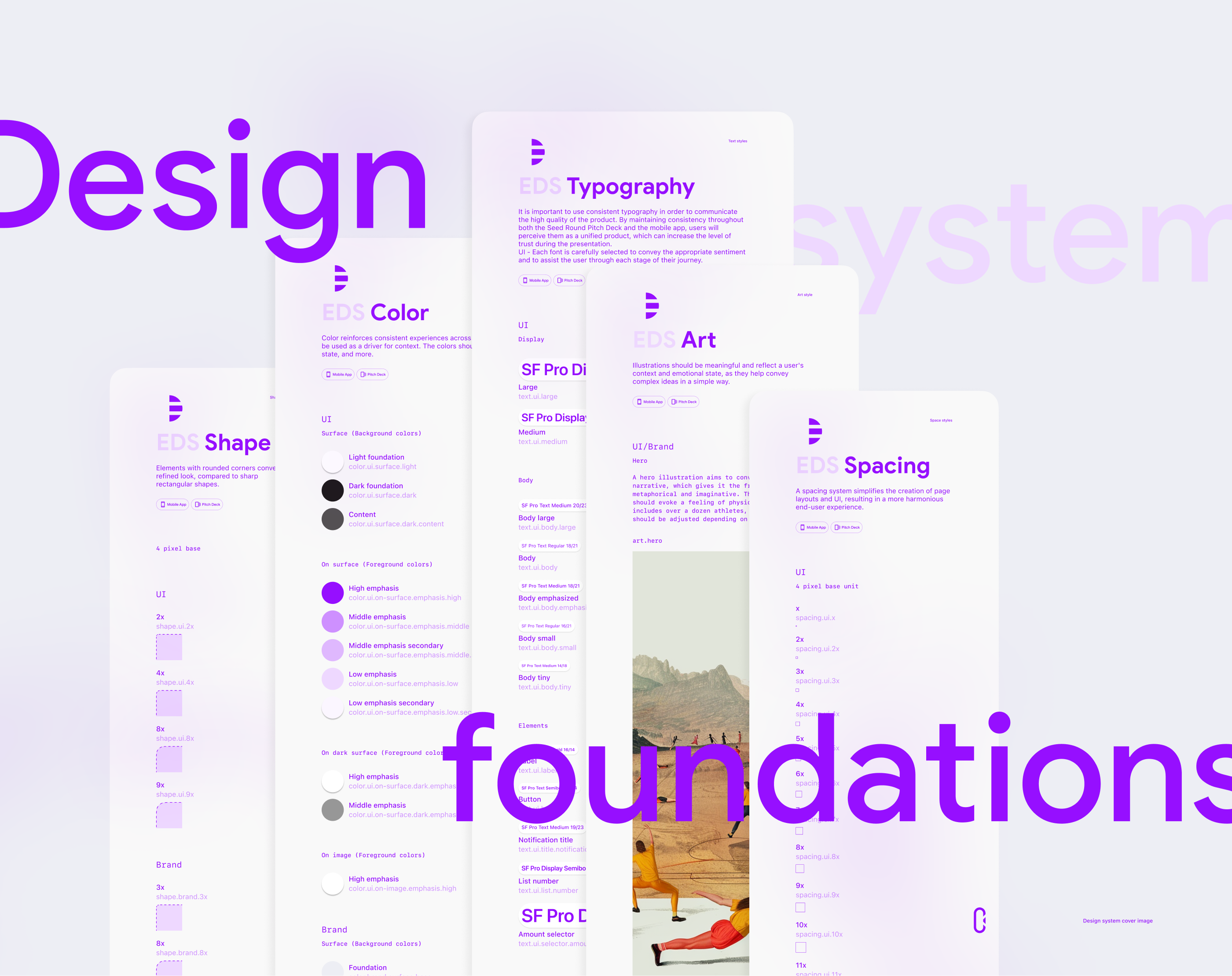
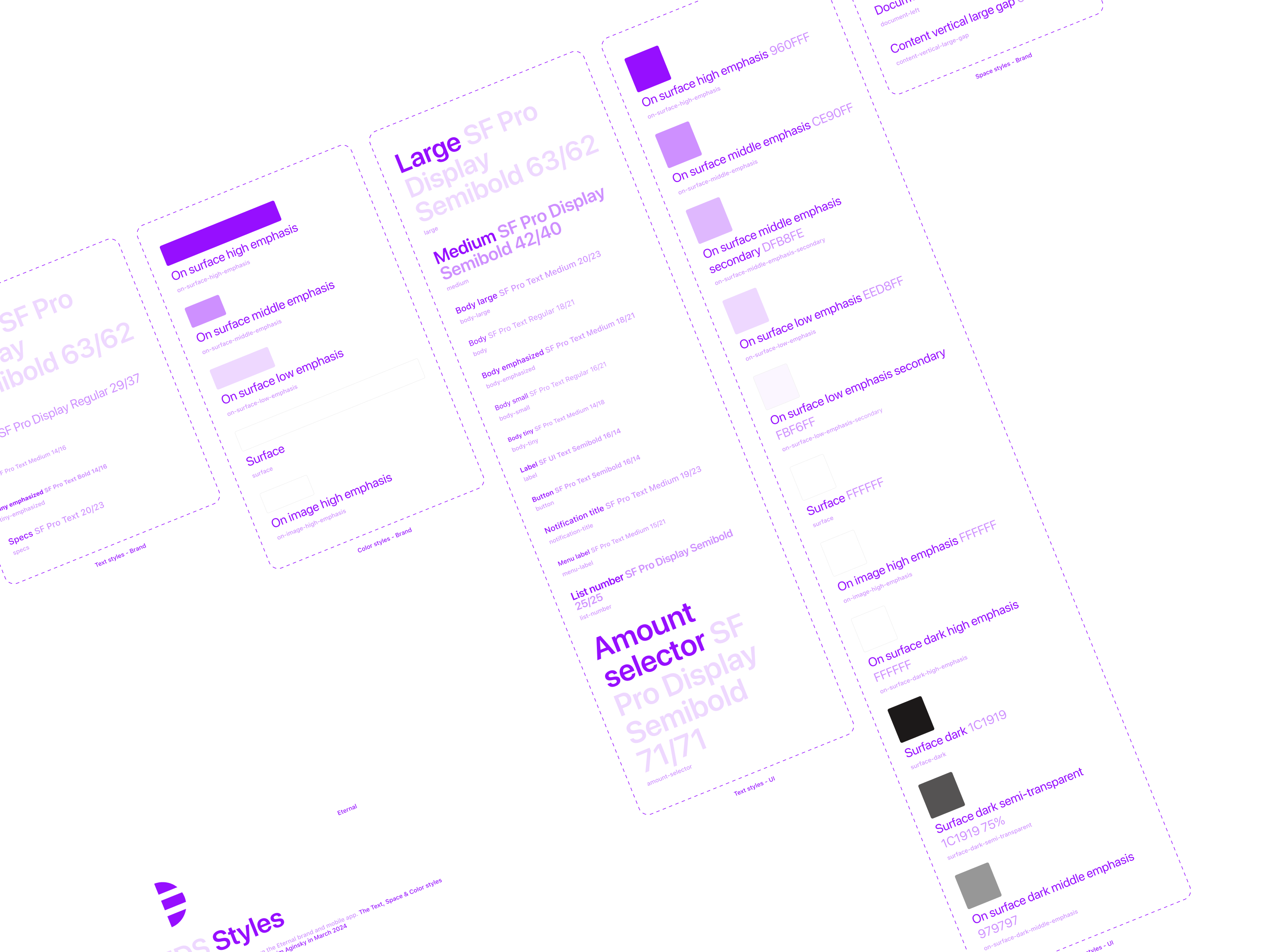
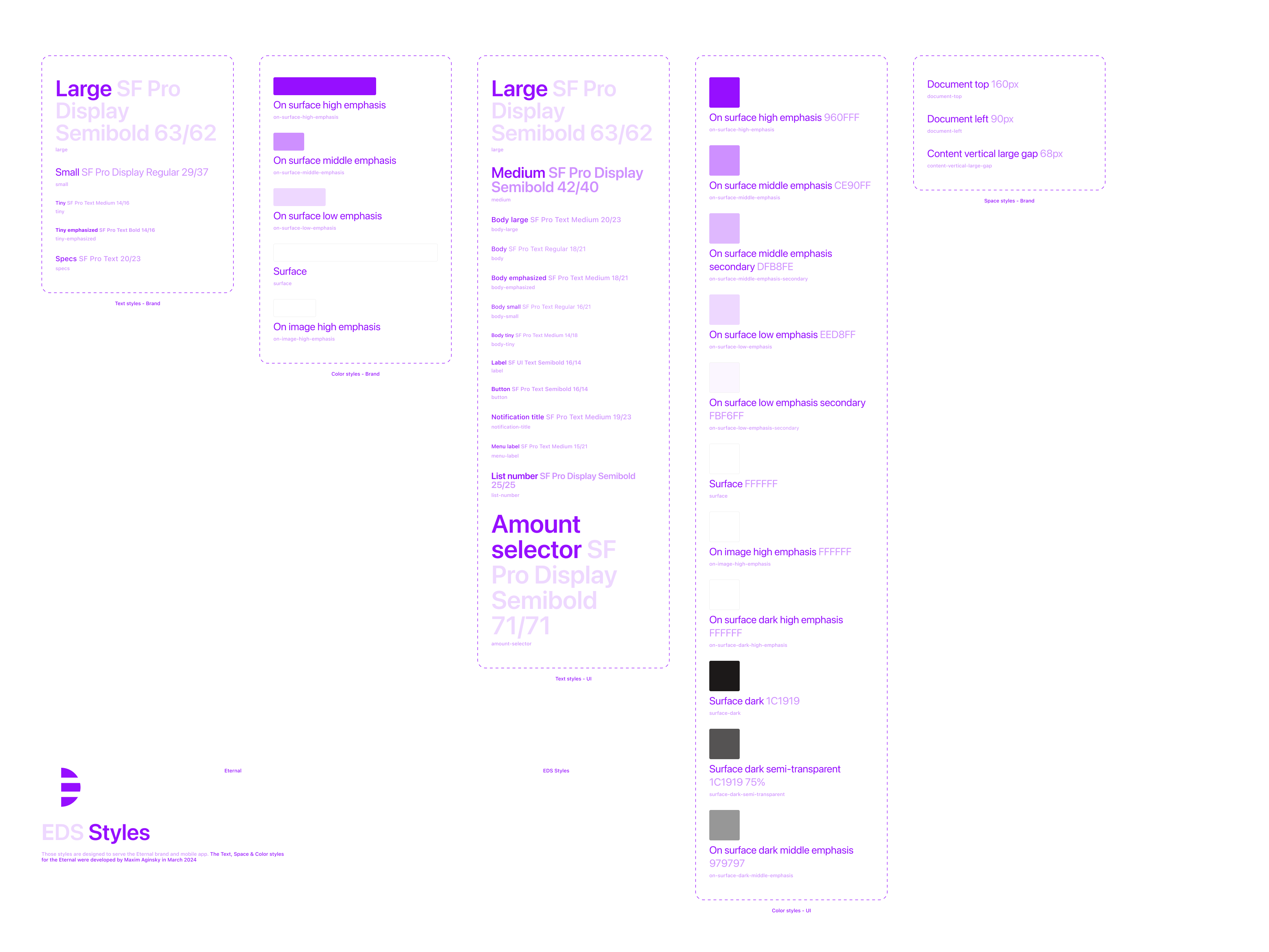
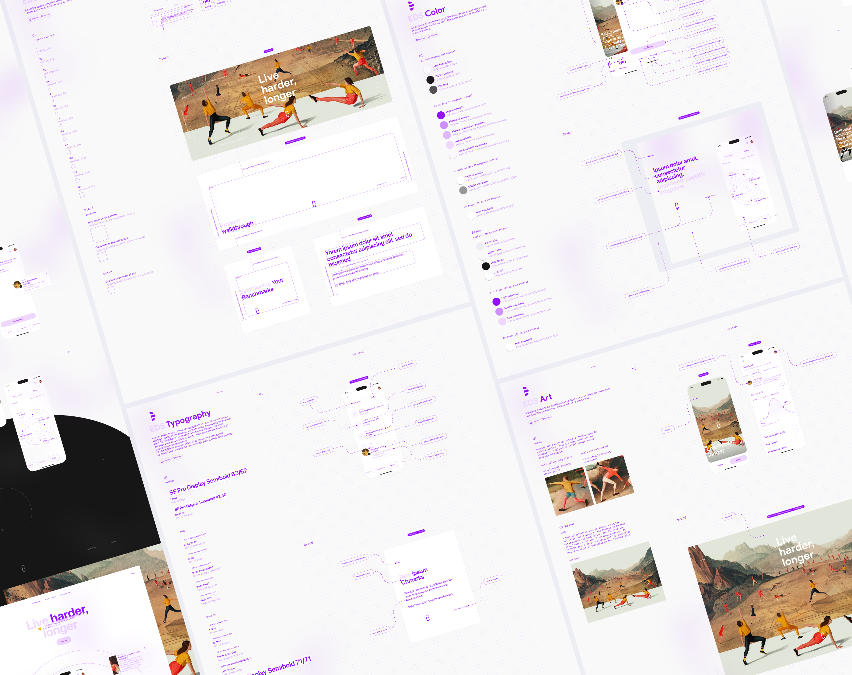
Design system foundations
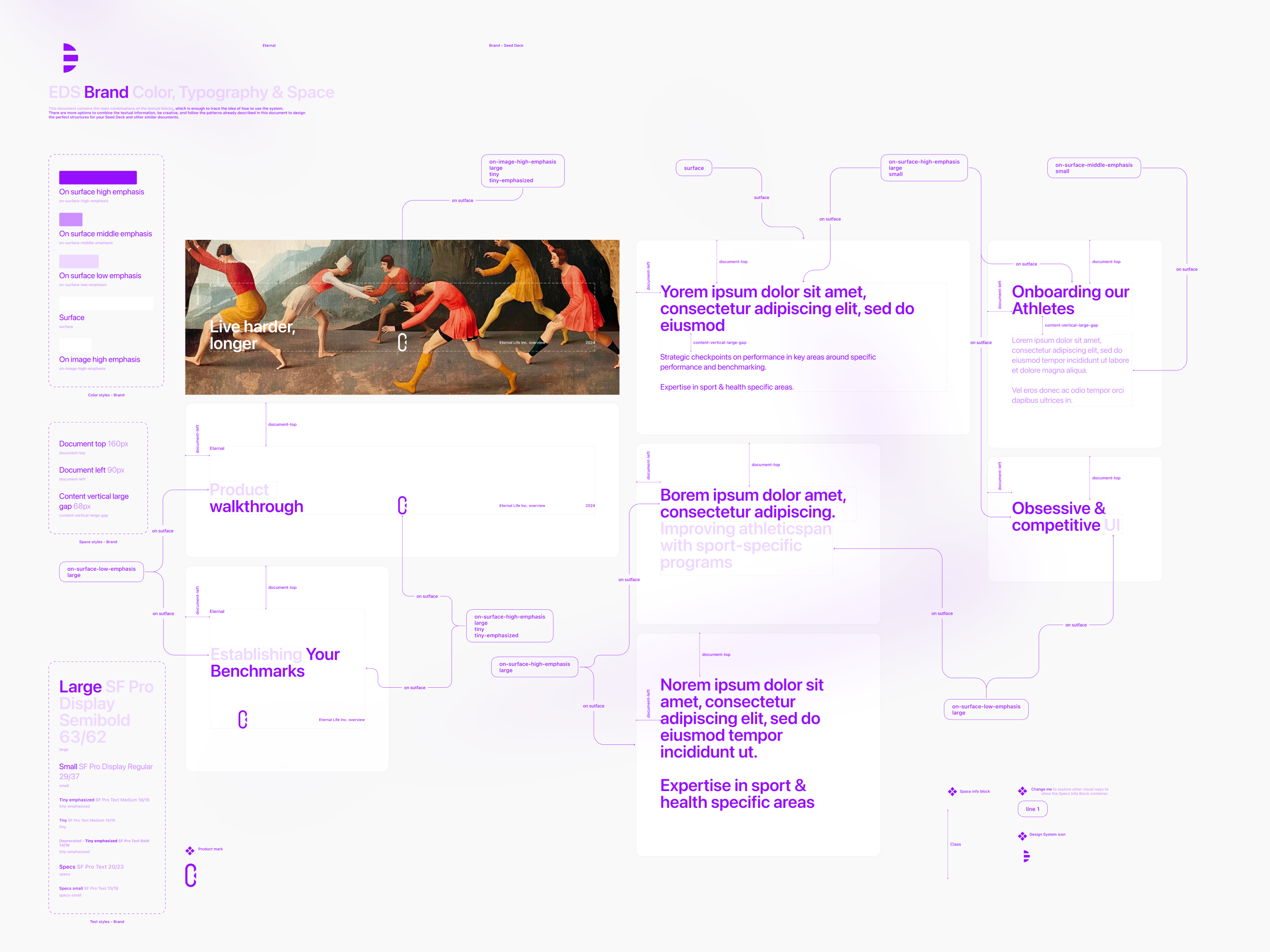
Text, Spacing, Color, Shape & Art styles.
Foundations are necessary for creating simple and engaging end-to-end user experiences, achieved through consistent text, spacing, color, shape and art styles.
Design system foundations. Cover image
Design system foundations. Teaser
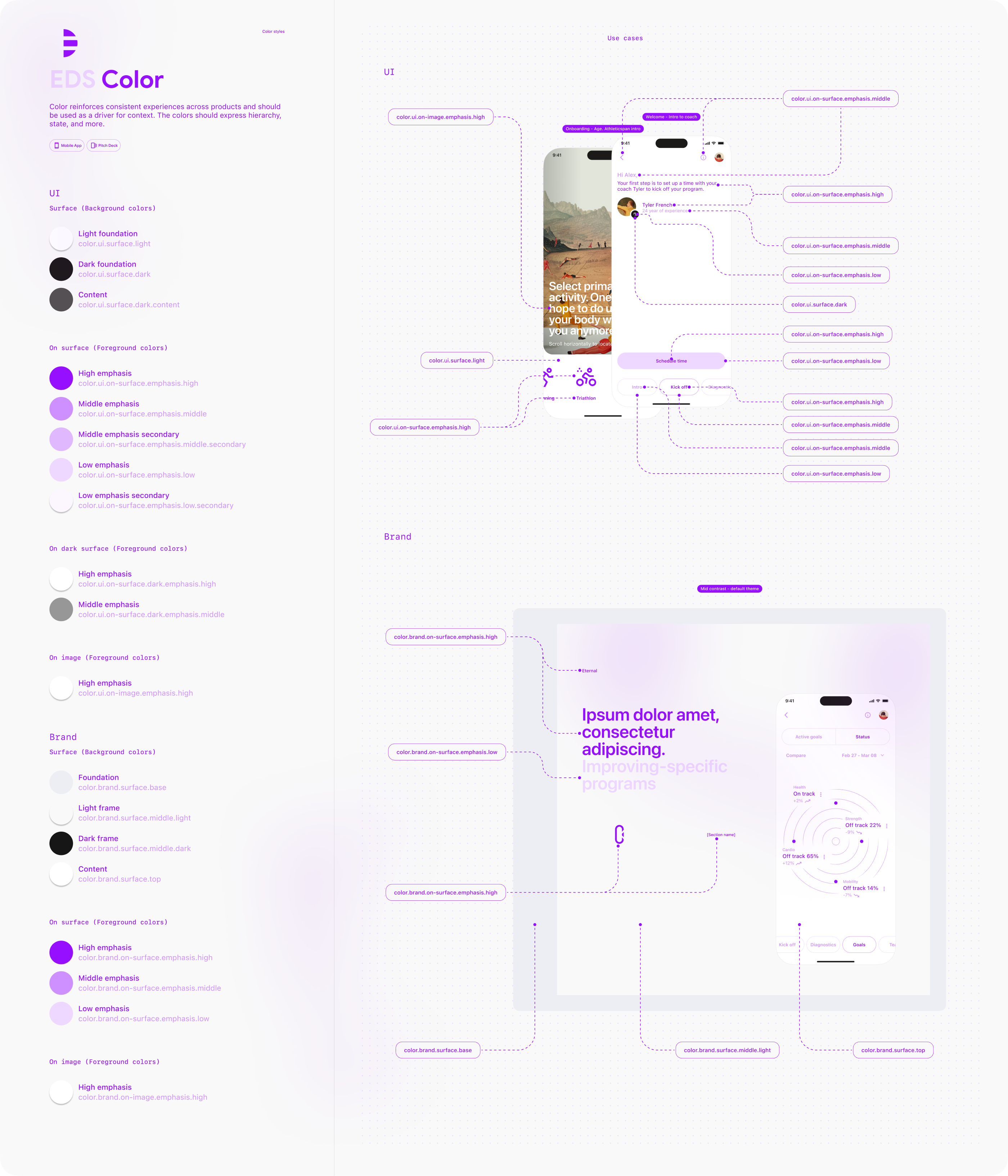
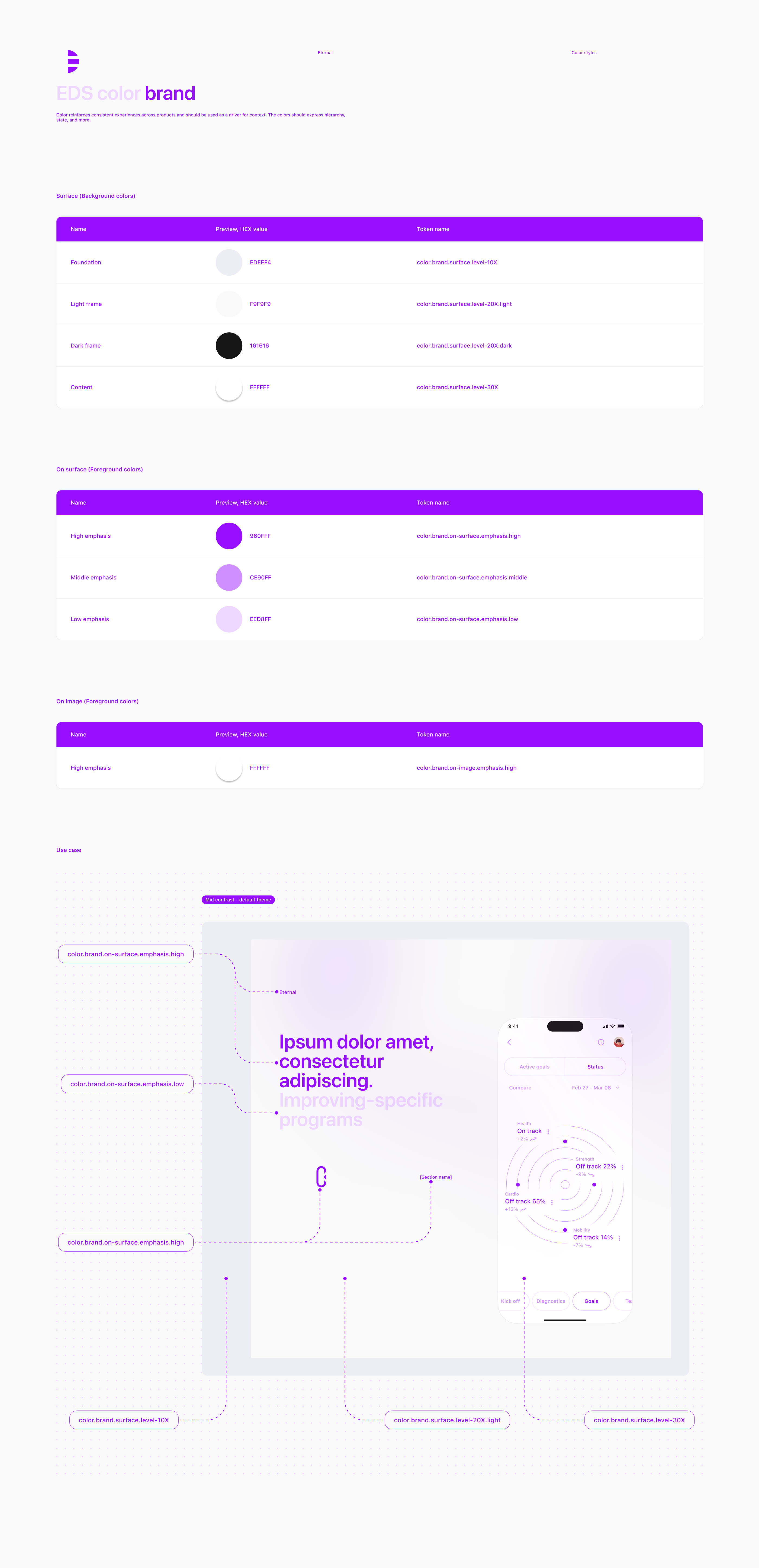
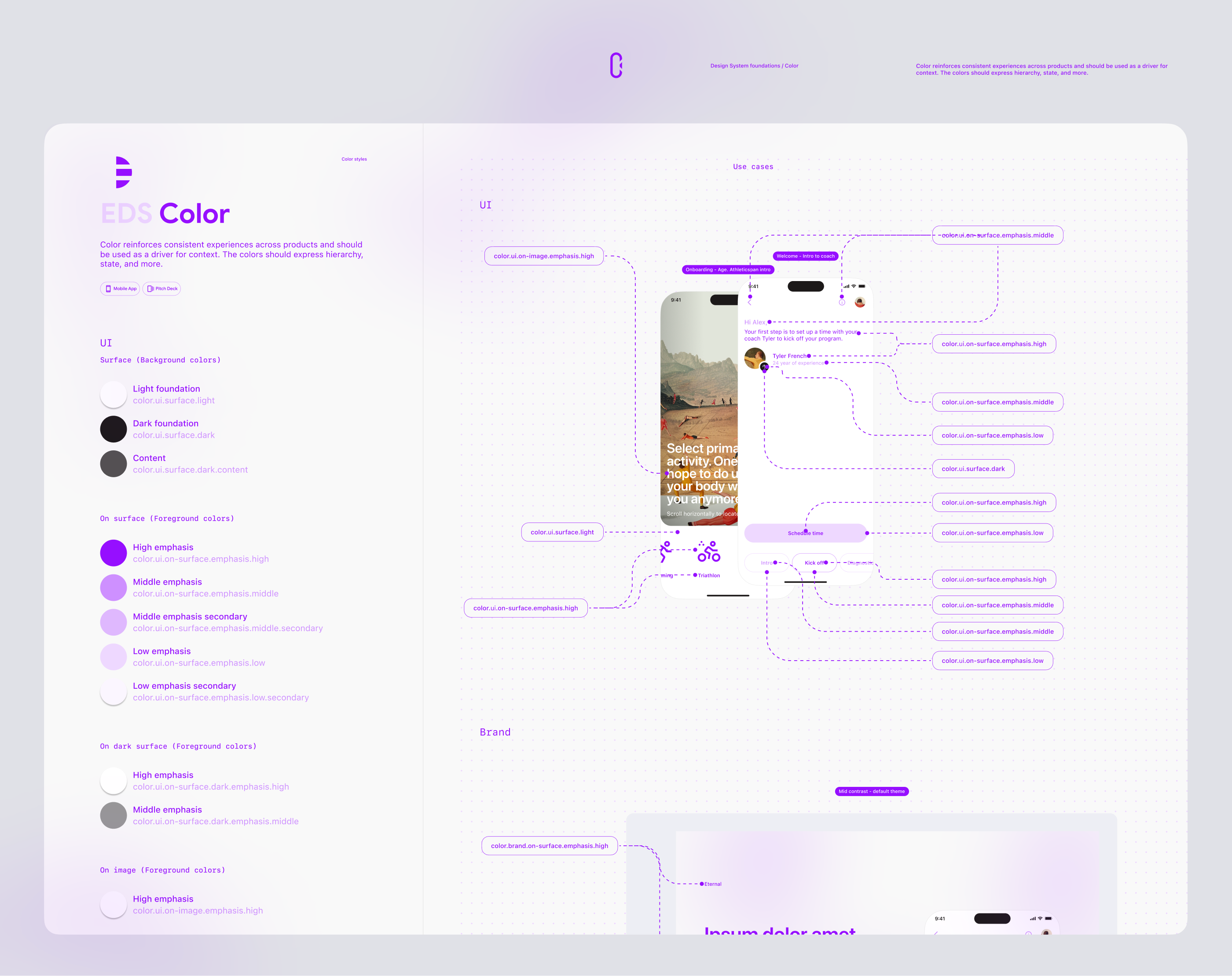
Color
Color reinforces consistent experiences across products and should be used as a driver for context. The colors should express hierarchy, state, and more.
Color is one of the instruments to emphasize the order of importance within a structure.
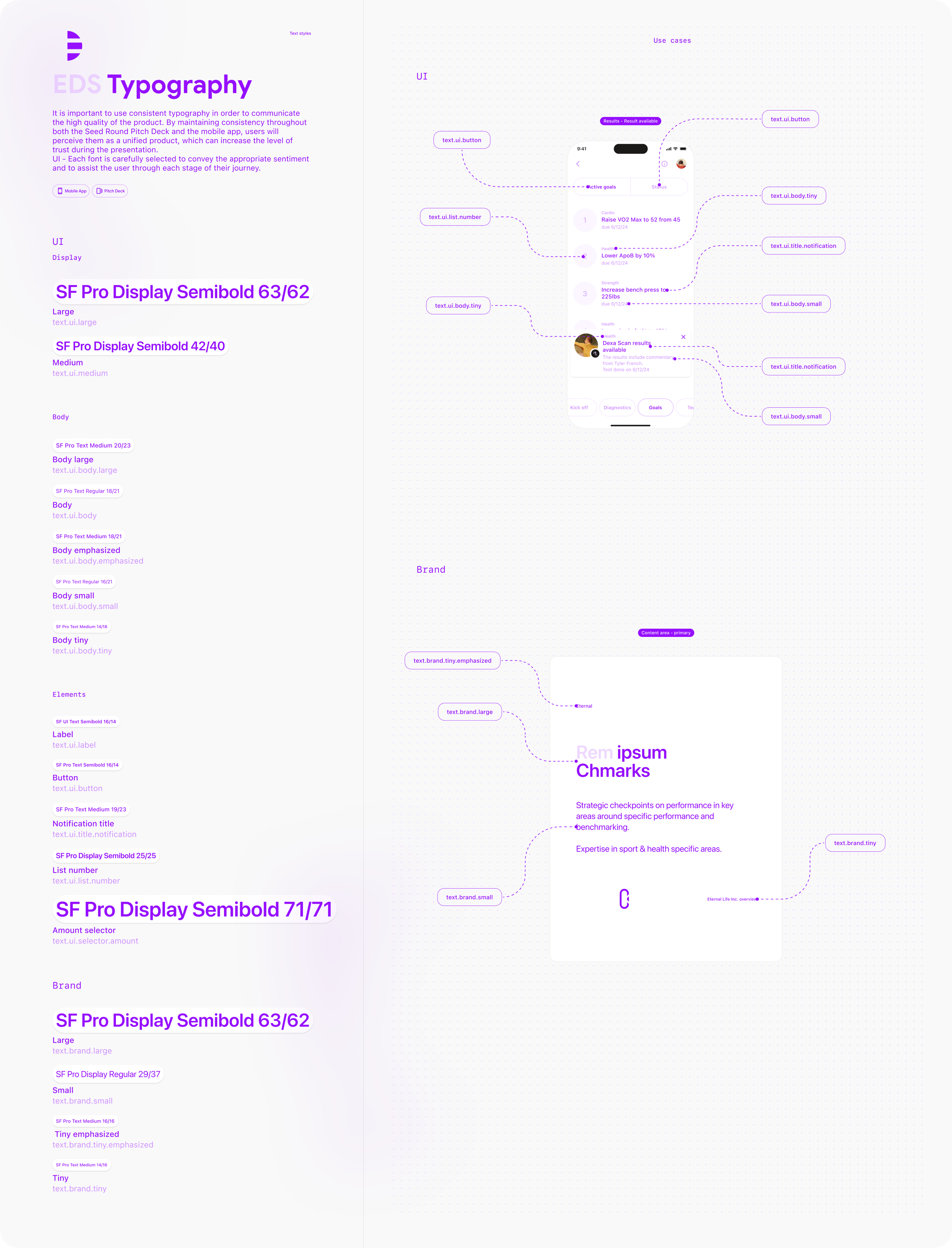
Typography
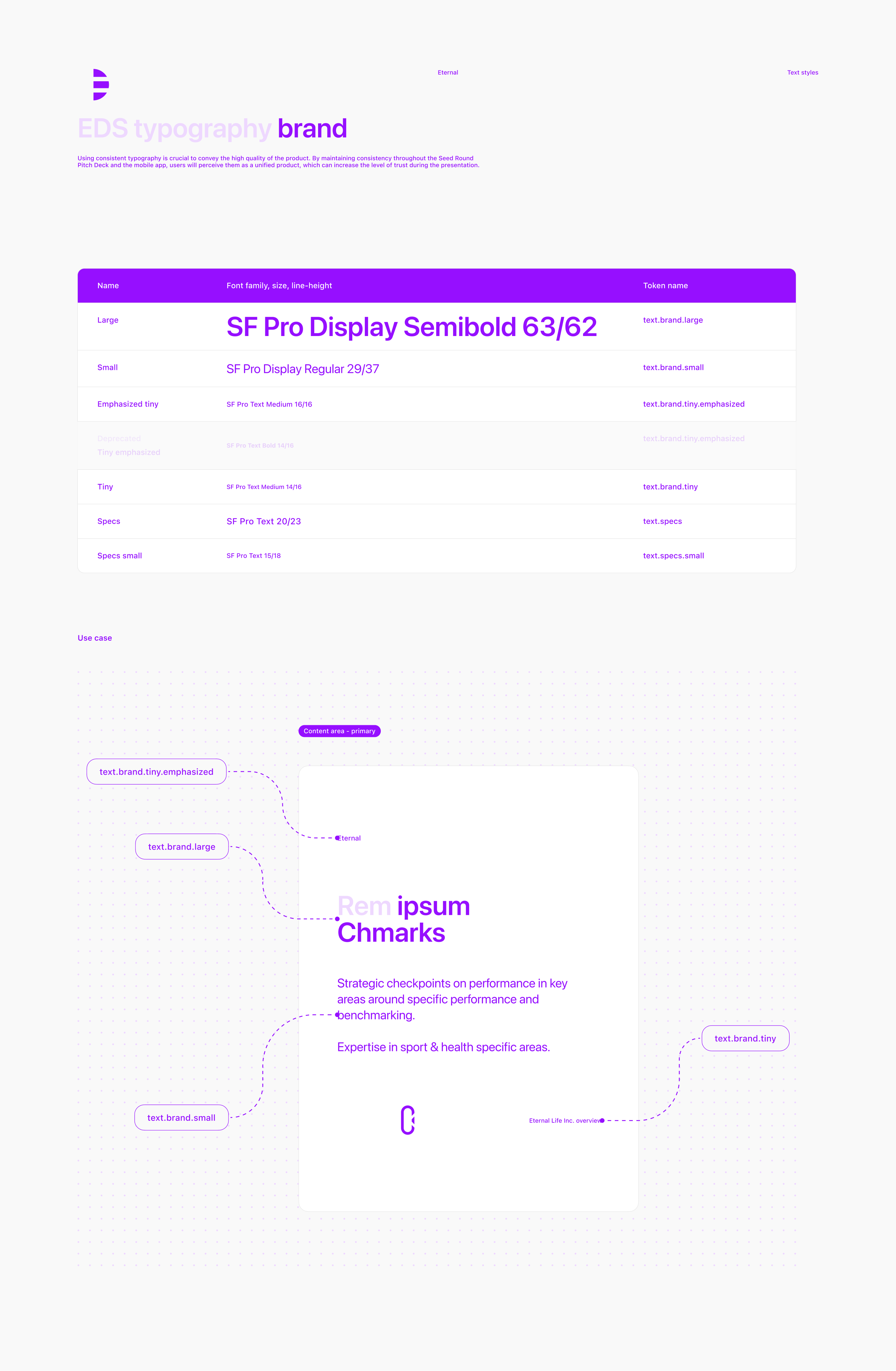
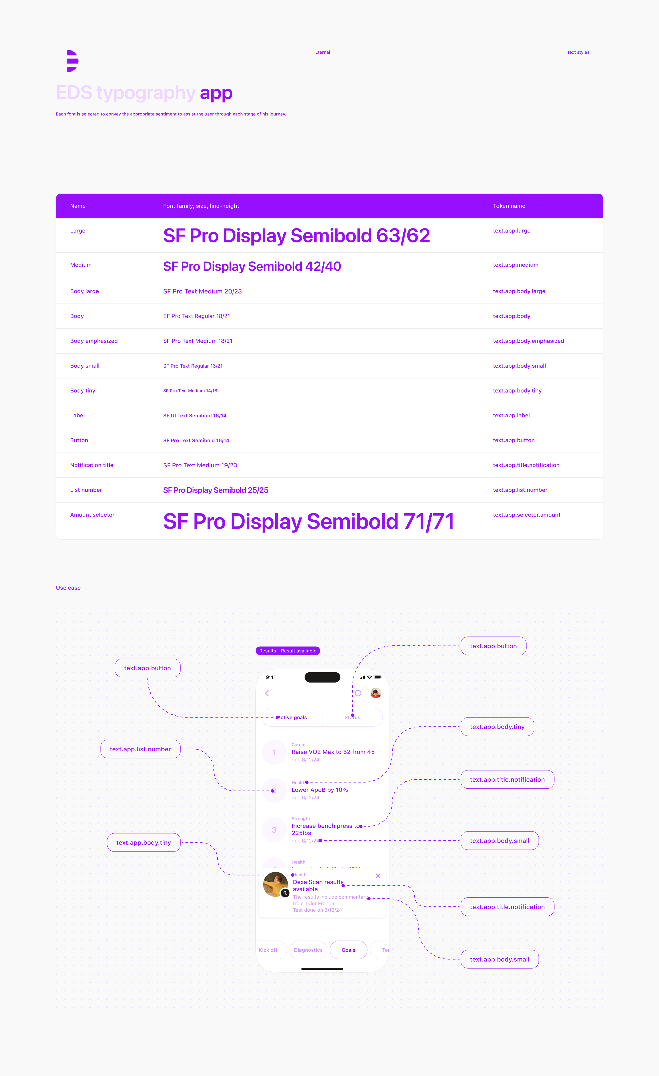
It is important to use consistent typography in order to communicate the high quality of the product. By maintaining consistency throughout both the Seed Round Pitch Deck and the mobile app, users will perceive them as a unified product, which can increase the level of trust during the presentation.
UI - Each font is carefully selected to convey the appropriate sentiment and to assist the user through each stage of their journey.
Maintaining consistency in design can increase the level of trust between parties during the pitch presentation.
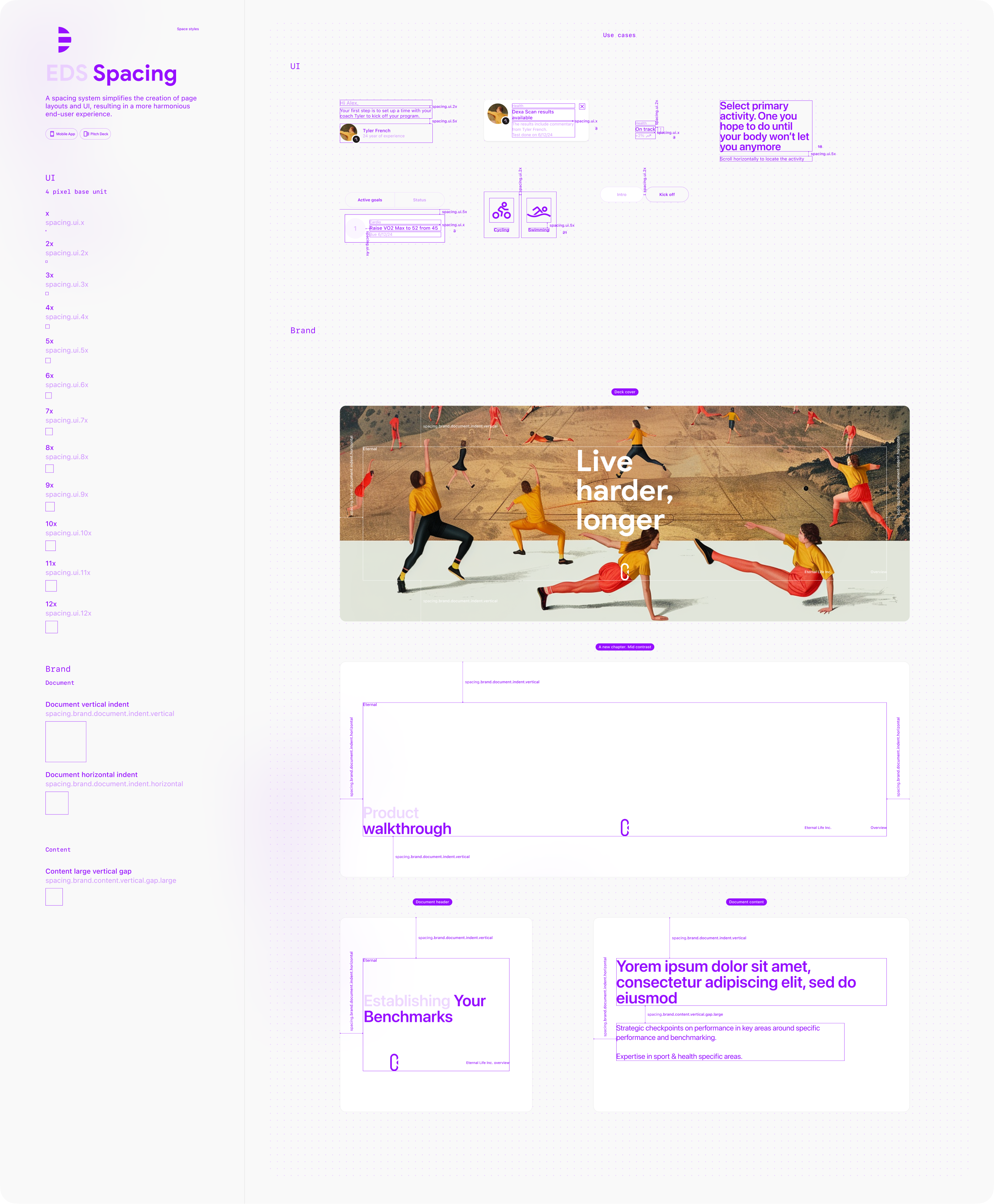
Spacing
A spacing system simplifies the creation of page layouts and UI, resulting in a more harmonious end-user experience.
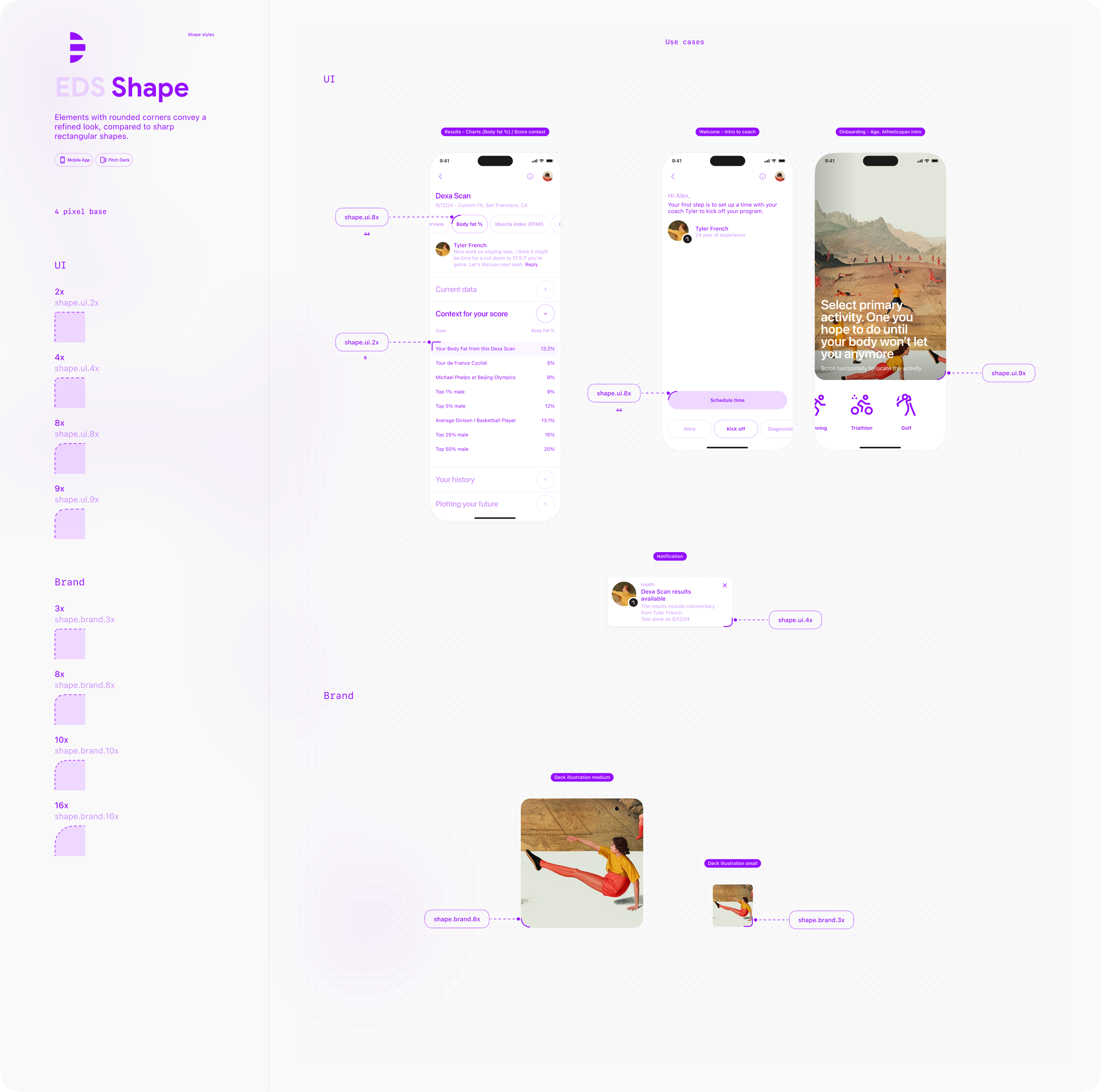
Shape
Elements with rounded corners convey a refined look, compared to sharp rectangular shapes.
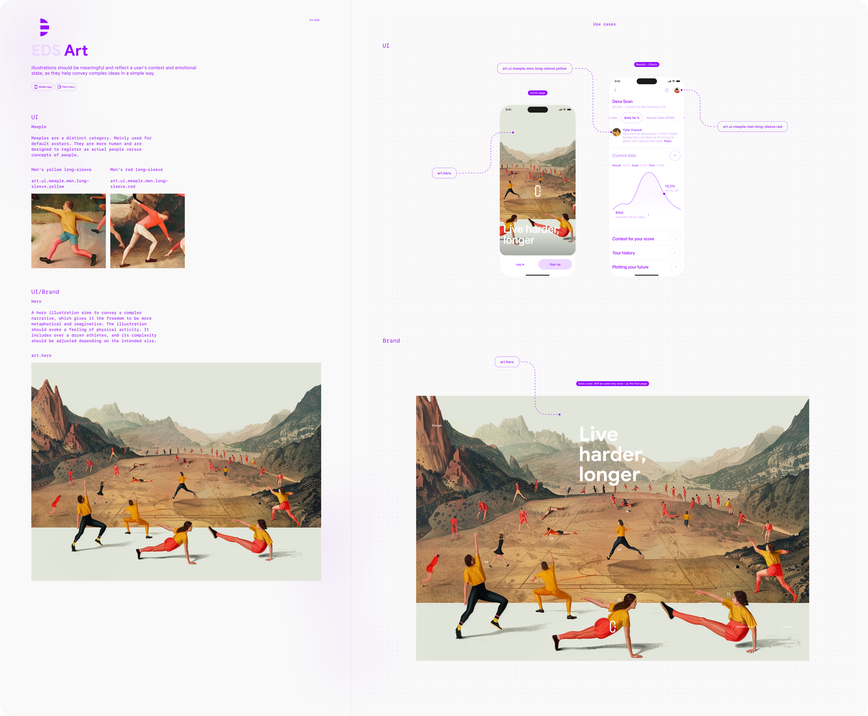
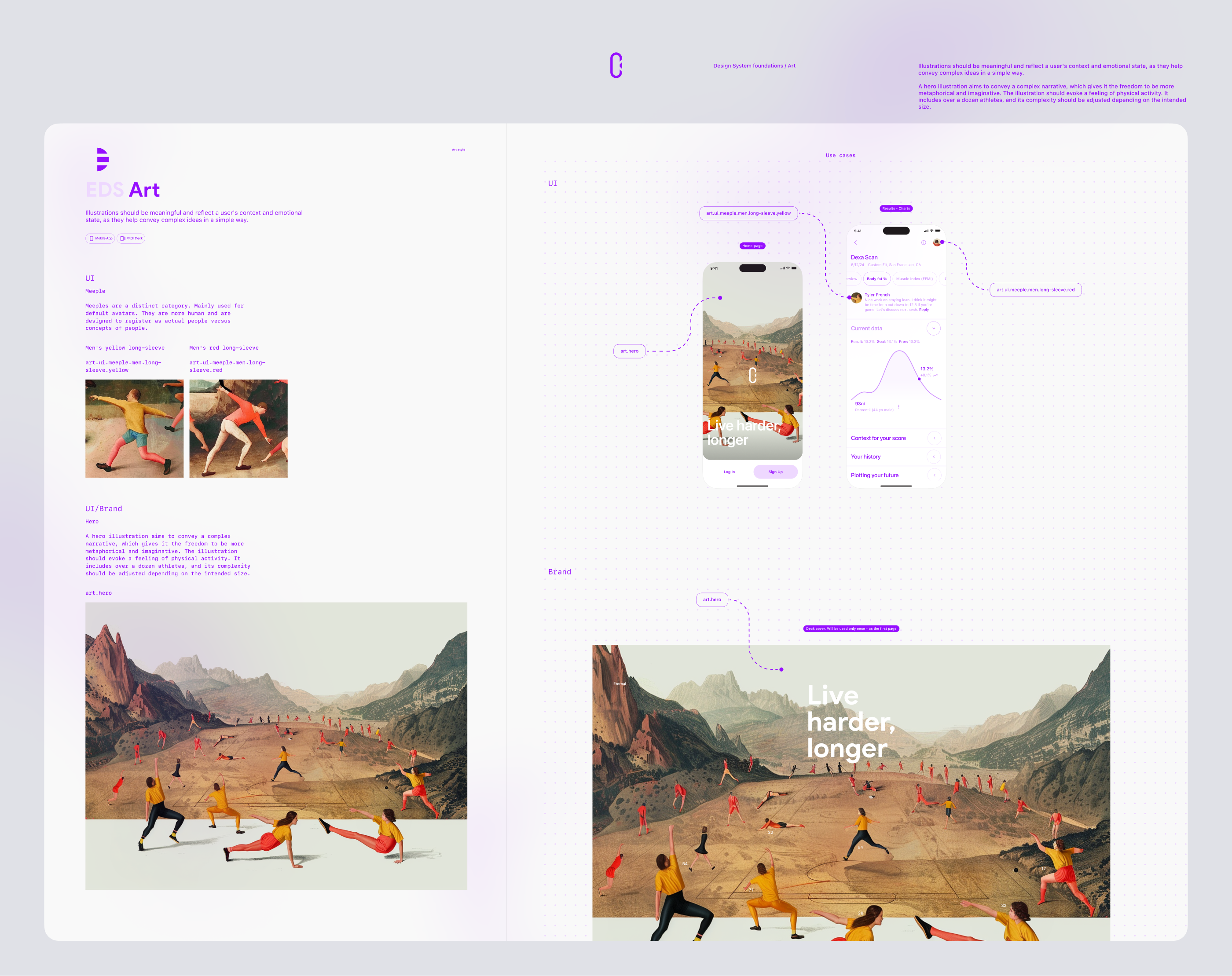
Art
Illustrations should be meaningful and reflect a user's context and emotional state, as they help convey complex ideas in a simple way.
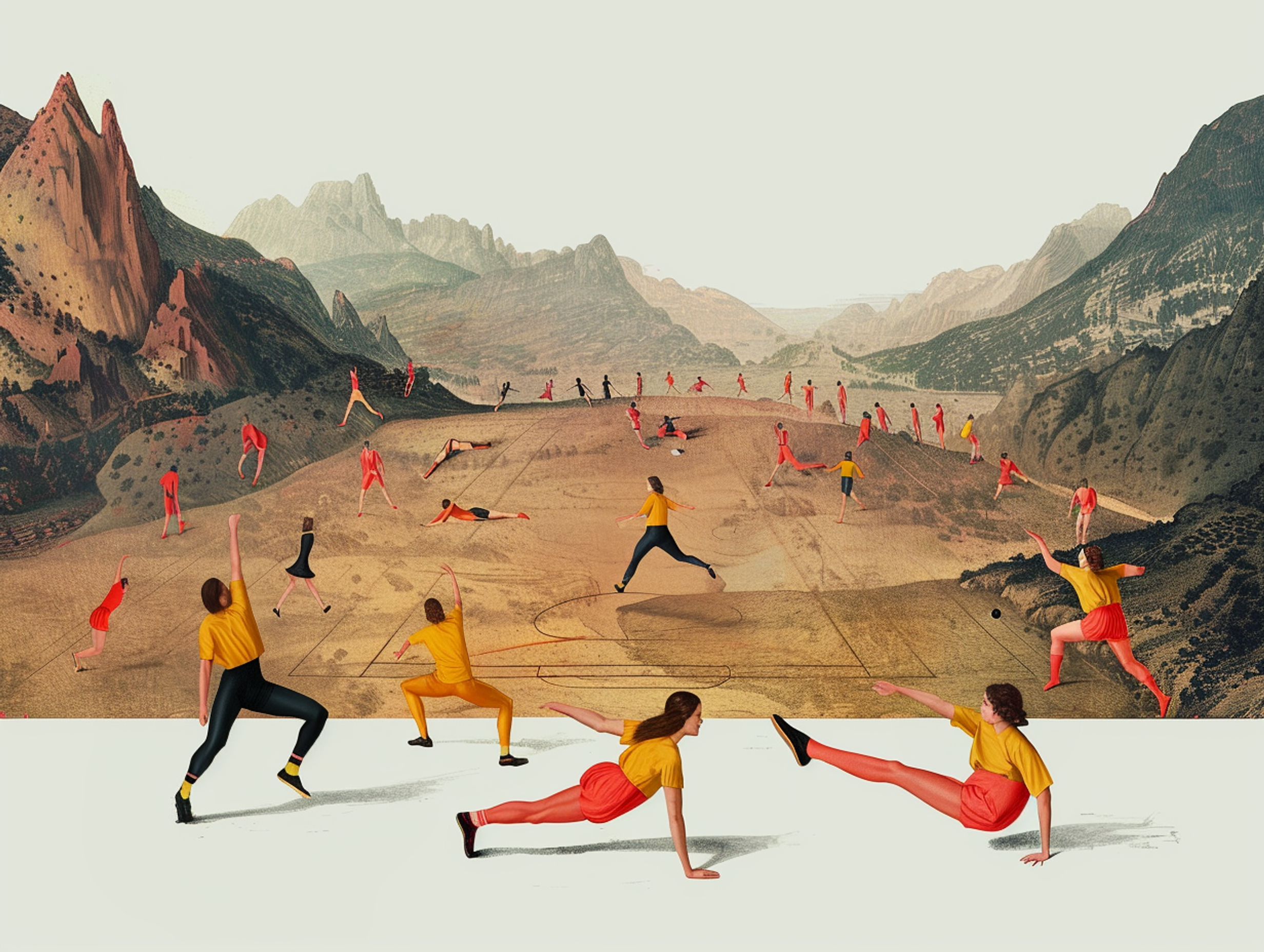
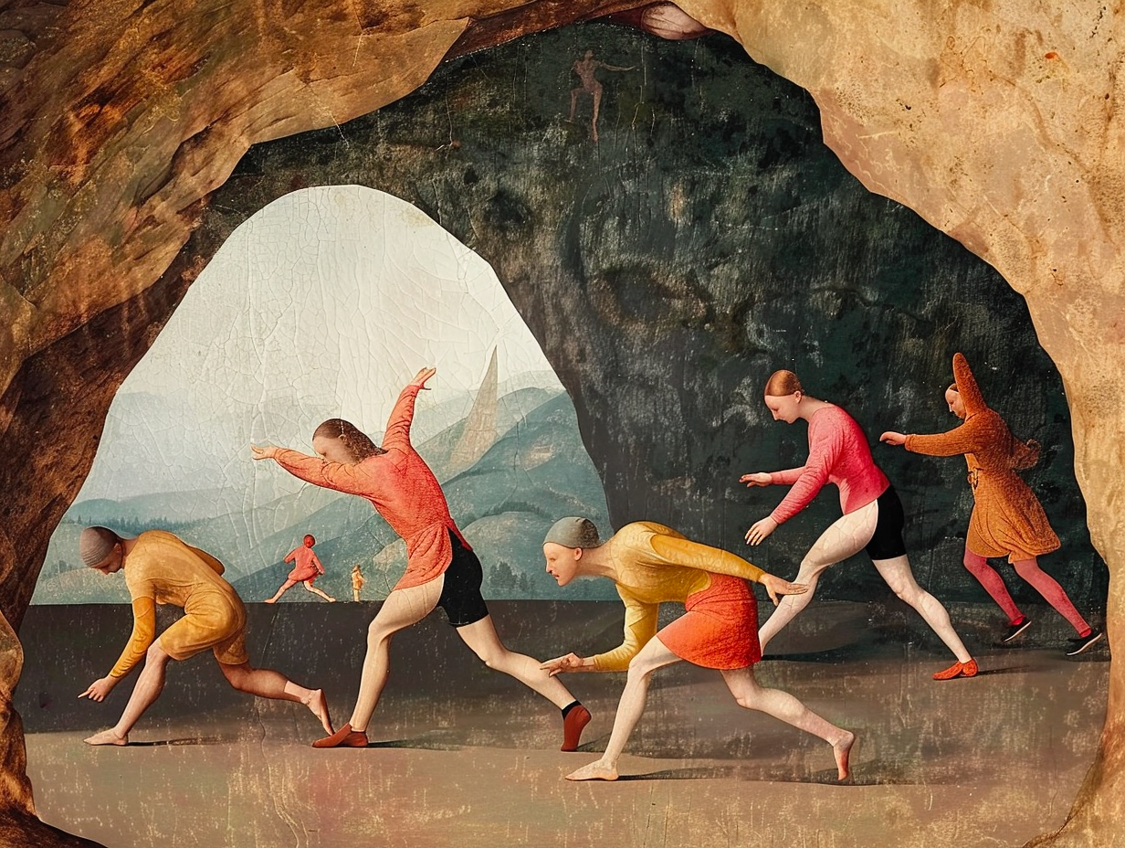
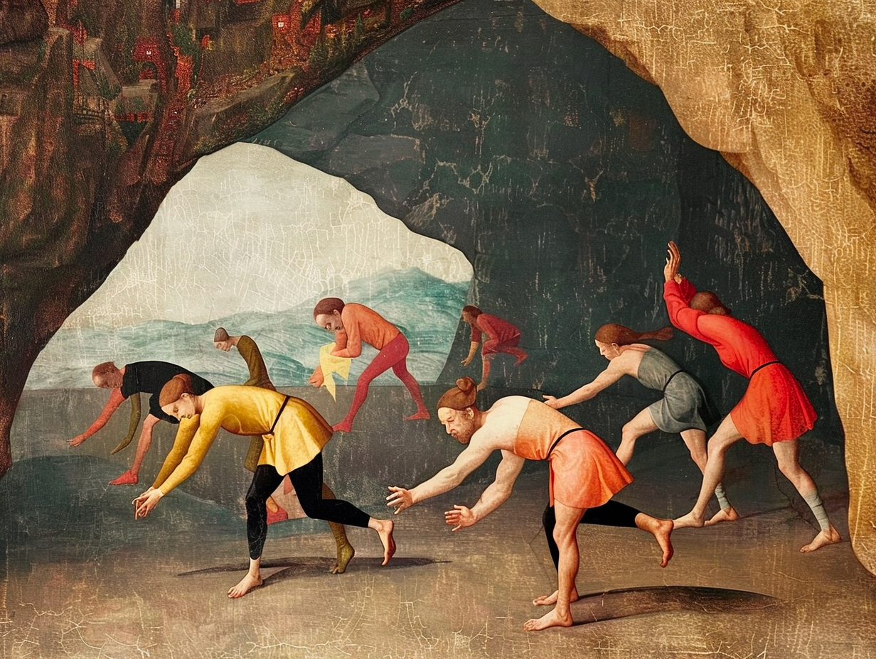
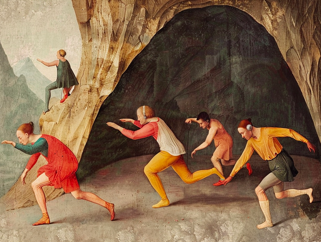
A hero illustration aims to convey a complex narrative, which gives it the freedom to be more metaphorical and imaginative. The illustration should evoke a feeling of physical activity. It includes over a dozen athletes, and its complexity should be adjusted depending on the intended size.
Styles version 1
DS version 1
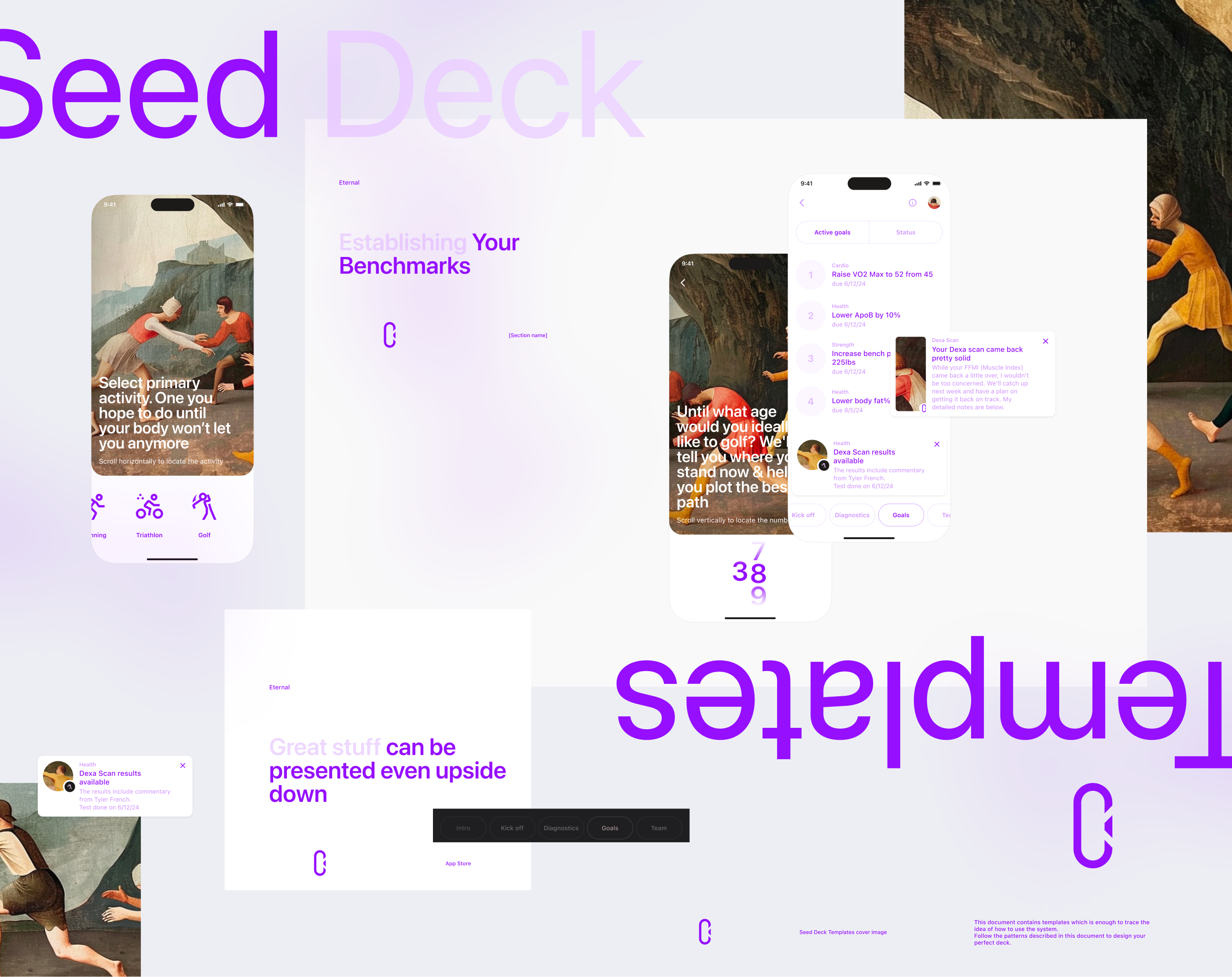
Seed Deck
This document provides the primary combinations of textual blocks, which should be sufficient to understand how to use the system. However, there are many more options available to combine textual information. Be creative and follow the patterns already described in this document to design the perfect structures for your Seed Deck and other similar documents.
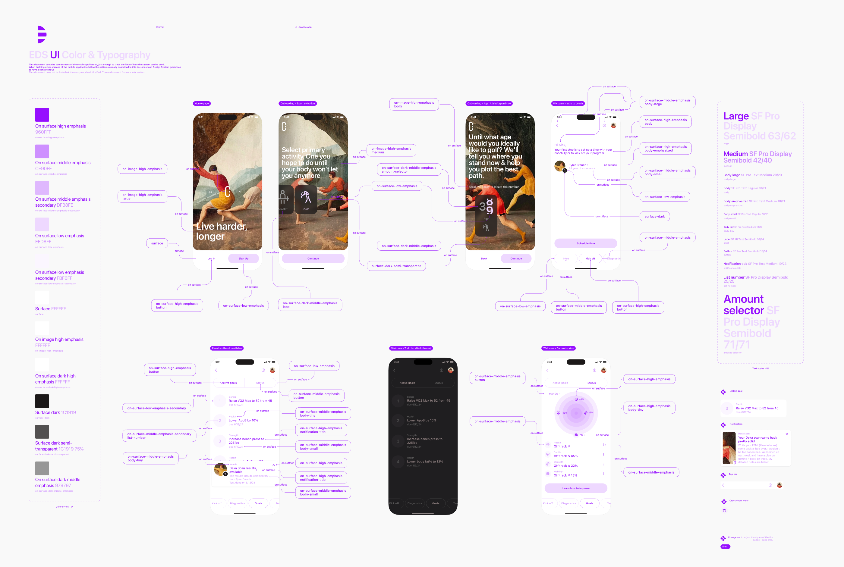
Mobile App (the version before refinements)
This document contains core screens of the mobile application, just enough to trace the idea of how the system can be used.
When building other screens of the mobile application follow the patterns already described in this document and Design System guidelines to have a consistent UI.
This document does not include dark theme styles, check the Dark Theme document for more information.
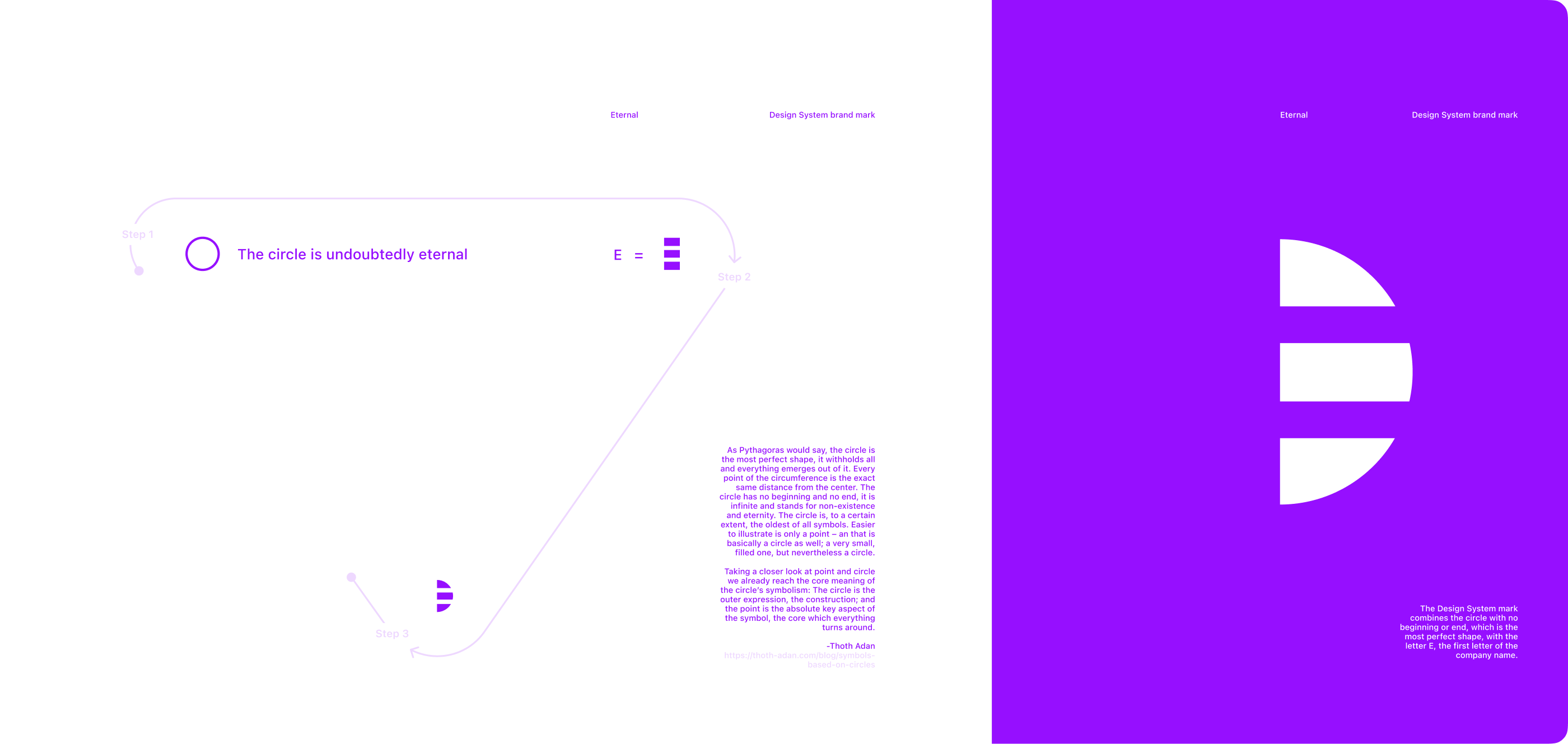
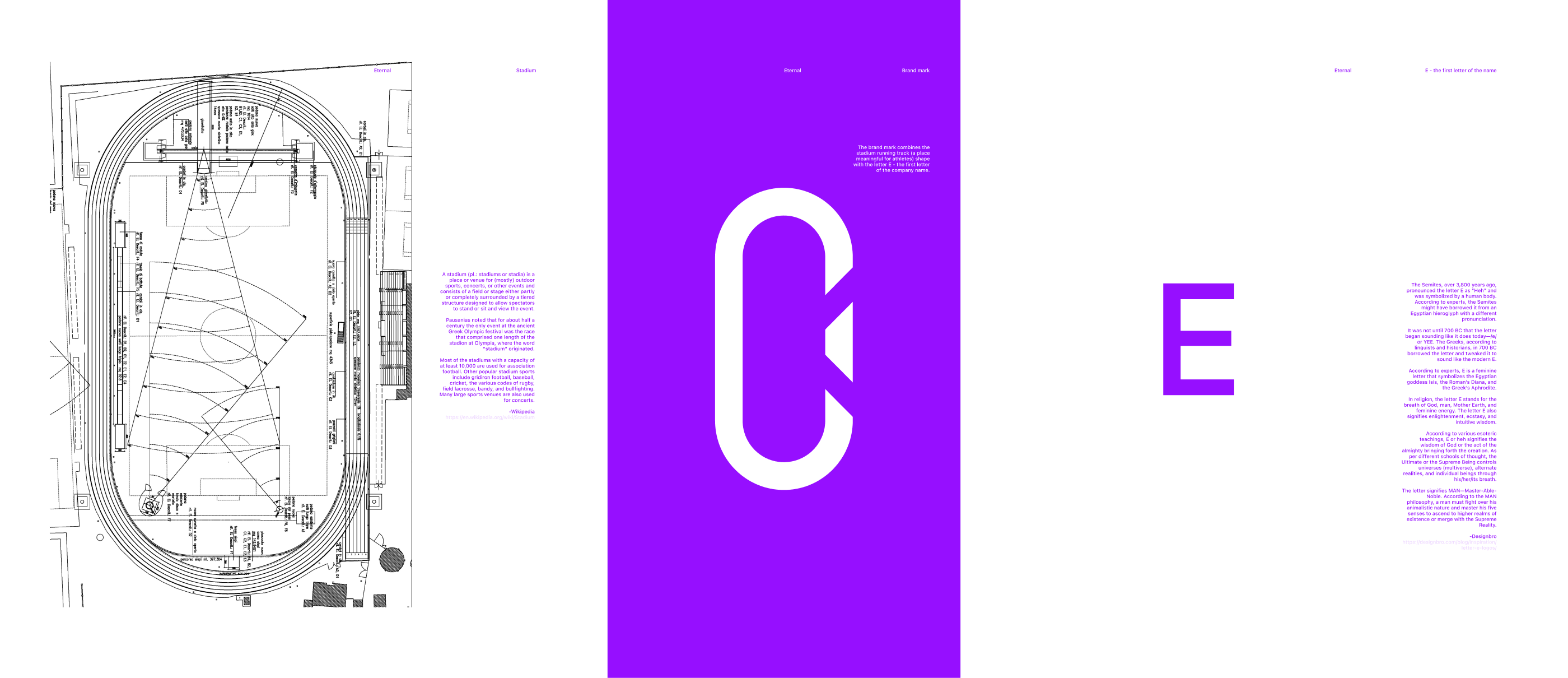
Design System mark
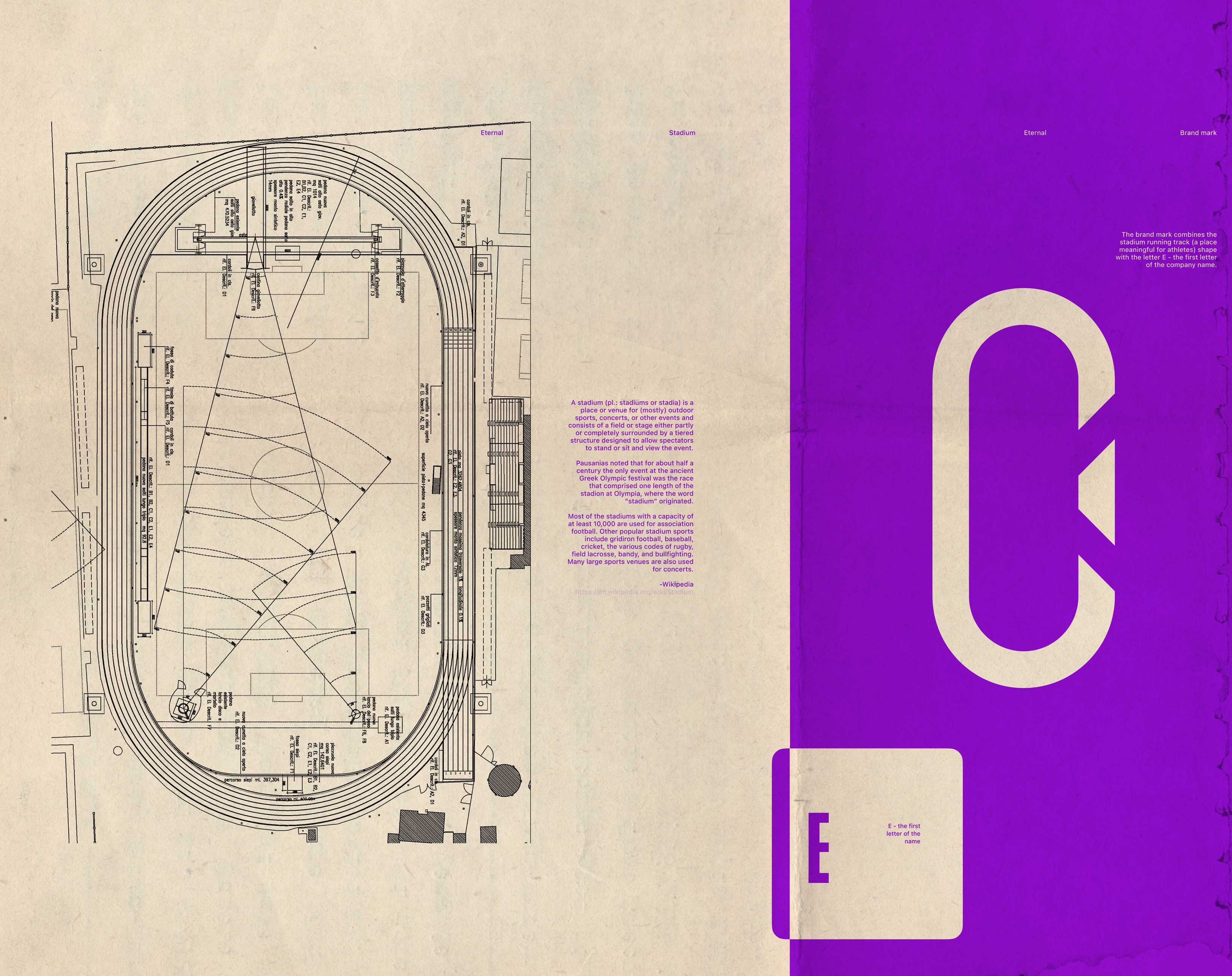
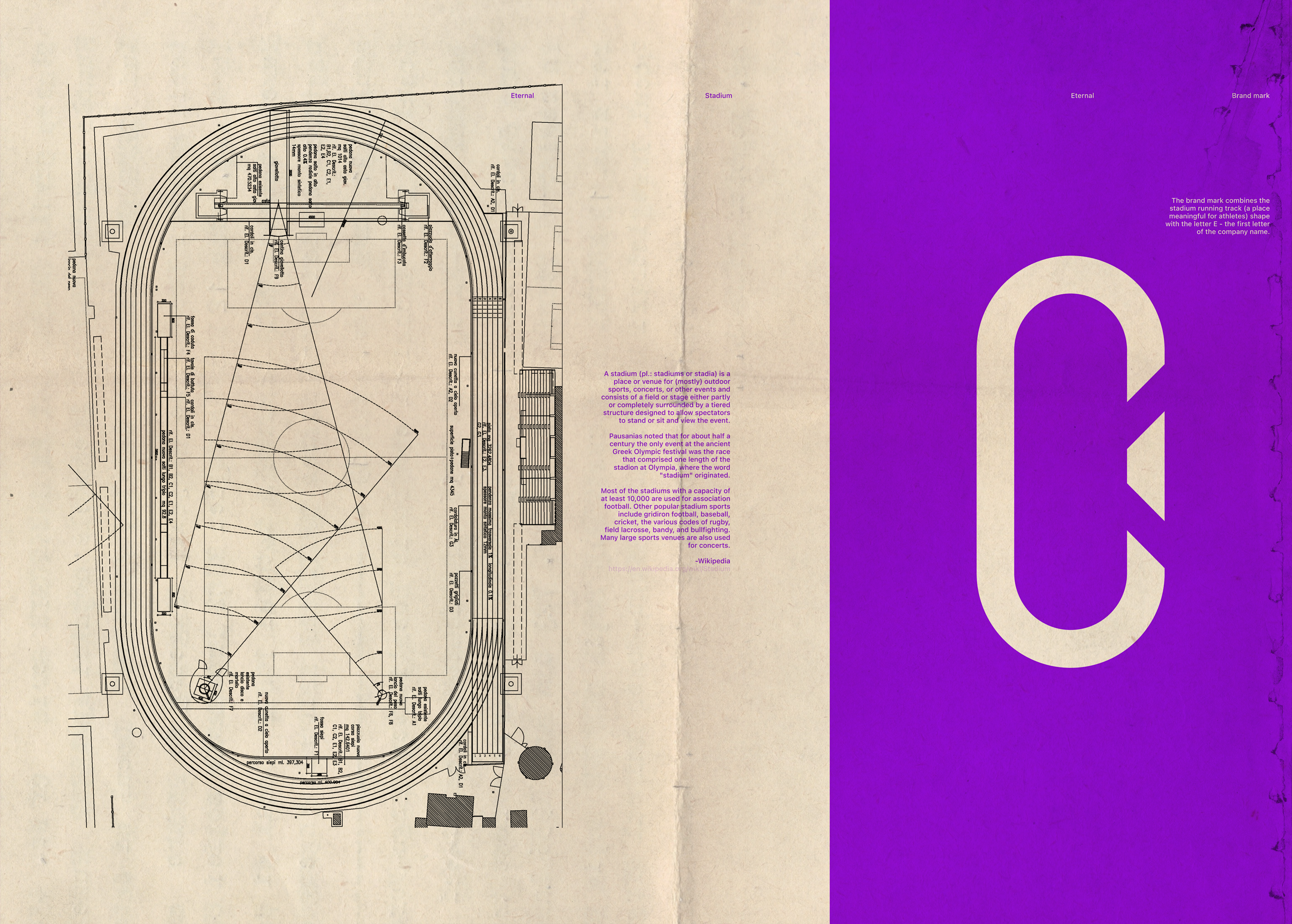
The Design System mark combines the circle with no beginning or end, which is the most perfect shape, with the letter E, the first letter of the company name.
“As Pythagoras would say, the circle is the most perfect shape, it withholds all and everything emerges out of it. Every point of the circumference is the exact same distance from the center. The circle has no beginning and no end, it is infinite and stands for non-existence and eternity. The circle is, to a certain extent, the oldest of all symbols. Easier to illustrate is only a point – and that is basically a circle as well; a very small, filled one, but nevertheless a circle.
Taking a closer look at the point and circle we already reach the core meaning of the circle’s symbolism: The circle is the outer expression, the construction; and the point is the absolute key aspect of the symbol, the core which everything turns around.”
-Thoth Adan
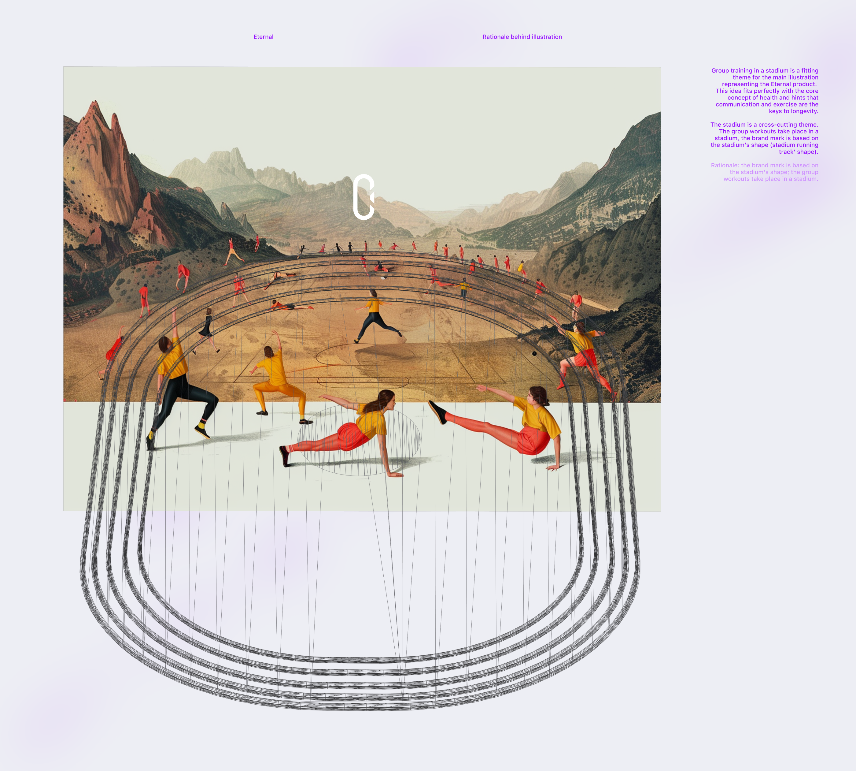
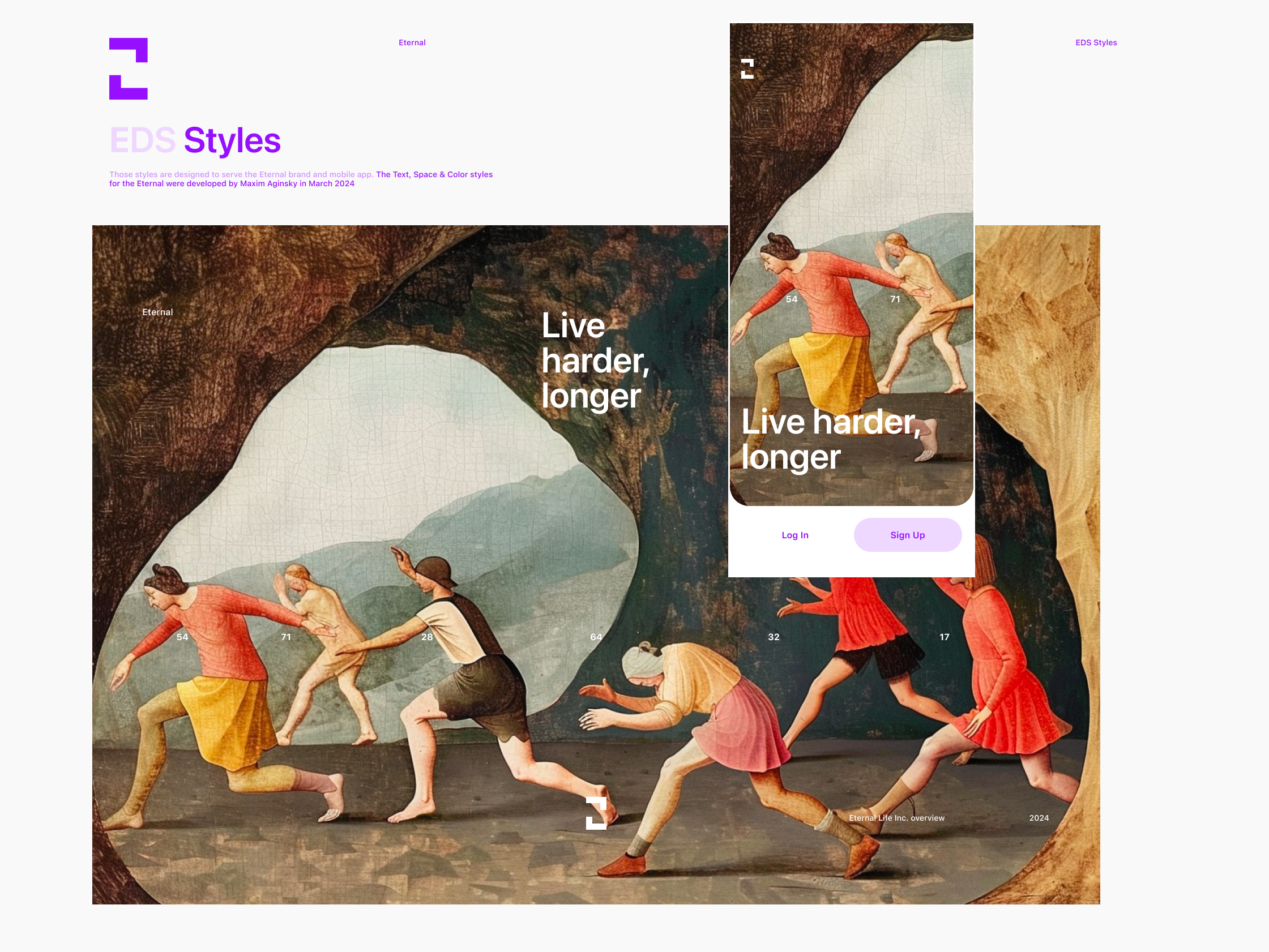
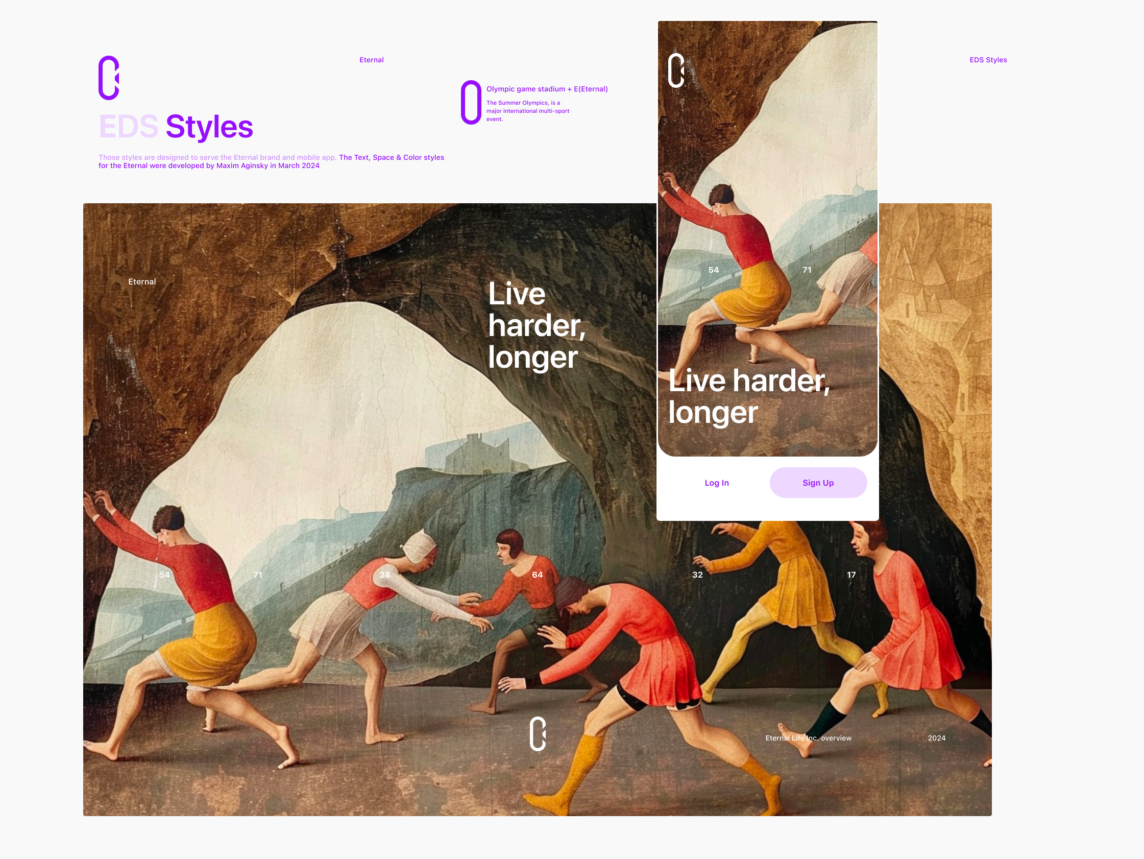
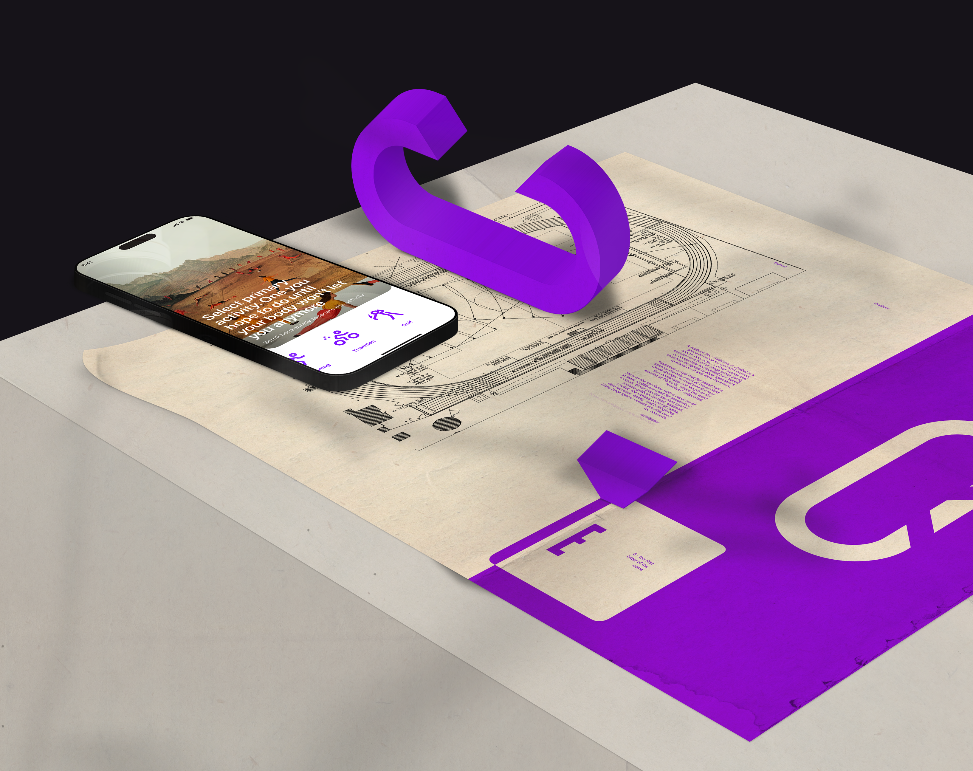
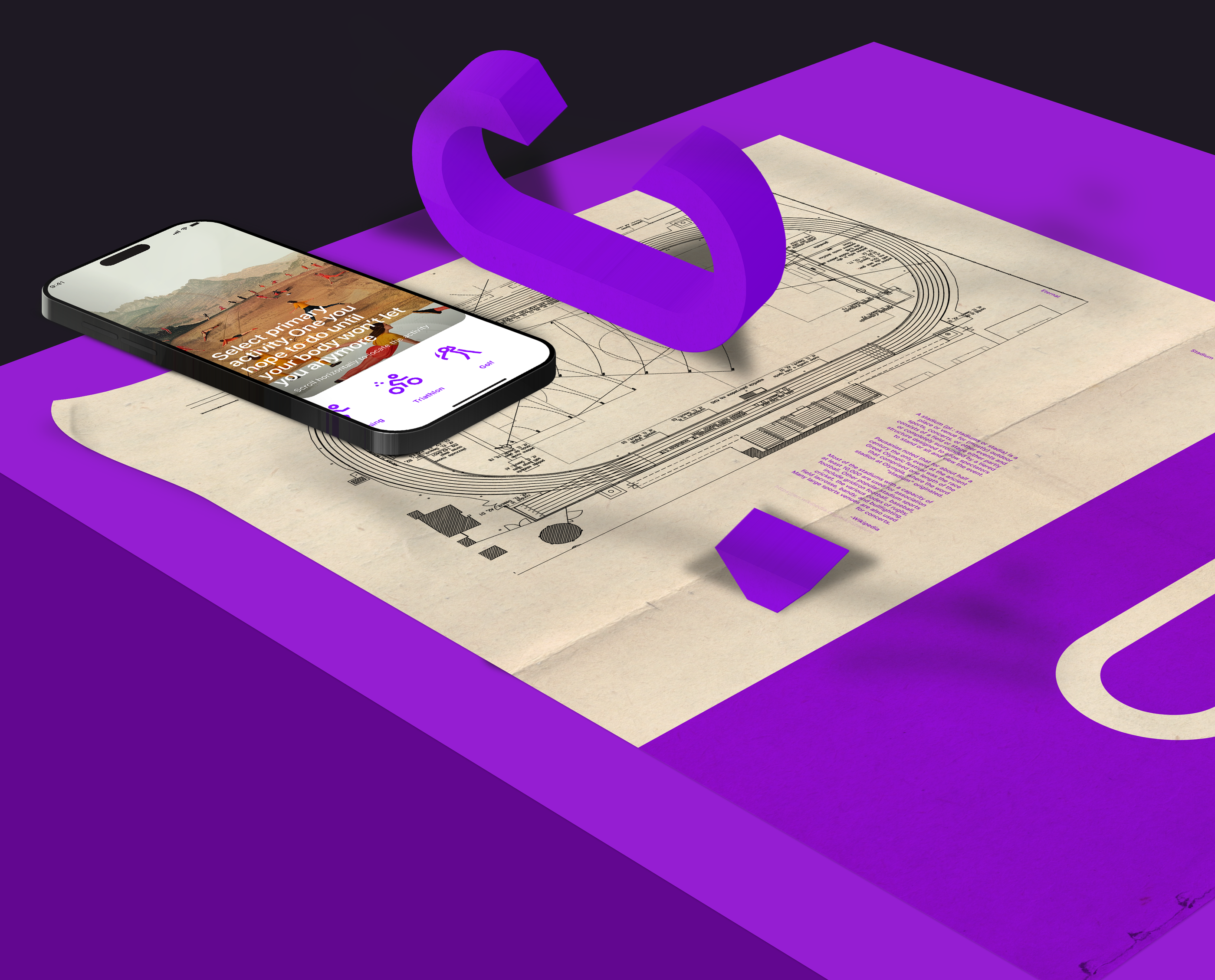
Hero illustration
Group training in a stadium is a fitting theme for the main illustration representing the Eternal product. This idea fits perfectly with the core concept of health and hints that communication and exercise are the keys to longevity.
The stadium is a cross-cutting theme. The group workouts take place in a stadium, the brand mark is based on the stadium's shape (stadium running track' shape).
Hero illustration
Rationale: the brand mark is based on the stadium's shape; the group workouts take place in a stadium.
Rationale
Working process
Brand mark
The brand mark combines the stadium running track (a place meaningful for athletes) shape with the letter E - the first letter of the company name.
A stadium (pl.: stadiums or stadia) is a place or venue for (mostly) outdoor sports, concerts, or other events and consists of a field or stage either partly or completely surrounded by a tiered structure designed to allow spectators to stand or sit and view the event.
Pausanias noted that for about half a century the only event at the ancient Greek Olympic festival was the race that comprised one length of the stadion at Olympia, where the word "stadium" originated.
Most of the stadiums with a capacity of at least 10,000 are used for association football. Other popular stadium sports include gridiron football, baseball, cricket, the various codes of rugby, field lacrosse, bandy, and bullfighting. Many large sports venues are also used for concerts.
The Semites, over 3,800 years ago, pronounced the letter E as “Heh” and was symbolized by a human body. According to experts, the Semites might have borrowed it from an Egyptian hieroglyph with a different pronunciation.
It was not until 700 BC that the letter began sounding like it does today—/e/ or YEE. The Greeks, according to linguists and historians, in 700 BC borrowed the letter and tweaked it to sound like the modern E.
According to experts, E is a feminine letter that symbolizes the Egyptian goddess Isis, the Roman’s Diana, and the Greek’s Aphrodite.
In religion, the letter E stands for the breath of God, man, Mother Earth, and feminine energy. The letter E also signifies enlightenment, ecstasy, and intuitive wisdom.
According to various esoteric teachings, E or heh signifies the wisdom of God or the act of the almighty bringing forth the creation. As per different schools of thought, the Ultimate or the Supreme Being controls universes (multiverse), alternate realities, and individual beings through his/her/its breath.
The letter signifies MAN—Master-Able-Noble. According to the MAN philosophy, a man must fight over his animalistic nature and master his five senses to ascend to higher realms of existence or merge with the Supreme Reality.
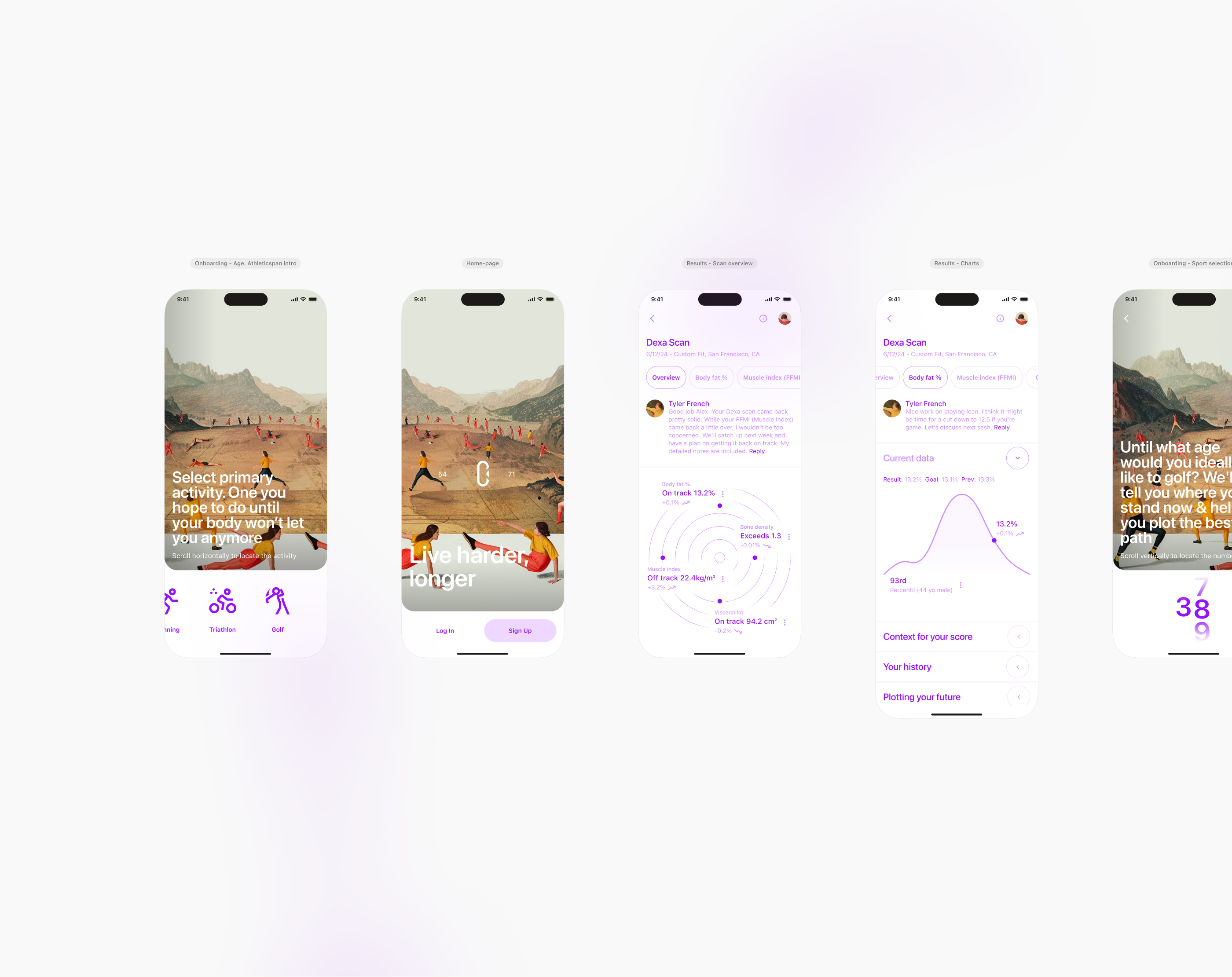
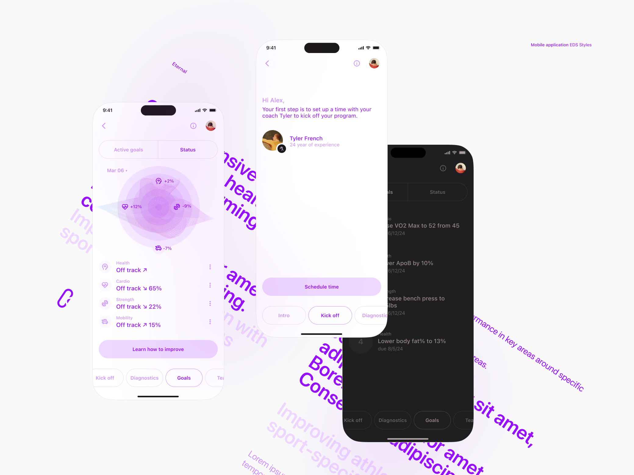
Mobile app workflow. Selected views
A series of tasks that were laid in front of me, were addressed considering common interaction patterns that have become evident over the past few years. Information design is crucial to creating a user-friendly interface and interactions. During this stage, I will make critical decisions that will impact the later stages of the product design process.
Here you will find a series of steps for each view that uncover the motivation and thinking.
Some of my decisions were influenced by the need to consider that the mobile app mockups have to illustrate the document, which means that I do not have complete control over redesigning wireframes. Despite this, I am pleased with the resulting materials.
The overall principle is to express your thoughts regarding something if you have any.
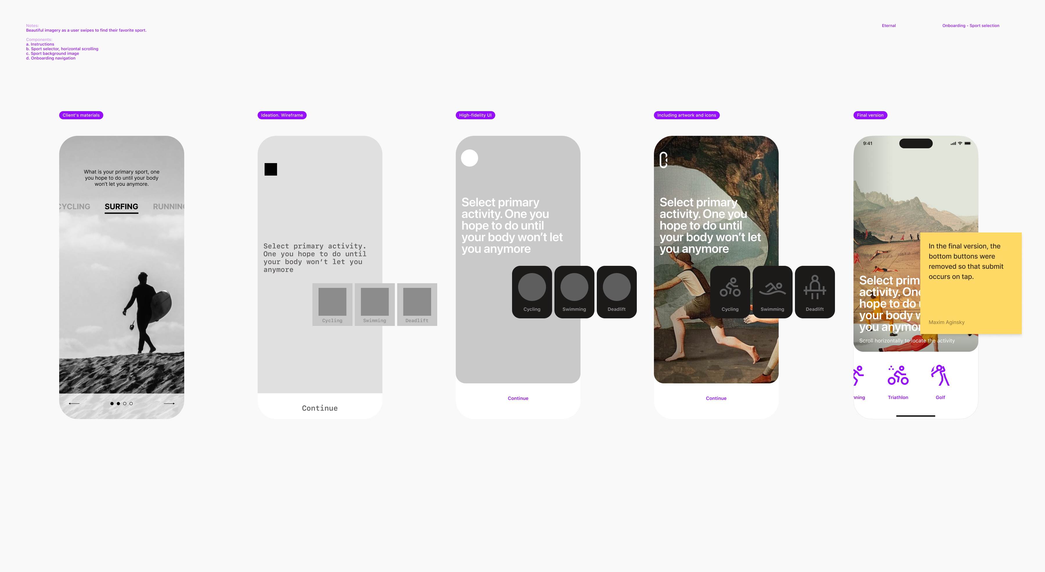
Onboarding - Sport selection
I am beginning to conduct visual tests once I have a good idea of what information design should be.
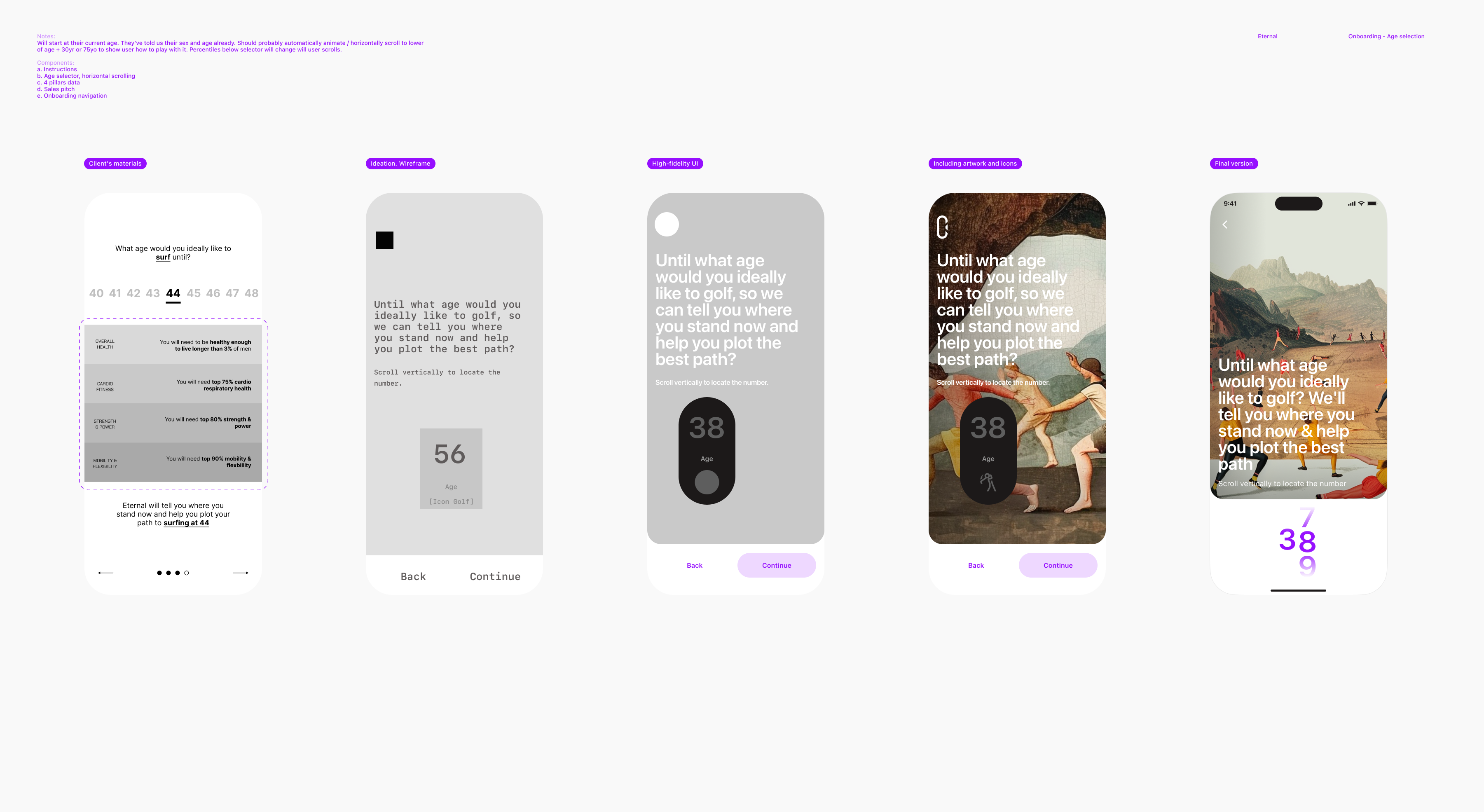
Onboarding - Age selection
The reason for removing the outlined information is that it's not relevant to age selection, which is the main focus of this view. This type of content should be included in the core application and not in the onboarding process. Additionally, information such as "You will need to be healthy enough to live longer than 3% of men" may potentially frighten the user at this point.
This is the second screen of the IA stage, but I have already created at least two dozen visual tests, searching for the mood that I want to develop. This shows how important visual design is to me.
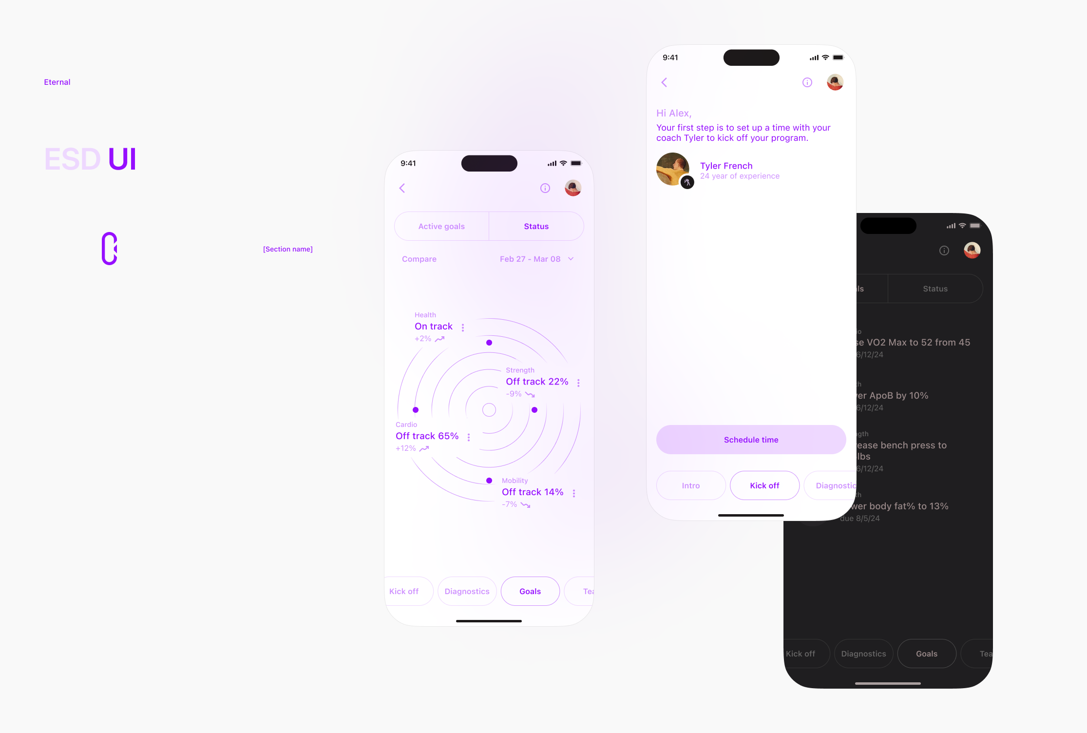
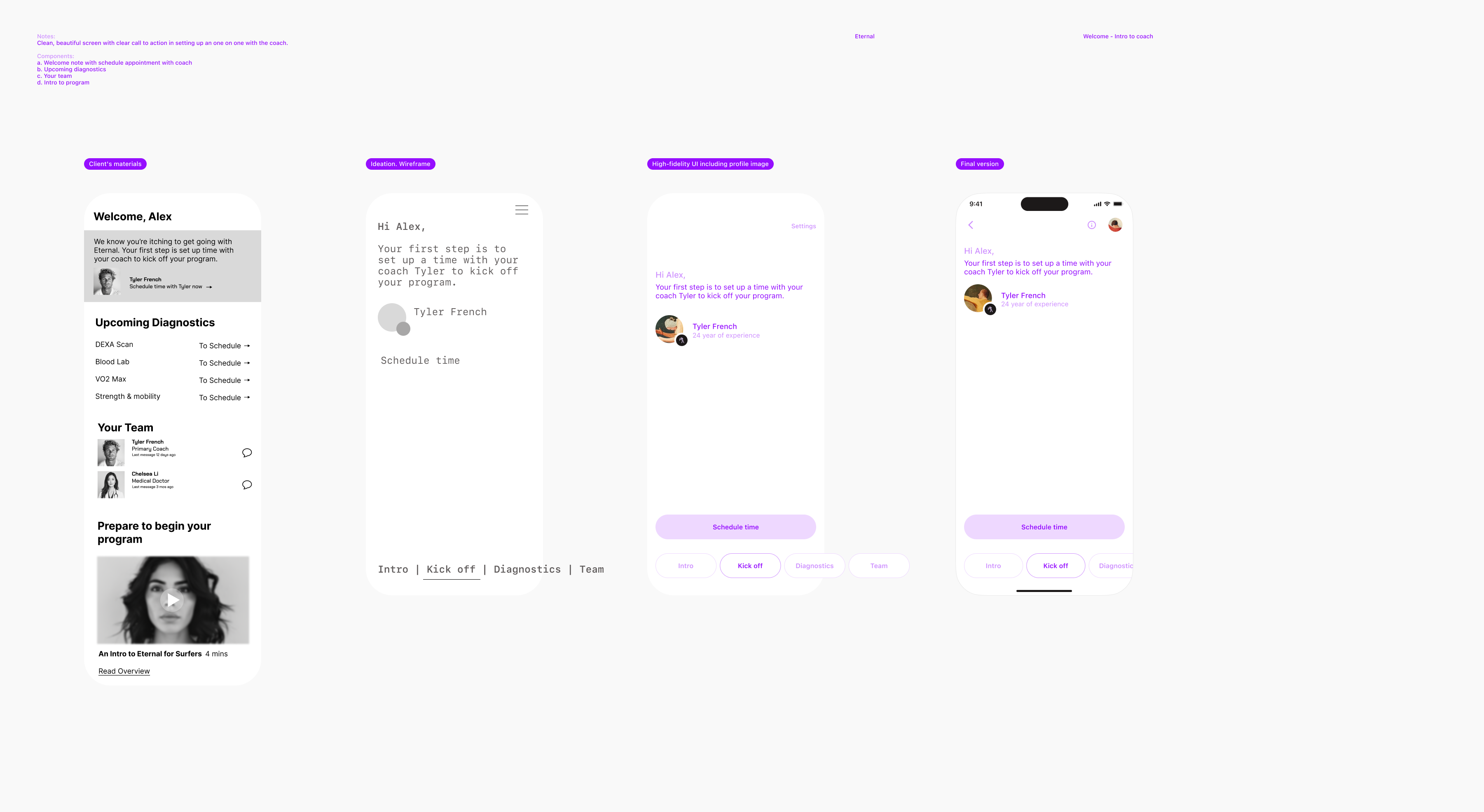
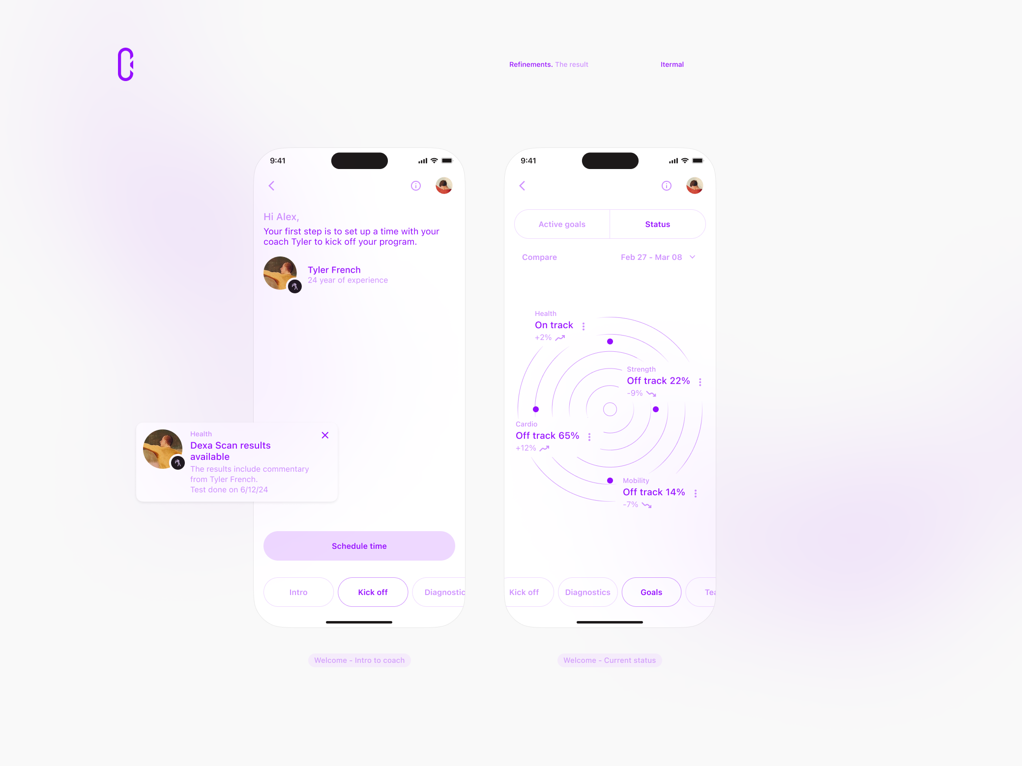
Welcome - Intro to coach
I decided to replace the vertical scroll with sections by introducing tabs. This change was made to minimize the amount of scrolling required and to make it easier for users to navigate through the different sections of the page.
The first section is dedicated to scheduling time with the coach, and therefore, the call-to-action (CTA) button has been made more prominent.
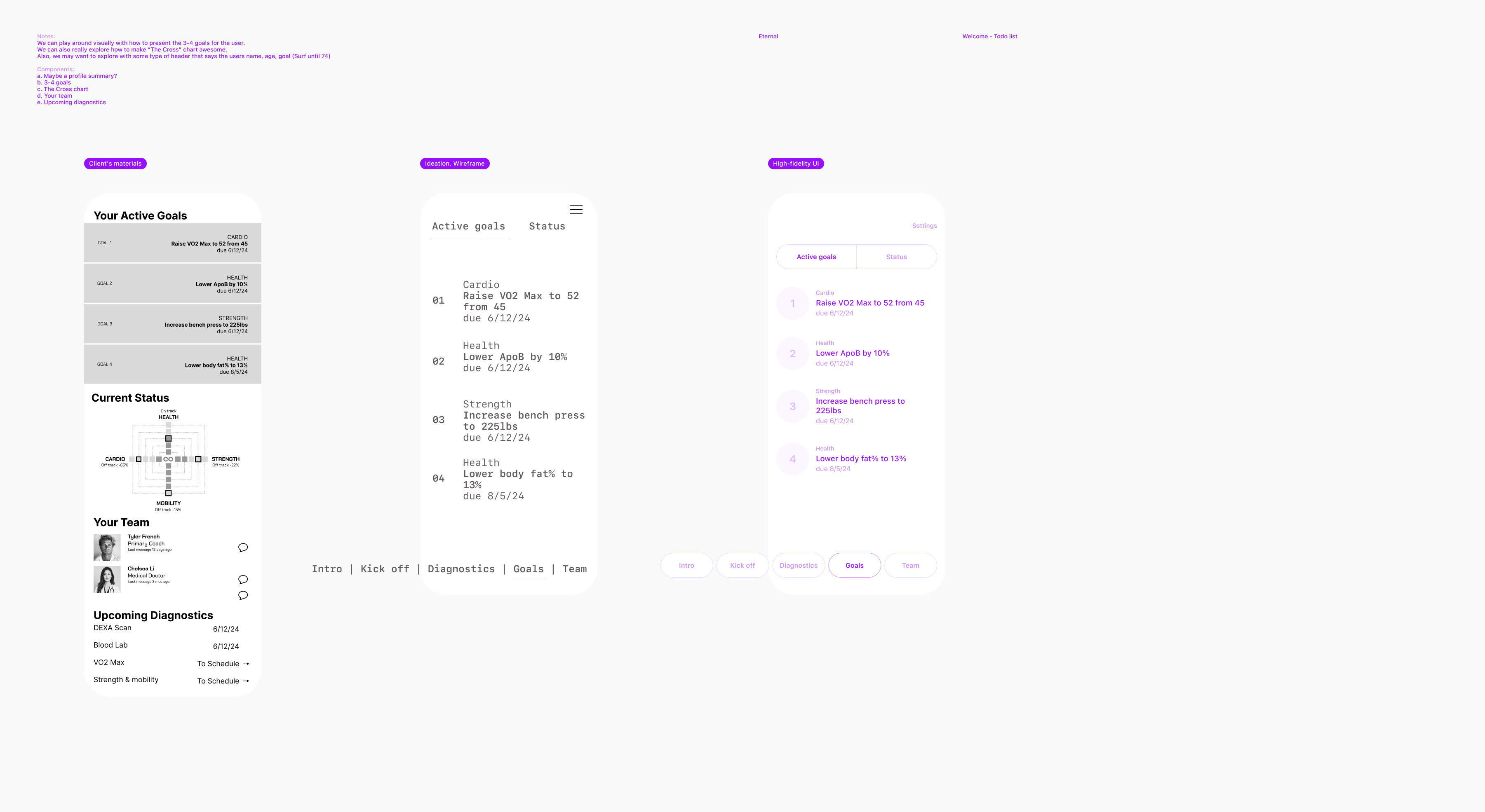
Welcome - Todo list
In order to arrive at the optimal solution, it is crucial to possess a comprehensive comprehension of the entire process. It is possible that the status may appear as part of the bottom navigation.
I have made a simple calculation of 1+1=2, apart from the first two sections, the remaining sections are identical to those on the previous screen. Therefore, I have grouped them together by introducing top tabs.
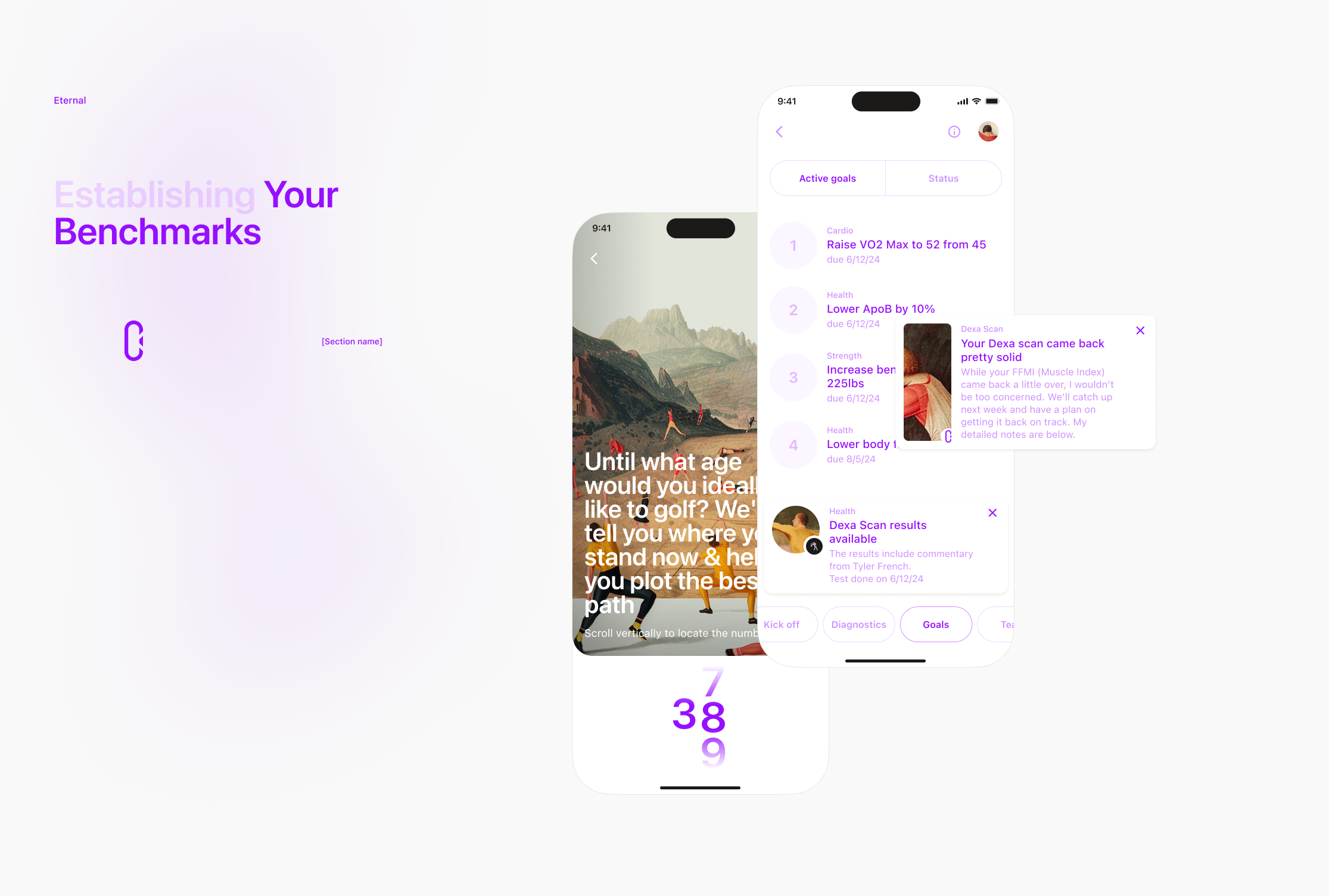
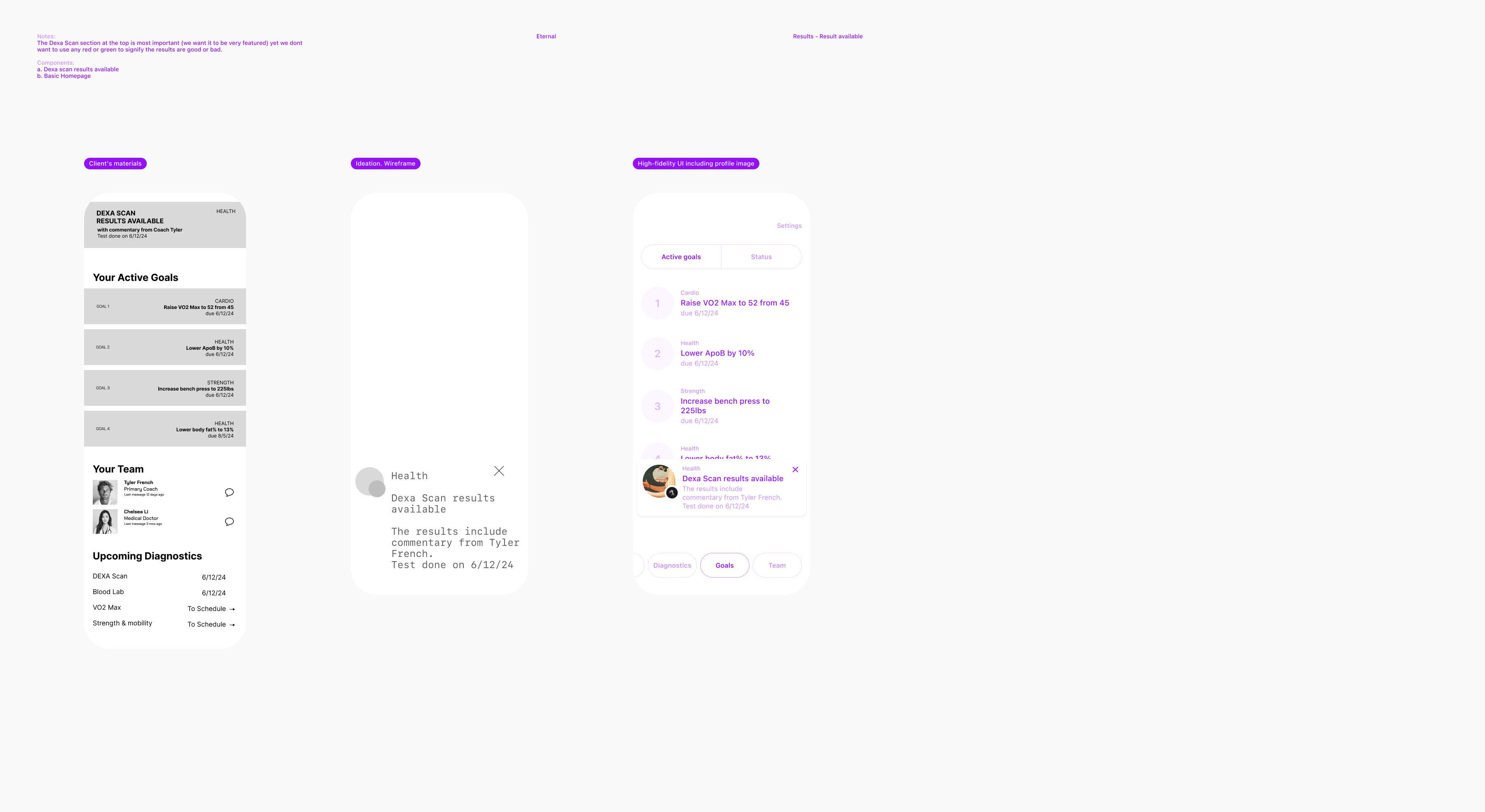
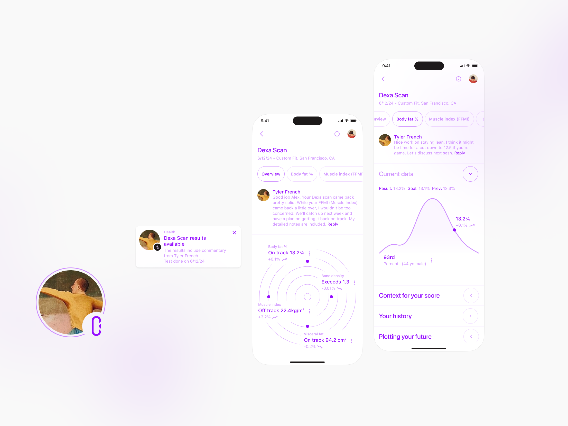
Results - Result available
Information understanding.
The result available is a notification that the user needs to be able to receive on any page of the app when the result is ready. Additionally, the Results page is needed to host all results - could be included as another tab in the bottom navigation or in the main menu. A full IA is needed to make the final decision.
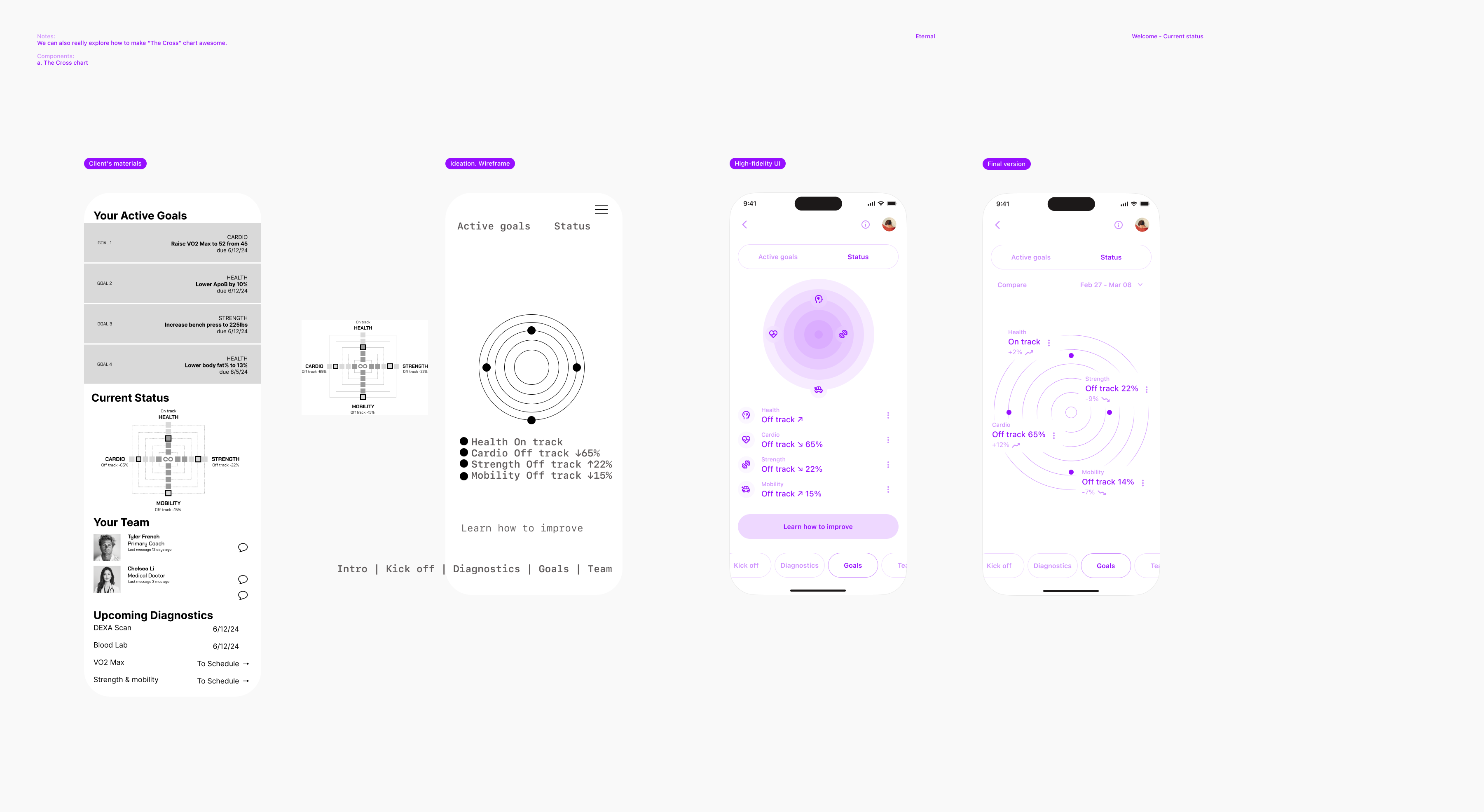
Welcome - Current status
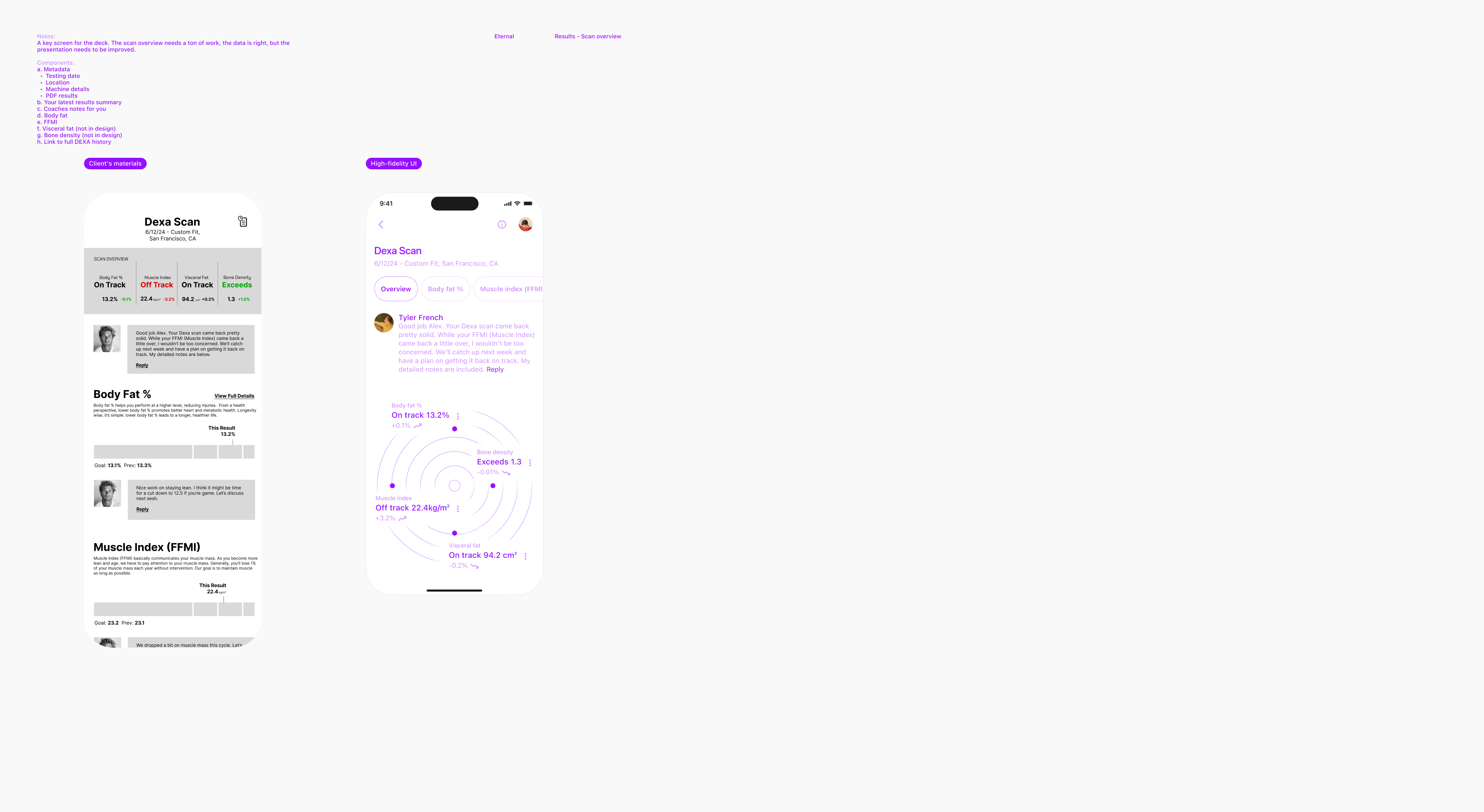
Results - Scan overview (key screen)
The same as before (Welcome - Intro to coach).
The key to a user-friendly system is the similarity in the usage of the pattern. I'm replacing the multiple sections (scroll) with the top navigation.
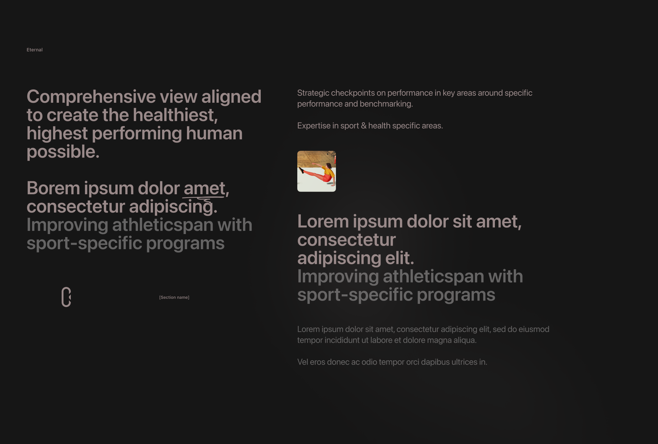
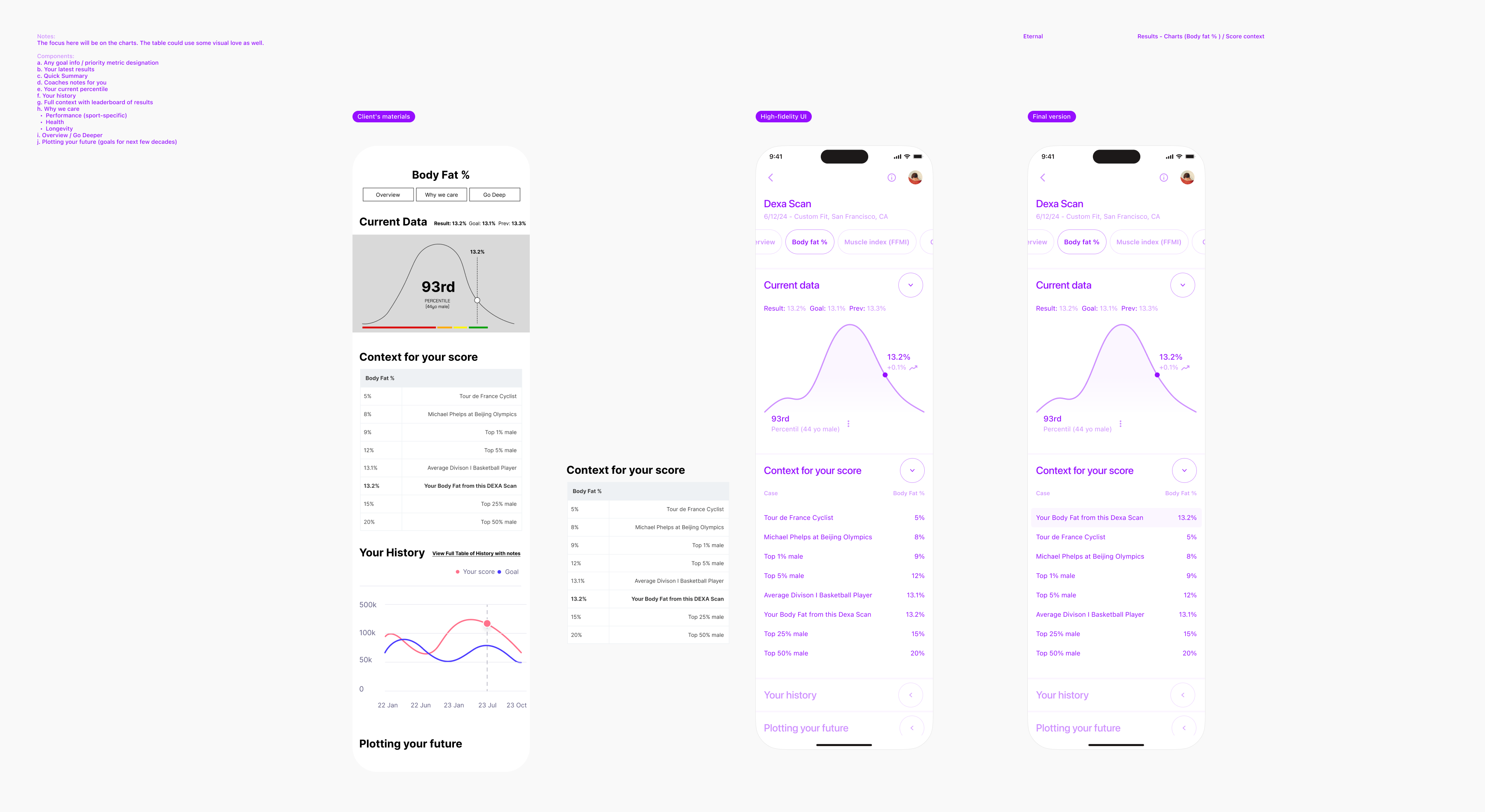
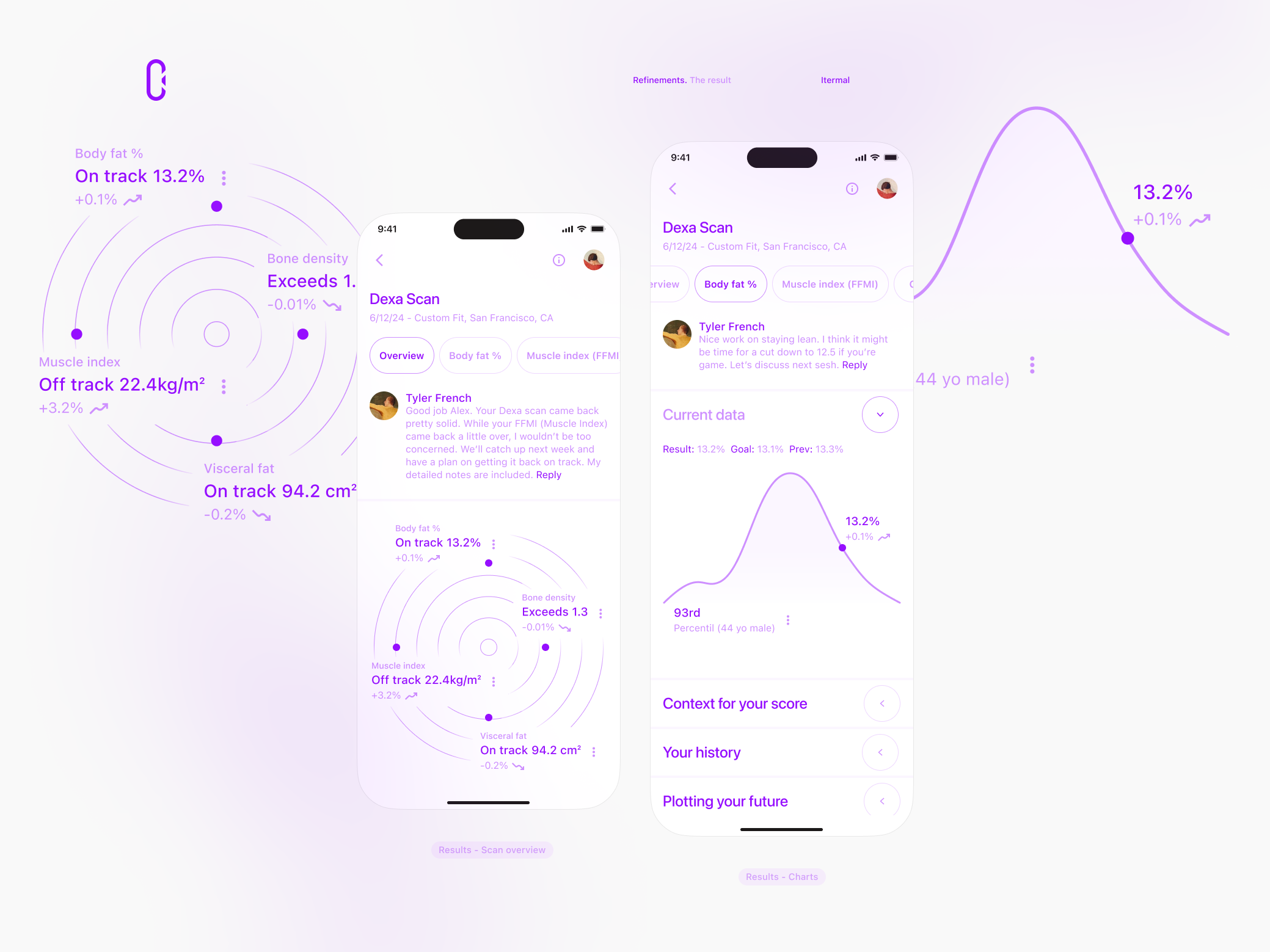
Results - Charts (Body fat %)
Introducing collapsible sections for improved content visibility.
Fast scanning and hierarchic organization help to aid navigation.
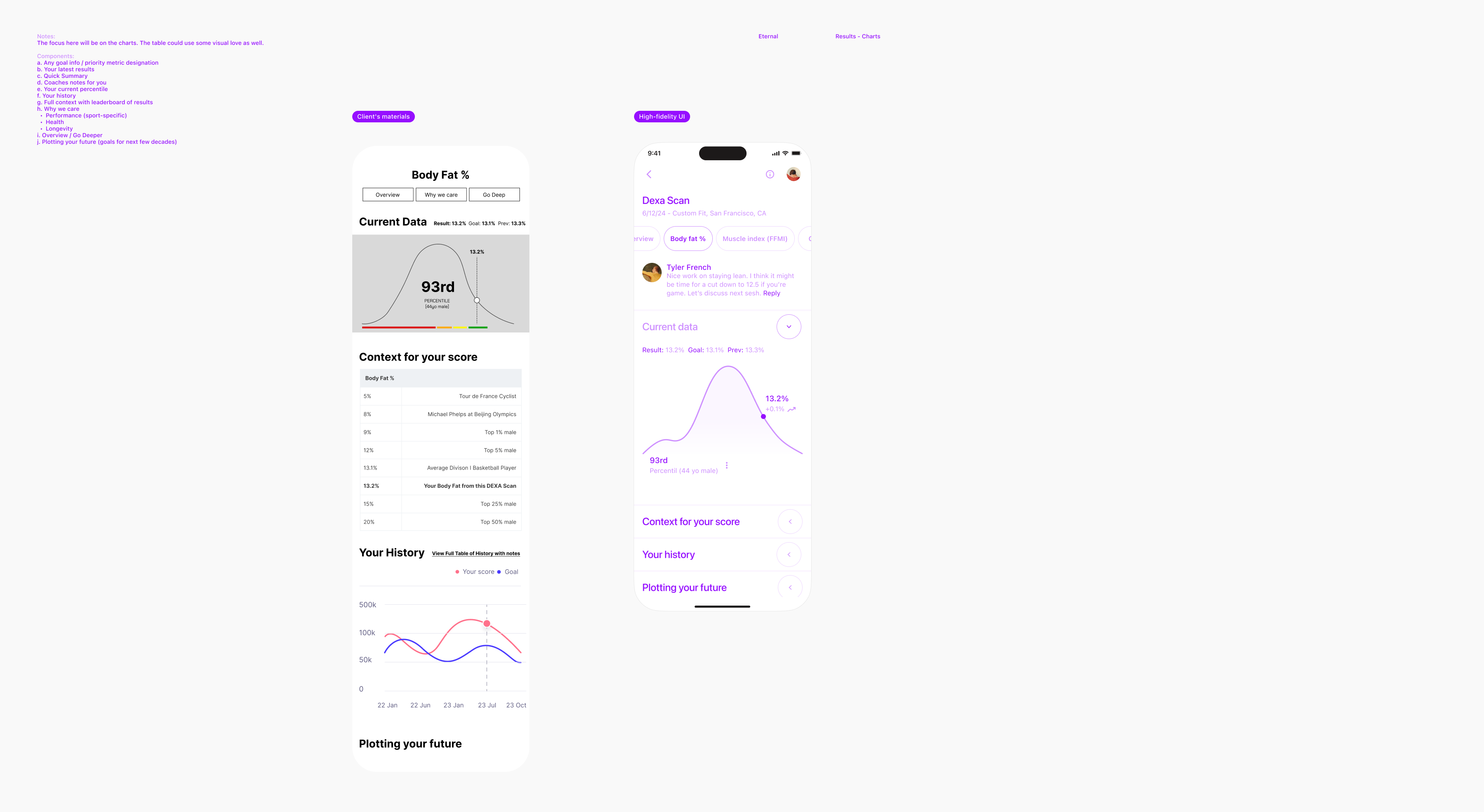
Results - Charts (Body fat %) / Score context
The table re-design.
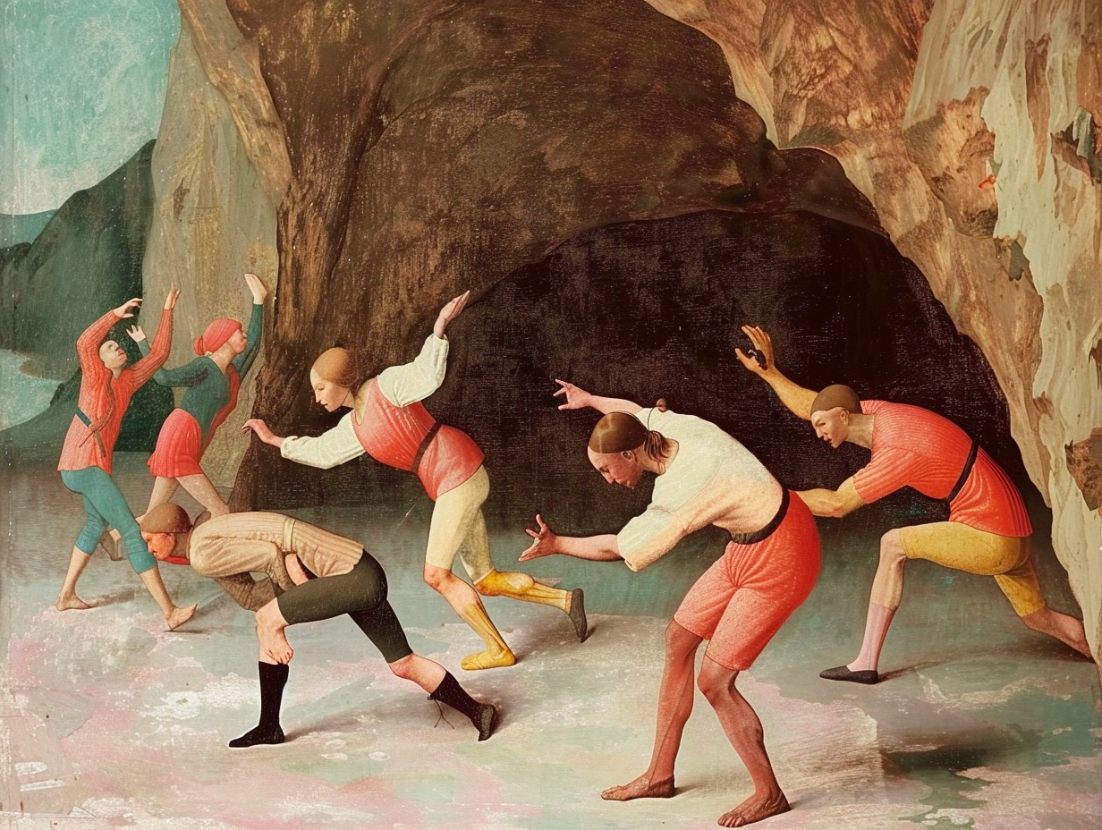
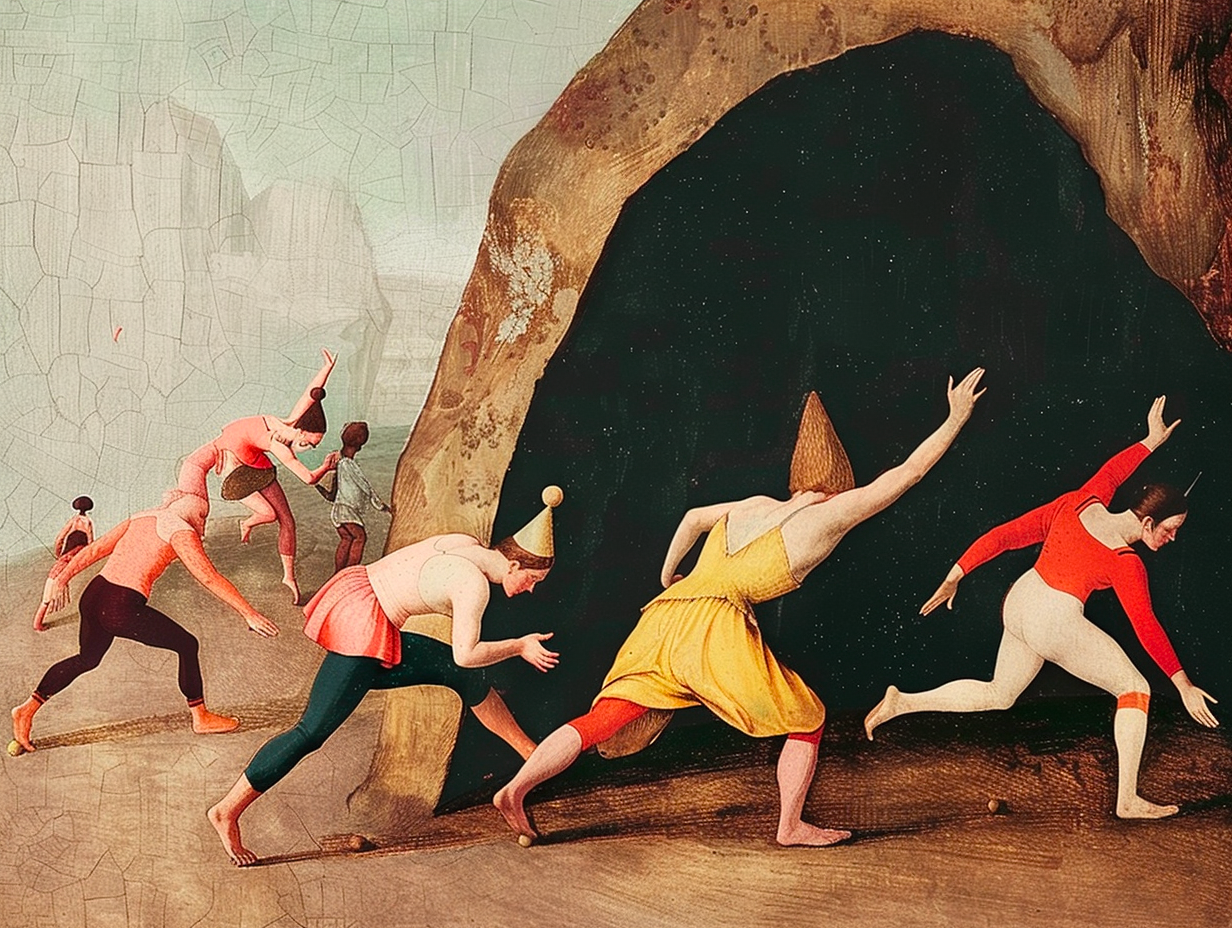
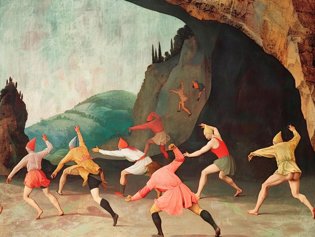
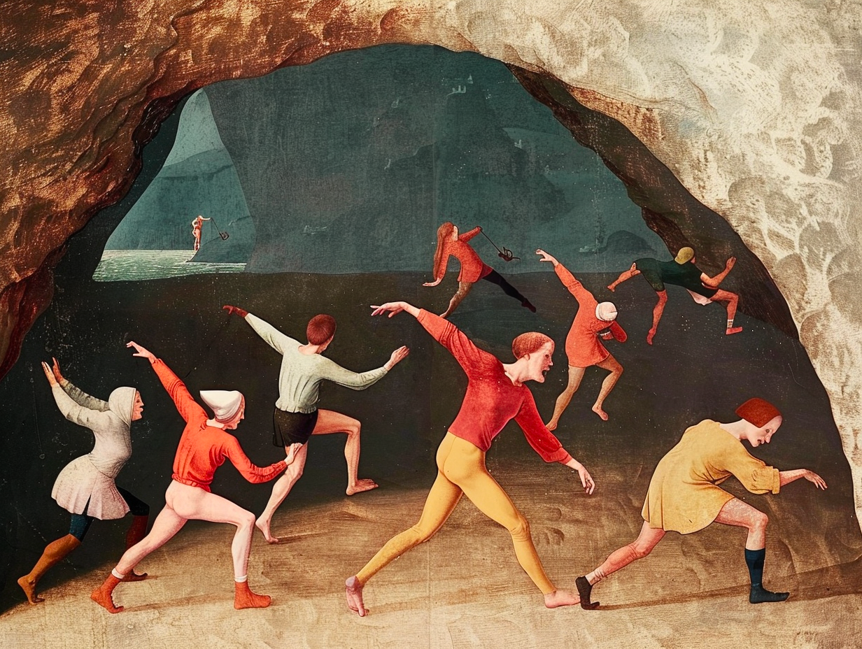
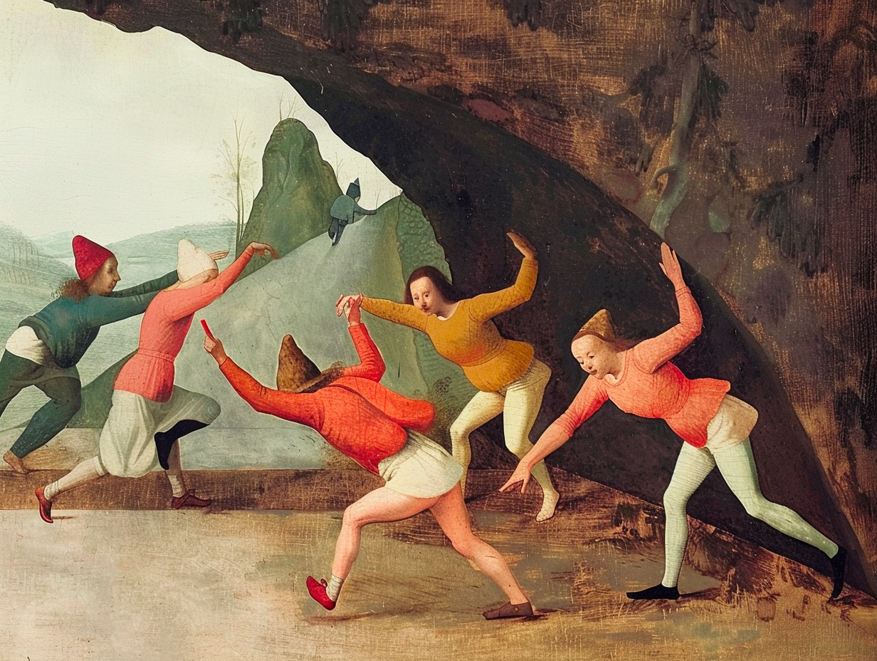
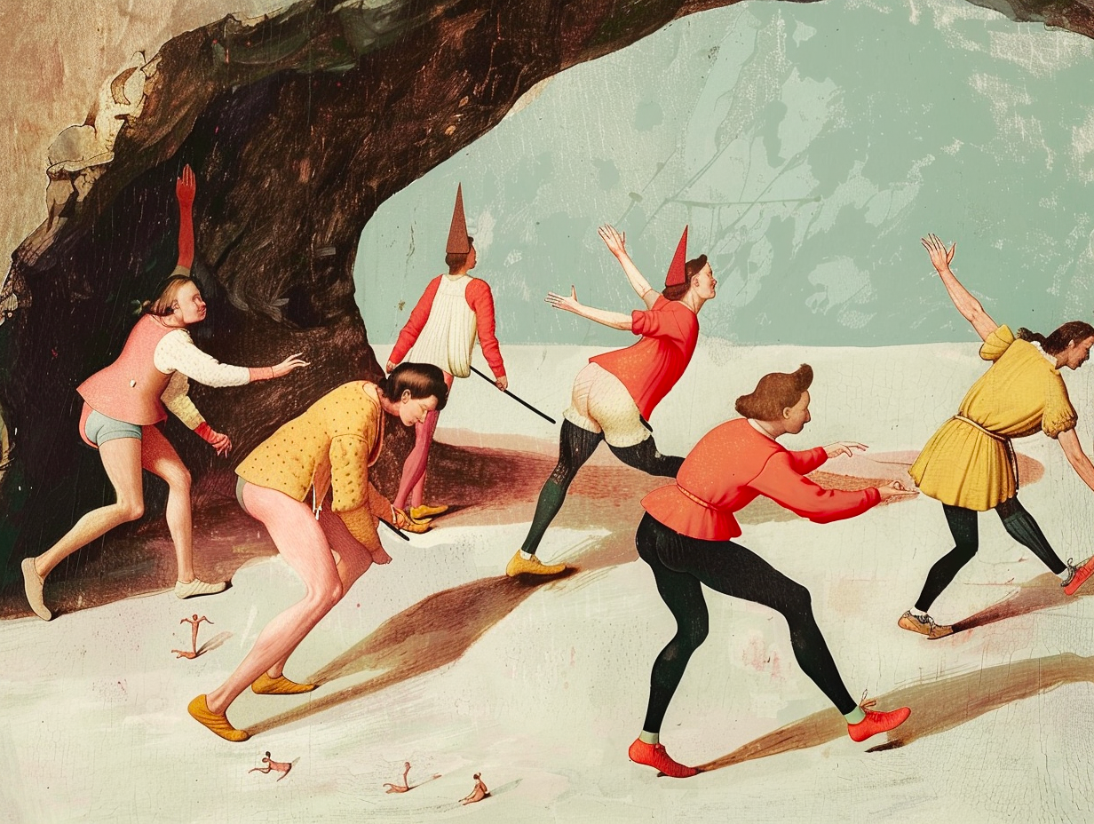
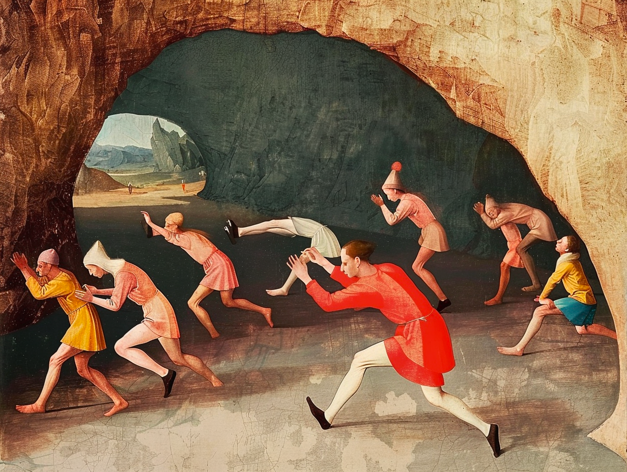
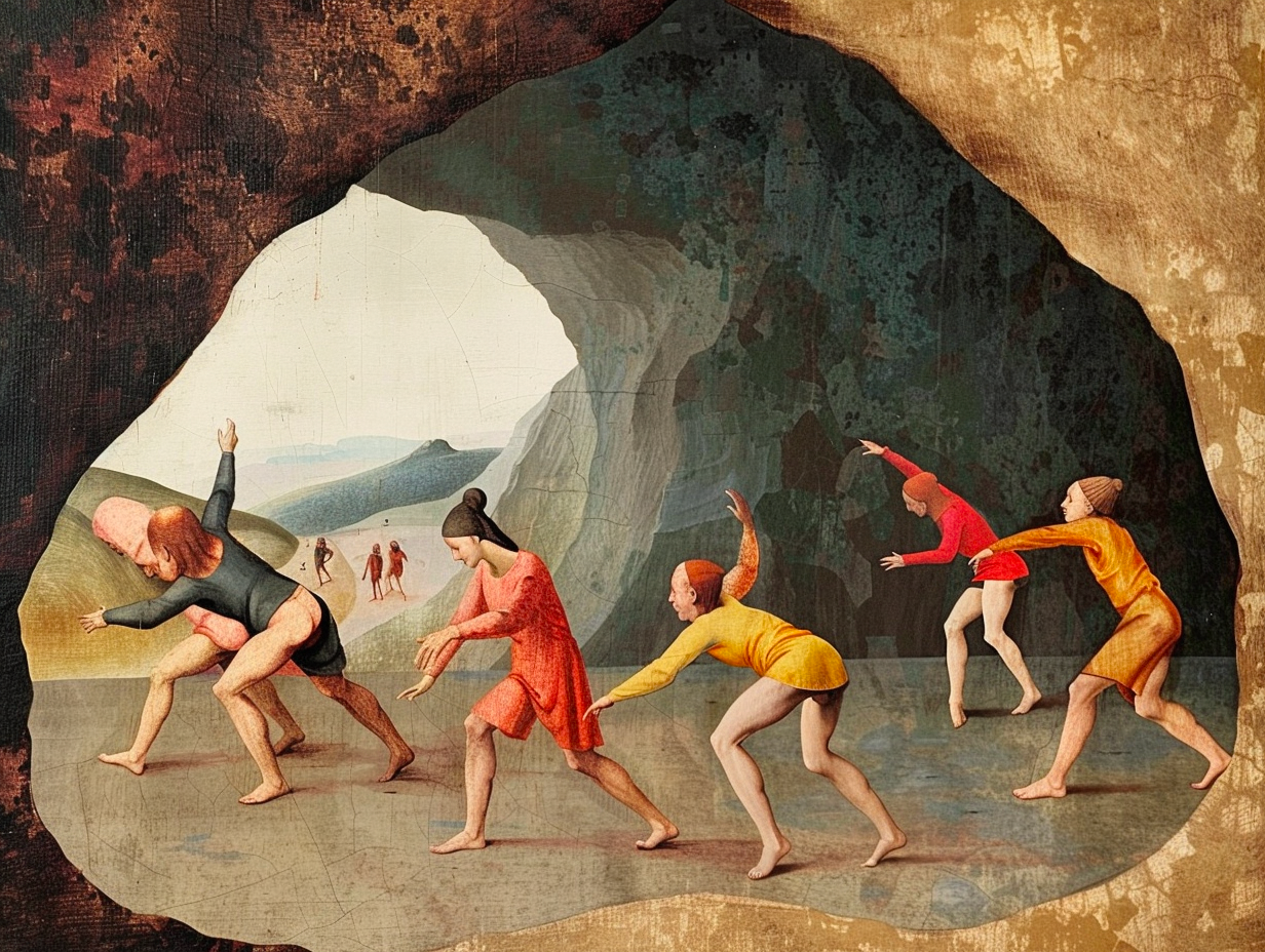
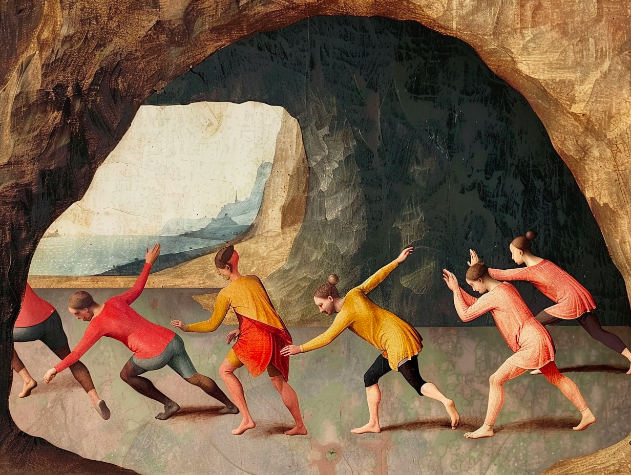
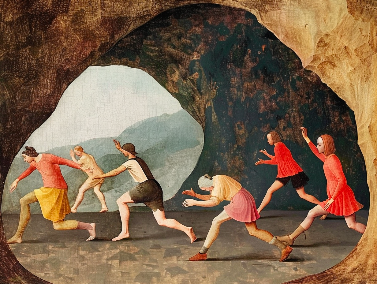
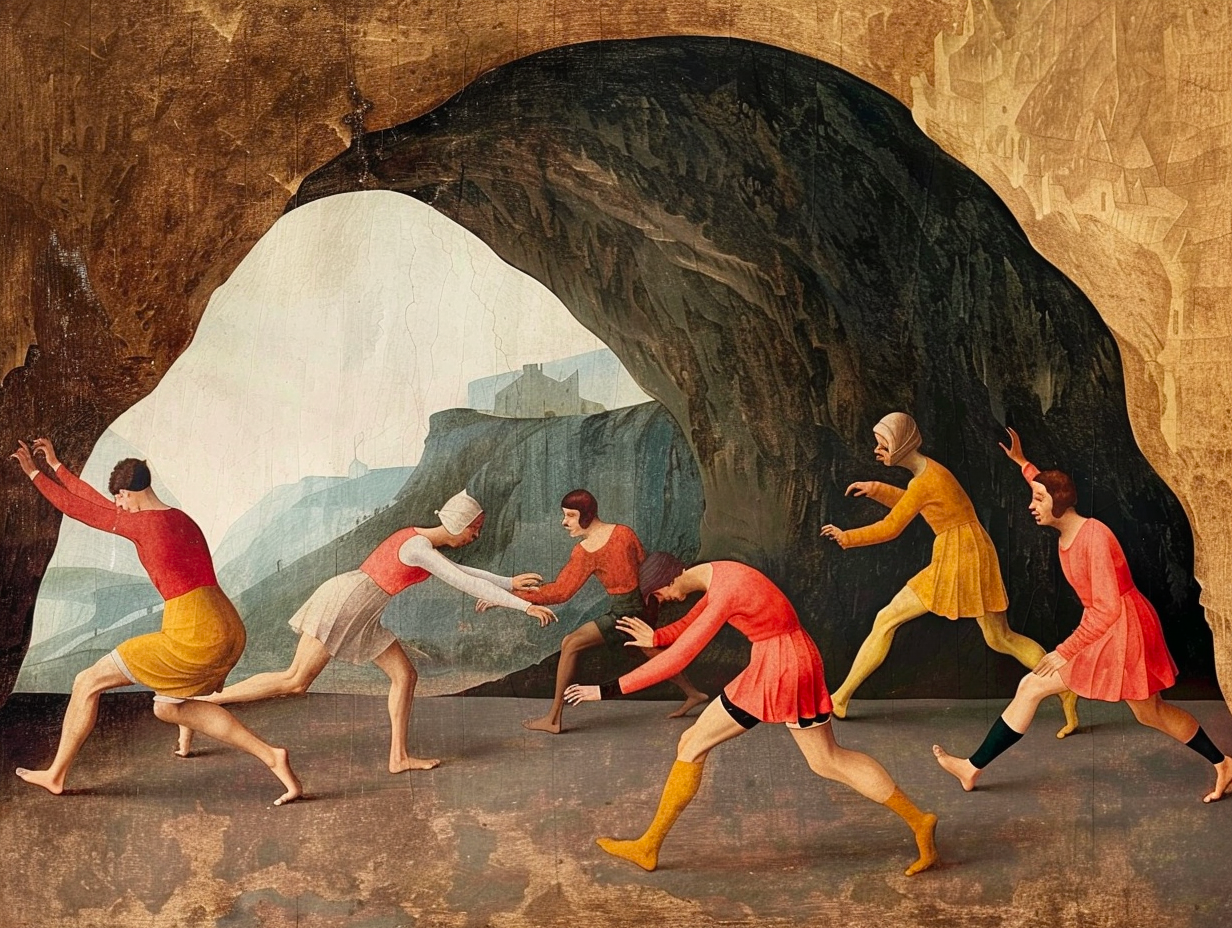
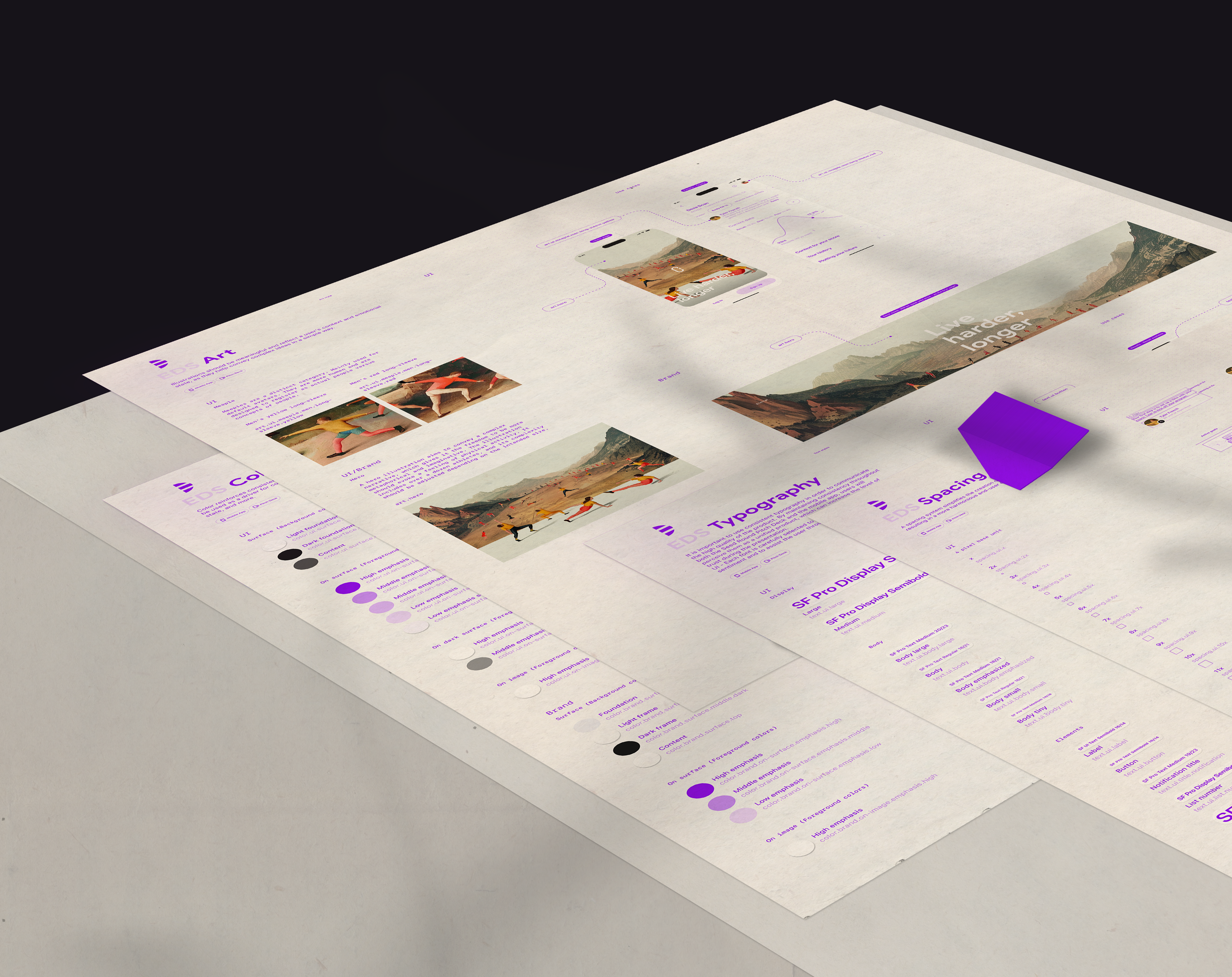
Compositions and fragments
To ensure that you are heading in the right direction, there is no other way but to test your materials. By combining them in different sets, you can determine whether the visual language you are using is efficient and powerful enough.
If you can create good compositions from the materials you develop, then you are on the right path.
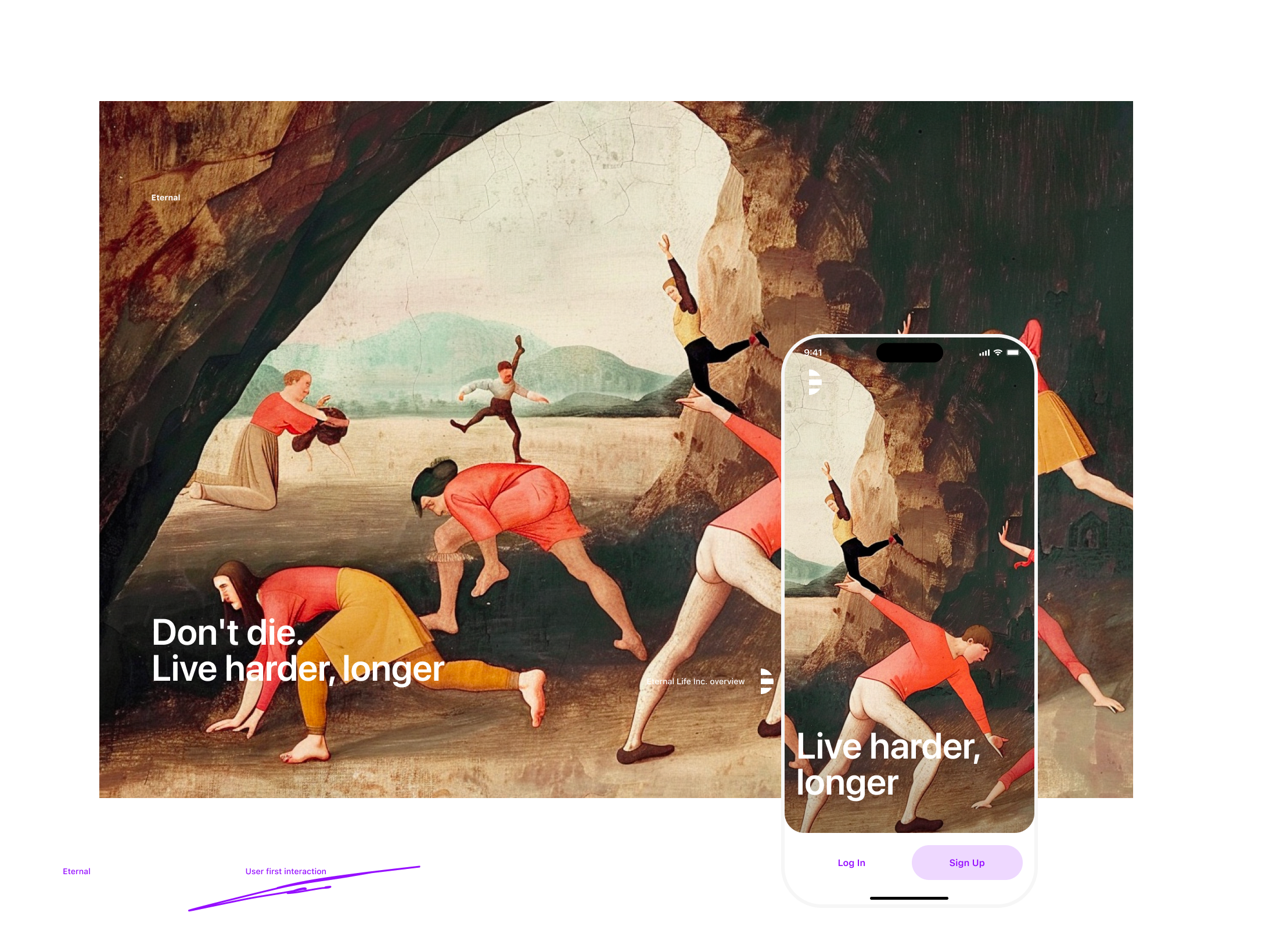
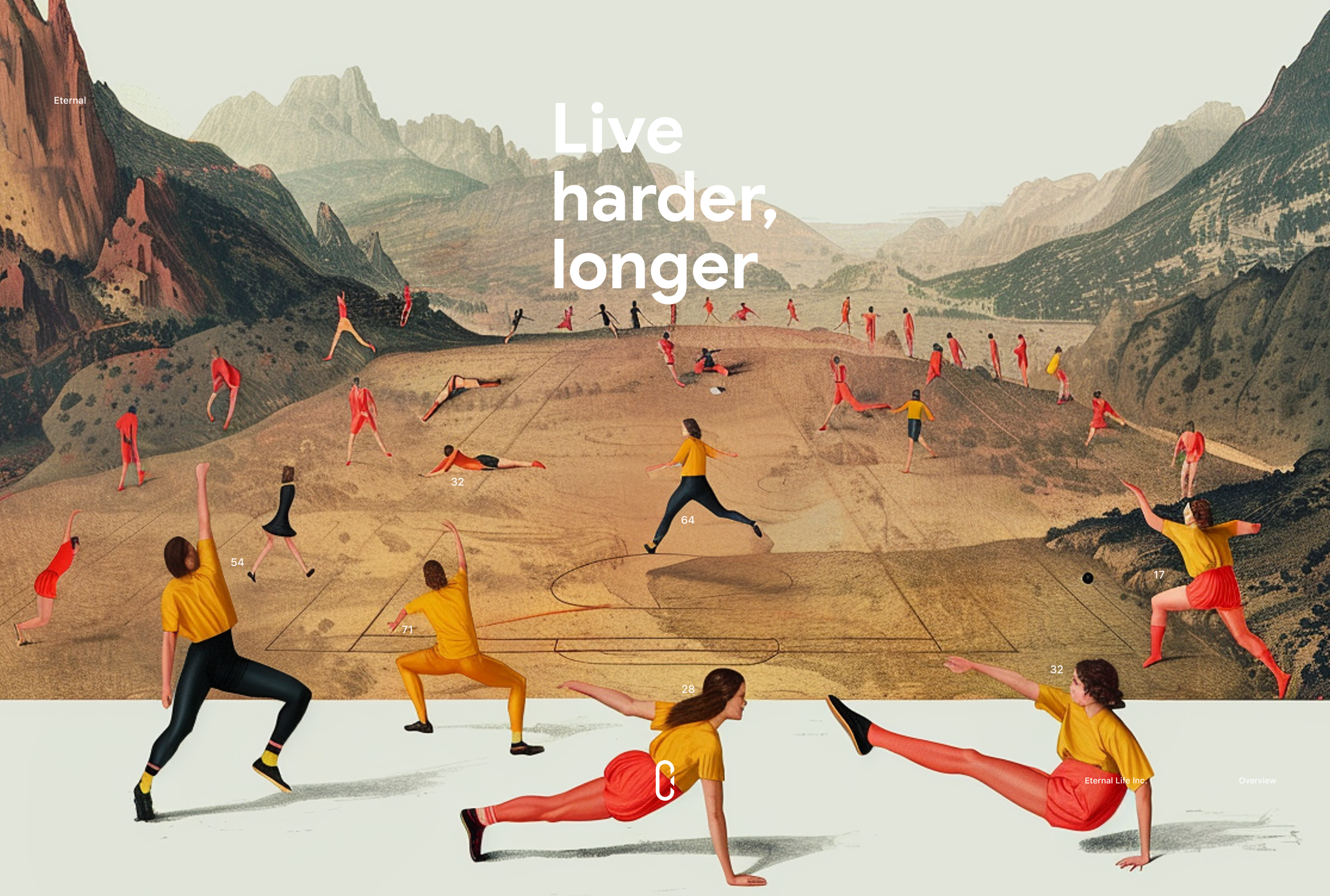
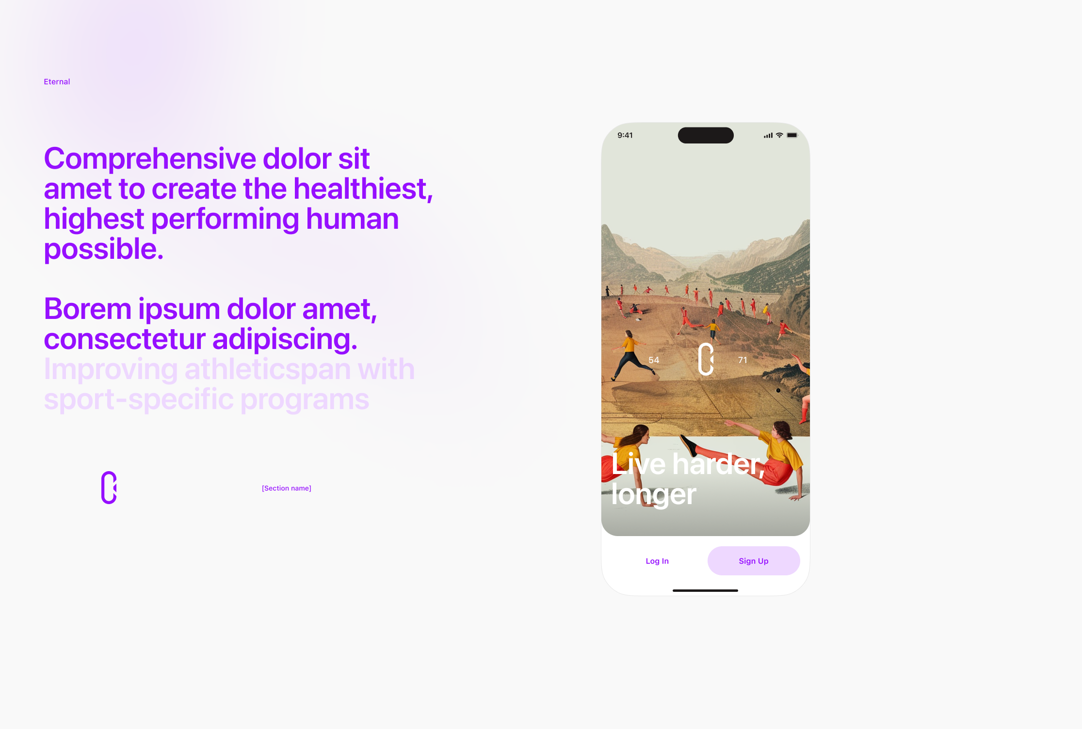
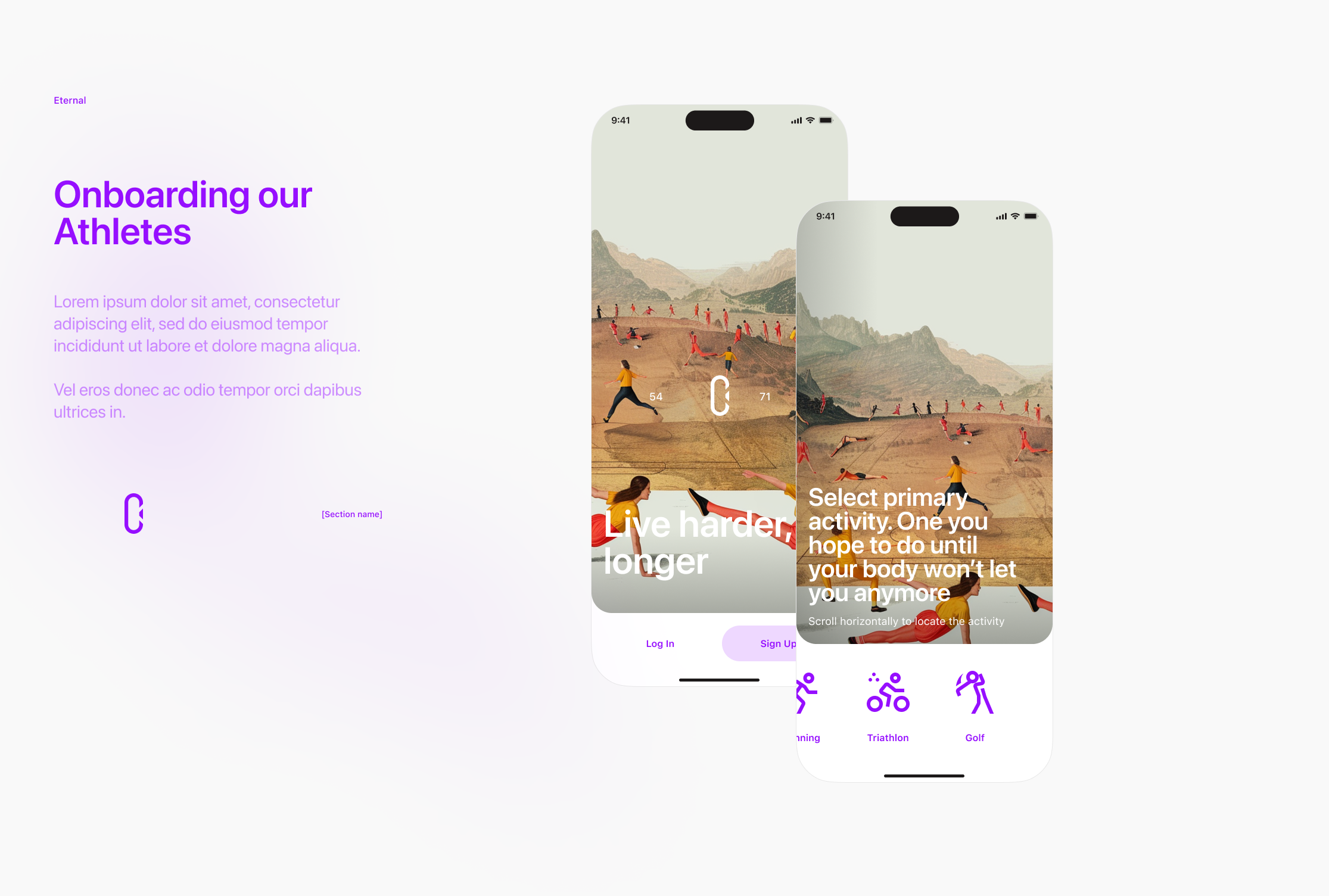
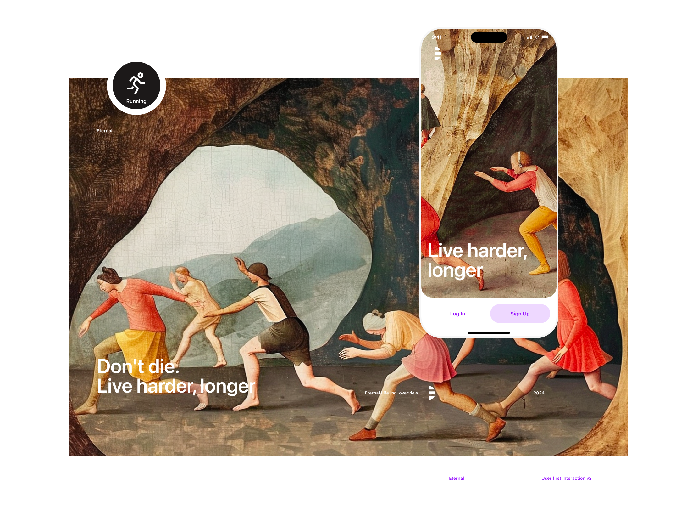
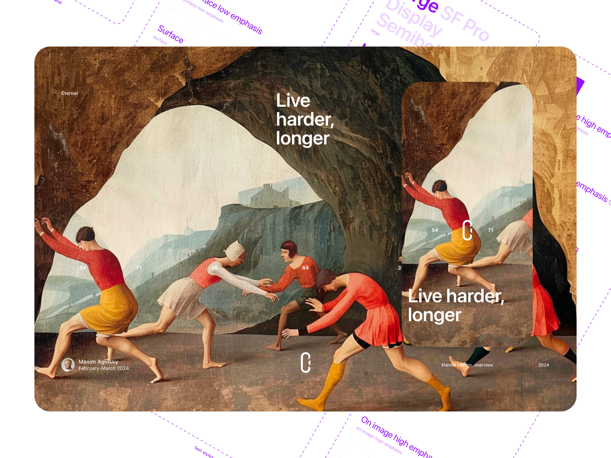
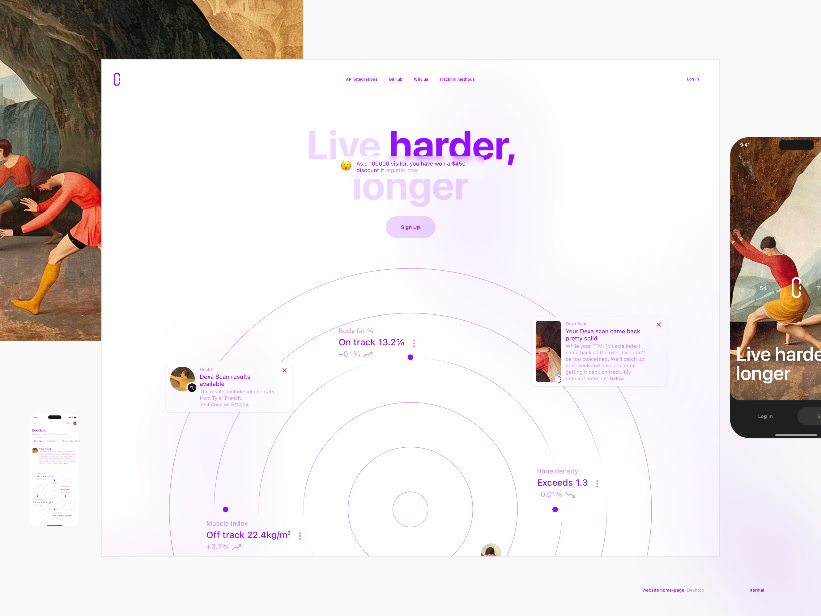
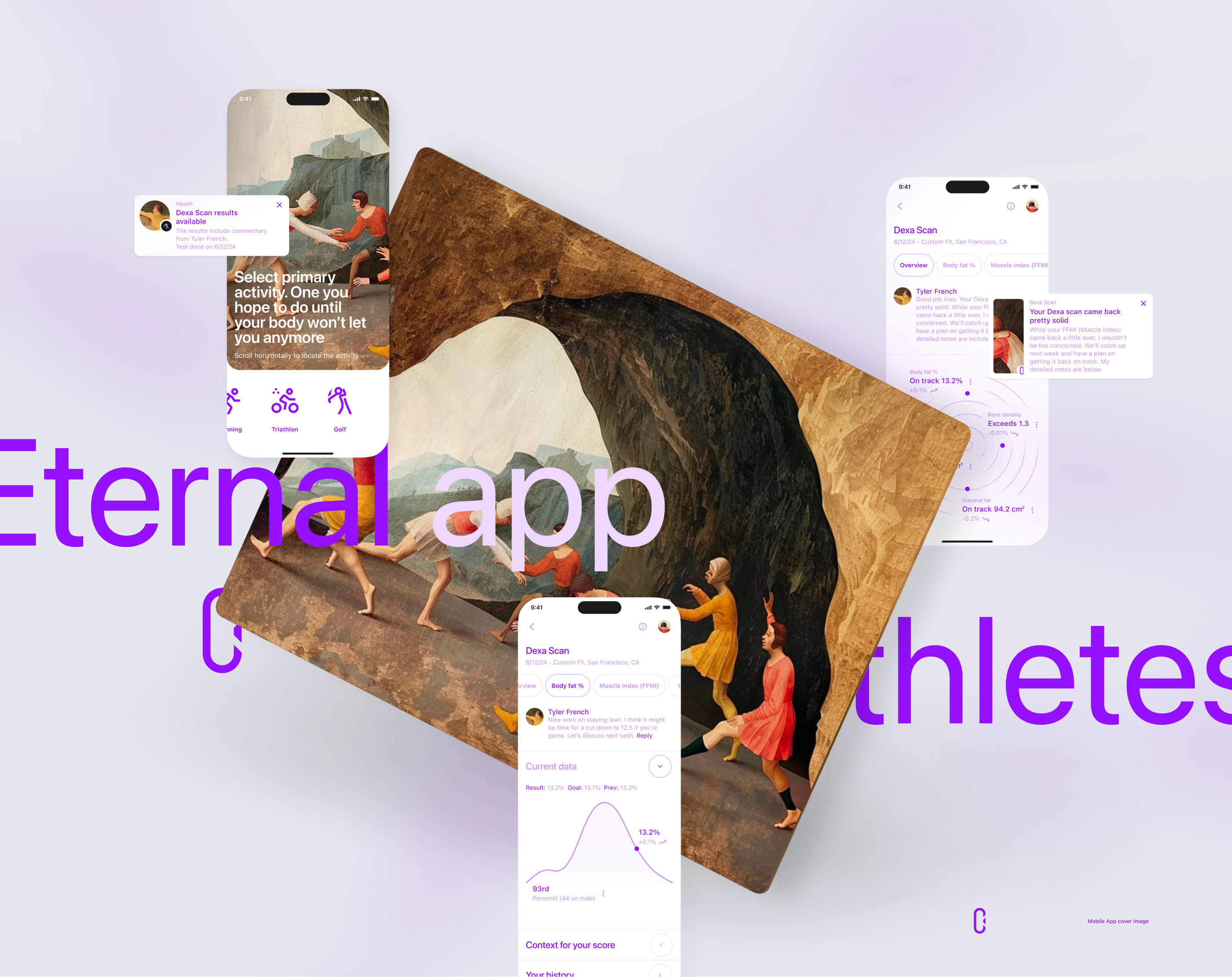
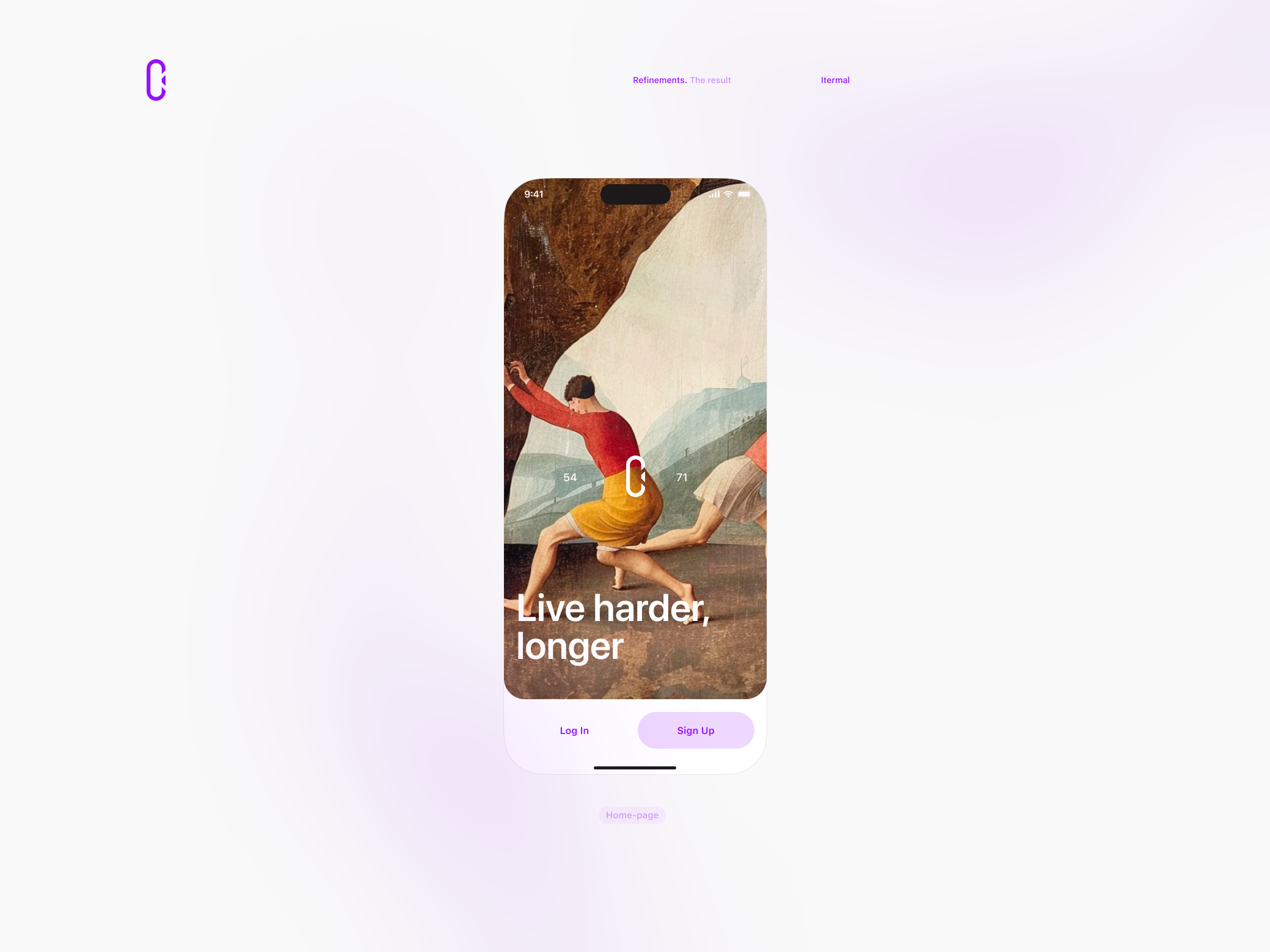
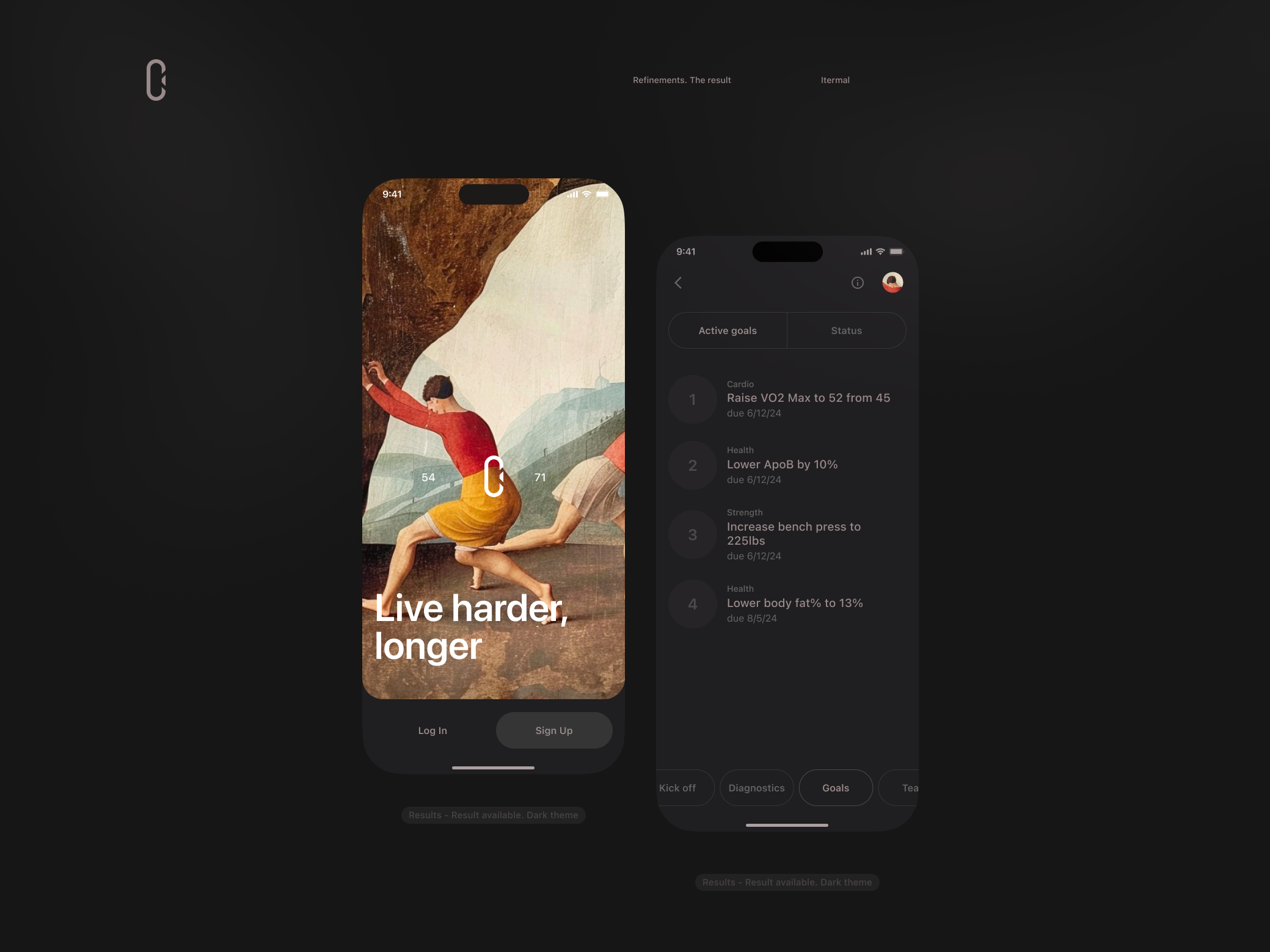
Live harder, longer. Seed Deck and Mobile App first user interaction
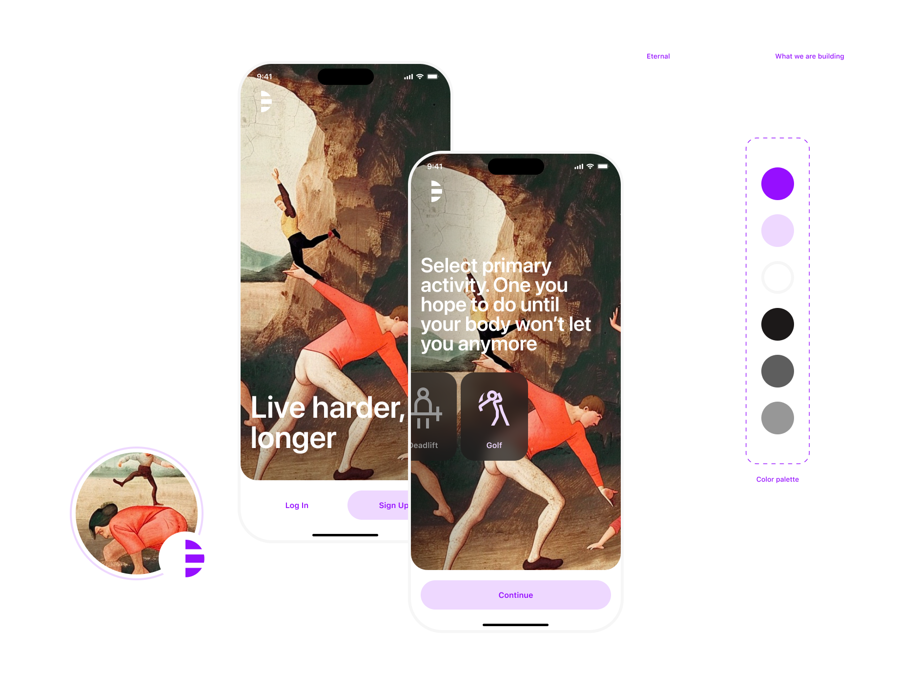
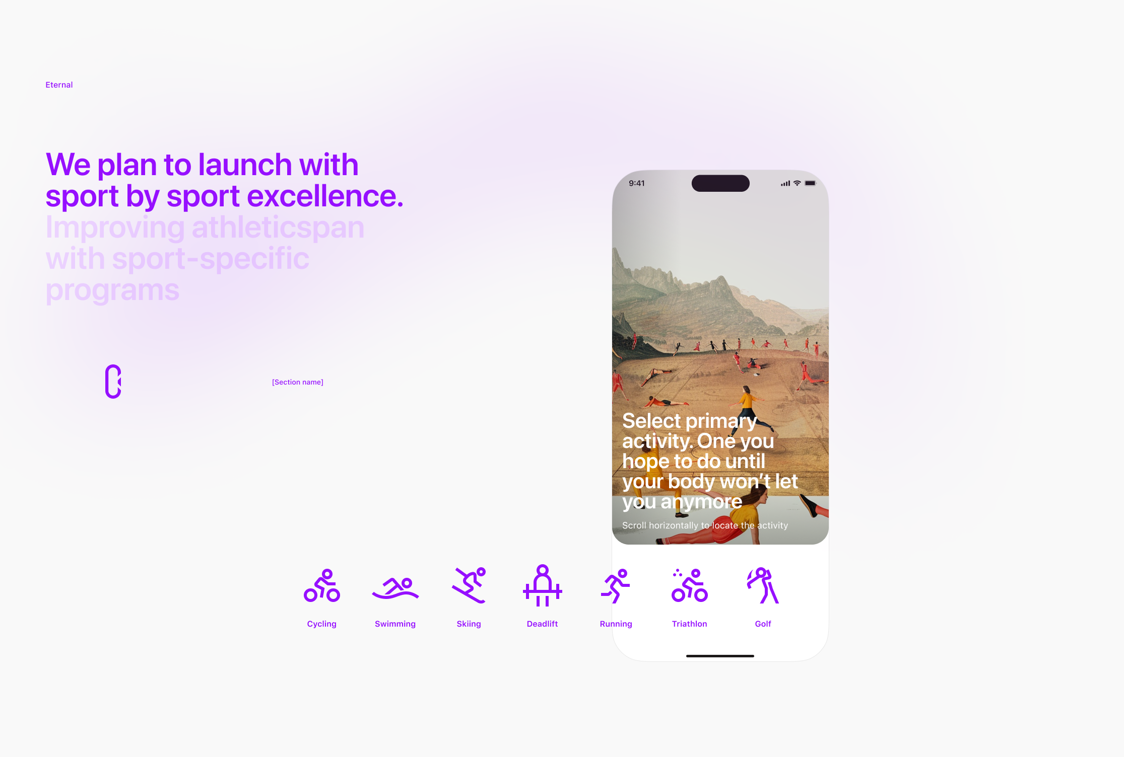
Select primary activity. Mobile App login and onboarding screens
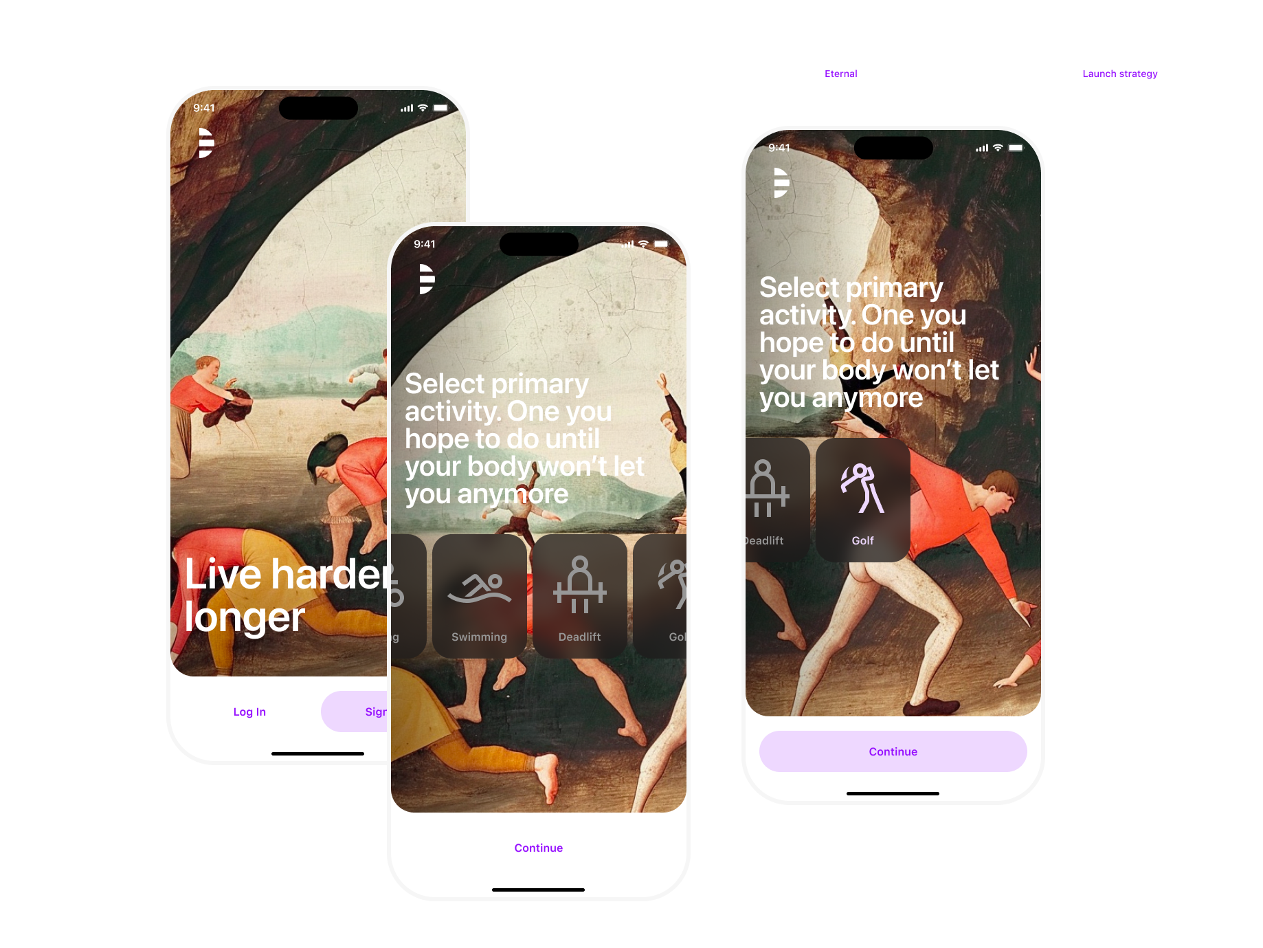
Select primary activity horizontal scroll behaviour. Eternal Mobile App
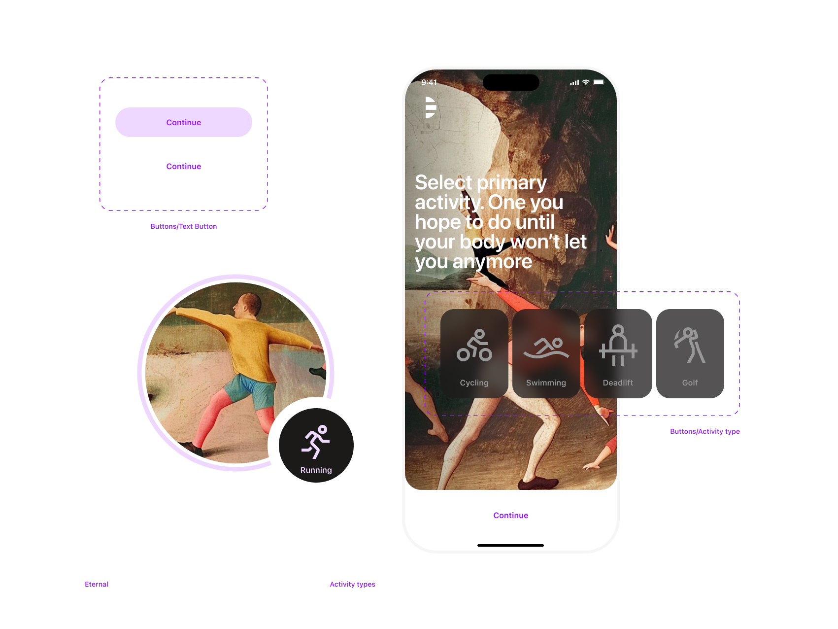
Button components. Eternal Mobile App
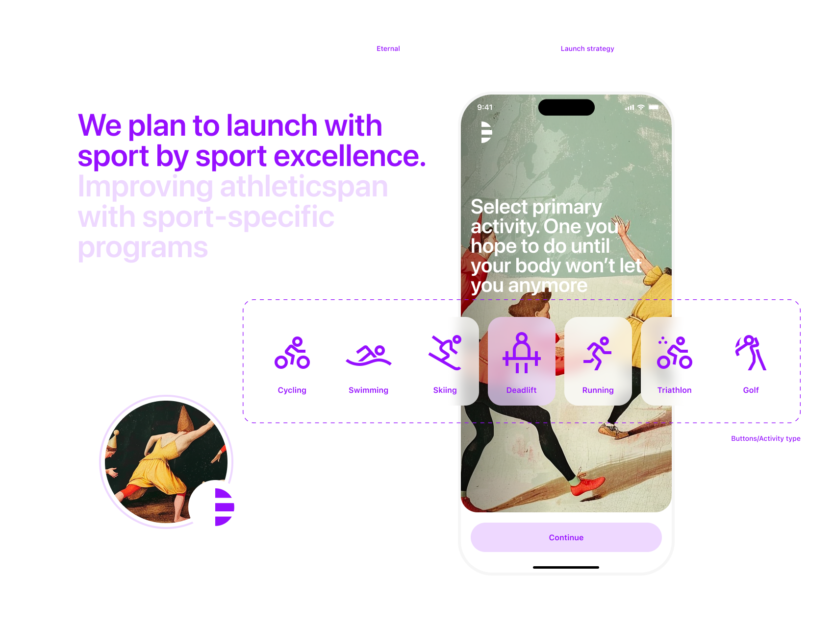
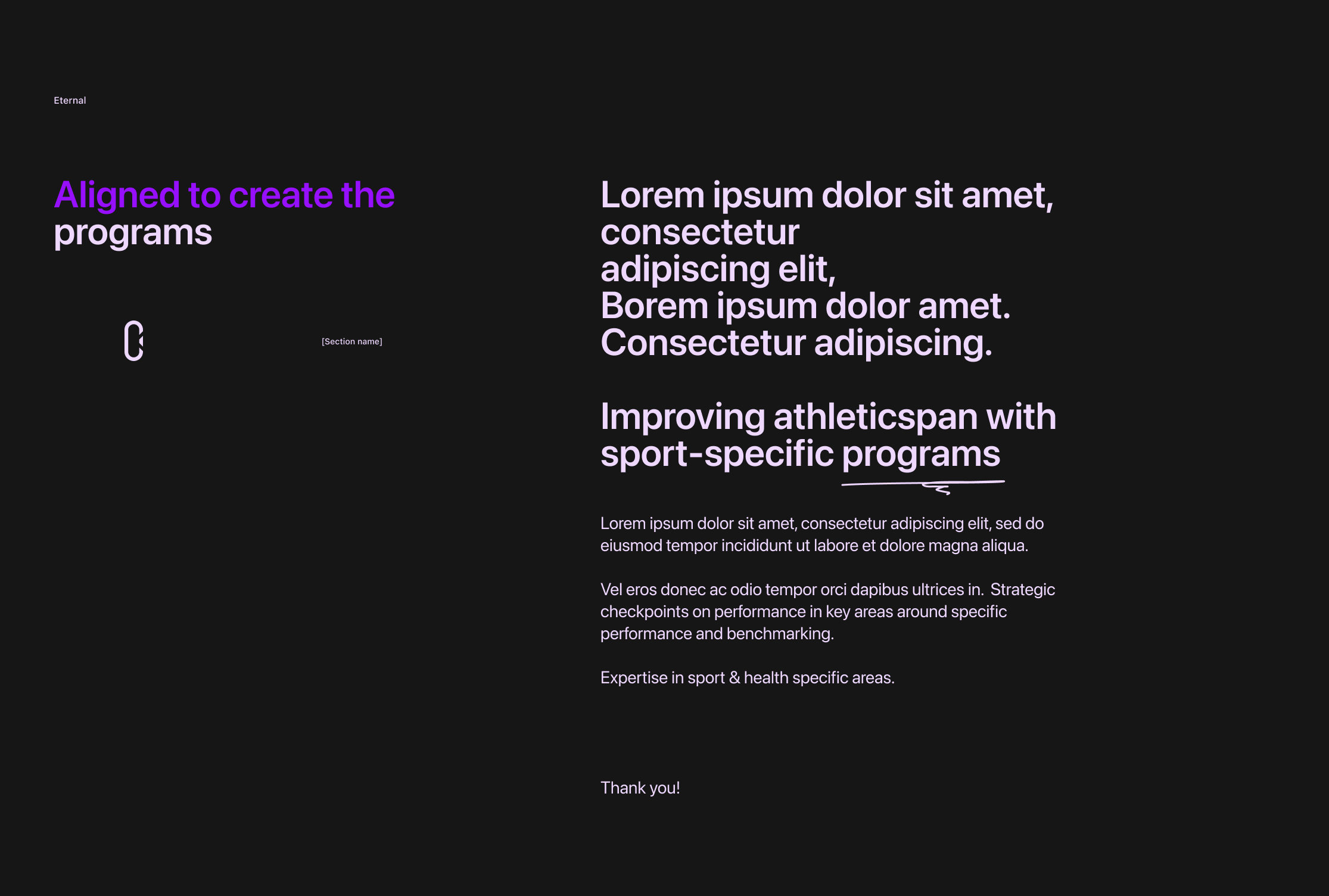
Activity types. Improving athletic span with sport-specific programs. Eternal Mobile App
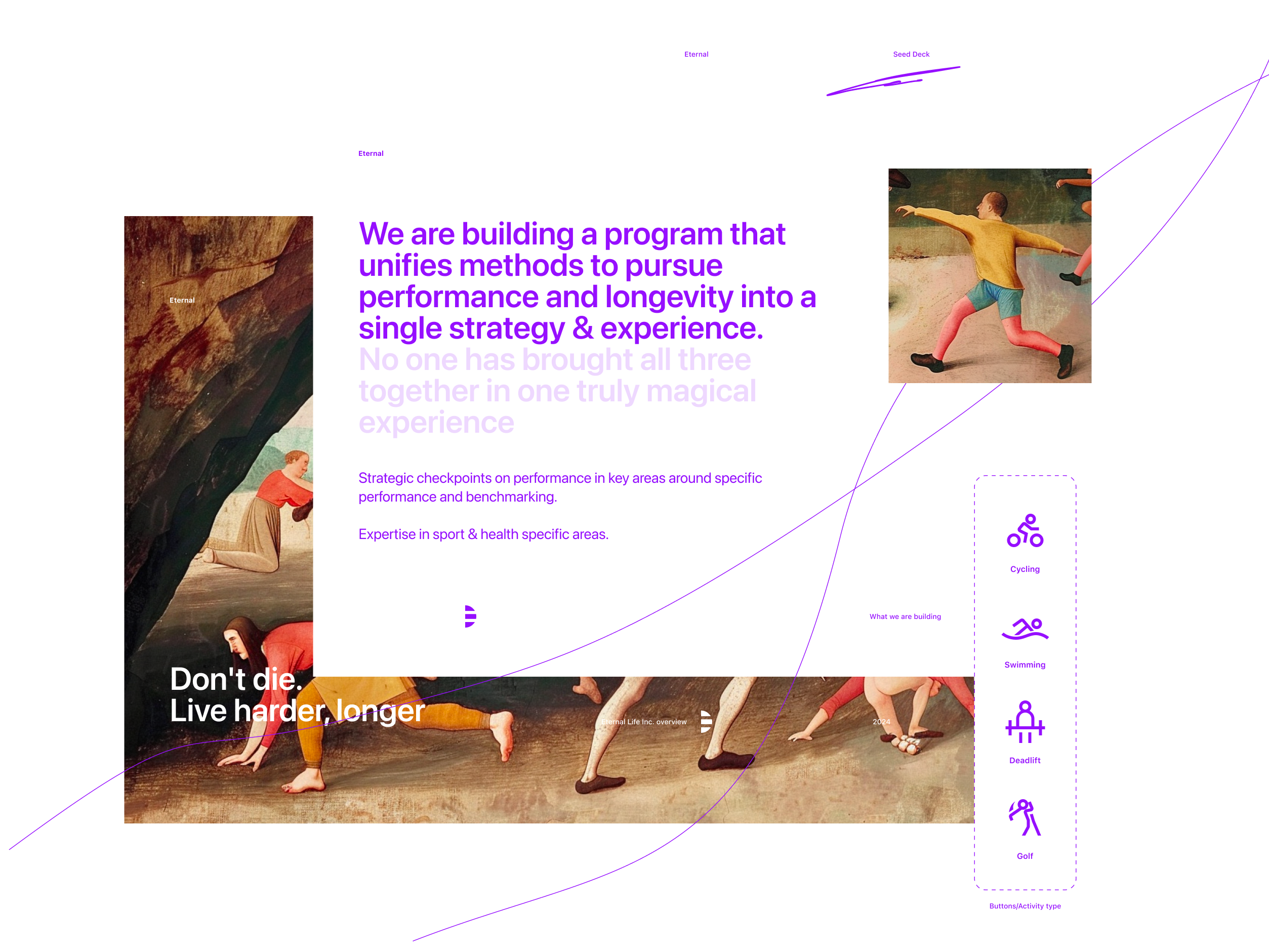
No one has brought all three together in one truly magical experience. Eternal Seed Deck
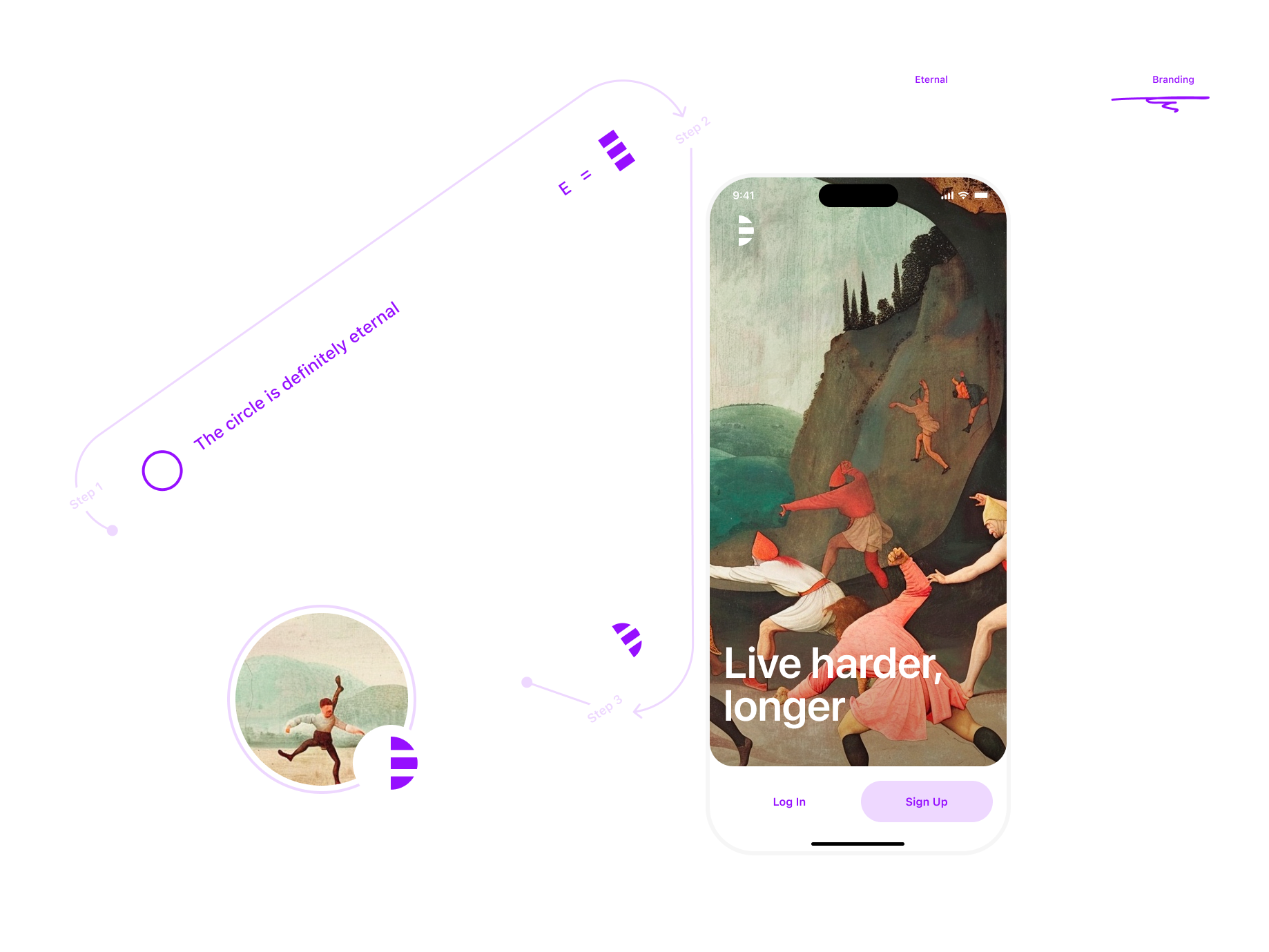
Eternal Logo explaining. The circle is definitely eternal
Artwork experiments. Eternal Seed Deck
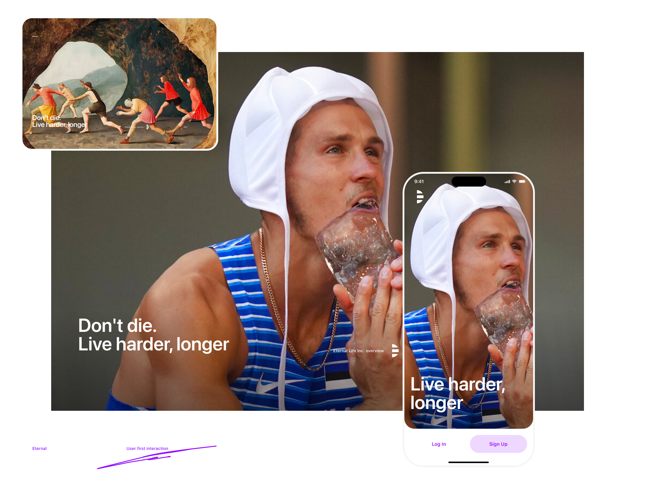
Alternative approach
Testing the visual language behavior when using a very different cover image - Maicel Uibo, of Estonia, rubs a block of ice on his face during the decathlon pole vault at the 2020 Summer Olympics, Thursday, Aug. 5, 2021, in Tokyo.
I'd say - acceptable, but not as good as a more generic and artistic version, where the balance between the elements is just perfect.
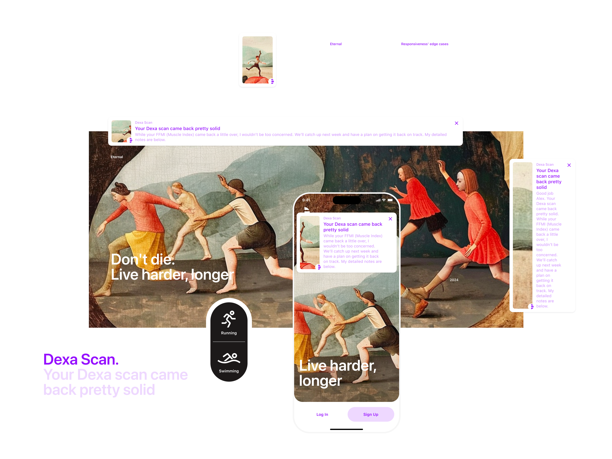
Notification. Responsiveness edge cases. Eternal Mobile App
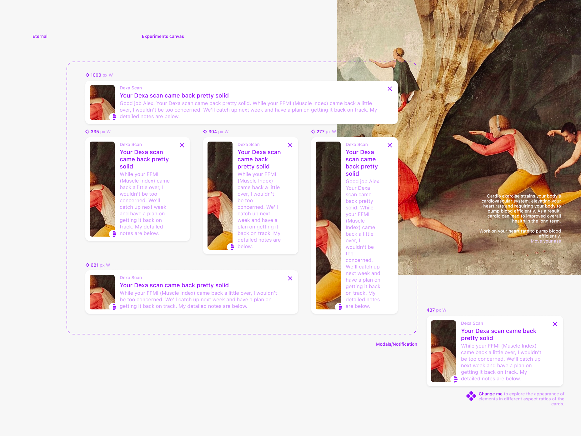
Notification. Experiments canvas
Cardio exercise strains your body’s cardiovascular system, elevating your heart rate and requiring your body to pump blood efficiently. As a result, cardio can lead to improved overall health in the long term. Work on your heart rate to pump blood efficiently. Move your ass.
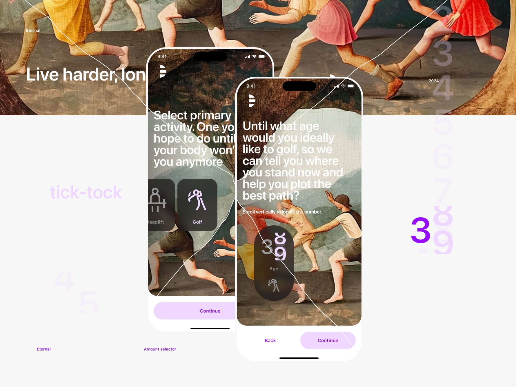
Sand clock. Eternal Mobile App amount selector
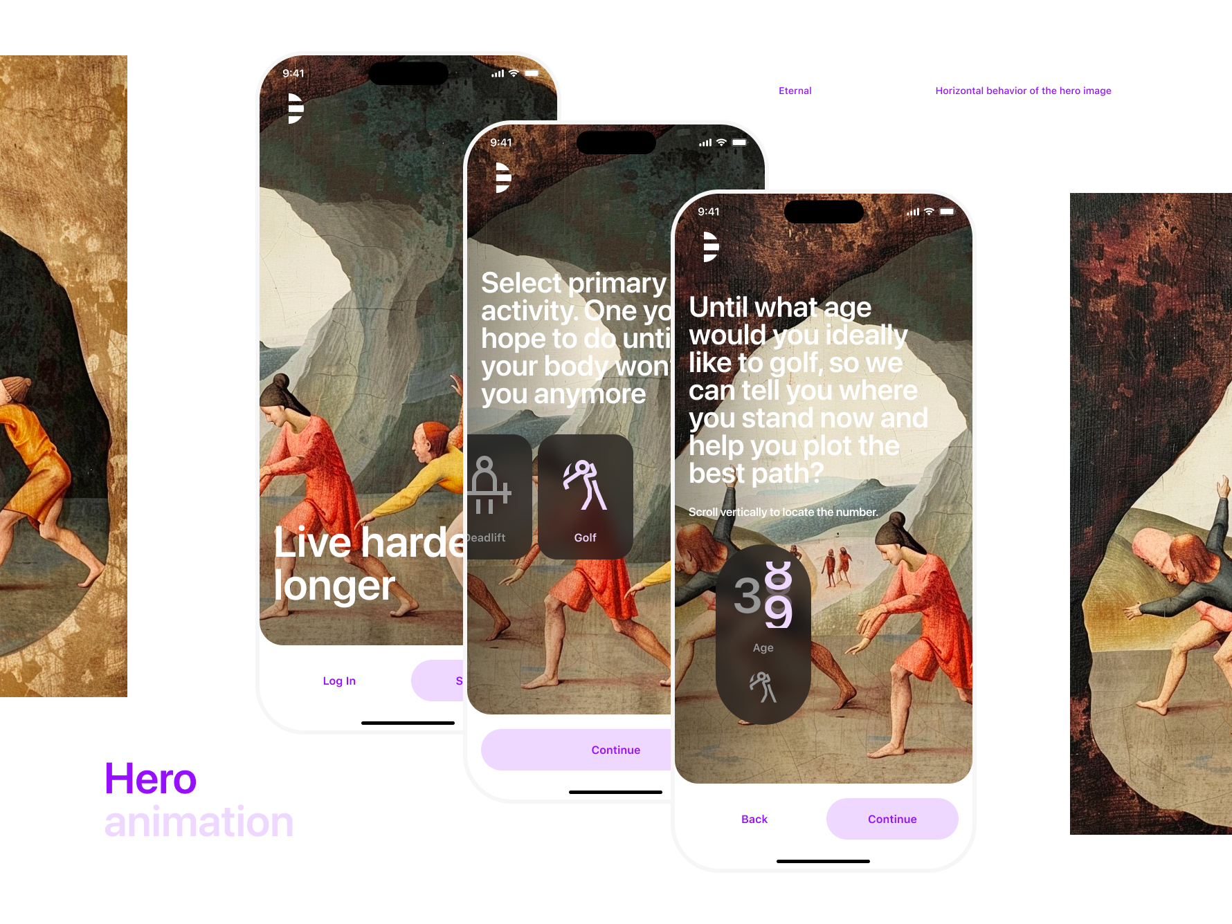
Hero image horizontal behavior starting from the home page and through the onboarding screens. Eternal Mobile App
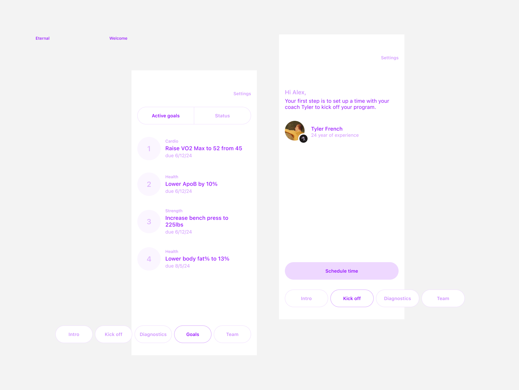
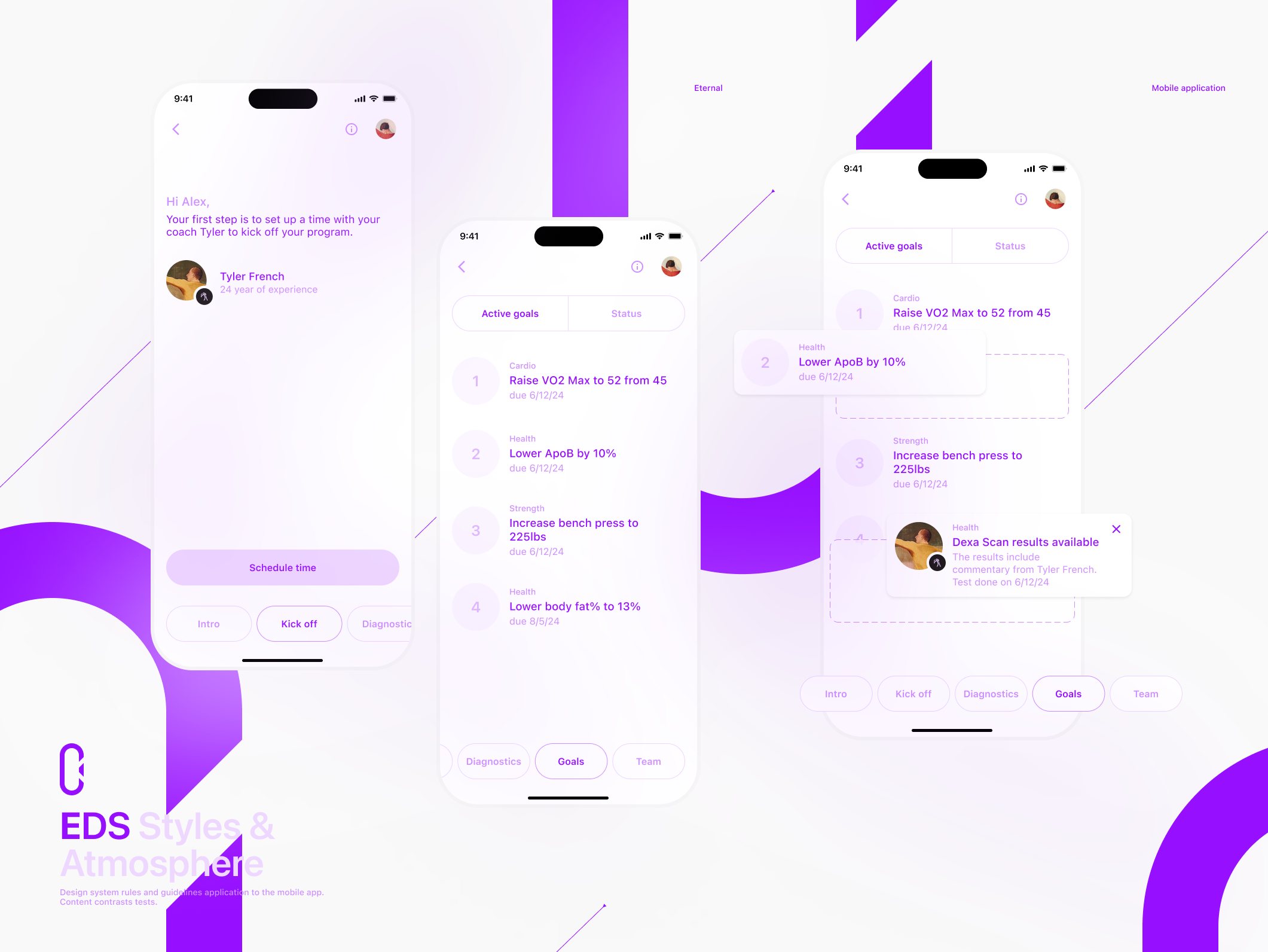
Intro to coach and todo list screens. Eternal Mobile App
Colors, Typography & Space. Eternal Design System fragment. Brand
EDS App and Brand styles. Text, Space & Color
EDS App and Brand styles. Text, Space & Color
Brand mark variations
Brand mark variations
EDS color and artwork combination tests. Contrasts and atmosphere.
Design system rules and guidelines application. Mobile app content contrasts tests.
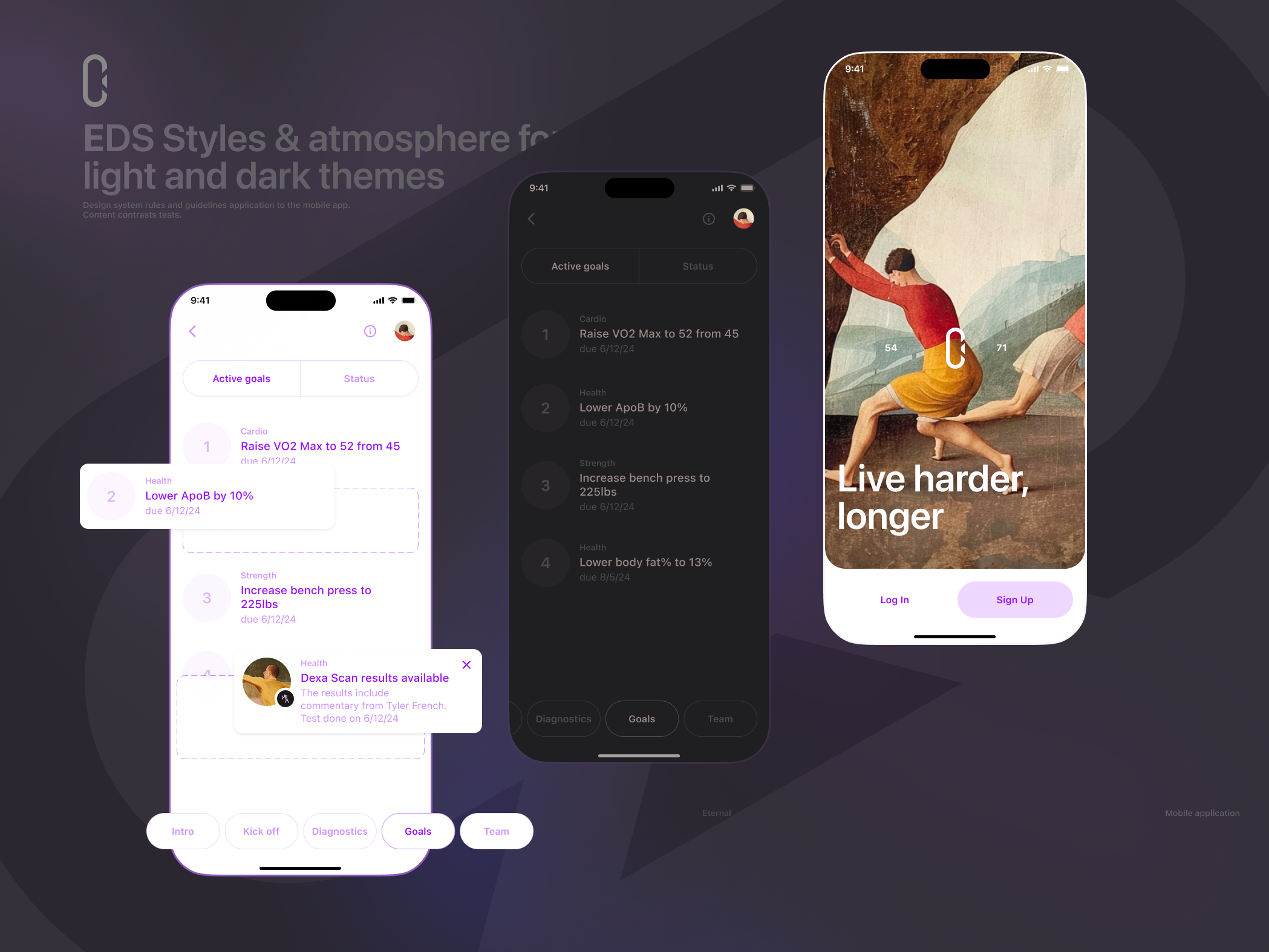
EDS Styles & atmosphere for the light and dark themes
Colors, Typography & Space. Eternal Design System fragment. Brand
Mobile application EDS Styles
Website desktop home page.
The visual object concept is a variation of the element from the Results-Scan overview, which is the key screen based on the information received from the client.
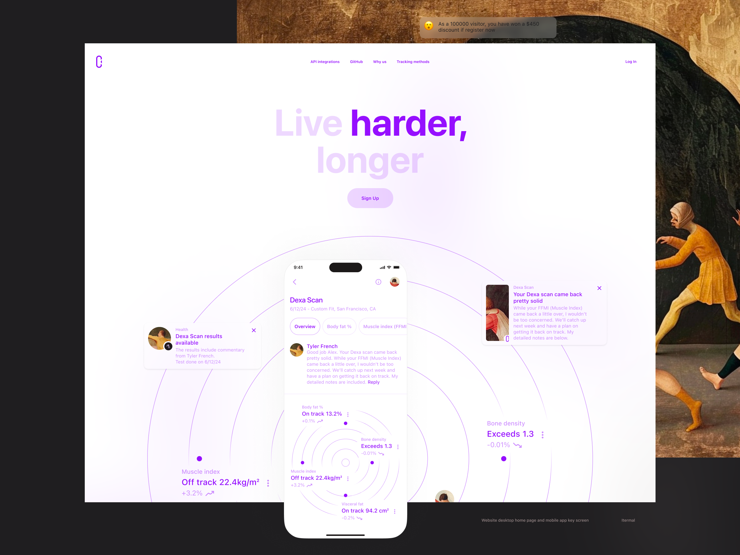
Website desktop home page and mobile app key screen with the Cross chart.
The case study chapters
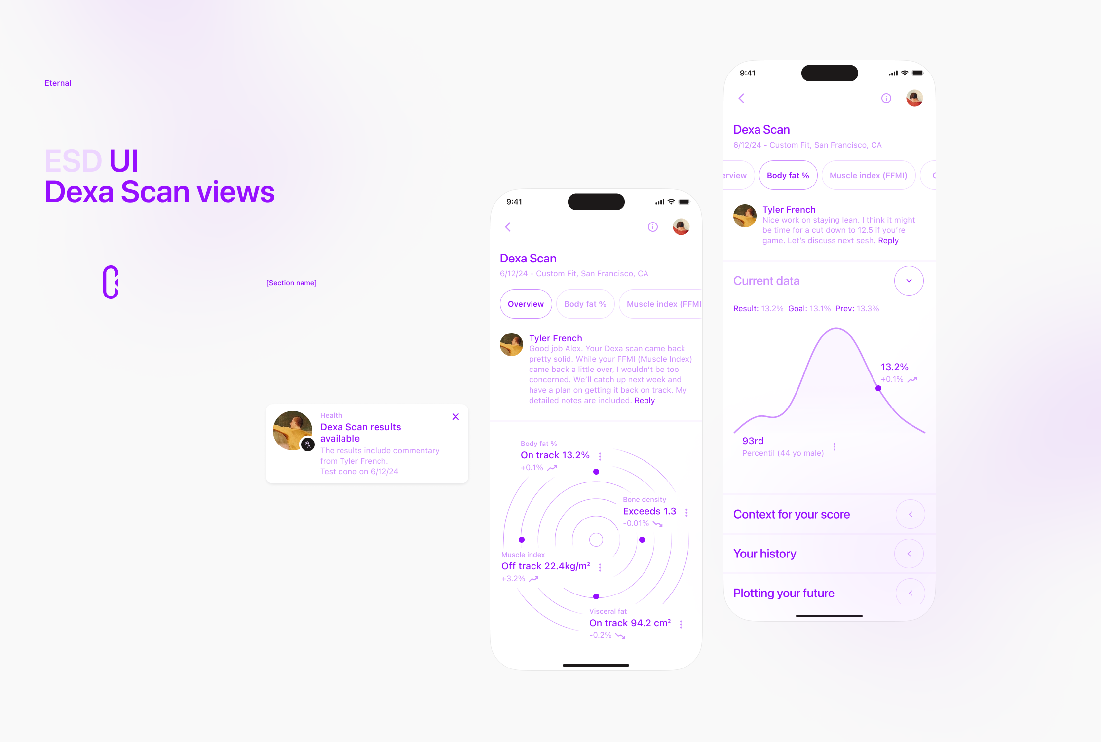
Dexa Scan. Report with charts
Mobile App delivery. Cover and mocks
Seed Deck Templates delivery. Cover image
Case study cover image
An iPhone mockup with an activity selector step (onboarding), a 3D (Photoshop) brand mark, and a brand mark concept printed on vintage paper were combined to create a realistic mockup. V2
V1
A brand mark concept printed on vintage paper. V2
V1
Design system
Design System Foundations. Vintage paper print
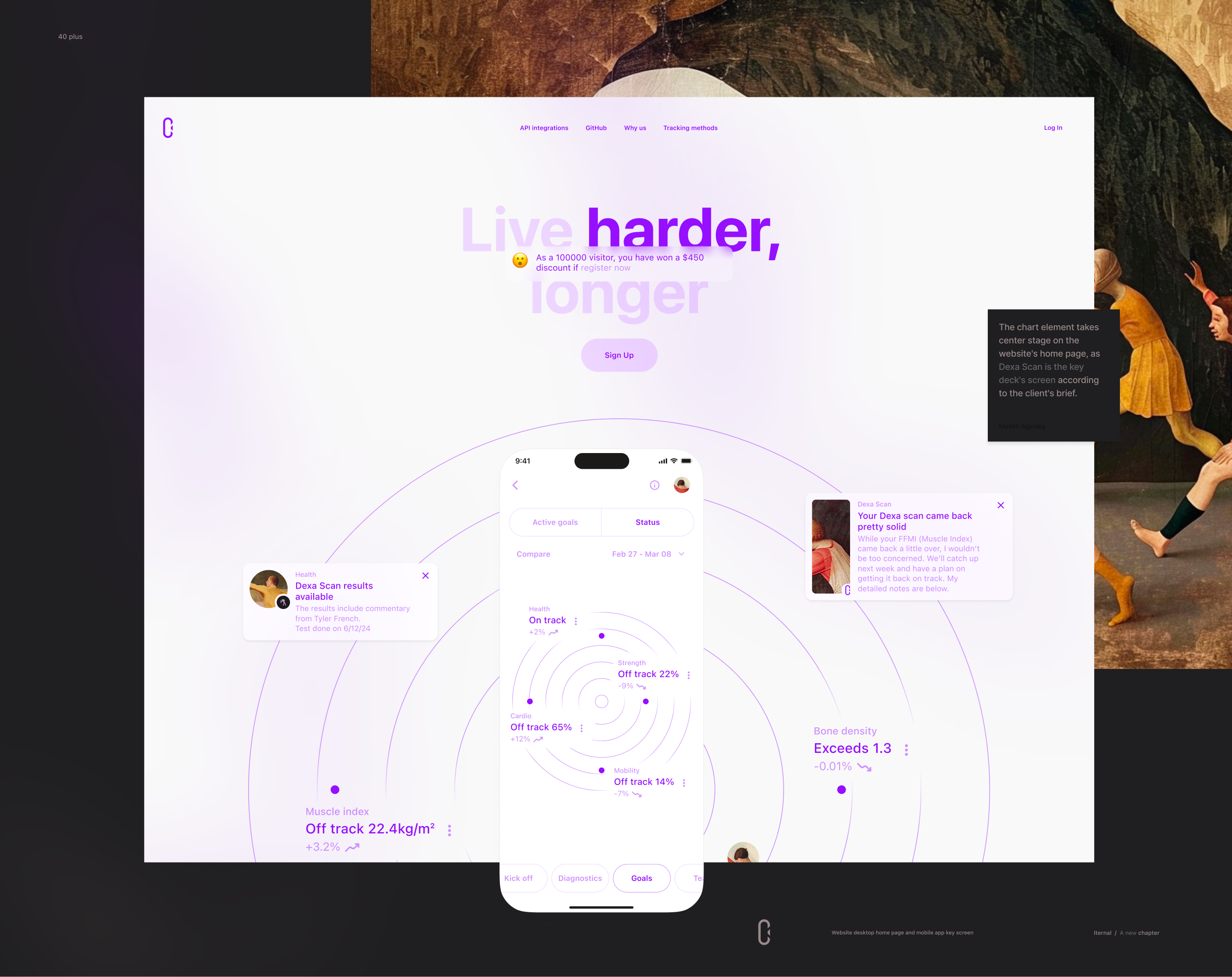
The chart element takes center stage on the website's home page, as Dexa Scan is the key deck's screen according to the client's brief.
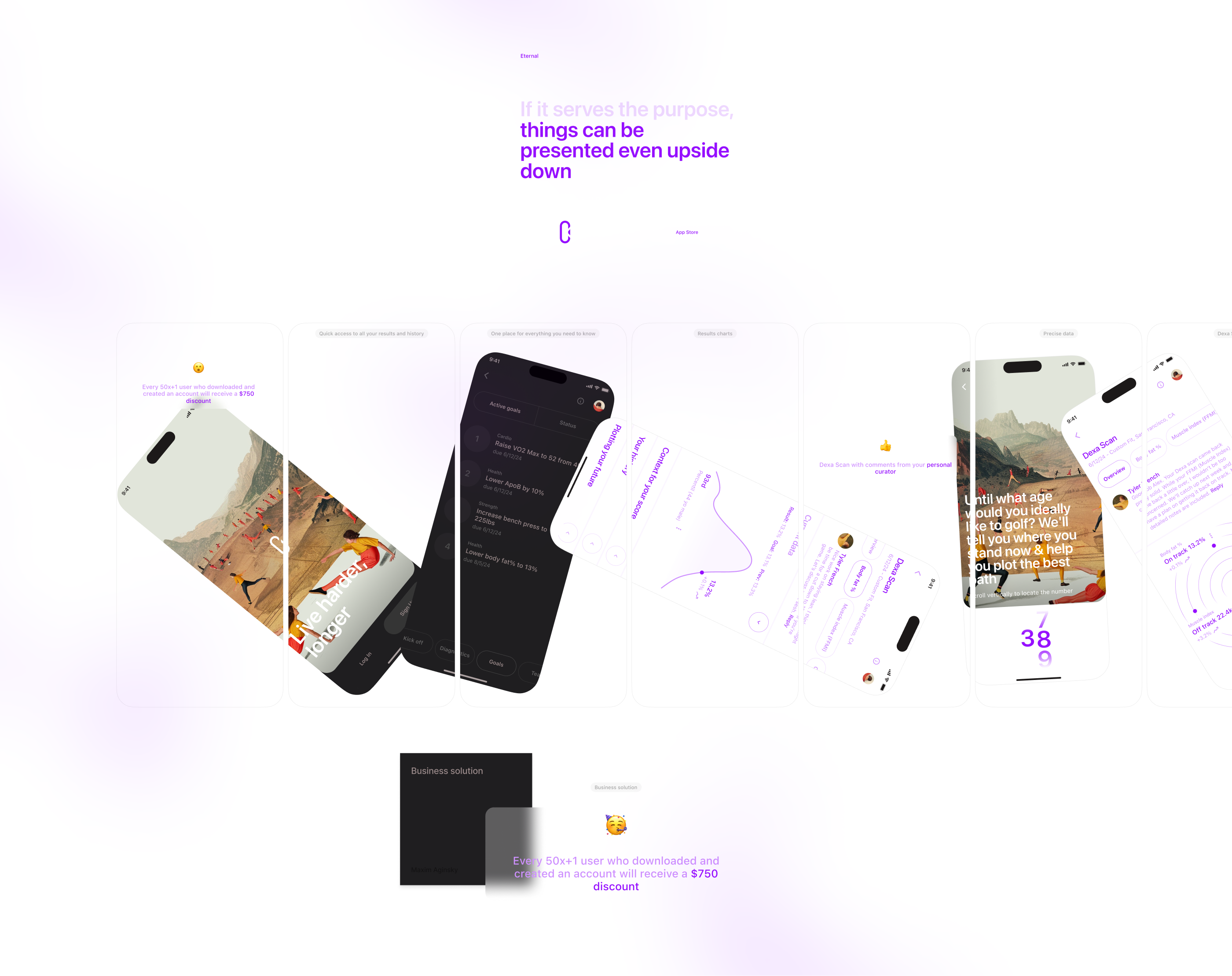
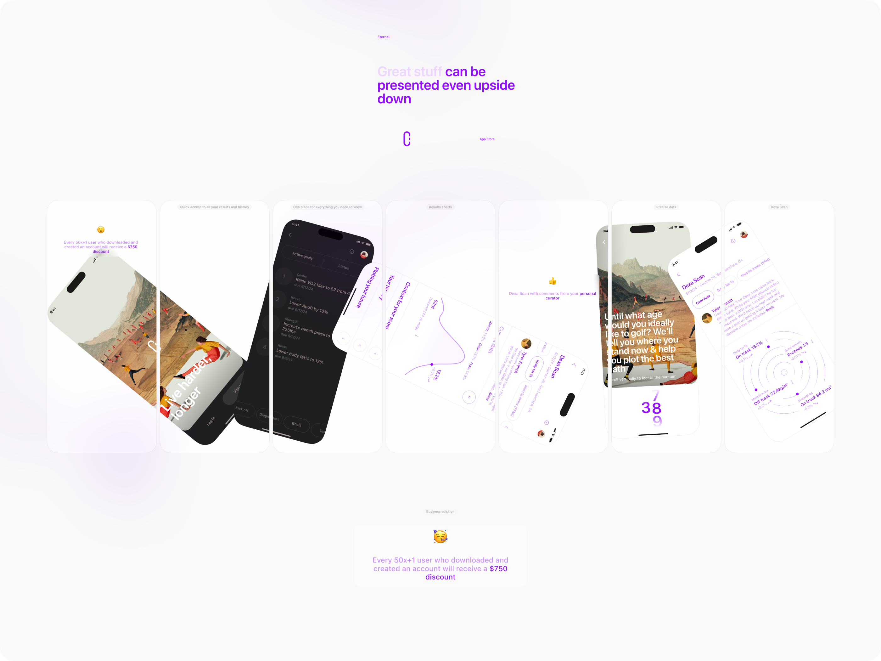
If it serves the purpose, things can be presented even upside down
Design System Foundations / Art
Design System Foundations / Color
Mobile app views refinement process
Design is like a language - the more you practice, the better you get at it. During the course of my work, I realized that certain screens had not been designed using conventional patterns. Therefore, I began to search for a solution to this problem. The following report outlines my process and findings.
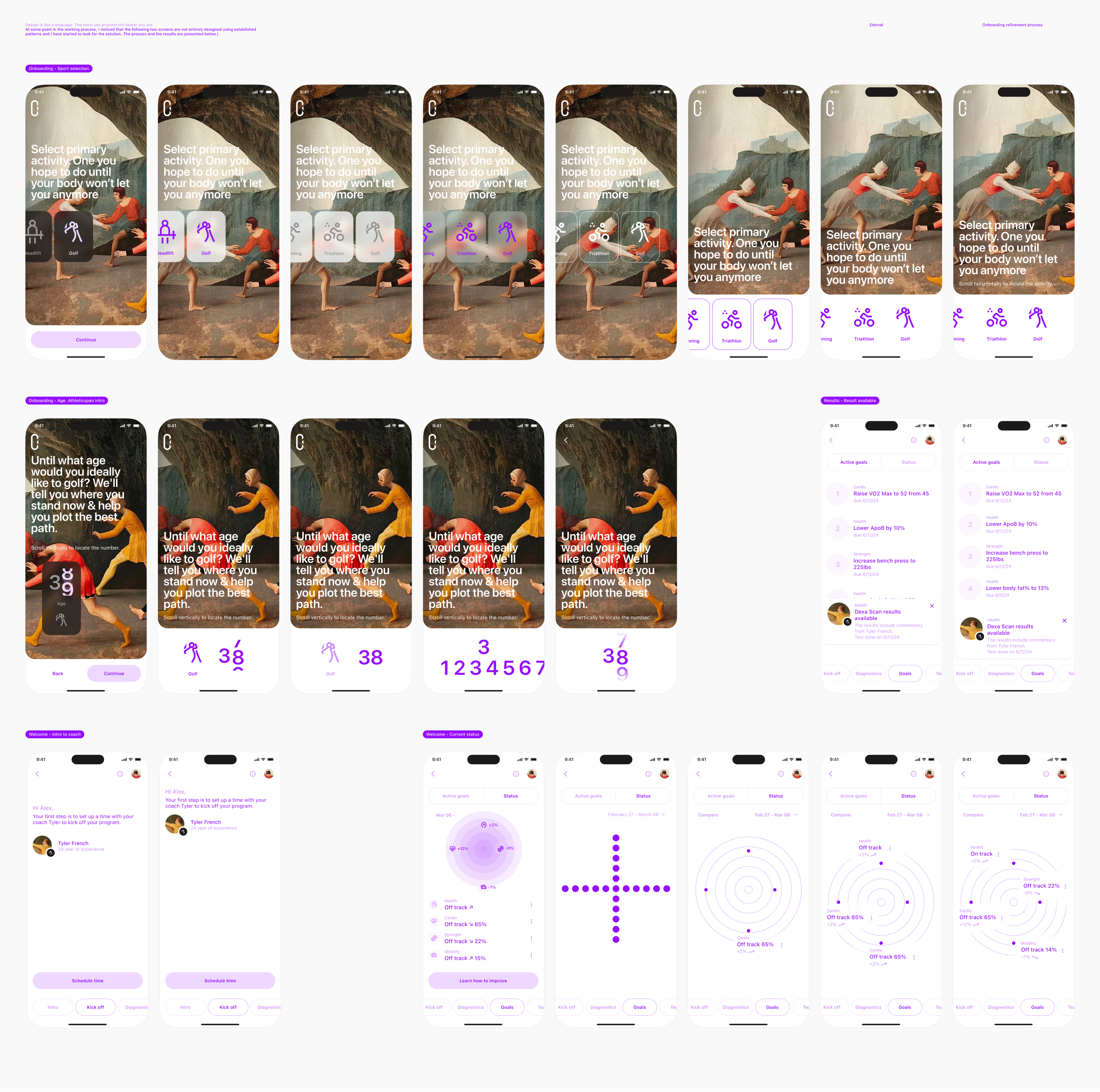
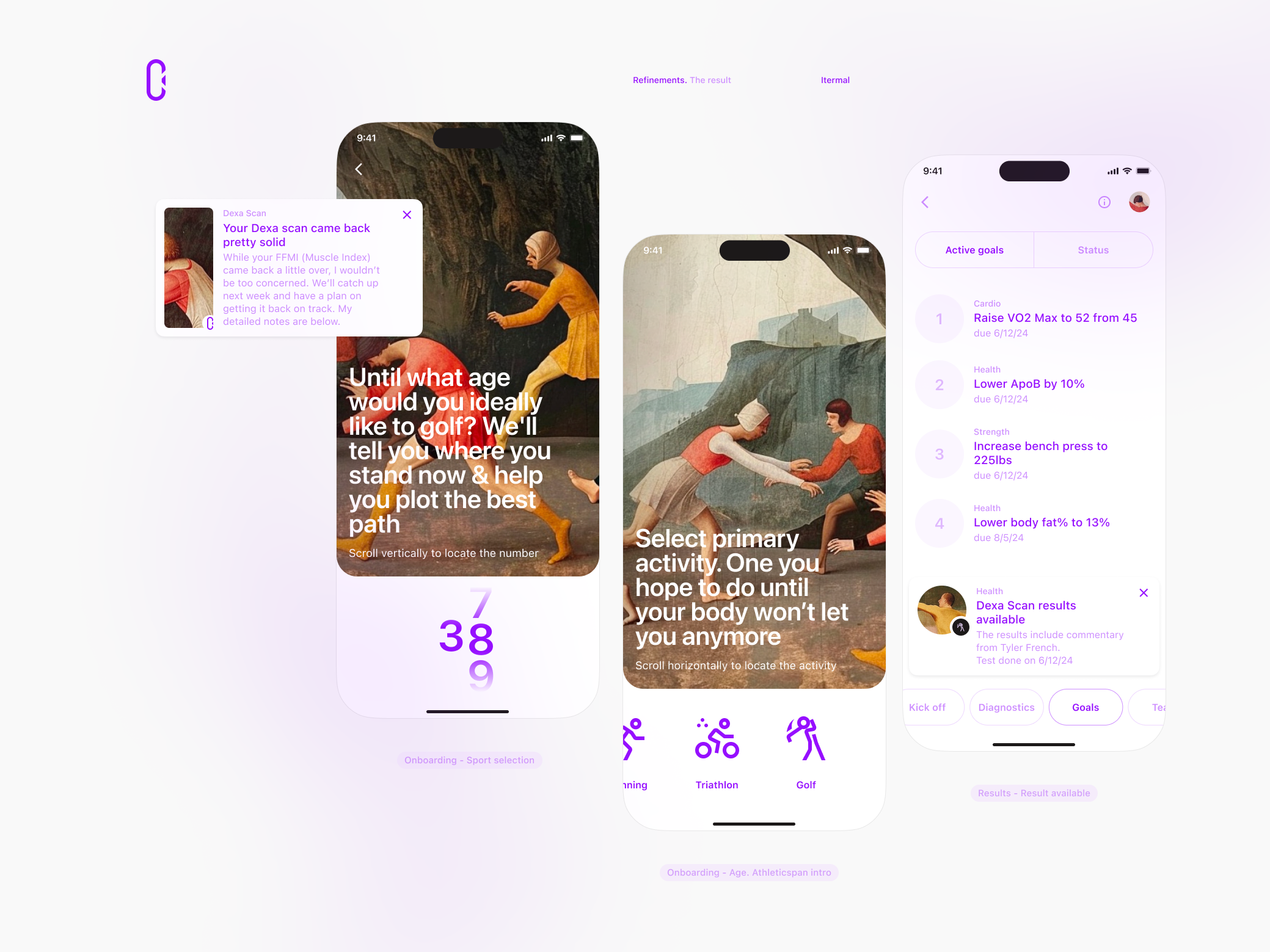
The result of the refinement process
App Store Screenshots and previews
Great content can be presented in unconventional ways - upside down. Especially if as a 50x+1 user who downloaded and created an account you will receive a $750 discount. Isn't that cool?
Now, let's get down to business. The upside-down screen format puts the chart (core element), at the center, giving it a better focus compared to a traditional portrait orientation. The key takeaway is that anything can work if it's done correctly.
As I once said,
Art is not design, but design is art.
The design of art. May 2021
This holds true even today.
Inspiring App Store product shot for your startup iPhone App
Client feedback
Alex Mather (CEO, Eternal), Information Technology, San Francisco, California.
Maxim Aginsky delivered high-quality Figma designs on time, meeting expectations. The client praised the team's creative prowess and cohesive, accurate brand and design work.
Alex Mather. March 25, 2024
Project summary.
Maxim built a fundraising deck for an online media company. This involved designing slide templates, branding elements for the deck, and 12 mobile screens for a hypothetical product.
Why did you select arrowww over others?
Great portfolio.