MIRAS is a cultural non-profit to organisation, which promotes Tatar cultural and educational activities.
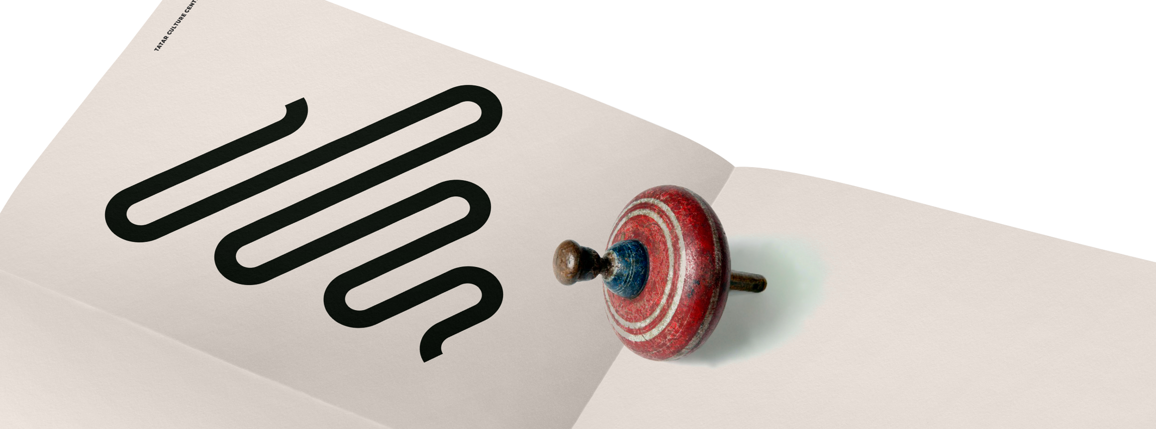
Logotype concept
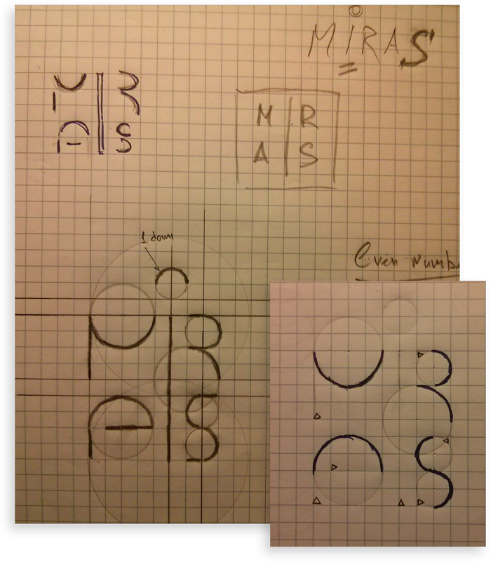
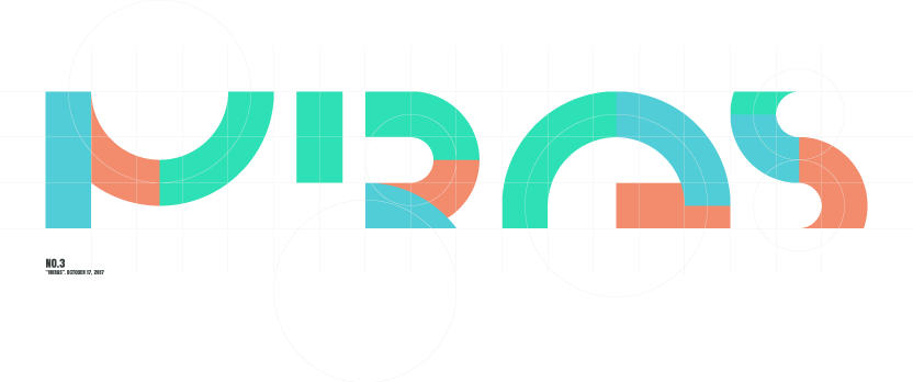
The letter "I" located between the letters M, R and A, S of the name combined from the parts of the letters M, R, A – right line of the M letter, left line of the R letter and right line of the A letter. The mentioned parts of the letters M, R and A need to be removed from those letters.
The weak part of this idea is that the letter S does not have any natural vertical lines. That is why the concept will be slightly modified in the process.
Logotype
We were asked not to use any of the classic Tatar ornaments and symbols as an inspiration, but develop original visual style that won't have any visual relation to the classic Tatar visuals. The reason as was explained: We are a Canadian organisation and would like to highlight this position by using non-traditional visual identity.
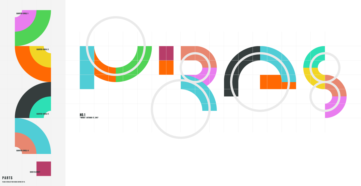
The decision to use simple geometric shapes devoid of any particular meaning is taken following the client's demand.
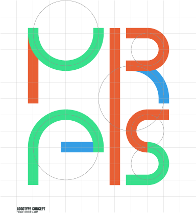
The original concept was slightly modified to make sure no weak points remain. In the current version, the fact that the letter S does not have any vertical lines is not an issue anymore.
The logotype accompanied by the main players of the construct.
Testing equal height.
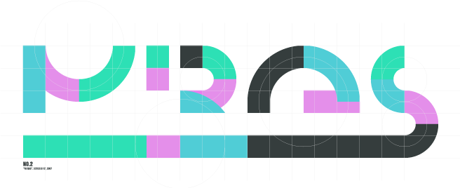
Another example of the logotype where all the letters have equal height.
However the first version of the logotype looks more balanced than the other versions where the figures are equal height. The decision is made.
"Spinning top". Mark concept
Two facts
1. Spinning top needs someone's help to spin.
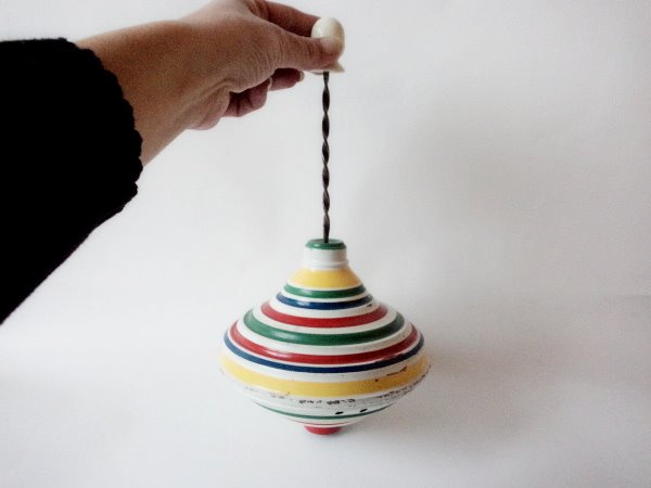
2. Miras - "heritage" in Tatar.
So how are these related? you might ask.
The answer is simple: the heritage needs a person to carry it on, and this person will apply a lot of efforts before the historical events become a fundamental part of his/her existence. In other words, the more time of your life you spend with a concept, the more powerful will be the appeal of this concept for you. Taking this into account, we assume that a spinning top is a perfect symbol of the heritage concept.
Spinning top needs someone's help to spin. Heritage needs someone's help to survive.
You move your hand – the spinning top spins. You remember – the heritage exists.
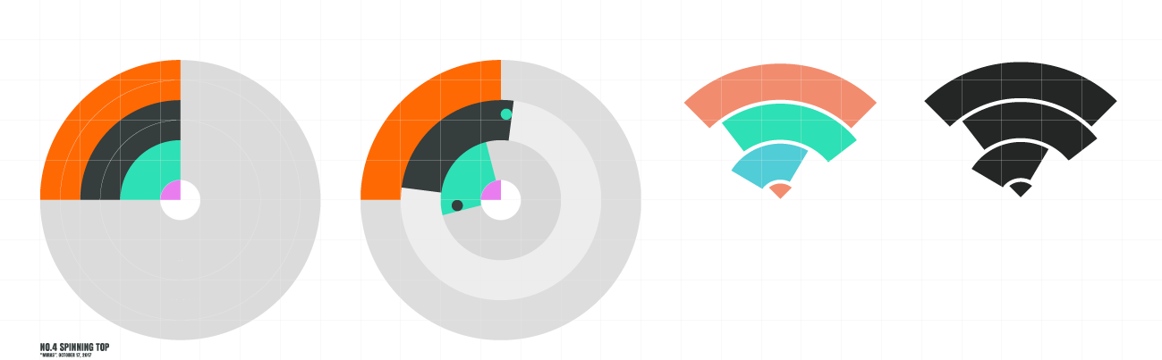
"Spinning top". The mark
Parallel associations: pencil and upside down pyramid.
Pencil – symbolising the memory.
Pyramid: such a pyramid symbolises fragility, instability: dealing the heritage, we should do it with great care to make sure it does not get lost.
"Way". Logo
Heritage – way.
"Resting spinning top". Mark concept
The spinning top resting on its side symbolises the fact that without a person's participation there cannot be any heritage (movement). This concept highlights the people's involvement and prioritizes the human factor because it is the people who bring the concept to life, with their willing to change something, to bring something unusual to their lives, and finally to work hard with no material interest – like children.
Verily I say unto you, Except ye be converted, and become as little children, ye shall not enter into the kingdom of heaven.
Matthew 18:3
Features Bunnies and Babies on the top, wooden handle topper.
Made in USA.
"Resting spinning top". Mark
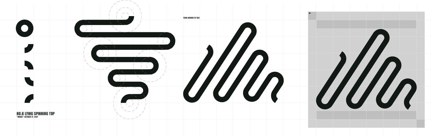
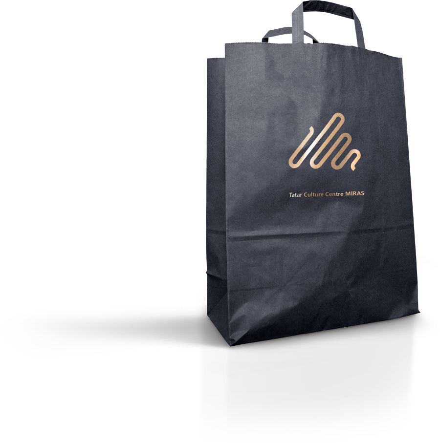
"Resting spinning top". Realistic view.
To demonstrate the full power of the mark, you need a great realistic object. The bag below (WebTalkTo 10 hero image) was reused many times for the demonstrations and tests of the monochrome shapes, and it proves its usefulness in the current case.
Logo
A combination of the logotype and the mark previously created. The image still uses random colors that will be fixed shortly below.
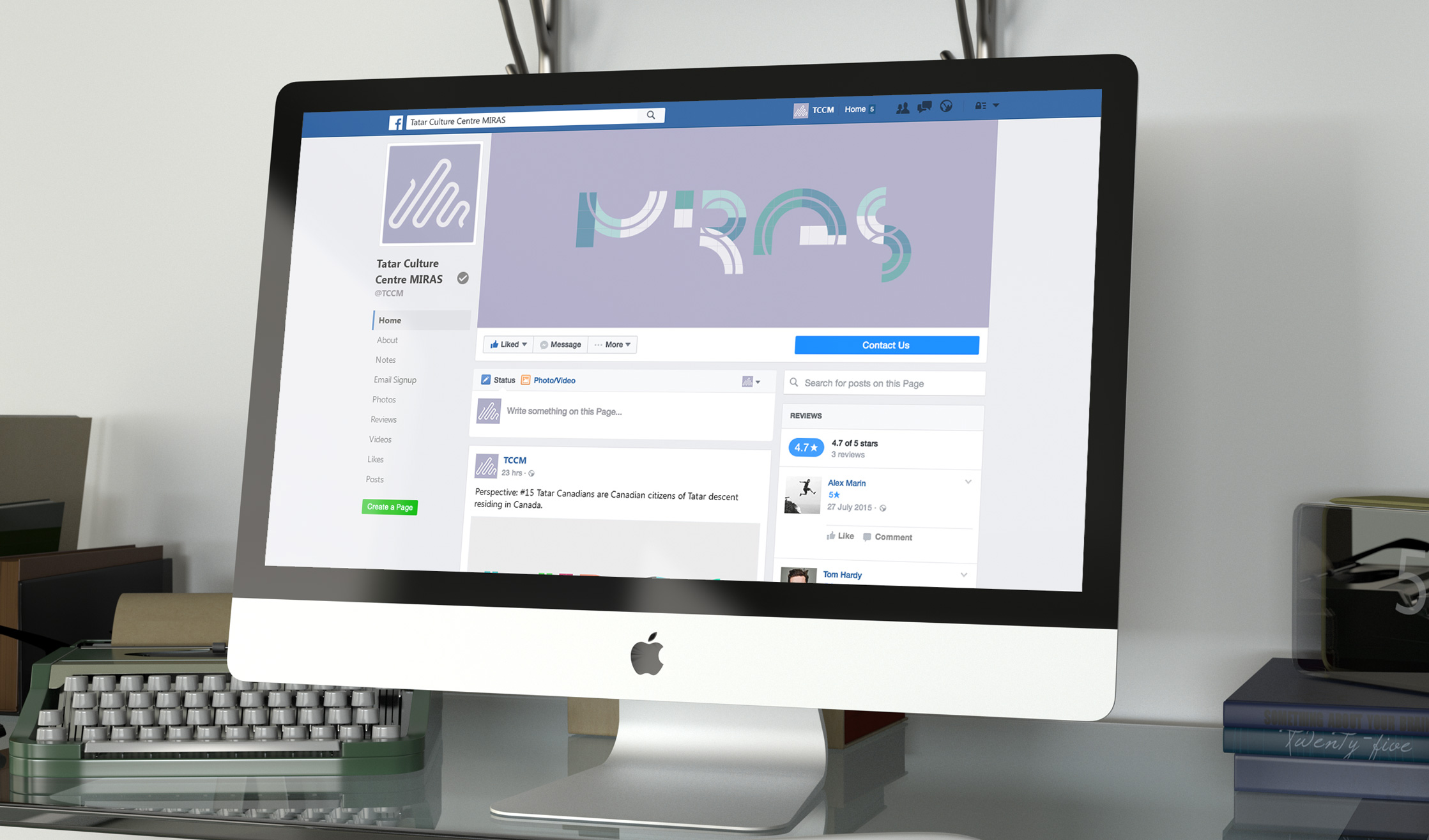
Along with the logo we were supposed to create a cover art for the main mass communication tool of the organisation - Facebook page. That is why we decided to find the final color balance working with the Facebook realistic mock-up. Many versions were tested before we found one we liked.
Facebook page
The image uses final color palette.
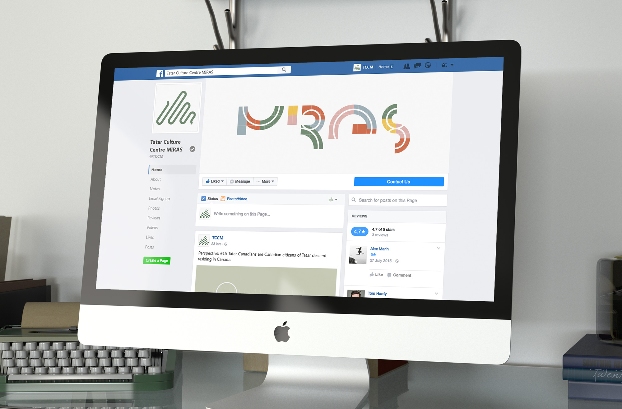
The mock-up also a great visual prove of the quality of developed brand mark. Facebook page uses different sizes of the profile image, where the smallest one is 16x16 pixels – post status avatar. If the symbol is sharp and well-presented everywhere – you are on the right path.
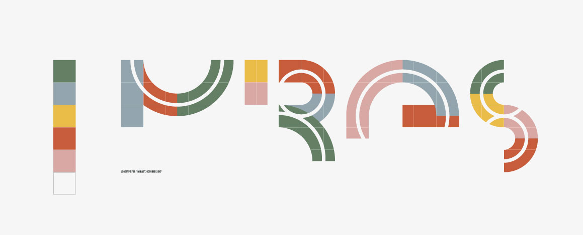
Logotype uses final color palette.
Alternative color palette.
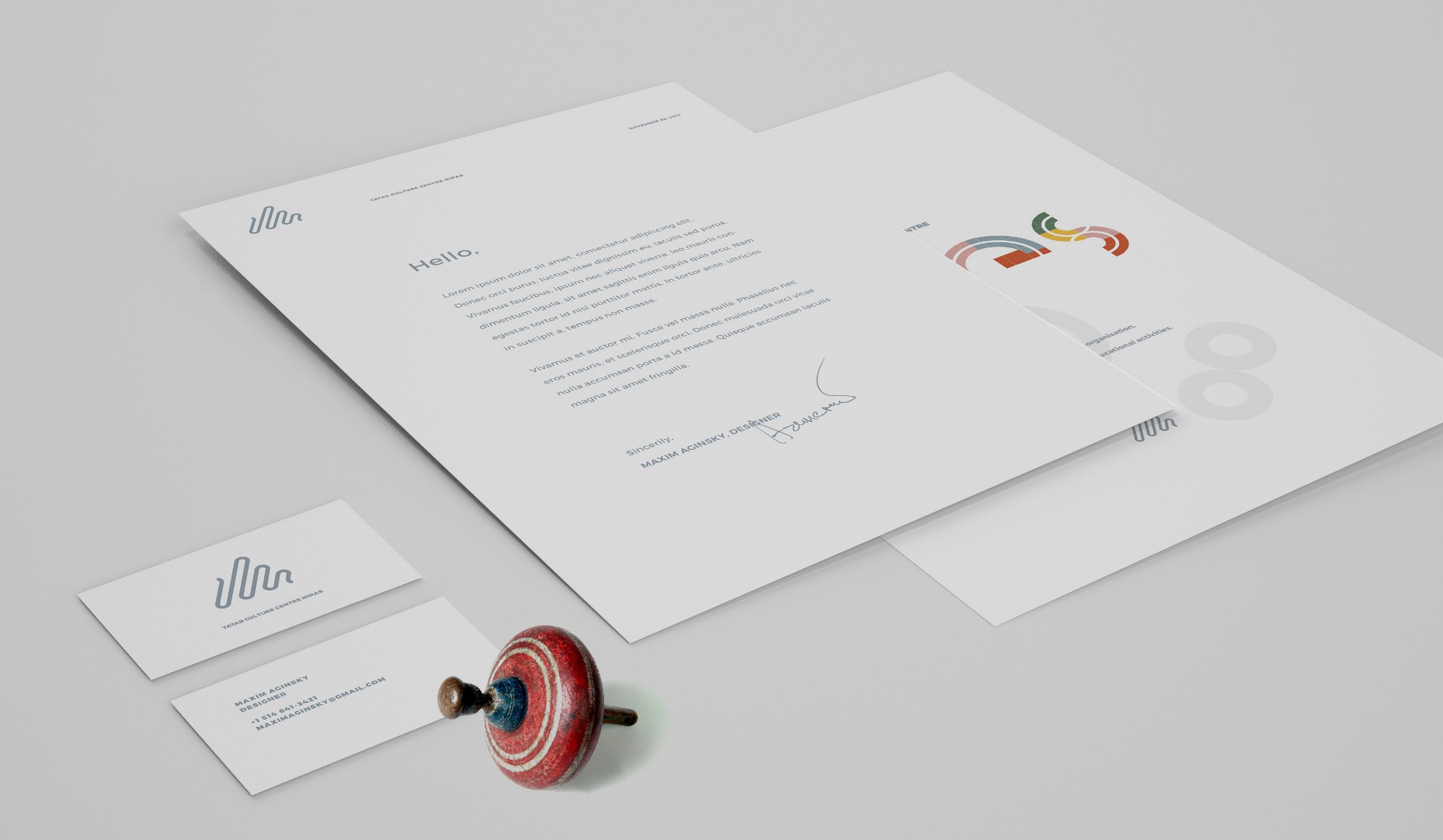
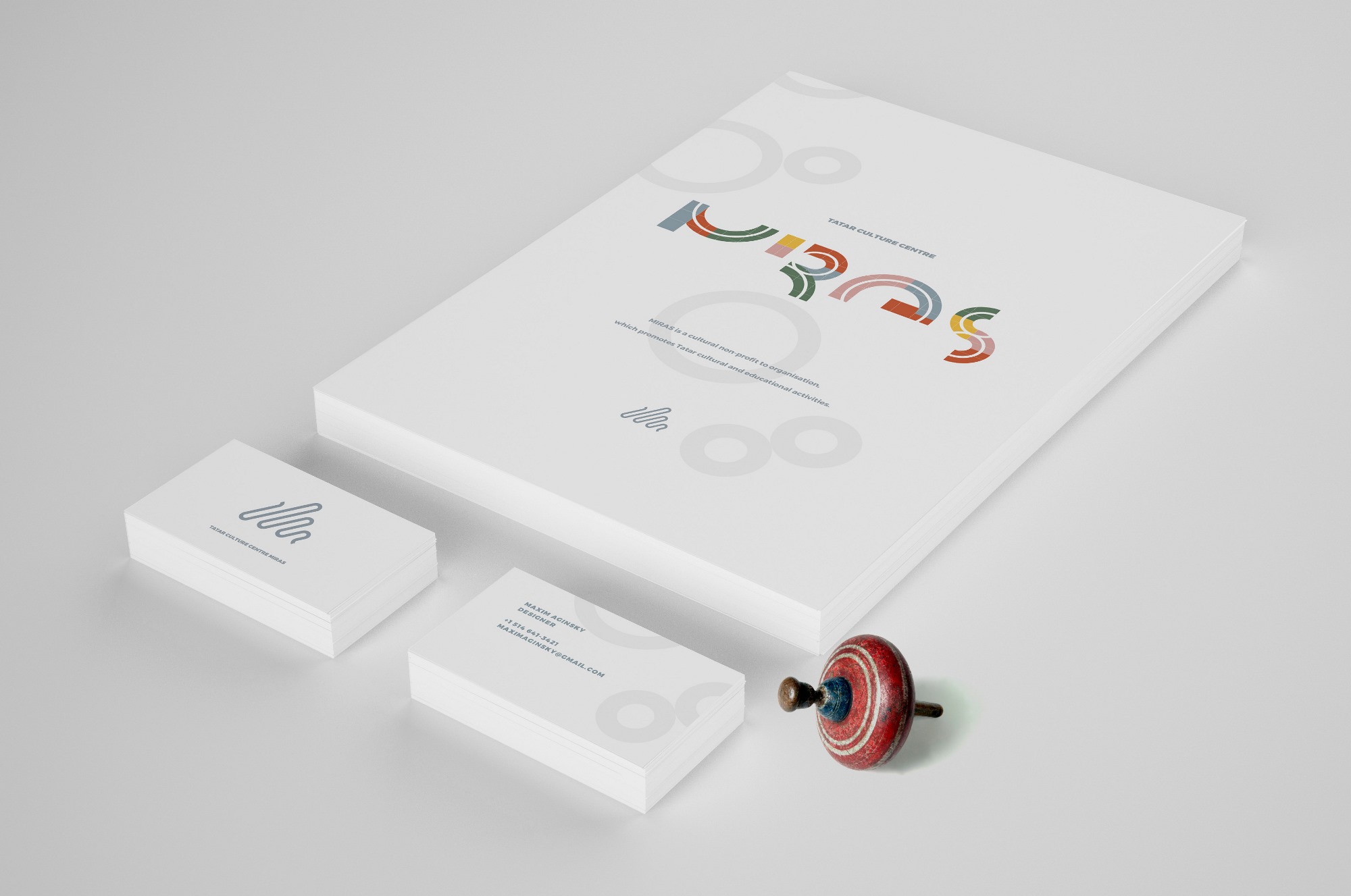
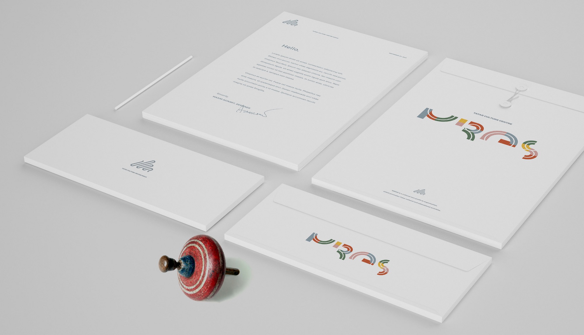
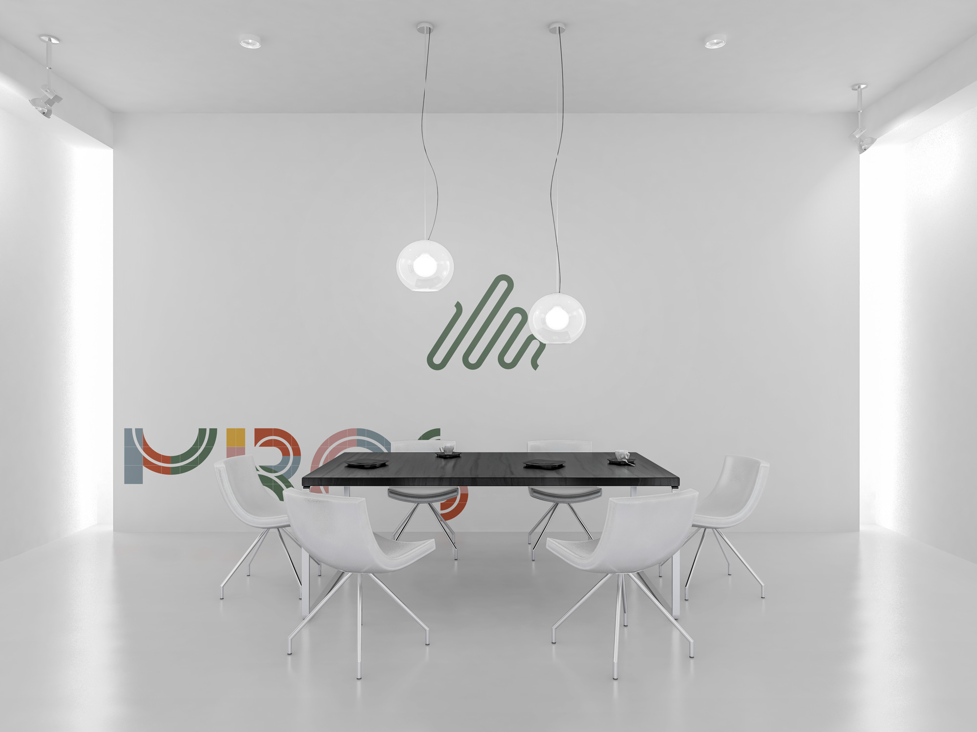
Realistic demonstration of the mark and logotype
Business card, Letterhead, Folder cover, Envelope cover, Booklet cover
A4 size: Letterhead, Folder and Booklet covers.