Here, I will be showcasing the website and brand identity formation process for Symbiotic Capital Management. This article includes all the materials from the beginning of the work to the point when I felt I had found the right vector and was ready to share it with folks.
I am always very curious about how you get to the final point, the final design. What exactly is the formula? What did you do? How did you replicate the process? How were the patterns found? It's why I maniacally save every document created and write this type of report. This also allows me to understand better what has actually been created, what I think and learn about it, what I can and what I still need to learn.
Maxim Aginsky, August 2023, Montreal.
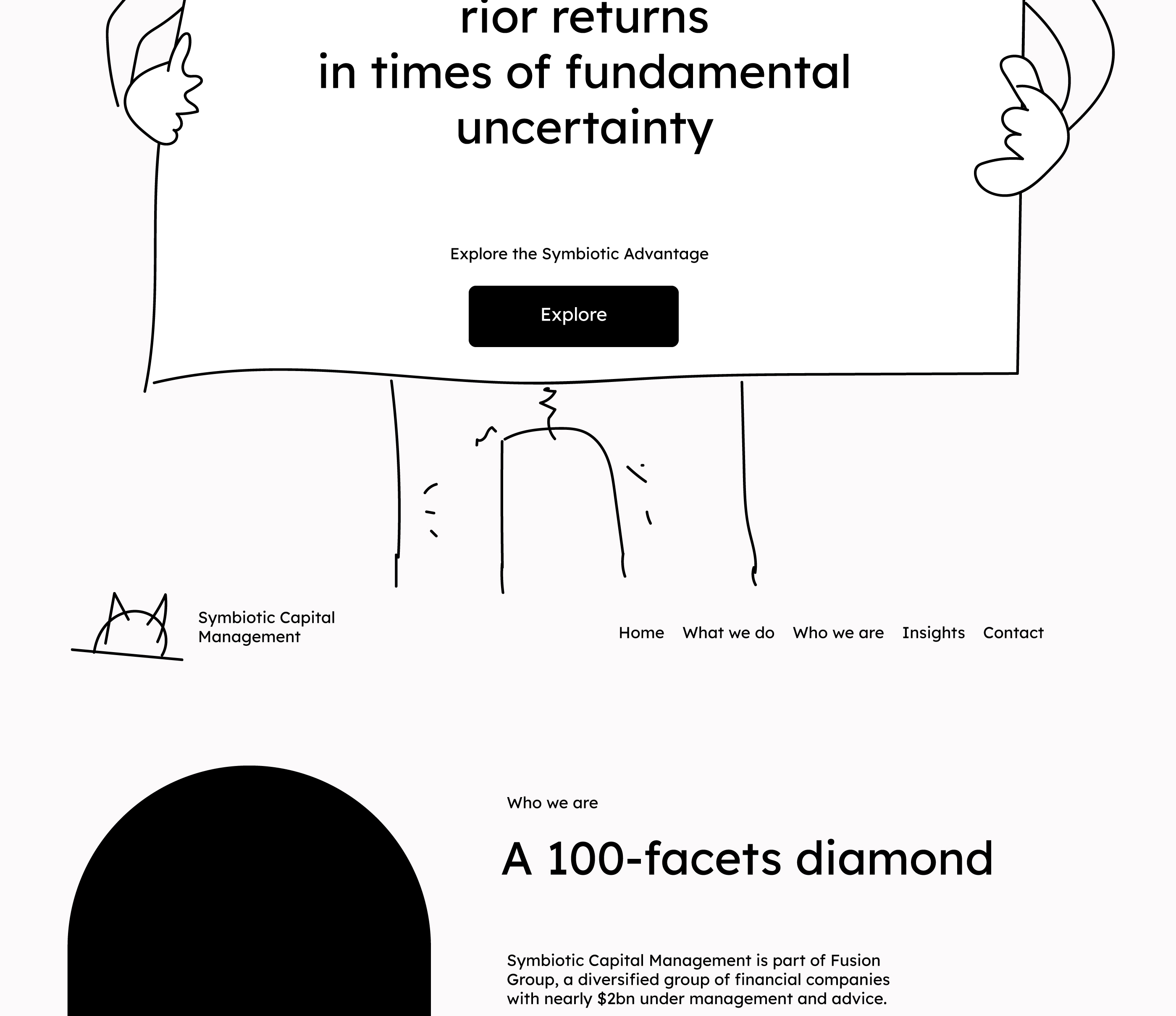
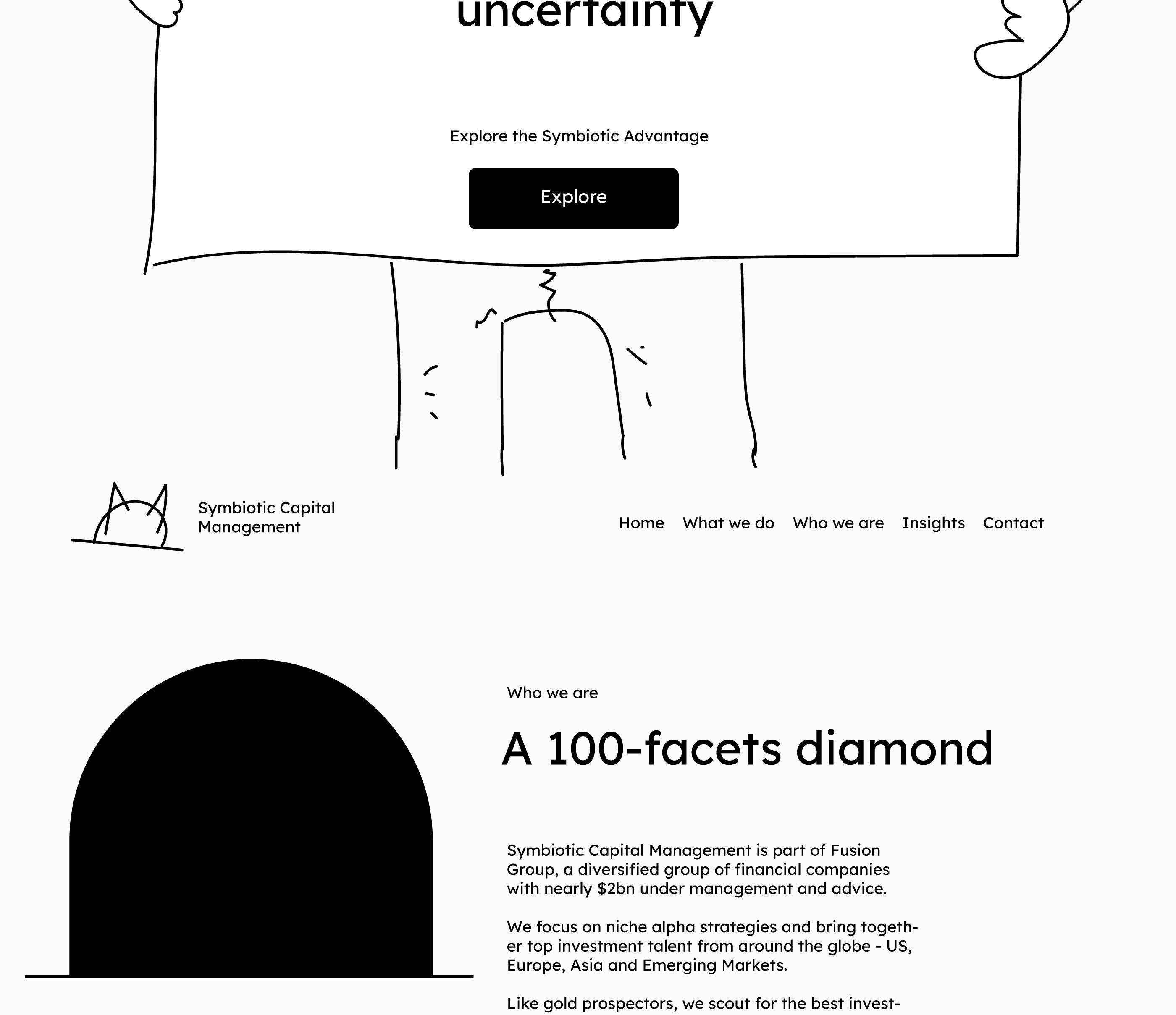
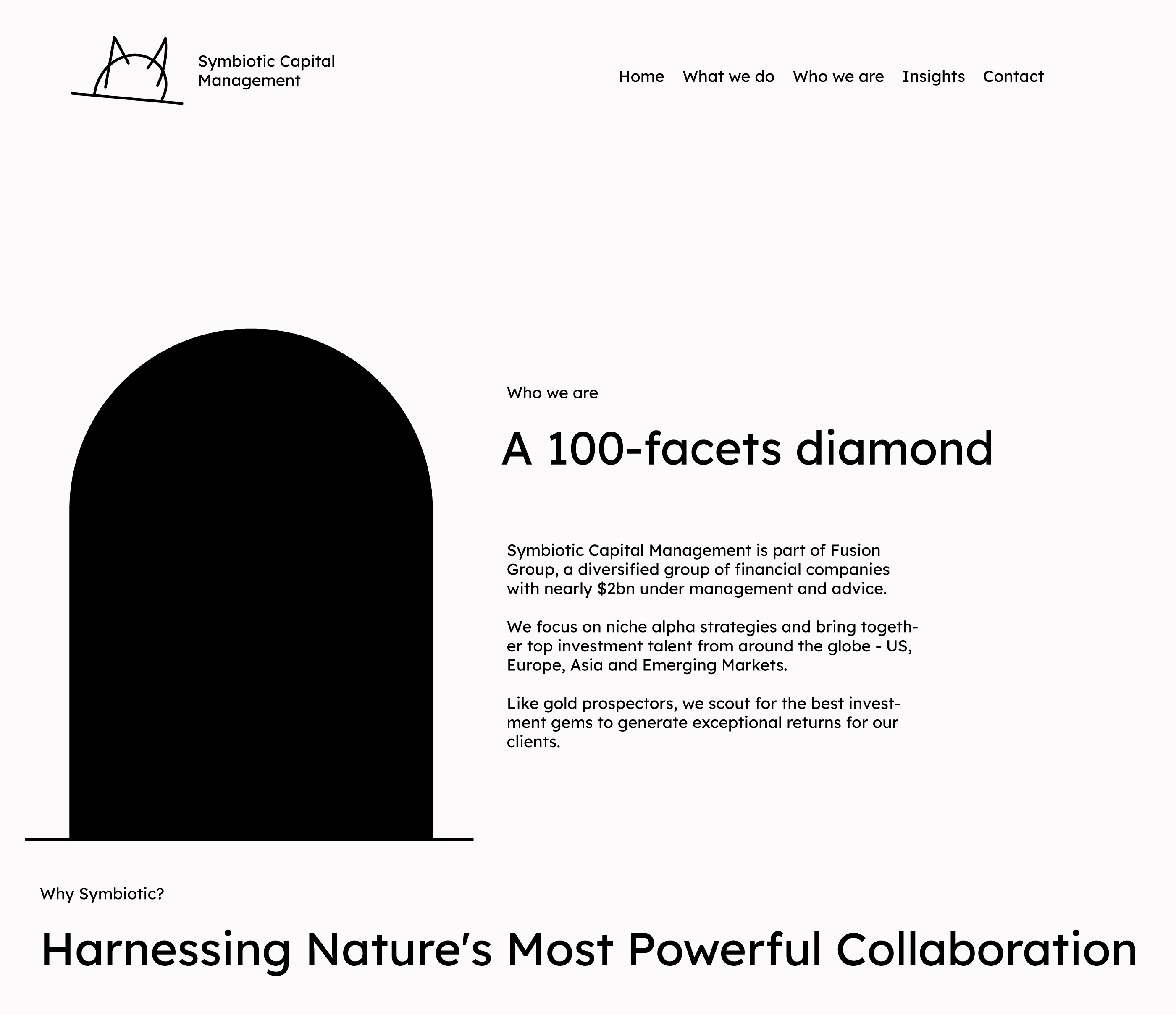
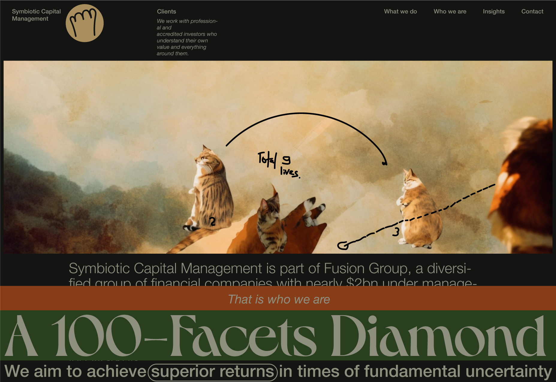
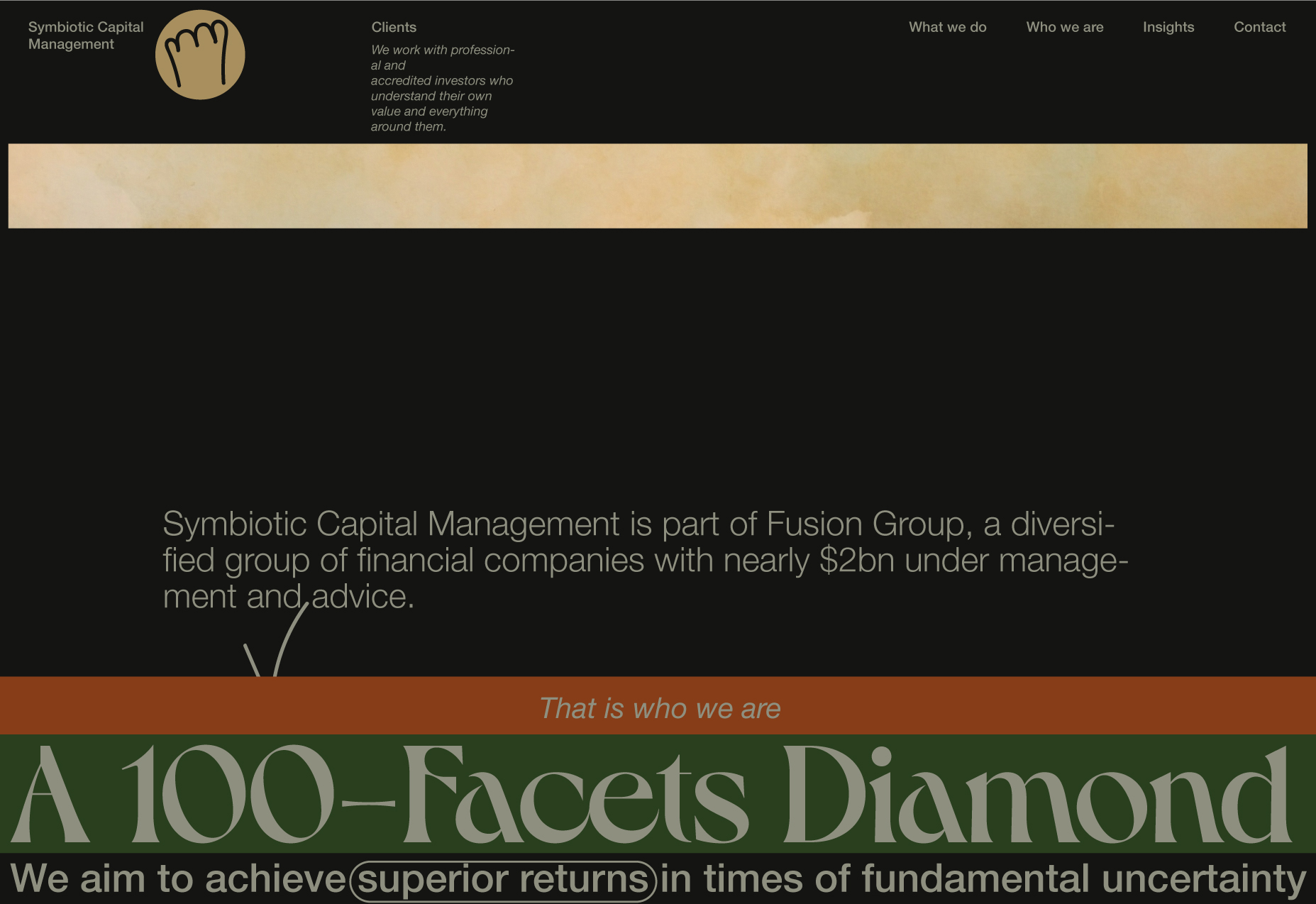
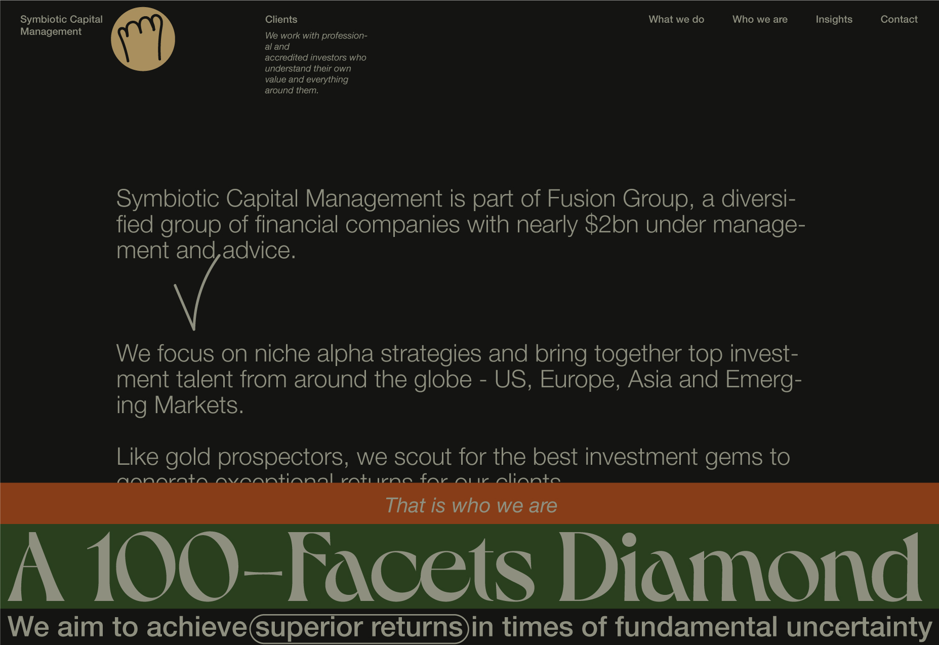
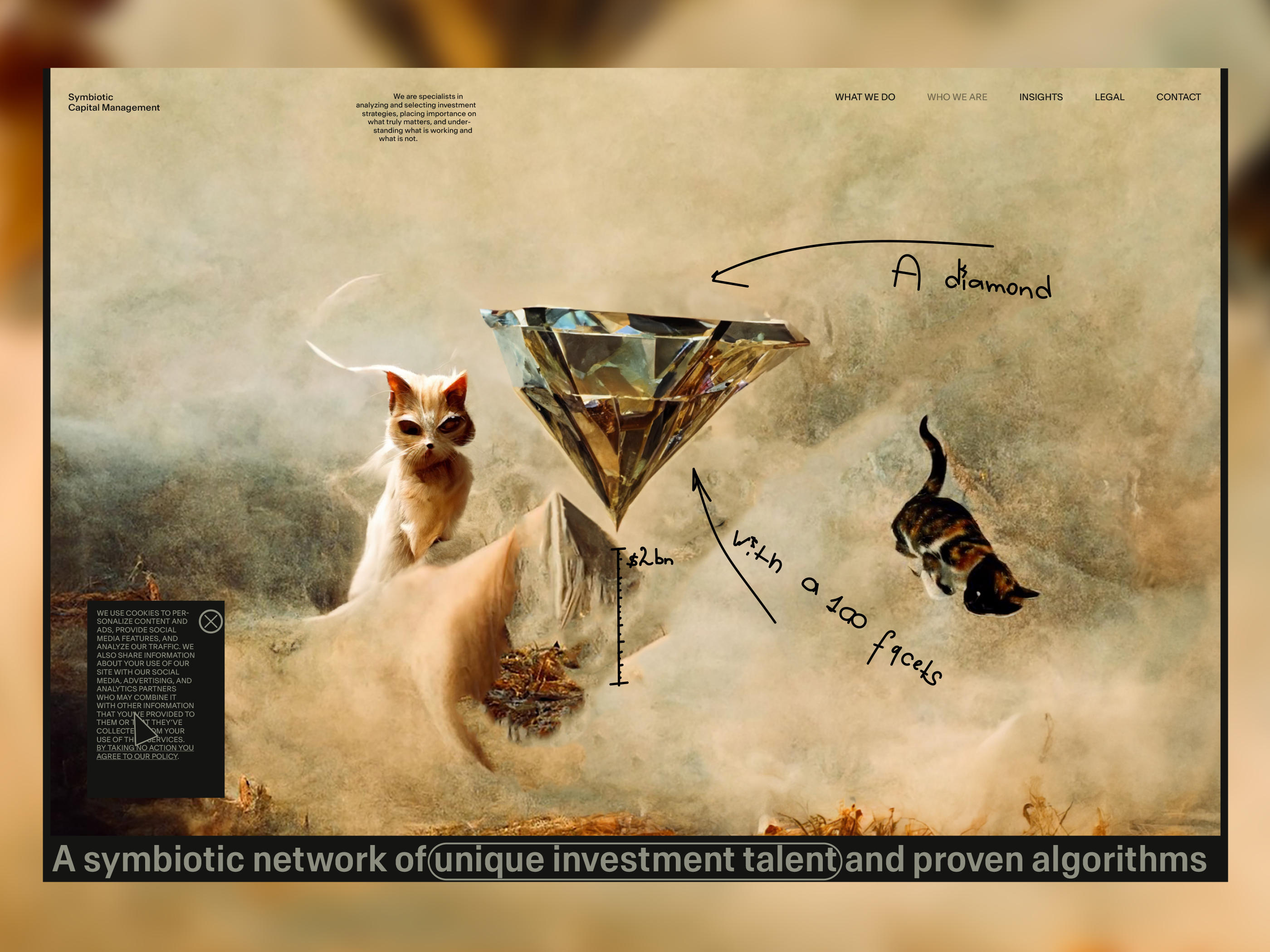
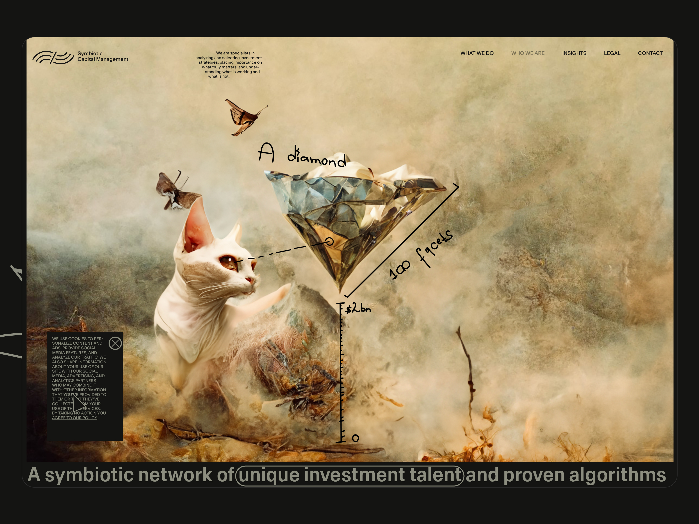
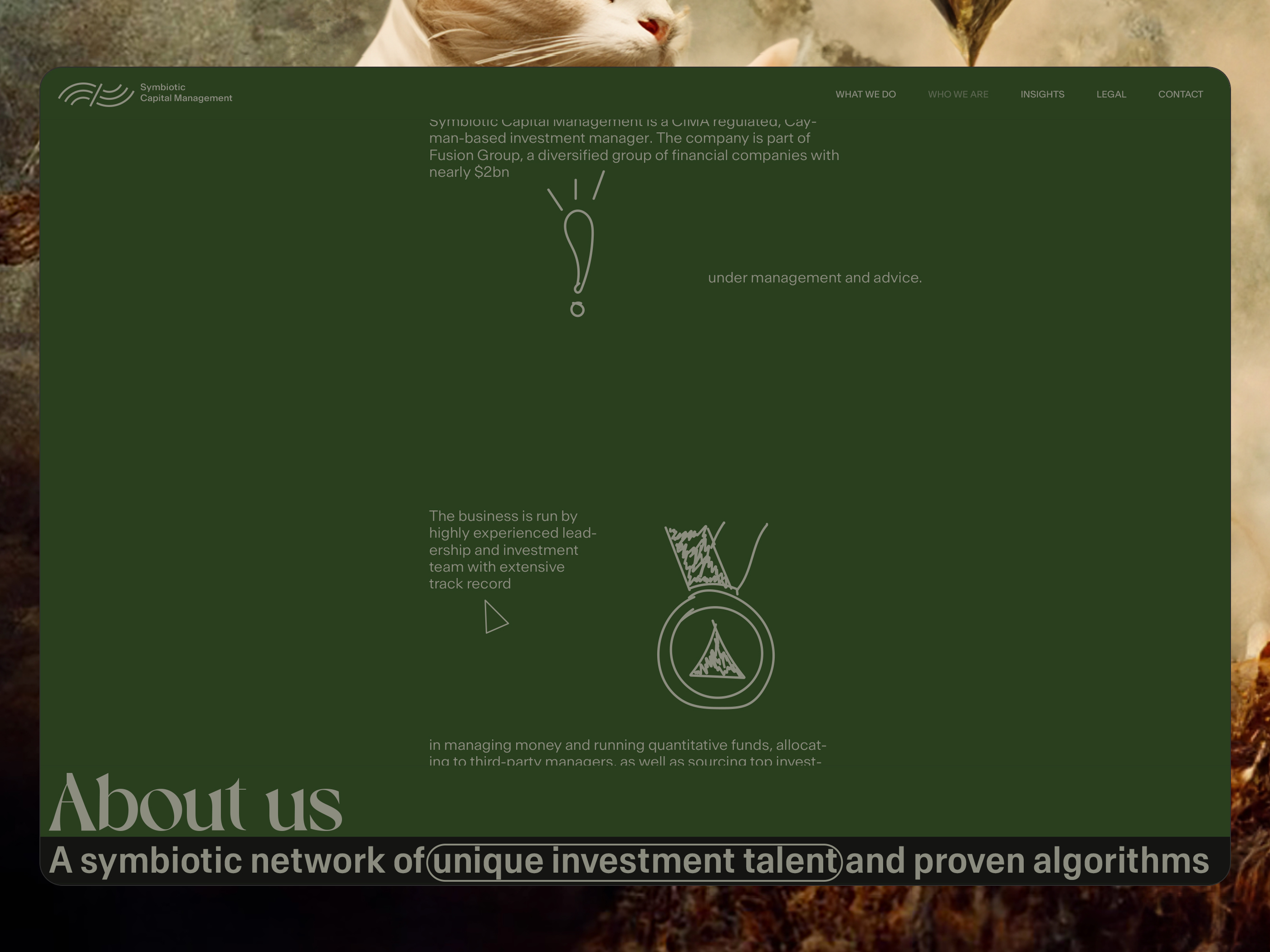
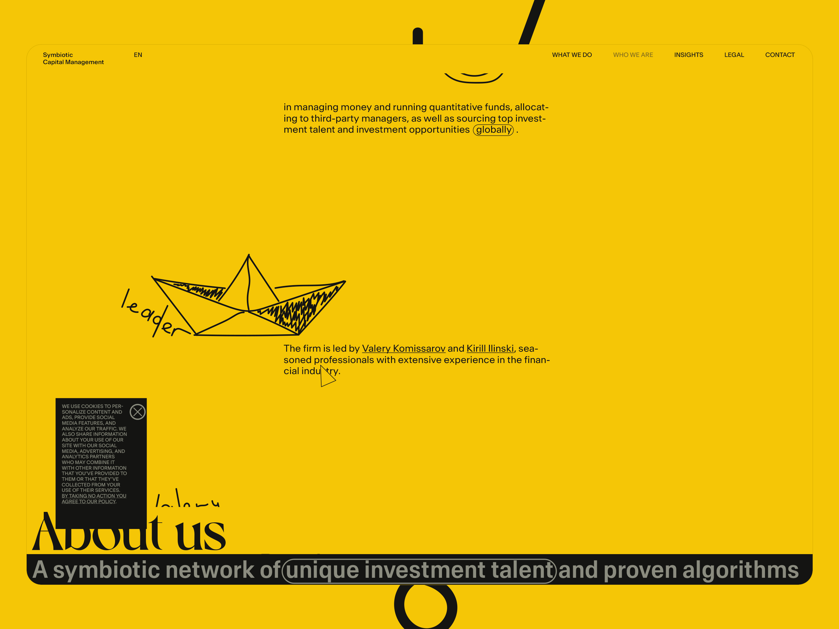
Symbiotic Capital Management is part of Fusion Group, a diversified group of financial companies with nearly $2 billion under management and advice.
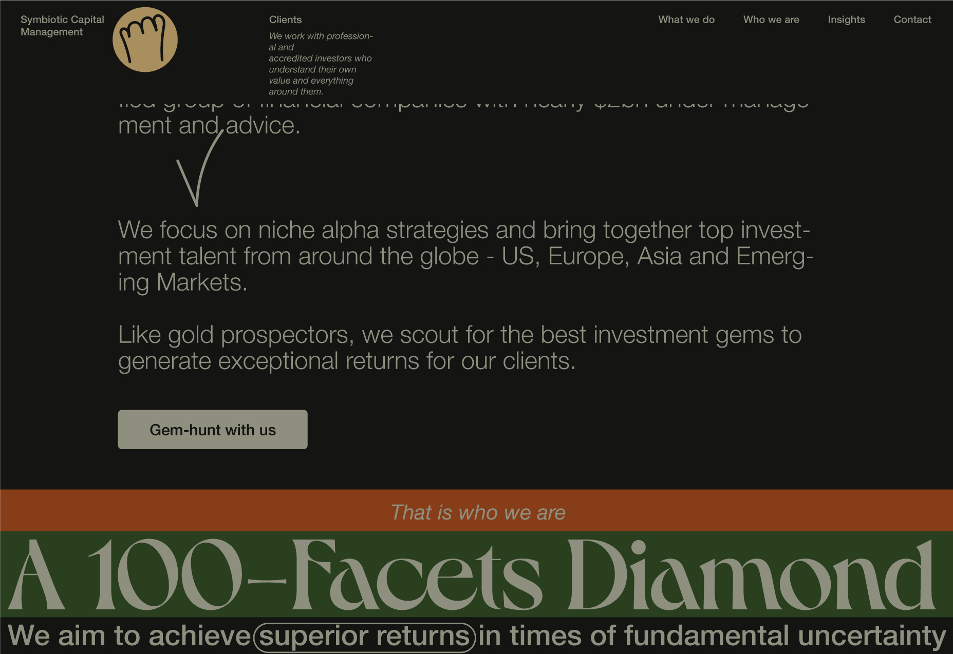
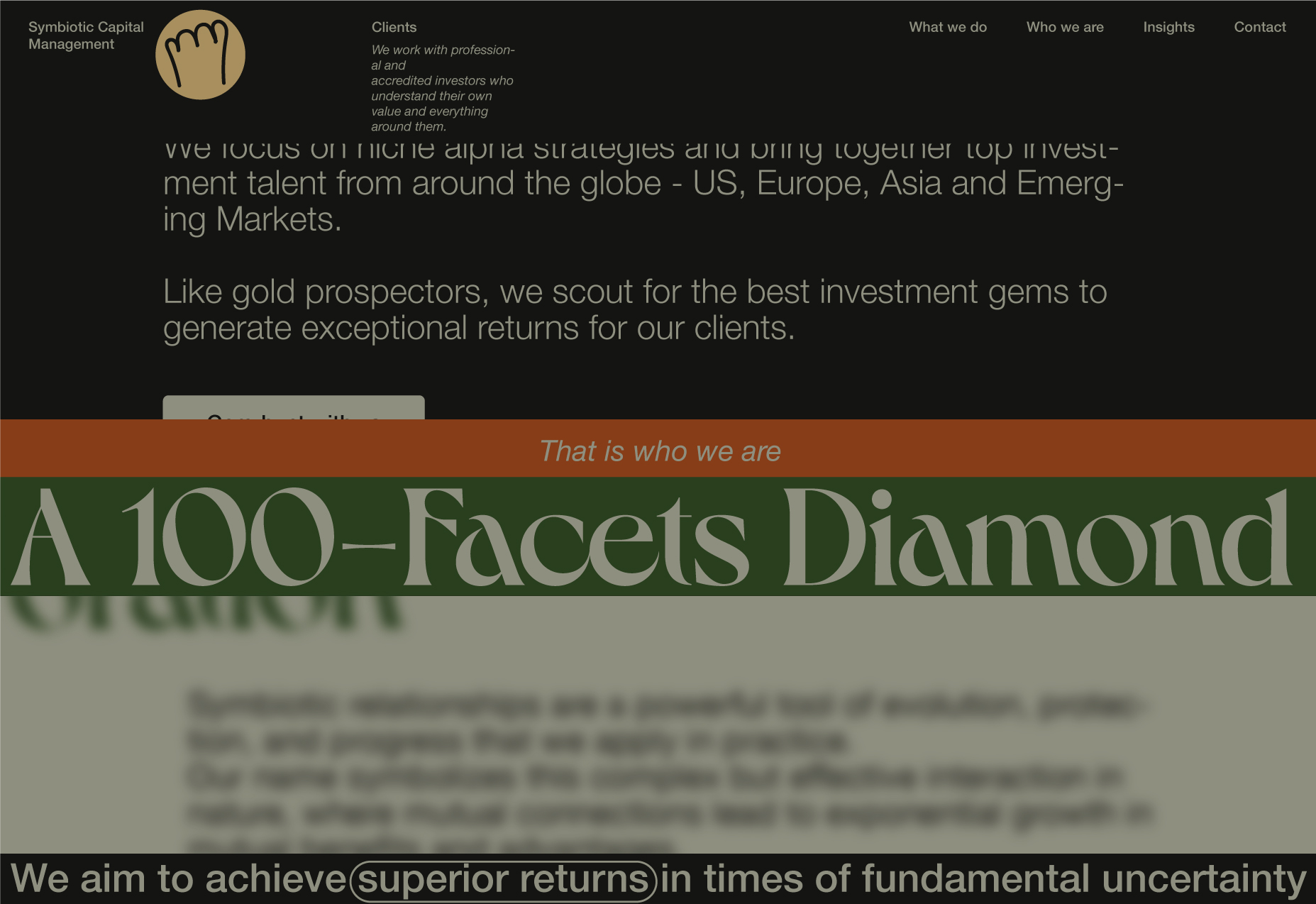
It focuses on niche alpha strategies and brings together top investment talent from around the globe, including the US, Europe, Asia, and Emerging Markets.
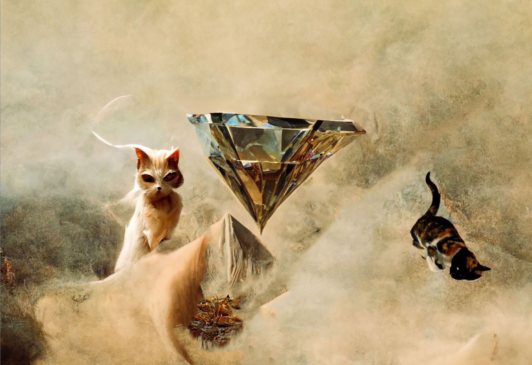
Like gold prospectors, it scouts for the best investment gems to generate exceptional returns for its clients.
Brief. Essential fragments
Website
- A positive vision for the future,
- The high-tech,
- The modern sense of time and space,
- The style is elegant simplicity.
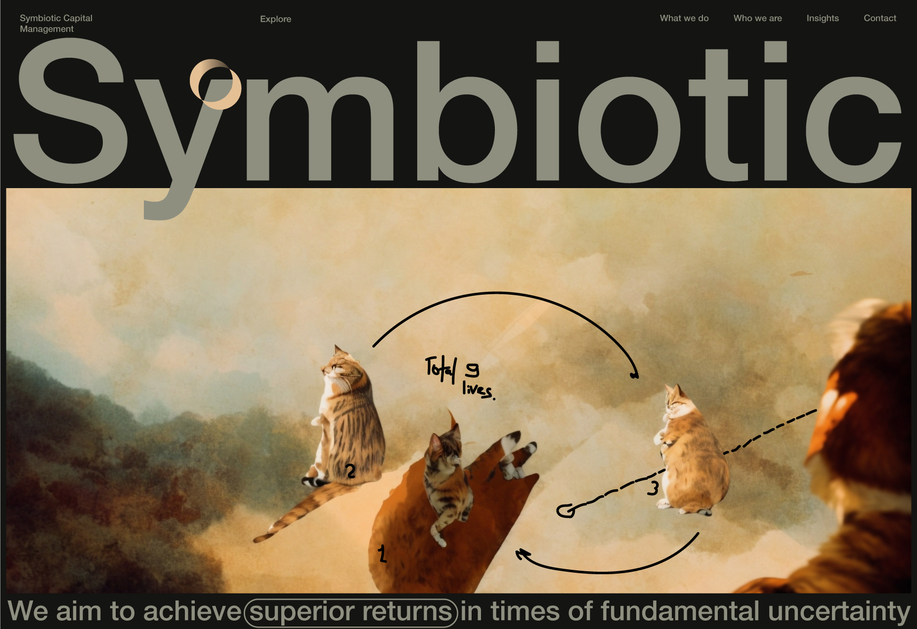
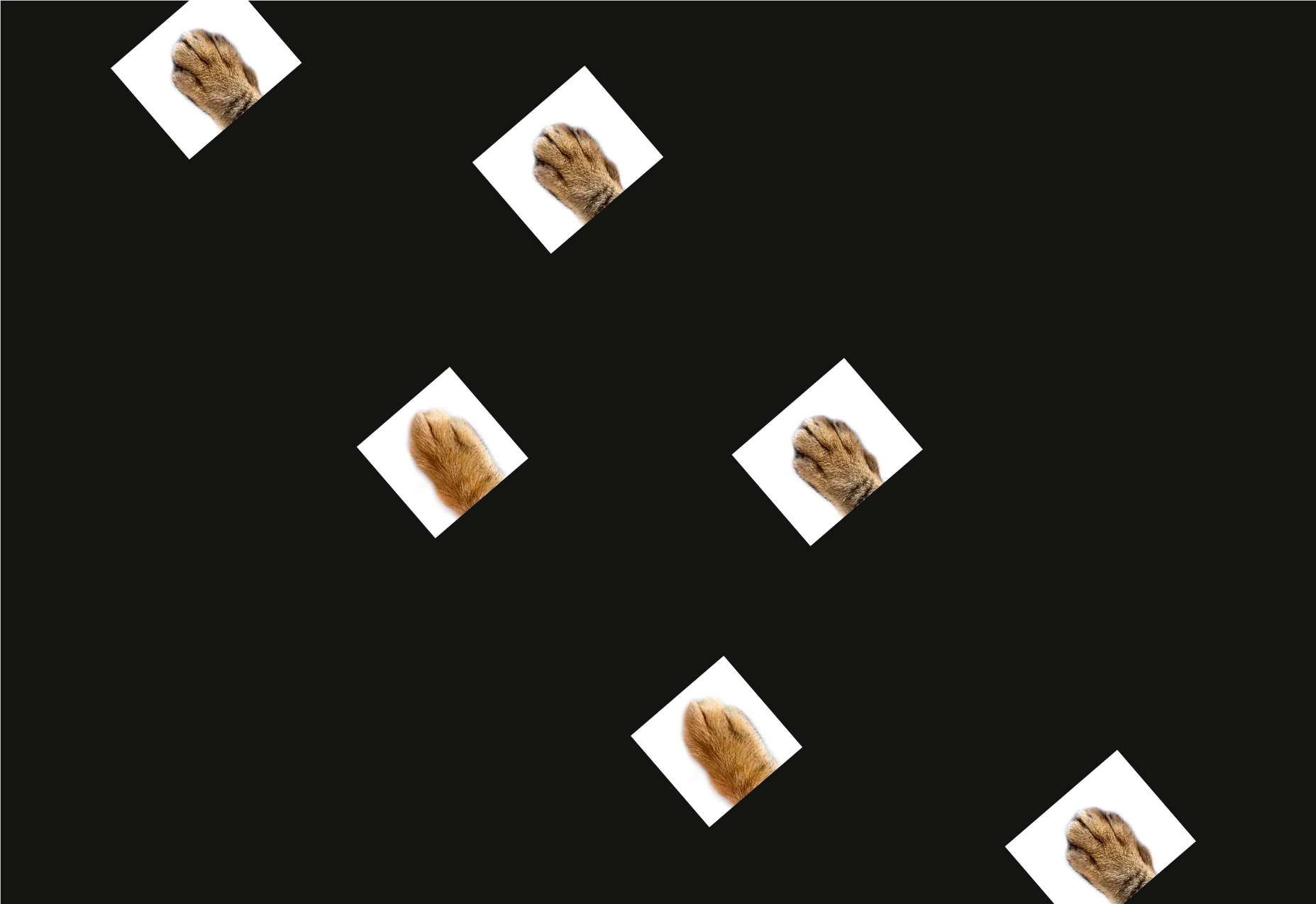
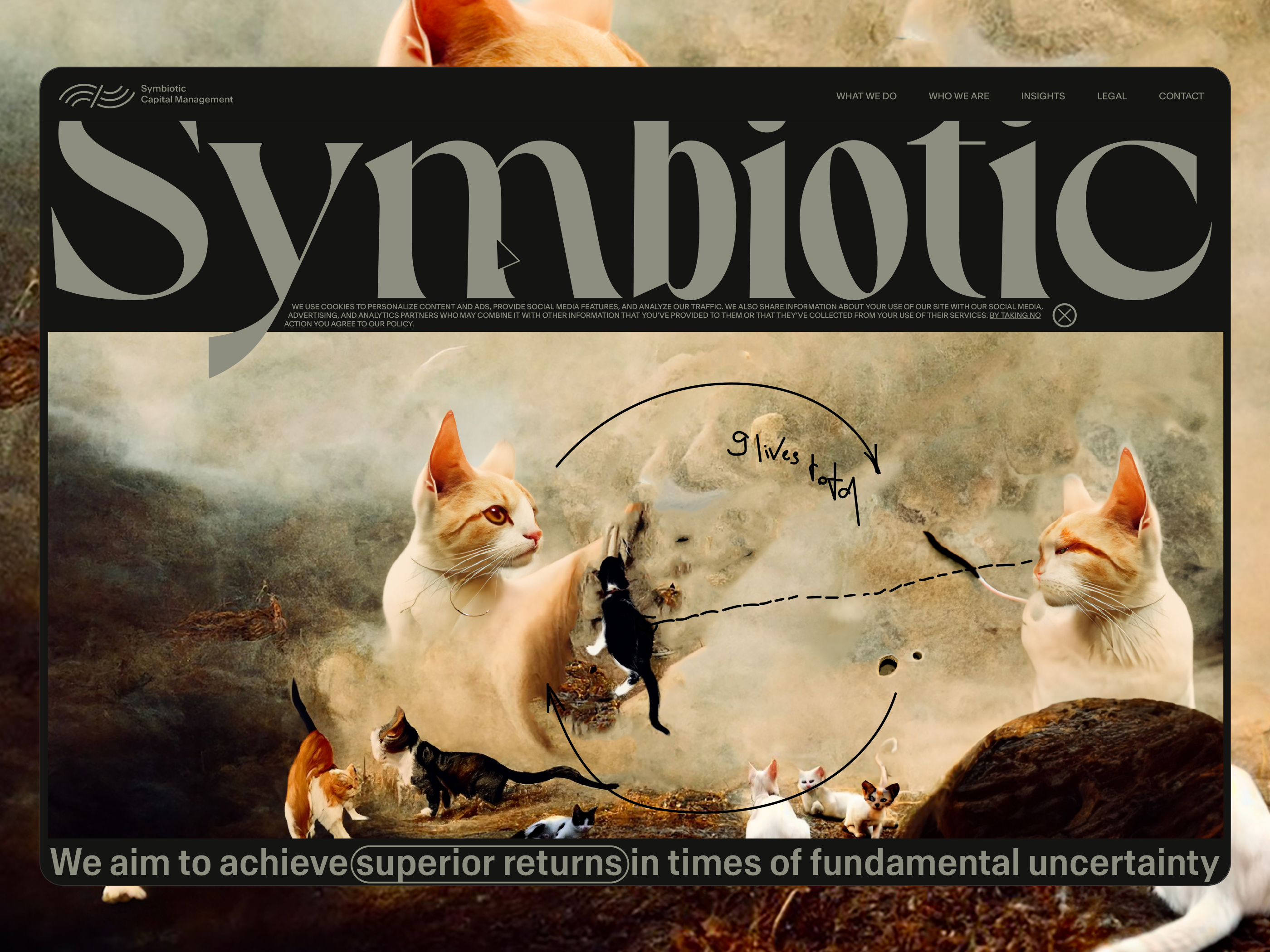
An adaptation of the image of a cat that
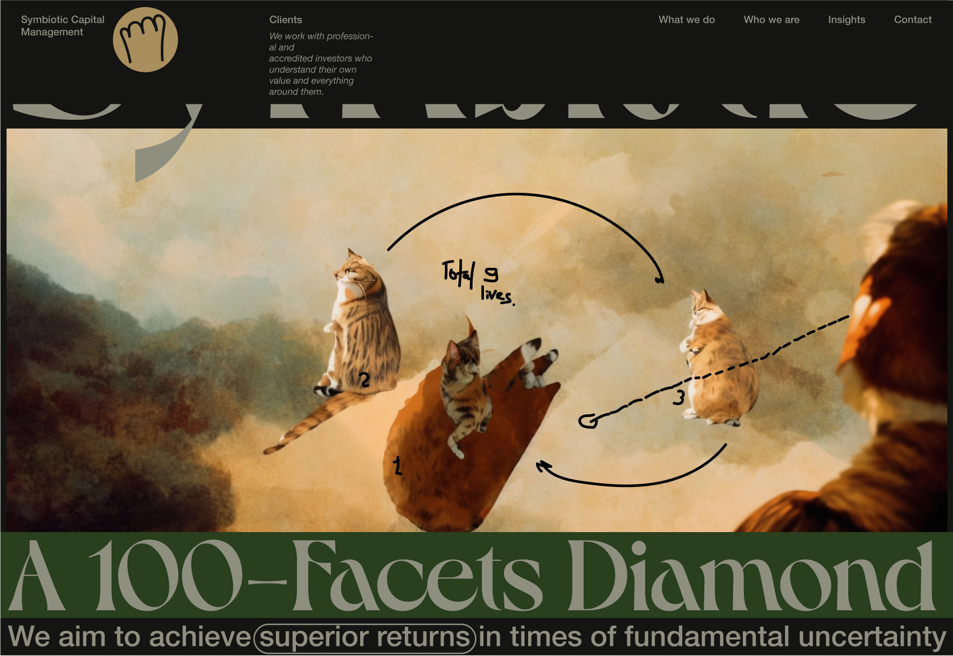
- Nothing is afraid of heights and always lands on all fours,
- sees in the dark,
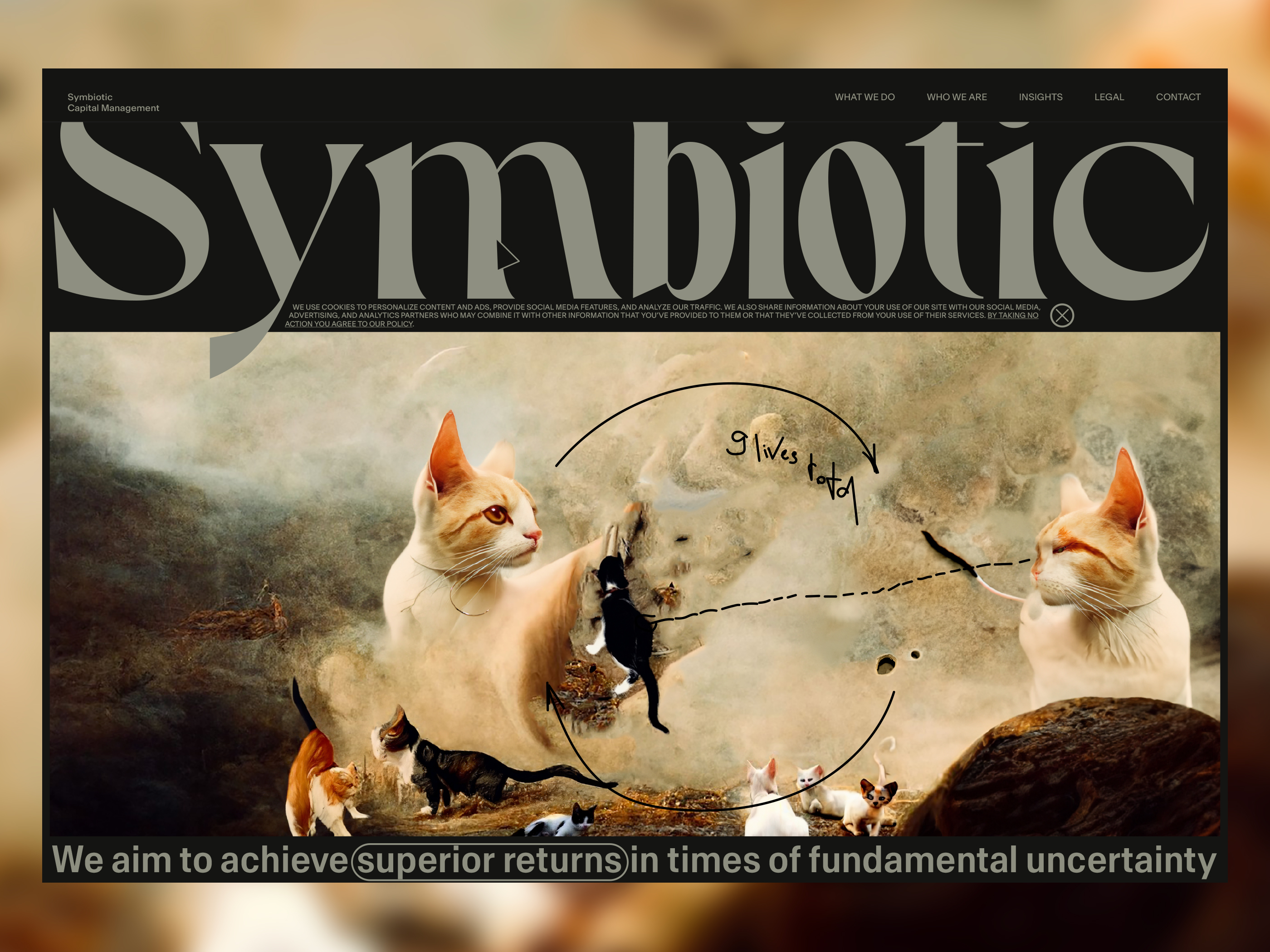
- who has 9 lives,
- soft and fluffy, but a fearless predator.
Colours
Need to keep in mind that the site is about money management and should project trust.
Goal
Accurately hit our target audience.
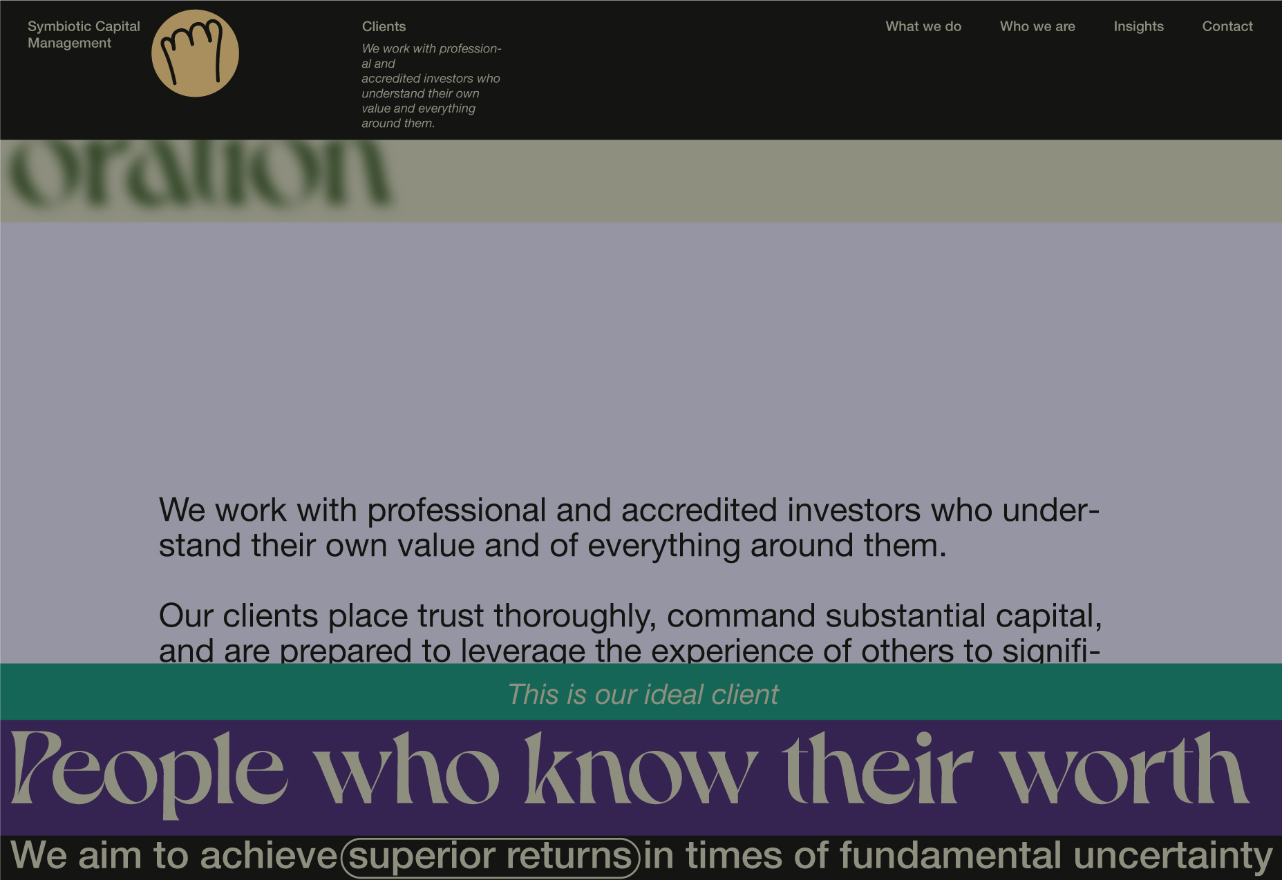
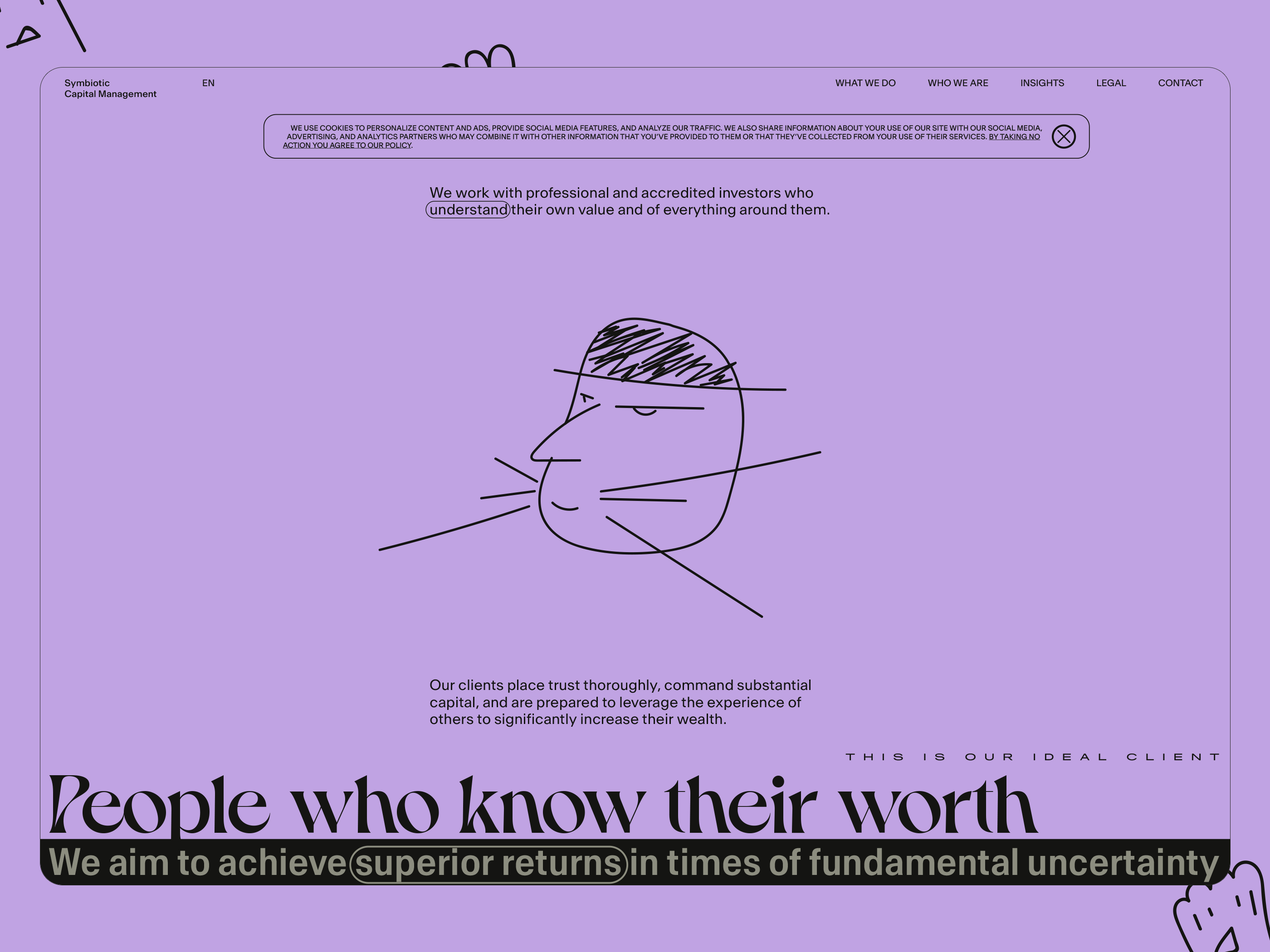
Who is our client
A person who knows the value of himself and everything around him, at the same time, does not trust anyone or anything, who has his own significant capital, and who is ready to climb on the shoulders of someone else's experience and talent in order to become much richer.
An adult, successful, and respectable person, but who is still a child at heart and loves (expensive) toys.
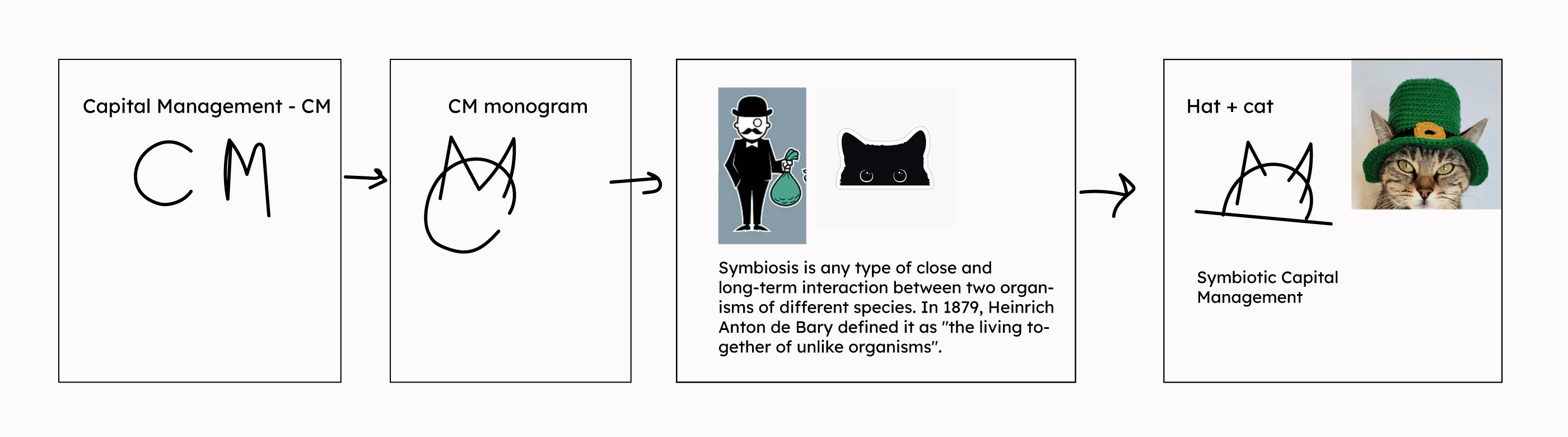
Logomark explanation
V1. British version
In the beginning, I was planning to draw the main association in deep relation with the United Kingdom. This is why I have used the pound sign and the English bowler.
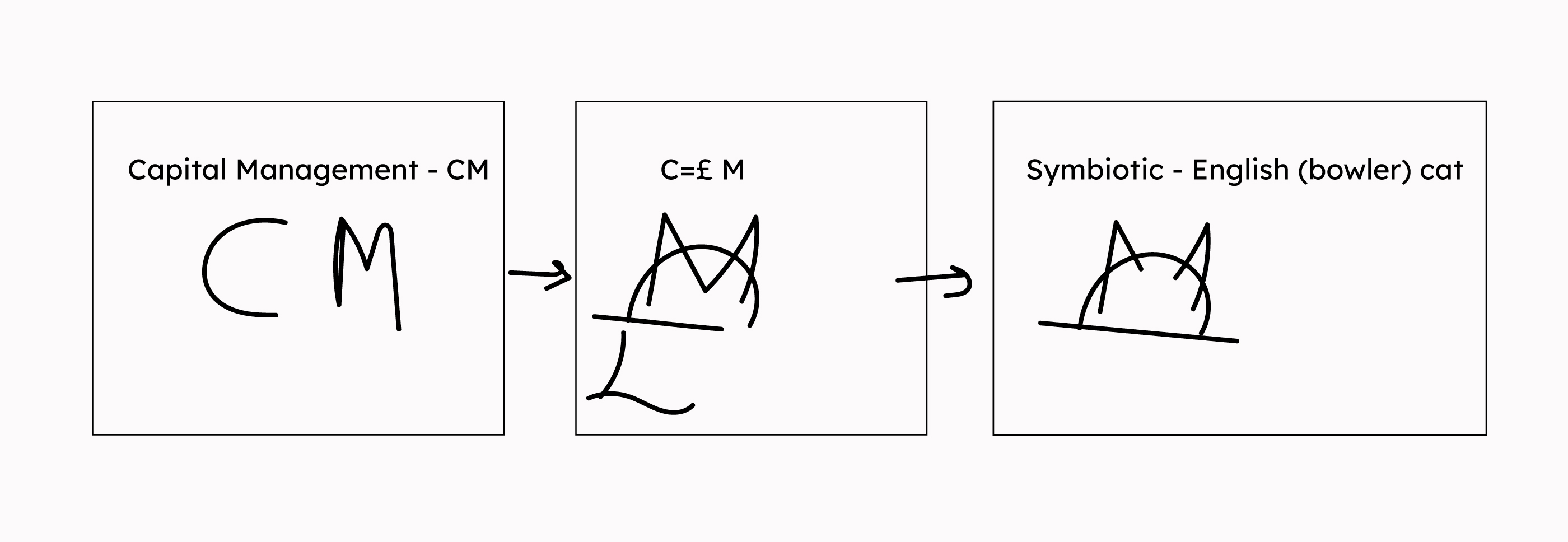
V2
Trying to reduce the associations with London (after talking with Taras). More international direction, with the same visual result.
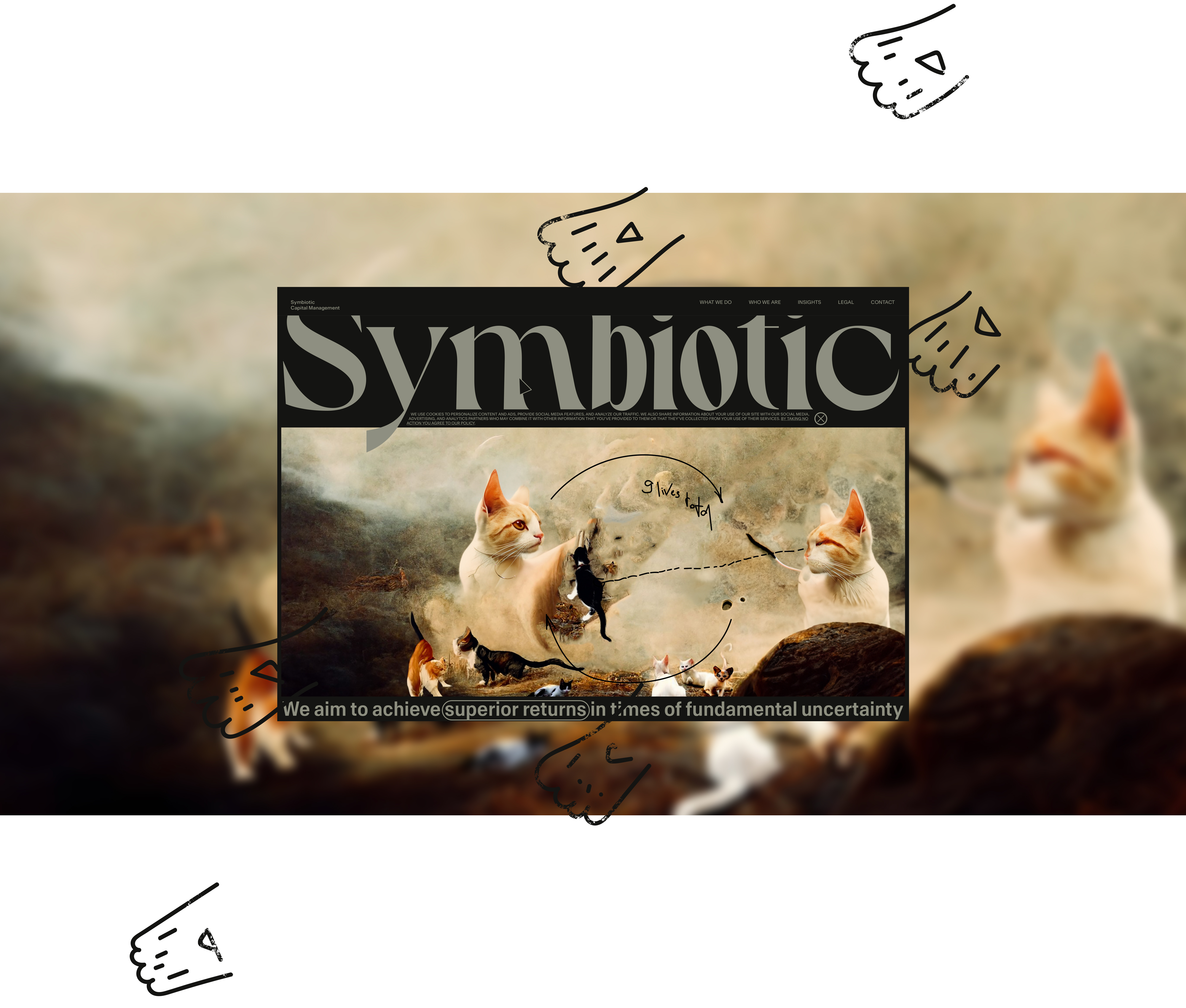
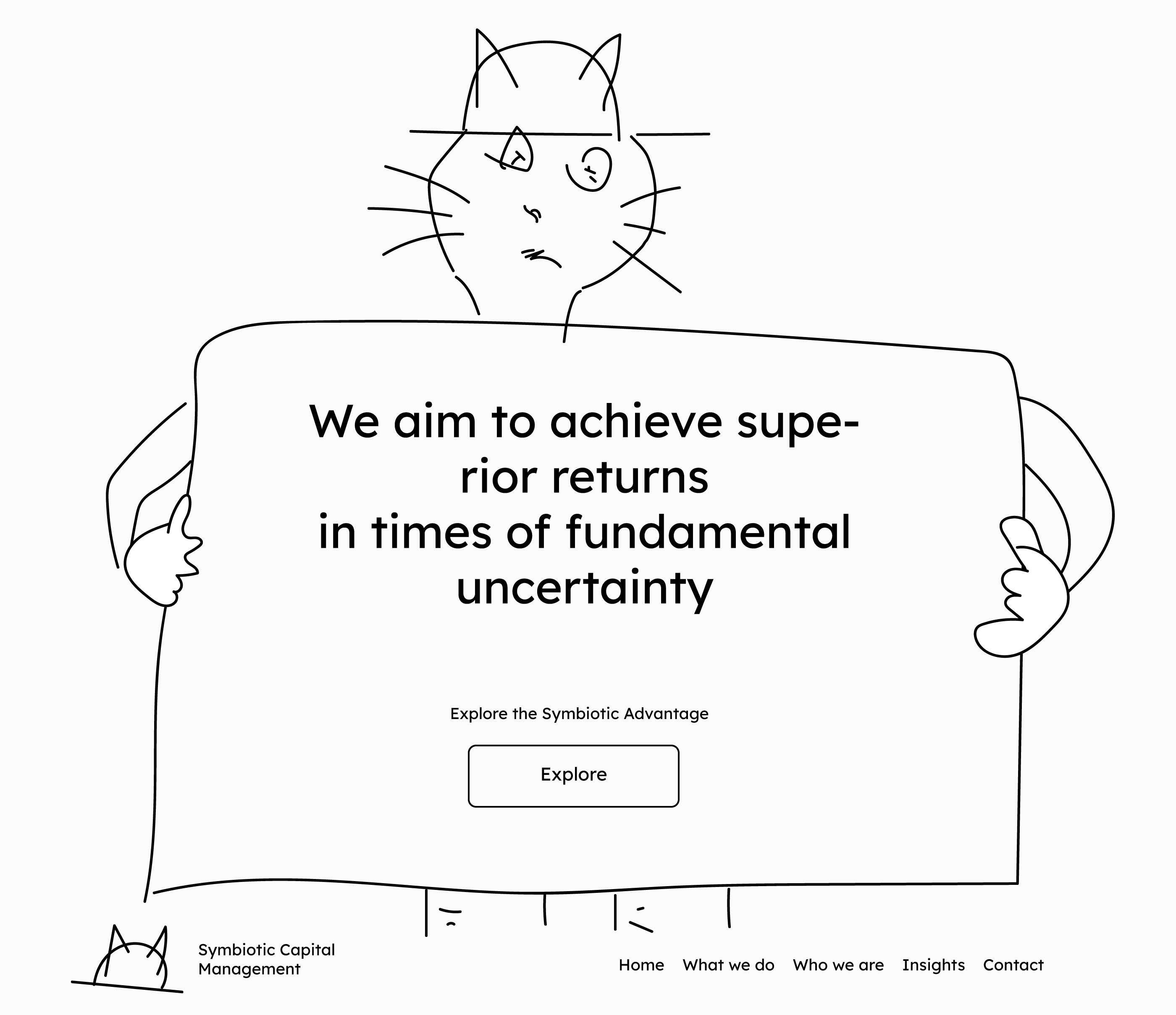
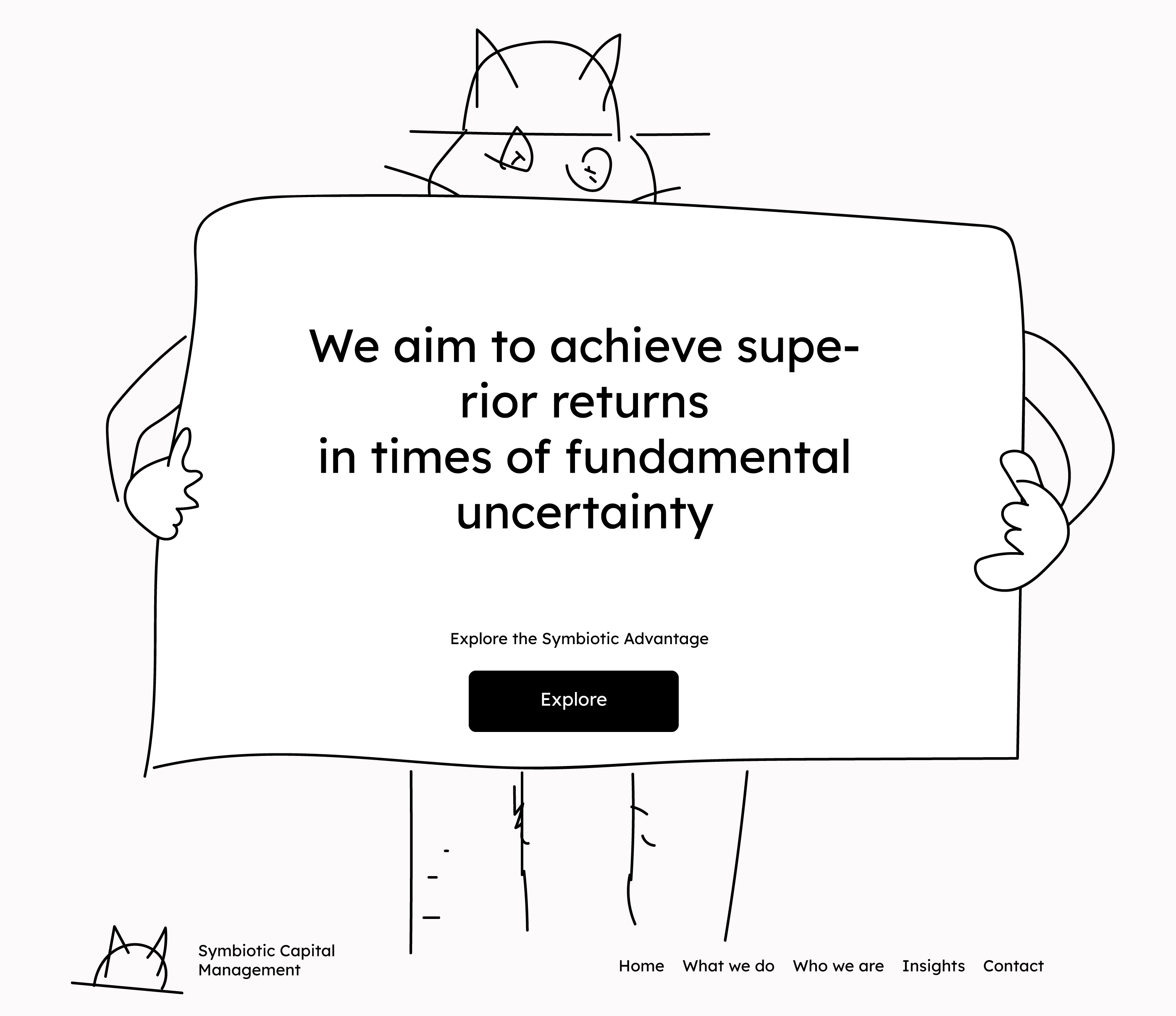
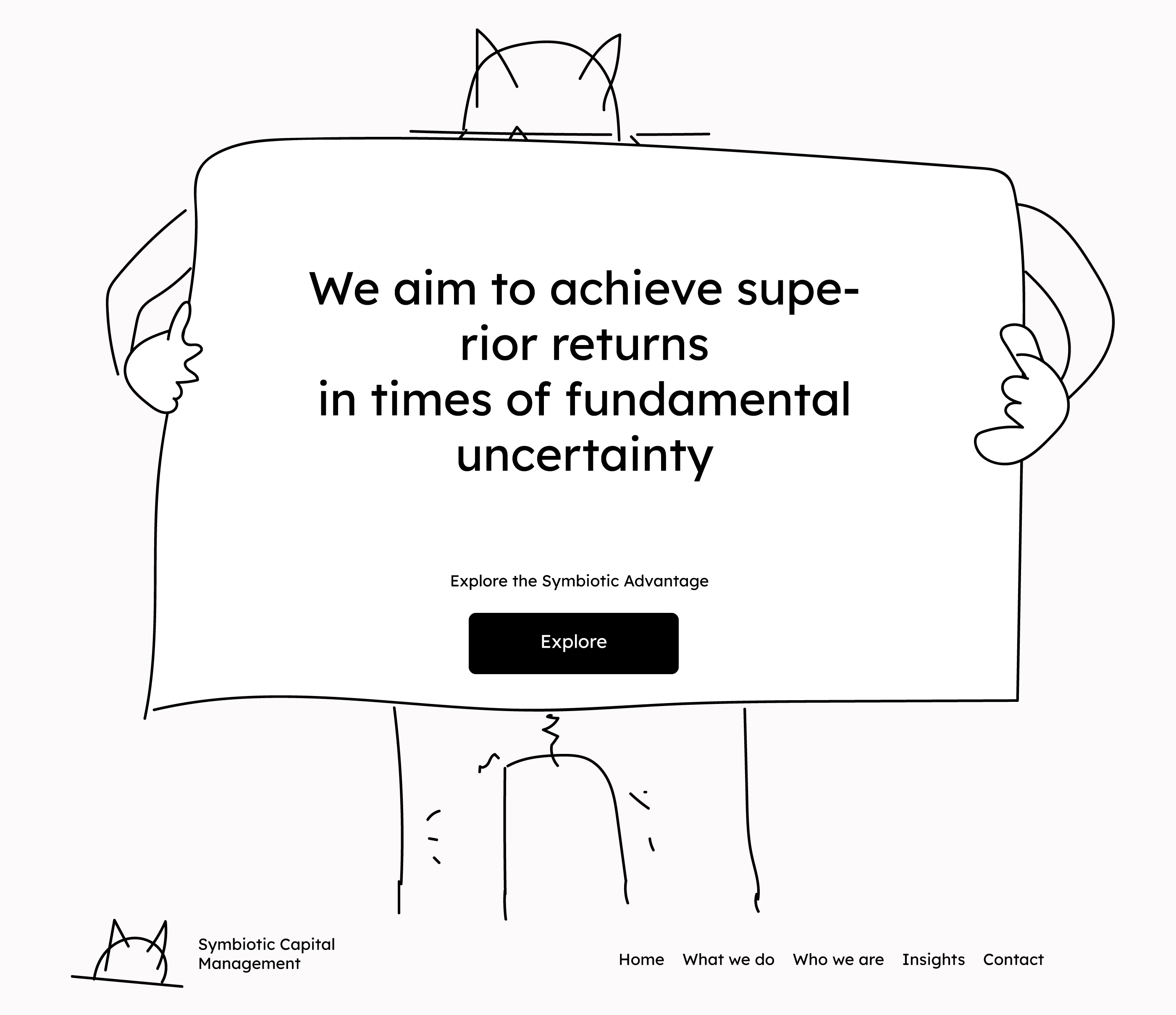
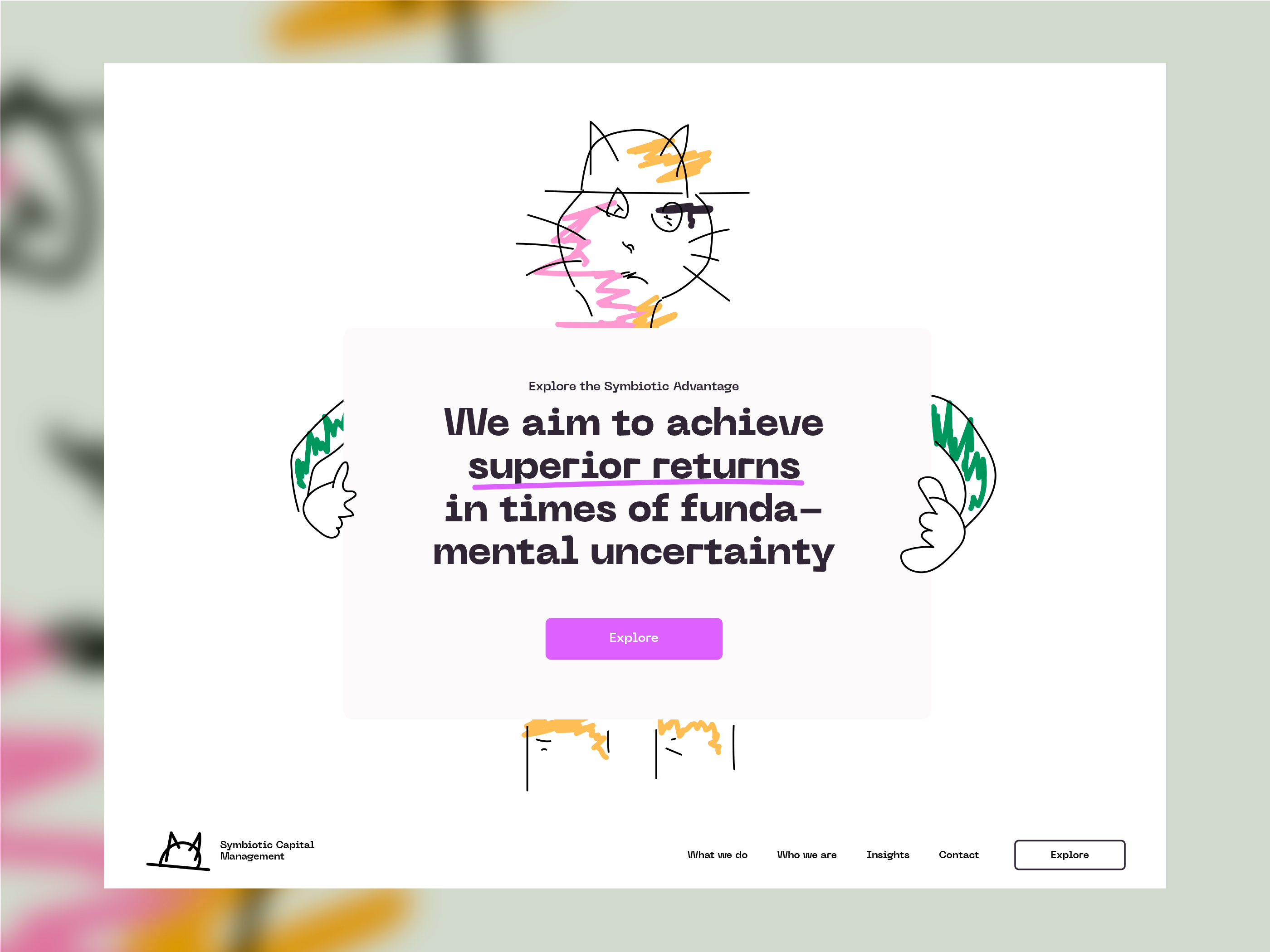
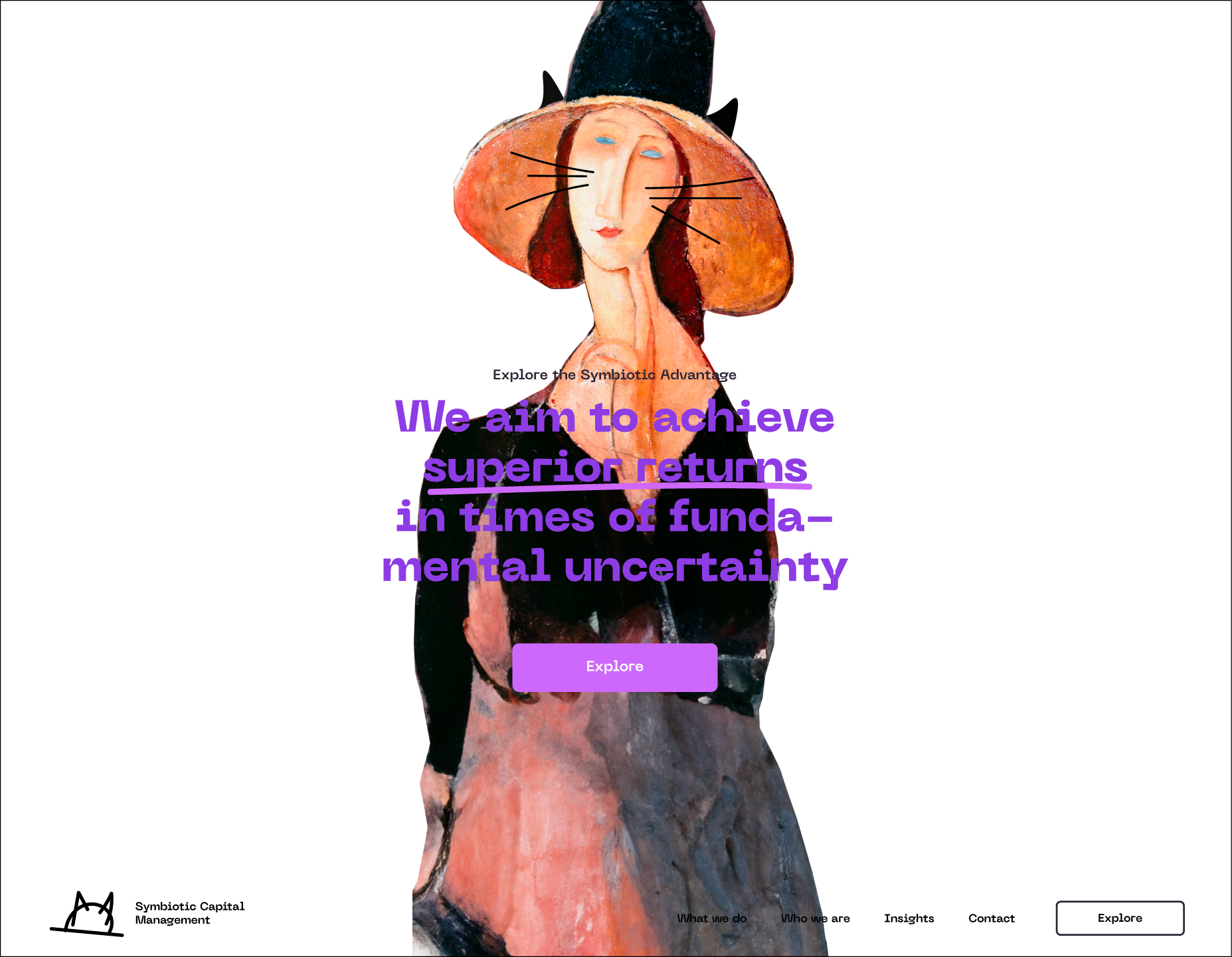
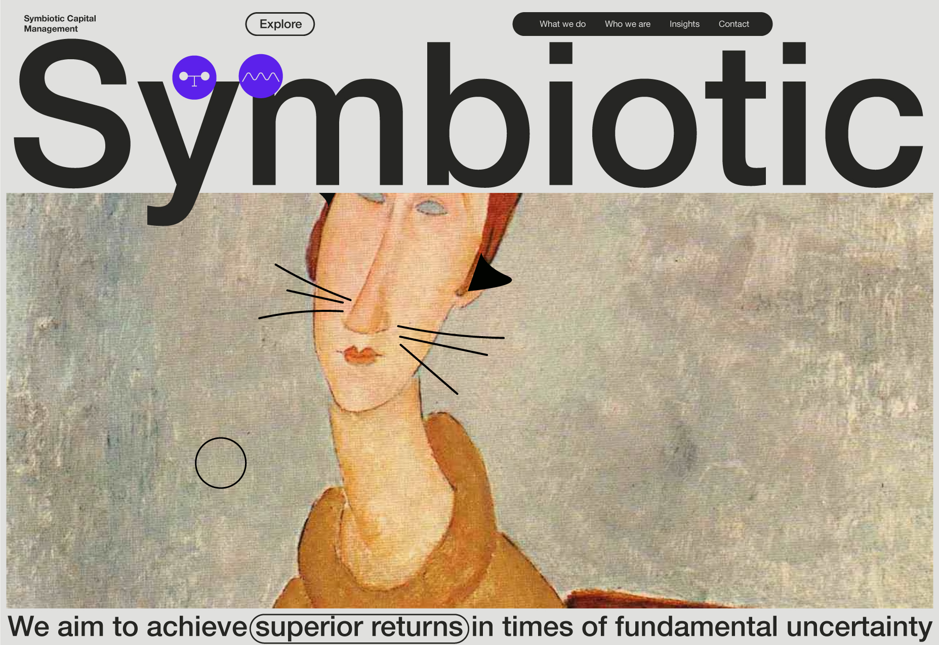
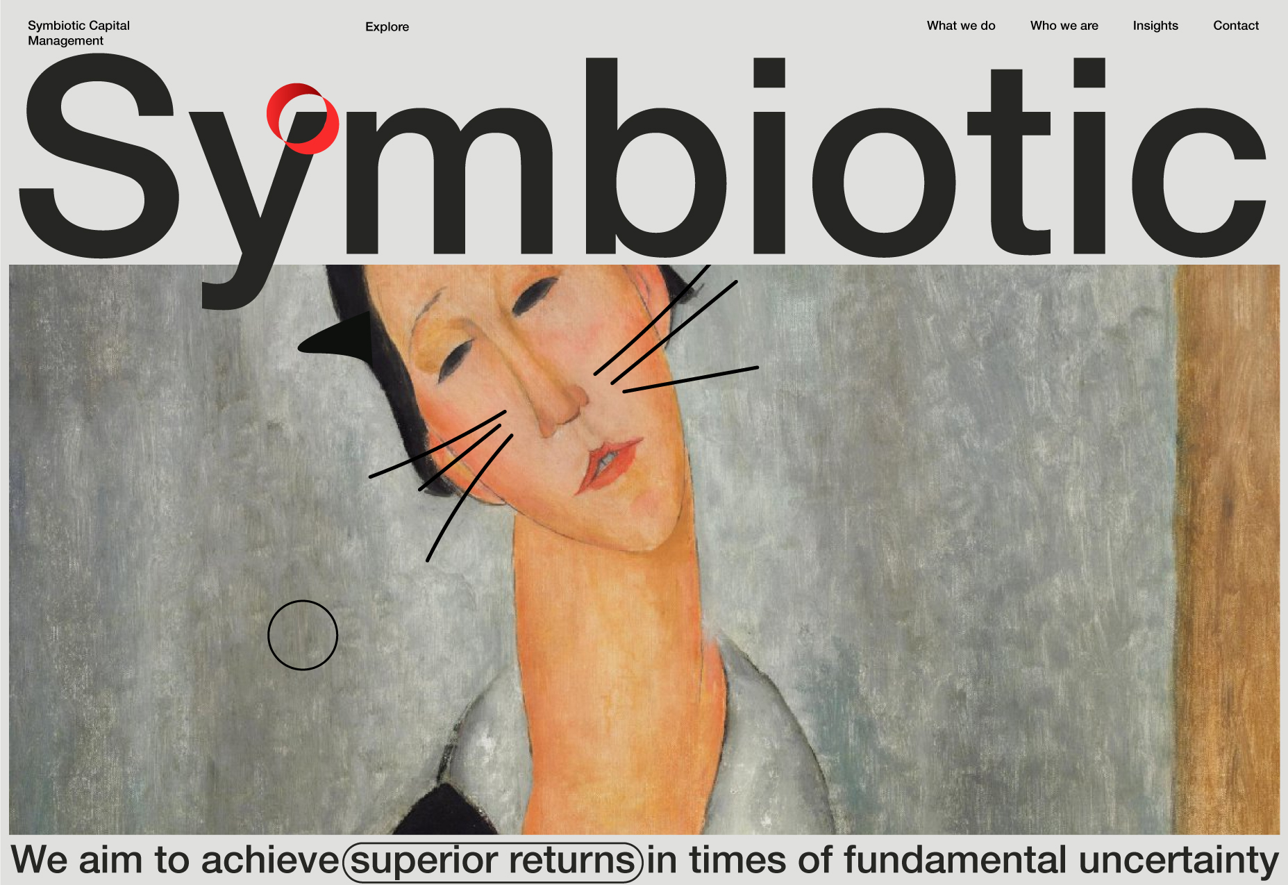
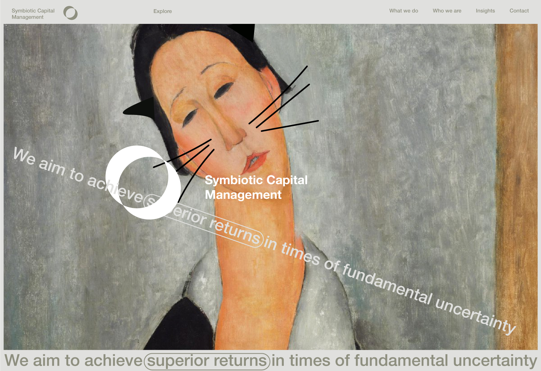
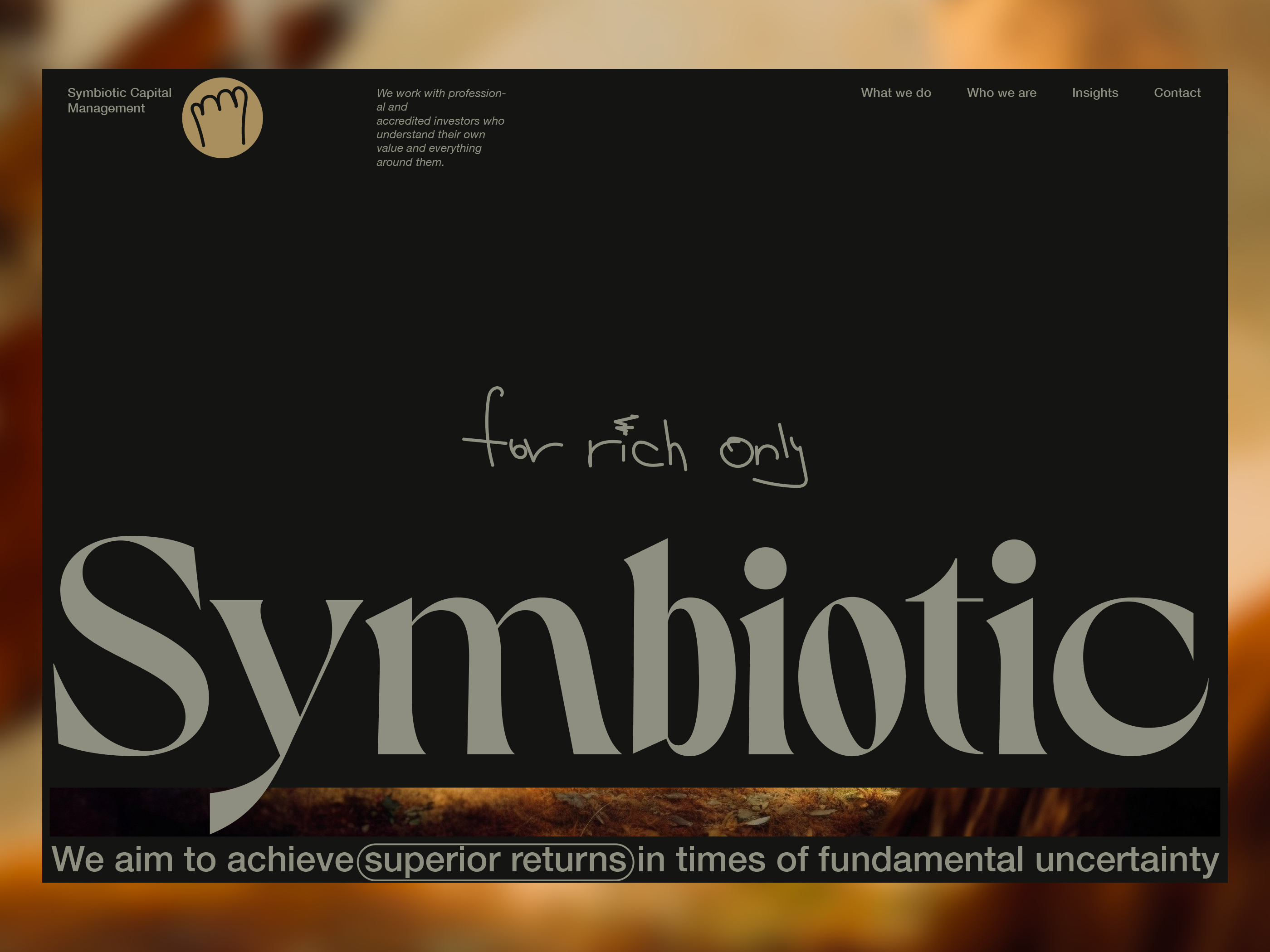
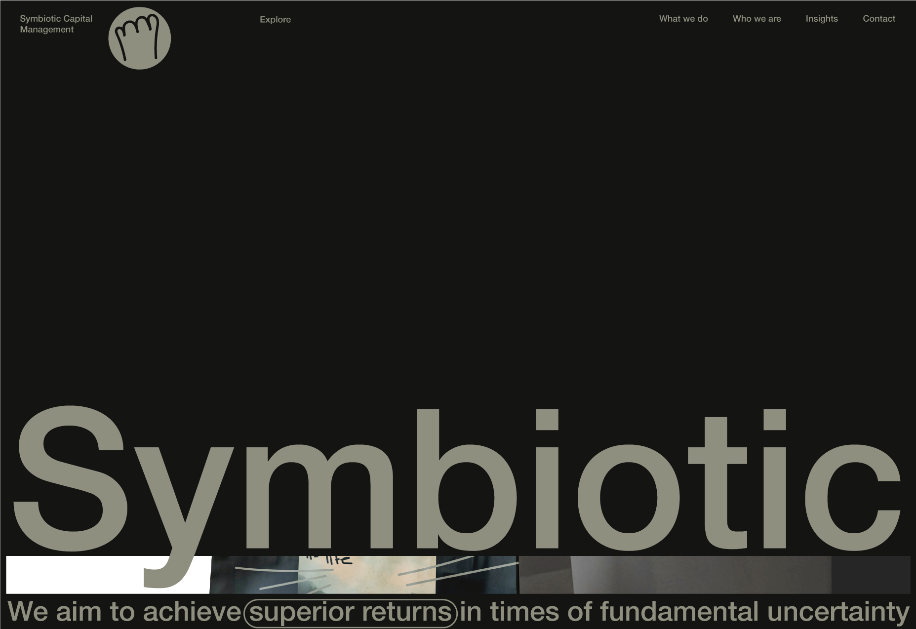
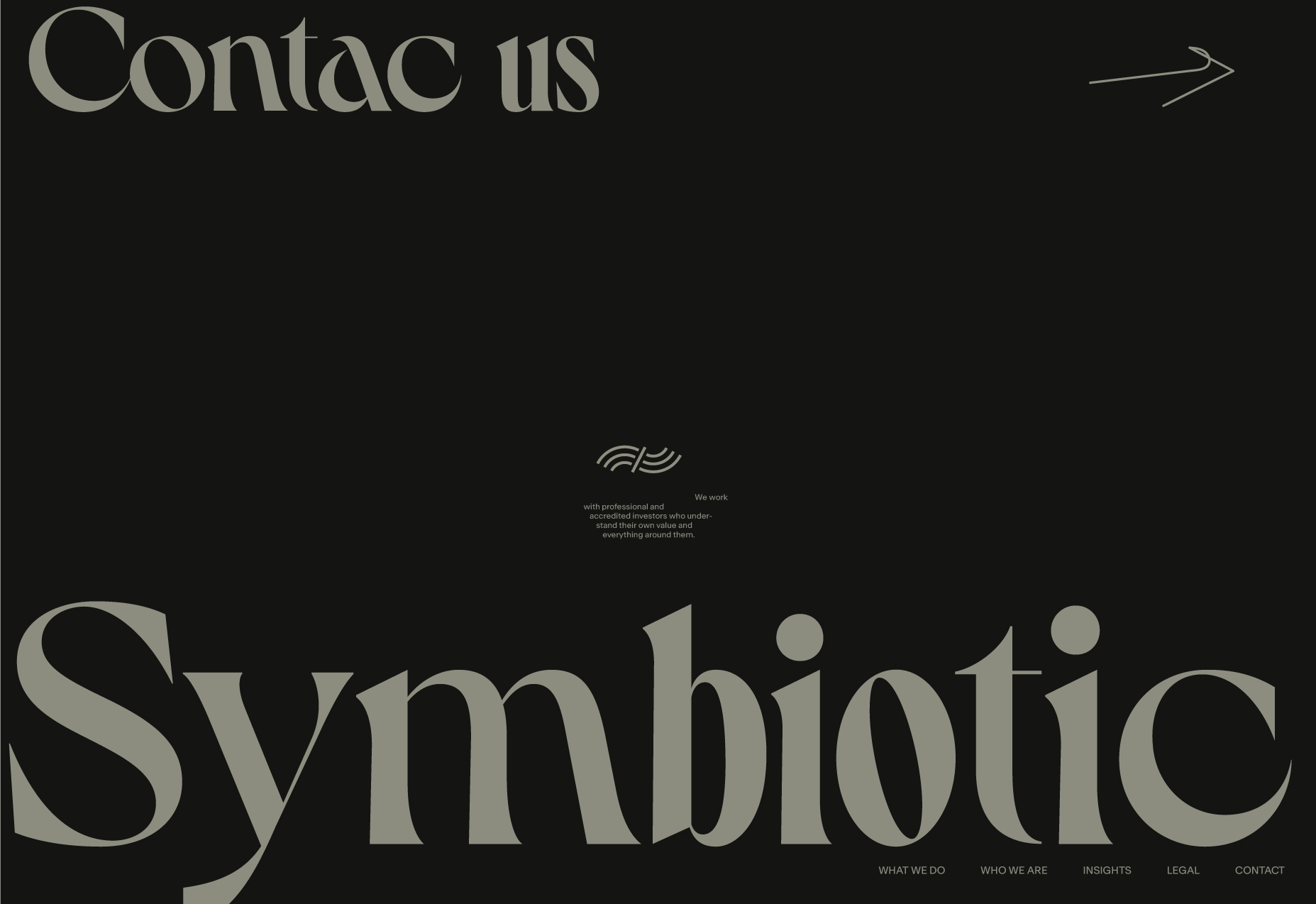
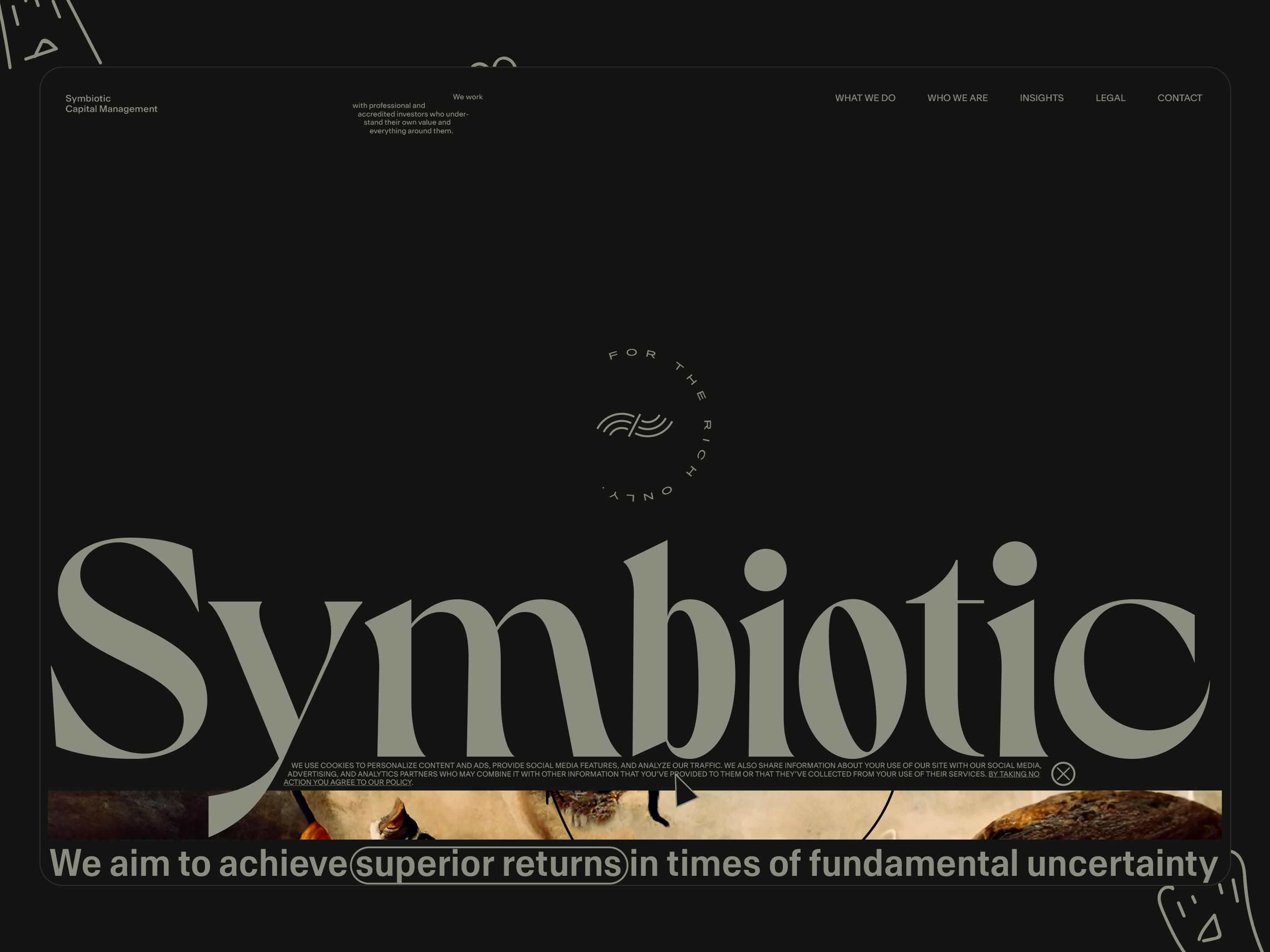
Landing above-the-fold story
Landing ATF open.
Landing ATF on scroll 1.
Landing ATF on scroll 2.
Landing ATF on scroll 3.
Landing ATF on scroll 4 + image animation idea (English bowler) 1.
Landing ATF on scroll 5 + image animation idea (hat) 2.
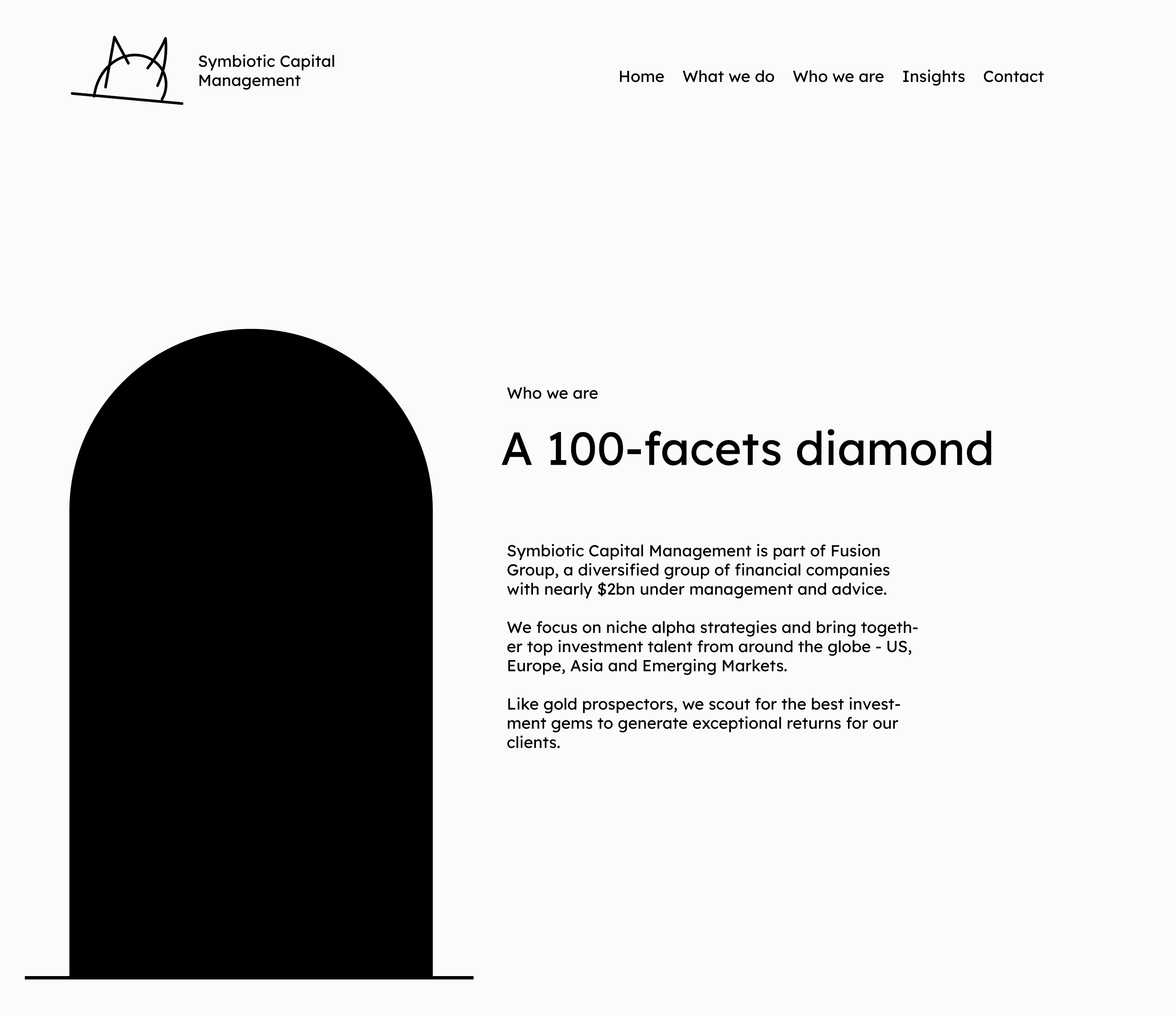
Image animation idea (hat) 3.
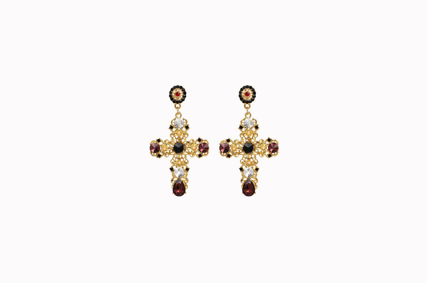
Visual direction idea
Using popular elements that people familiar with.
Use accessories like earrings and other jewelry.
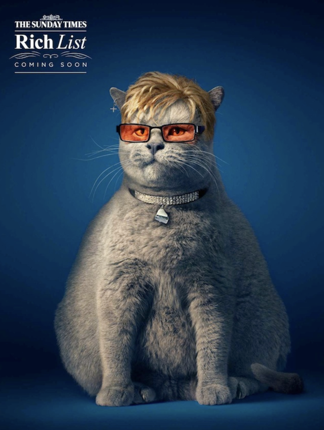
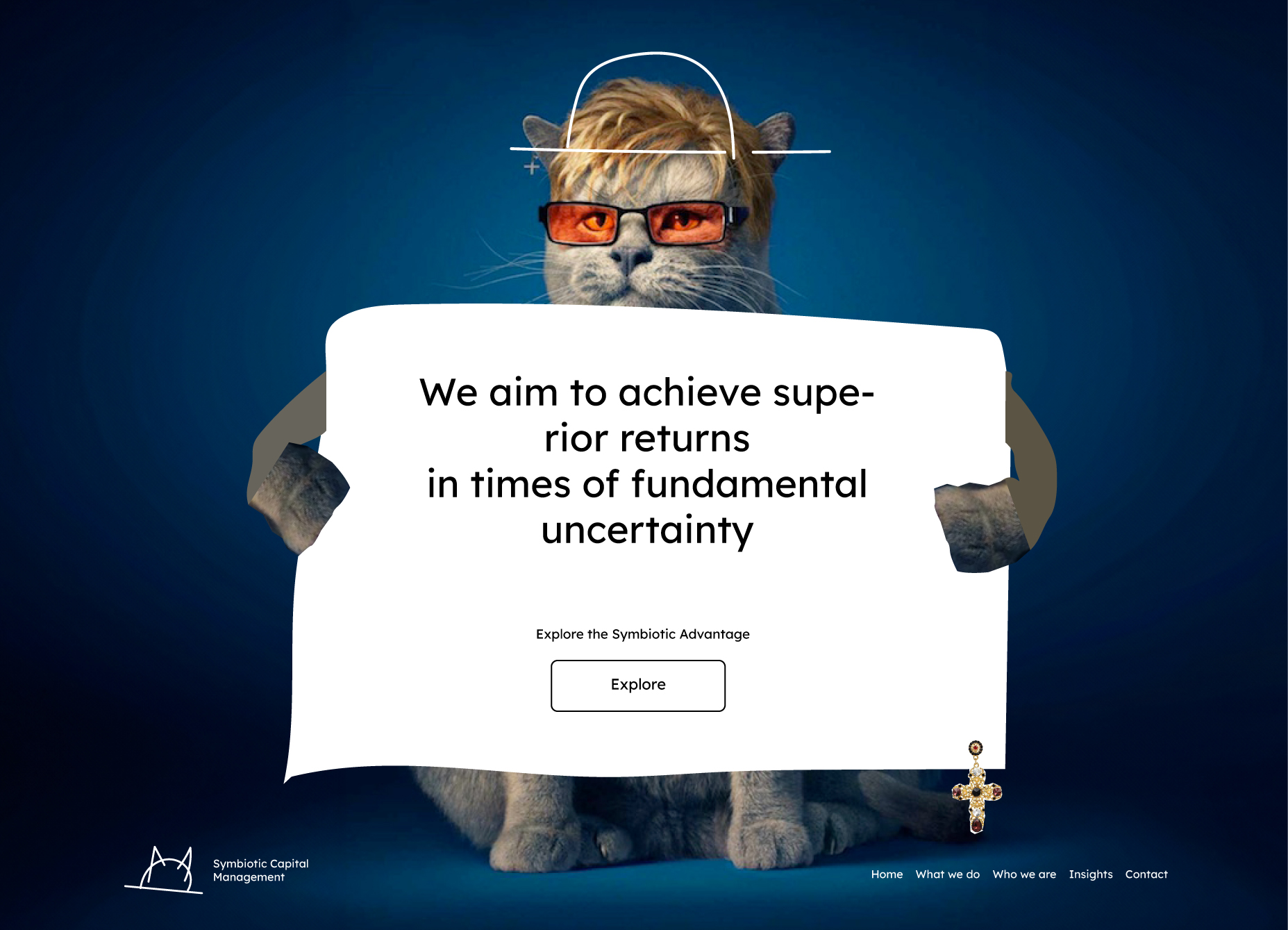
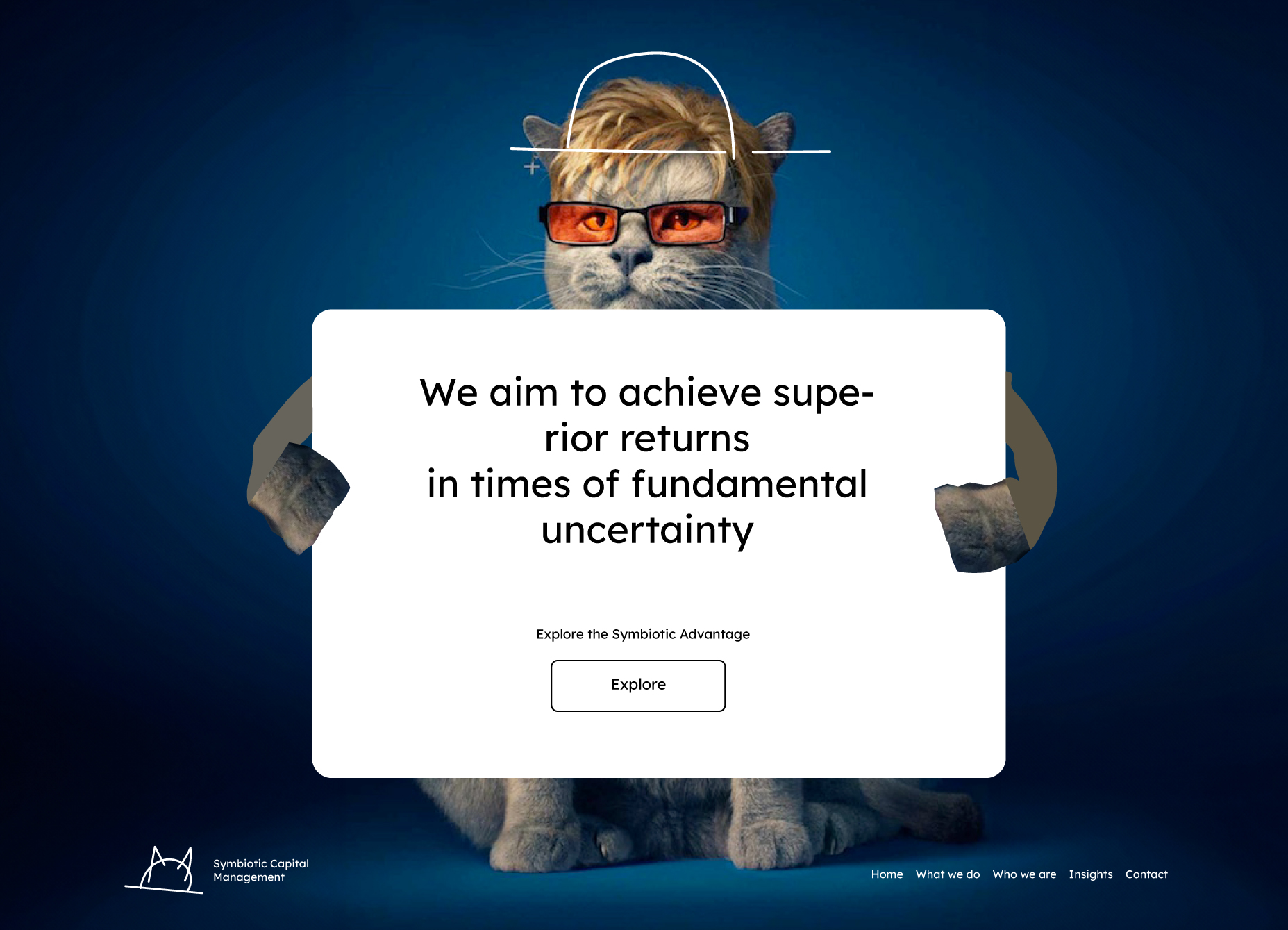
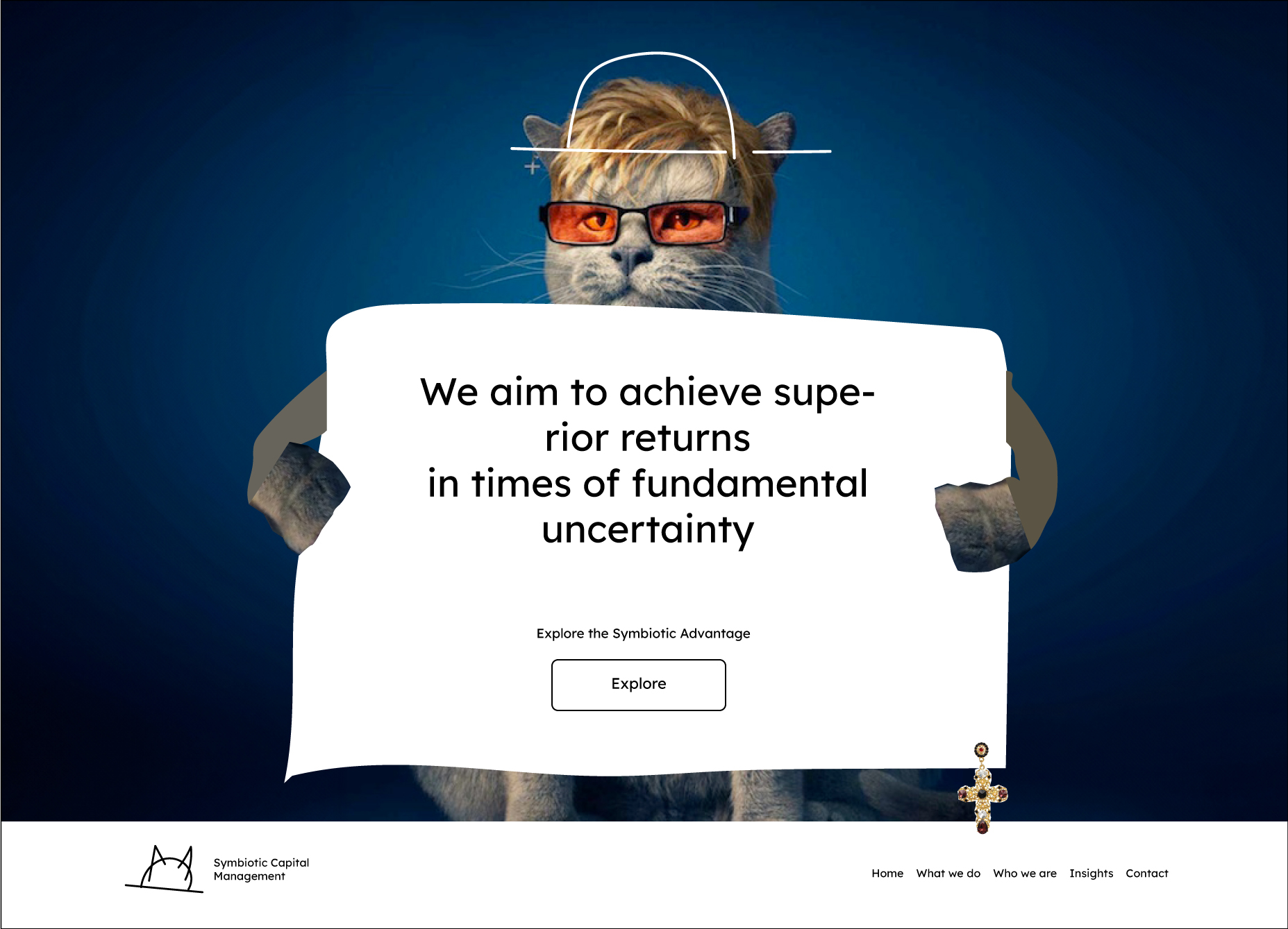
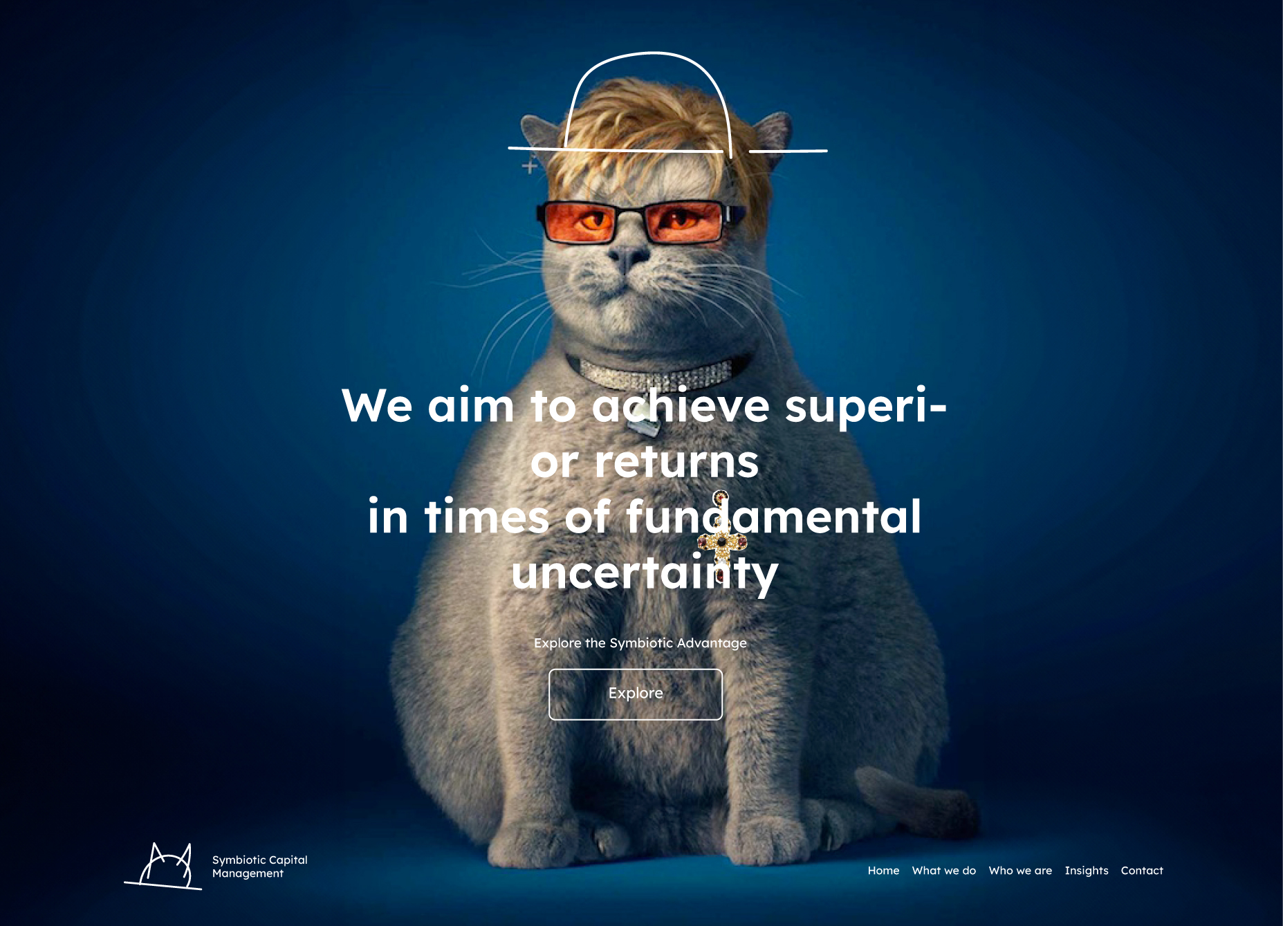
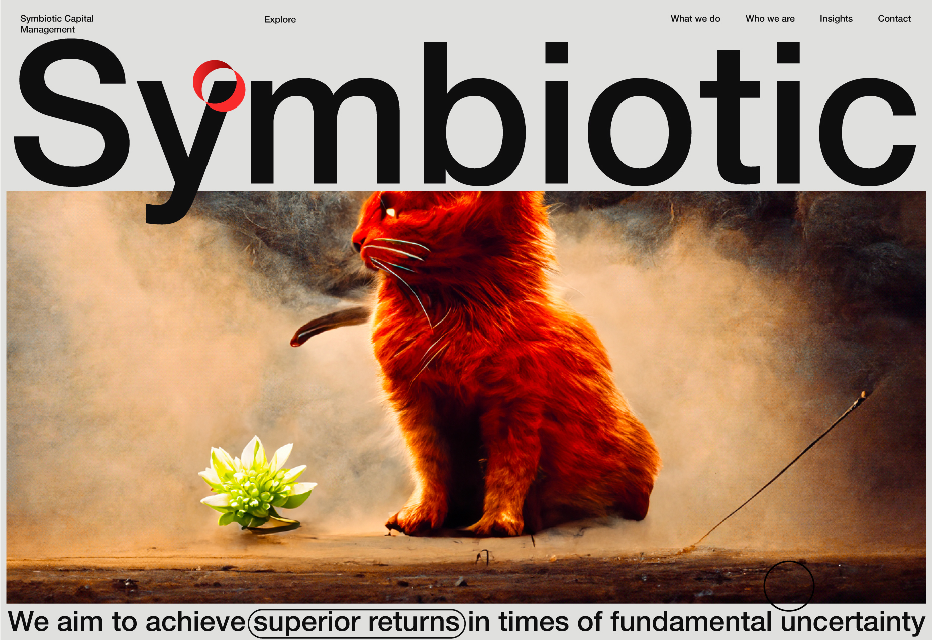
Fat Cat.
The term "Fat Cat" in English has a play on words: literally, it is "fat cat," but this is what the rich and successful people of the country are called. Photographer Tim Flach photographed the fat cats, and then Anthony Crossfield attached the faces of Richard Branson, Elton John, and Simon Cowell to them.
Proof of concept
Landing ATF open.
As a standard square for the main info block is not as good as in the previous version.
Landing ATF navigation on the scroll.
Landing ATF open version without hero section bg.
Landing ATF open test 1.
Elton John, Dua Lipa - Cold Heart as a cover art.
Landing ATF open test 2.
Cssfox web design community (v10) hero image as a cover art.
Landing ATF open test 3.
Test without main content block border.
Landing ATF open. Solid version.
I think this direction has great potential. However, the following experiments led me to a different place, despite the fact that I like this direction very much.
Visual direction ideas.
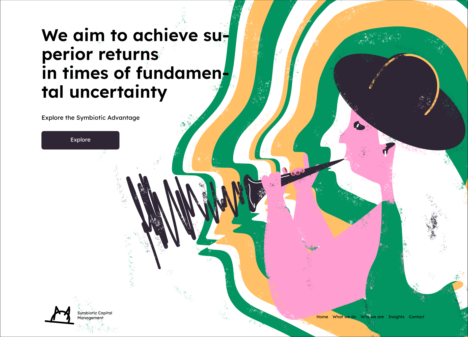
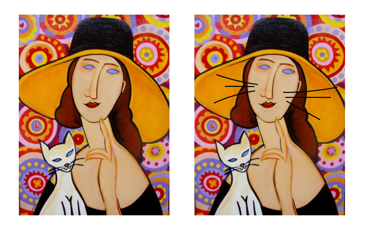
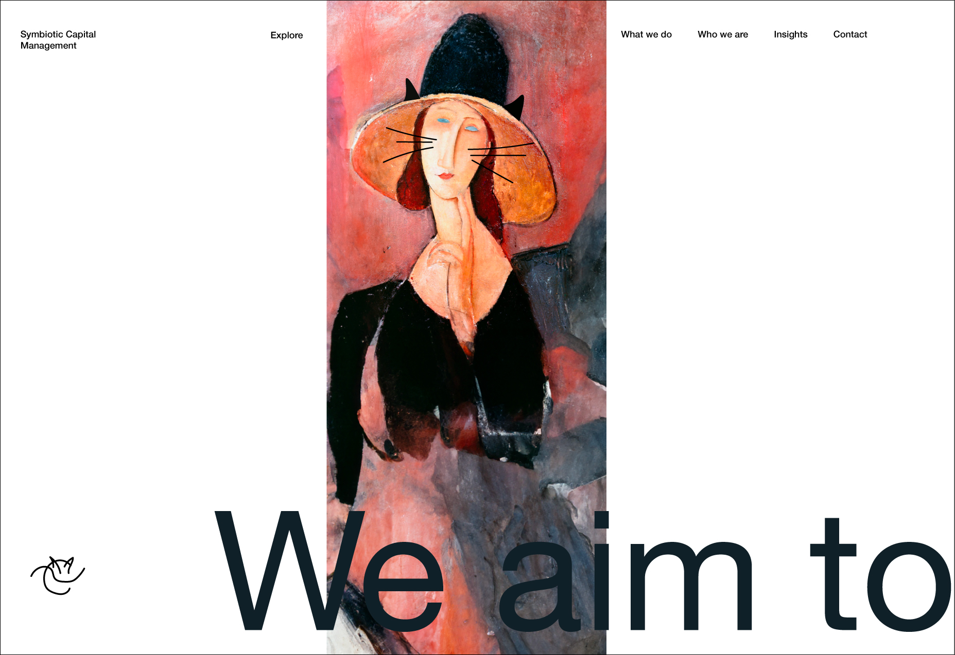
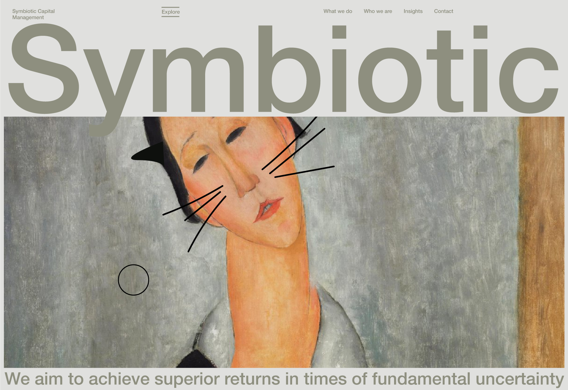
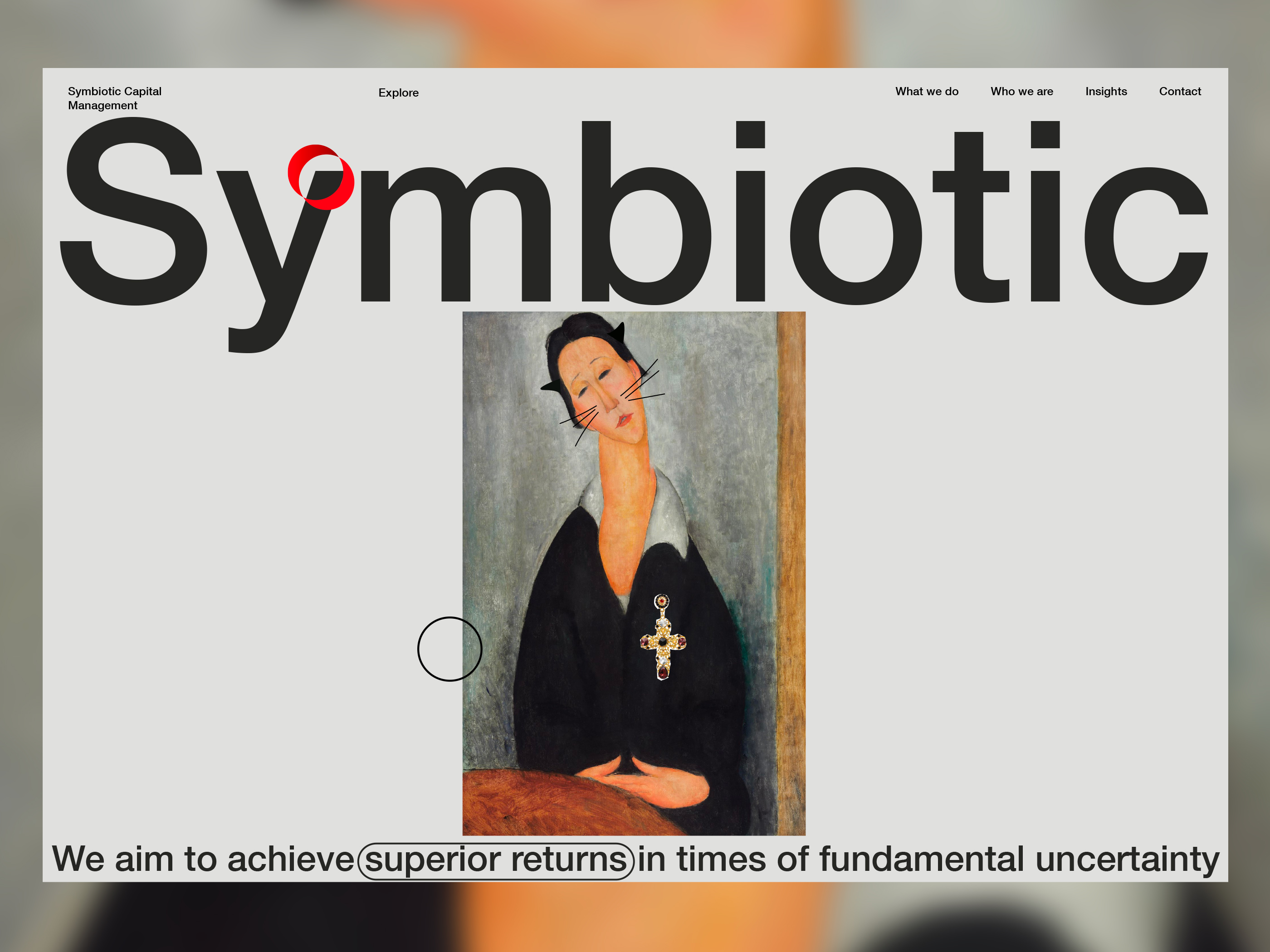
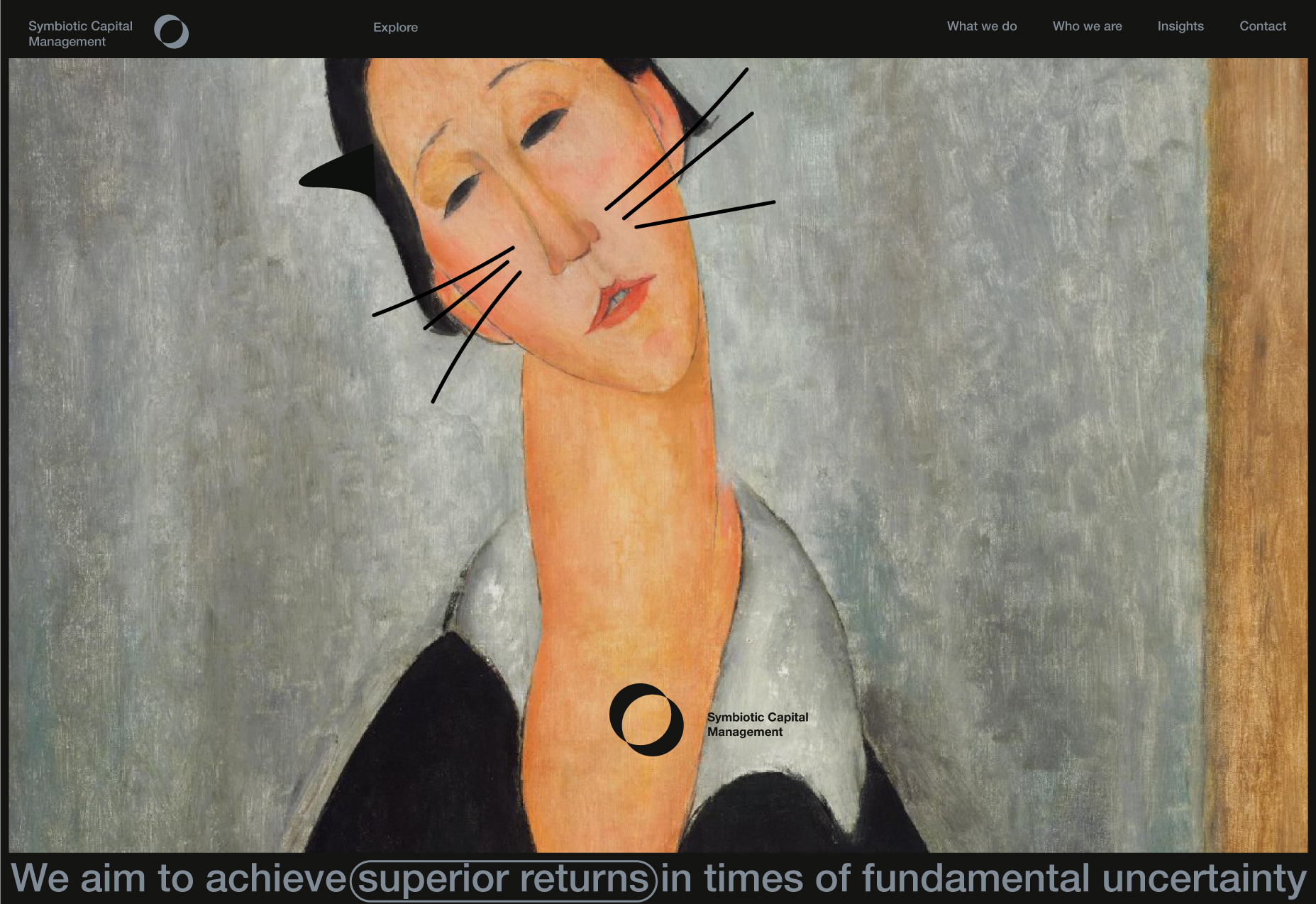
Inspirations: Bernardo Henning "Adobe Photoshop" and "The Cat in the Hat" by Dr. Seuss
Amedeo Modigliani / cat
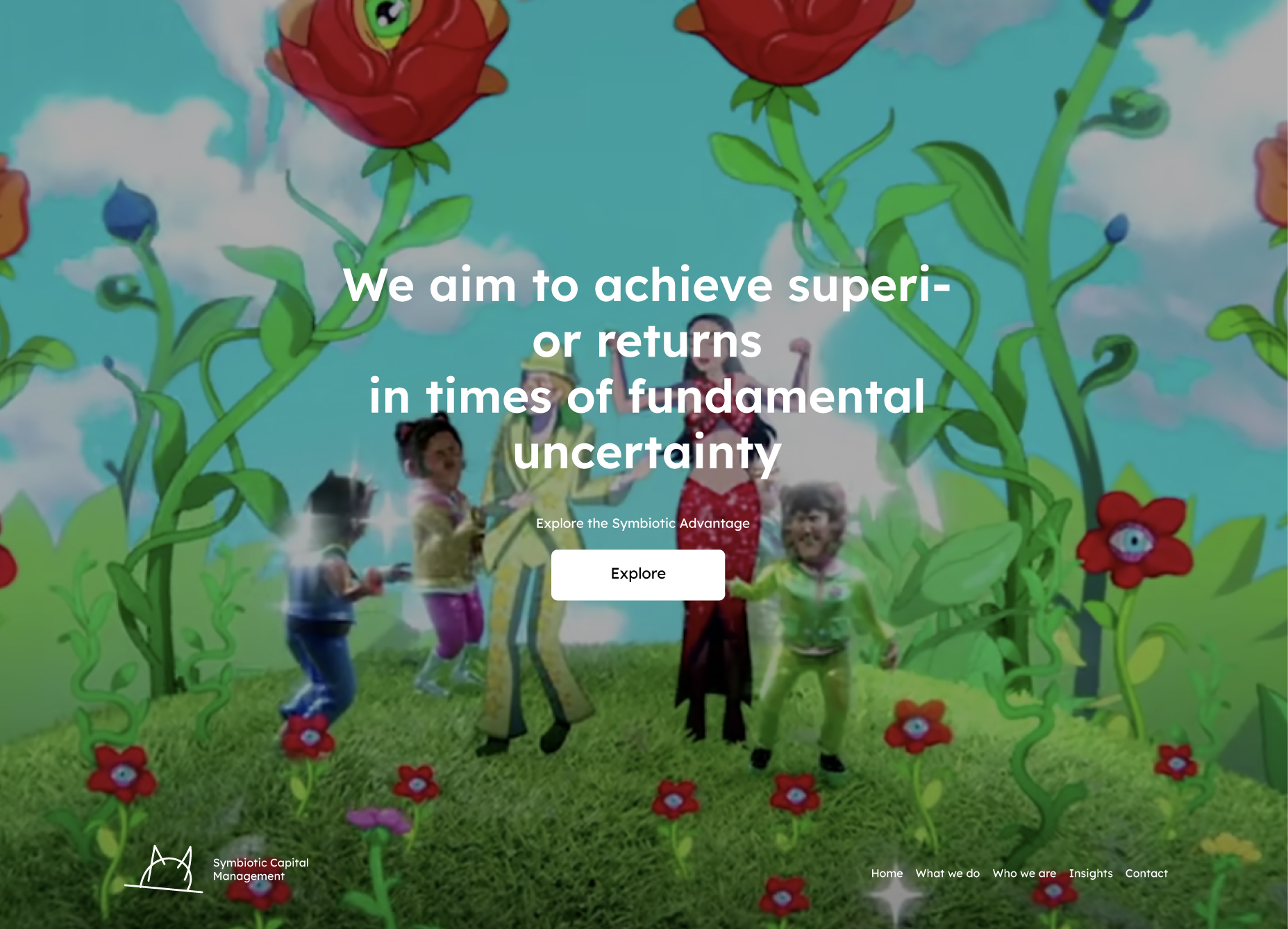
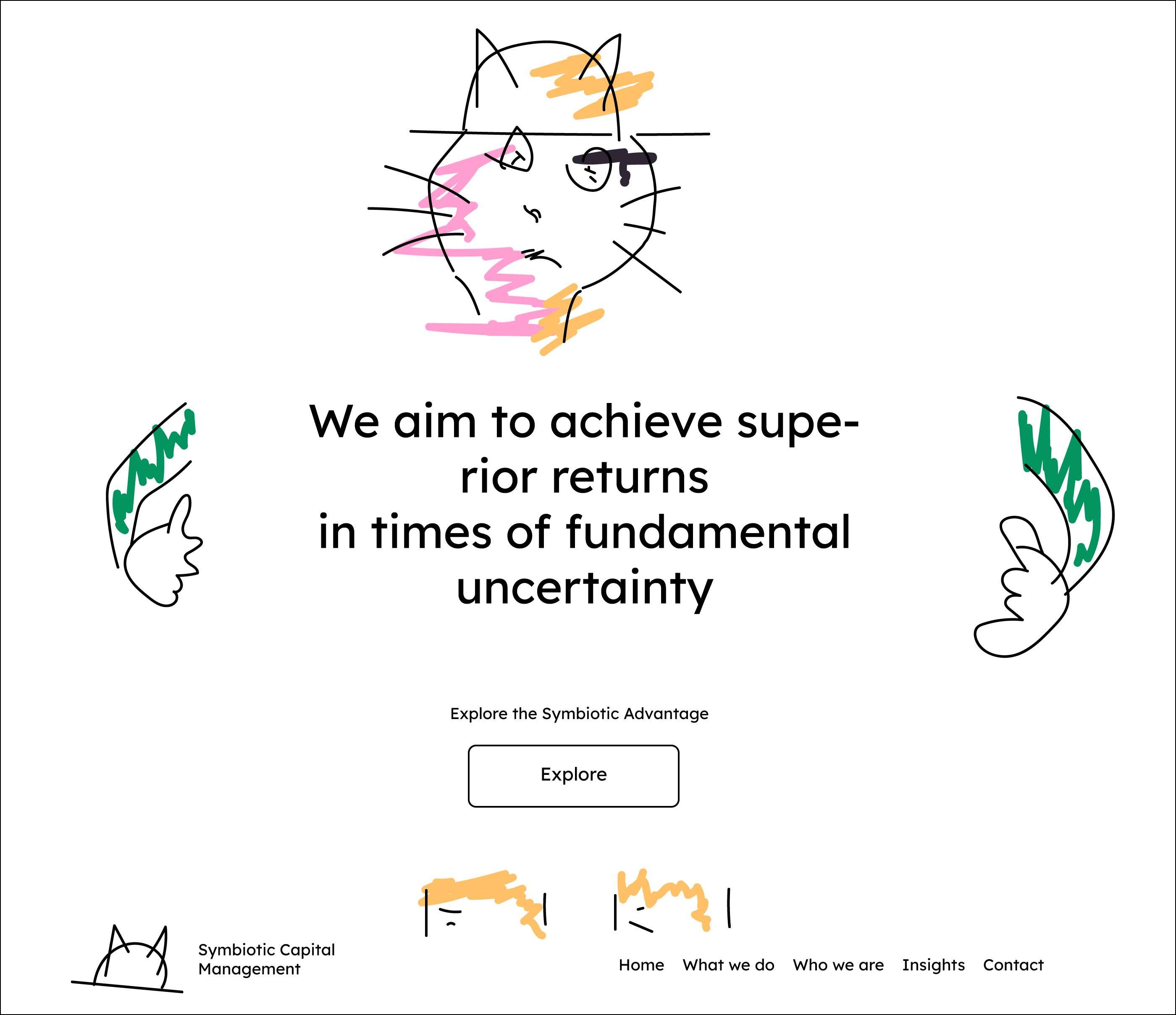
Exploring other directions.
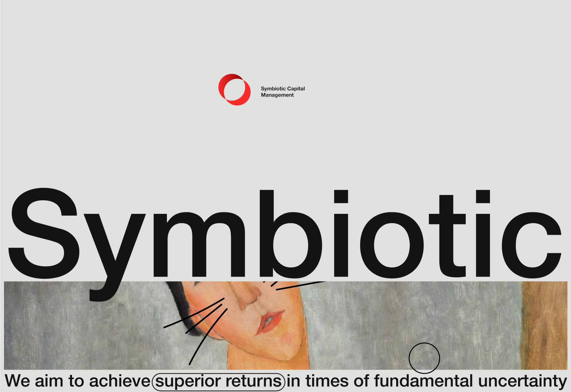
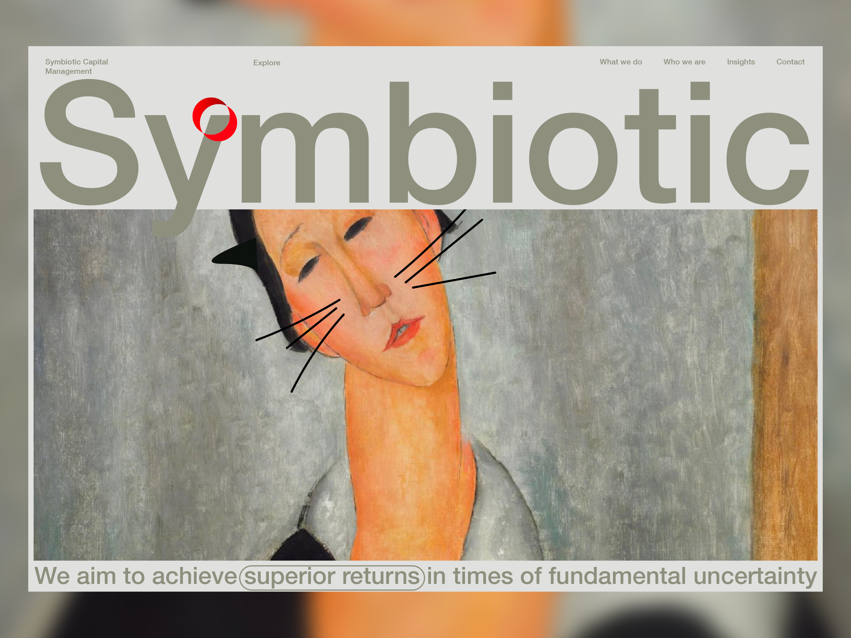
As can be seen, all the above presents the information as a group (one of the common solutions), mainly at the center of the canvas. Below, I am experimenting with the different placements, trying to understand better what would be the best information hierarchy, what needs to be the main focus, and what can be moved to the background.
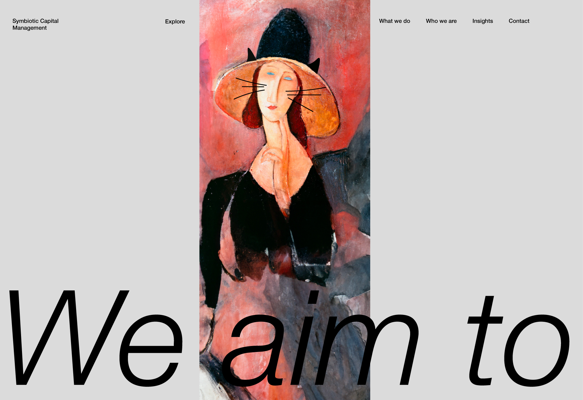
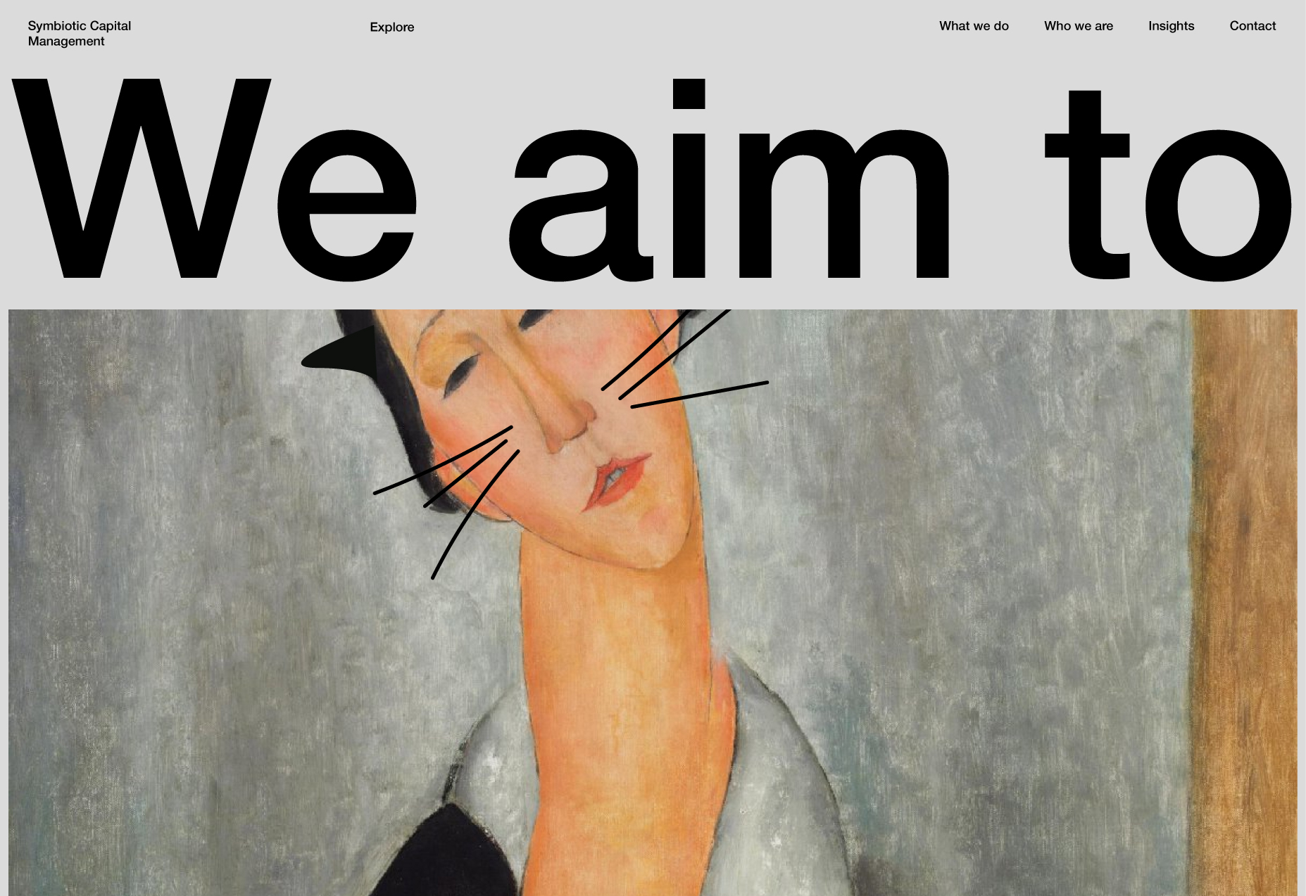
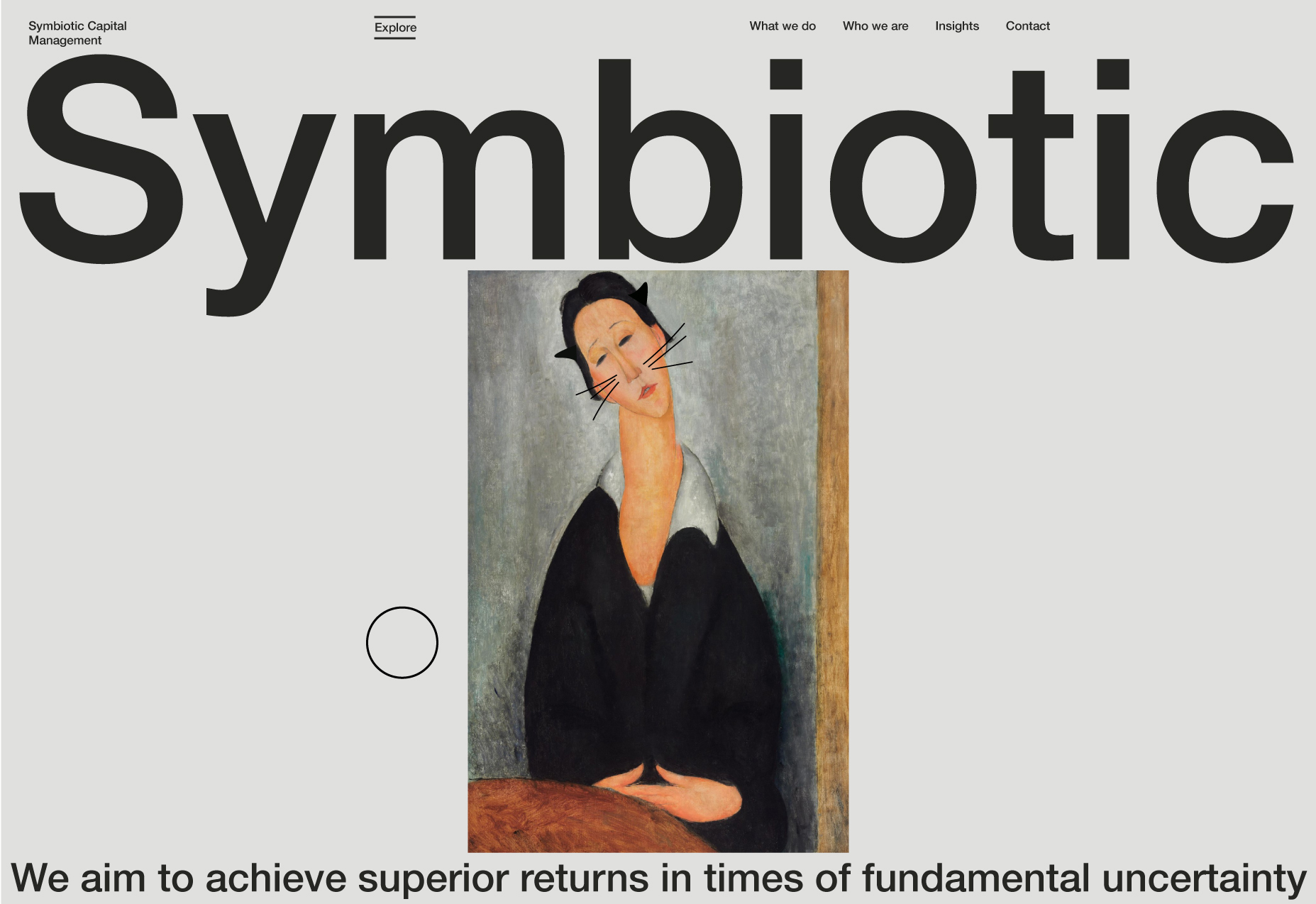
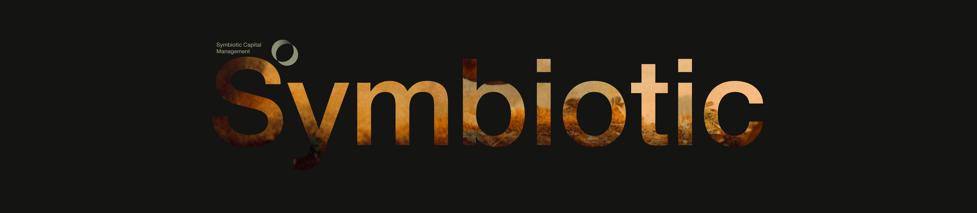
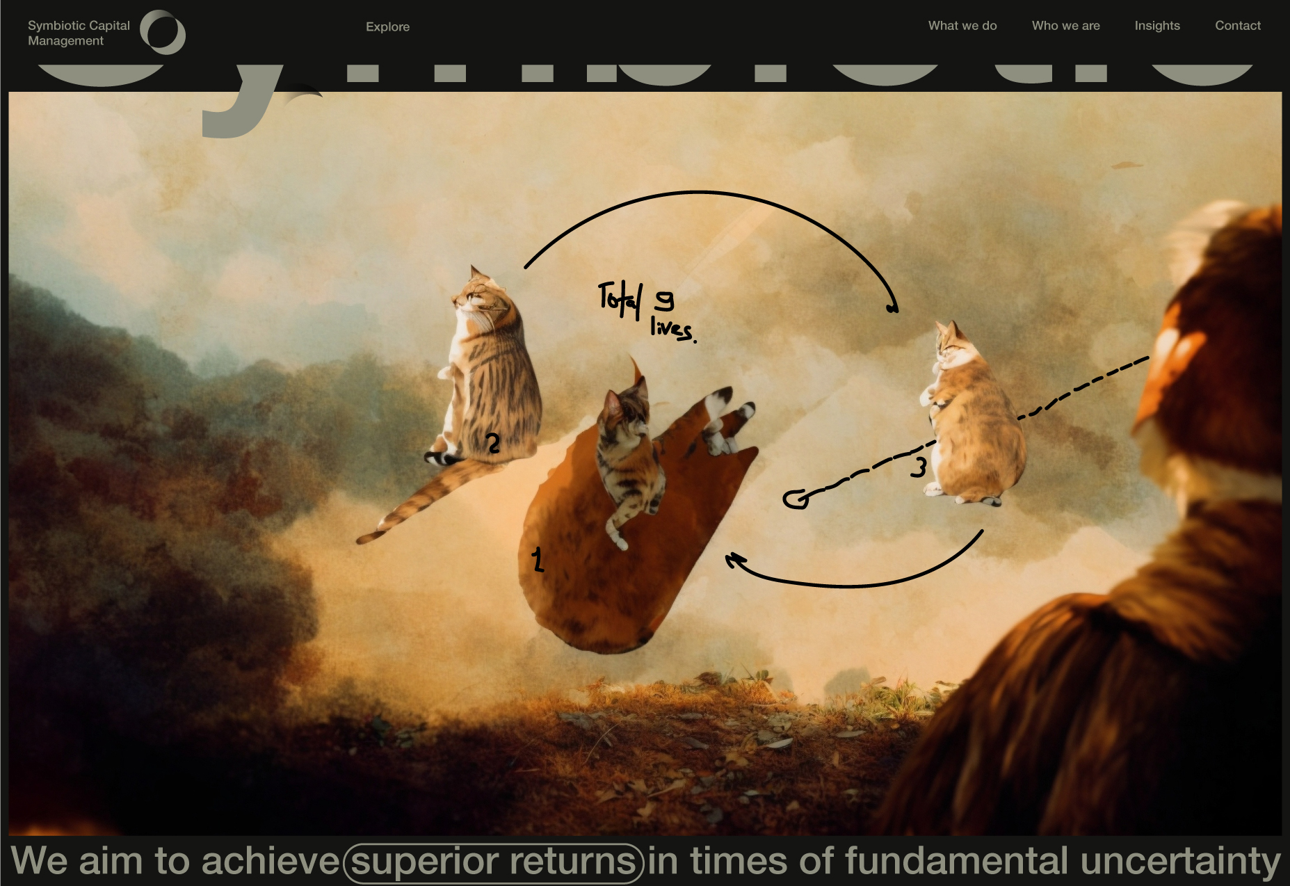
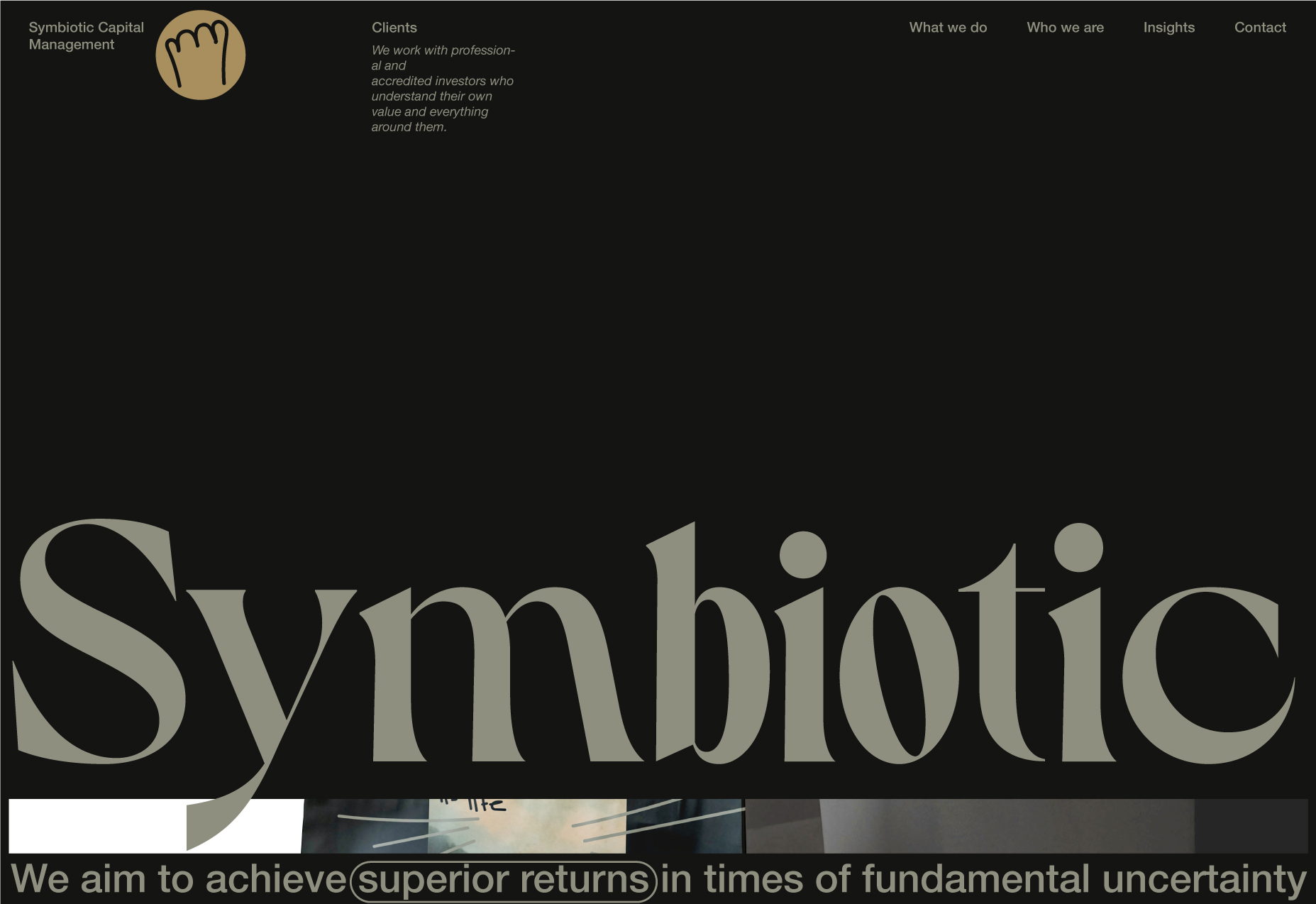
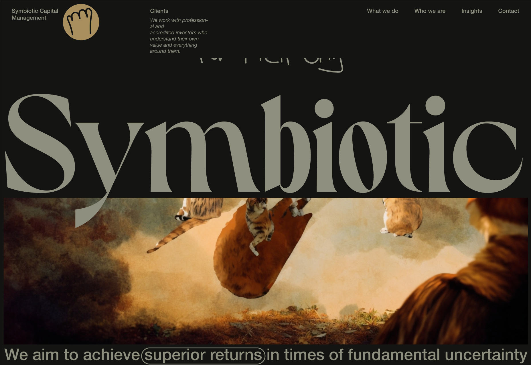
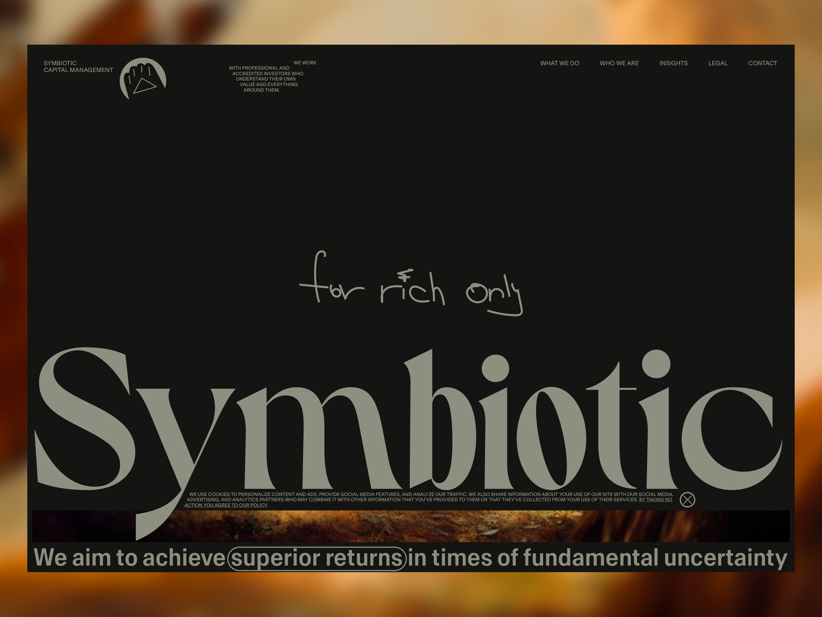
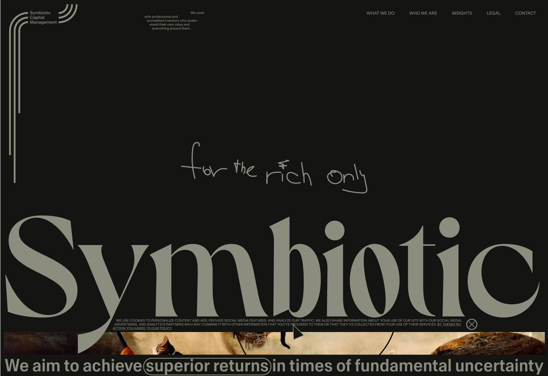
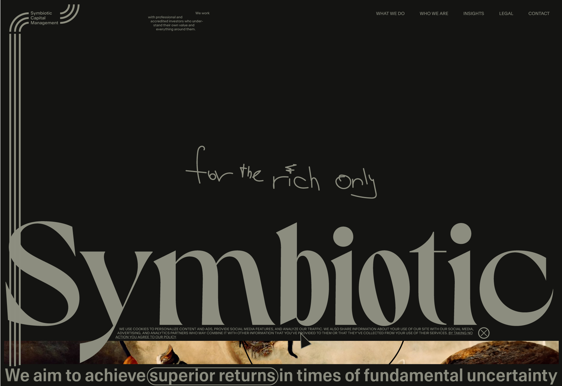
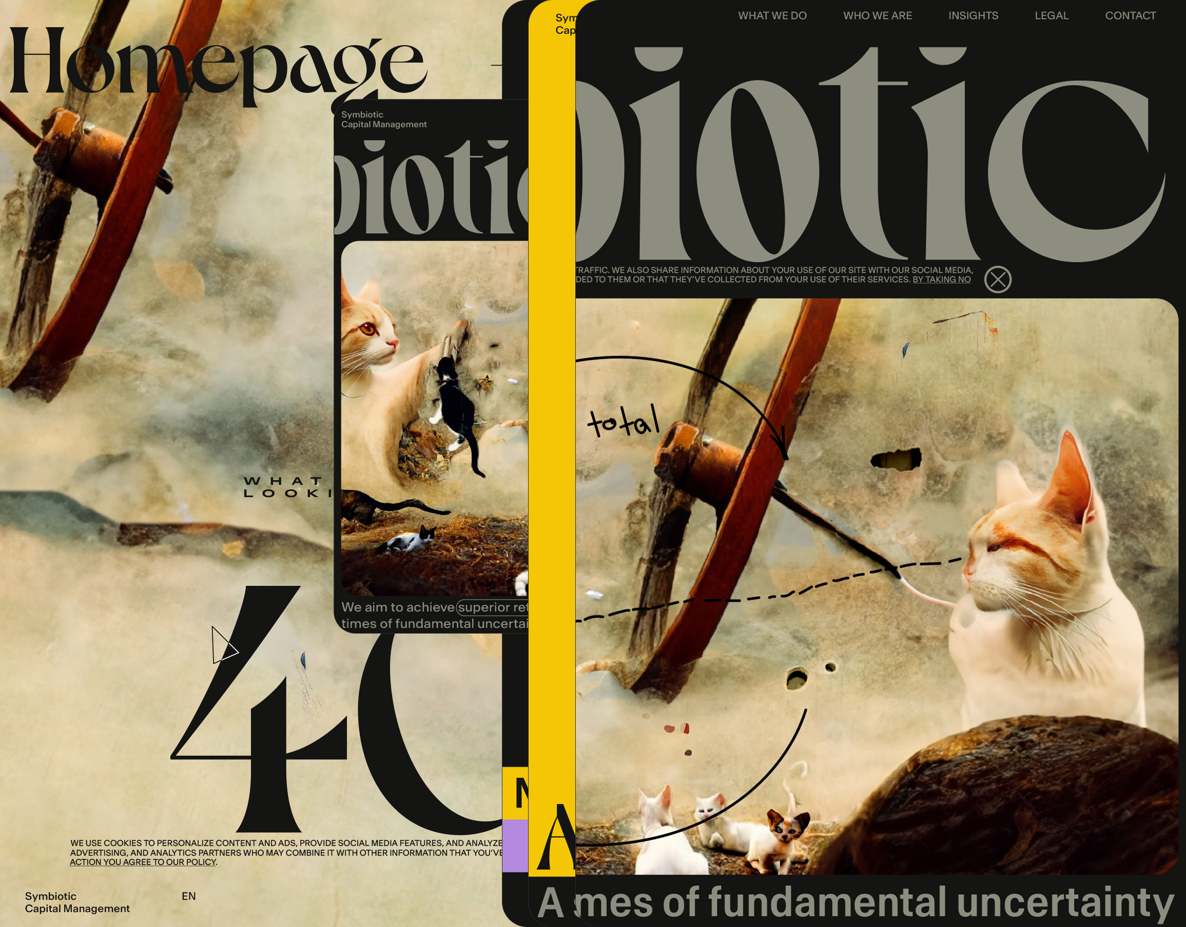
Started to put the primary focus on the word Symbiotic. From the received documents, I could clearly see that this also aligns with the folks' vision.
In comparison to previous experiments where the information is centralized, I have used the decentralized approach. Navigation, focus word, hero art, and description all look different, which highlights the hierarchy and guides the user to read in a certain order.
Basically, the way information should be presented needs to flow according to what the business is trying to tell the user. For example, bigger text is more prominent, the image is seen before the text, and so on.
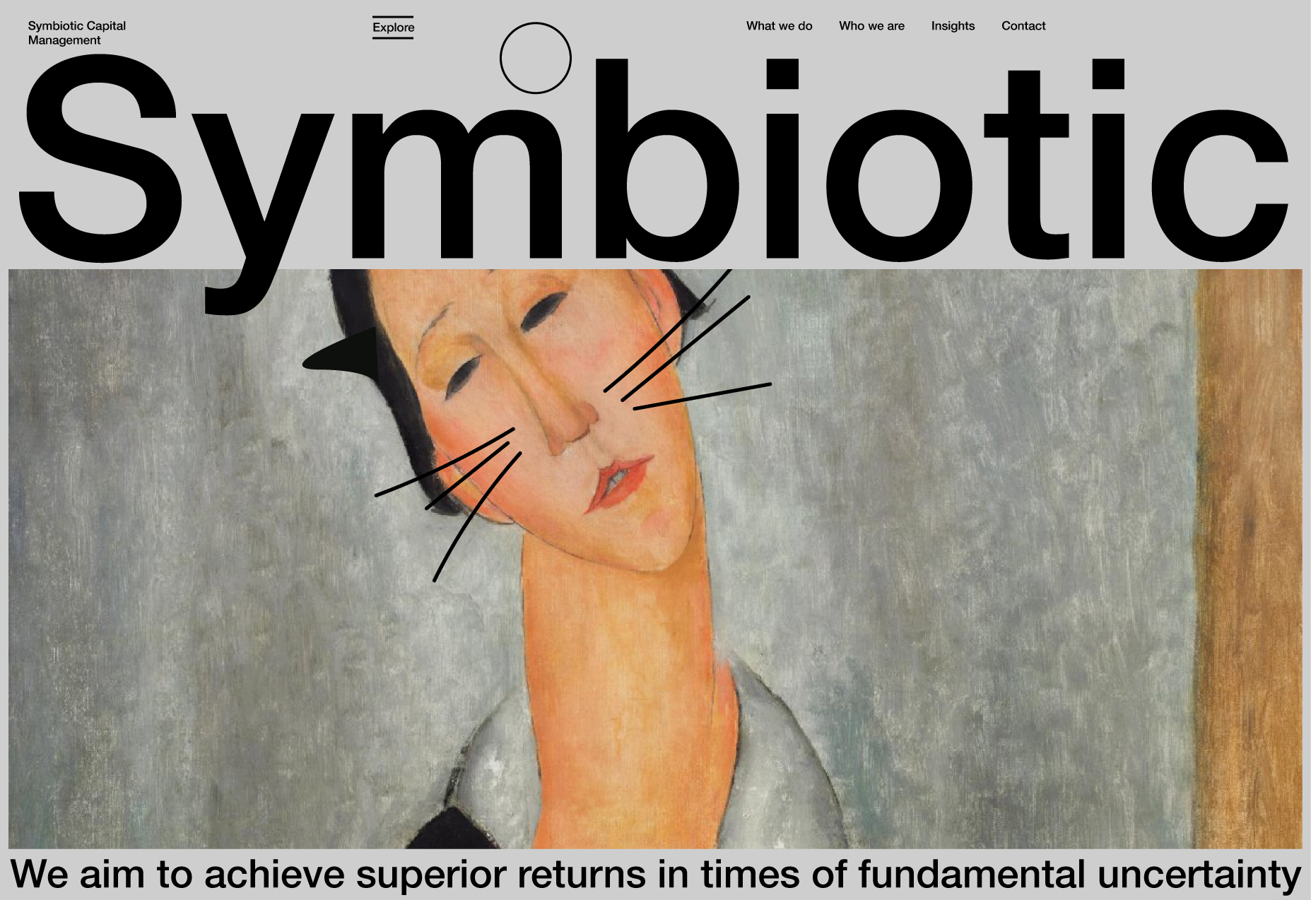
As you already saw, starting a few images back, I started to explore a better focus on the Symbiotic word, building a new hierarchy. As a result, here is an attempt to explore the symbol (logomark). The symbol is the first letter of the word Symbiotic - S. As the symbiotic is two, the circle is divided, and we receive two equal parts + sort of US dollar sign, which may be a good concept.
Exploring different symbols.
Logomark
Two circles create a tunnel or pipe, and both are related to the movement - simultaneous movement of the two organisms. Or the marriage ring.
The simplest shape is a circle. The symbiotic is two circles that intersect. We will keep only the parts that do not intersect (unique). The tunnel is a good metaphor.
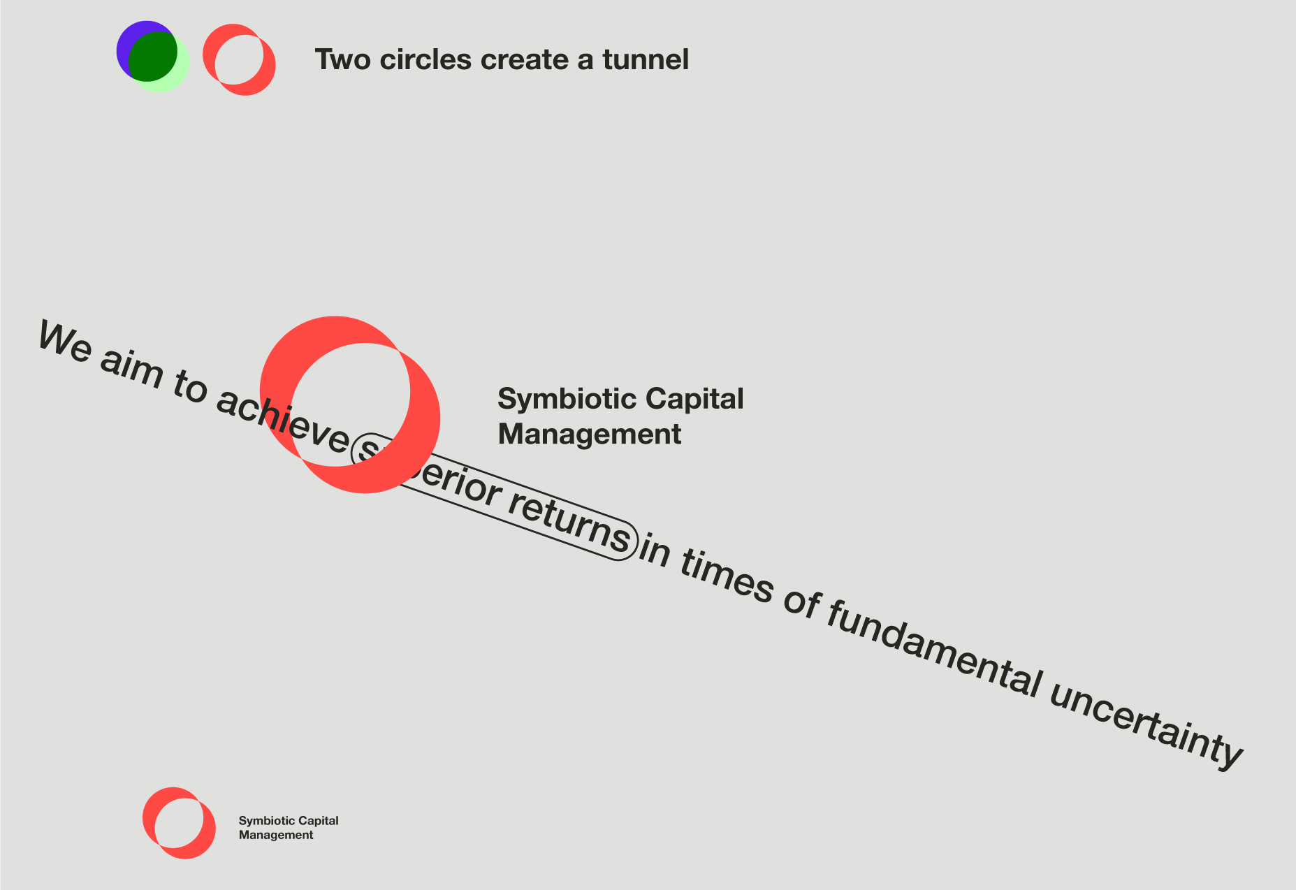
Content goes through the object.
Ring with the textual message.
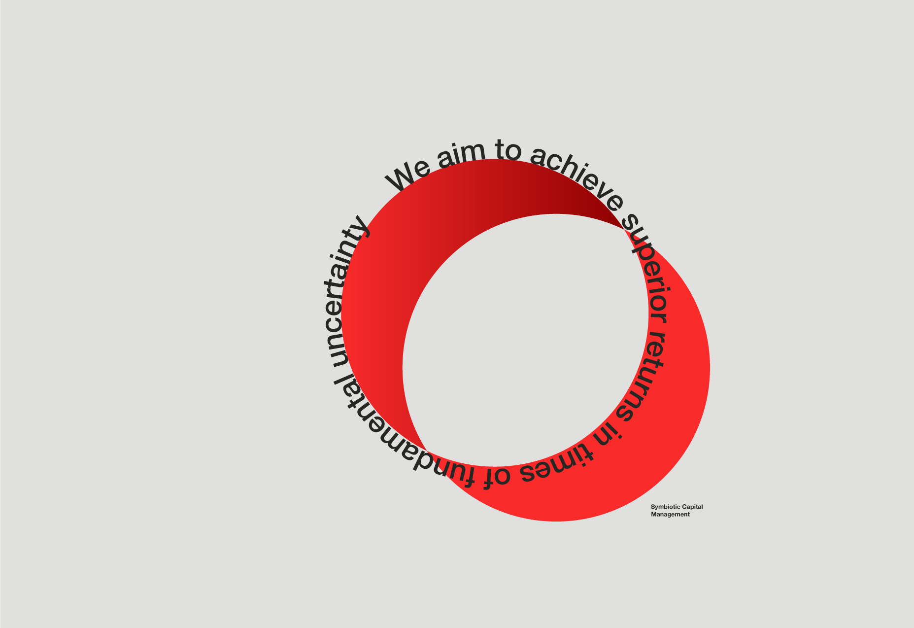
Content goes around the object.
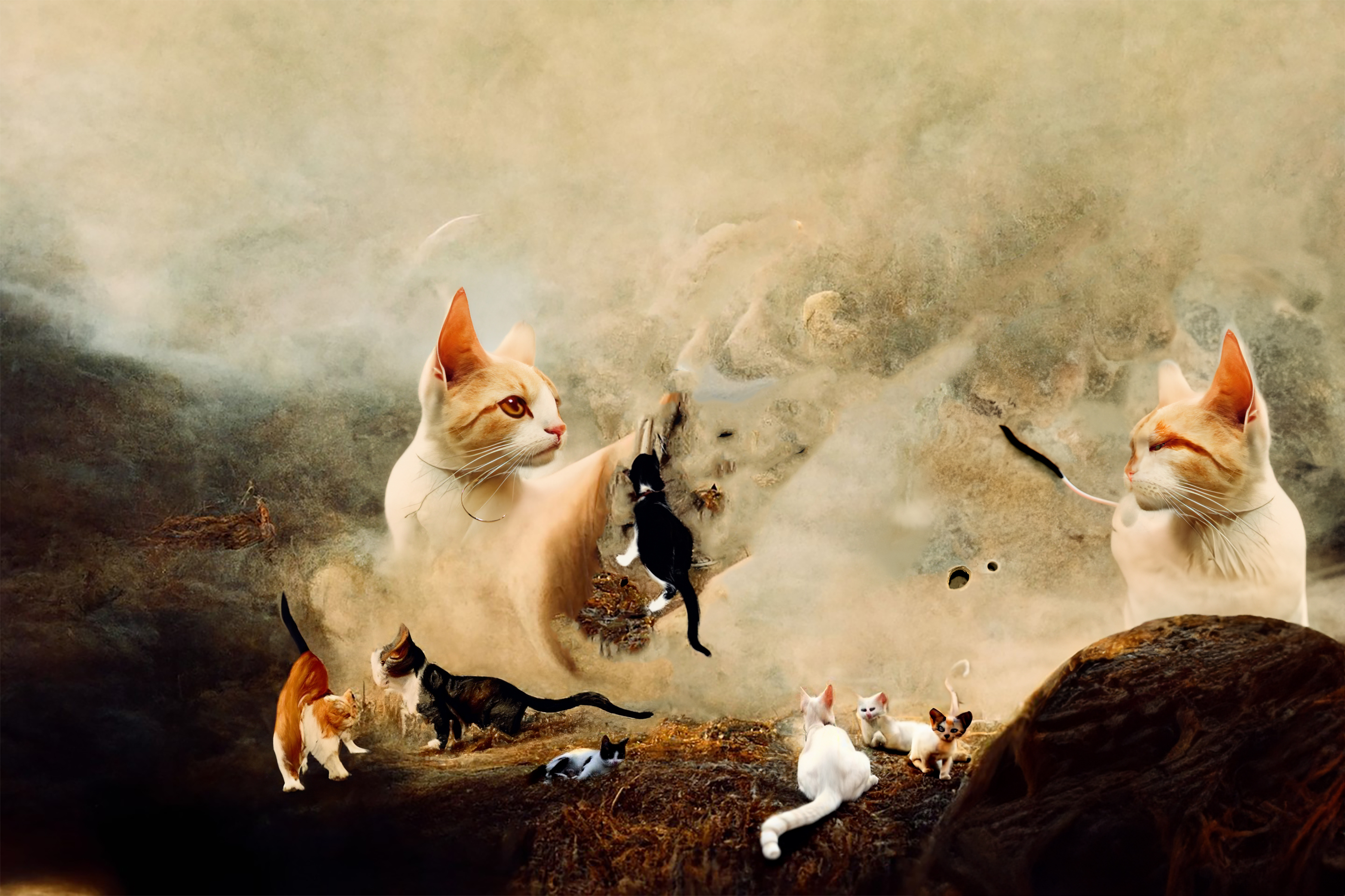
The system is becoming more complex. If, at the start, we had the cat as a symbol and art as well, now it's two different autonomous organisms: logomark (symbiotic-general concept) and art (something + the cat element-art direction).
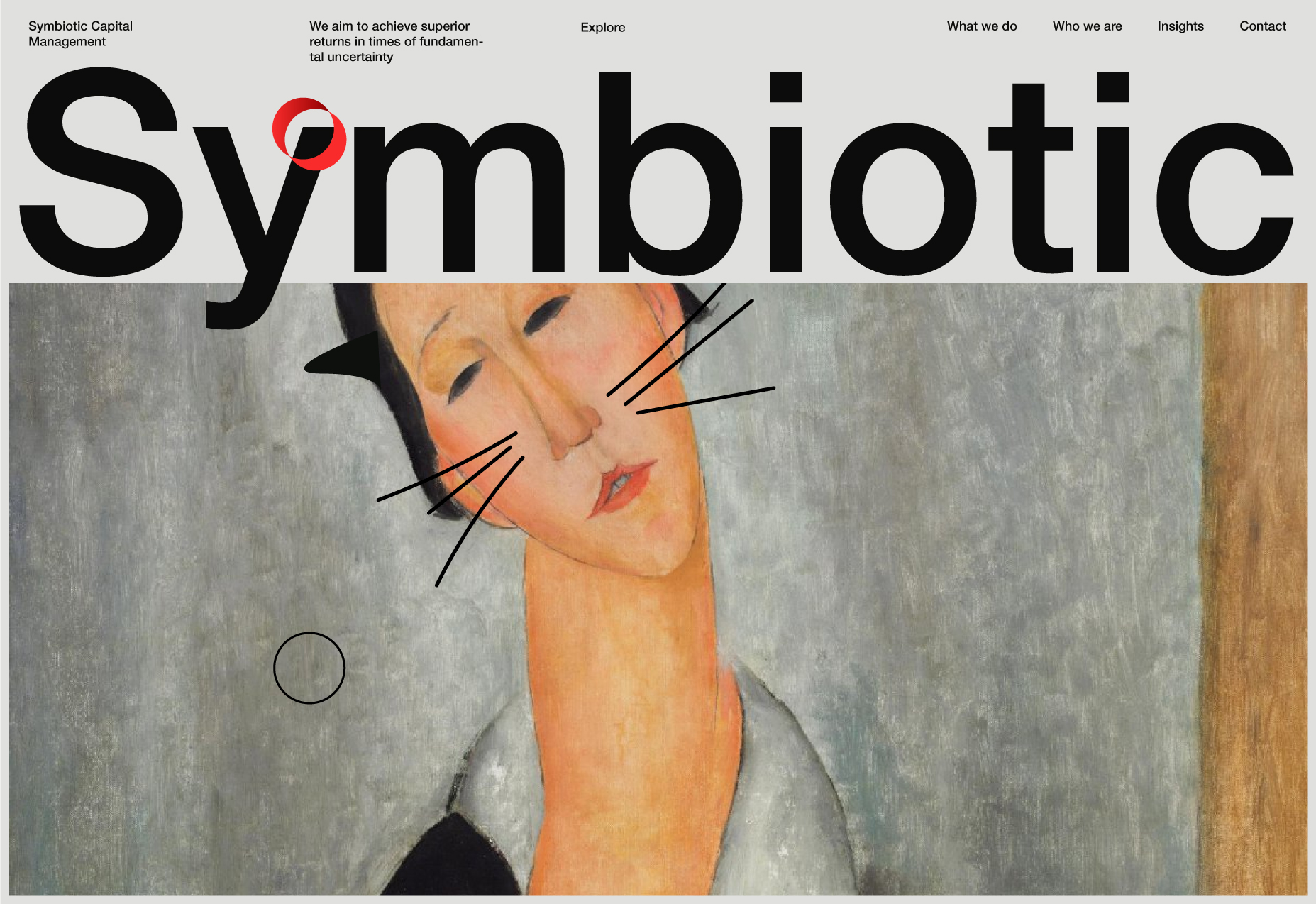
It's important to have a good understanding of what the hero image will look like, as this image will affect the styles of other elements when polishing the composition. So it seems we are very close to the point when we will have to make a decision on what the hero image should be.
Uncovering the potential.
This is amazing how the "What if?" helps you to see things that were not visible before.
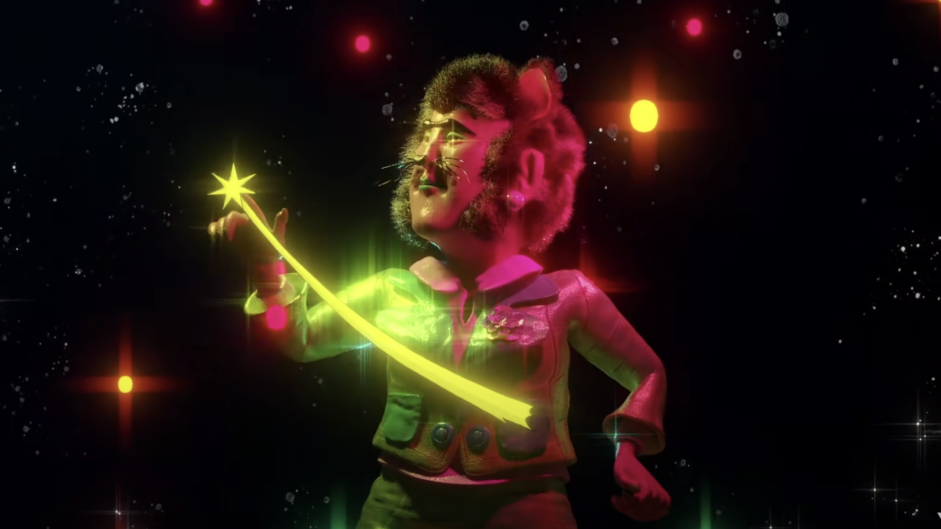
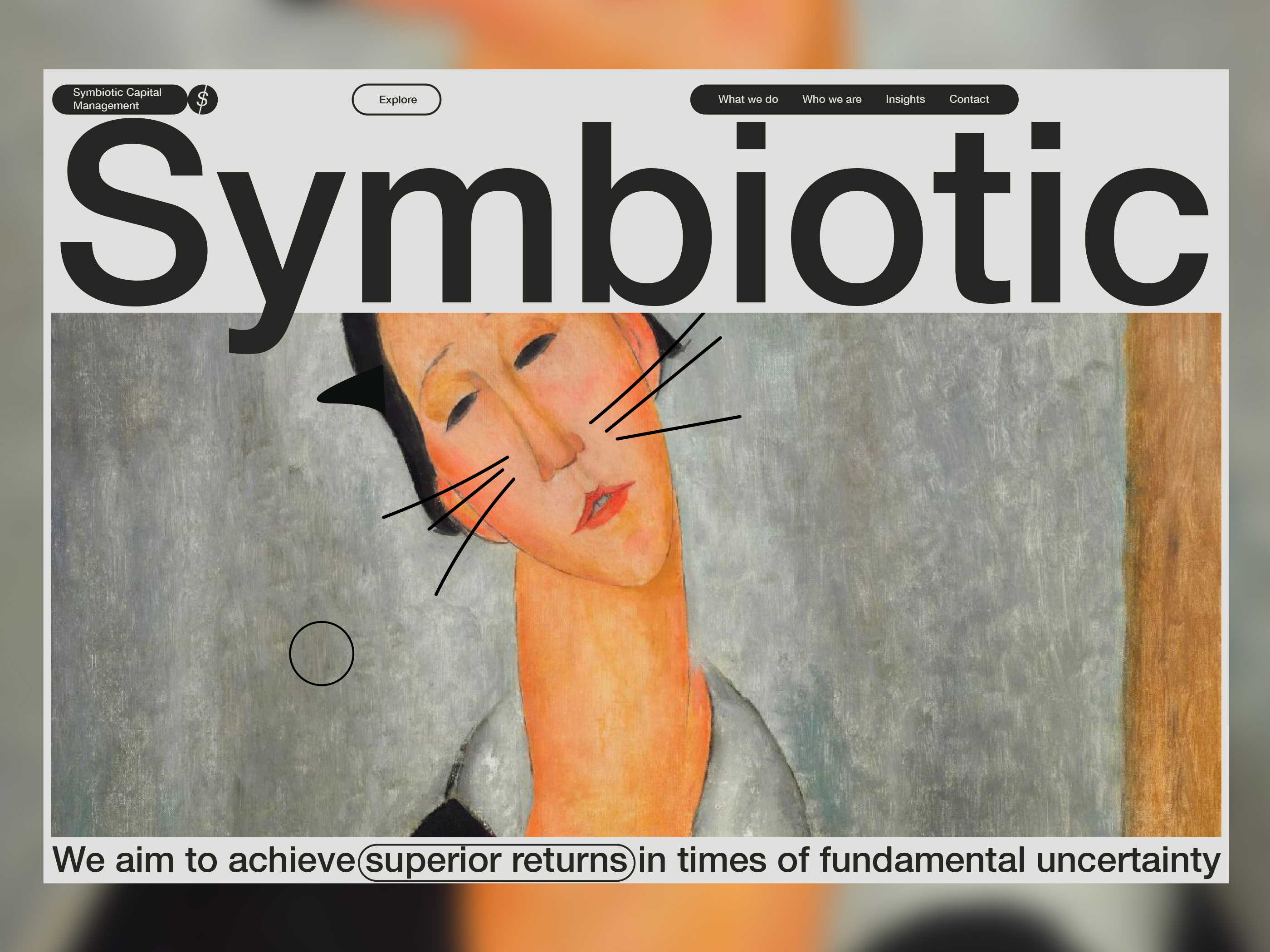
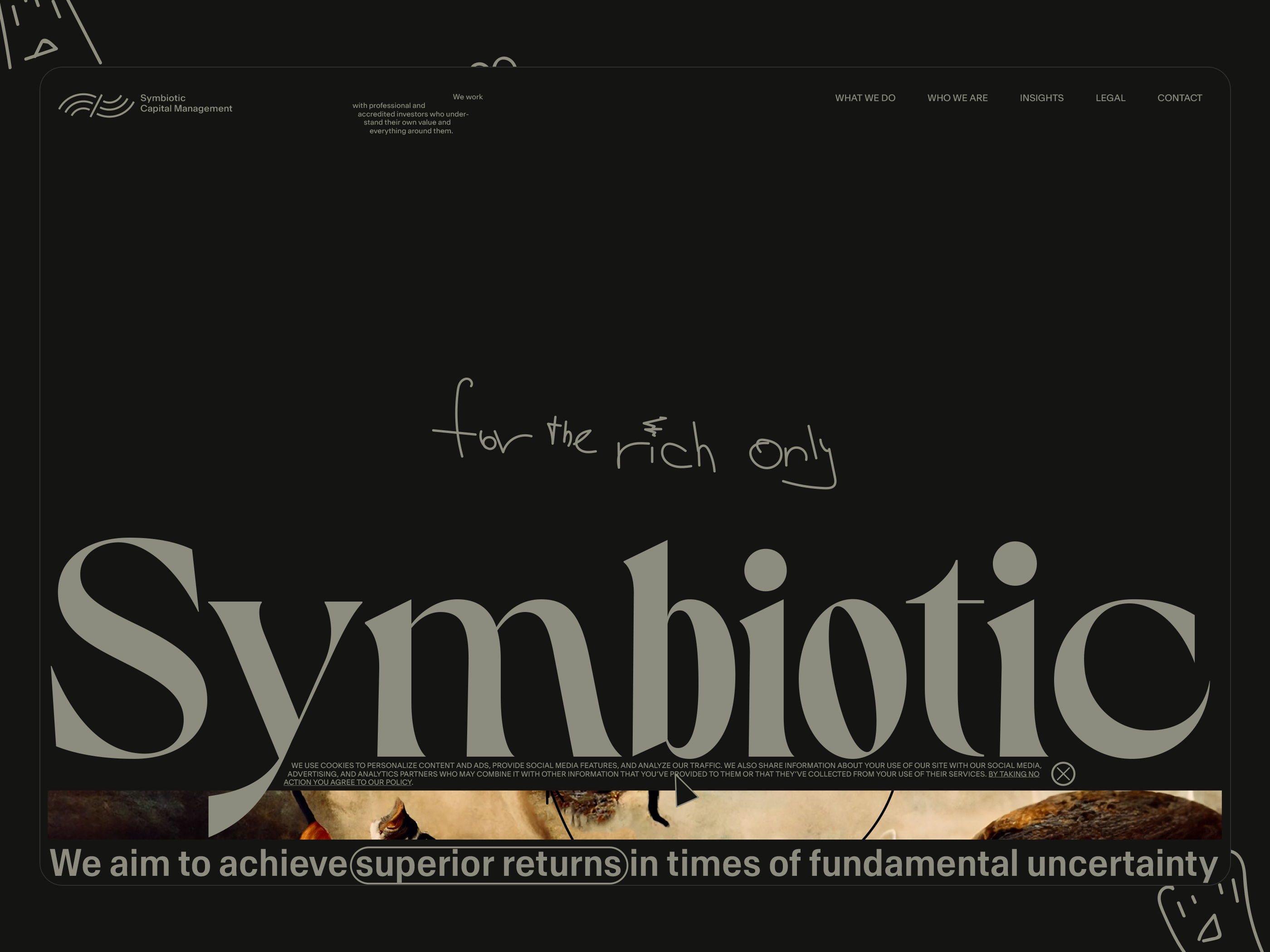
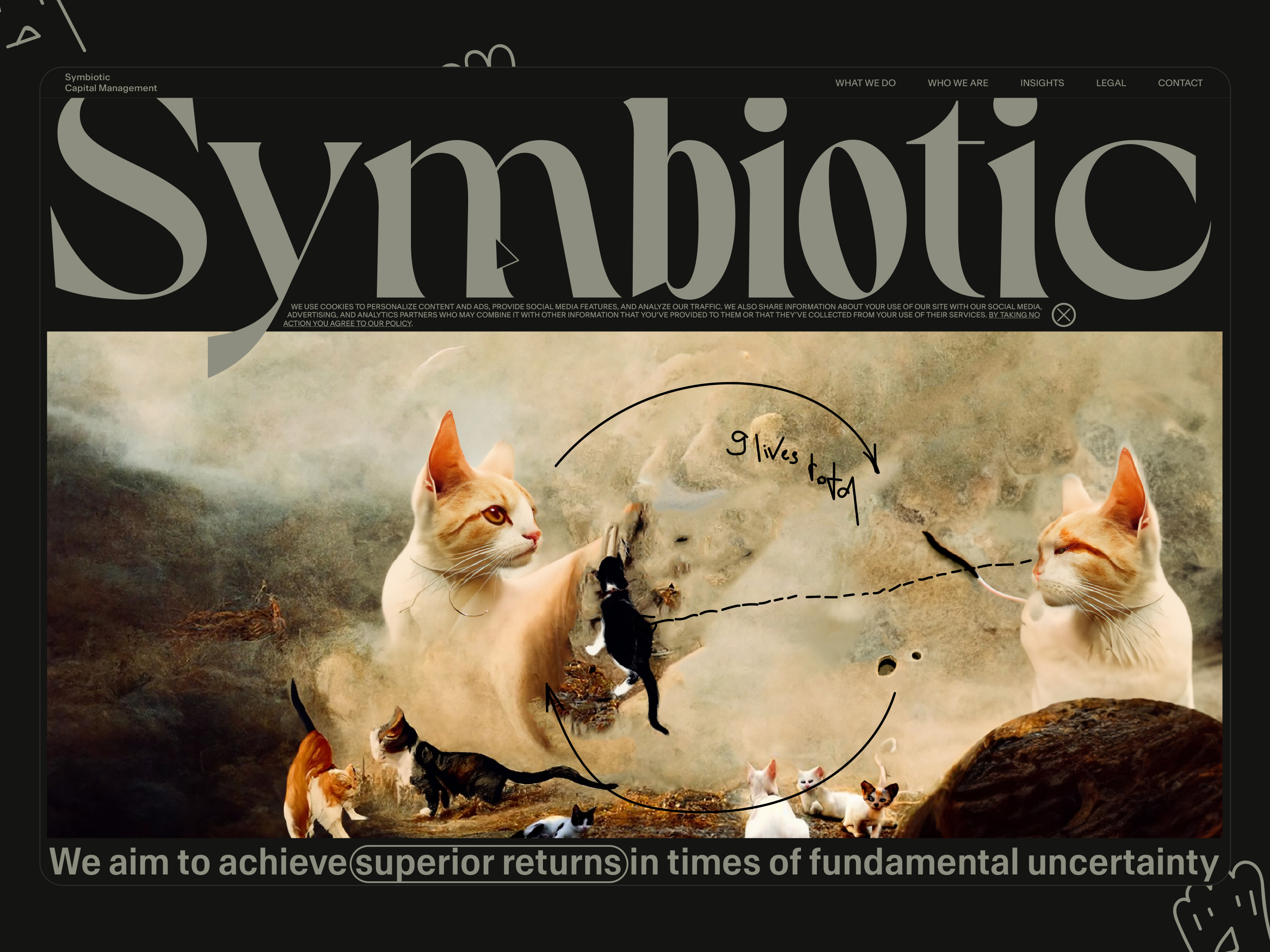
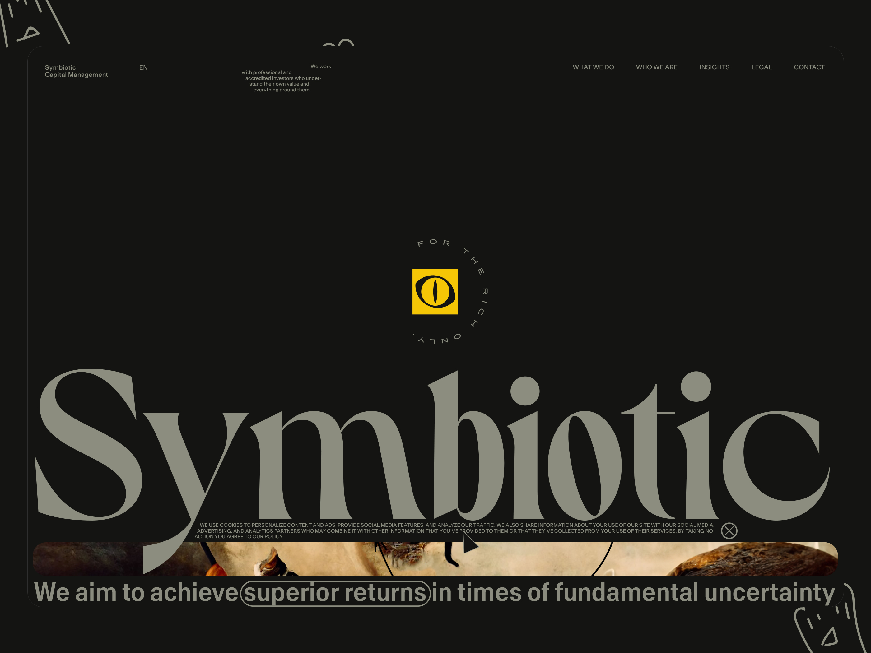
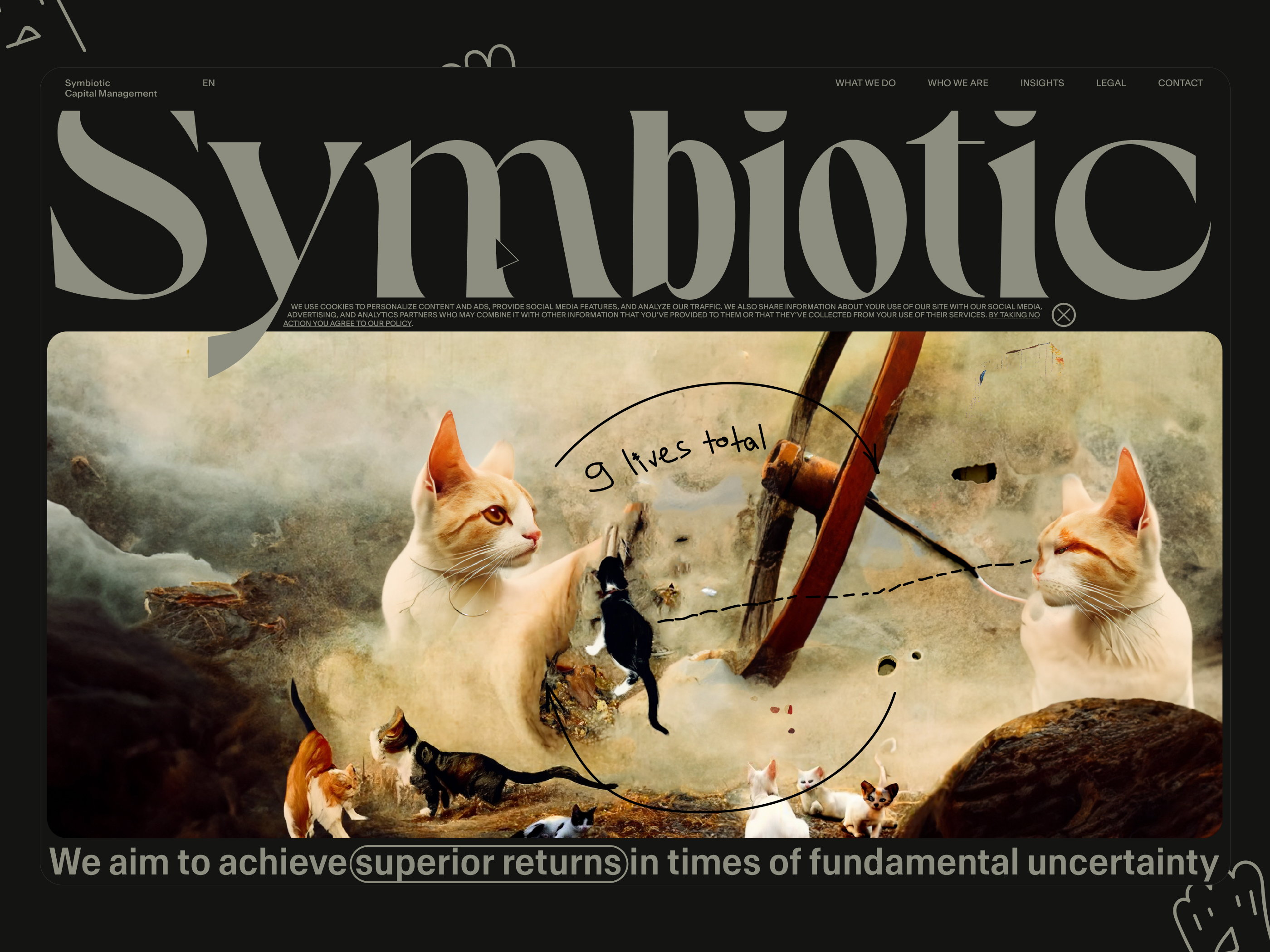
Welcome to heaven. Synthesis
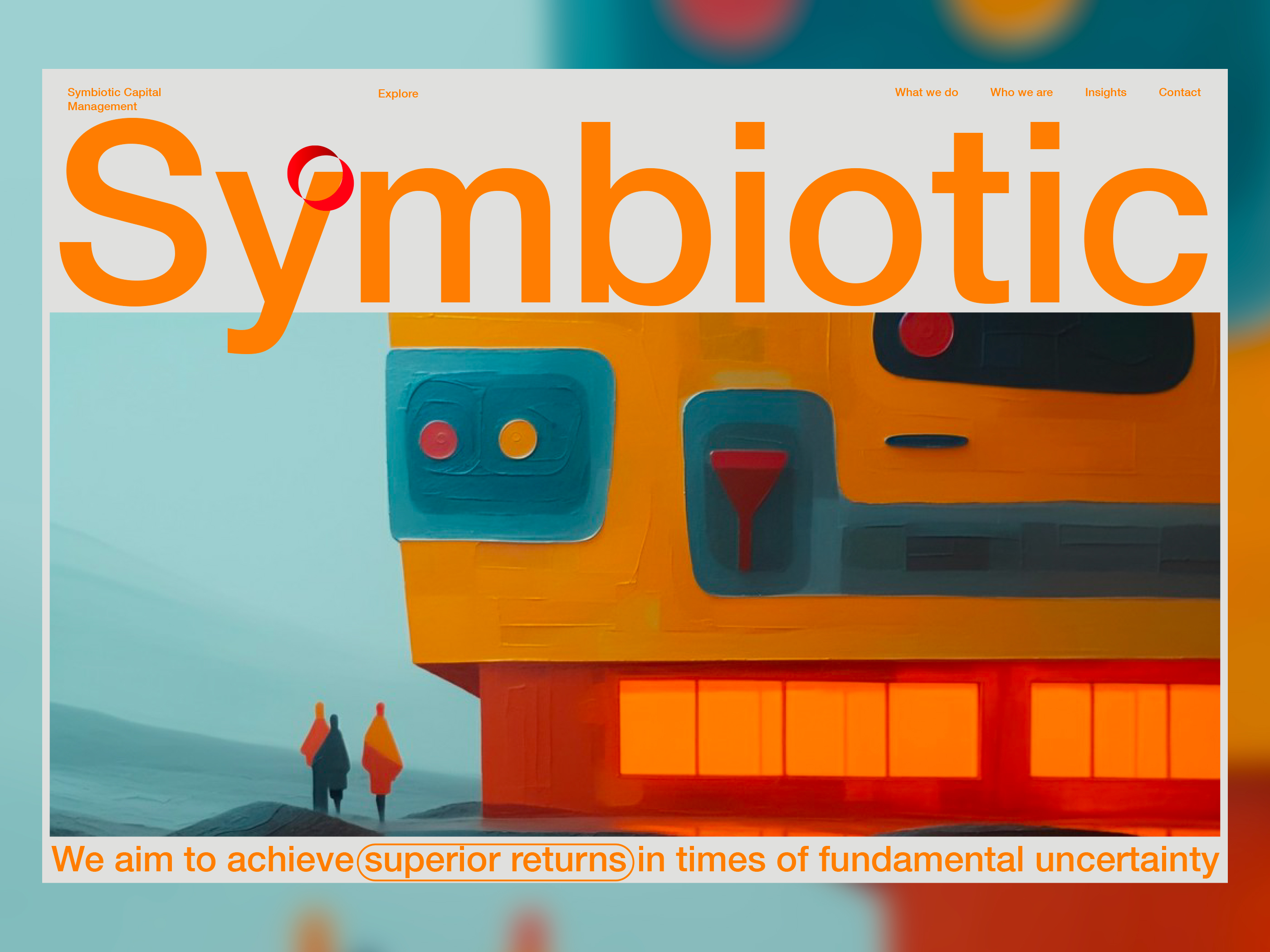
- Visual style - classic painting art.
- Main environment - heaven (clouds, desert, modern urban, actually it can be anything that can convey established mood).
- Main characters: cat, god (use the word boss instead of god), or any kind of manager.
- Comments and notes explaining the art are drawn on top of the art with the pen*. - Pen drawings can also be used on top of solid colours (for example, the main dark colour).
- Special effects:
flashes of lightning or other flashes. For example, in the website content or promotional videos. - Landing's above-the-fold information hierarchy:
Image → Word Symbiotic → Phraise We aim to… → Header
*Why do I use handwriting? Hmm, I love to use handwriting, and since nobody else uses it the same way as I do (at least I can not remember one), it's also become a sort of must-have for me.
For the current case, folks will need a presentation doc (I had a chance to hear how they are planning to talk about the product), and I think that if the core of the slide is shortly described in the related artwork, being a part of it, it's going to be also a user-friendly feature.
Identity-hunting result
Some details:
- Intro - loading screen with SVG animations.
- Landing exposition with SVG line animations.
- Fixed header and footer on the scroll.
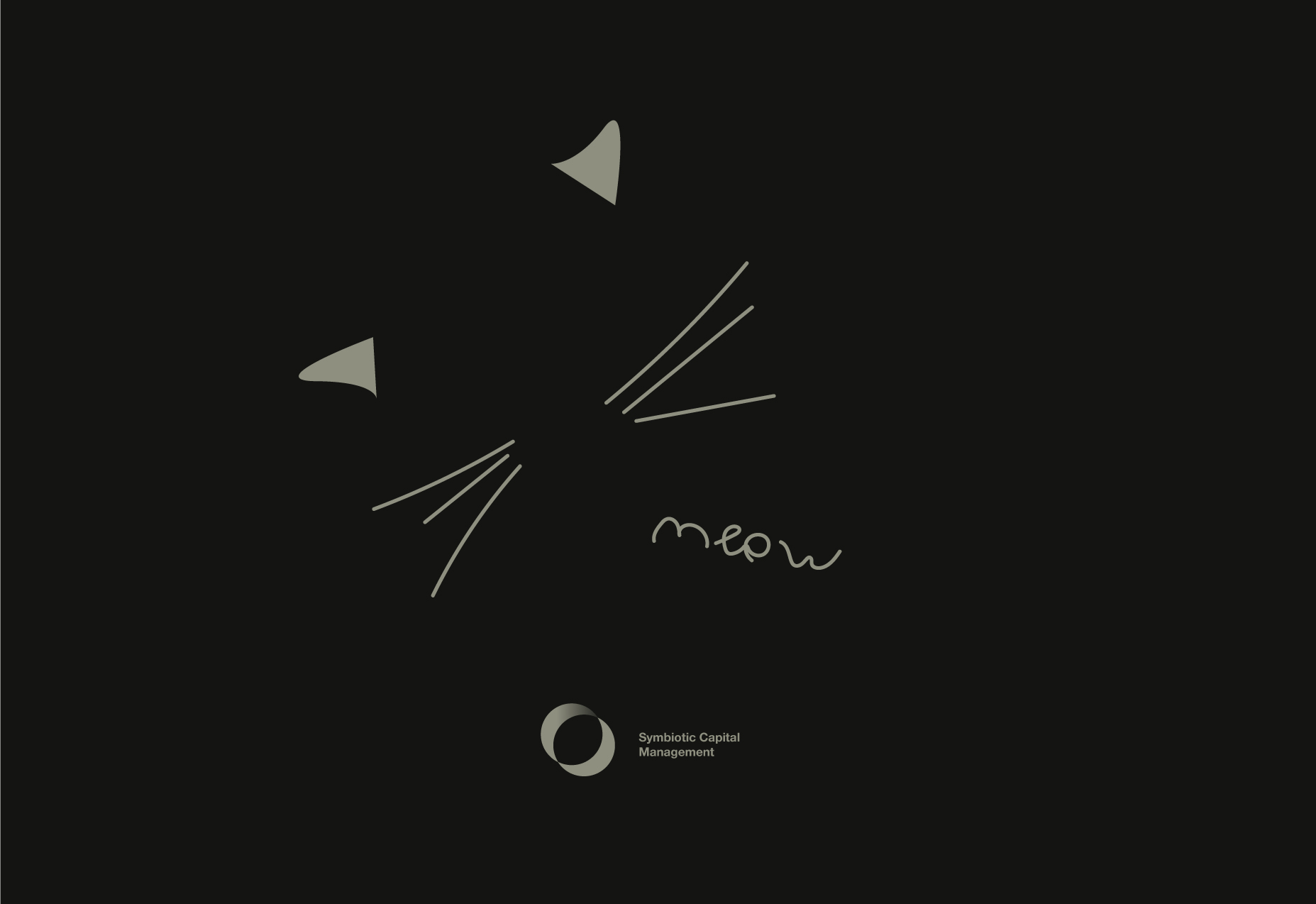
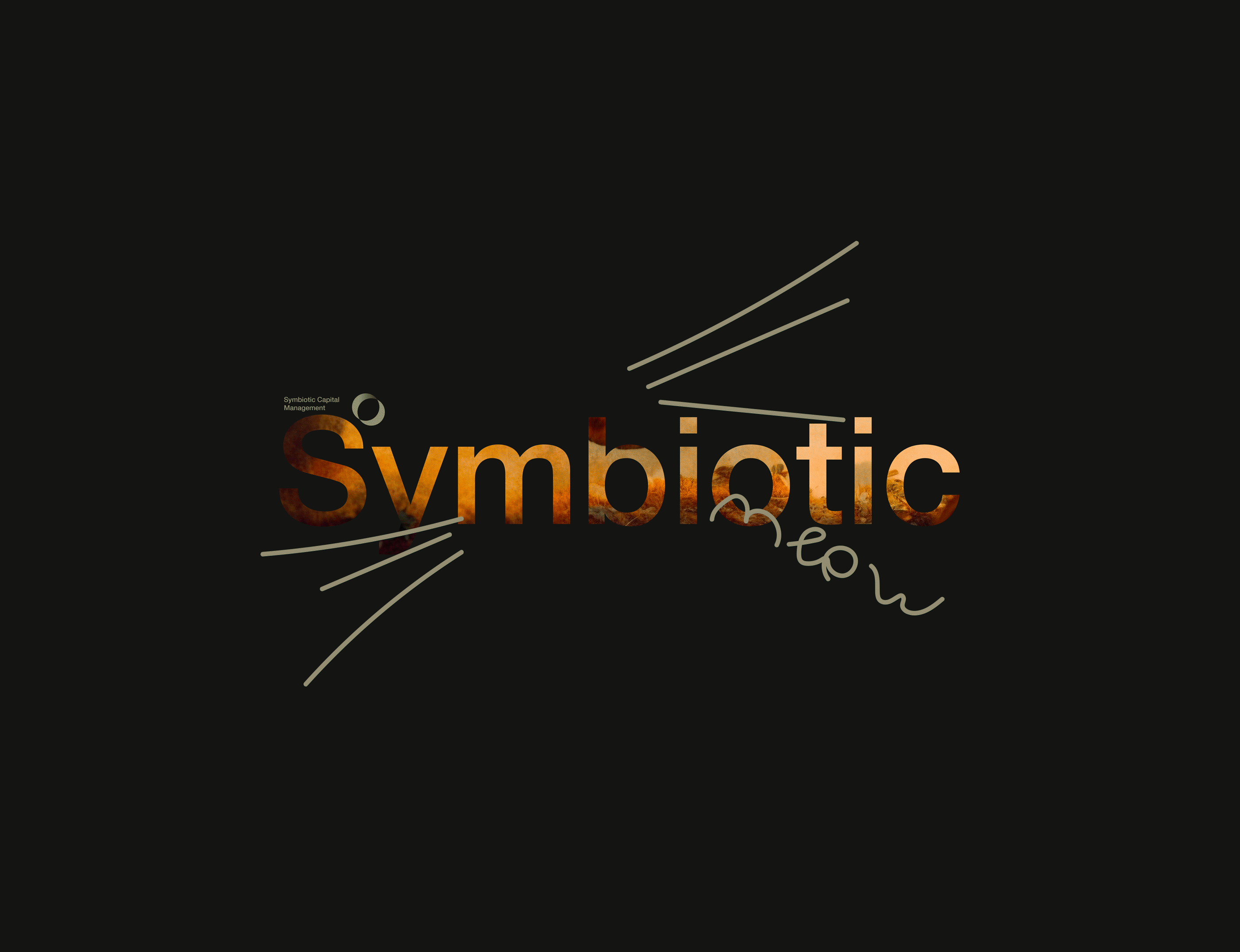
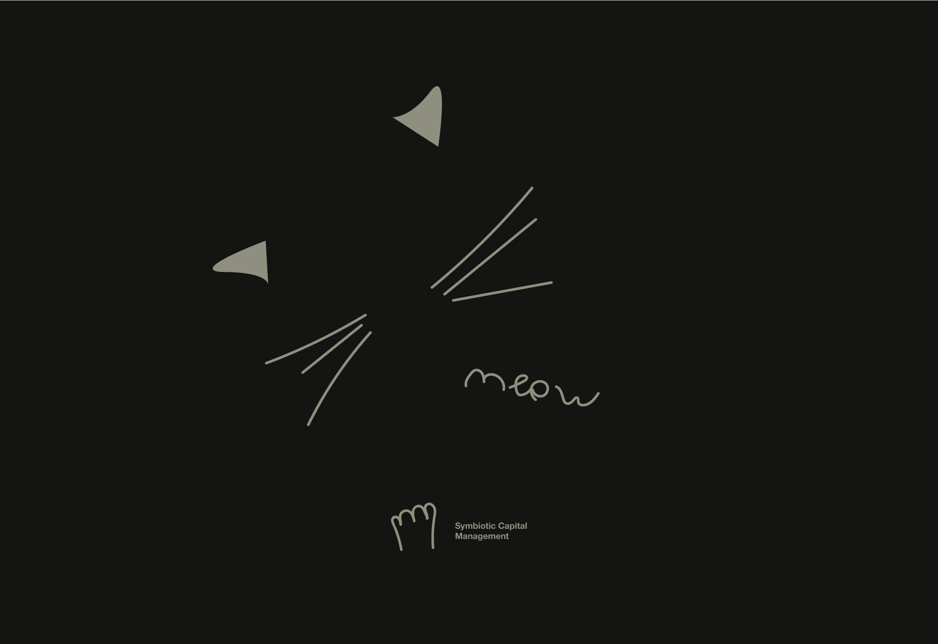
Meow! - instead of Thank you!
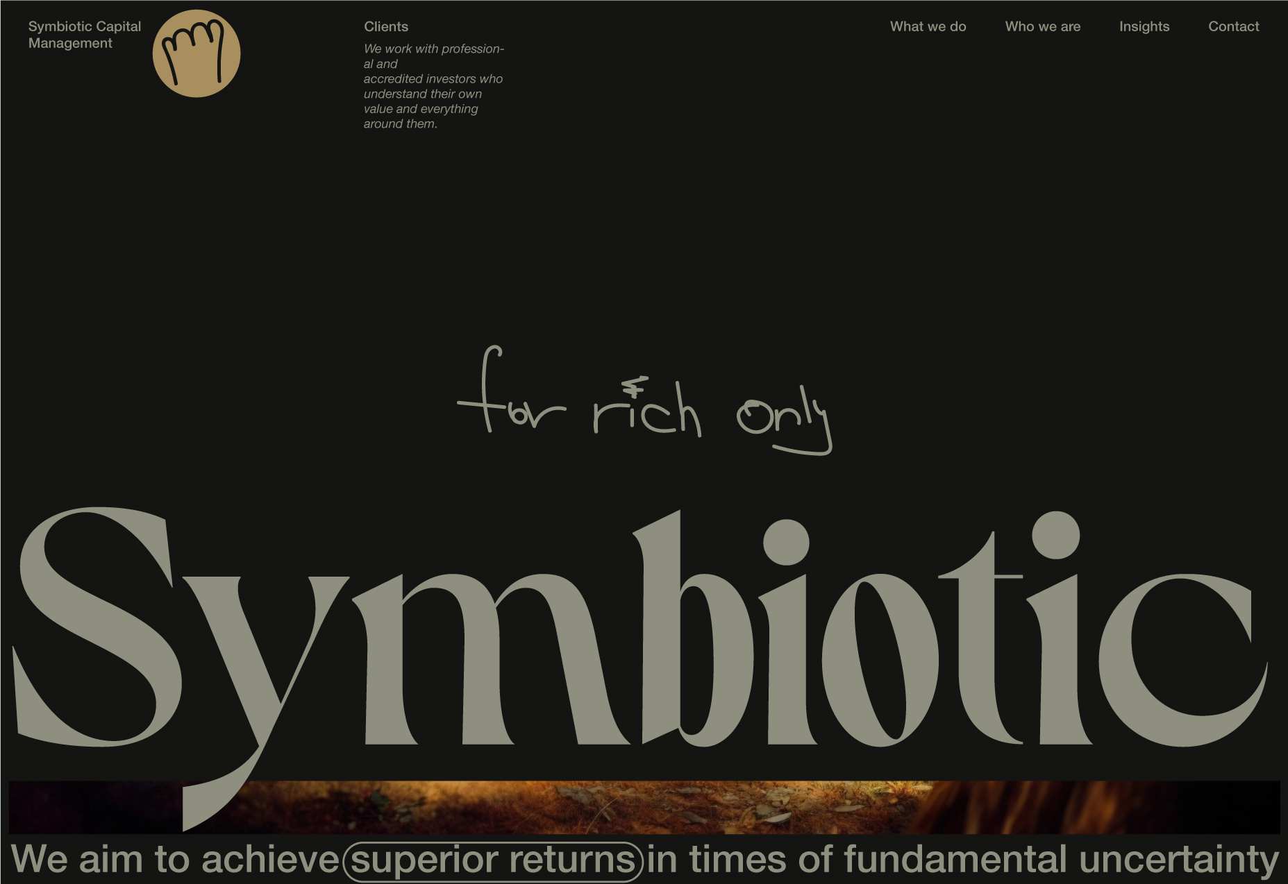
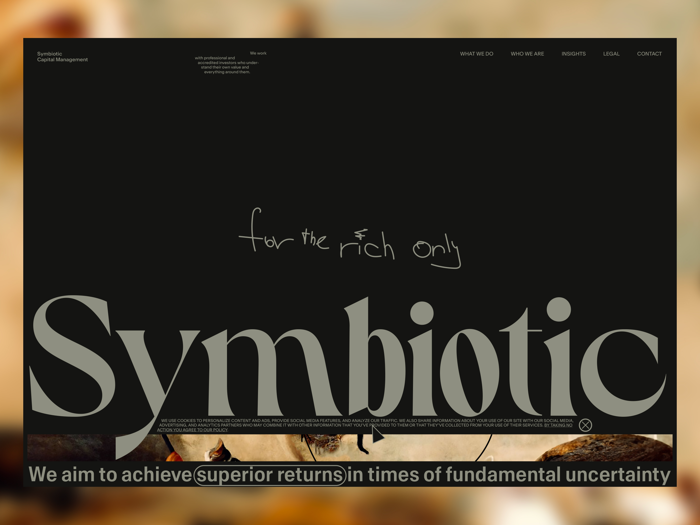
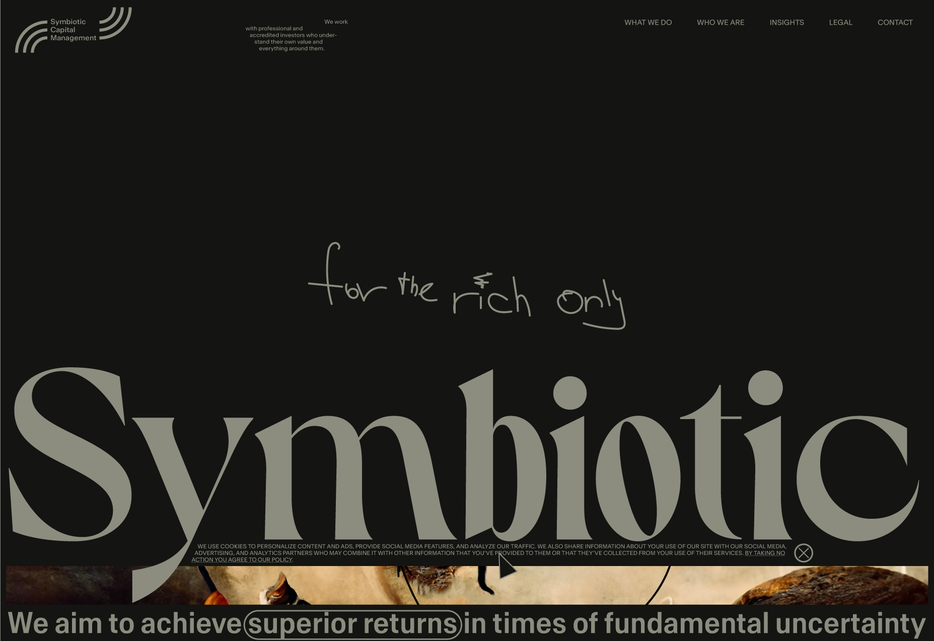
For the rich only. Continuation
Definitely, "For rich only" can be rephrased. However, to gain trust, sometimes you need to surprise with frankness. The impression will also be formatted based on the combination of the textual content and visual message, and to be frank, anything can work if the designer can find the right balance.
What is new:
In a few words, we just continue to improve the founded direction, trying to have a more balanced composition by drawing a better relation between its elements. Also, I have developed a complete Landing page behaviour scenario, starting with the loader and ending with the page's footer.
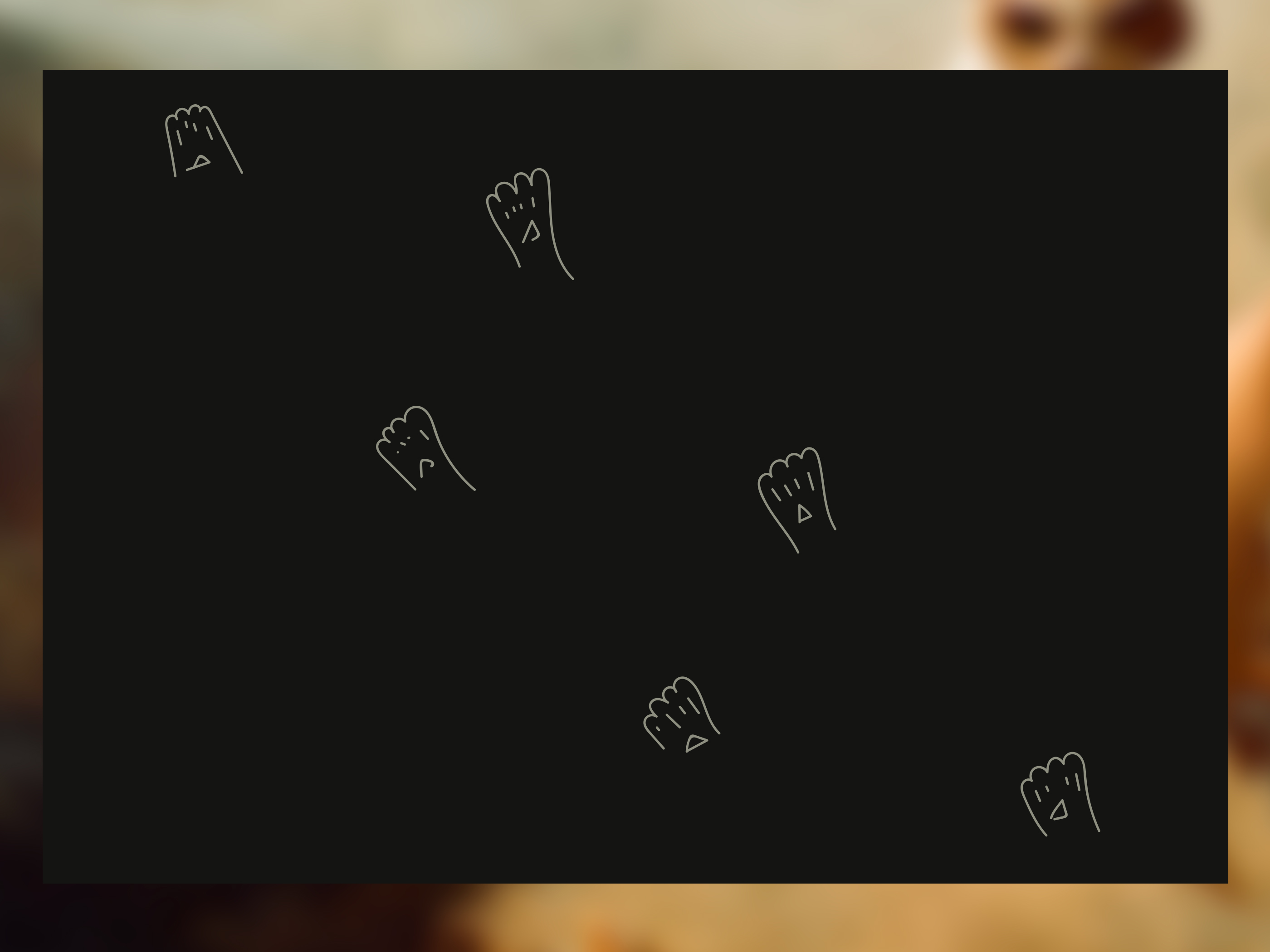
- This is a new logomark idea (the shape will need to be polished-this is just a concept for now). The shape will also be used as a website loader (cat footprint).
- Headings typeface - Dahlia. For the logotype, we will use two fonts.
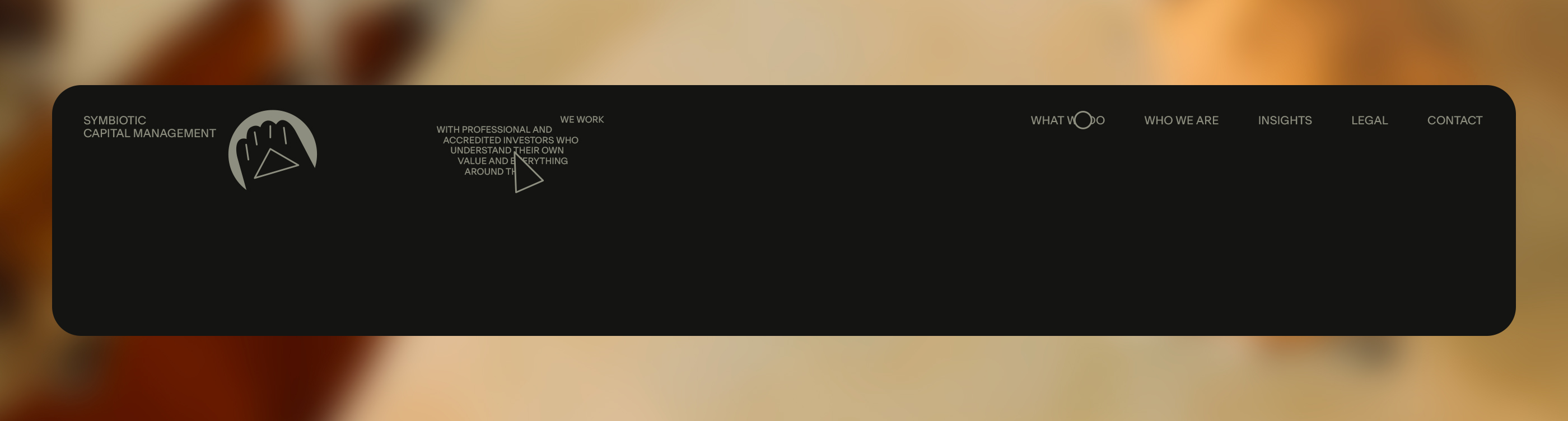
- Main navigation content. "Explore" was removed; instead, a paragraph about clients was added (it may have made sense to have a client page). However, the information architecture will have to be rethought again - wireframes and wireframes again.
- Note: Include in the logo the ® symbol. The uppercase is only in the first word in a sentence.
Landing ATF. The result of the new iterations stage.
The proof of the concept.
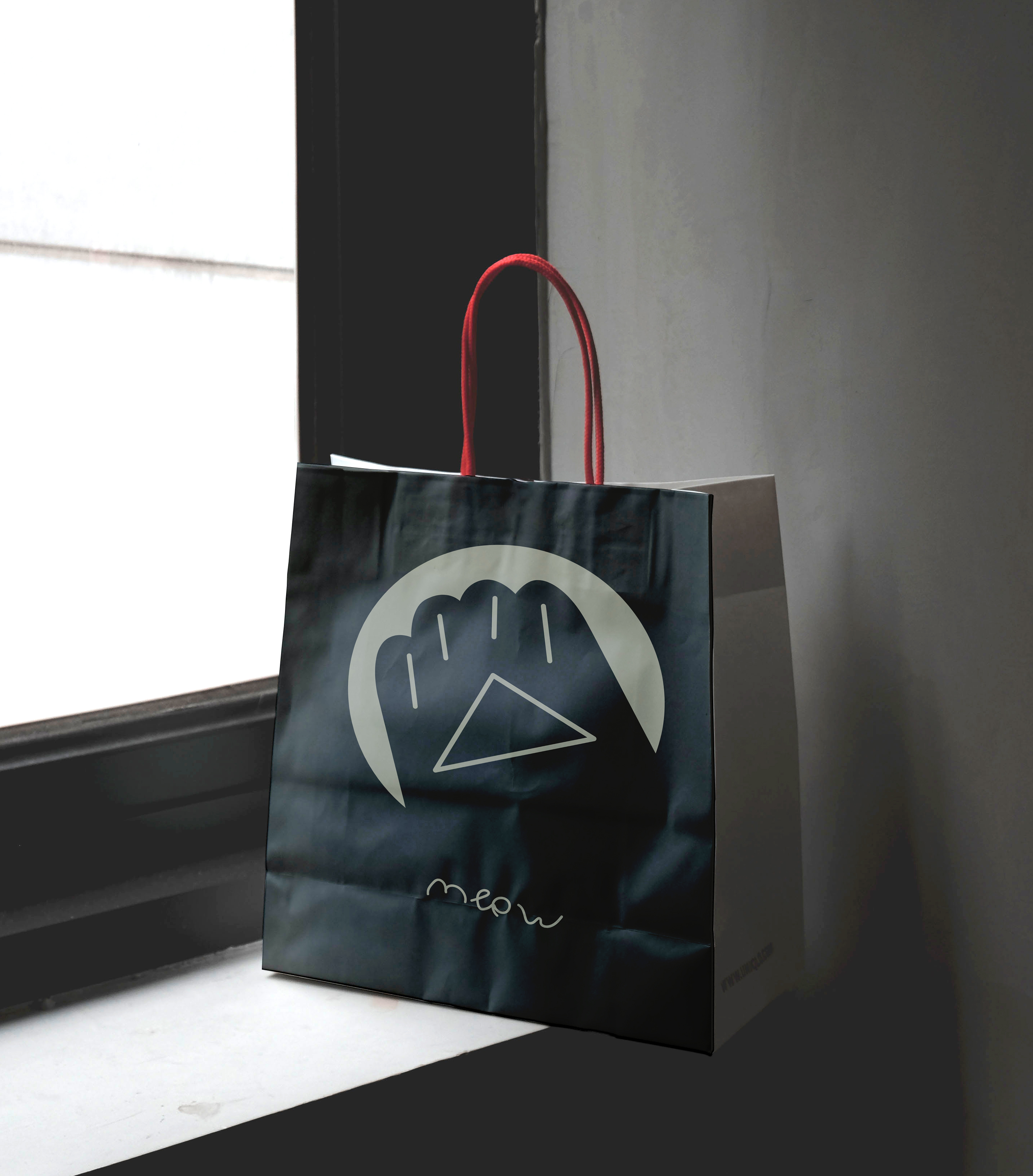
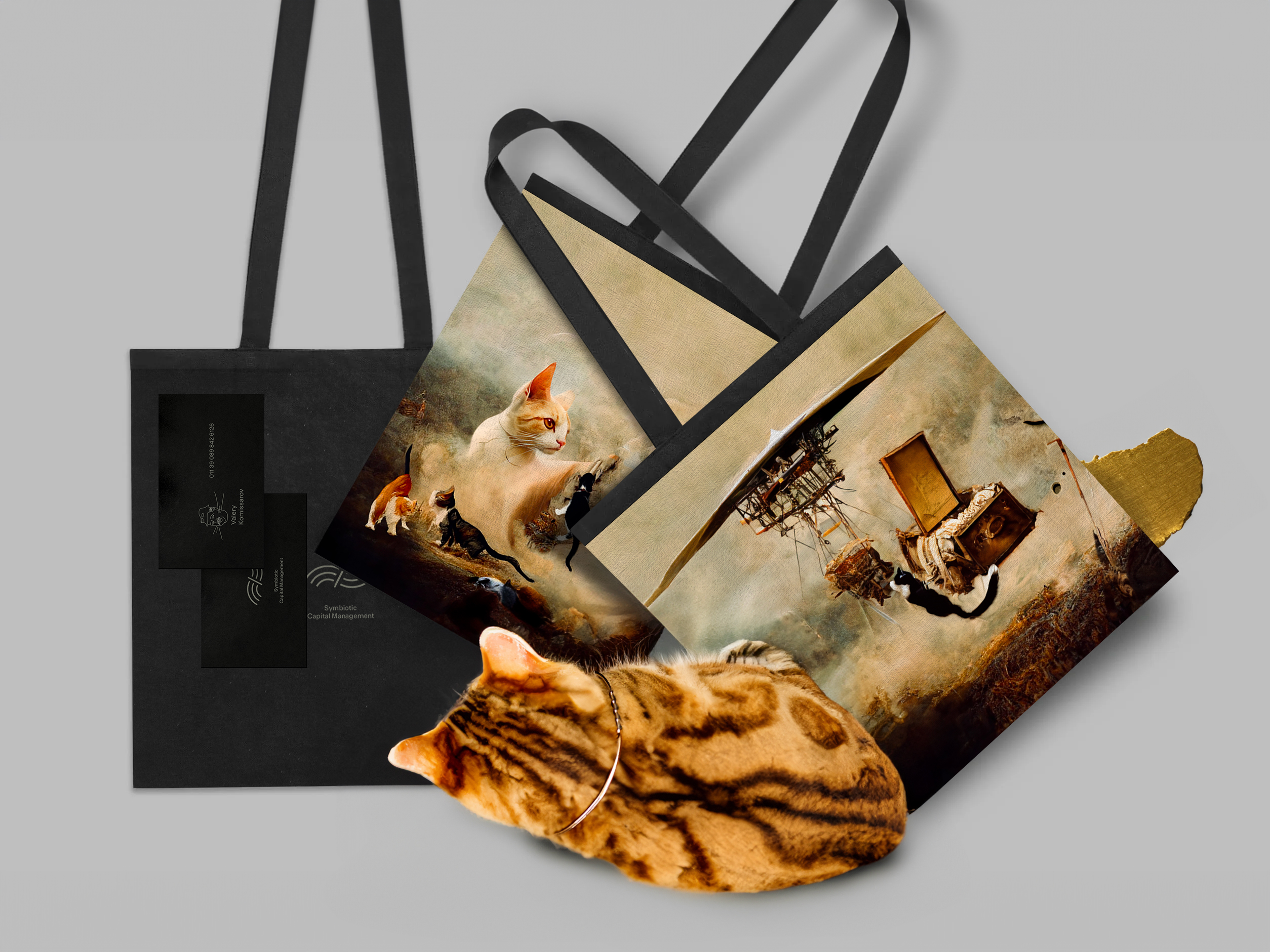
The bag has some accessories.
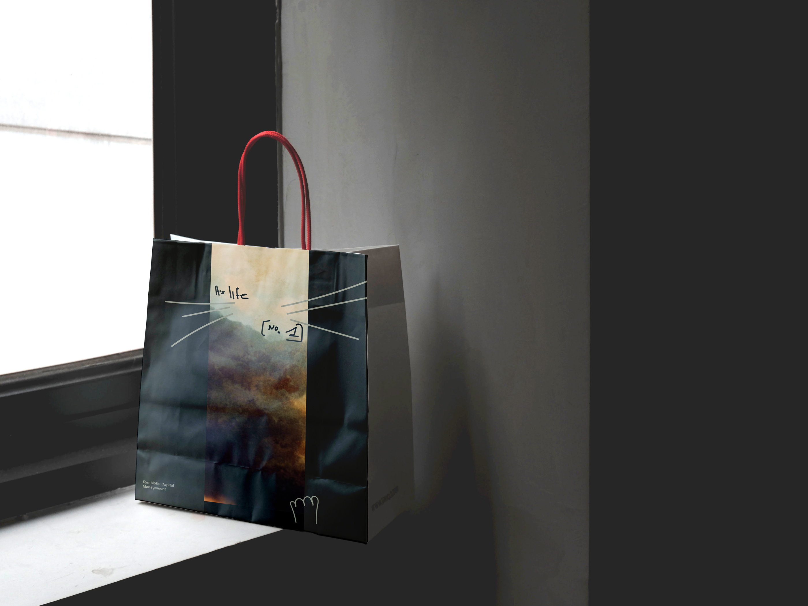
Cat footprint, Headings typeface, Navigation, and elements positioning.


Complete the Landing page behaviour (on-scroll animations) scenario. UX - first!
From the site loader all the way down to the footer.
1. Website page loader.
2. Landing after the entry animations were executed.
3. Begin scrolling. The hero image gets more visibility.
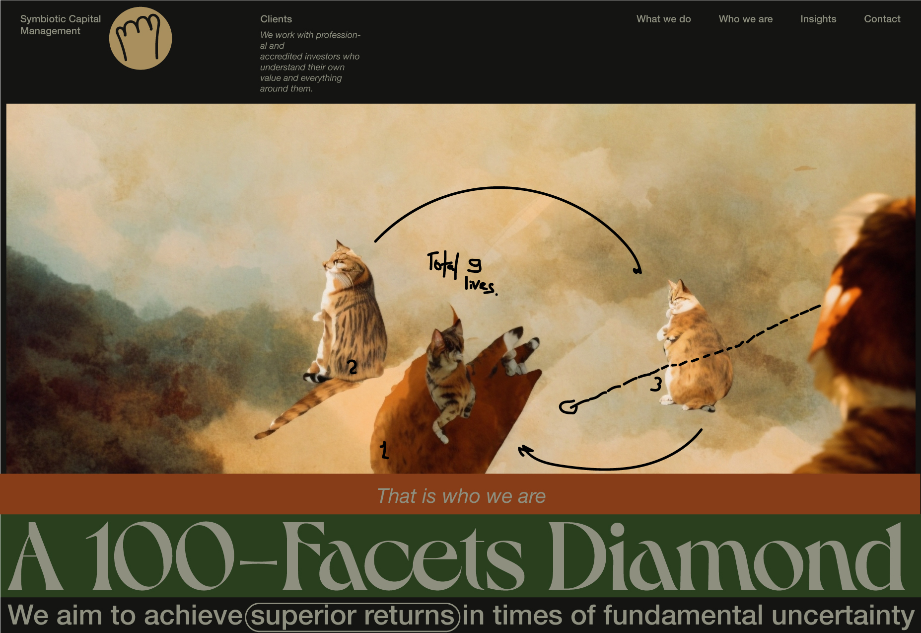
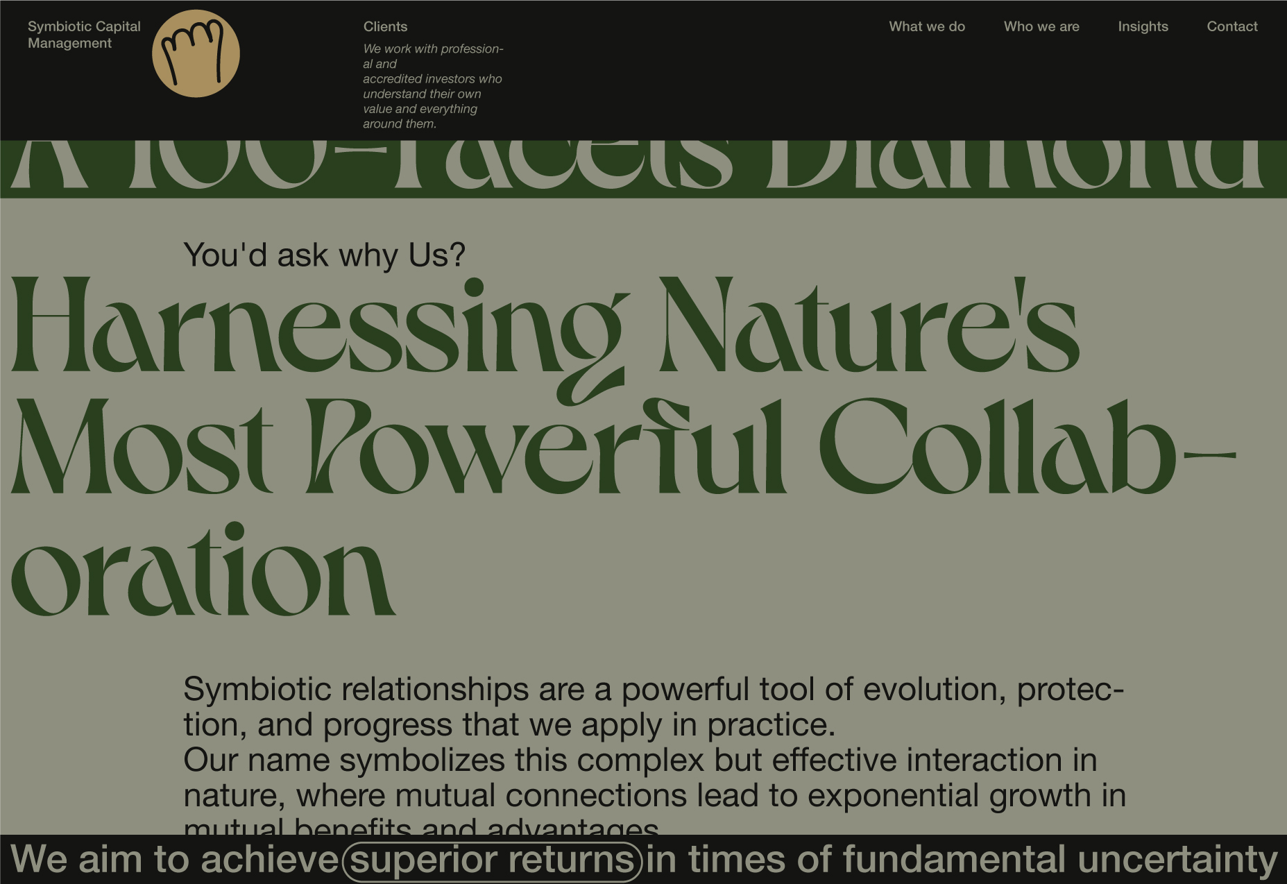
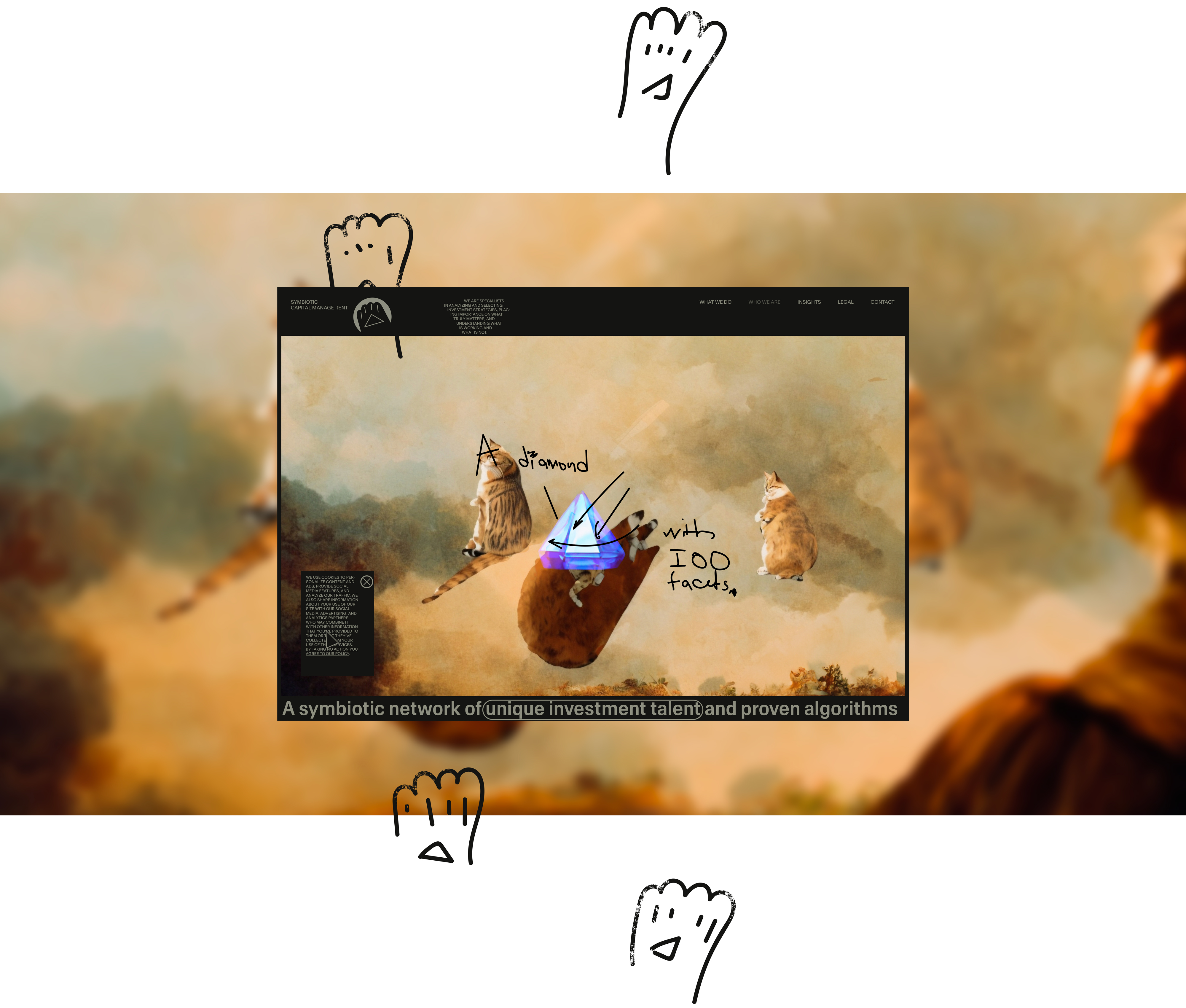
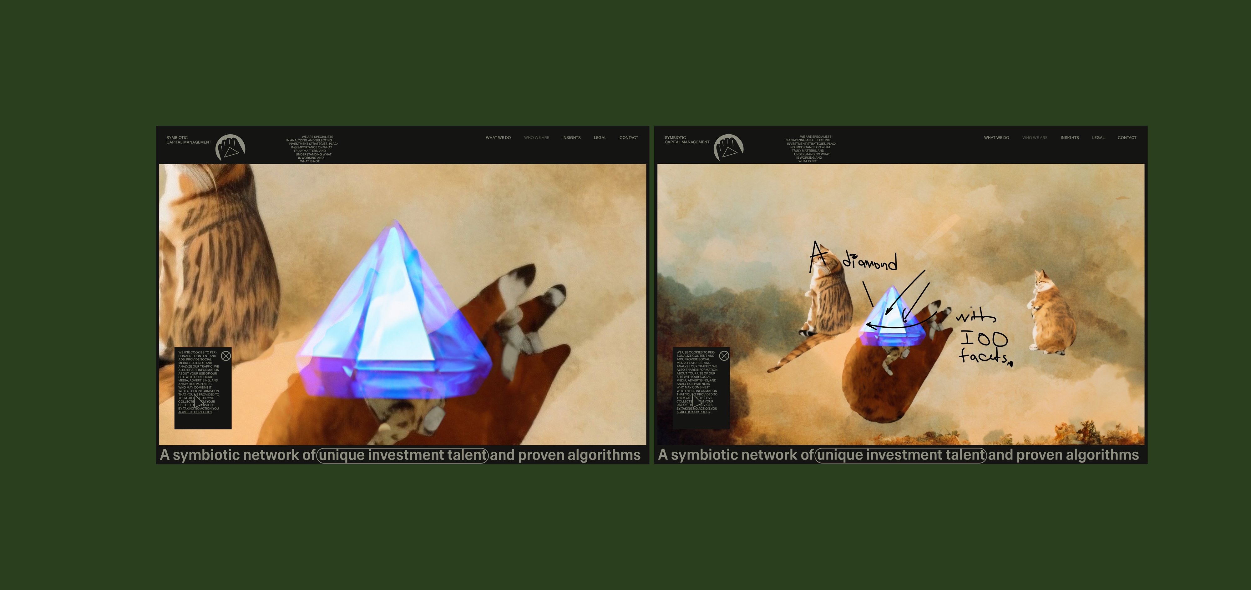
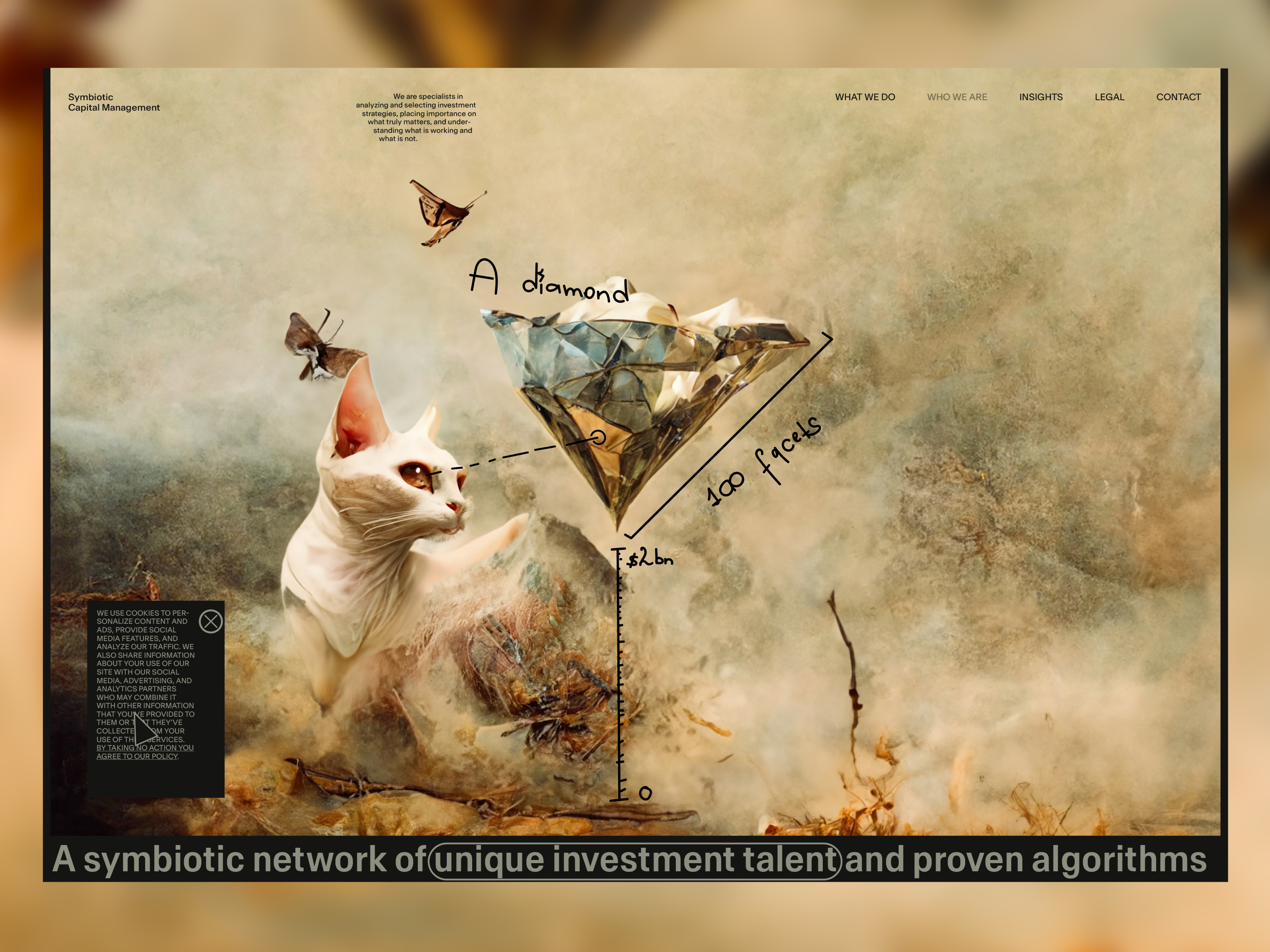
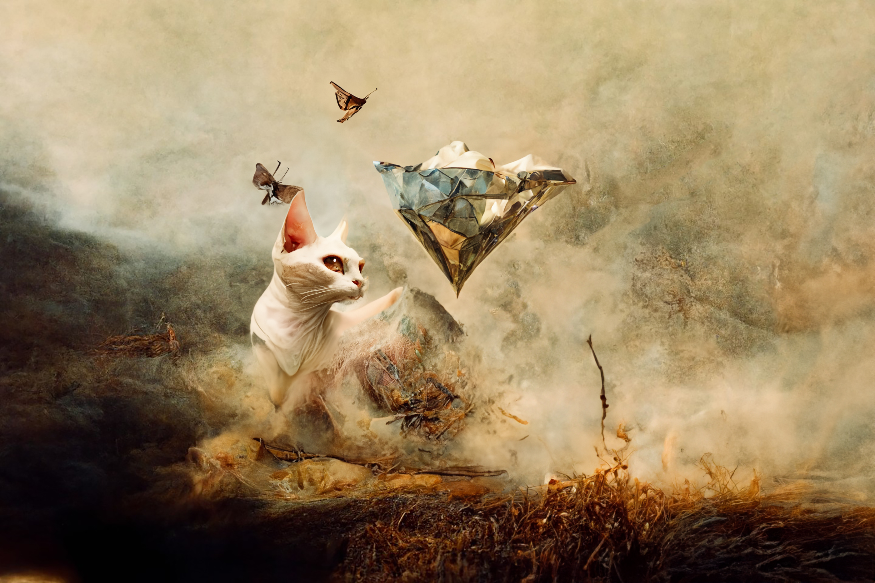
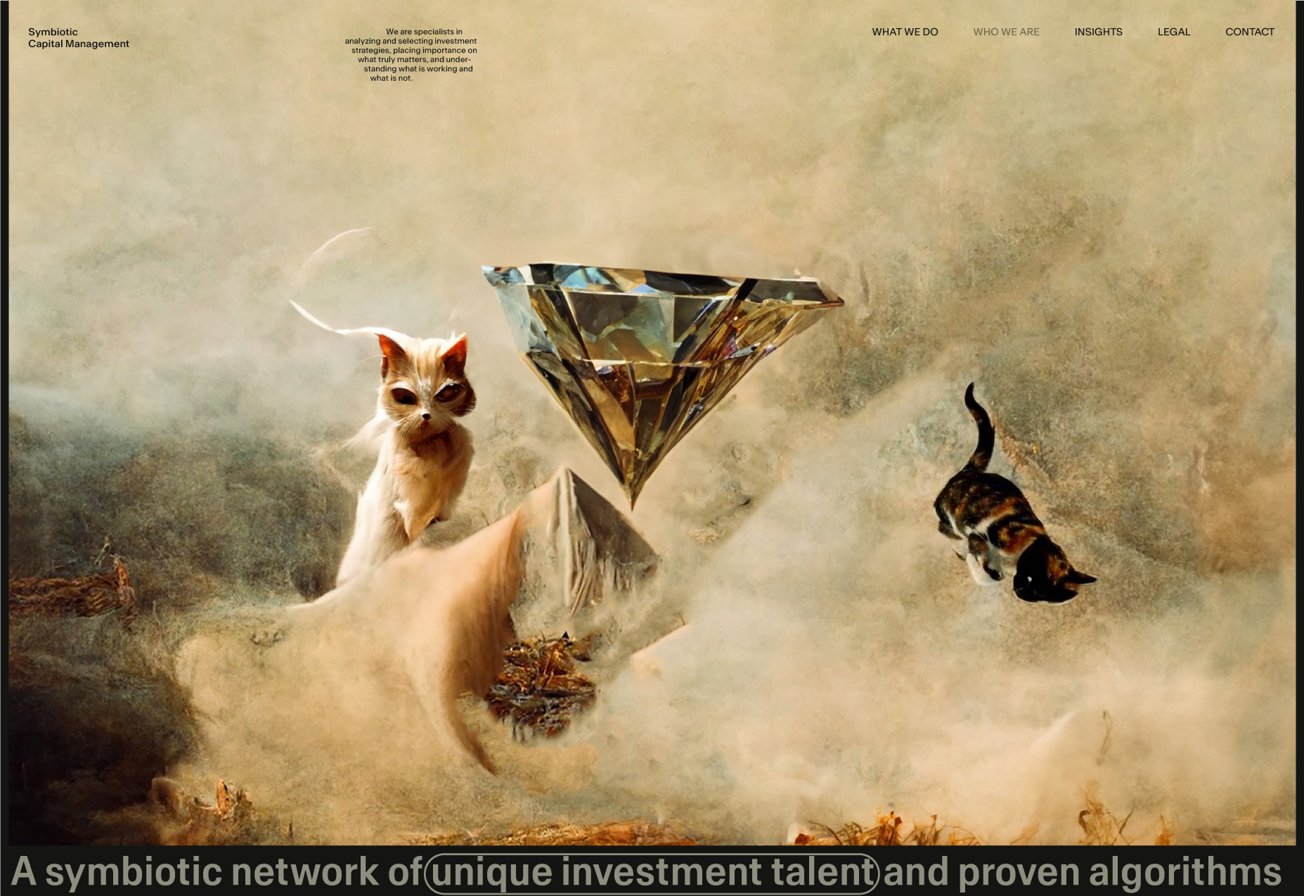
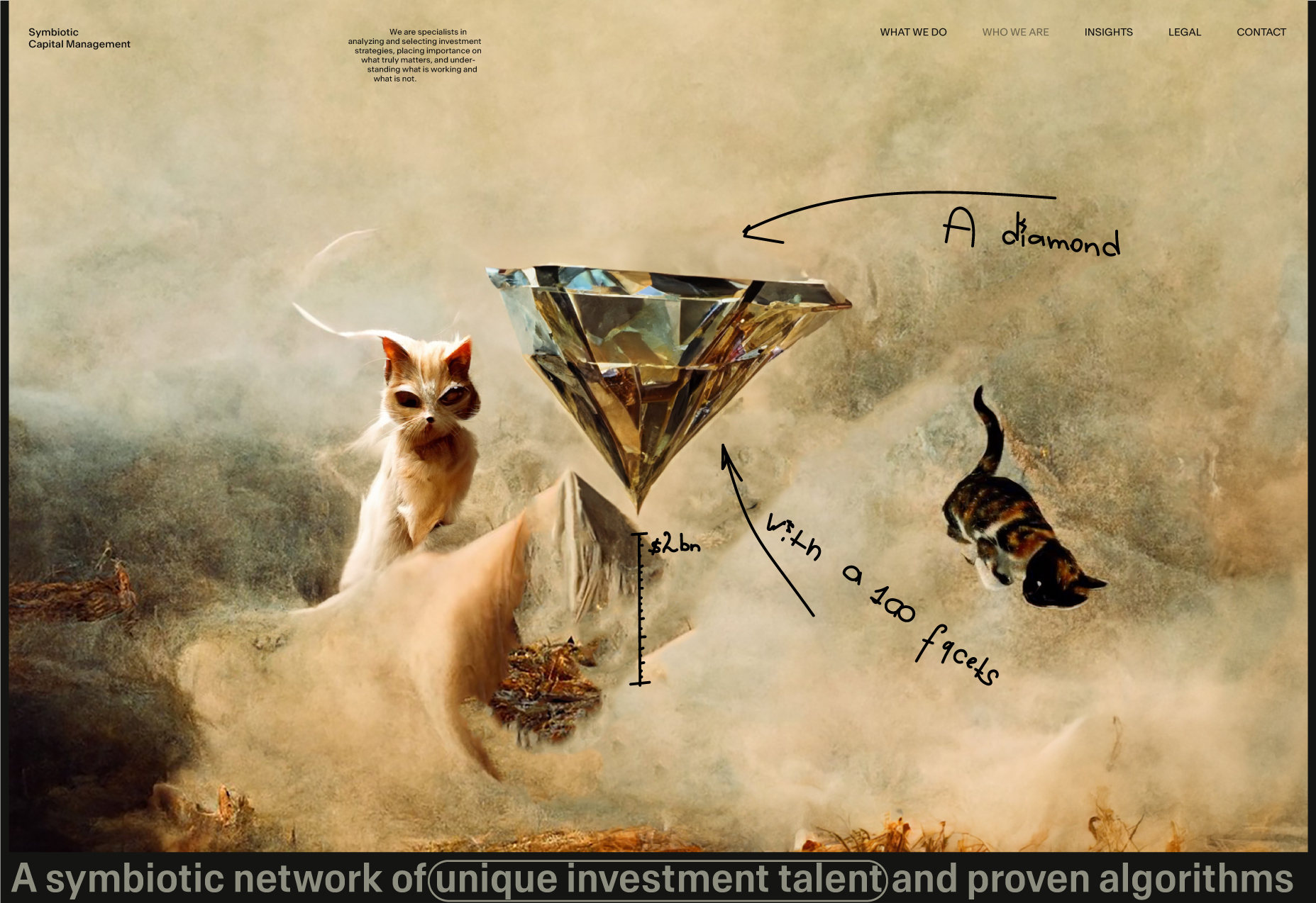
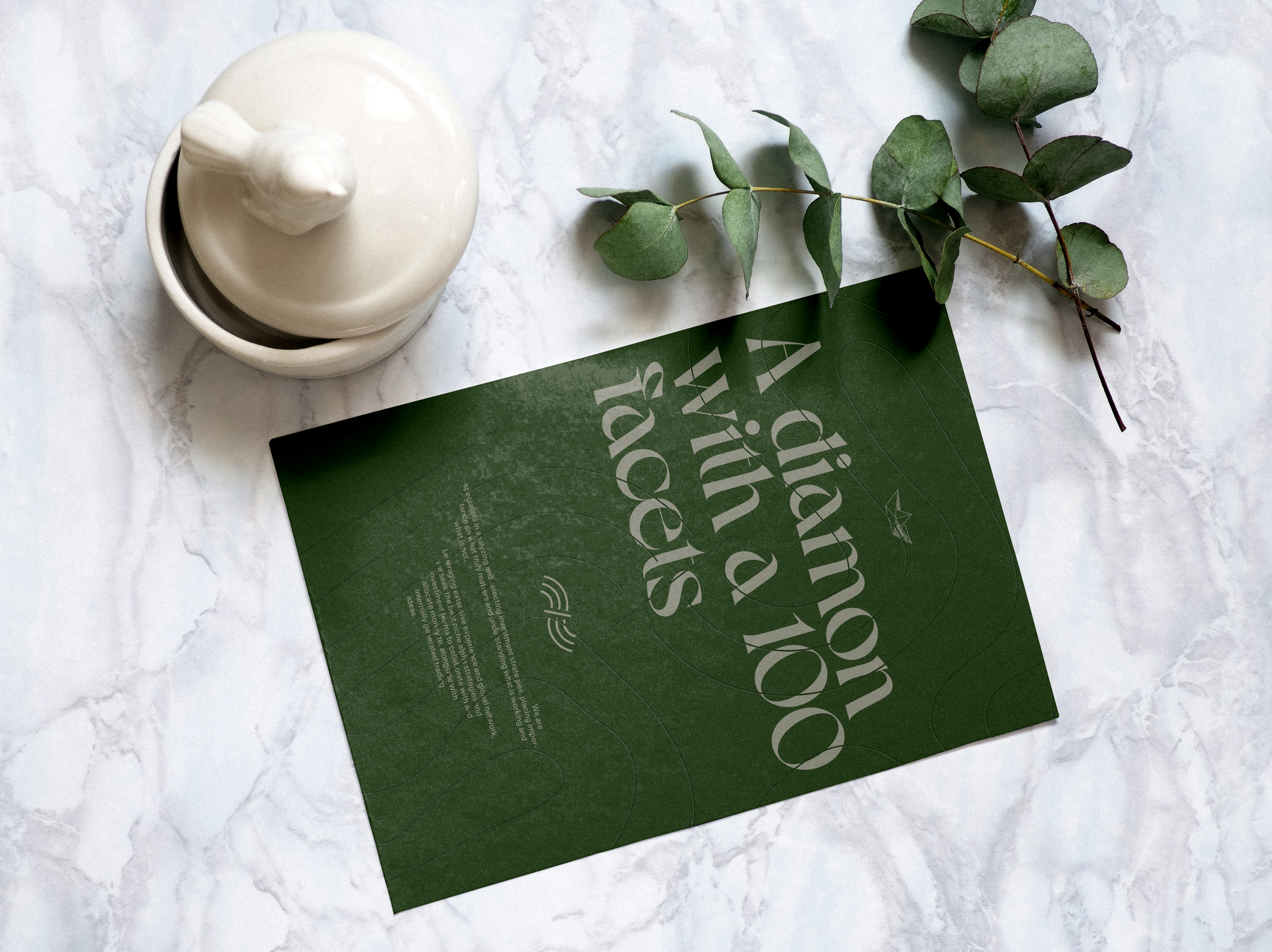
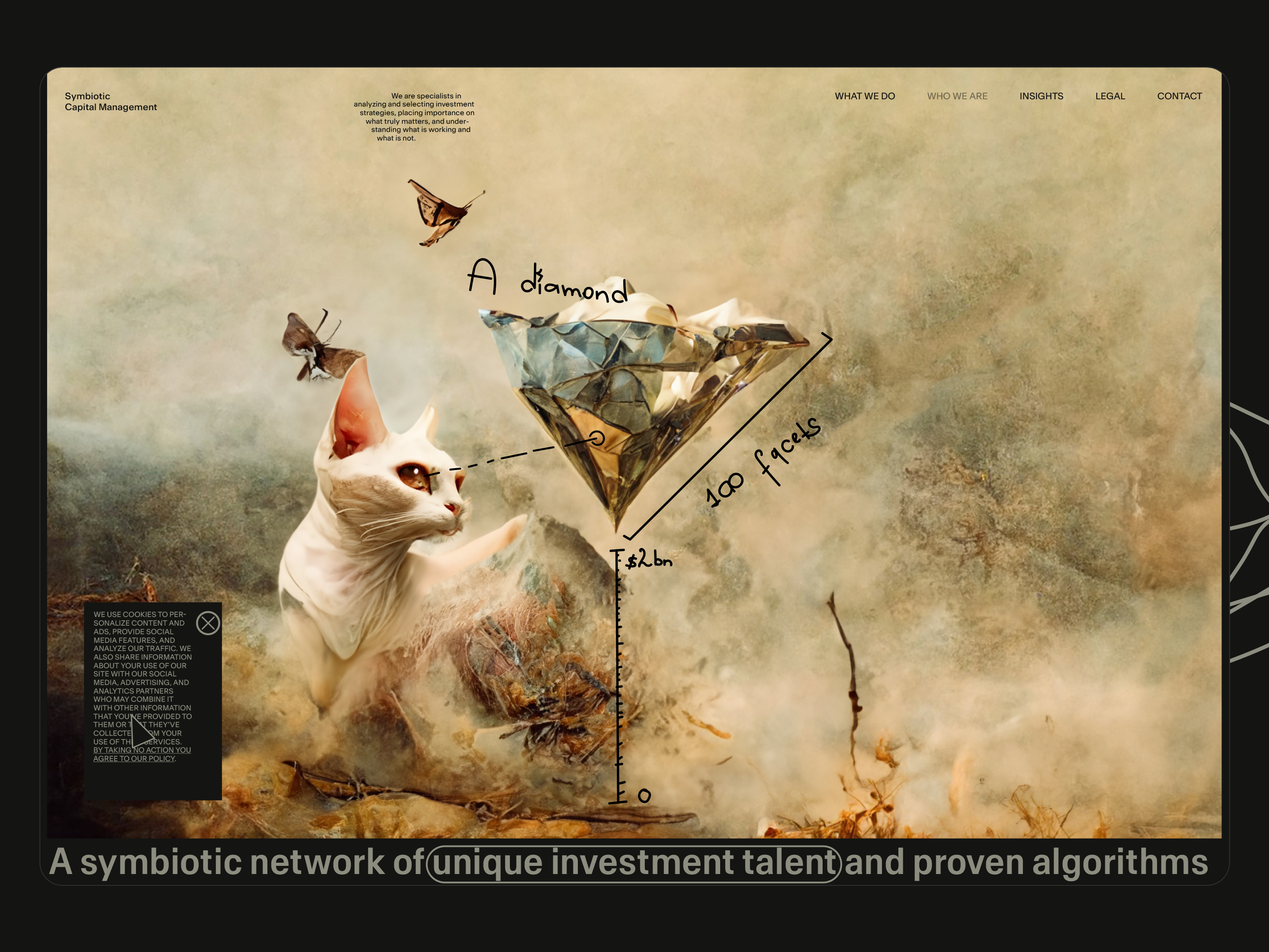
4. "A 100-Facets Diamond" appearance.
We are going to show this main paragraph first and then the secondary paragraph.
Instead of saying:
Who we are → A 100-Facets Diamond.
We'll do:
A 100-Facets Diamond (primary) → That is who we are (secondary).
In the same manner, we will handle the other section.
Instead of saying:
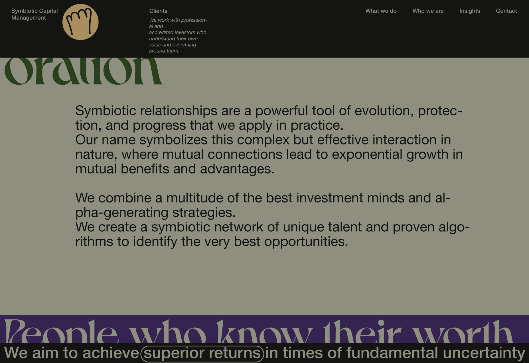
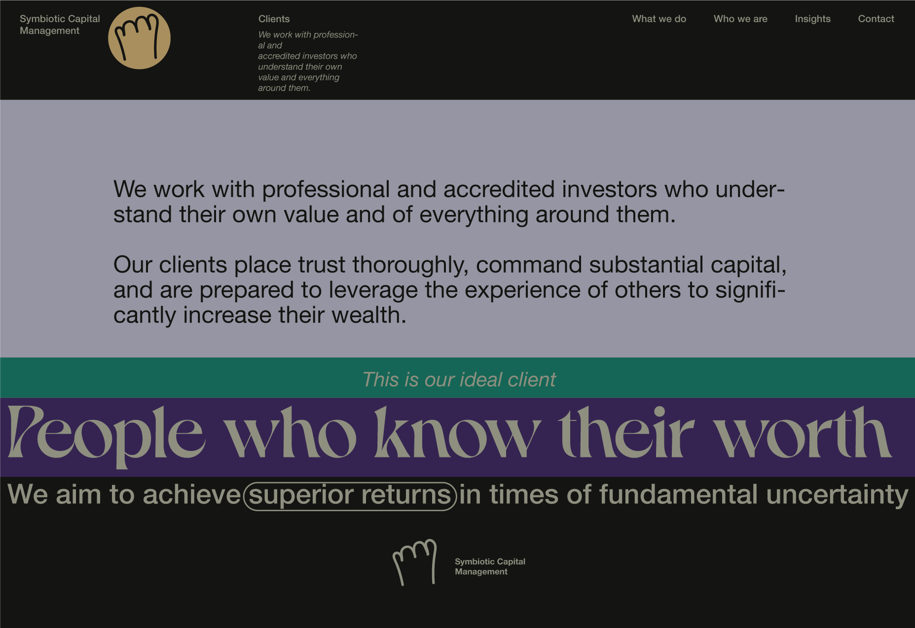
Our Clients → People Who Know Their Worth
We'll do:
People who know their worth (primary) → This is our ideal client (secondary).
5. "That is who we are" appearance.
6. Text block appearance. "A 100-Facets Diamond" section. Note: All the sections with texts probably will have illustrations.
7. The background will be moving faster than the text block.
8. This is where the section and two blocks in the footer will start moving together, however, with different speeds.
9. The two blocks in the footer move faster than the textual content. The next section is blurred and located behind the "A 100-Facets Diamond" section at the top of the page. The blur will be removed when the previous section almost disappears below the fixed header.
10. The blur has been removed.
This section is blurred because its content appears to start at the bottom of the page, and we do not want the user to see something that is not useful. We care about UX.
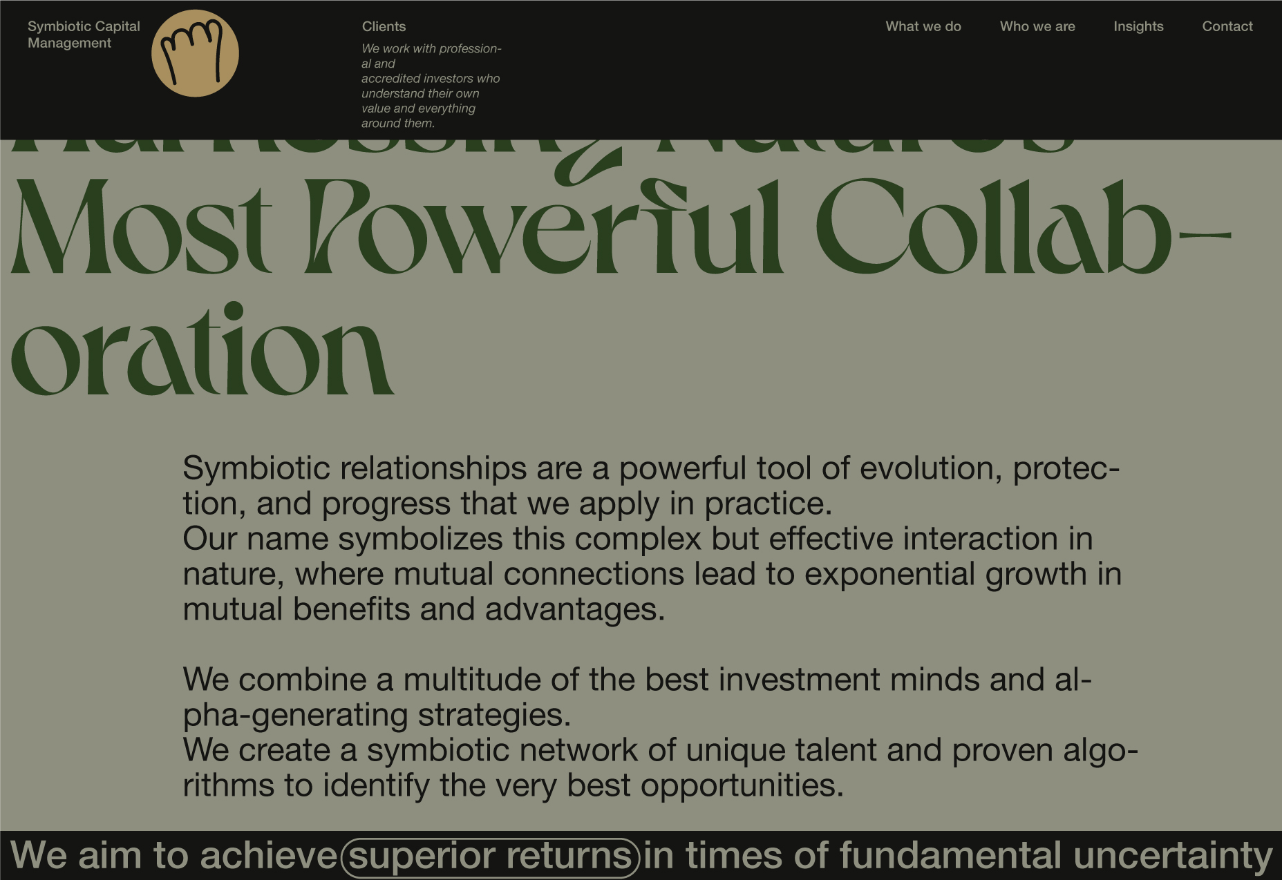
The colours of every section are different. For example, this section is light green because of the previous "A 100-Facets Diamond" section's main paragraph background colour. The title has the same colour as the "A 100-Facets Diamond" section's main paragraph background colour - green.
11. An example of "Harnessing Nature's Most Powerful Collaboration" section on scroll.
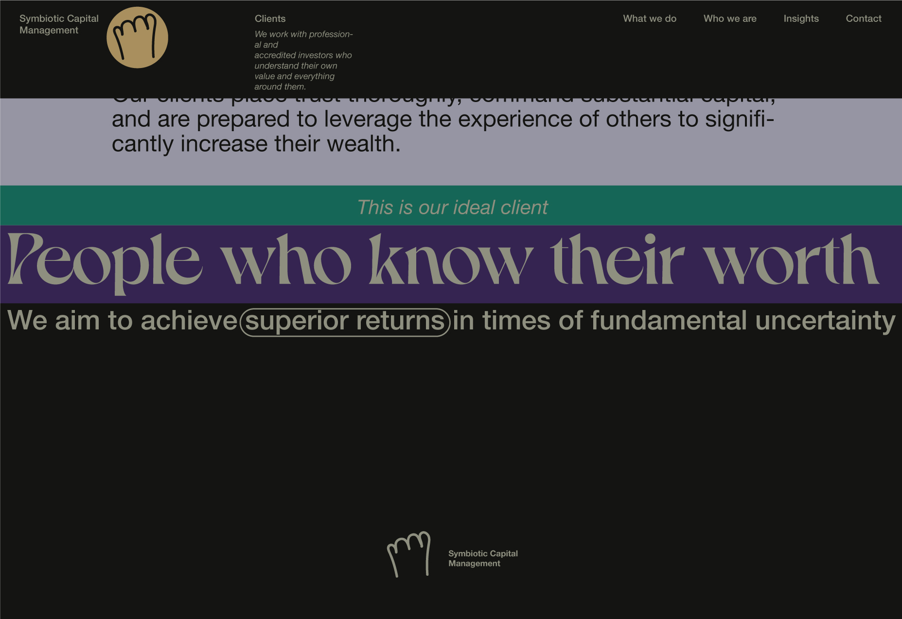
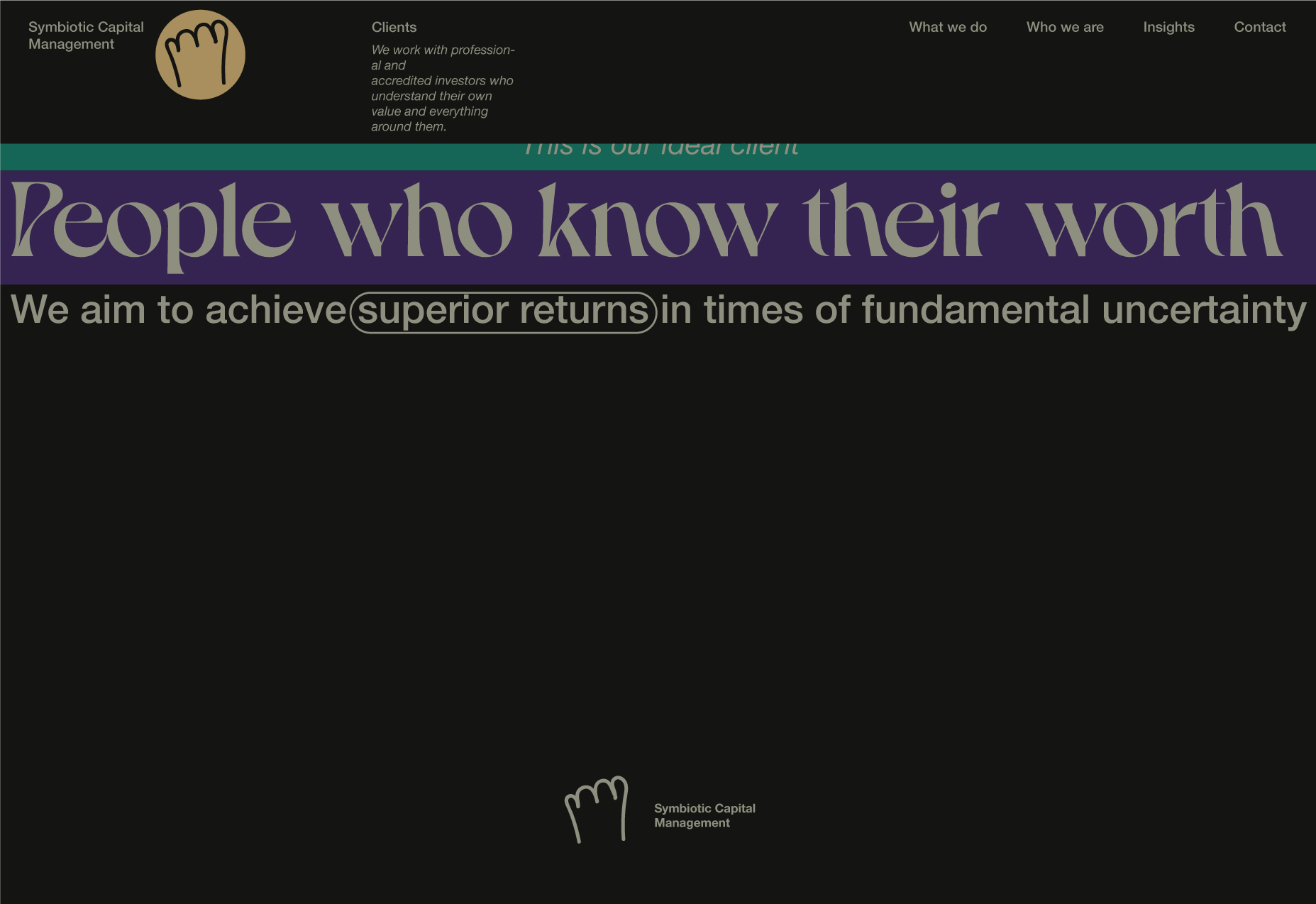
12. Appearance of the "People Who Know Their Worth" main block.
Instead of saying:
Our Clients → People Who Know Their Worth
We'll do:
People who know their worth (primary) → This is our ideal client (secondary).
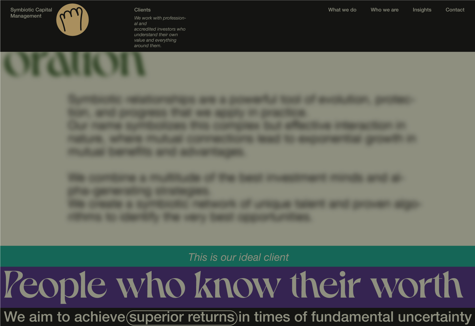
13. Appearance of the "This is our ideal client" secondary block. The previous section is becoming blurred, as we do not really want the user to explore its content anymore.
14. Content block.
15. All the sections are moving on a scroll. The final content is below.
16. After the previous content disappears, the can parts and Meow (Thank you!) will be animated using the SVG line animations.
A square version of the logotype.
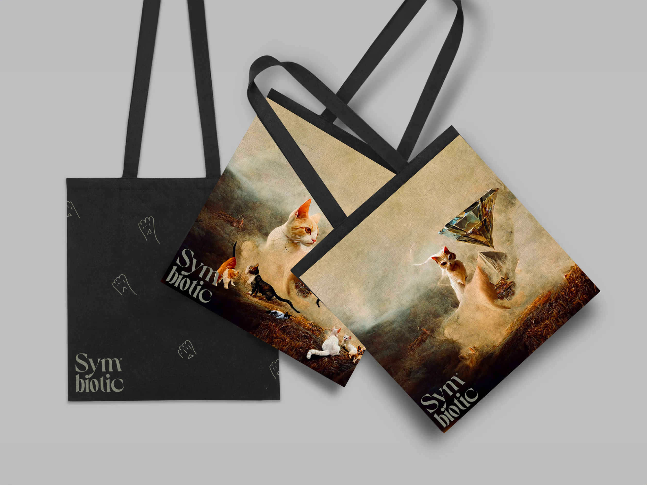
A realistic example of the logo on the cotton tote bag.
Ligature of yi.
The ligature is made up of two graphemes, "yi," joined together to make a single glyph. In other words, we created a unique character by joining multiple characters, which creates a more concentrated (by increasing the composition elements' relationship) object.
Behind the scene.
Why I (yi) or Why Me(client): You are ready because you are rich because you want more.
Landing page behaviour prototype.
The prototype is a great thing. It will allow you to understand the system better and uncover your mistakes. However, this time, I was not surprised-the result was exactly how I imagined it.
Landing page behaviour prototype.
This workflow reminds me wawes during the storm. In the course of time, the wawes became higher and stronger - more details got involved, the same time the elements got sharper and sharper with every wave.
The more wawes you can survive better the design will be, and maybe you will be able to weather the storm and get to land.
The weakness of this approach is that it is impossible to calculate the time the work will take. Which is essential when providing a quote to a client. All this, of course, is important only if you care about what you do.
Now that we already know what it going to look like and how it will work, we will:
- prepare the wireframes of all the pages, discuss provided contents, and propose modifications if needed.
- Present the prototype to the development team to make sure they can develop it. At this stage, it may make sense to actually develop the prototype to test the behaviour in the browser.
- Continue working on the website landing and other pages, including the mobile website version, logomark, and other brand-related materials.
Landing wireframe
At this stage, we want to establish the structure and flow of possible solutions. These outlines - wireframes - must reflect user and business needs. It will help ideate toward an optimal and user-oriented system.
Note: Uppercase is used only in the first word in a sentence, except for titles and names. This needs to be explained.
Frankly, we are talking about the user here - his/her/them… comfort. The readability depends on the typeface used. If the tests clearly show that every word with the first uppercase letter makes it more readable, so be it.
Since we have already envisioned what it should look like and how it is supposed to work, our main goal regarding the landing page is to focus on the content of three information blocks-making them engaging by using illustrations and placements. In other words, we need to find something better than just texts.
HOW TO? - We just need to read the content very carefully.
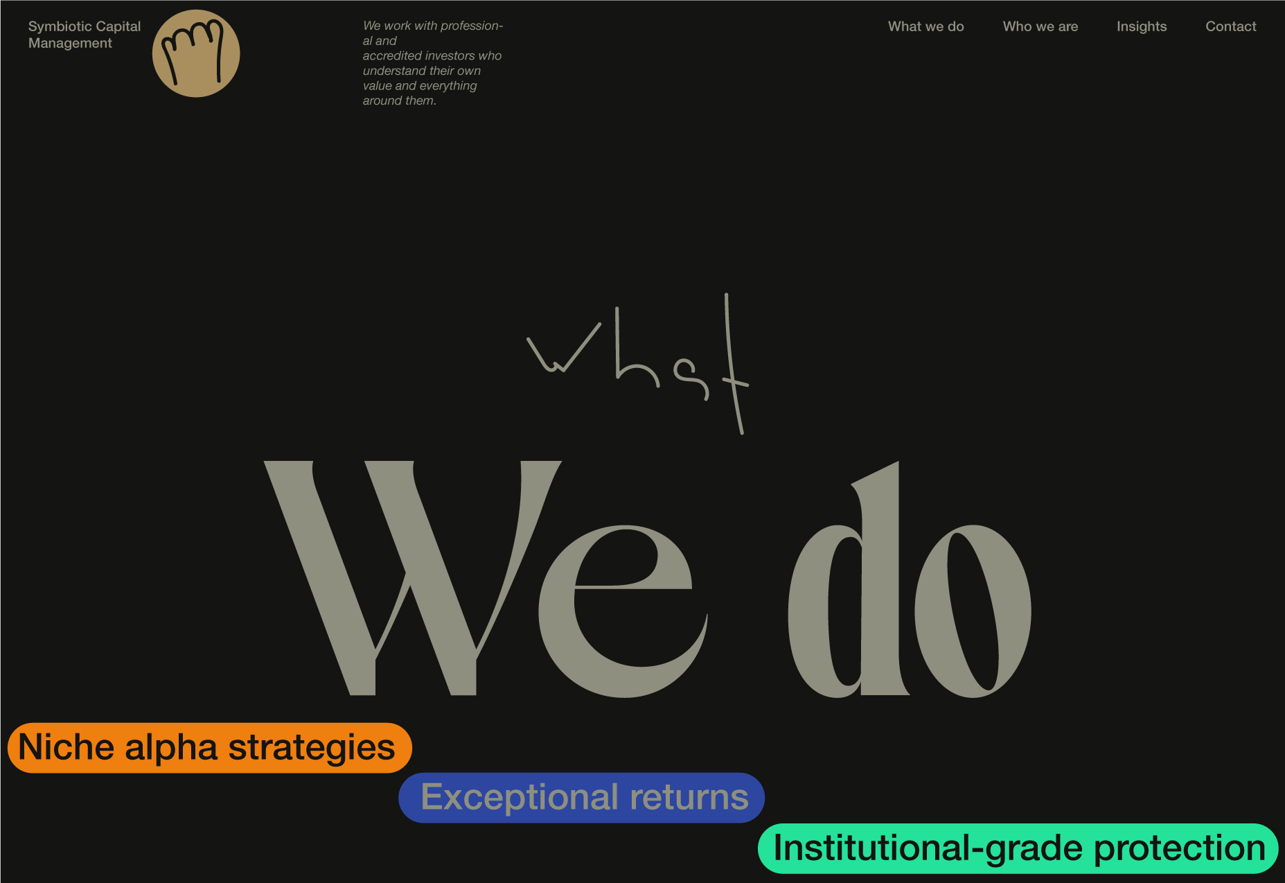
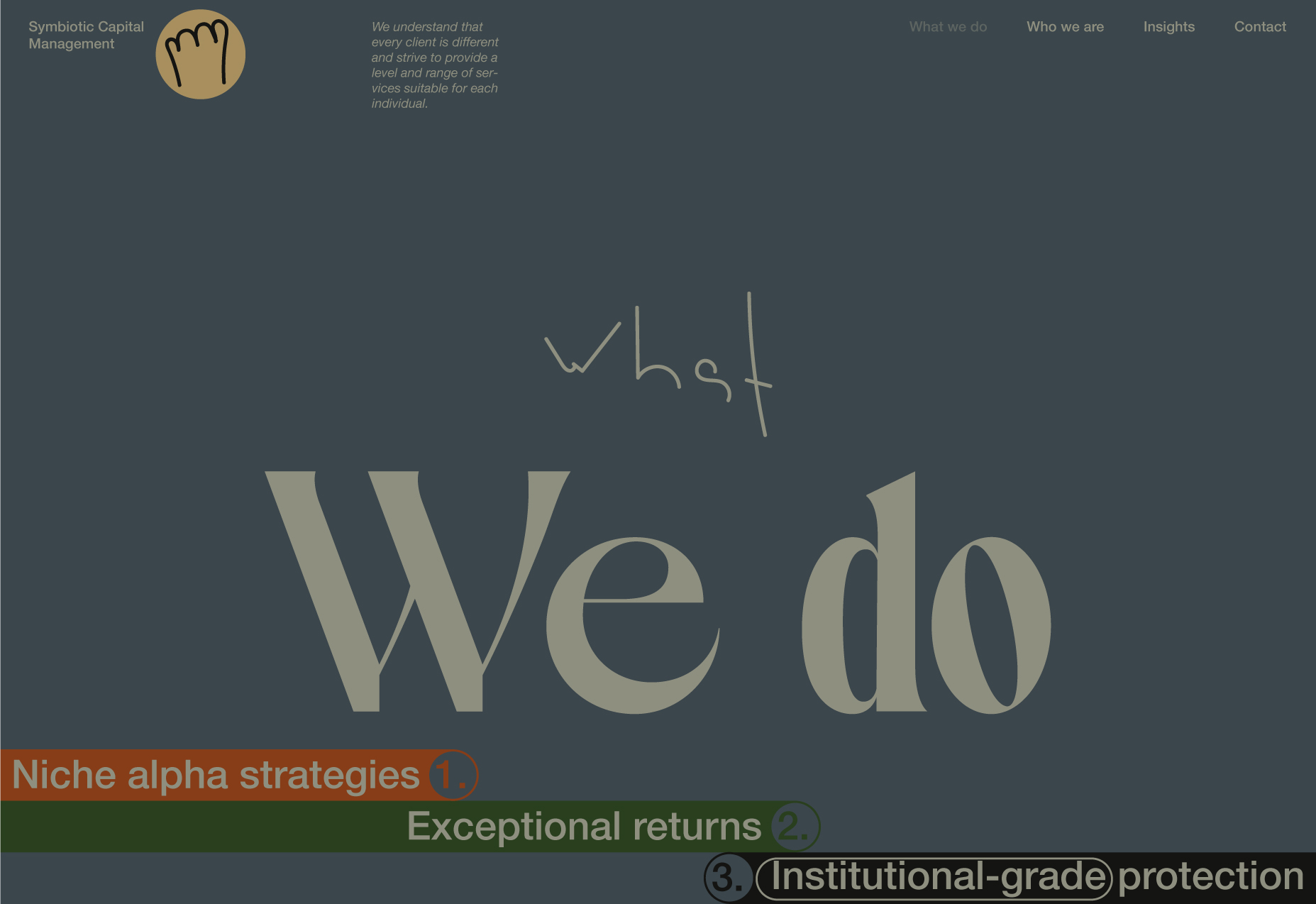
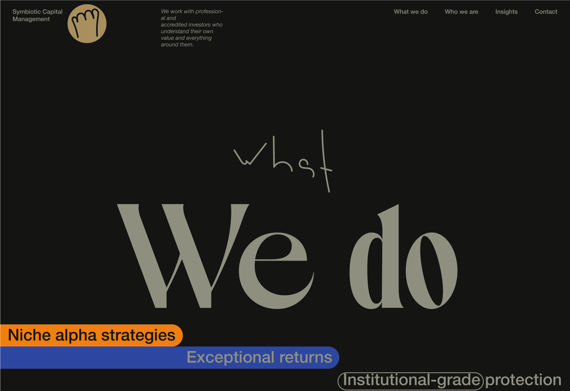
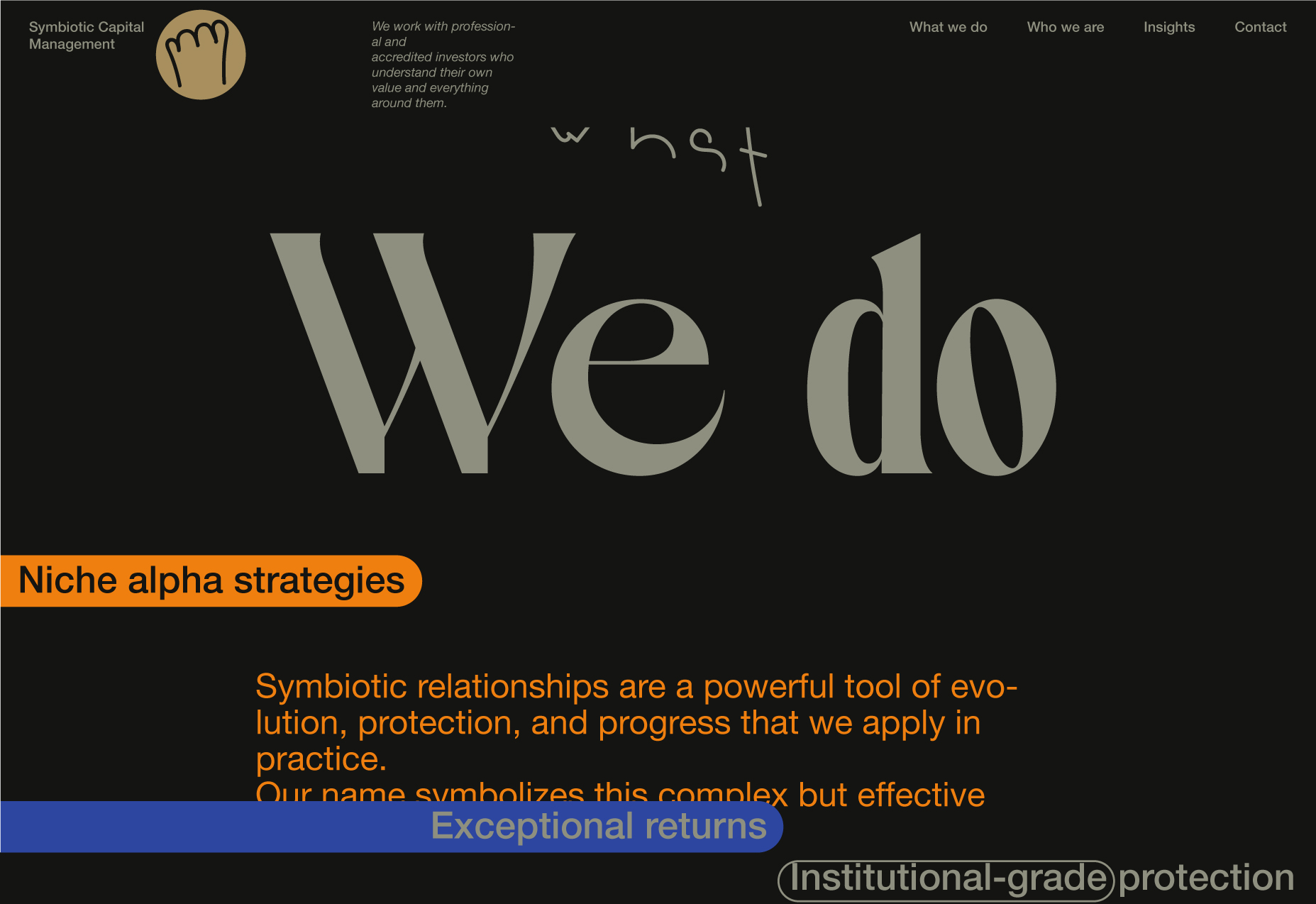
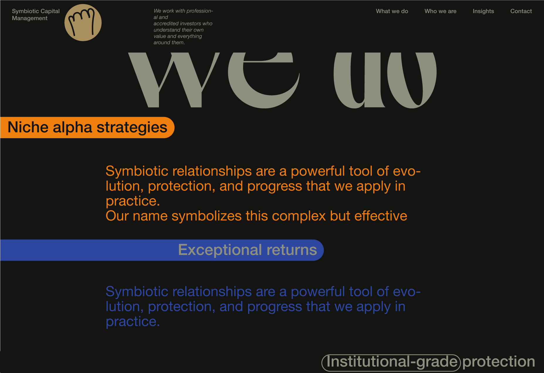
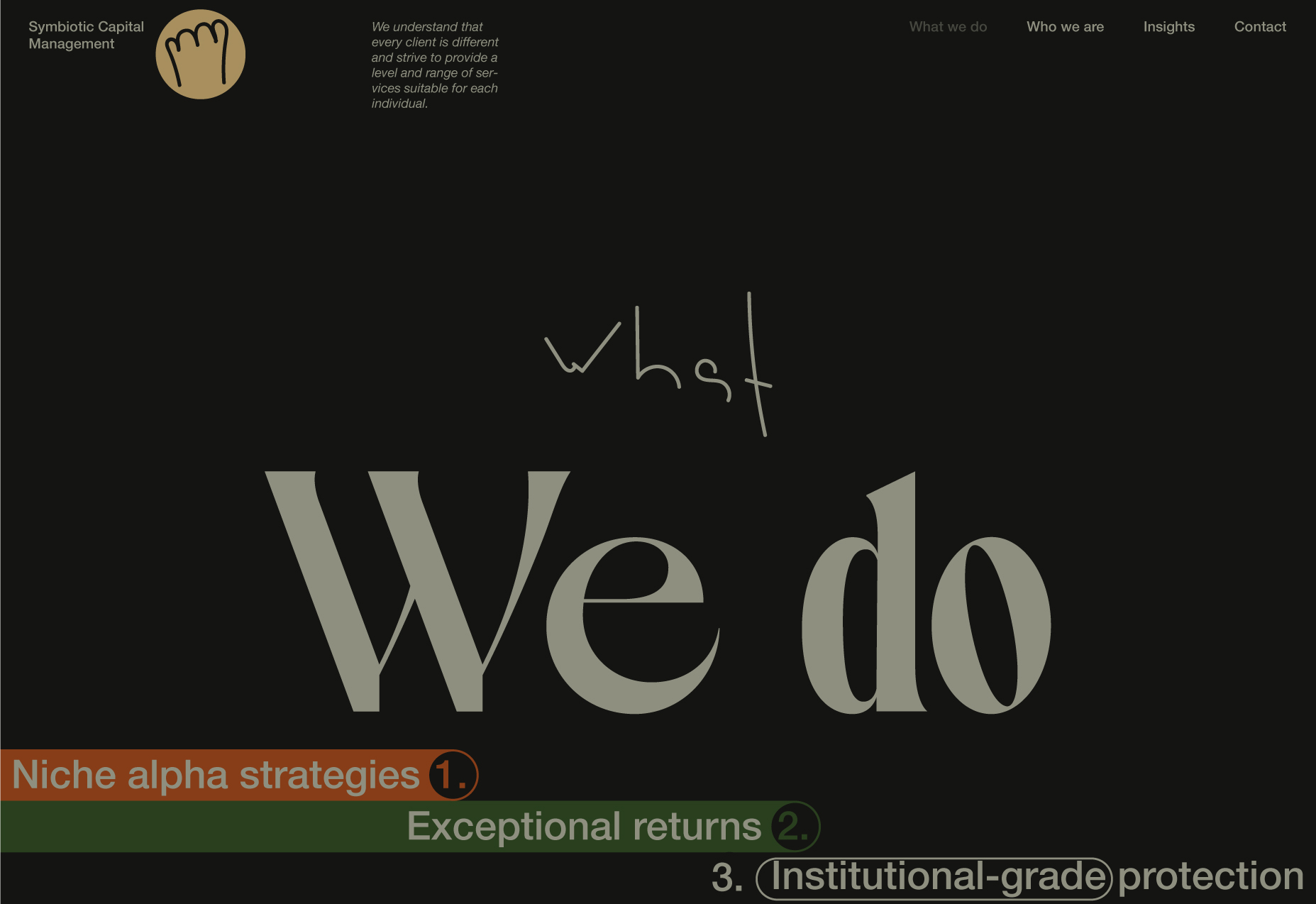
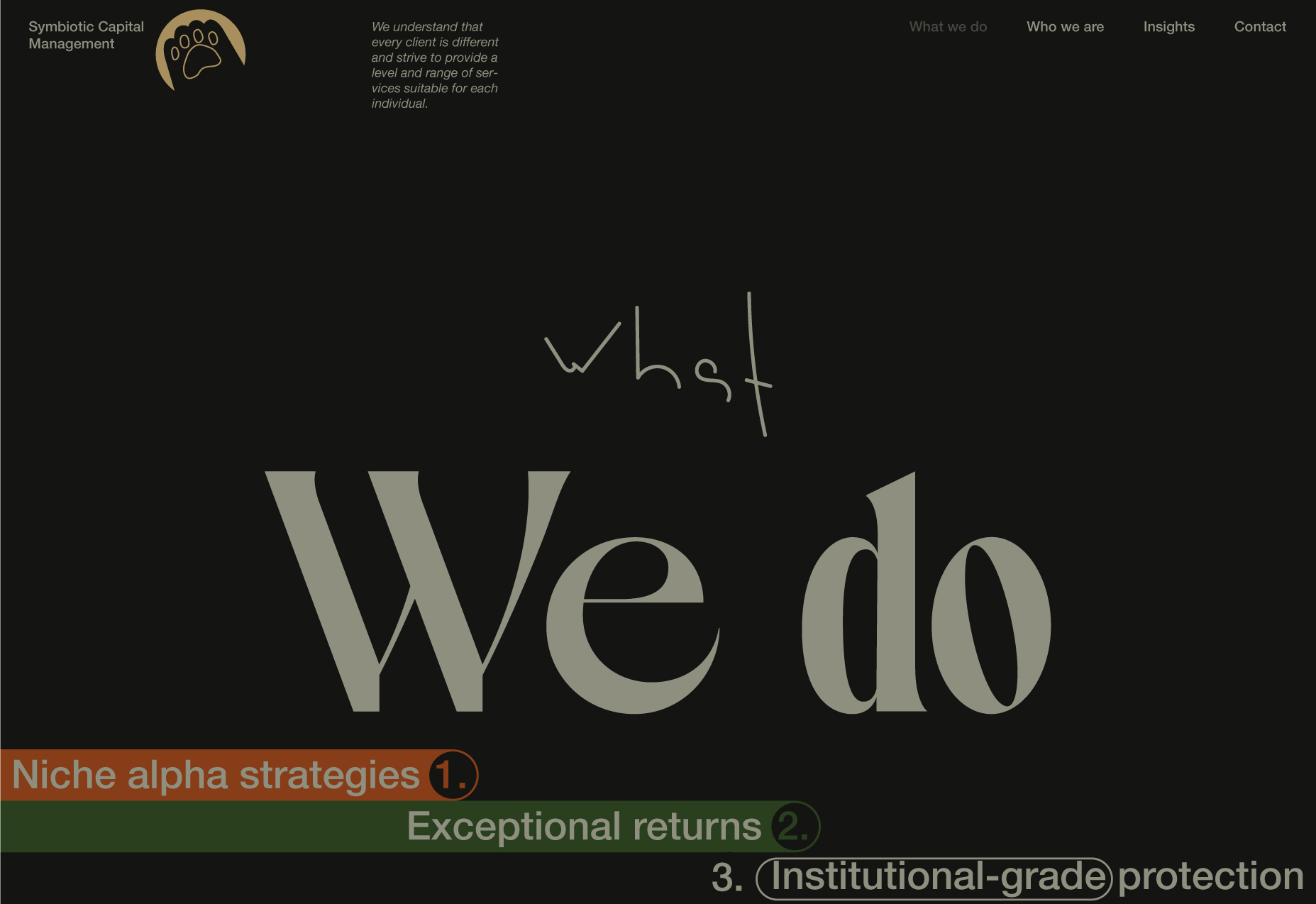
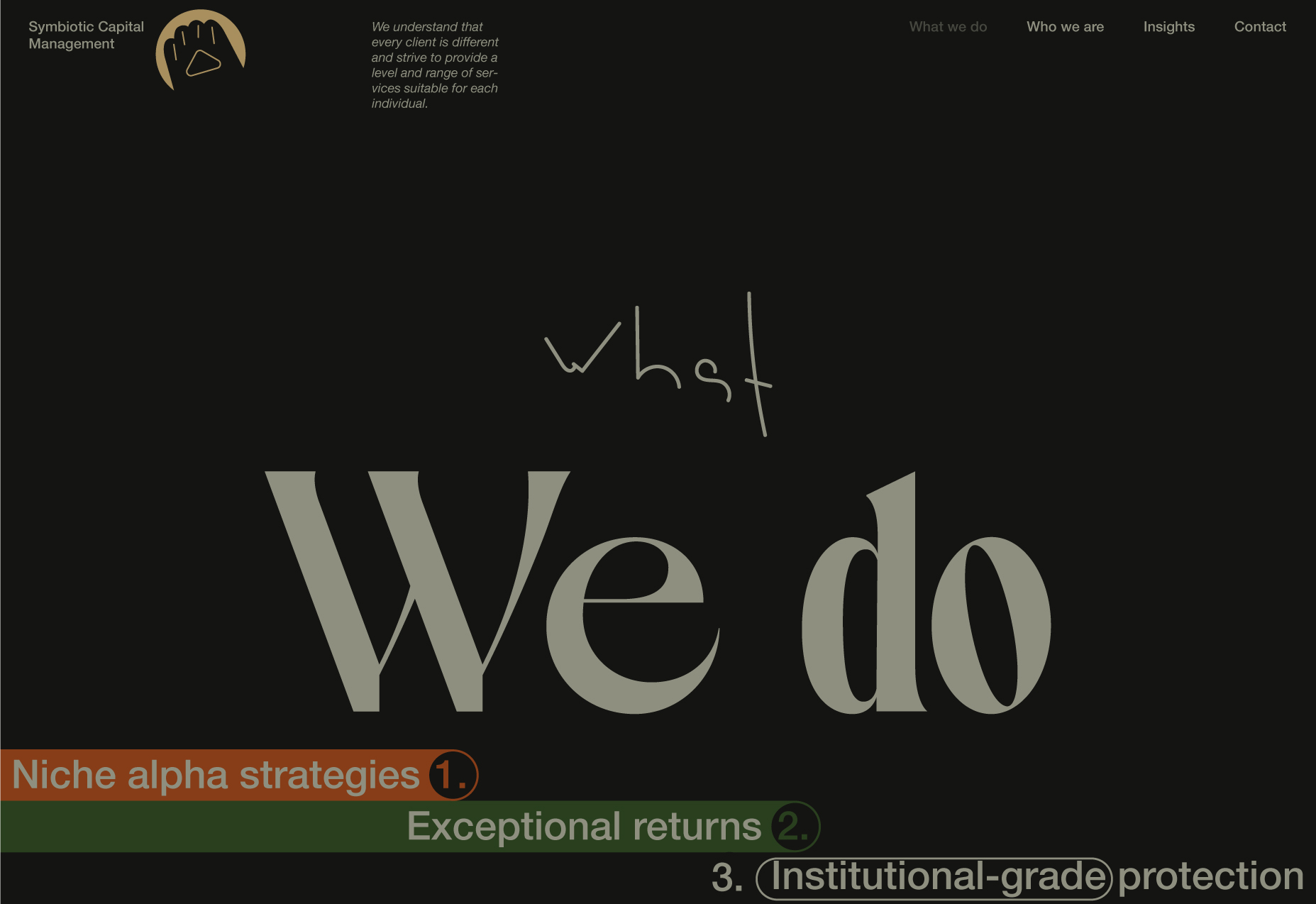
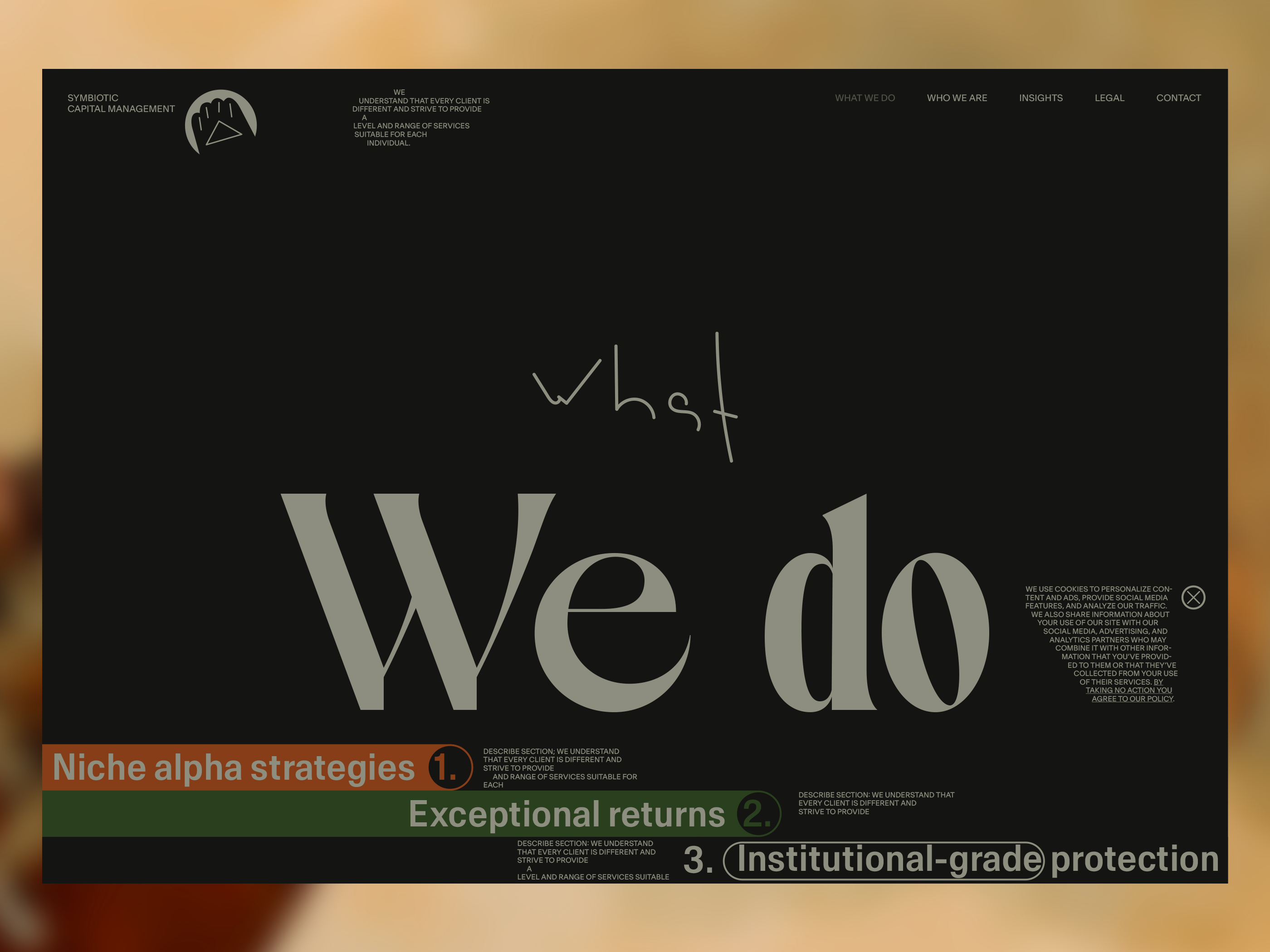
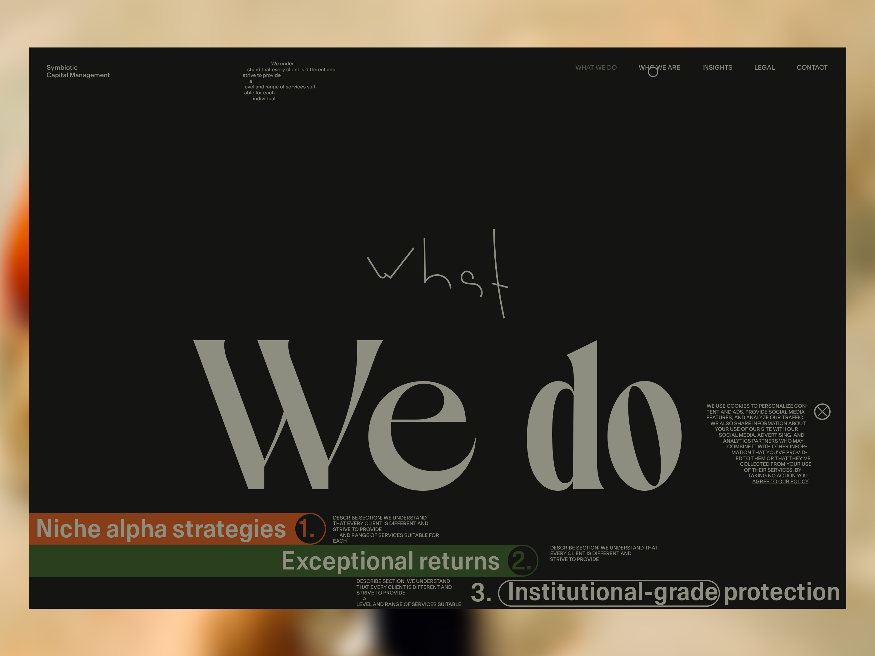
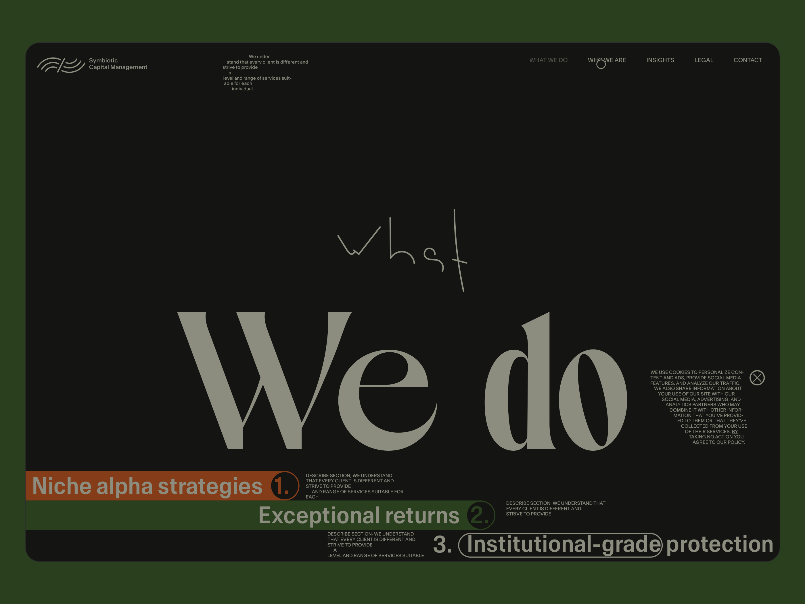
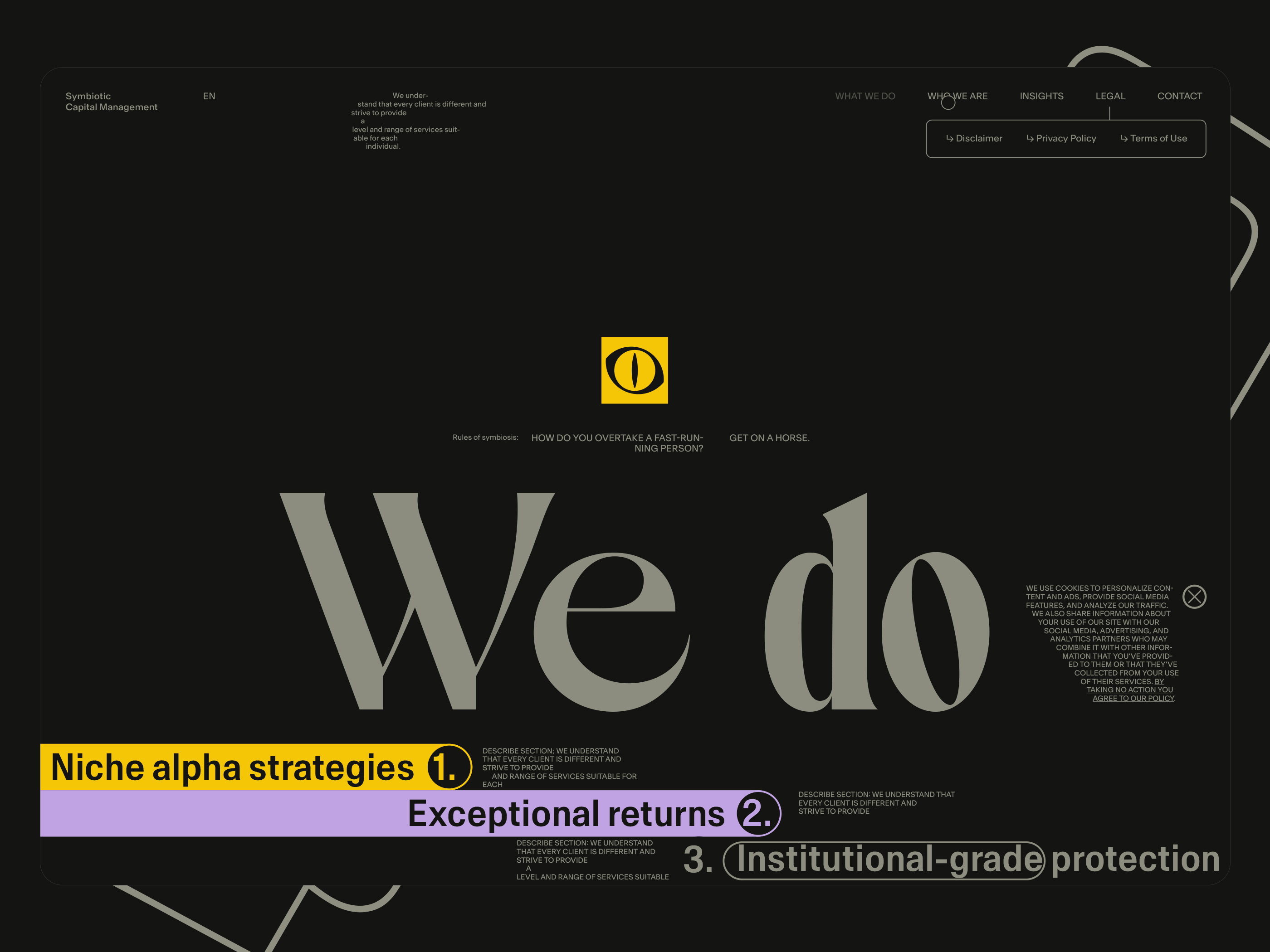
"What we do" page
The main challenge is always the same-consistency. It seems like we are fine; we are consistent in looks and behaviour.
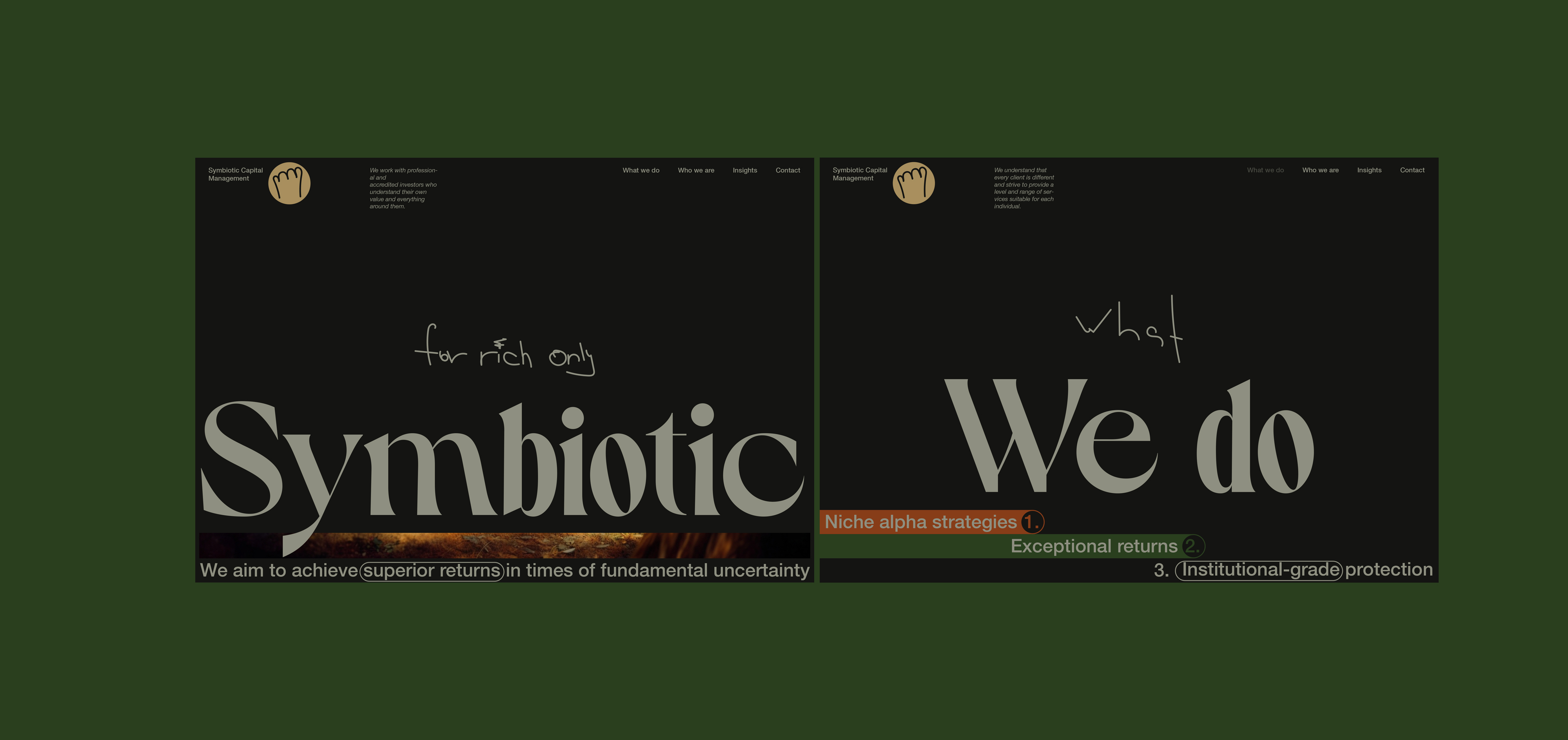
"Tabs". Searching for the solution
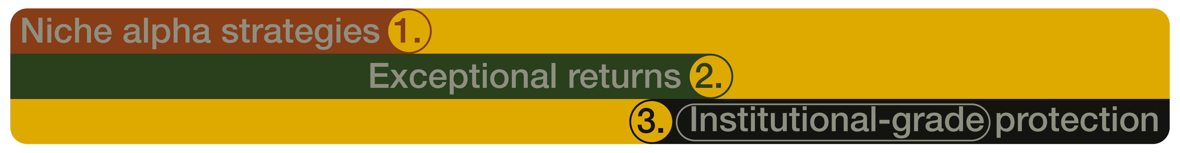
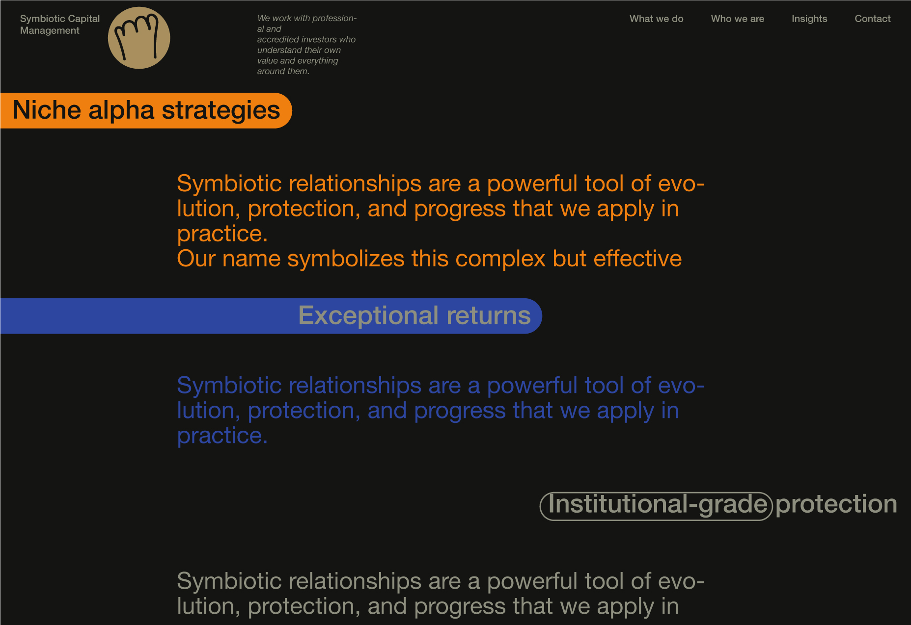
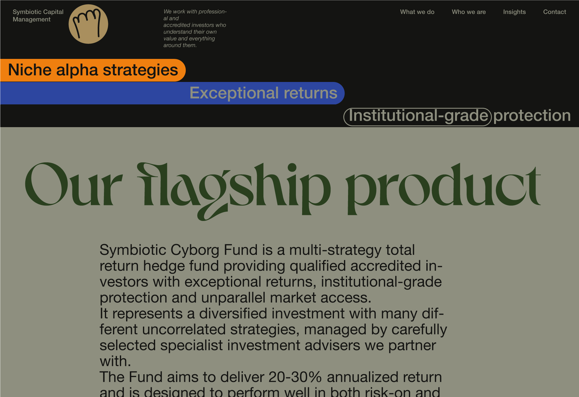
The original mockup has just the following text in the first section: Niche alpha strategies. Exceptional returns. Institutional-grade protection.
Basically, this is a list of the business's core promises. Since we already have a number of patterns, we can use them. In this case, the existing patterns can dictate how to present the information.
Note: The text block at the header can possibly use the relevant part of the page content text or be unique.
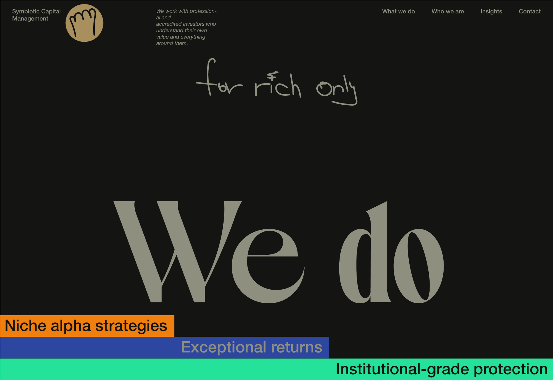
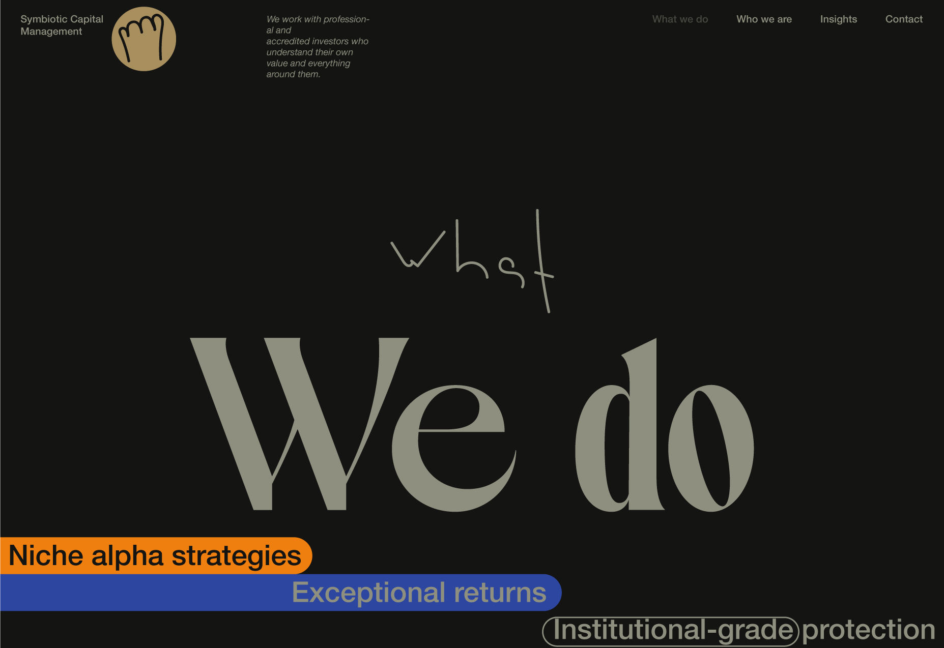

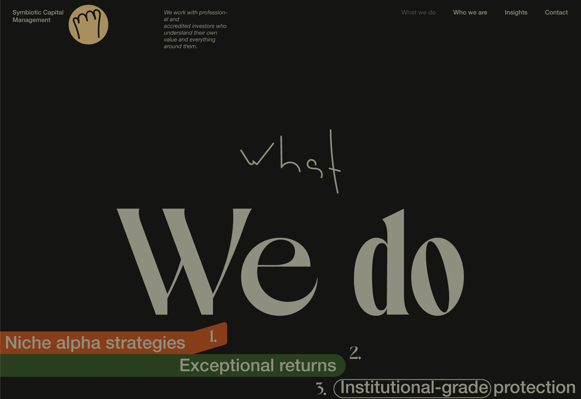
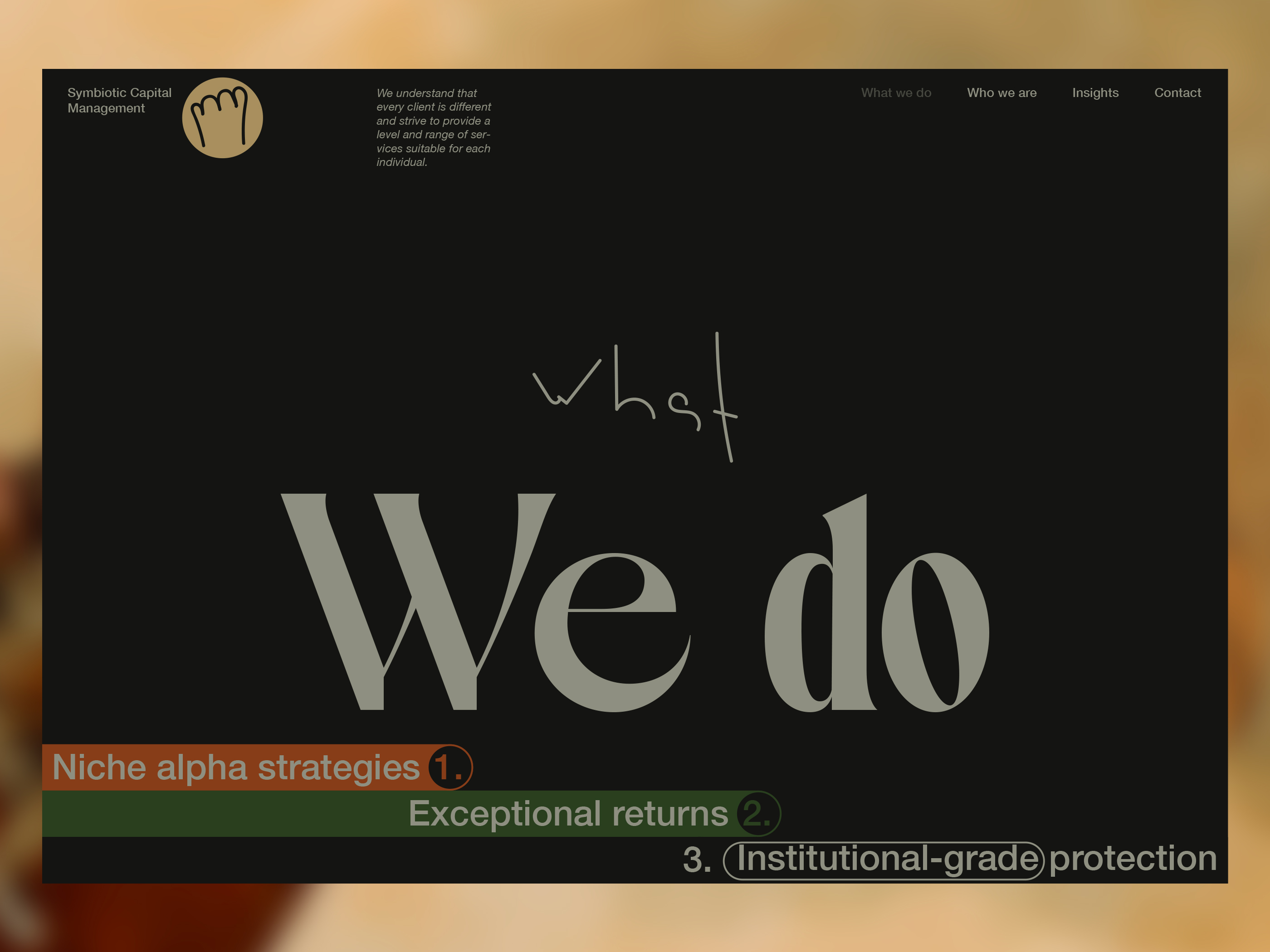
The lowest section kept different in purpose. There are a few reasons. one is to have it the same way (style)as the Landing footer. The other can be explained like this: it needs to be clear at the intuition level and not visually; this is not a website for kids. However, for those who have not yet been convinced - the lower section has the same (almost:) construction rules as others; what creates a difference is the same background colour as the main background colour of the website.
The example below demonstrates the sections that are different from the dark background colour of the website.
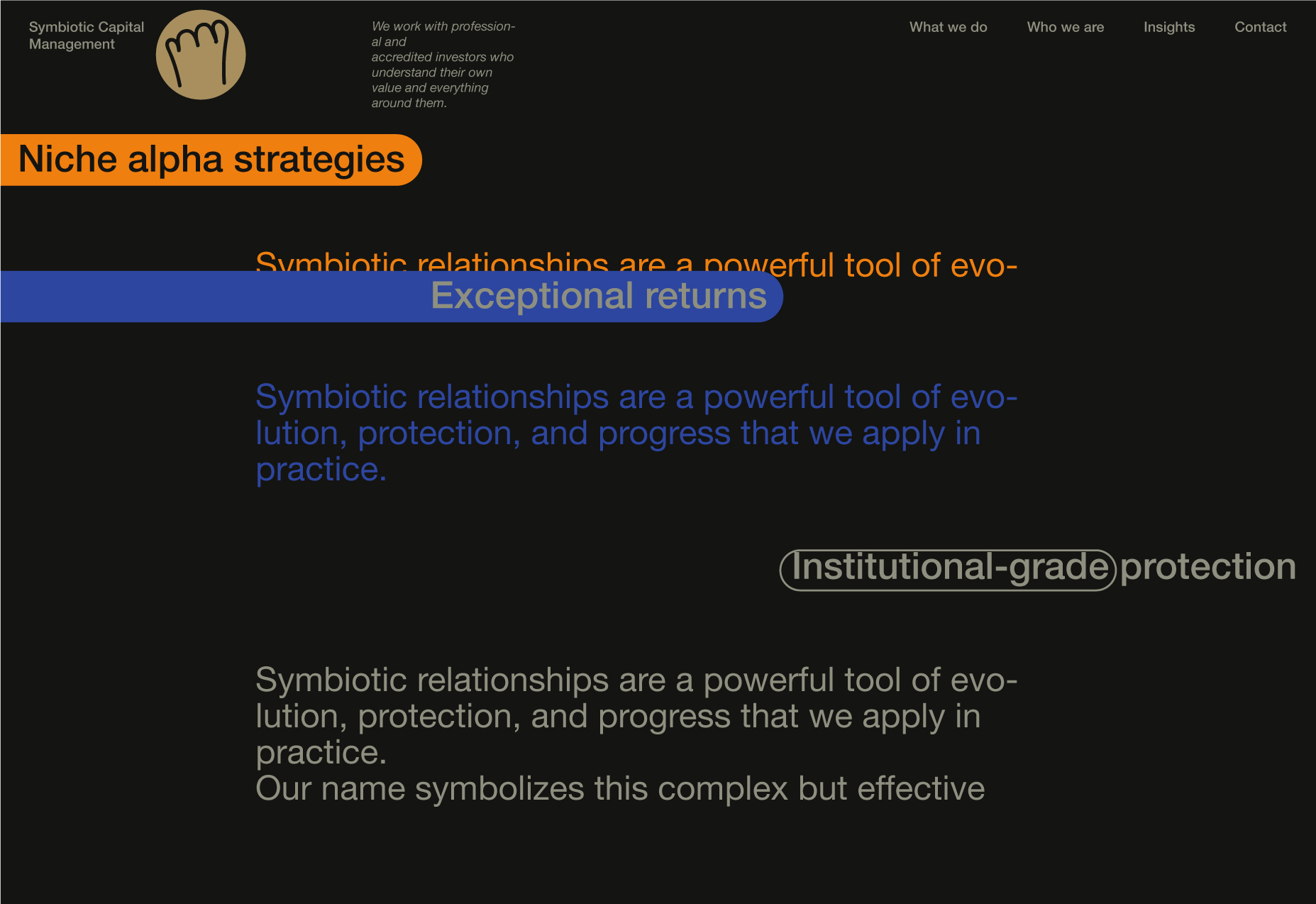
"Loop". Behaviour (on-scroll animations) scenario.
1. After the entry, animations were executed.
2. Begin scrolling. The first section scrolls.
3. The first and second sections scroll.
4. The first section is fixed at the top. The other two scroll.
5. The next section is located behind and is blurred. It's at the top of the page. The blur will be removed when all the "tabs" will become fixed at the top, under the header.
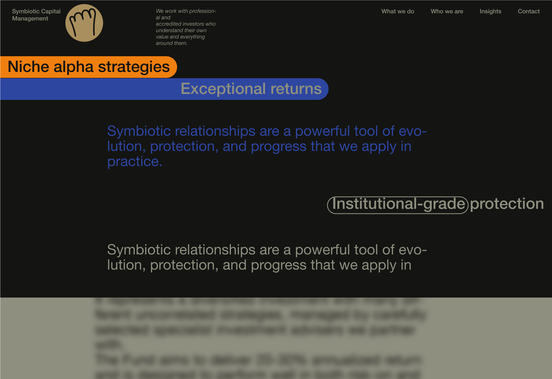
6. The blur has been removed. The "tabs" are going to stay fixed all the time.
7. Appearance of the next section. The previous content got blurred.
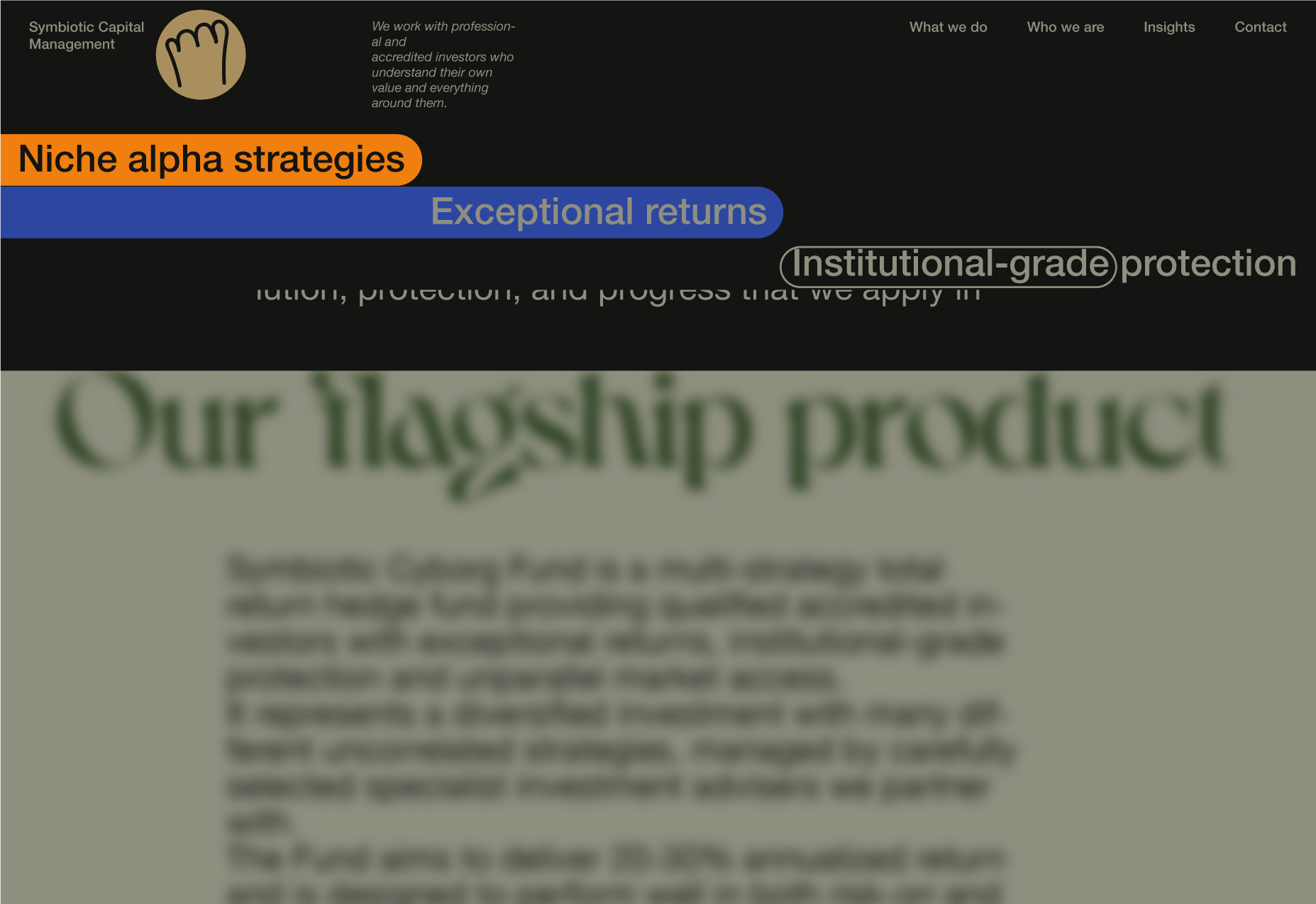
8. When the final paragraph of the section is visible, the content will be blurred, and the "tabs" will all at once start to move towards the bottom, exposing the main title, which is now: That's what we do.
9. The reverse scroll will be accessible just before the tabs touch the bottom of the page.
10. If the "tabs" got to the bottom, this is the same as the page just got opened (just the title is a bit different now) - loop.
Another rule we can clearly establish is to try to hold the most important information in view for as long as possible.
"What we do" page behaviour prototype
What we do page behaviour prototype.
Wireframe.
We need to find something better than just texts for the sections with textual content.
Logos
A new wave? Yep. Precisely.
It's time to determine whether we are ready to improve our cat footprint logomark. We have a composition we like, and now we can focus on the logomark to see if we can find a better visual solution for it. Frankly, this is an endless process.
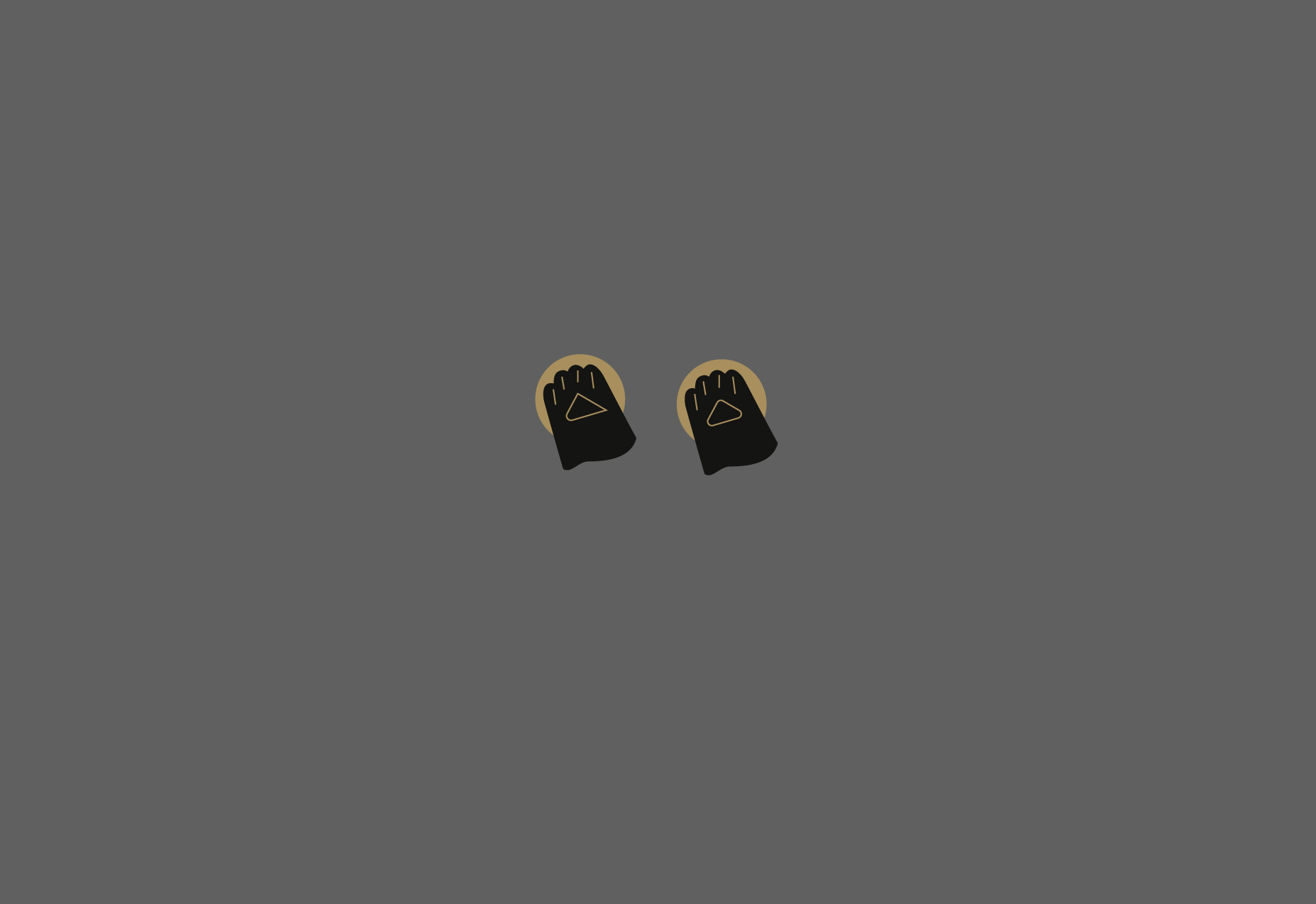
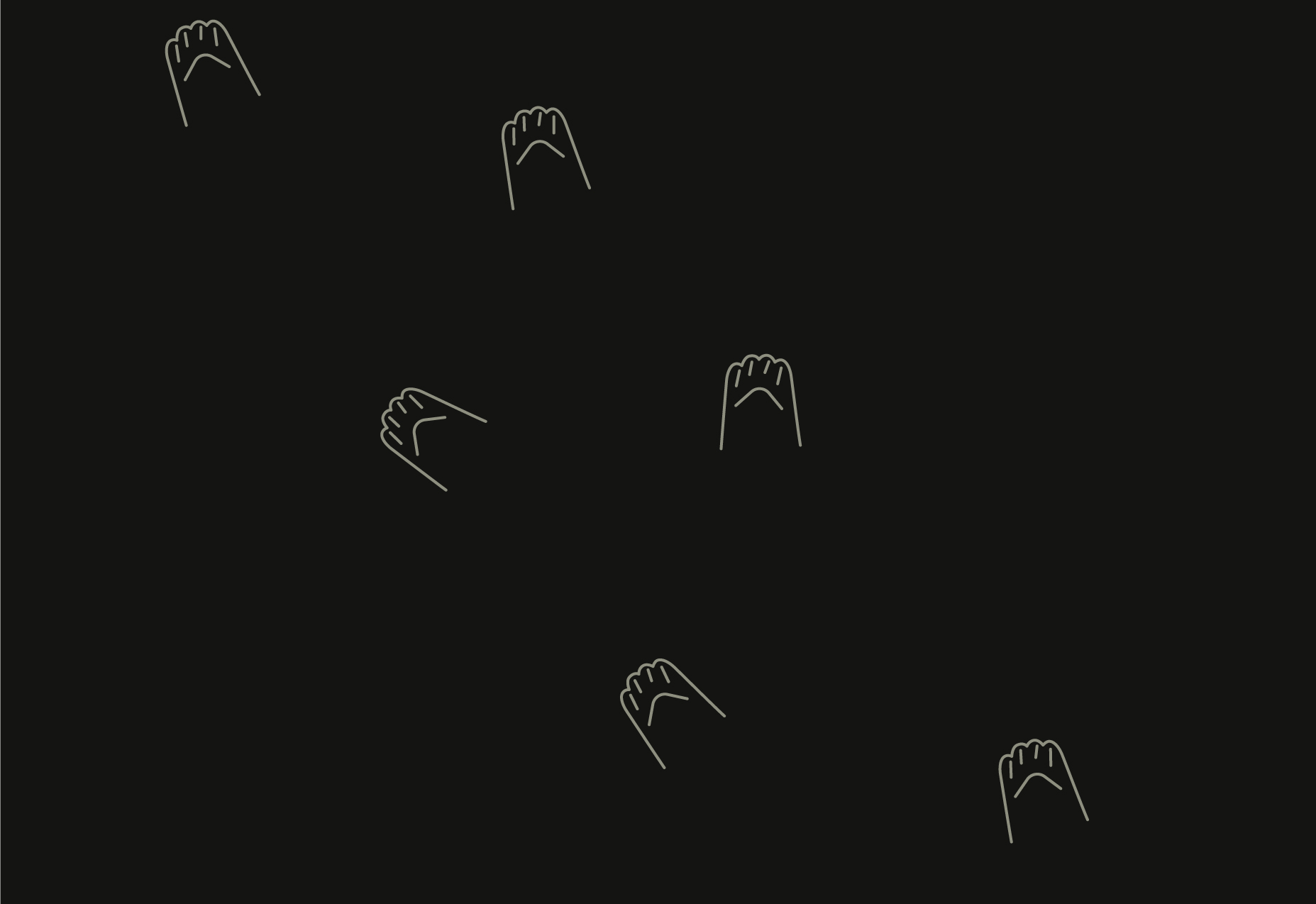
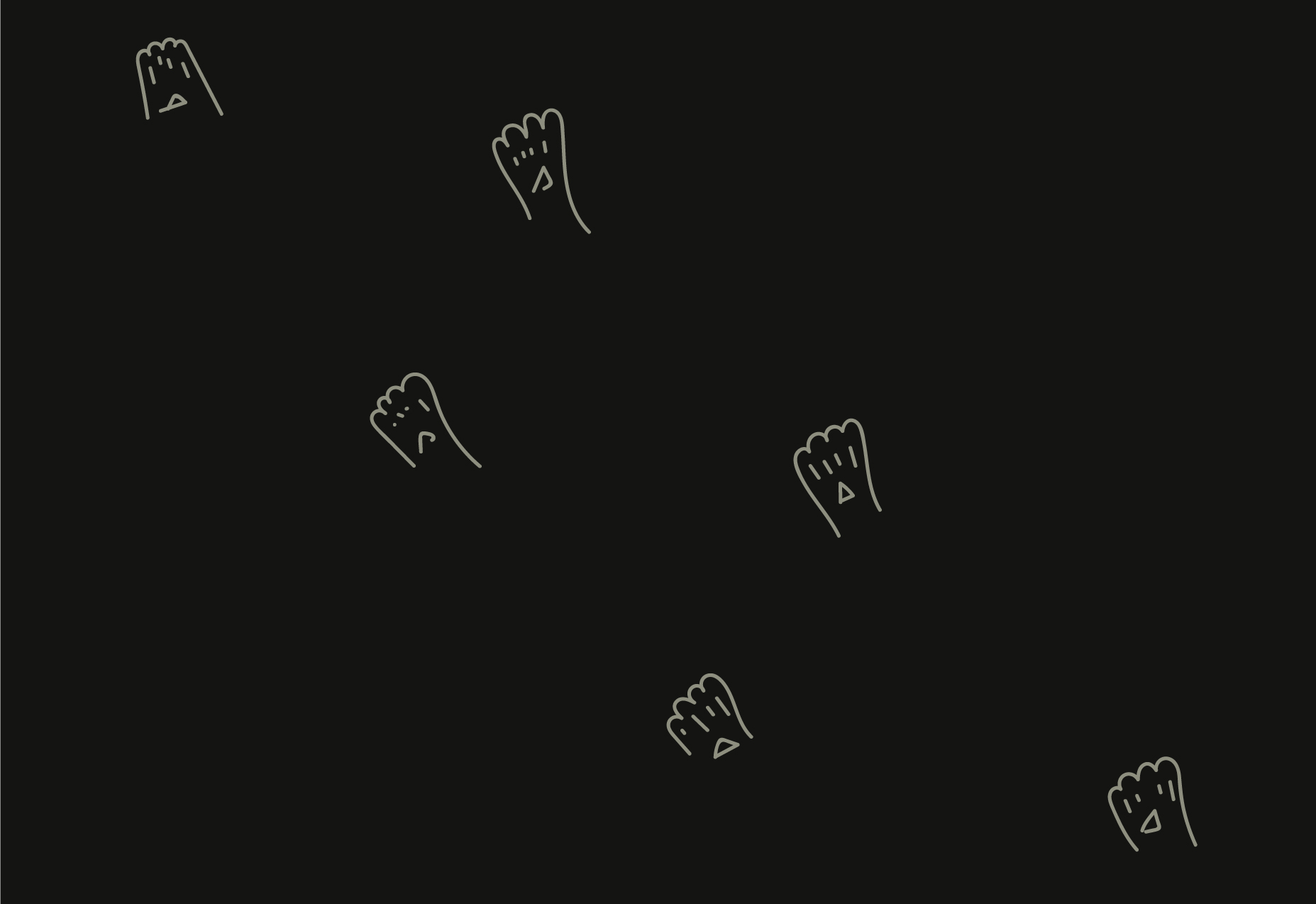
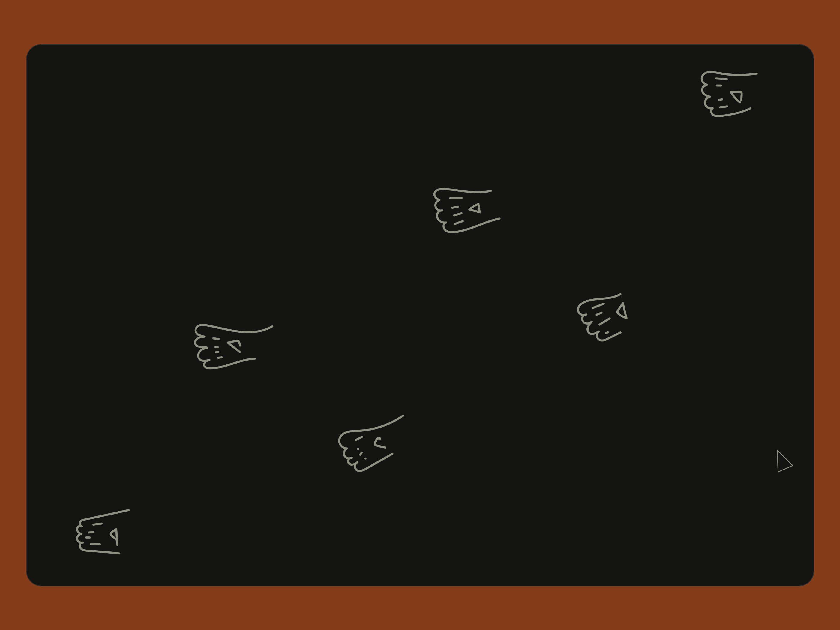
Hello, gesture (cat footprint).
The goal is to improve the shape so that the idea (cat footprint) going to be more recognizable.

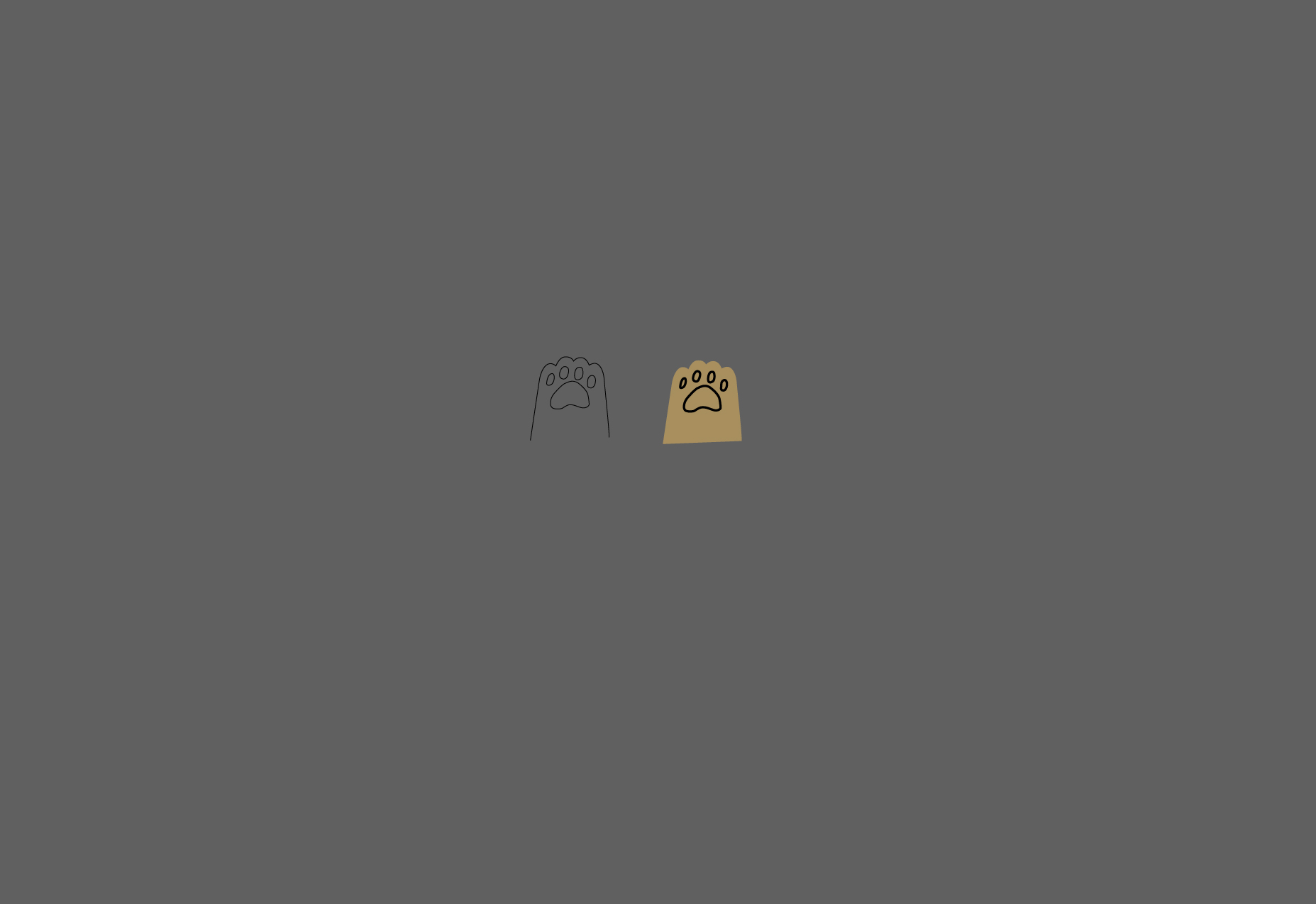

The examples above look too natural. We want to operate with simpler shapes - more schematic. This is not an illustration; it needs to be more symbolic. However, the shape will have to take into consideration the illustration style. It needs to be something between the free-hand drawings and the illustration.
There is nothing more symbolic than the triangle, whether we need a symbol for the finance field or any other field. So be it.


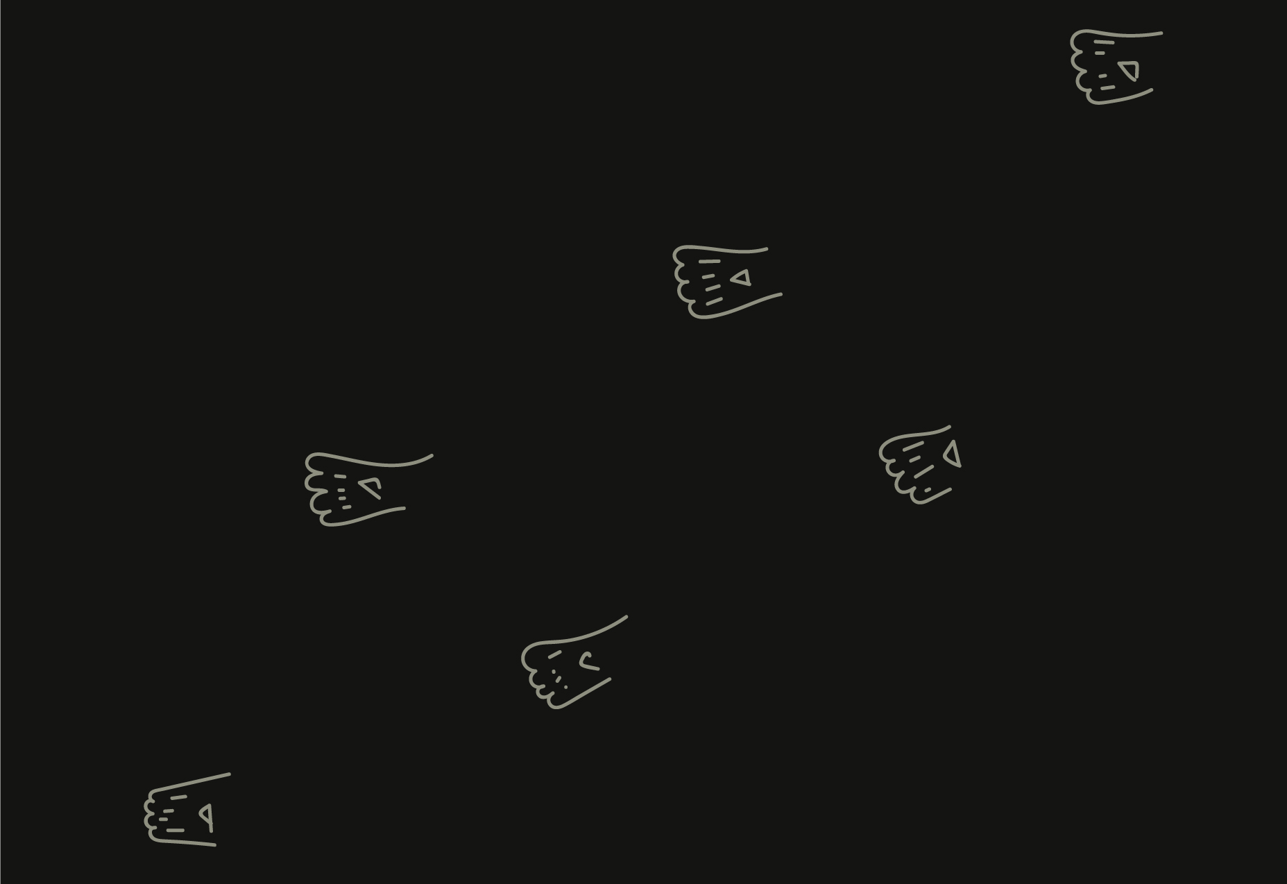
The loader footprints are not logomarks but a freehand variant of it.
We will have different variations of the loader. Each page will have its own loader version. The difference will be only about the direction of the footprints.
Landin - bottom right to the top-left. What We Do - from the top right to the bottom left. The same for other pages. Center/center also can be used.
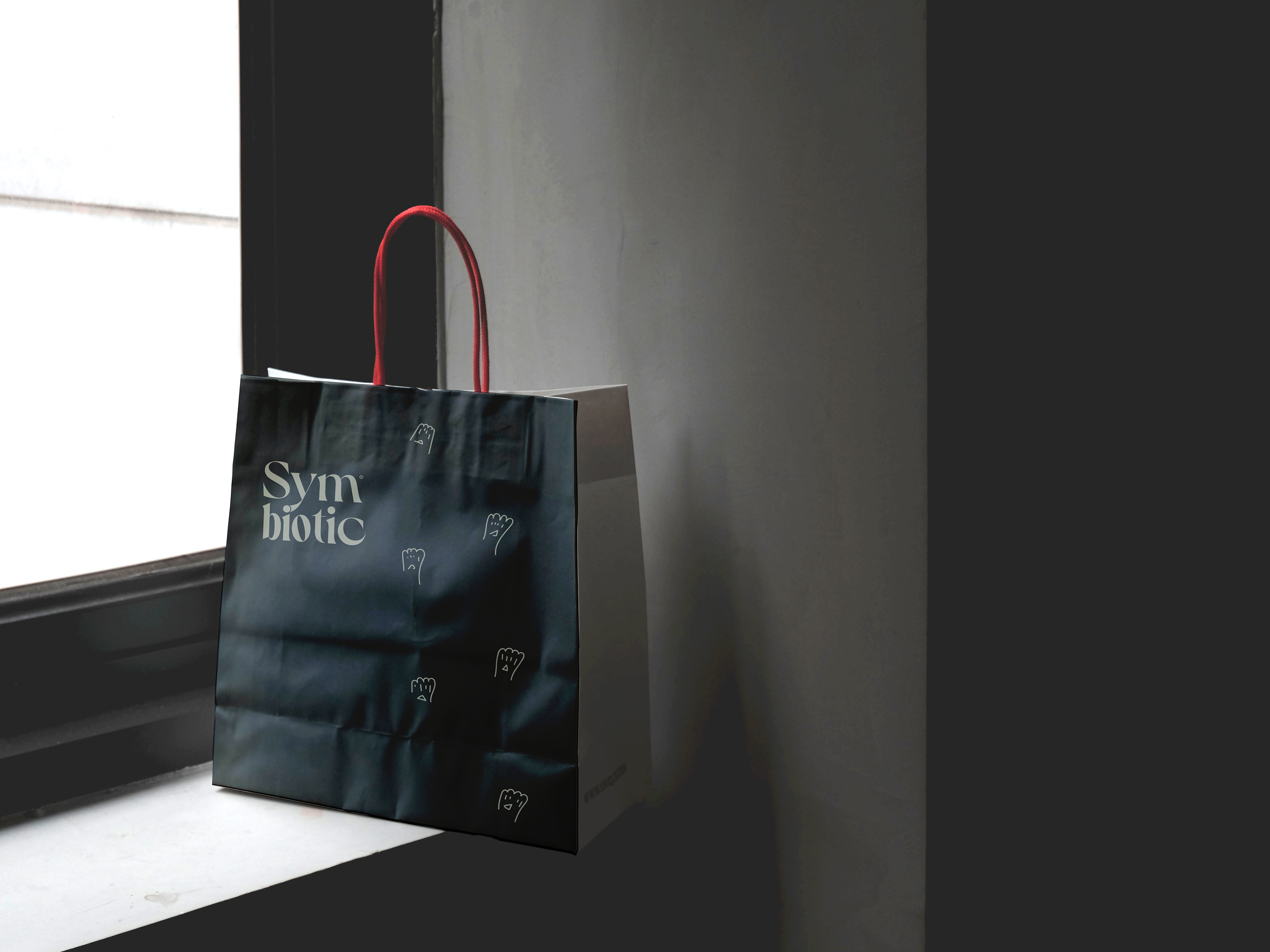
Logotype and freehand footprints on the bag.
Logomark and "Meow" instead of Hello or Thank You.
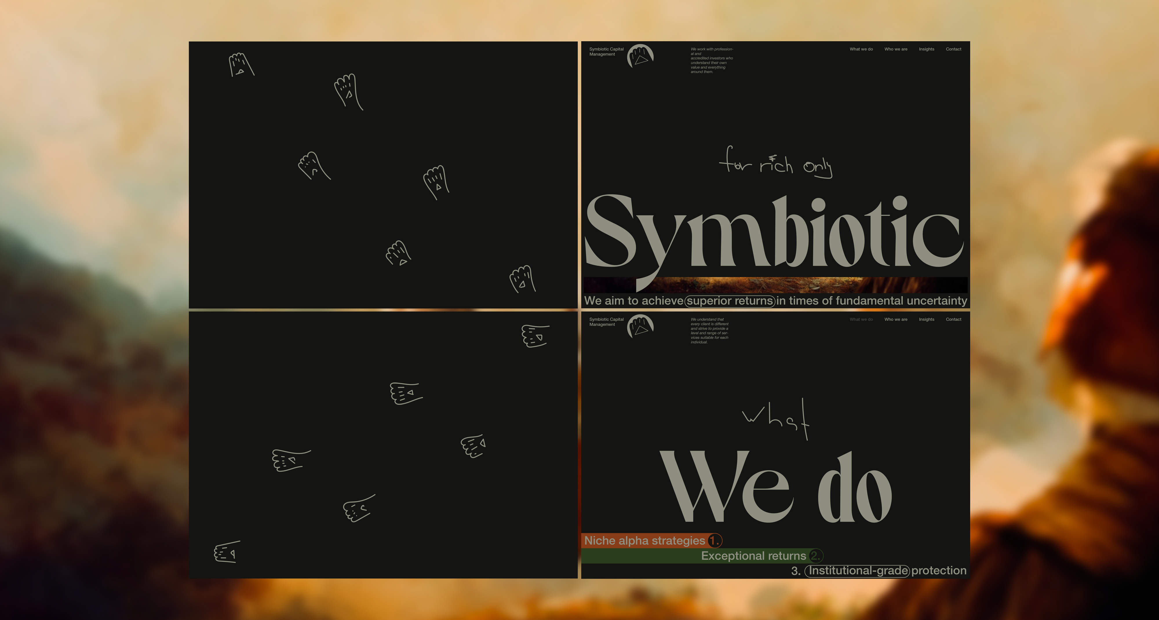
Four screens.
Loaders, Landing, and What We Do screens.
Adjustments.
- At this time, I will look at it 100% and adjust the sizes.
- The body font now is Antarctica VAR.
- I am adding section content previews for "tabs," the user will see them only when the section's content is not visible. In other cases, opacity is 0%.
- The navigation text block is different than the square shape. We will try to use an inverted triangle.

Cookie block added. It has a fixed position and stays exactly where it is till the user won't close it, or it will get a fixed position when it reaches the header - one of two.
The custom cursor is a triangle (play) that, on hover, becomes the circle (the eye).
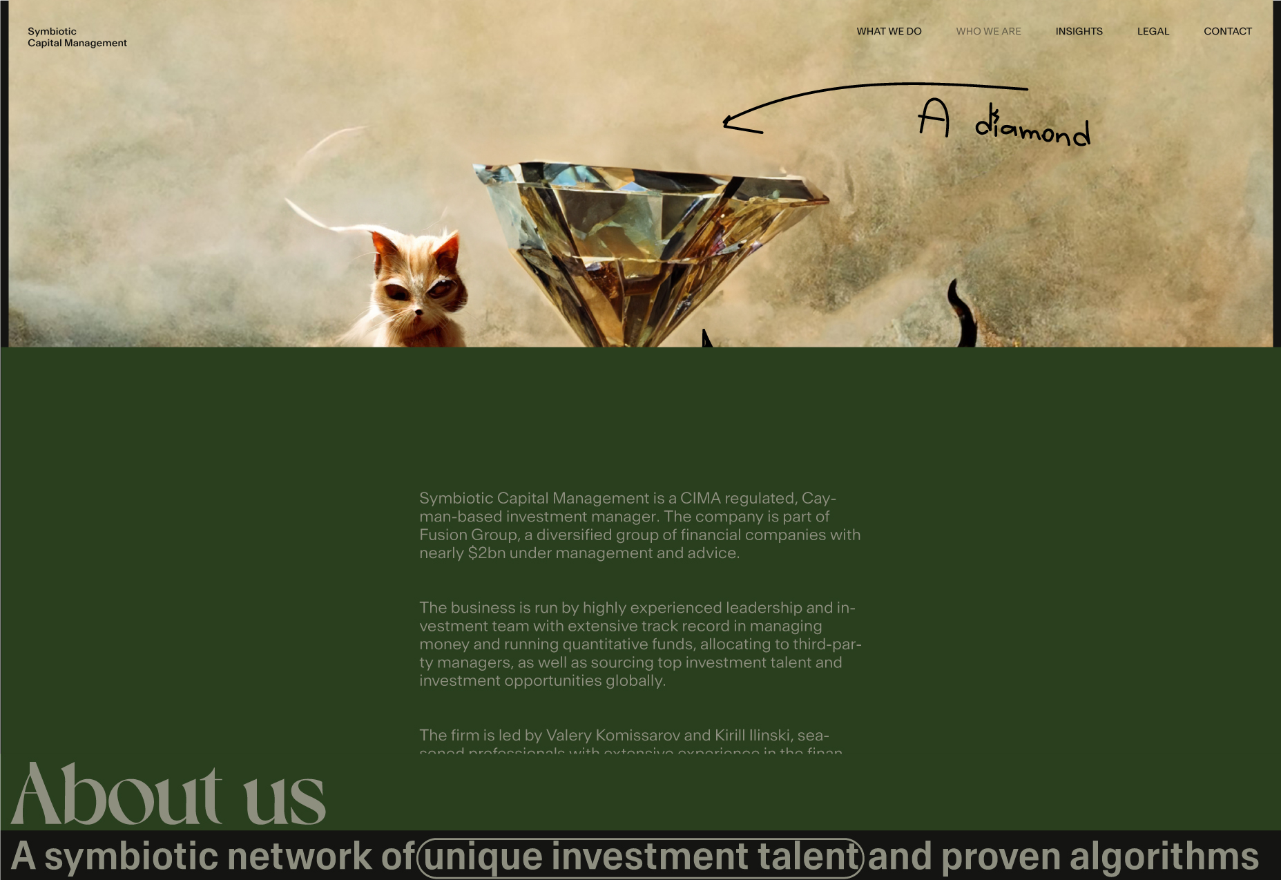
💎 "Who we are" page
Entry animations.
When the page opens, the image is bigger, but as you scroll, it gets smaller (well, we will come back to this shortly).
Let's try to start over again. I can see now how we can do better. I am especially concerned with the header. I feel the header has too much info, and maybe the logomark is not necessary at all here.
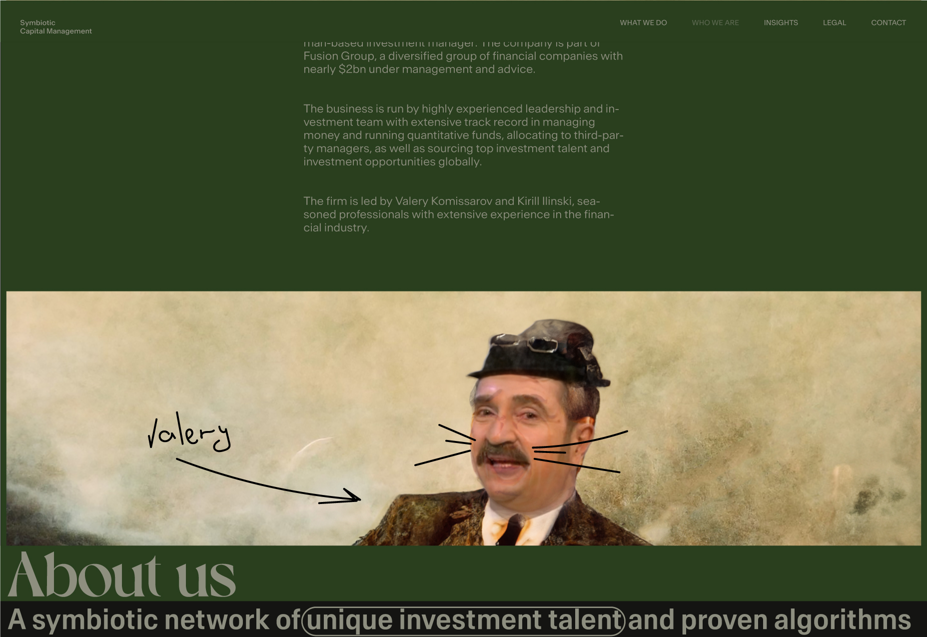
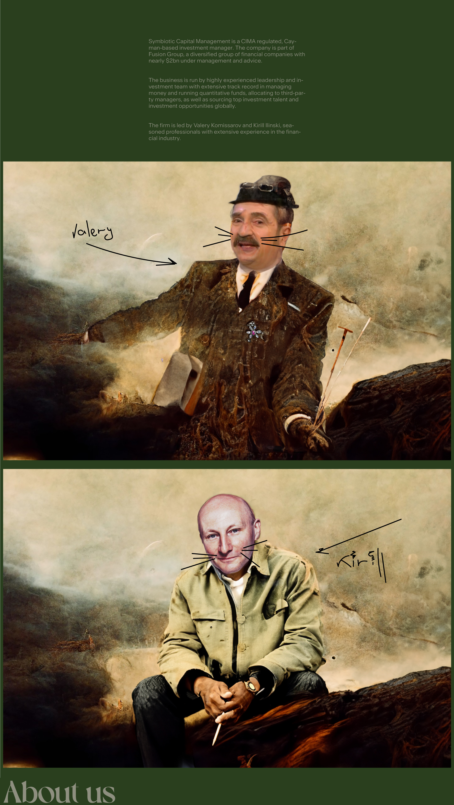
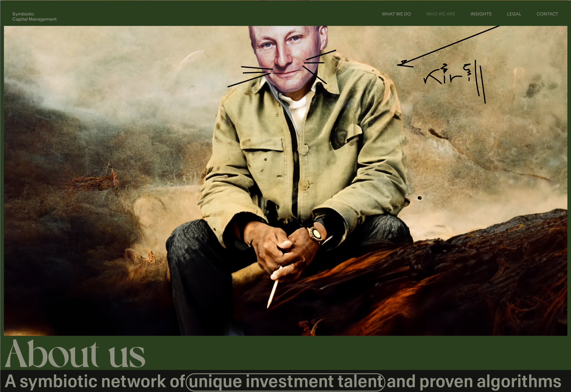
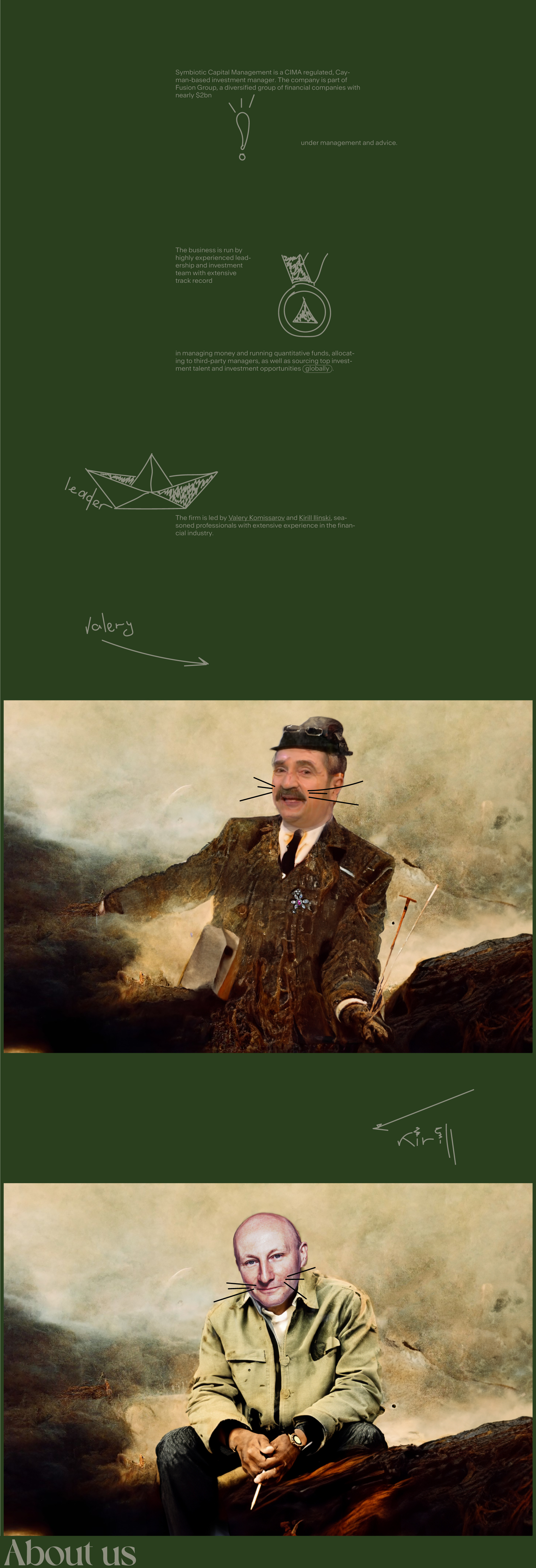
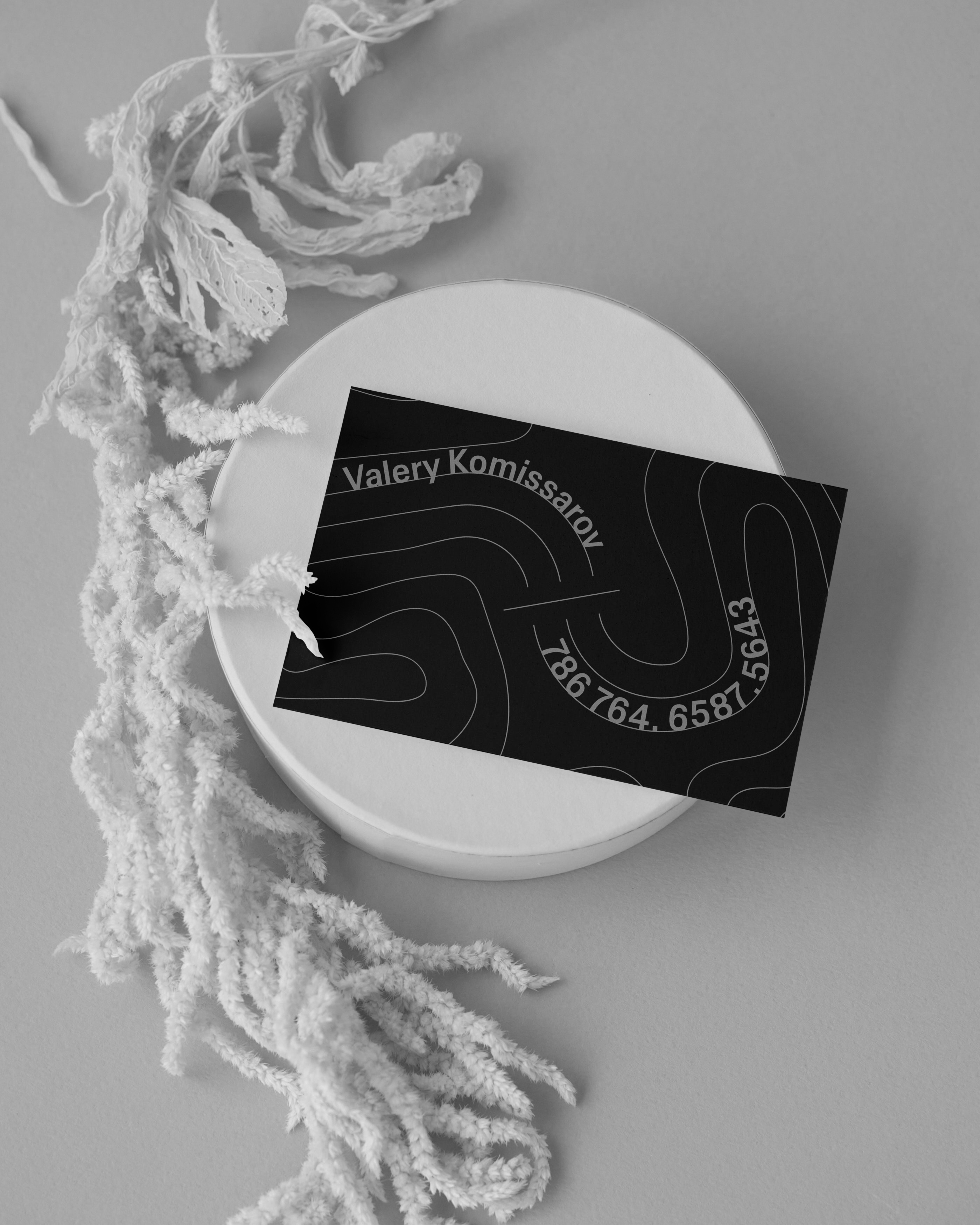
Art direction explanation: We have two leaders - a professor (Kirill Ilinski) and a producer (Valery Komissarov); art and whiteboard. Our art direction is a combination of both; this is a symbiosis. Art and comments on top of it. Naturalistic approach.
Four screens.
Who we are. V1.
Who we are. V2.
Landing.
Landing on scroll.
What we do.
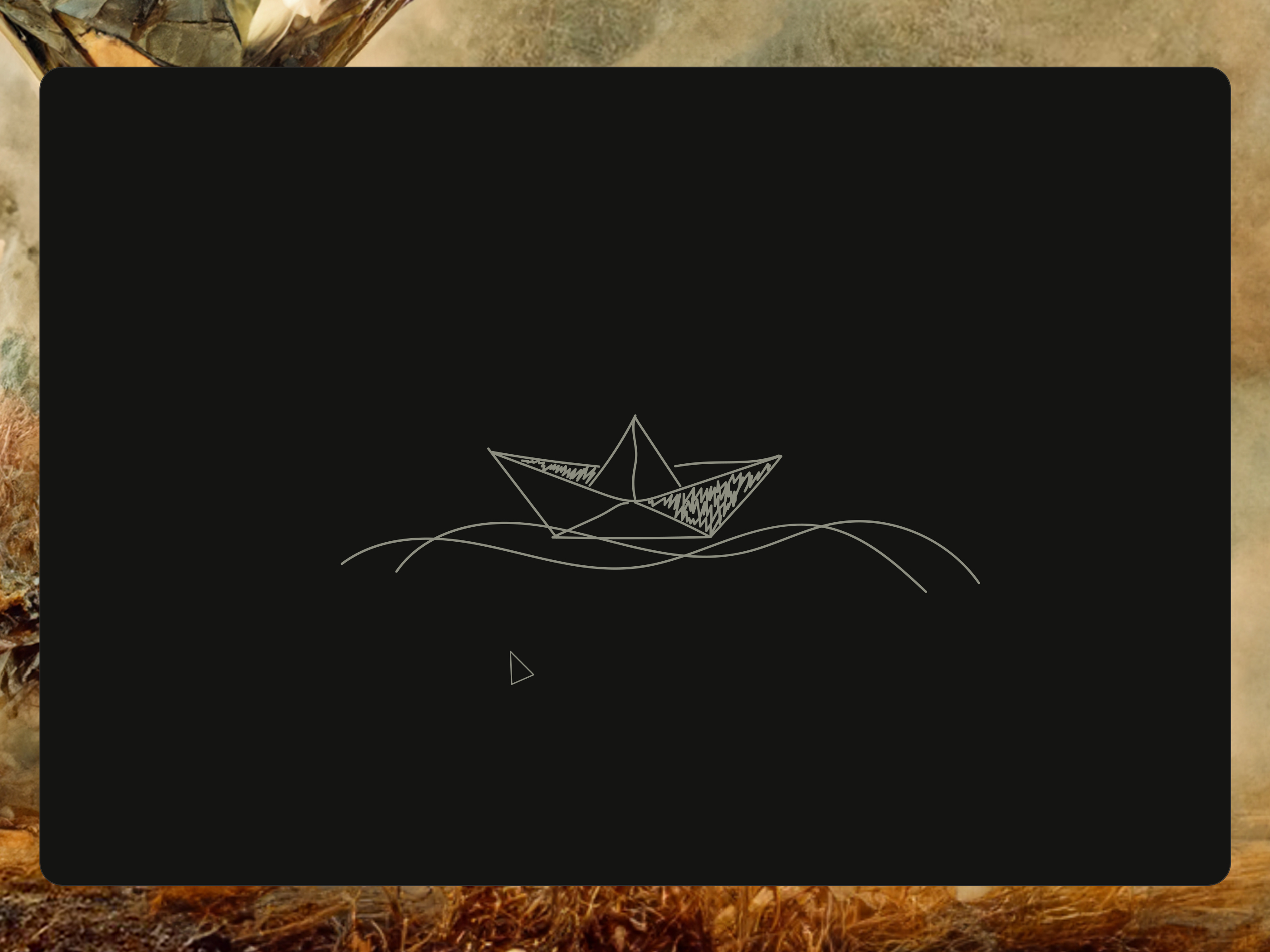
Landing loader.
Artworks.
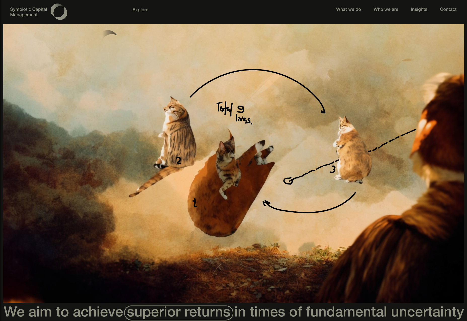
Nine lives (the artwork for the landing website page).
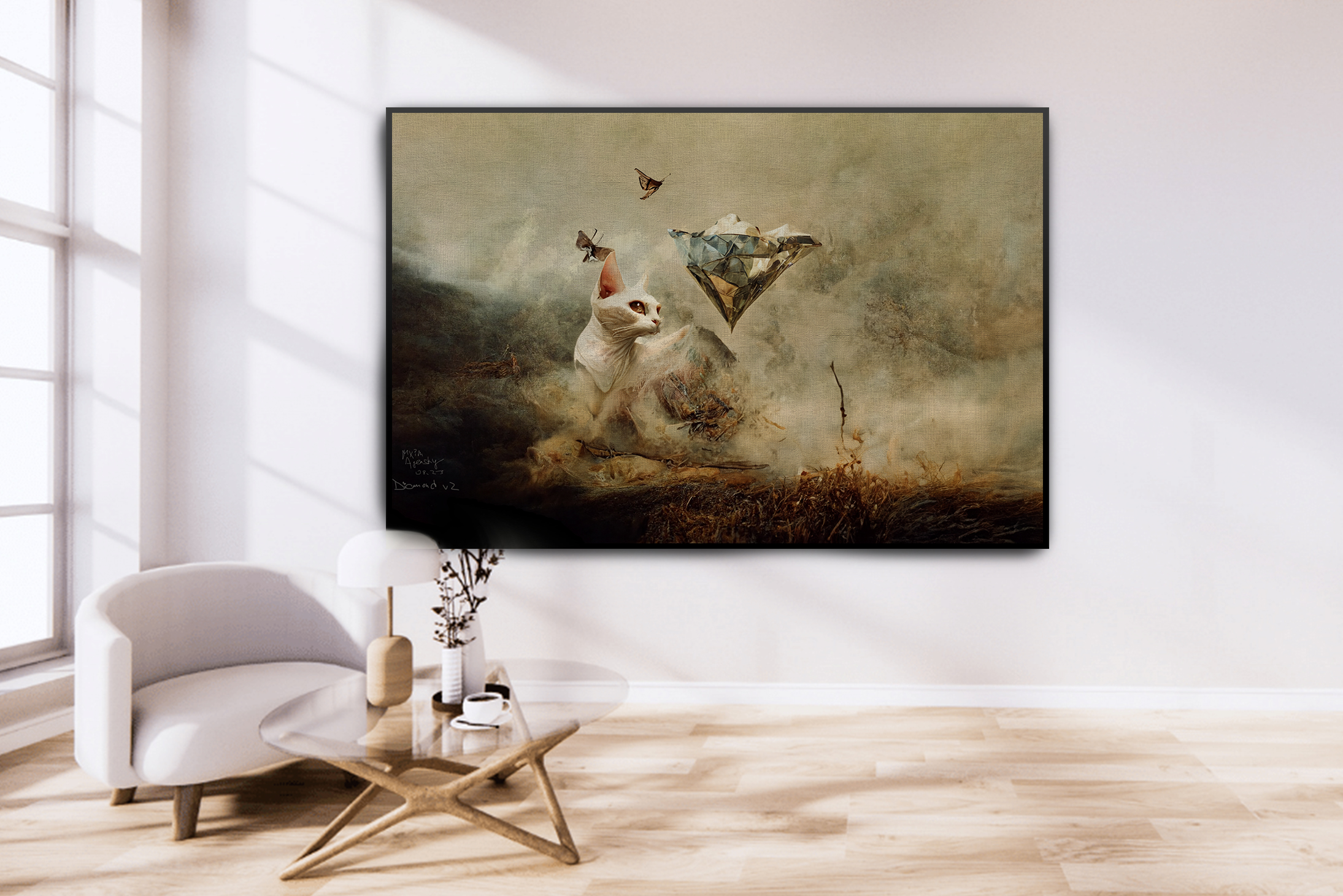
Diamond v1 (the artwork for the Who We Are website page).
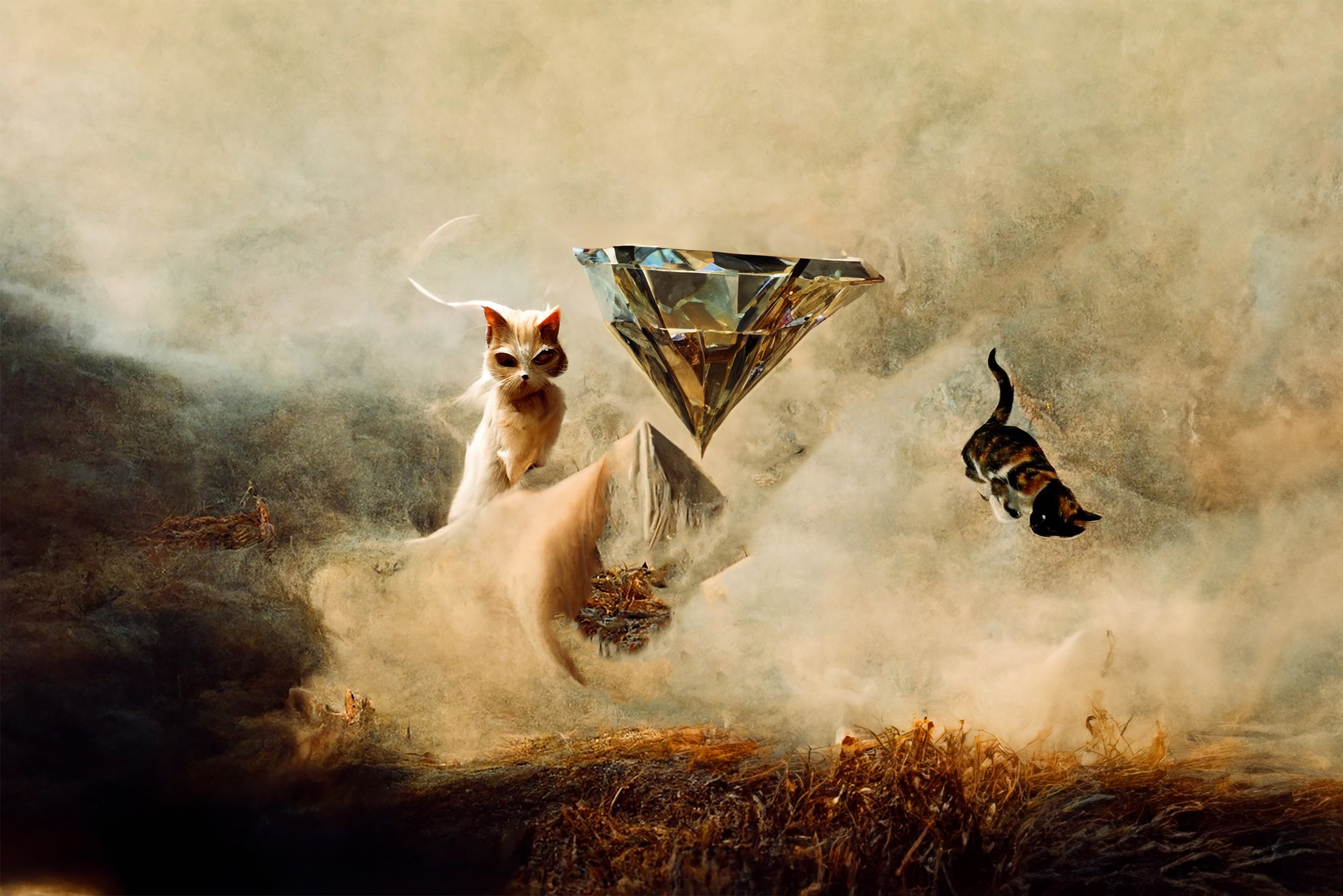
Diamond v2.
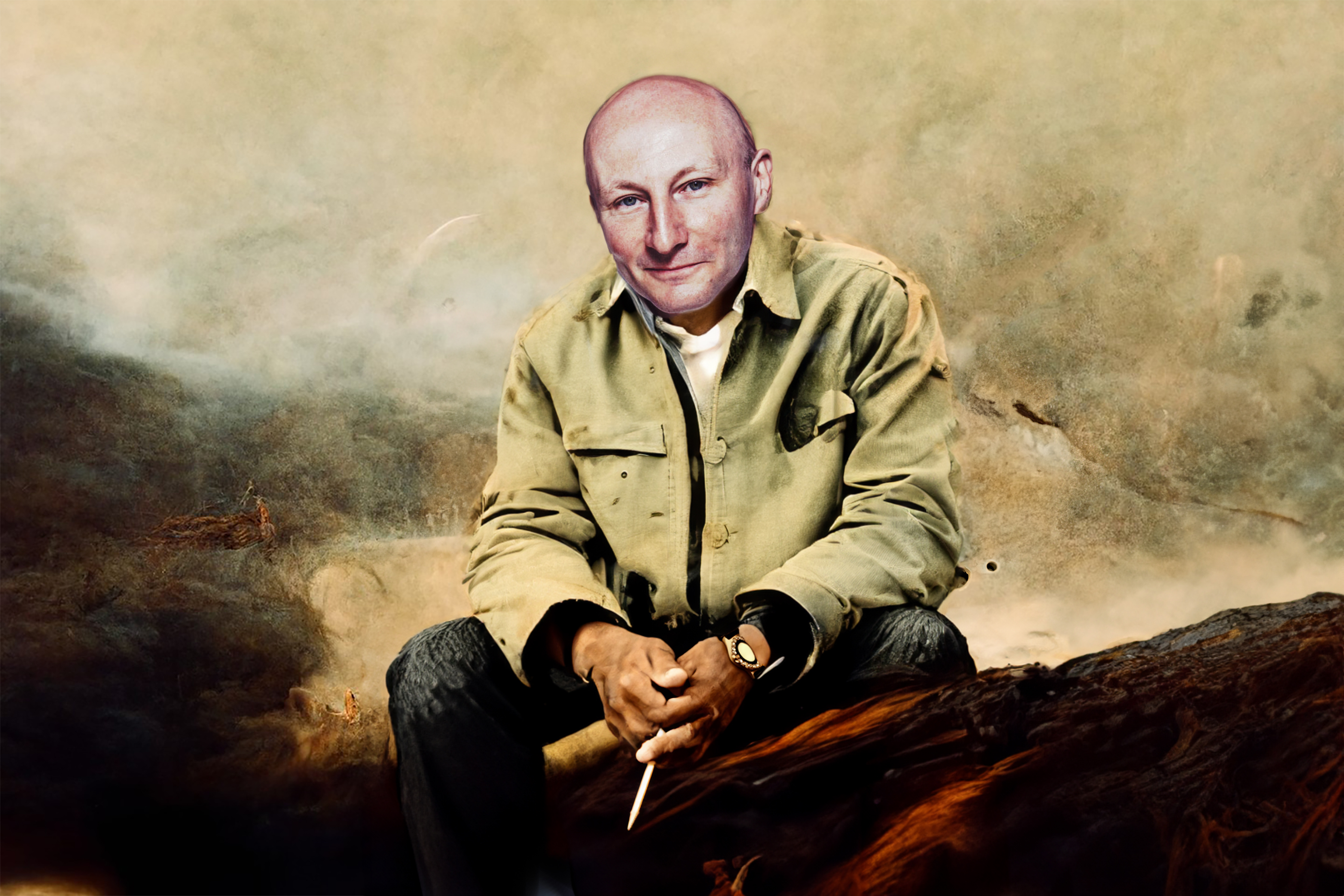
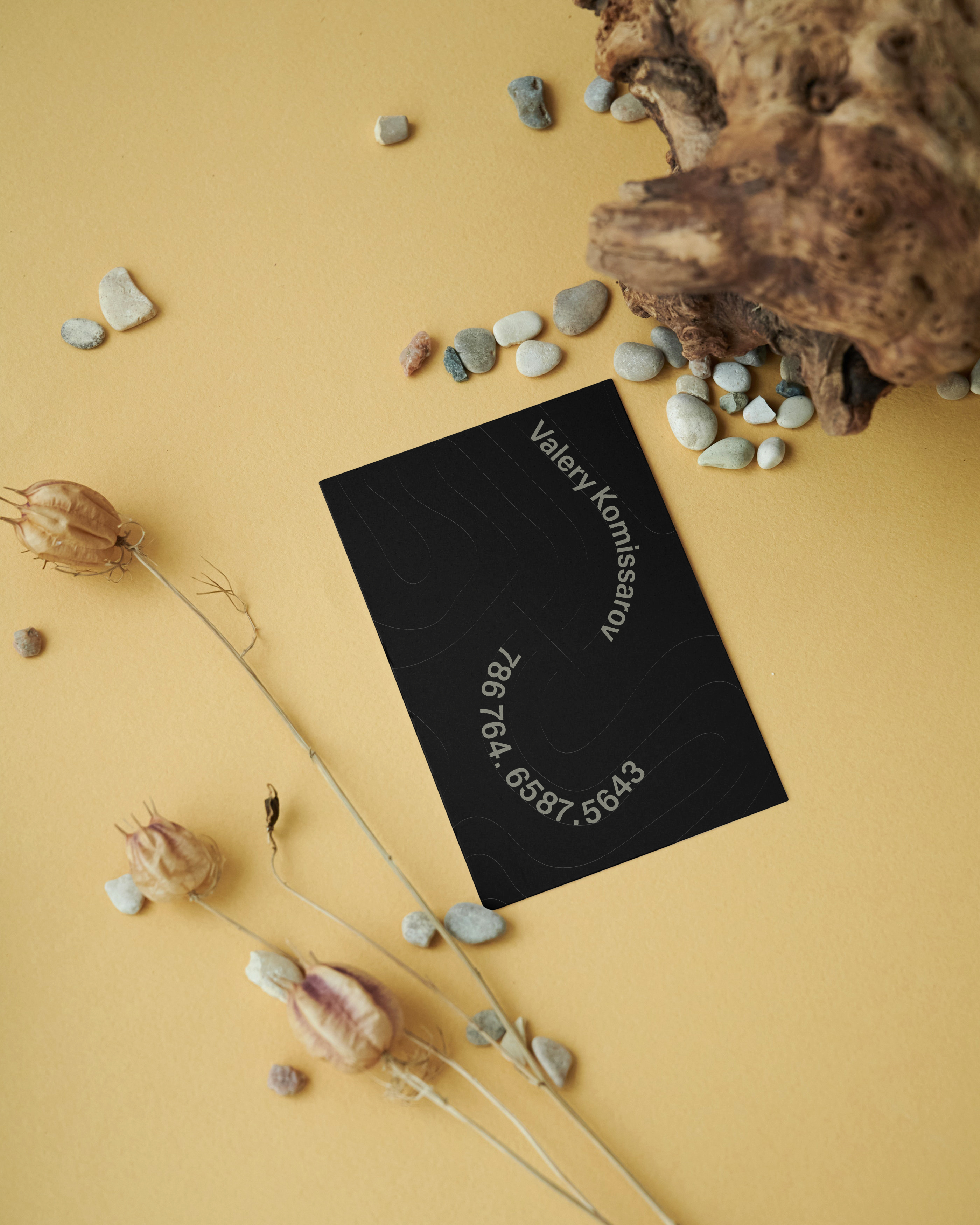
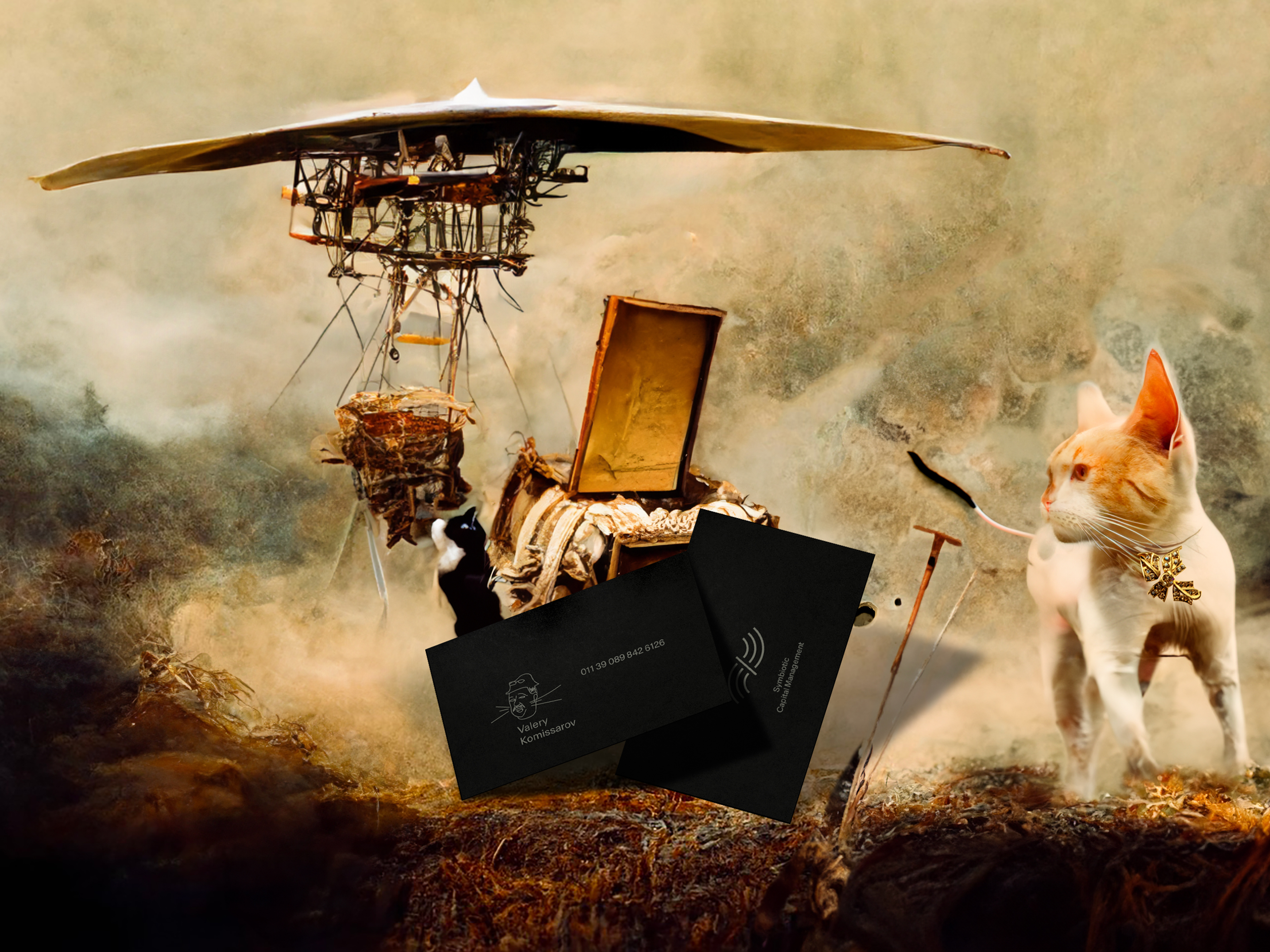
Valery Komissarov (the artwork for the Who We Are website page).
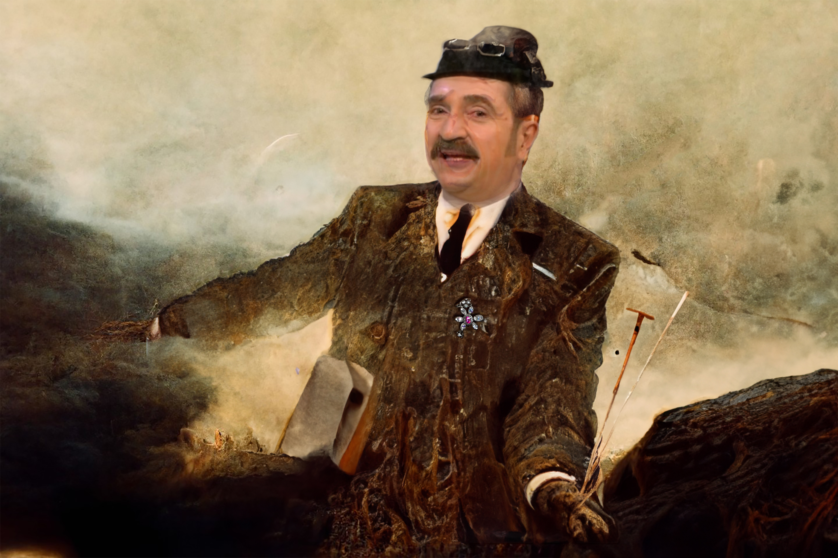
Kirill Ilinski (the artwork for the Who We Are website page).
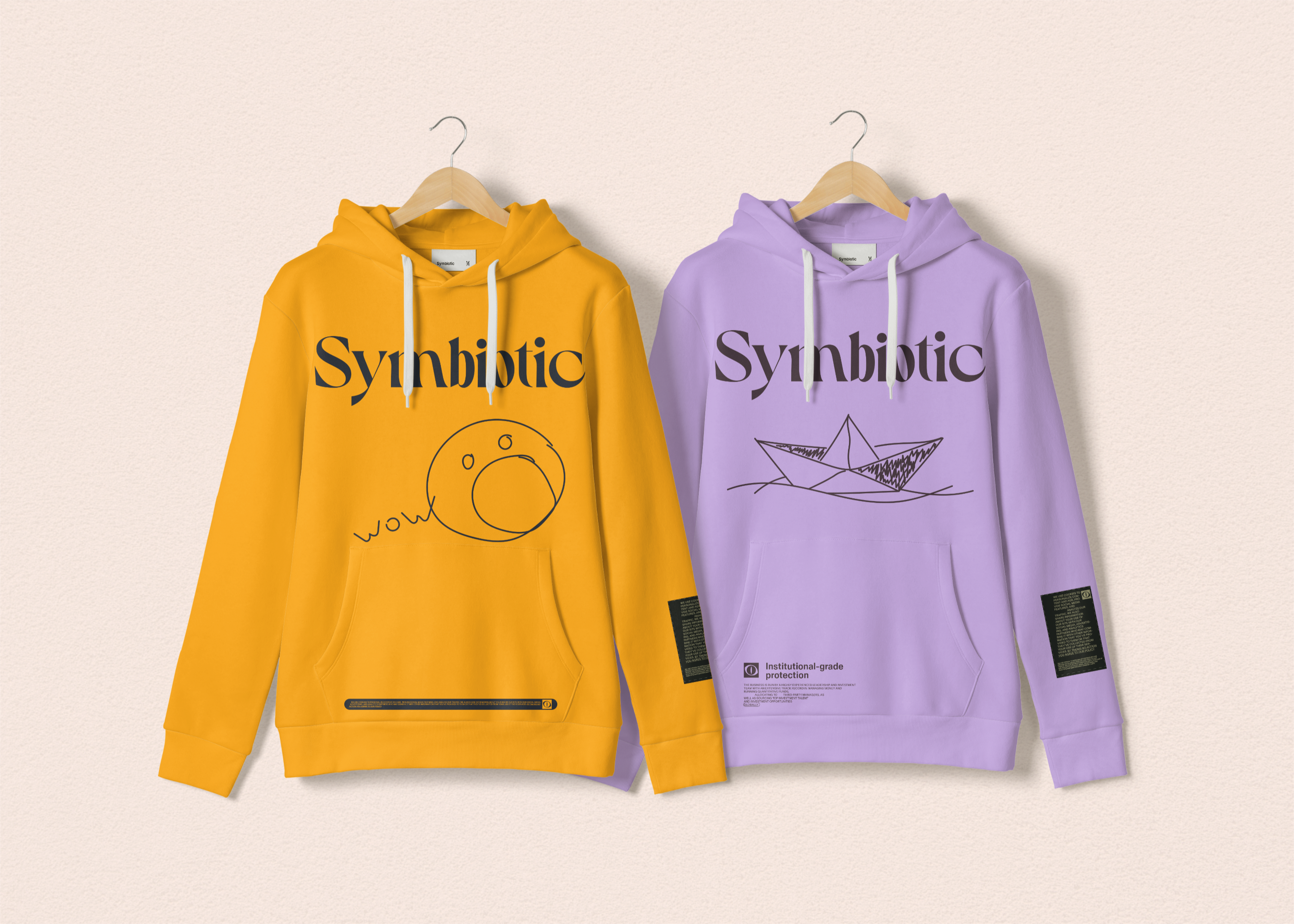
Bags.
Painting.
"Who we are" page behaviour scenario.
At this time, we will be using the height-fidelity mockups.
Note: The line in the footer and header appears only if the background colour is the same. In the case of the ATFs - after scrolling.
1. When the page opens, the hero image is bigger. Then it's getting smaller - transition.
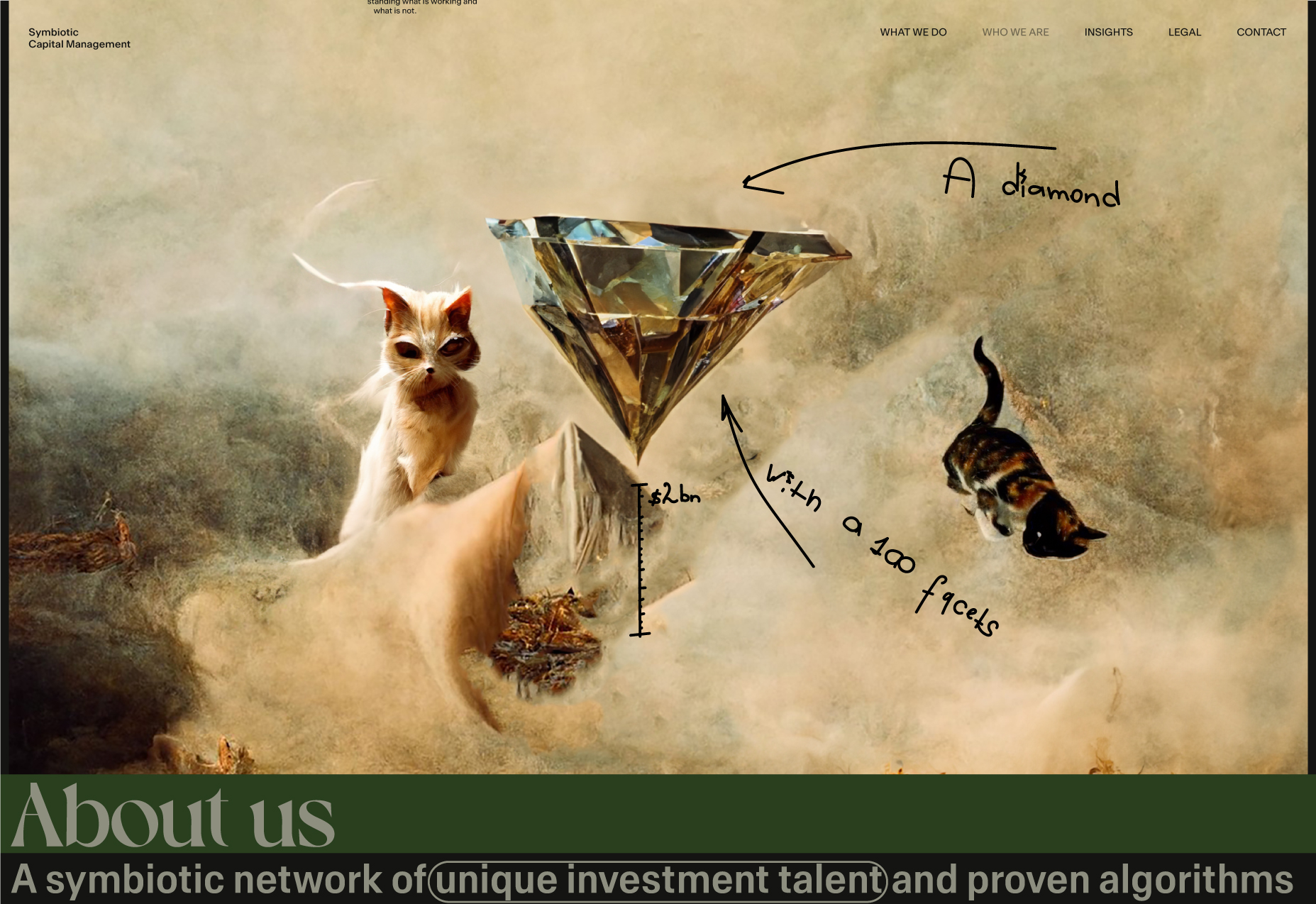
2. SVG comments appear. When scrolling, the hero section (SVG and image) moves slightly toward the top of the page. The "About us" title appears.
Note: All elements move at different speeds.
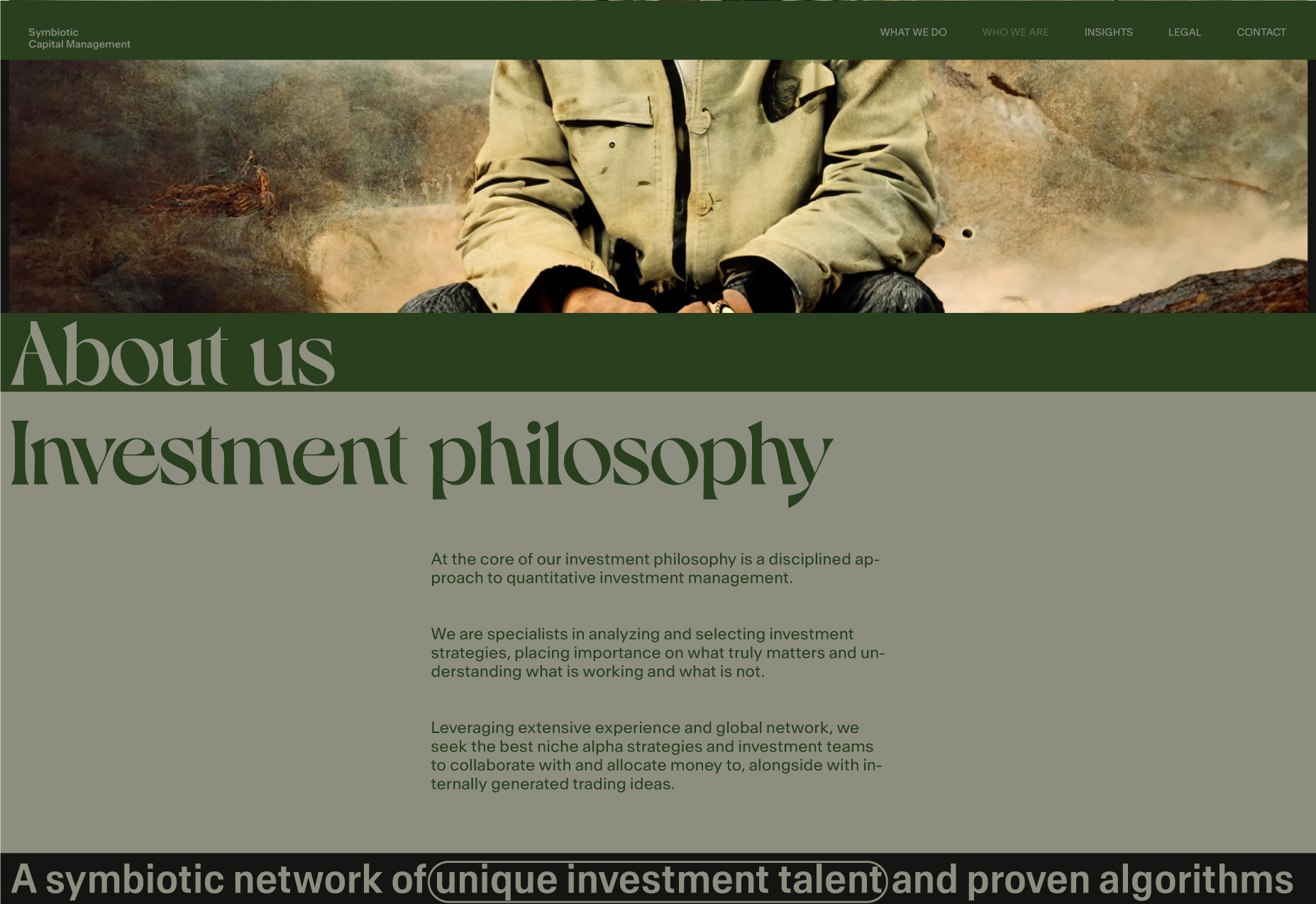
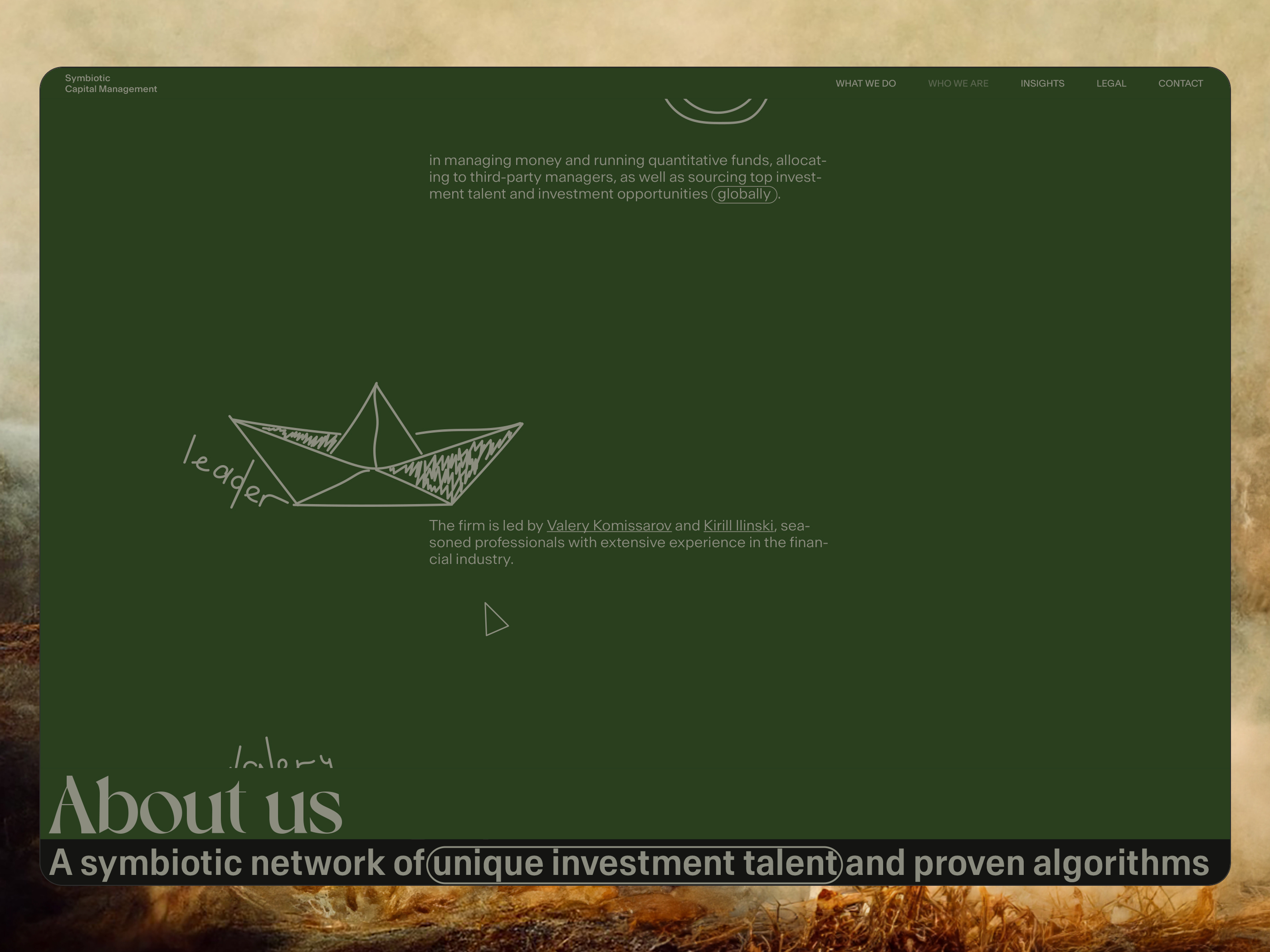
"About us" section content.
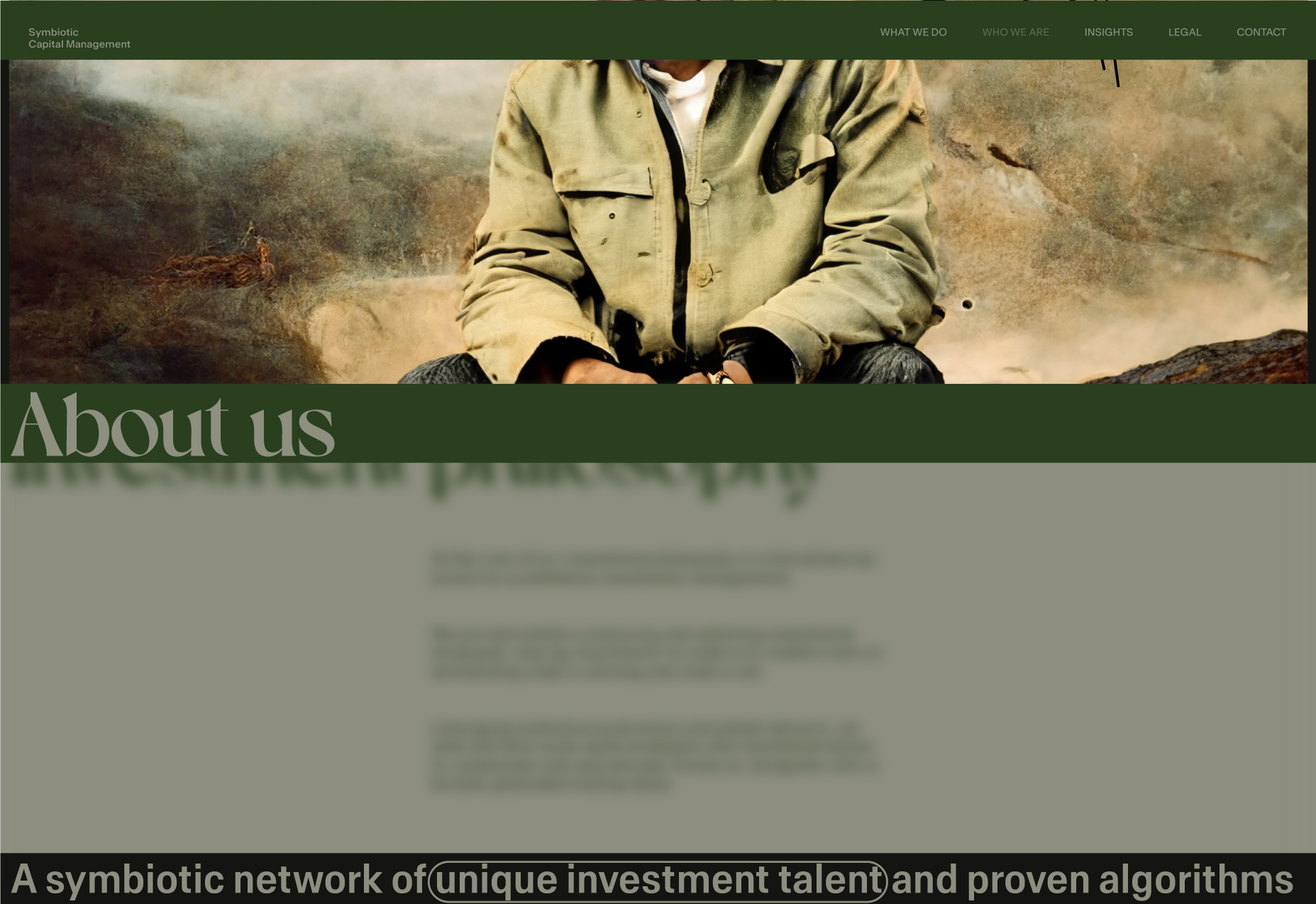
3. The hero section is slightly lower and without comment, and it will appear when the dark background of the previous section despairs or just slightly before it.
Wireframe.
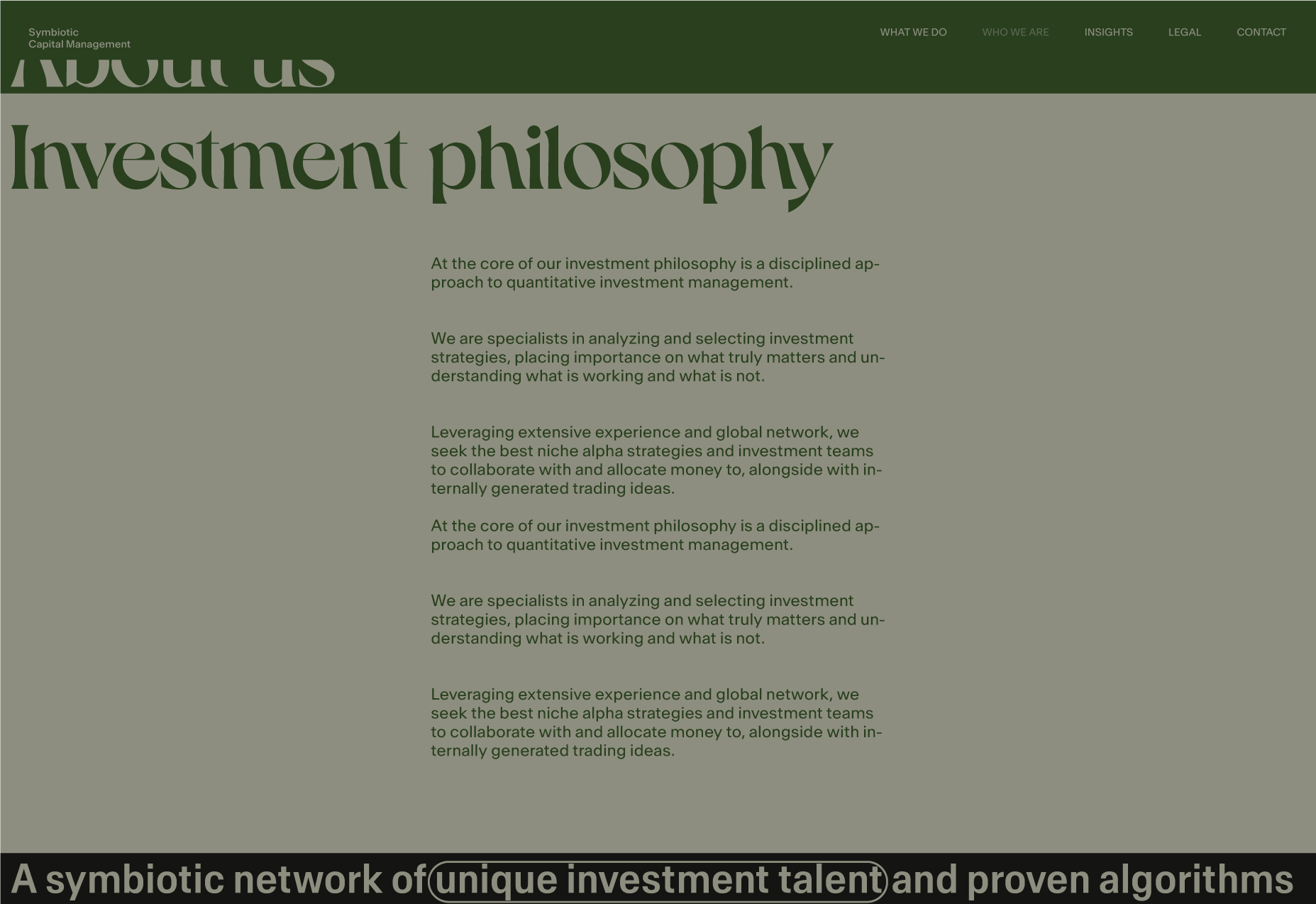
About Us section.
About Us section prototype.
About Us section prototype.
Meow.
Show and tell.
Well, what we will prepare now is more of a show than a tell. This is going to be a summary in MP4 format.
Show and tell no1.
Show and tell no2.
It was declared that the article would include all the materials between the beginning of the work and the point when I am confident I have found the right vector and am ready to share it with folks.
Well, I am ready now.
Cheers!
The trajectory of success
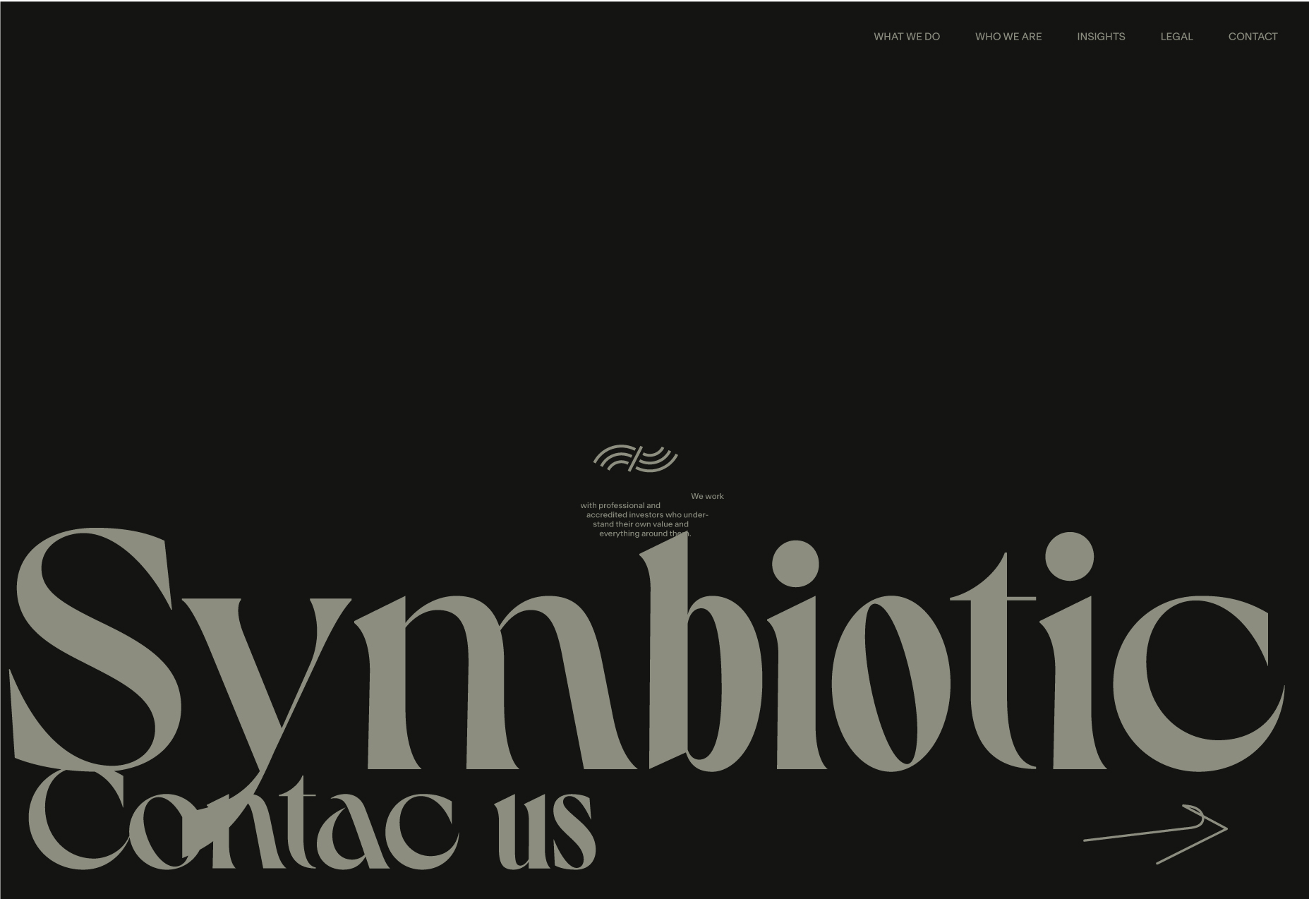
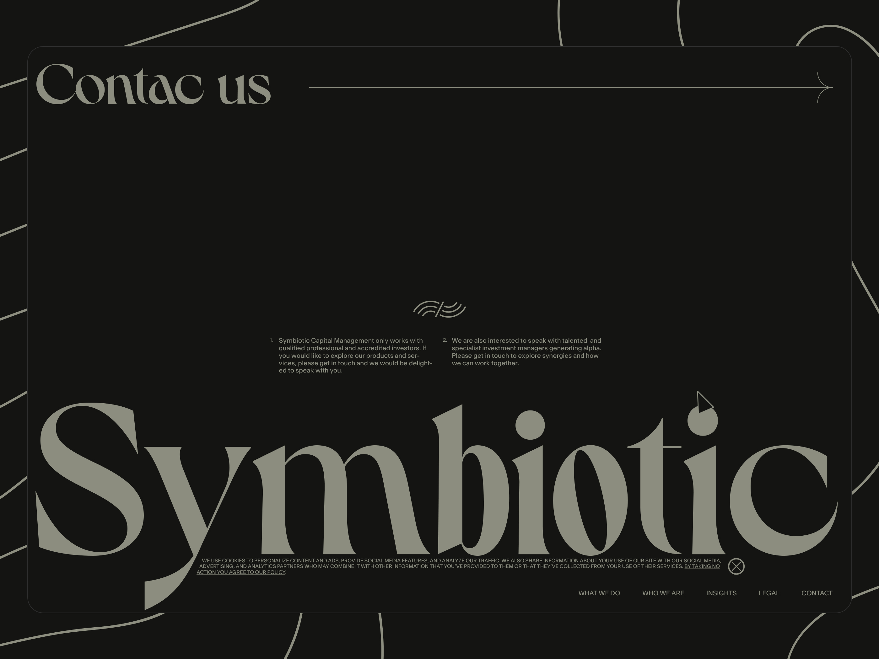
A new logo idea and Contact Us page.
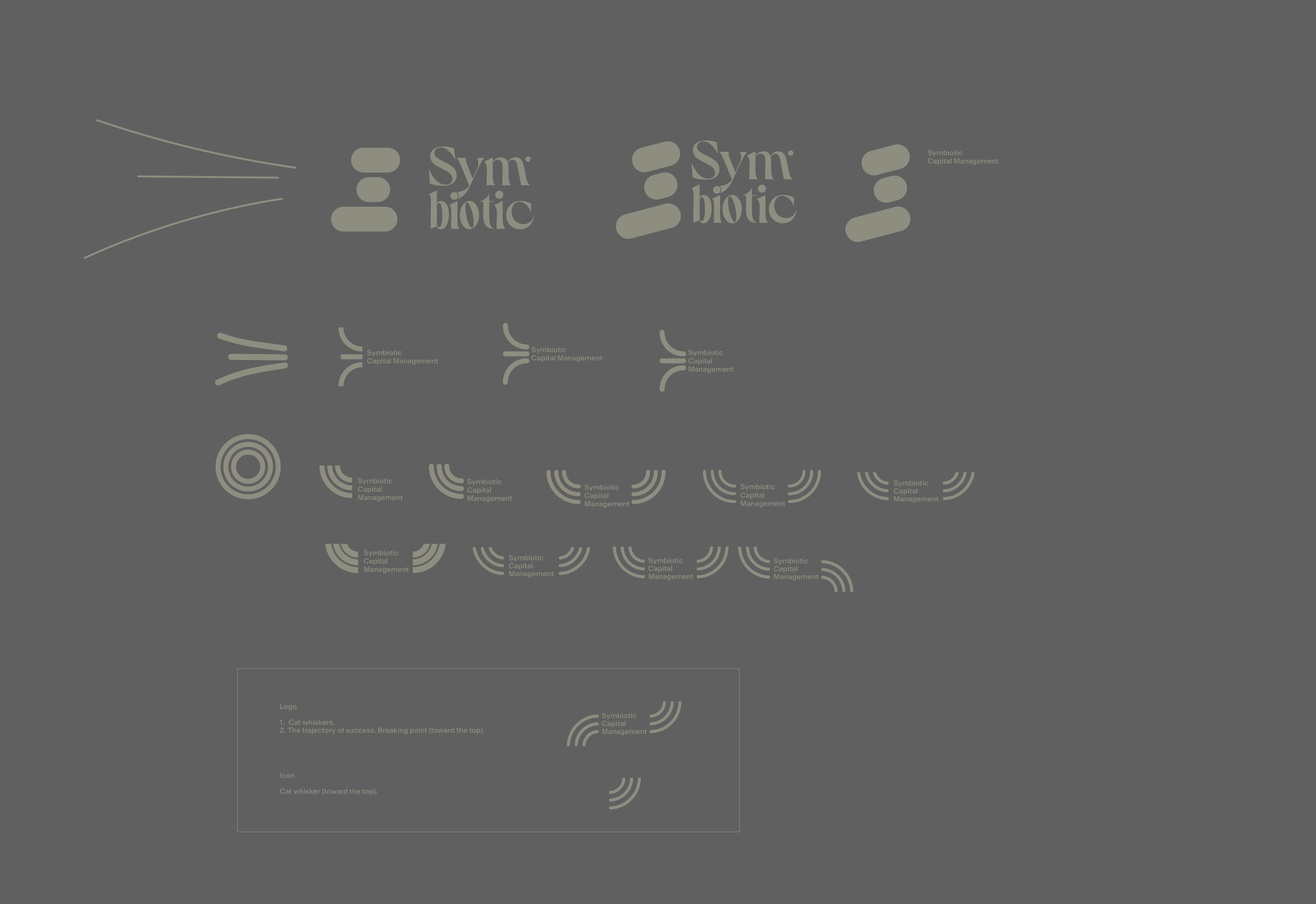
Logo.
- Cat whiskers.
- The trajectory of success is from bottom to top, with Symbiotic in the middle-the breaking point (toward the top). The Symbiotic can help change your trajectory toward the top. In the final version, instead of the company name, we will use the line.
- In the latest iterations, we plan to use the Hedings typeface for the logo, but the composition got more complex, and we finally reached the point where we could separate the logo and typeface.


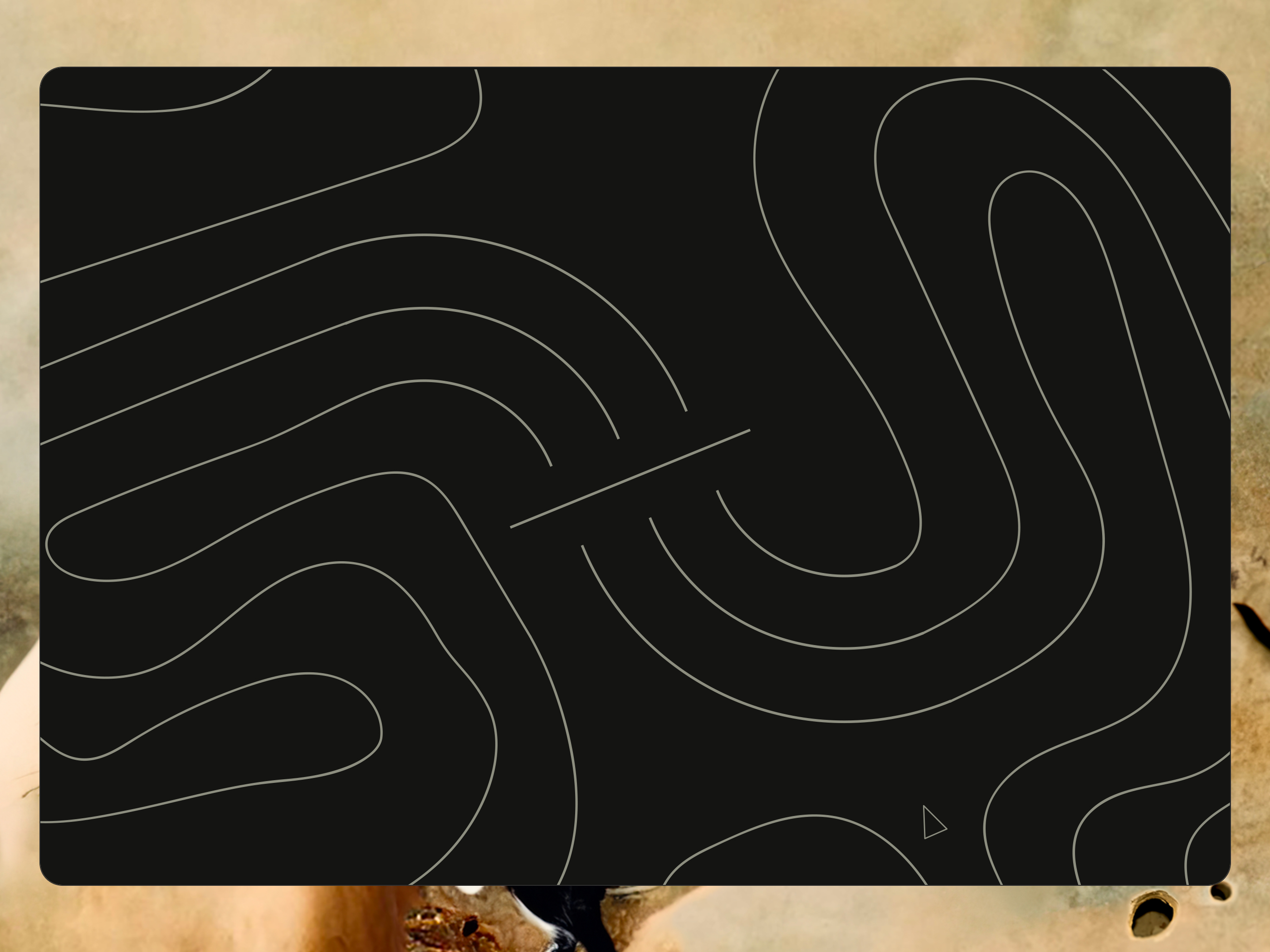
Financial maze.
The loader becomes the logo - turn counterclockwise.
Our solution - we are the conductor through the financial maze.
Only at this point (Contact Us page's composition) I was convinced the logomark would be beneficial.
A new summary.
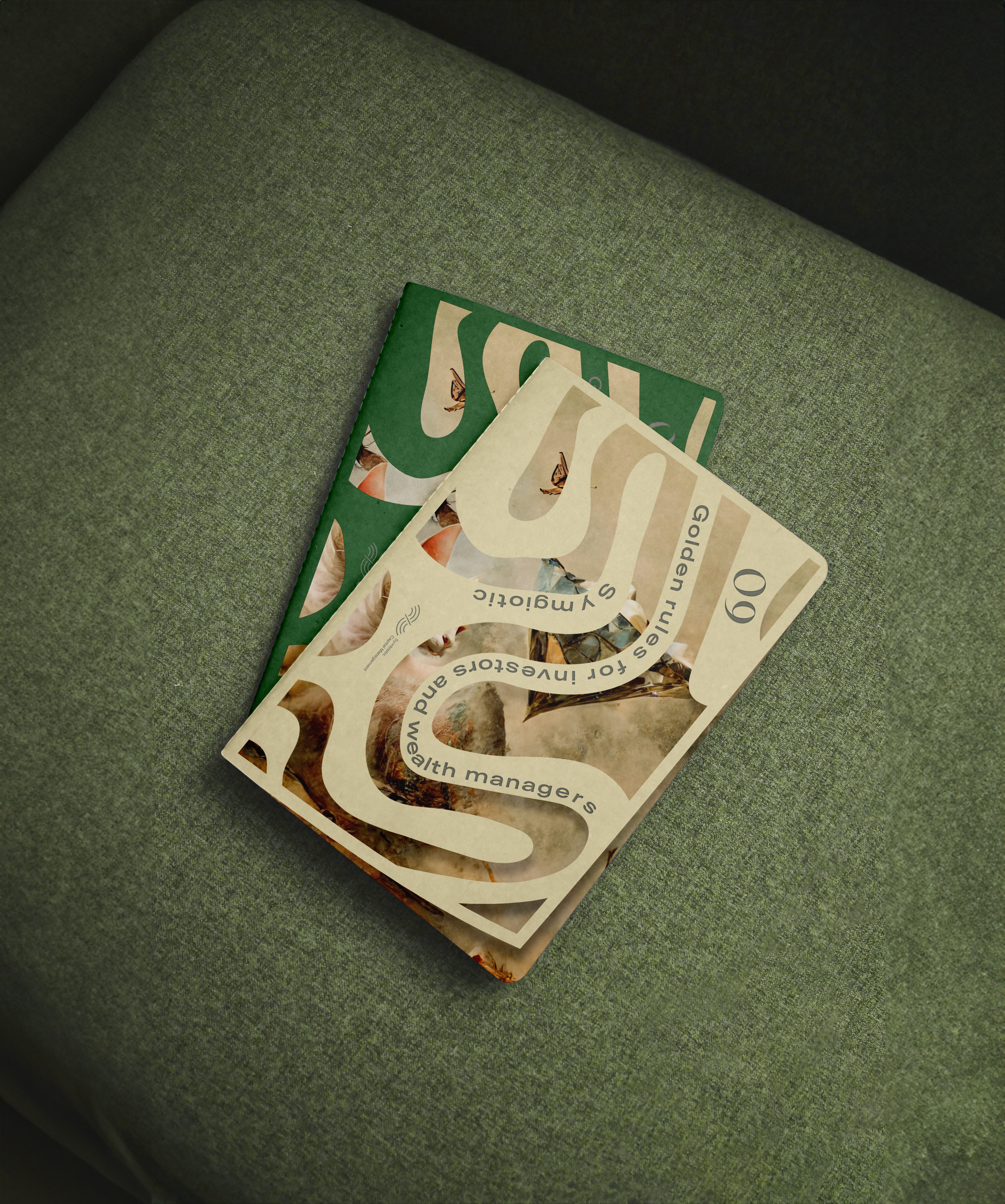
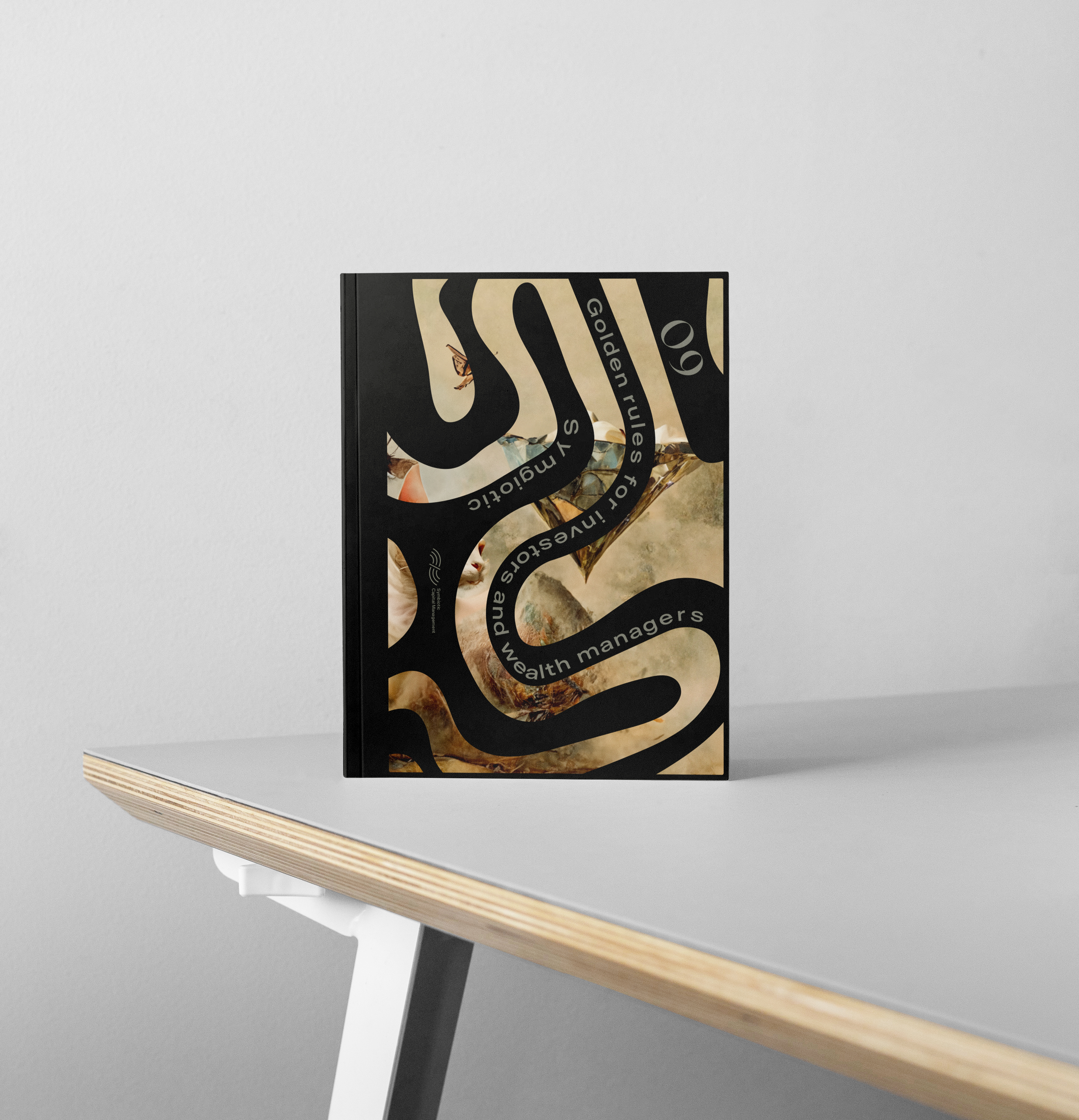
09 golden rules for investors and wealth managers.
August 31, 23:39 Feels good.
Polishing
- Logomark placement: Remove the logomark from the header and use it above the hero title. Keep just the name in the header-this composition has better readability.
- Free-hand hero text (above the hero title) is a type now - trying to have a better separation between UI elements and illustrations. Reference - Contact Us page ATF composition.
- Added (instead of the footprints like on the landing, but going in a different direction): We Do page loader (at the end, it's all about finance $).
Animation scenario: First, show one bill, then add one more, and so on. - Other.
Landing page loader.
Landing page ATF.
Landing page ATF on-scroll.
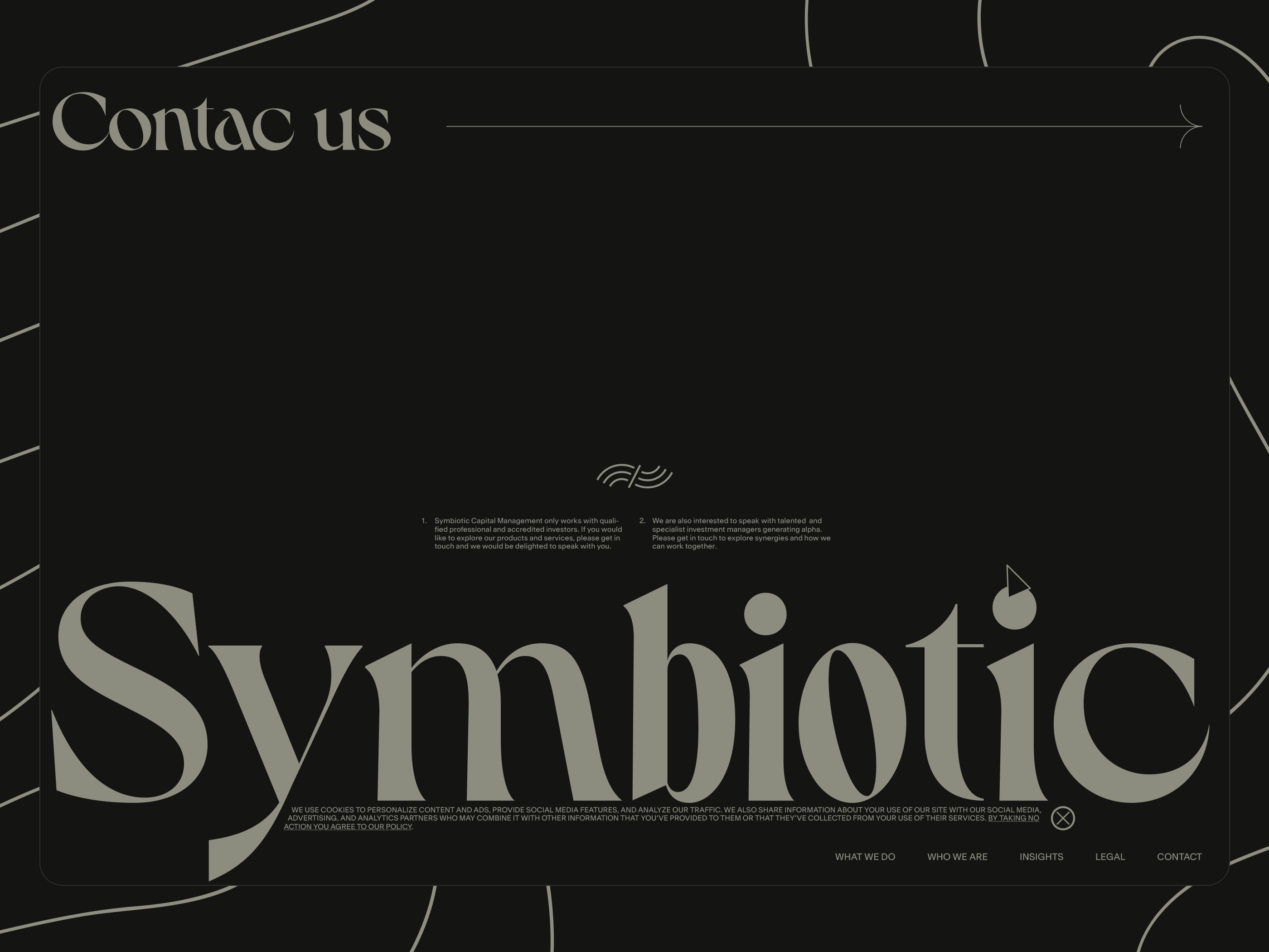
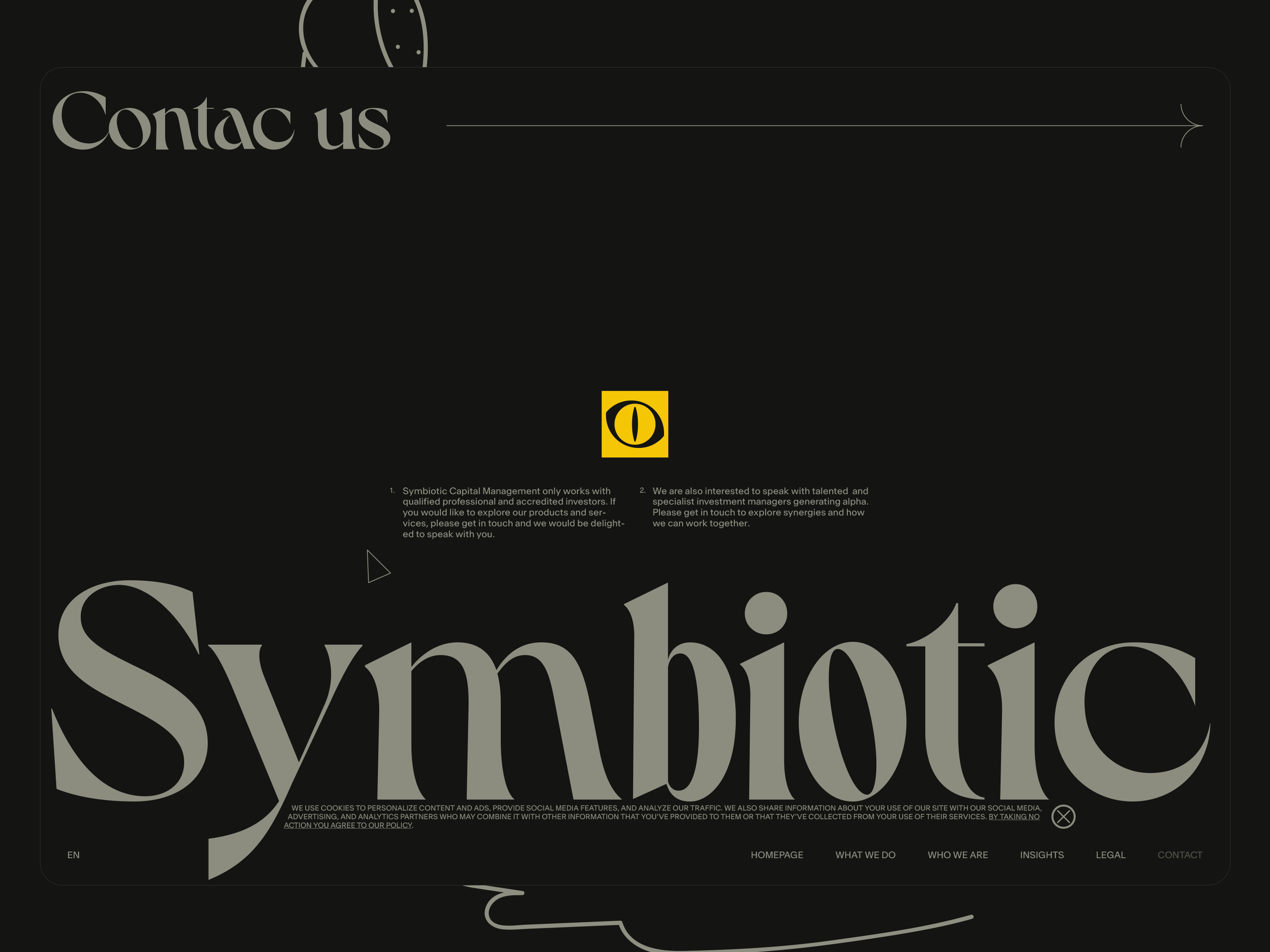
Contact Us page loader.
Contact Us page.
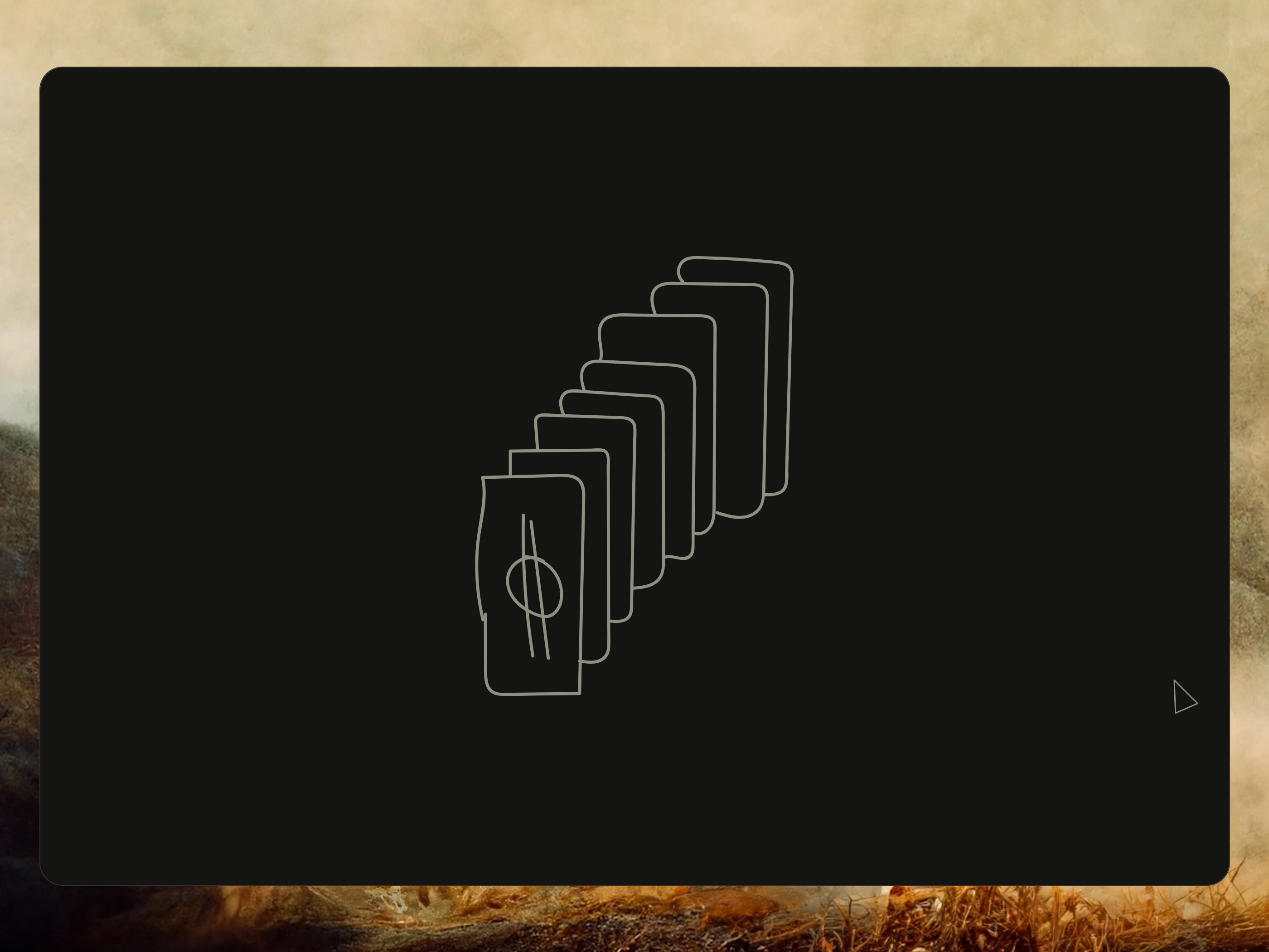
What We Do page loader.
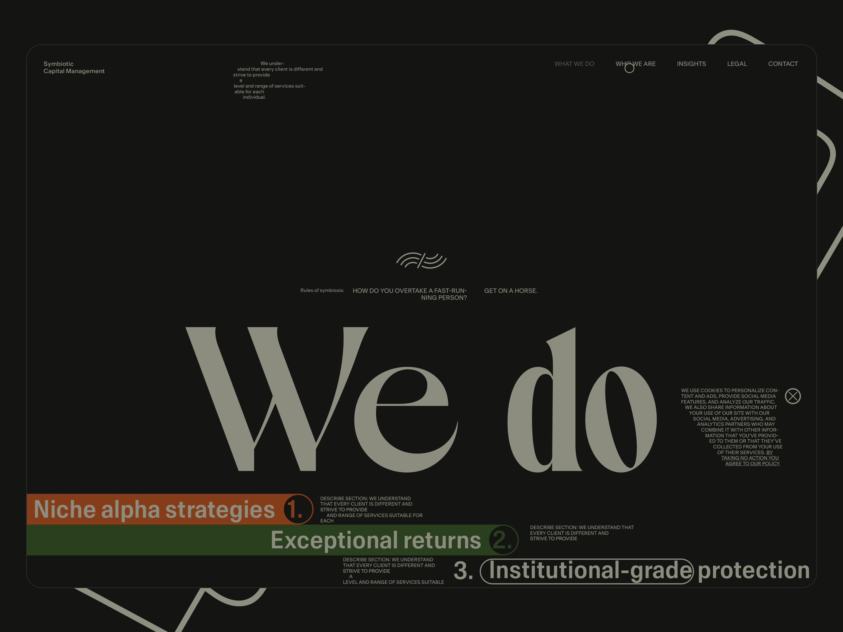
What We Do page ATF.
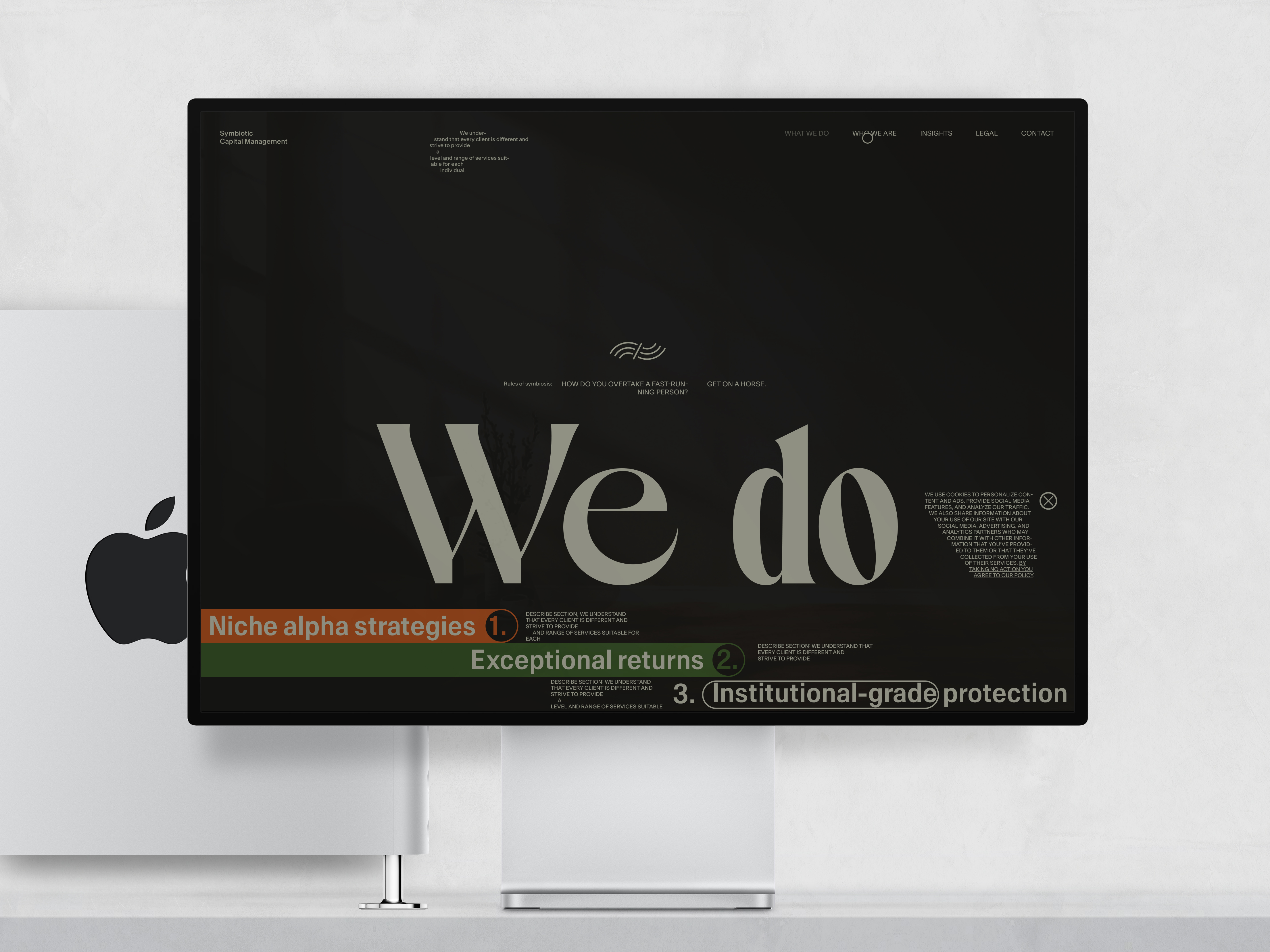
What We Do page ATF on the Apple Studio Display.
Who We Are page loader.
Who We Are page ATF.
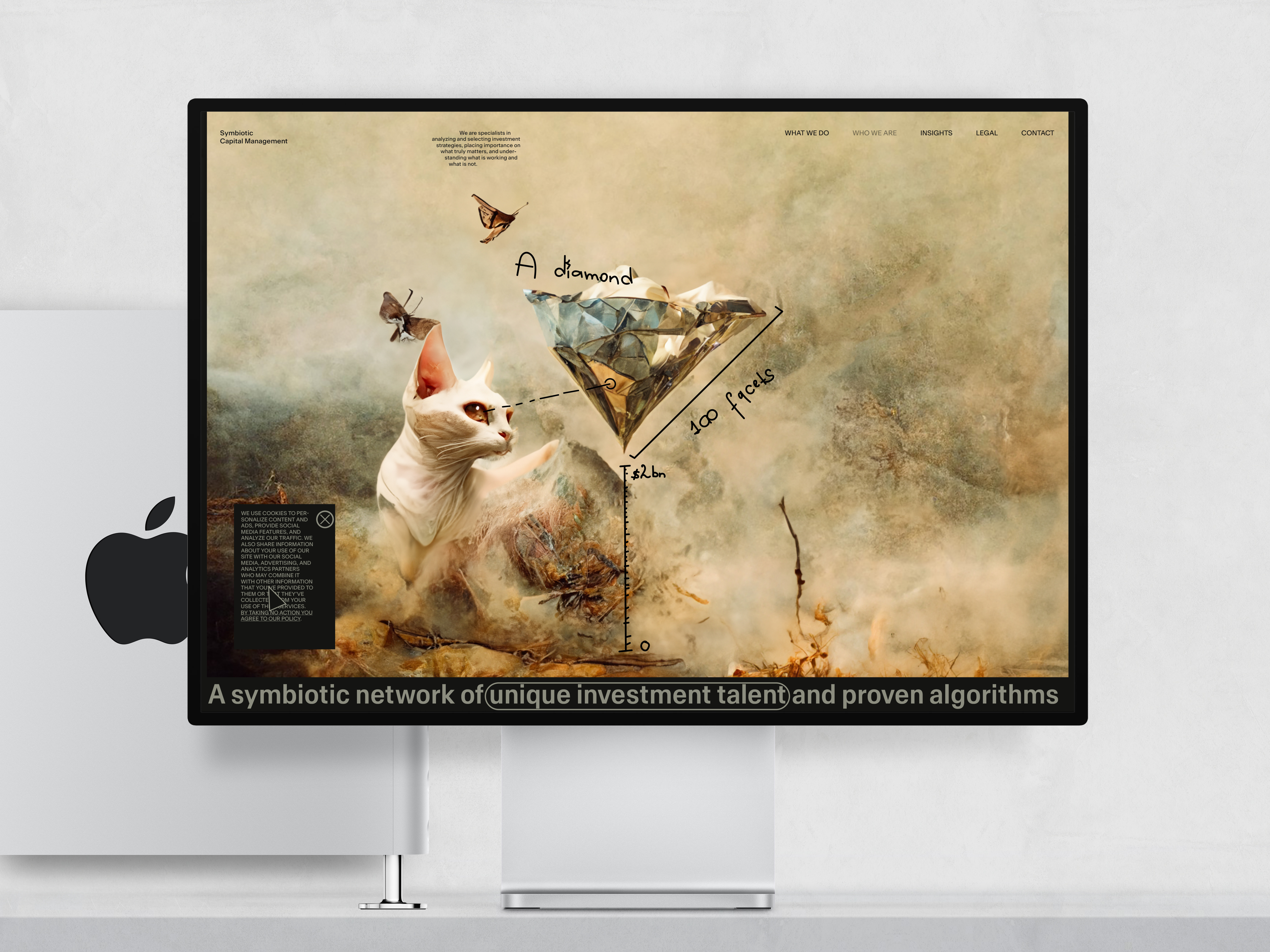
Who We Are page ATF on the Apple Studio Display.
Who We Are page content.
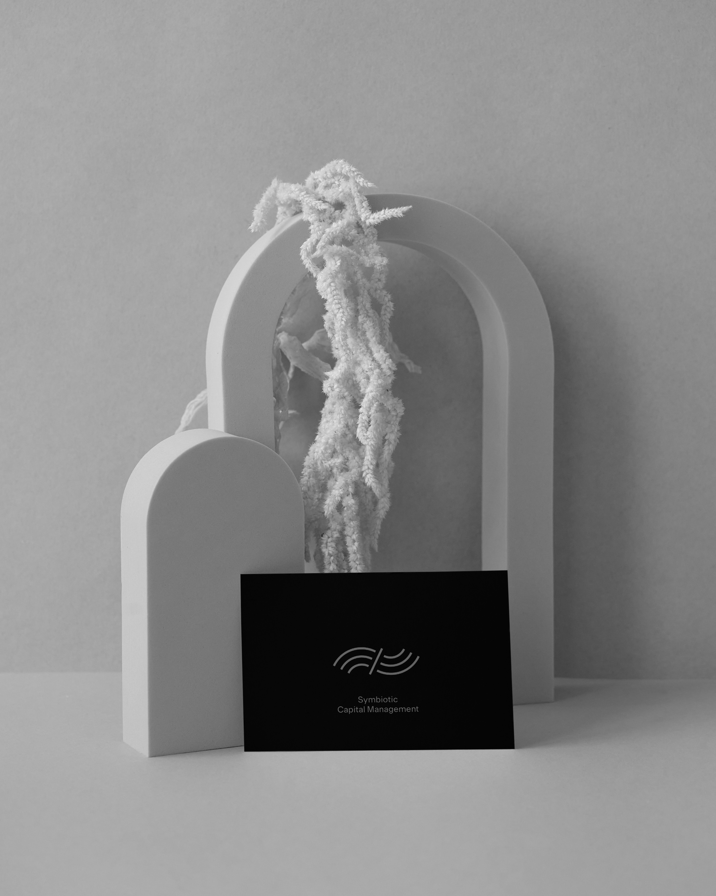
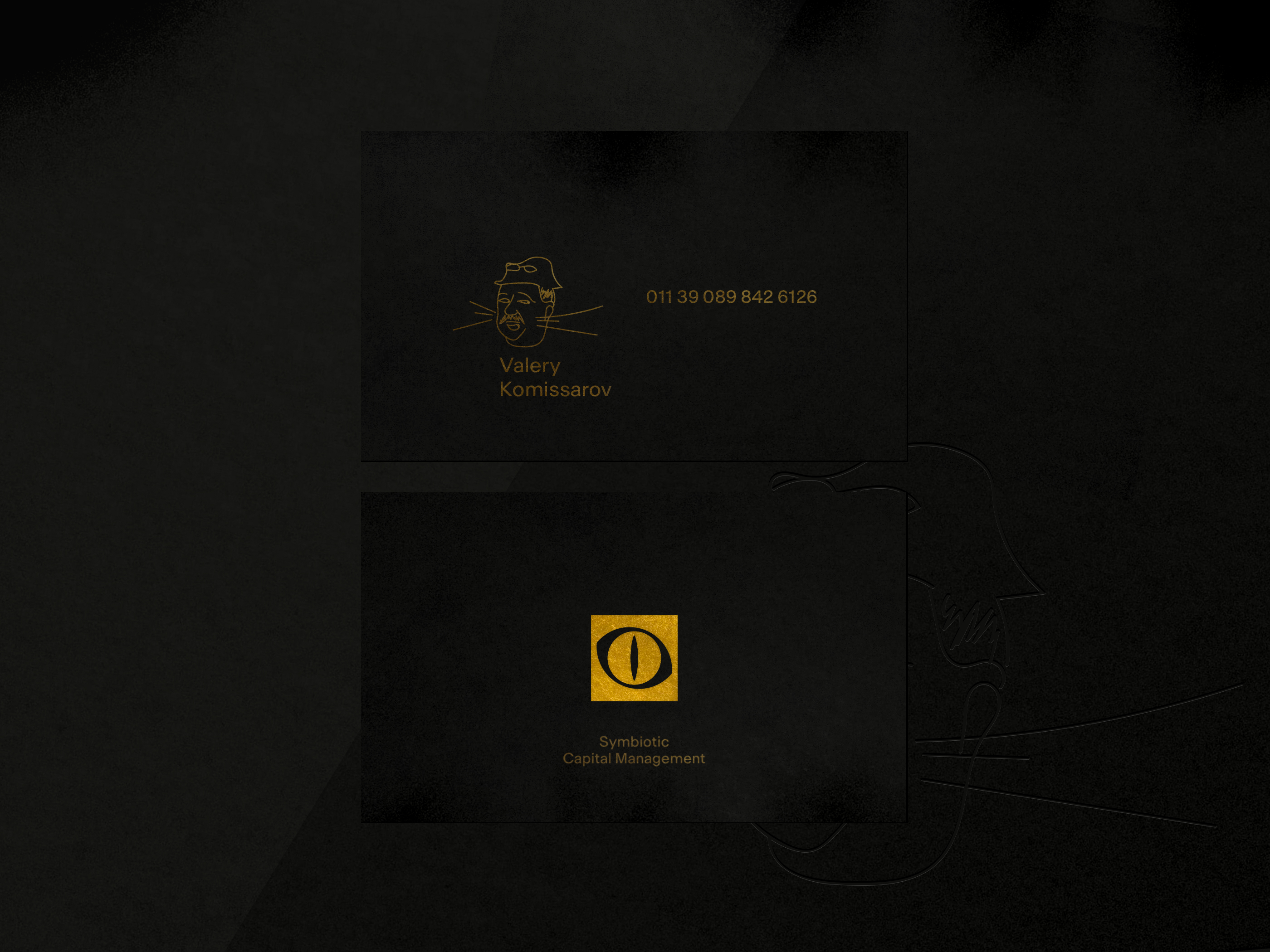
Escape attempt. Sometimes, you want to run away even from heaven. (Business cards).
Brand application.
Polishing
Header section on hover
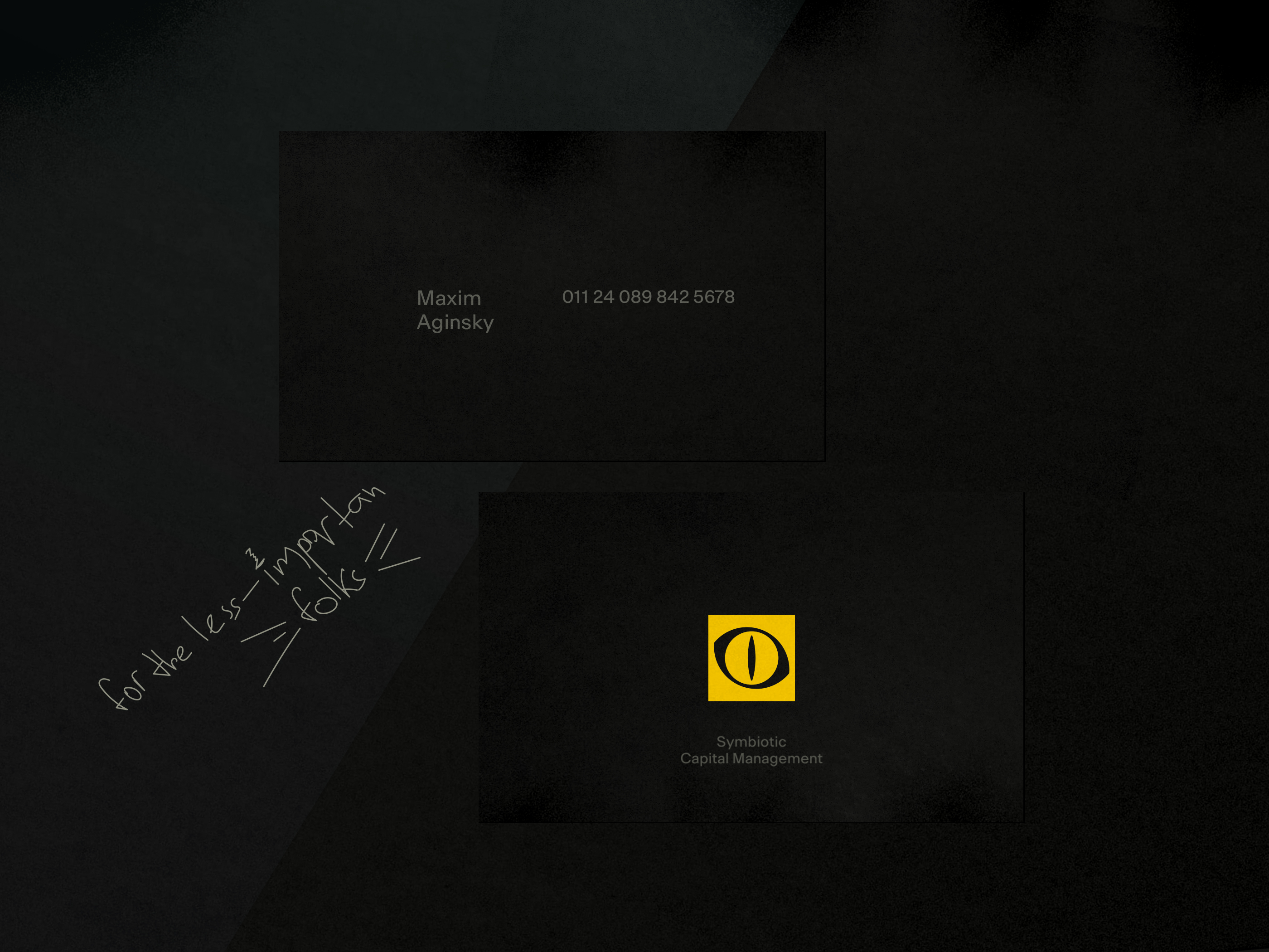
Less expensive version
For the less important folks.
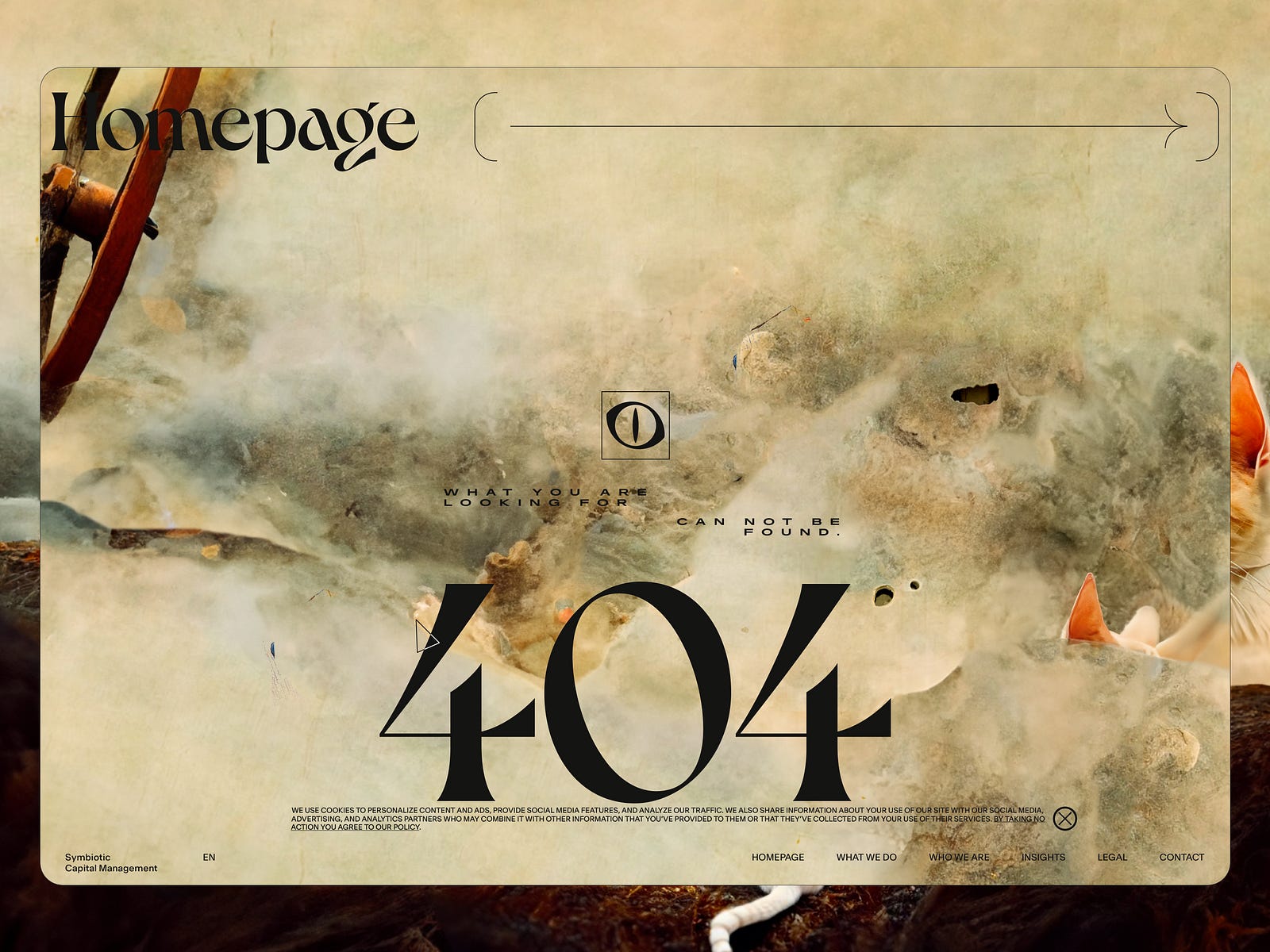
Deprecated
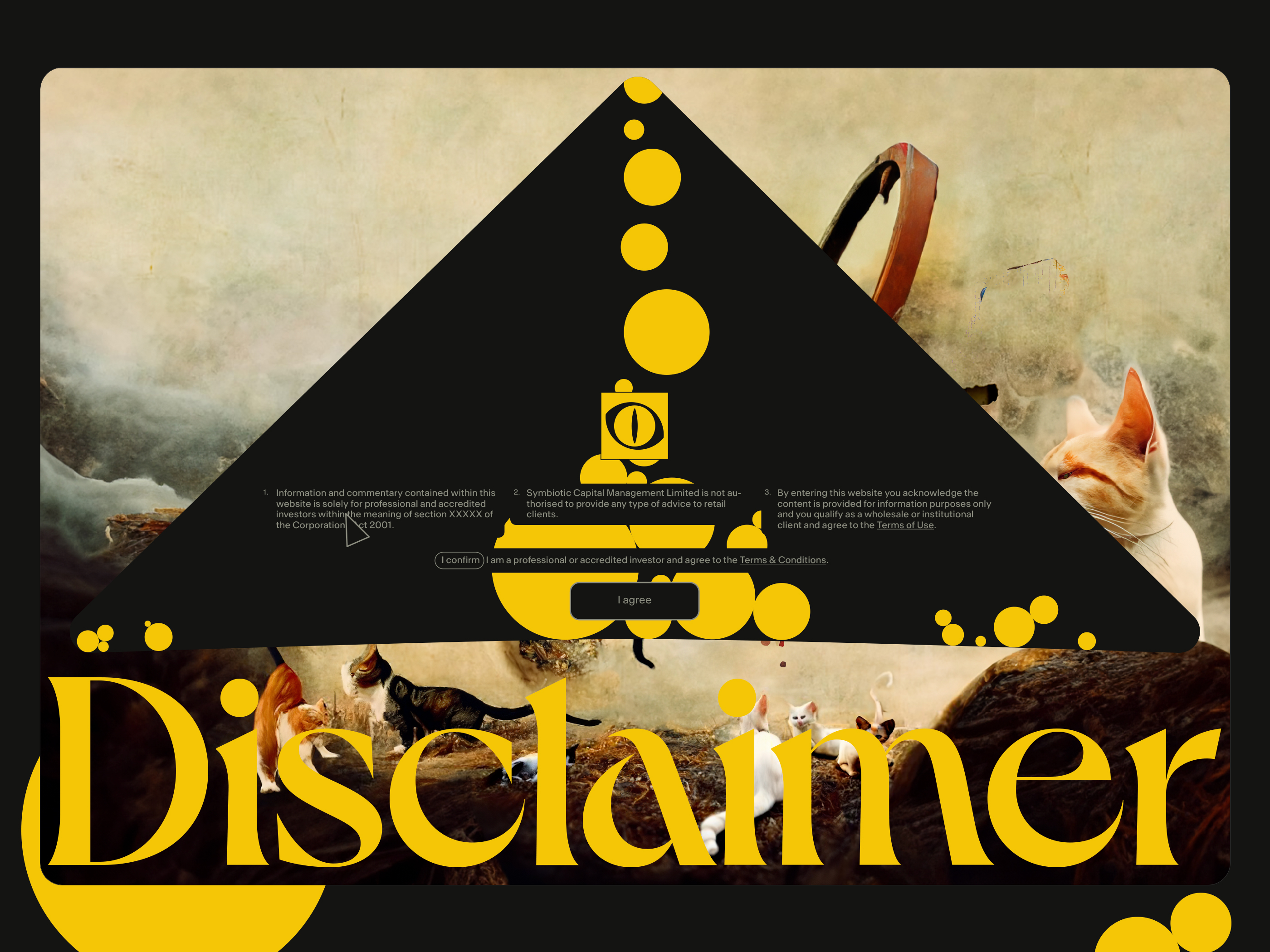
Disclaimer loader
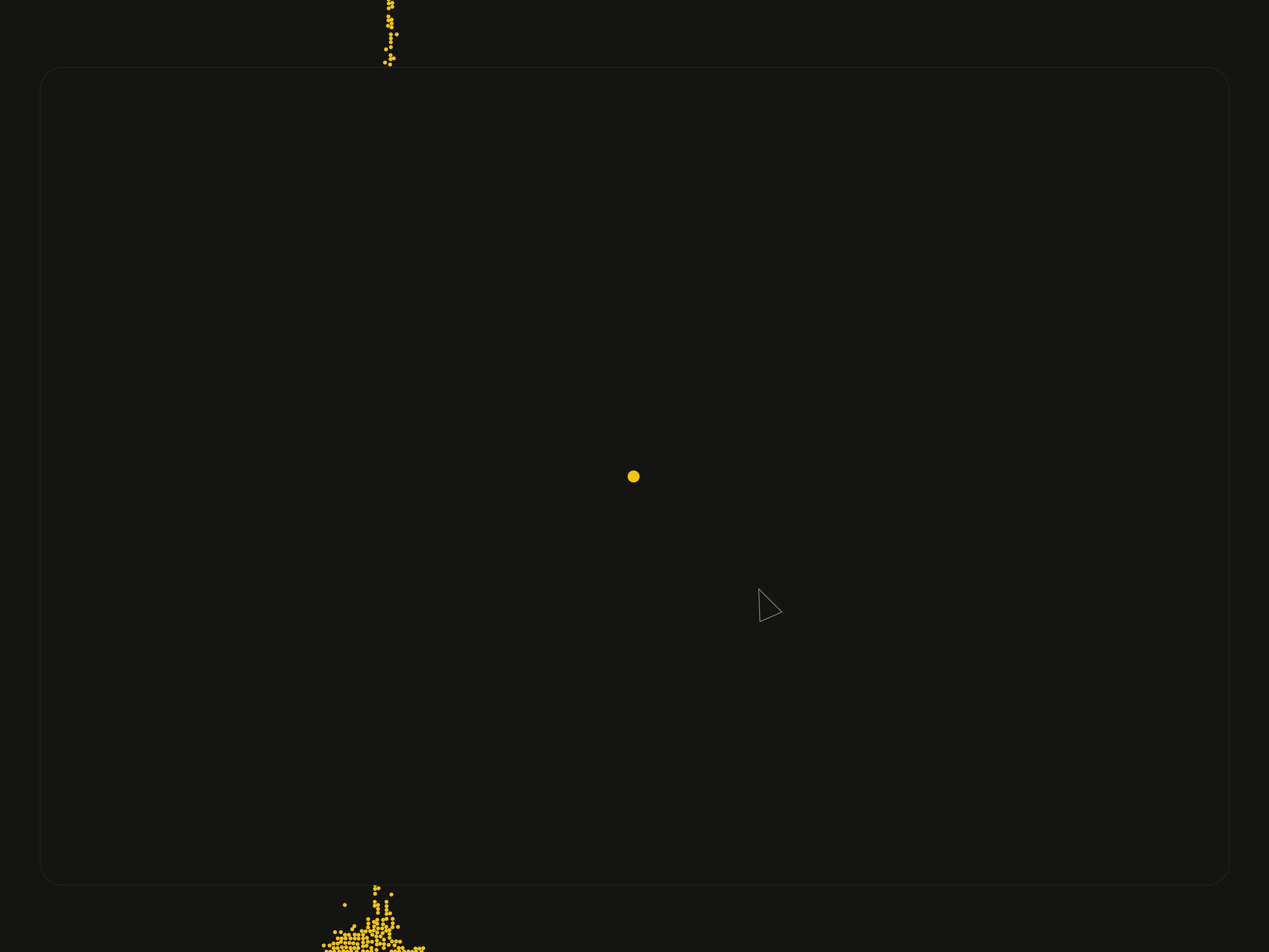
Disclaimer first frame
After the loader is gone, only the content in the triangle appears with the transition.

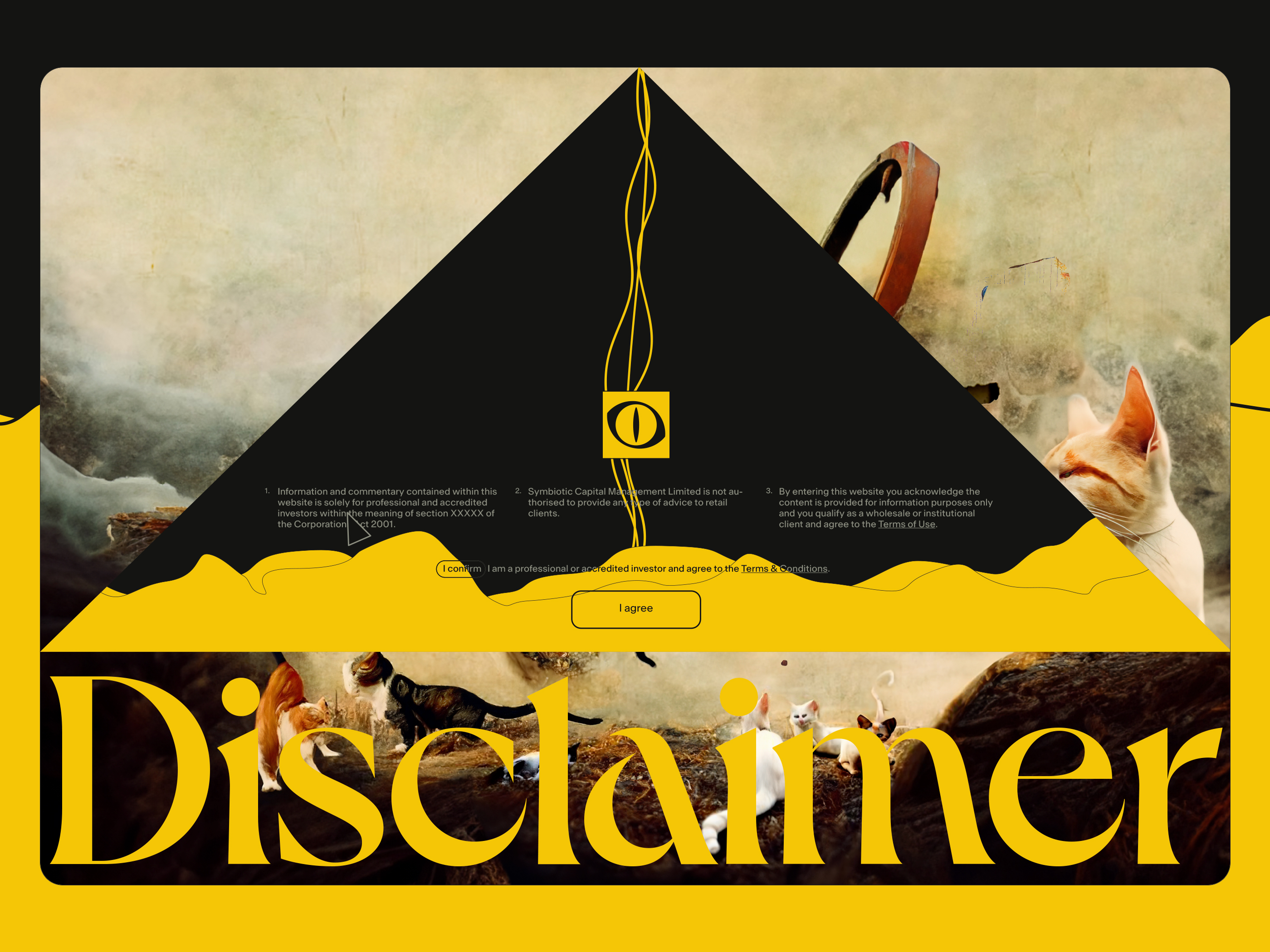
Disclaimer's second frame. "Golden sand"
The sand starts foll after the loader is gone and will fill the triangle entirely.
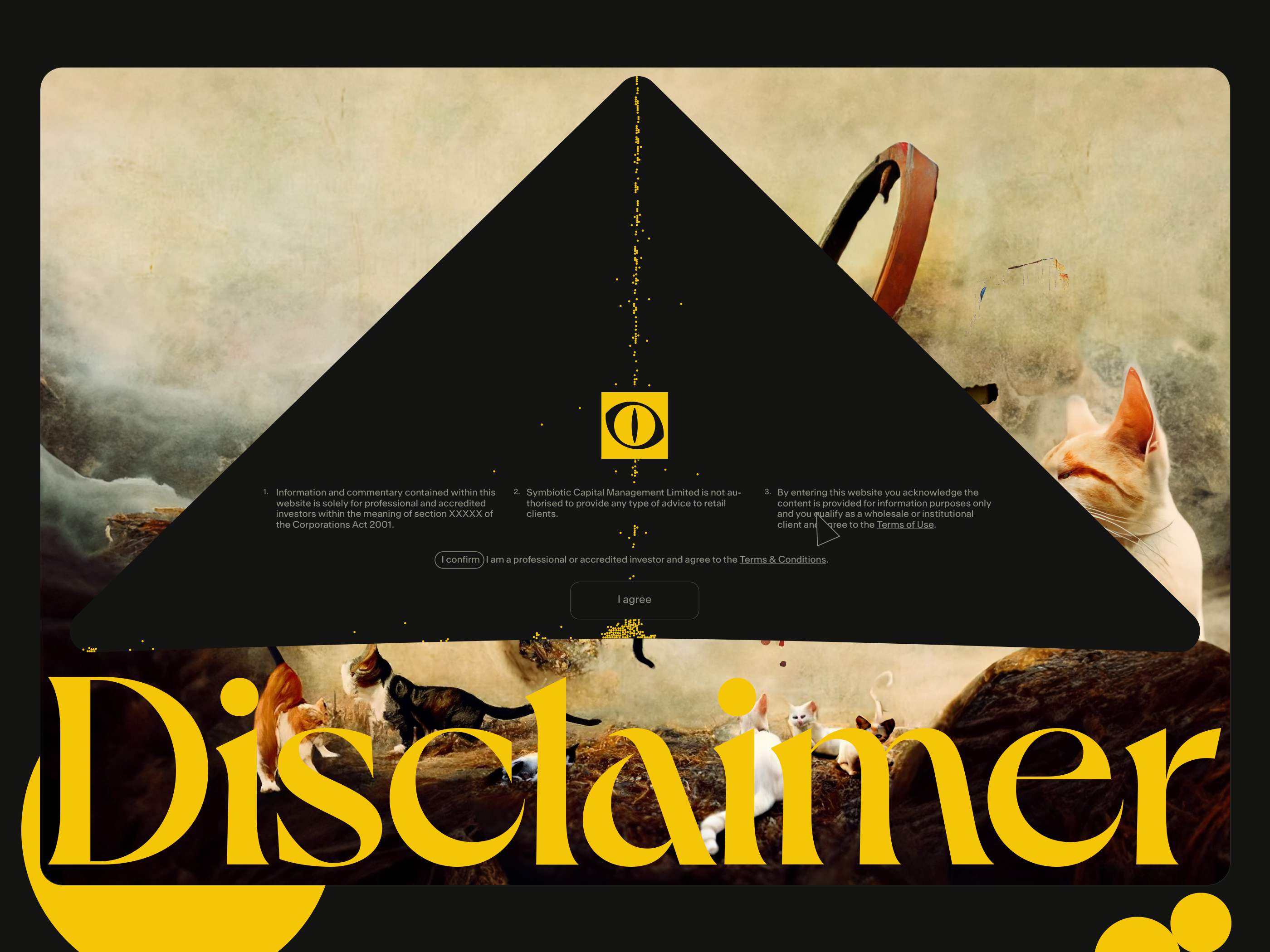
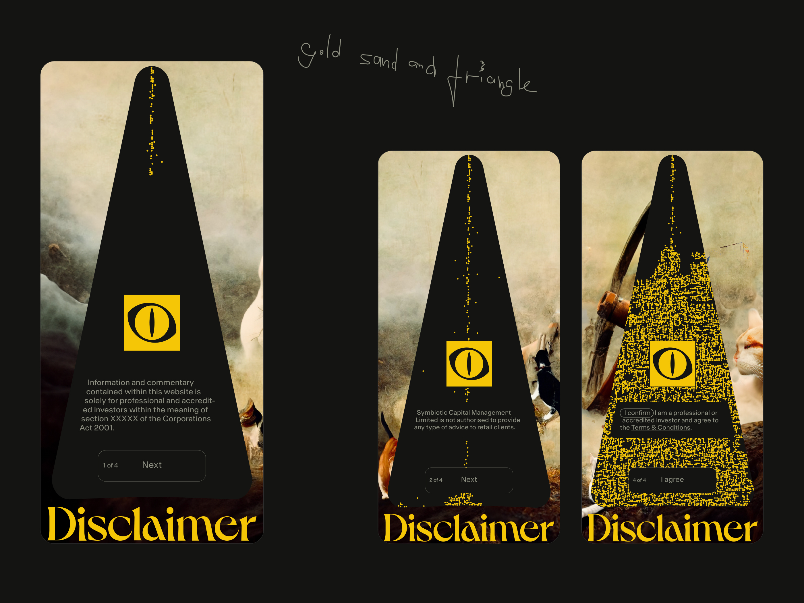
Disclaimer "Les Misérables" versions
Animation of the sand in the hourglass (left) and animation of falling gold coins (right).
Disclaimer. Mobile
Gold sand and triangle.
Meow