The message
The United States Holocaust Memorial Museum (USHMM) is the United States' official memorial to the Holocaust.
Adjacent to the National Mall in Washington, D.C., the USHMM provides for the documentation, study, and interpretation of Holocaust history.
It is dedicated to helping leaders and citizens of the world confront hatred, prevent genocide, promote human dignity, and strengthen democracy.
Introduction
It is a challenge for anyone born a significant amount of time after a tragedy (I was born in 1979 - 34 years after the catastrophe) to create a visual symbol for that event which represents the emotions involved. On the other hand, I have a personal connection to the event.
Speaking literally, I exist because my family was able to escape from the city. One of our distant family members was able to help my grandpa and grandma run away from Kiev just before the Germans took it over in the autumn of 1941 and one of the most notorious episodes of the Holocaust – the Babi Yar execution - happened. Records show that 33,771 Jews concentrated in Babi Yar were executed by shooting on September 29 and 30th, 1941. Another 15,000 Jews were murdered in the same place during 1941 and 1942 and my grandparents, gratefully, were an exception. My father was born four years after the Babi Yar execution.
As you can see, I am connected. Of course, that does not mean that I have a higher emotional sensitivity than someone who does not have this kind of family story. Personally, I always choose spiritual relation over blood relation and believe that we "build" ourselves – this means: if the subject is important for the person and the person spends a good amount of time on it, he will have a stronger connection to it than someone that was just born into something, but does not give a penny about it.
Where was I going with this? Ah…yes. My apologies in advance to those who may take offence to my creations and explanations of it. I had good intentions. On the other hand, the designer's role is to translate meaning to the modern audience…
Visual identity. September 2017
One of the basic elements layout concept: the main element located at the top left side (heart pseudo position), below the main element is canvas with oblique (diagonal) top line that represents other half of the "body", this canvas can hold related information.
The logo concept
December 3, 2016
The mind map
Step 1.
The heart (Here we use the idea of the heart in its symbolic sense as the center of emotion. Color - red).
Step 2.
Crying heart (Crying is the shedding of tears in response to an emotional state).
Step 3.
Eye 50% + Tear 50%
Optional color scheme: eye – gradient, use all colors (the human eye has many colors and combinations); tear – blue color.
Step 4.
Let's use two halves of one heart (breaking heart) to create a crying eye. Anyone that is emotionally connected to the tragedy has a broken heart at the moment of the emotional connection and crying eyes, figuratively at least.
If we simplify the two halves of the heart, we get triangles which we can rearrange into the Star of David. I do not think I need to explain the relation between David's star and the 20th century holocaust. Here we have a direct association with the color yellow.
Logo concept sketches
Logo concept illustration
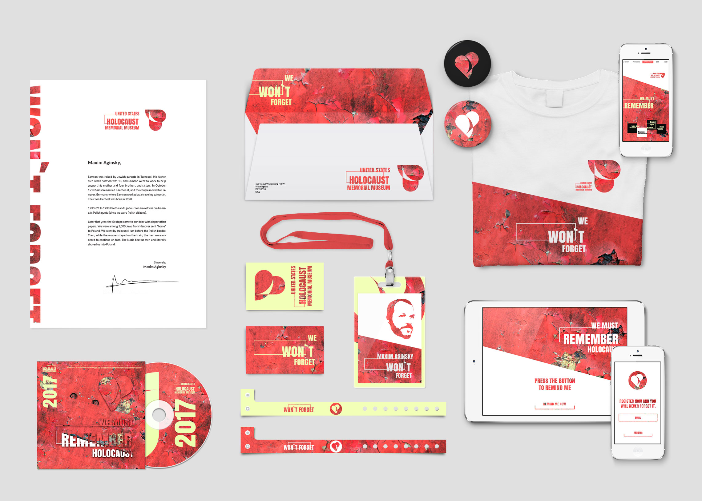
The logo
Below is the final version of the United States Holocaust Memorial Museum logo and slogan.
Memory refresh cards
Logo with guidelines. Illustrator
Colors
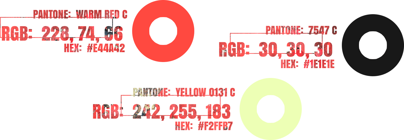
Clearly following from the above, the color scheme will include: red, yellow, black, white and blue (secondary color). Possible gradient usage - combined using the established colors.
Web design
One of the basic elements layout concept: the main element located at the top left side (heart pseudo position), below the main element is canvas with oblique (diagonal) top line that represents other half of the "body", this canvas can hold related information.
Here are the first and third ("Visit the museum") sections of the front page. Each of the sections can be reached by a single turn of the mouse scroll wheel.
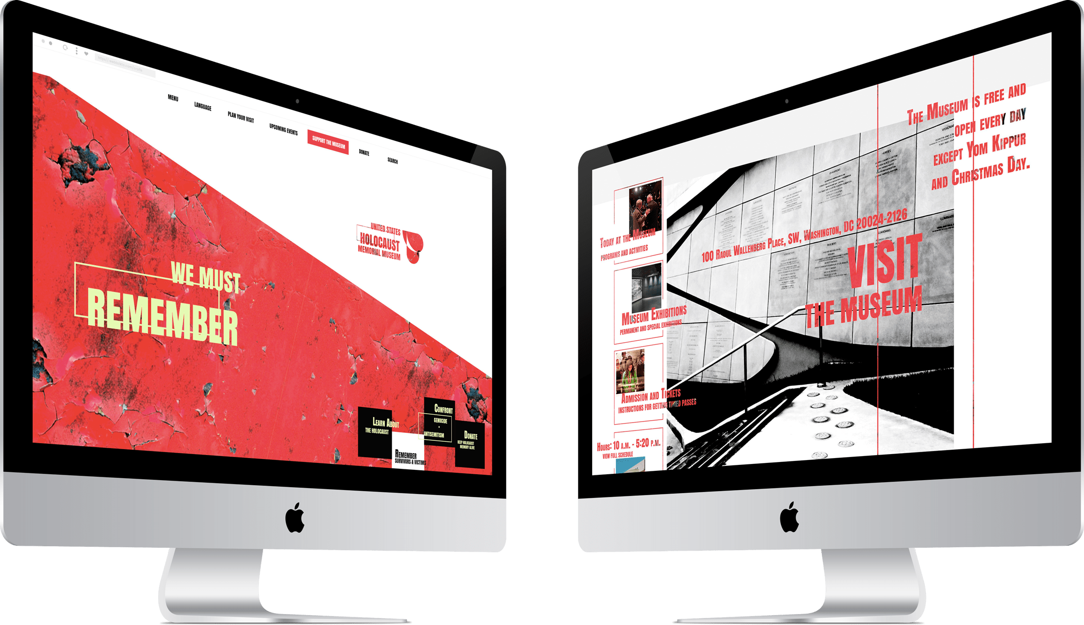
USHMM front website page sections on 27-inch iMac
The first section of the front page on mobile device screen.
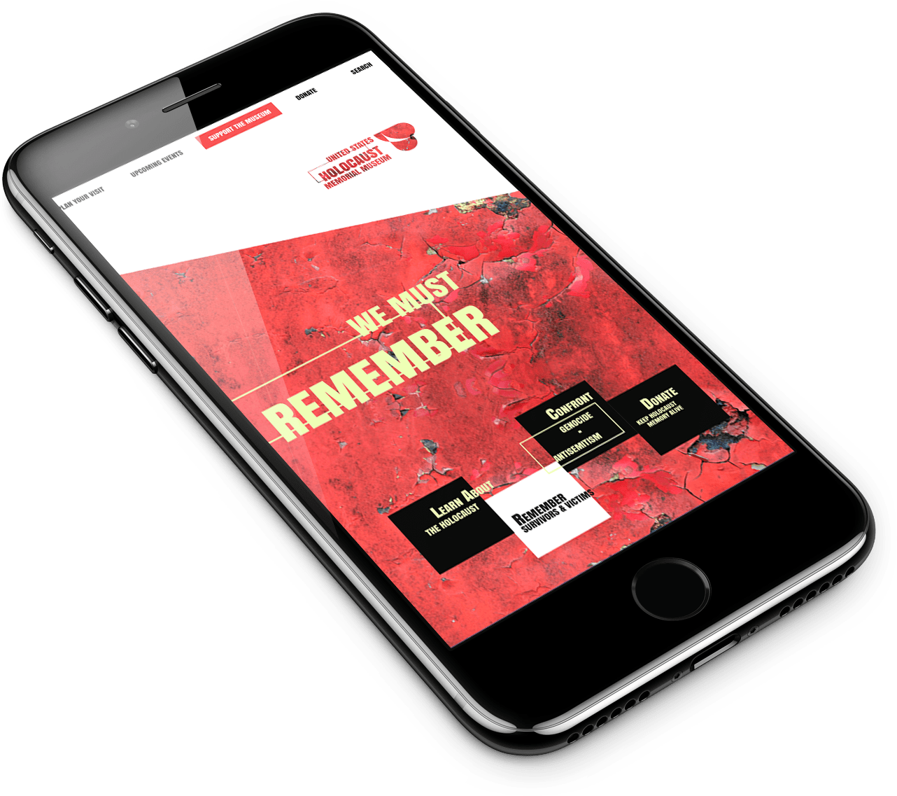
USHMM front website page on iPhone 7
As one scrolls down, sections alternate from left to right like tears falling down. This idea is partly incorporated on the home page, but can be better visualized on other website pages where the blocks of information follow each other clearly.
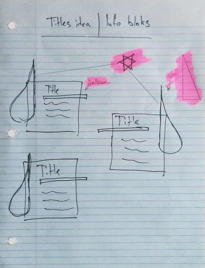
Tears section illustration. Sketch
If the left-side halves are merged with the right-side halves we will receive Stars of David showing up from the top of the page to the bottom.
USHMM front website page design
The long page scroll became one of the main subjects for discussion among UX designers and people who have any relation to the field of website development. Real battles about the pros and cons of the long page scroll took place on the pages of internet. Some designers emphasize – and sure, it is user-friendly – giving space to the content, suchwise therefore dramatically increasing the page height and accordingly, the scrolling time. Others prefer to place most of the information into the initial view – the visible part of the screen - thus presenting the most important part to the user immediately.
Parallel concept STARTs here
Working mouse as a tool for commandments execution
Personally, I think that the user should "merit/earn" the view of the information. In other words, the involvement needs to be physically confirmed from the user side for the best interaction between the two participants - collective mind and user.
You will work hard for your food, until your face is covered with sweat. You will work hard until the day you die, and then you will become dust again. I used dust to make you, and when you die, you will become dust again.
Genesis 3:19
We need to scroll for our bread.
So in this context, the concept of the "working" mouse as a tool to earn the view of the information fits perfectly into the most influential concept ever.
Ignoring the rules can cause real disaster. The UX designers should remember the rules given by people and histories, printed forever in our hearts and collective memory, and follow them.
Parallel concept ENDs here
However.
Since I planned to fit a lot of information into the USHMM front website page, and still needed to make it user friendly, I separated the content into sections and call each section with a single turn of the mouse scroll wheel - very little mouse involvement. Thus, at the same time we can have and enjoy long page structure with enough needed spacing, as well as having all important info right in front of the users' eyes all the time.
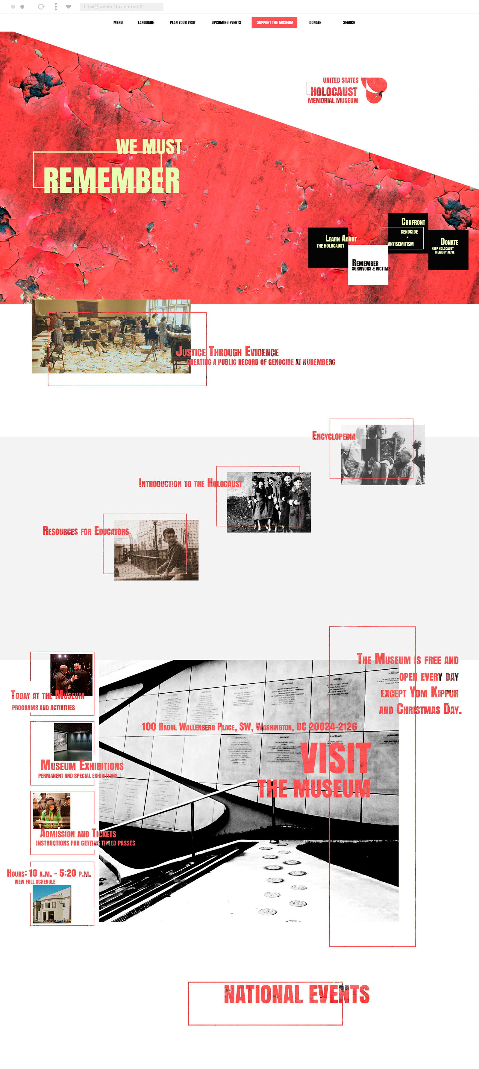
United States Holocaust Memorial Museum front web page design. Desktop
P.S. (September 15, 2017)
While working on the redesign of WebTalkTo (v10), I saw room for the improvement of this craft :) All the imaginary content was recreated and redesigned.
The first version uses a solid red color. For the current version, I have decided to use "old wall" texture to symbolize that everything gets older, forgotten.
Unfortunately it is the nature of most of people, to completely forget a lesson almost right after that lesson has been learned (gift). So in this context the "old wall" texture perfectly complements the concept.
At some point I started to feel that my "do not forget" becoming more and more aggressive. And I understood that it was time to stop working on this craft, before "do not forget" could become "we have suffered enough! Now it is your turn to suffer" or even something more extreme.
The power of a good concept is that it always wants to grow and in some way the "do not forget" will sound more imperative, "do not" will transform to something like "you have to" and then to "you must" and … To make sure it won't happen I will stop here. Thanks for visiting and hope to see you soon following my imaginary constructions.