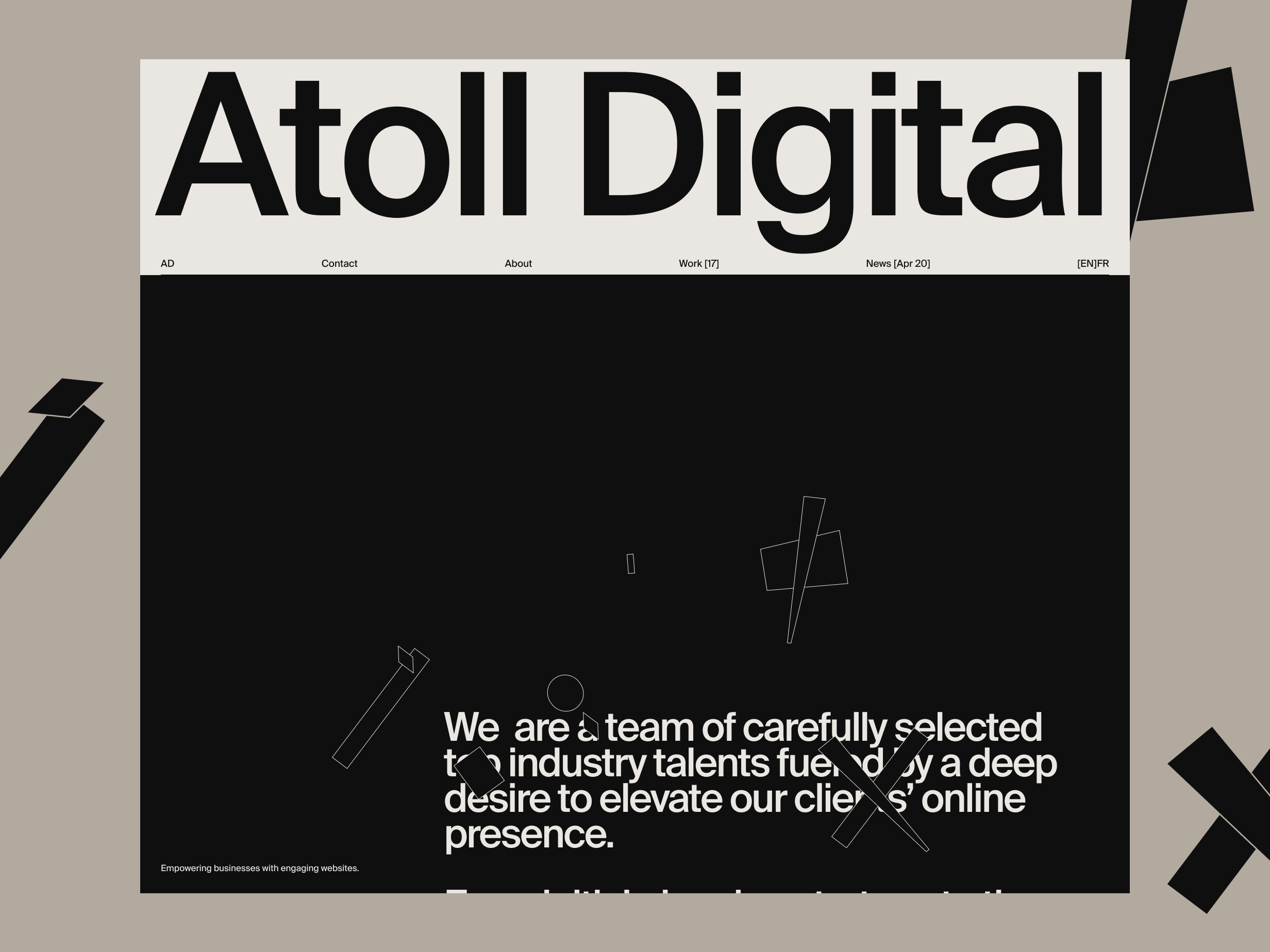
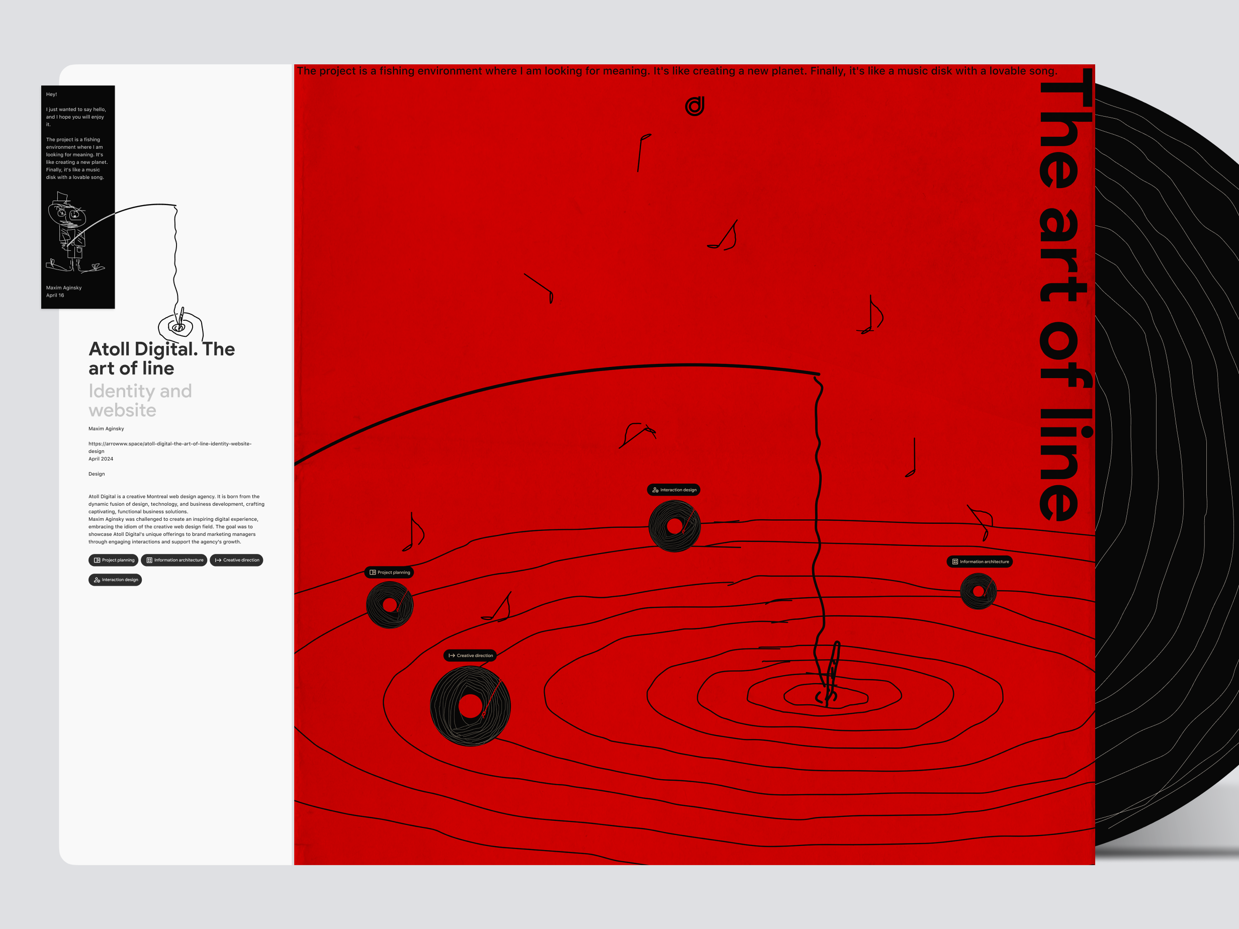
AD is a creative Montreal web design agency. It is born from the dynamic fusion of design, technology, and business development, crafting captivating, functional business solutions.
Maxim Aginsky was challenged to create an inspiring digital experience, embracing the idiom of the creative web design field. The goal was to showcase AD's unique offerings to brand marketing managers through engaging interactions and support the agency's growth.
The case study in Figma.
The password: trim-range-seven-shush
Project planning. Brief and Plan
By investing more time into creating well-organized and well-documented project materials and paying attention to their visual appearance and overall aesthetics, you gain the opportunity to think about creative aspects and, as a result, come up with different ideas.
Essentially, any activity that is related to your project could potentially result in the same outcome.
Scenario: Imagine you've started sketching out a concept, but you need to take a break to update the Project Planning document and design new supporting components. During this time, you can continue to think about your concept, make notes, and maybe experiment a little without actually working on it.
The takeaway is that the more involved you are (the more you live it) with your project, the better your outcomes will be.
For this project, I use Bdoc. I designed Bdoc, an elegant documentation builder framework for Figma, to streamline project documentation organization. While the library is not currently public, I plan to publish it in the future so you can also enjoy it.
Target audience
👉 Marketing managers / Brands (diverse industries).
Benefit to clients
AUTHORITY GAIN - Businesses stand out against their competitors.COMPANY GROWTH - More trust = More business opportunities.
Values that we want to transmit
Digital First & Creative - Edge cutting minimalist website redesign, Sharp + Strong digital impression.
How to transmit: Use some digital coding-related symbols, dynamic, nice typo, and interesting dynamic typo positioning.
Functional - Everything we do is a mix of creativity and functionality. We will never compromise one for the other. This means that our website can have a creative direction but should be easy to absorb the content.
Supportive & Collaborative - Supporting businesses in their new online visibility.
Our goal with the website
- Make the 👉 marketing manager of brands want to contact us for their new website projects.
- Competitive design look & experience.
- Showcase our services AND work and create engagement through clean, engaging interactions.
Main competitor
Locomotive | Montreal web agency 🙌
Overview
One-to-one
Creative Directions №2

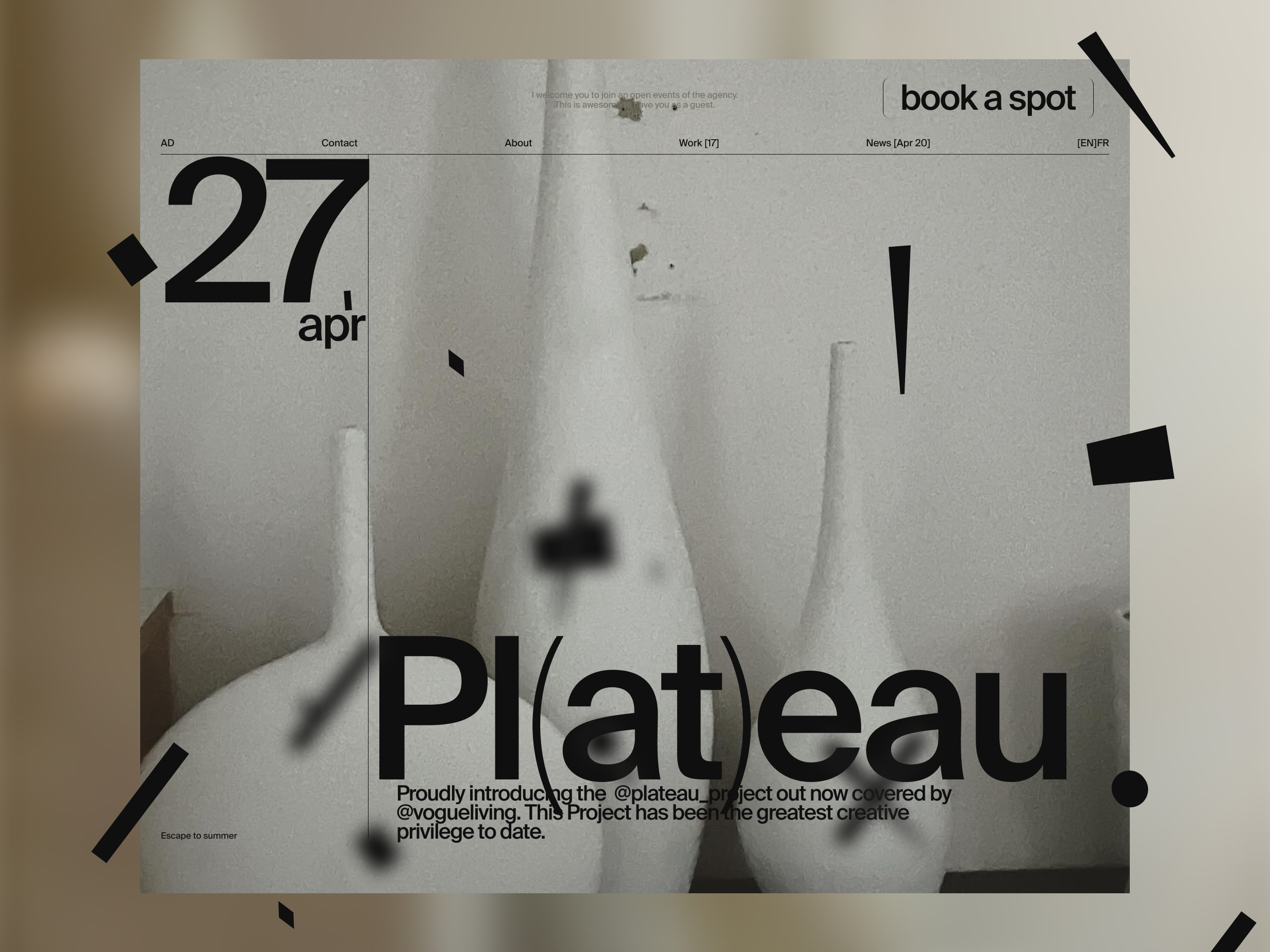
A calendar.
Events calendar EXP №2 Apr 27.
“The image itself is not worth a thousand words”.
Art credits: Lara Hutton
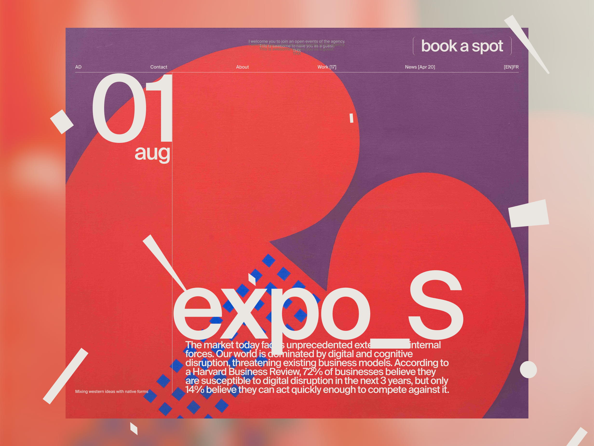
A calendar.
Events calendar EXP №2 Apr 28.
“The image itself is not worth a thousand words”.
Art credits: Mohamed Melehi
Inevitability.
May 01, 2024

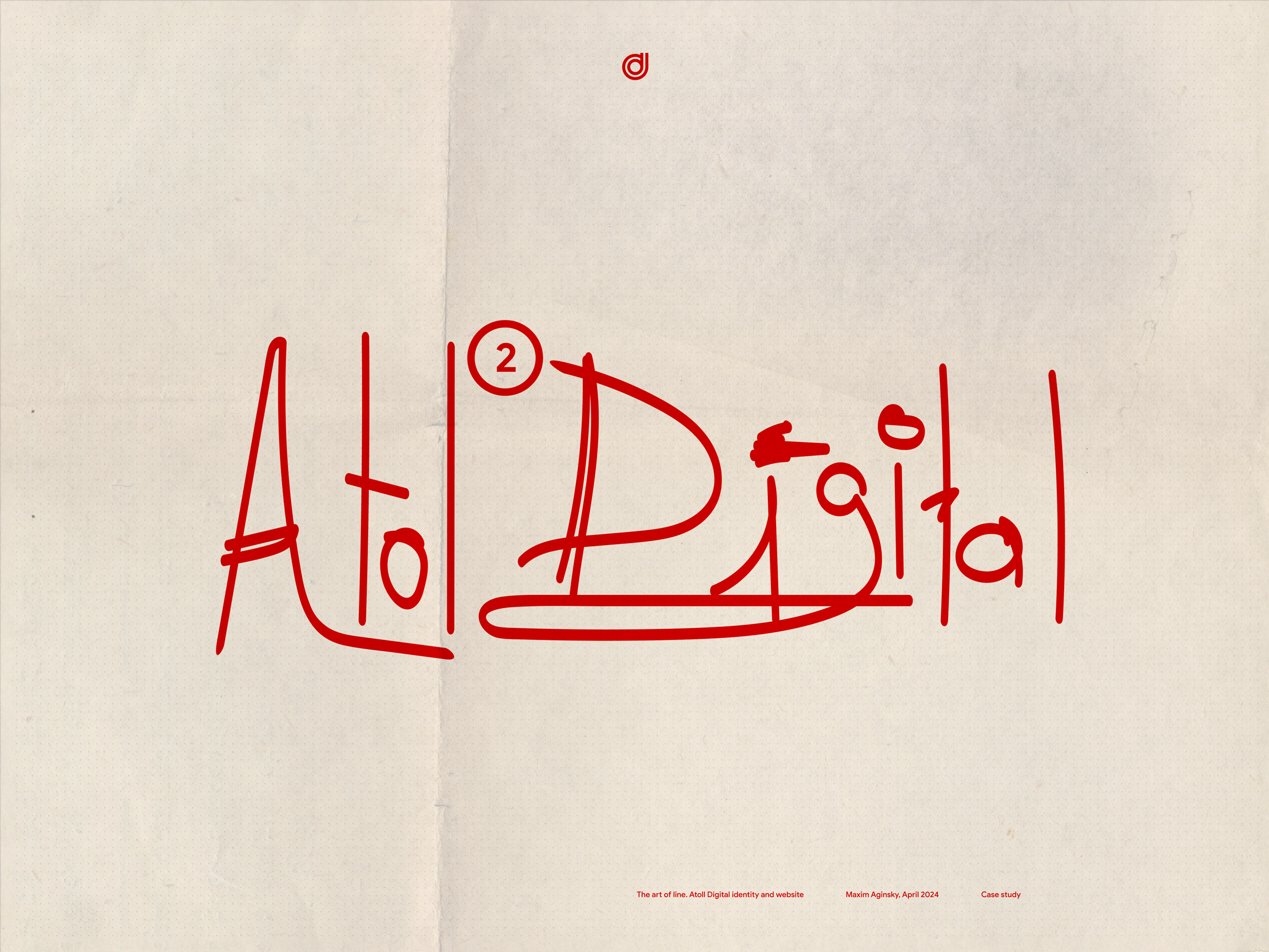
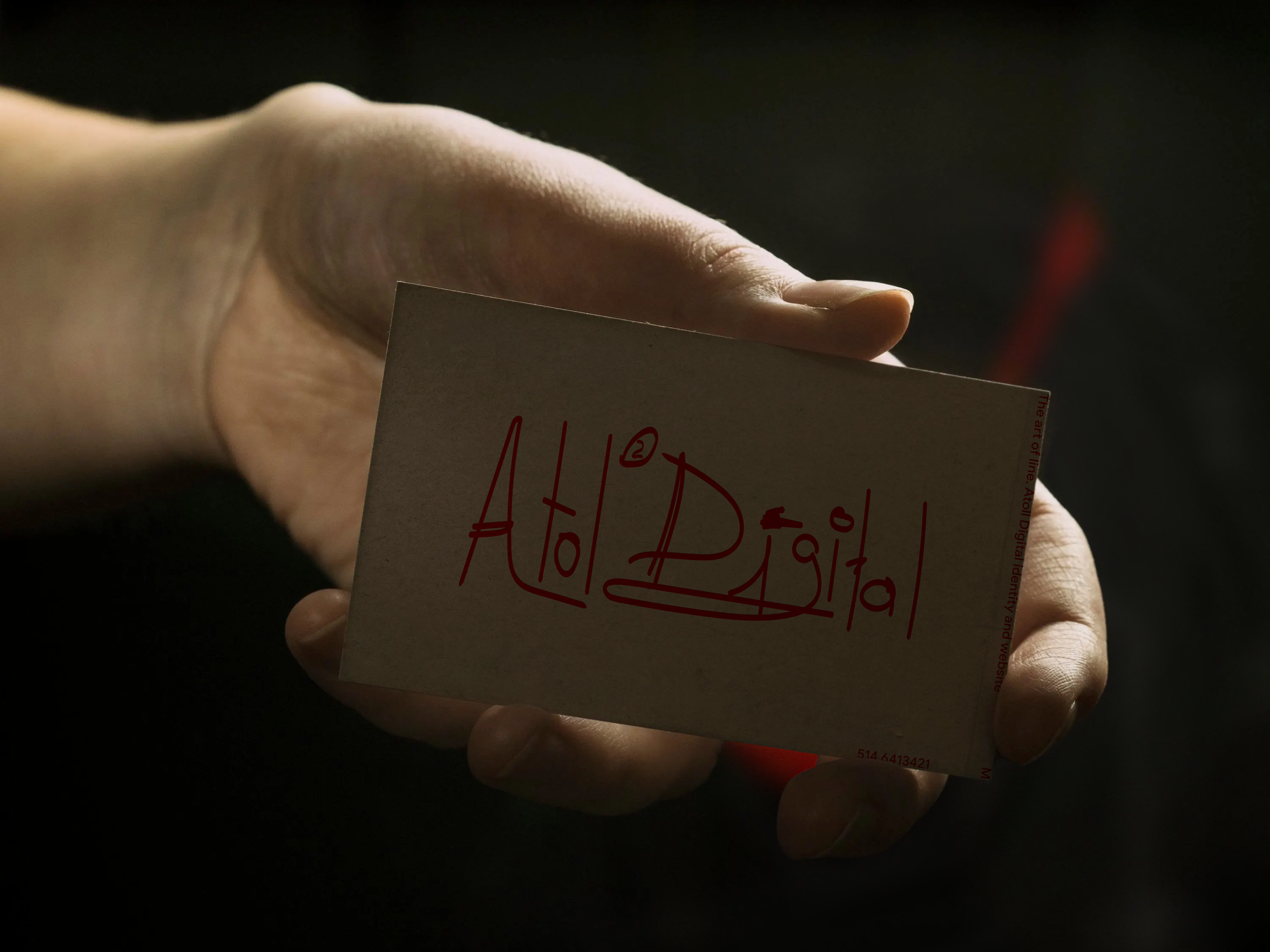
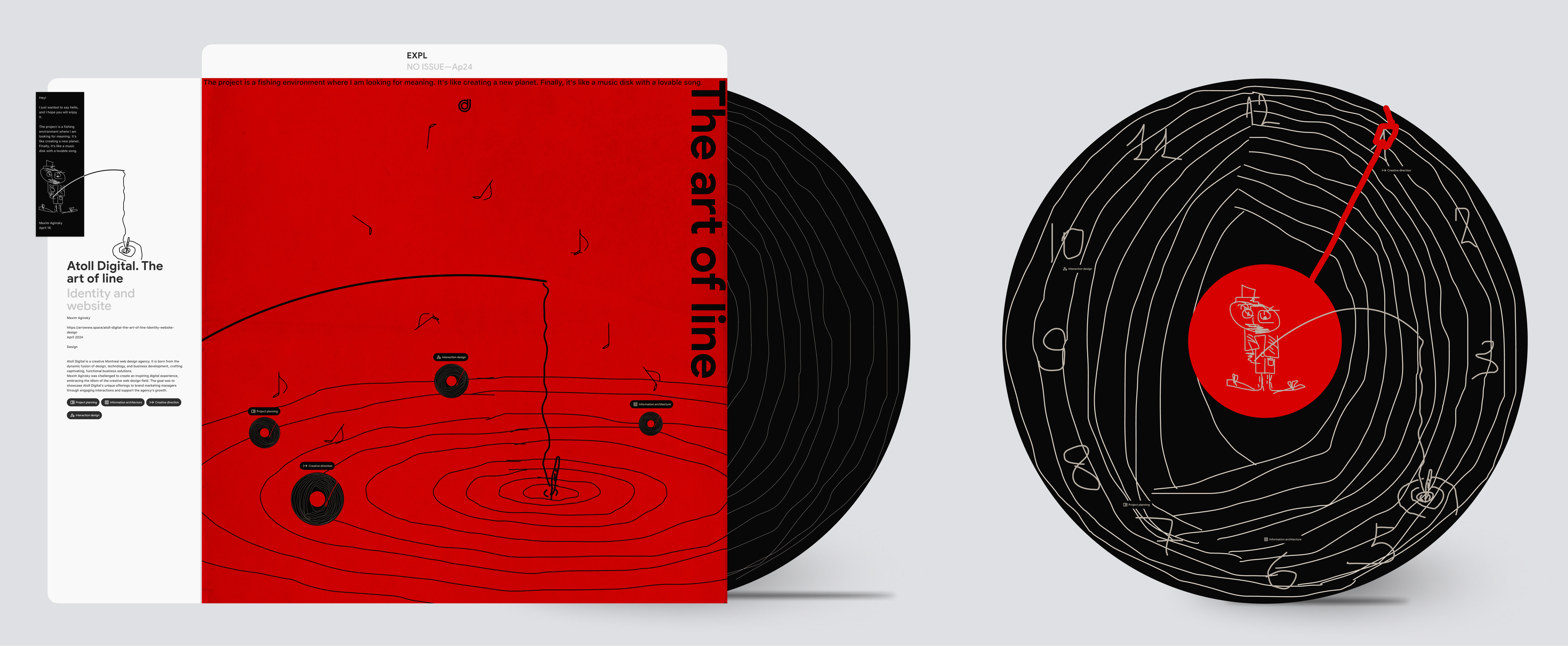
The art of line
Creative Directions №1
This creative direction regarding the front-end implementation and design specification documentation is quite complex.
One of the important questions that needs to be answered is what technique the engineer will propose to use and how this will affect the direction.
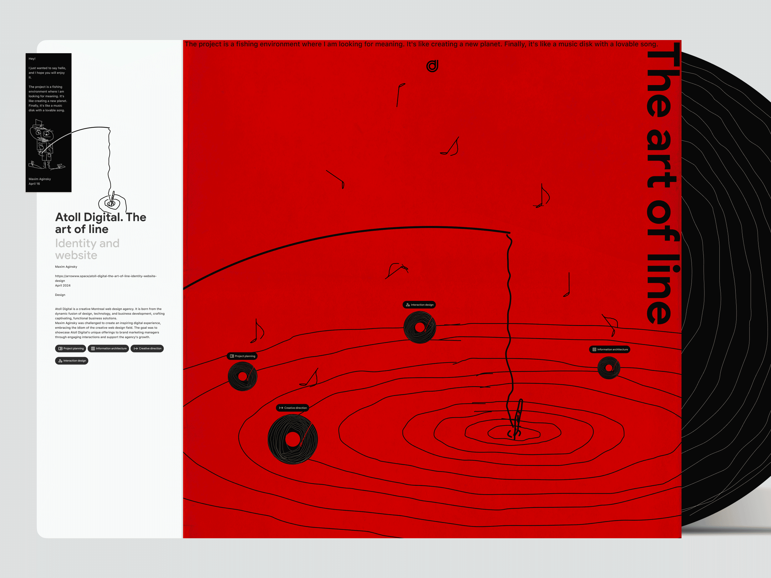
The art of line
Hey!
I just wanted to say hello, and I hope you will enjoy it.
The project is a fishing environment where I am looking for meaning. It's like creating a new planet. Finally, it's like a music disk with a lovable song.
Maxim Aginsky, April 16
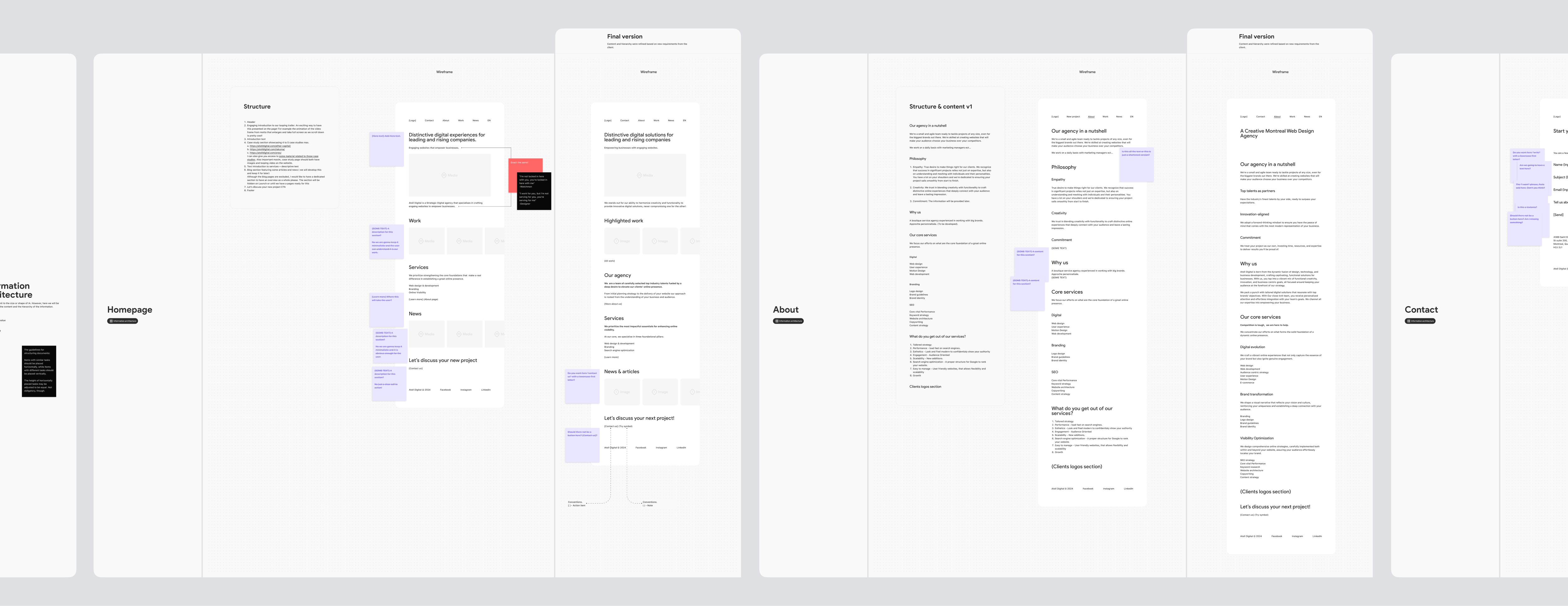
Information architecture
There is no set limit to the size or shape of an IA. However, here, we will consider only the content and hierarchy of the information.
Conventions
[ ] - Action item
{ } - Name of the value
( ) - Note
The guidelines for structuring documents:
Items with similar tasks should be placed horizontally, while items with different tasks should be placed vertically.
The height of horizontally placed tasks may be adjusted to be equal. Not obligatory, though.
I'm not locked in here with you; you're locked in here with me.
Watchmen
I work for you, but I'm not serving for you; you're serving for me.
Designer
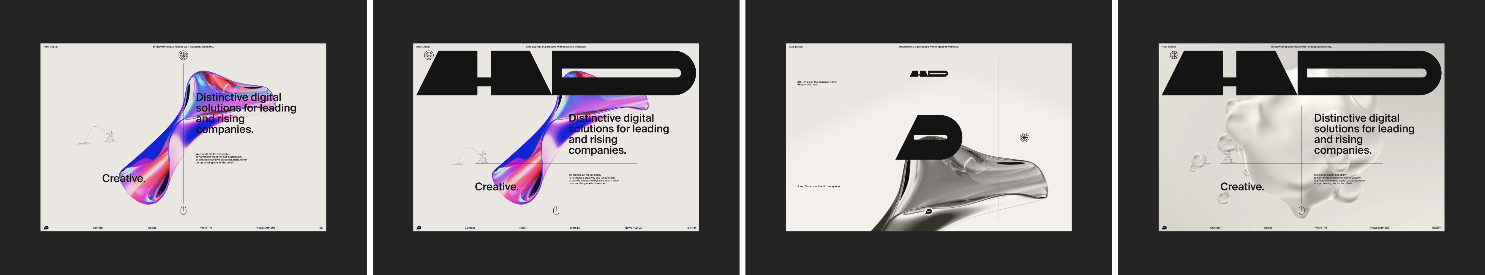
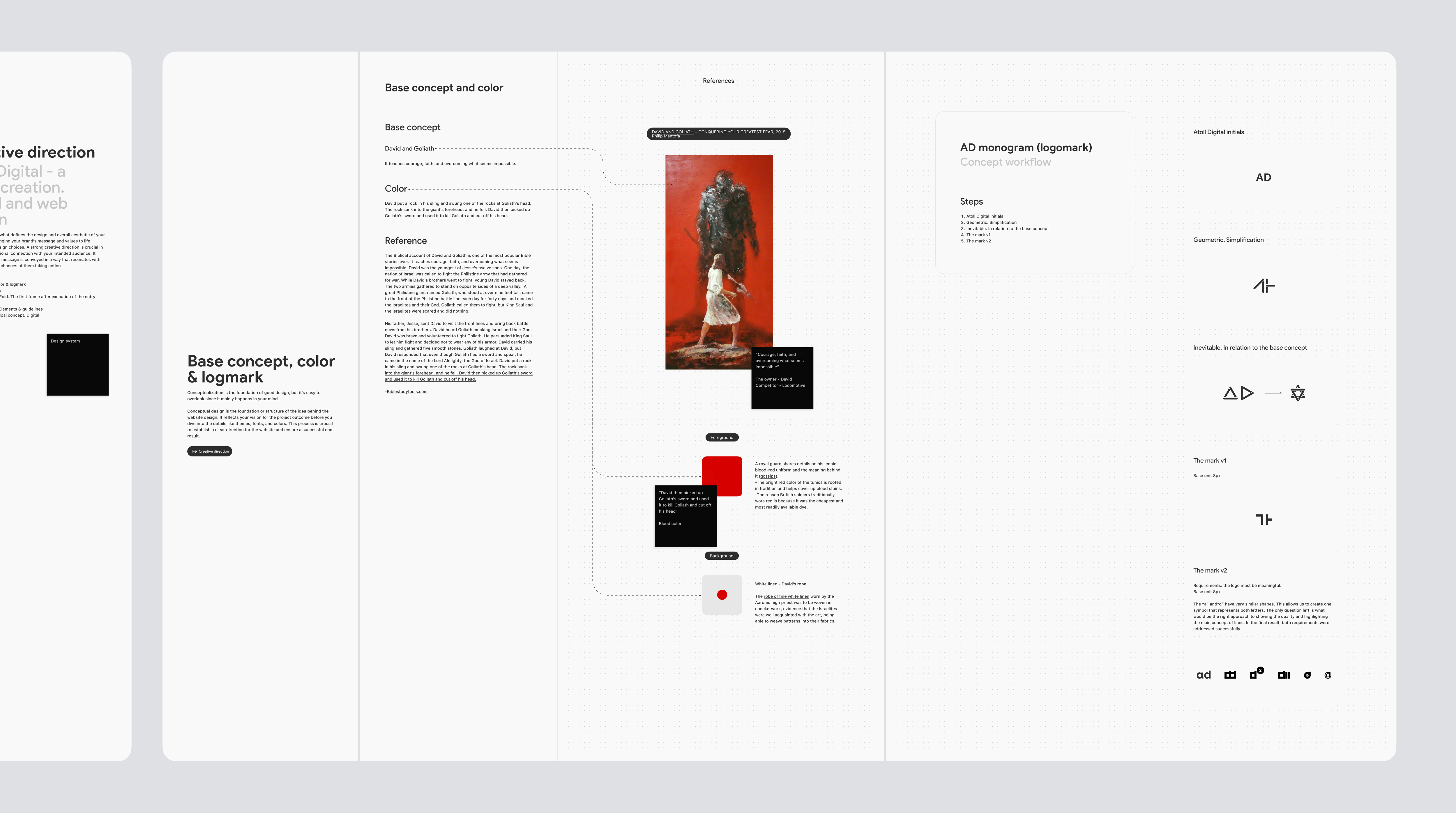
Base concept, colour & logomark
Creative direction.
Conceptualization is the foundation of good design, but it's easy to overlook since it mainly happens in your mind.
Conceptual design is the foundation or structure of the idea behind the website design. It reflects your vision for the project outcome before you dive into the details like themes, fonts, and colours. This process is crucial to establish a clear direction for the website and ensure a successful end result.
Base concept
David and Goliath.
It teaches courage, faith, and overcoming what seems impossible.
Color
David put a rock in his sling and swung one of the rocks at Goliath's head. The rock sank into the giant's forehead, and he fell. David then picked up Goliath's sword and used it to kill Goliath, cutting off his head.
Foreground
A royal guard shares details on his iconic blood-red uniform and the meaning behind it (gossip).
- The bright red color of the tunica is rooted in tradition and helps cover up blood stains.
- The reason British soldiers traditionally wore red is because it was the cheapest and most readily available dye.
David then picked up Goliath's sword and used it to kill Goliath and cut off his head.
Blood color
Background
White linen - David's robe.
The robe of fine white linen worn by the Aaronic high priest was to be woven in checkerwork, evidence that the Israelites were well acquainted with the art, being able to weave patterns into their fabrics.
Reference
The Biblical account of David and Goliath is one of the most popular Bible stories ever. It teaches courage, faith, and overcoming what seems impossible. David was the youngest of Jesse's twelve sons. One day, the nation of Israel was called to fight the Philistine army that had gathered for war. While David's brothers went to fight, young David stayed back. The two armies gathered to stand on opposite sides of a deep valley. A great Philistine giant named Goliath, who stood at over nine feet tall, came to the front of the Philistine battle line each day for forty days and mocked the Israelites and their God. Goliath called them to fight, but King Saul and the Israelites were scared and did nothing.
His father, Jesse, sent David to visit the front lines and bring back battle news from his brothers. David heard Goliath mocking Israel and their God. David was brave and volunteered to fight Goliath. He persuaded King Saul to let him fight and decided not to wear any of his armor. David carried his sling and gathered five smooth stones. Goliath laughed at David, but David responded that even though Goliath had a sword and spear, he came in the name of the Lord Almighty, the God of Israel. David put a rock in his sling and swung one of the rocks at Goliath's head. The rock sank into the giant's forehead, and he fell. David then picked up Goliath's sword and used it to kill Goliath and cut off his head.
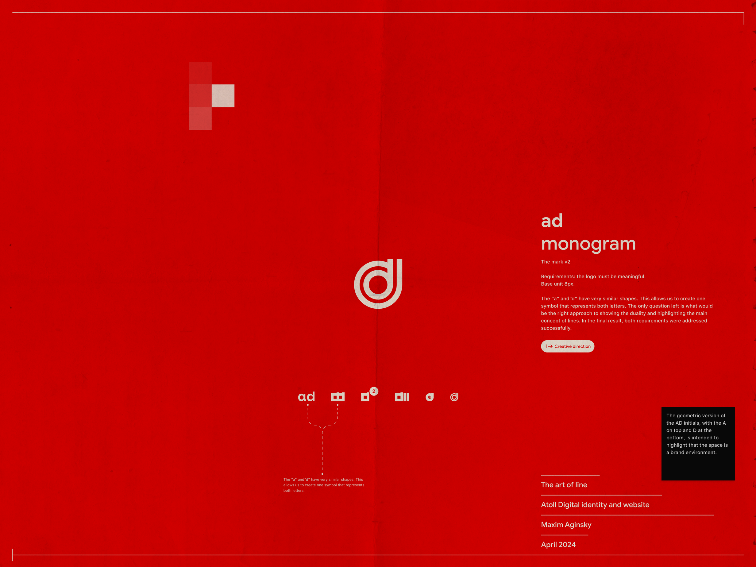
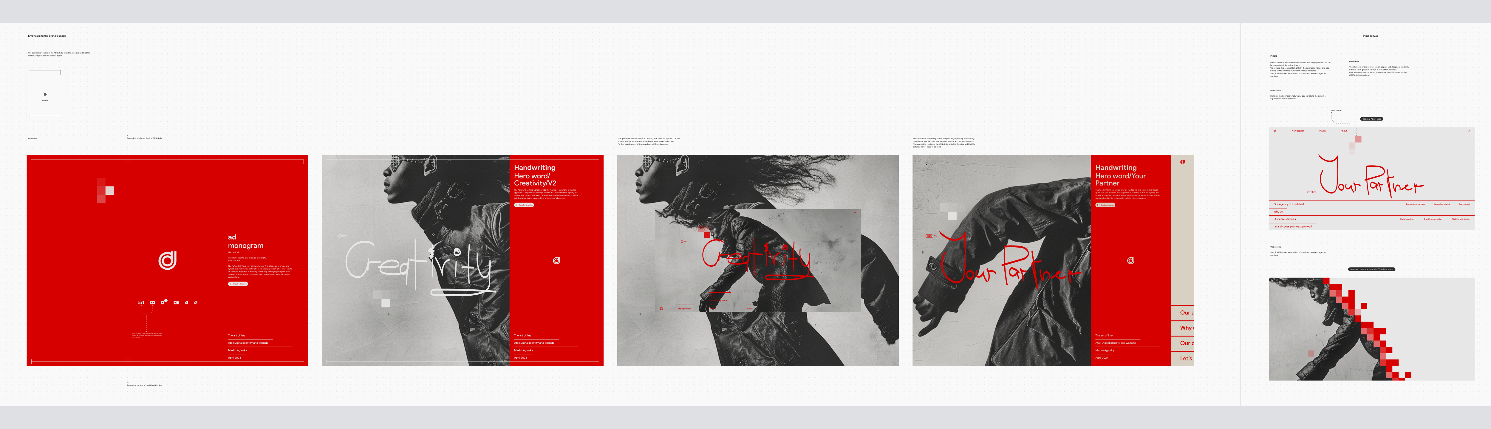
AD monogram (logomark)
Requirements: the logo must be meaningful.
Base unit 8px.
The "a" and"d" have very similar shapes. This allows us to create one symbol that represents both letters. The only question left is what the right approach would be to show duality and highlight the main concept of lines. In the final result, both requirements were addressed successfully.
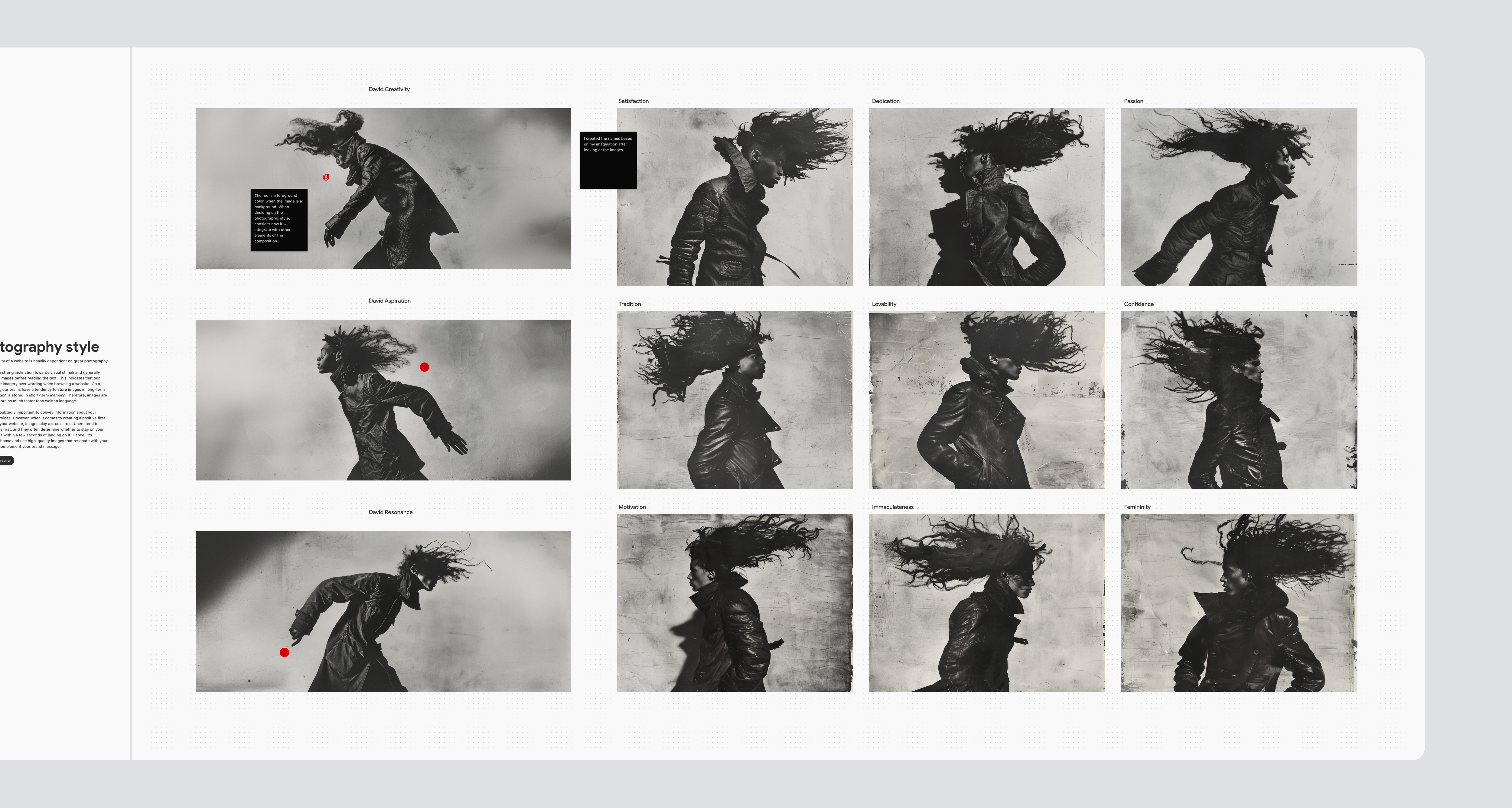
Photography style
Creative direction.
The visual quality of a website is heavily dependent on great photography.
Humans have a strong inclination toward visual stimuli and generally tend to look at images before reading the text. This indicates that our brains prioritize imagery over wording when browsing a website. On a biological level, our brains tend to store images in long-term memory, while text is stored in short-term memory. Therefore, images are retained in our brains much faster than written language.
Words are undoubtedly important to convey information about your products or services. However, when it comes to creating a positive first impression on your website, images play a crucial role. Users tend to focus on visuals first, and they often determine whether to stay on your website or leave within a few seconds of landing on it. Hence, it's imperative to choose and use high-quality images that resonate with your audience and complement your brand message.
Red is a foreground color when the image is a background. When deciding on the photographic style, consider how it will integrate with other elements of the composition.
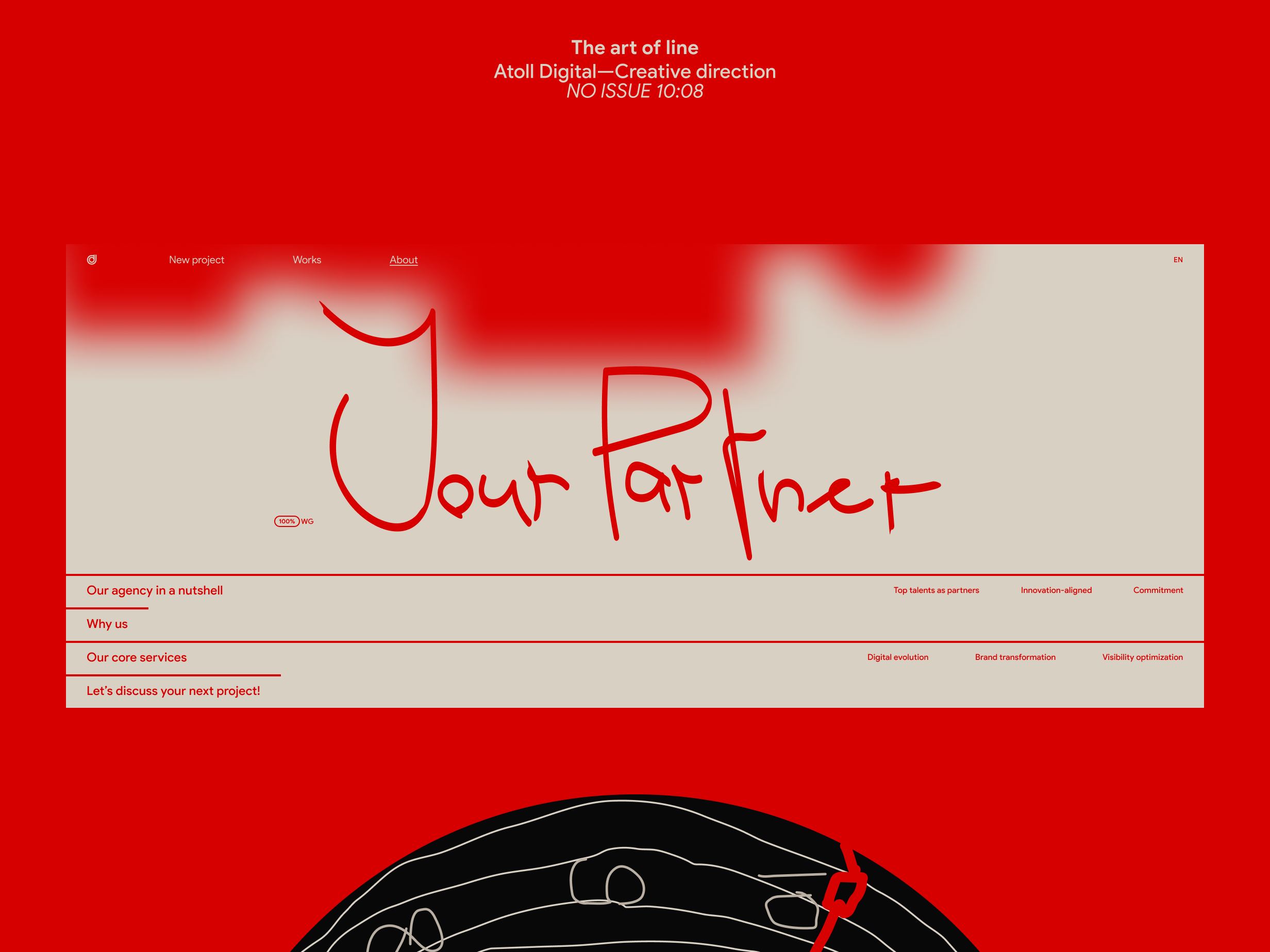
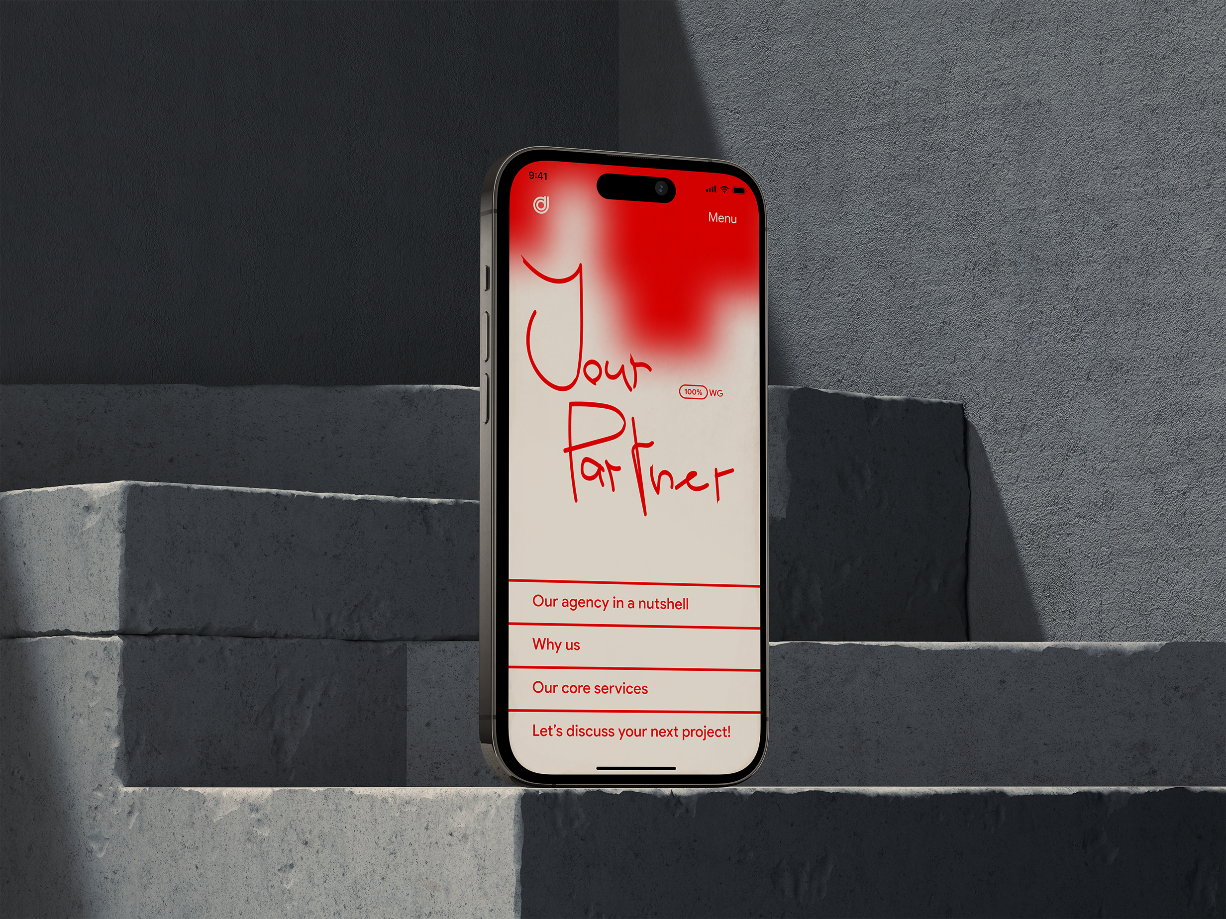
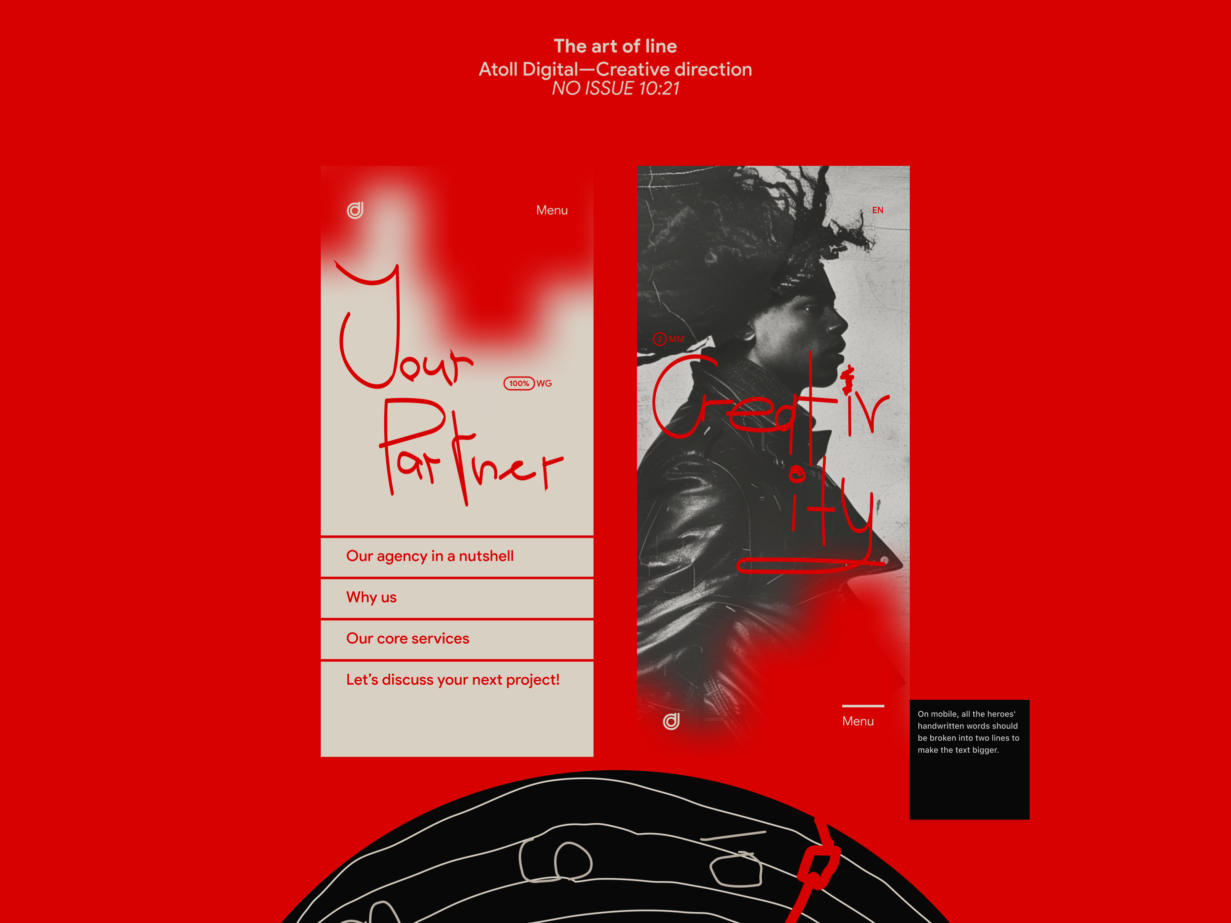
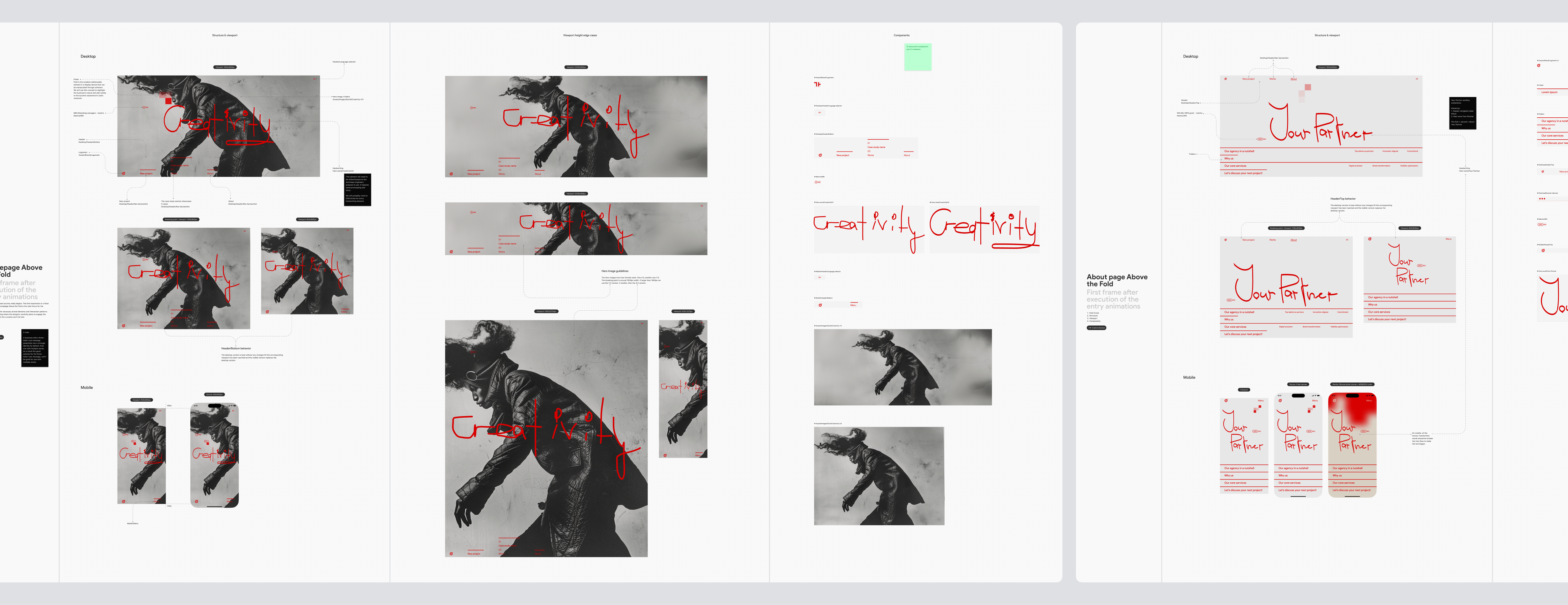
Pages. Above the Fold. The first frame after execution of the entry animations
Creative direction.
This is where the user journey really begins. The first impression is critical, and the homepage above the fold is the designer's main focus.
It should have all the necessary brand elements and interaction patterns. This is an onboarding where the designer carefully plans to engage the user and ensure that the curiosity is not lost.
A note.
A business with a three-letter core message potentially has a stronger identity by default than one with multiple words.
Consequently, the solution for the three-letter core message won't work for a message with multiple words.
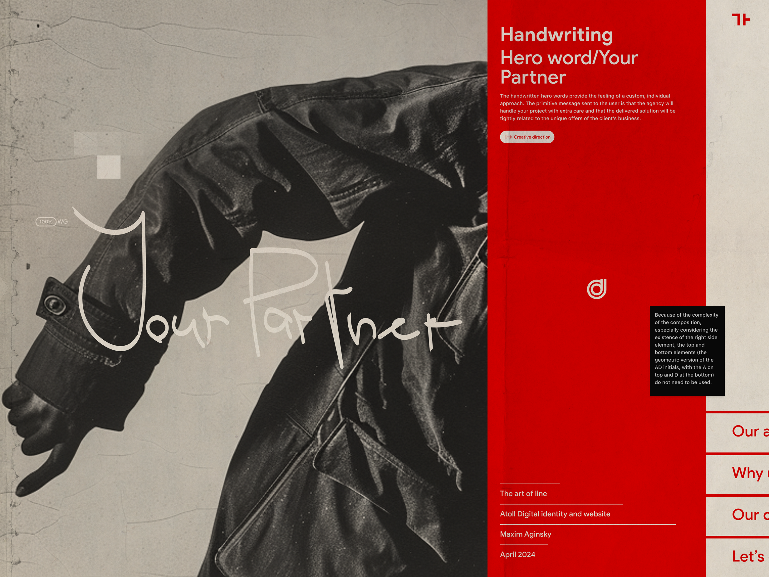
"Your Partner" wording explanation.
Hierarchy:
- Header navigation label About
- Hero word: Your Partner
The first + second = About Your Partner
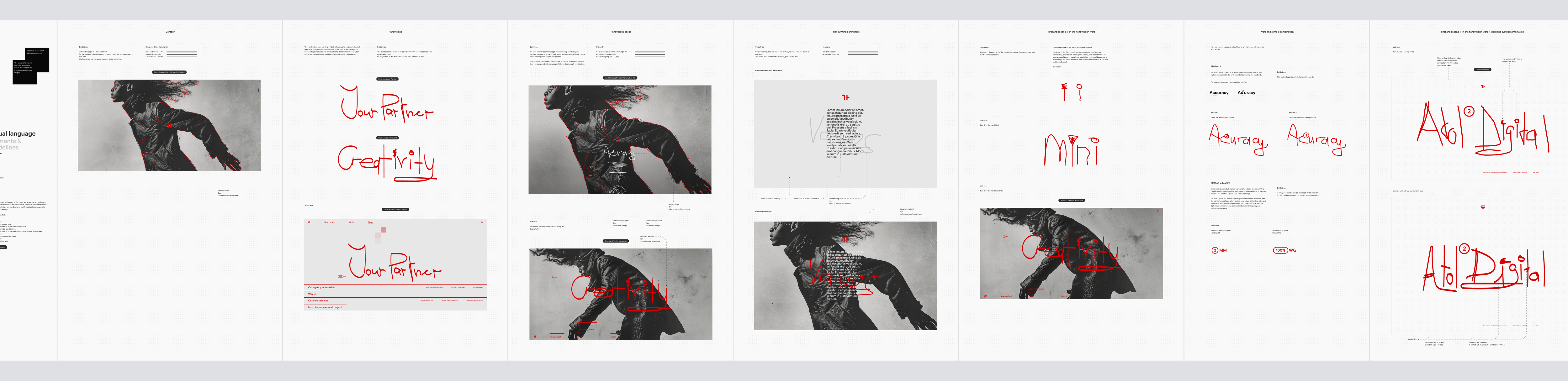
Visual language
Elements & guidelines. Creative direction.
The elements are the alphabet of the visual world and the principles are the words and sentences of the visual world. Elements oftentimes create the principles. Artists use the Elements and Principles to communicate their ideas and feelings.
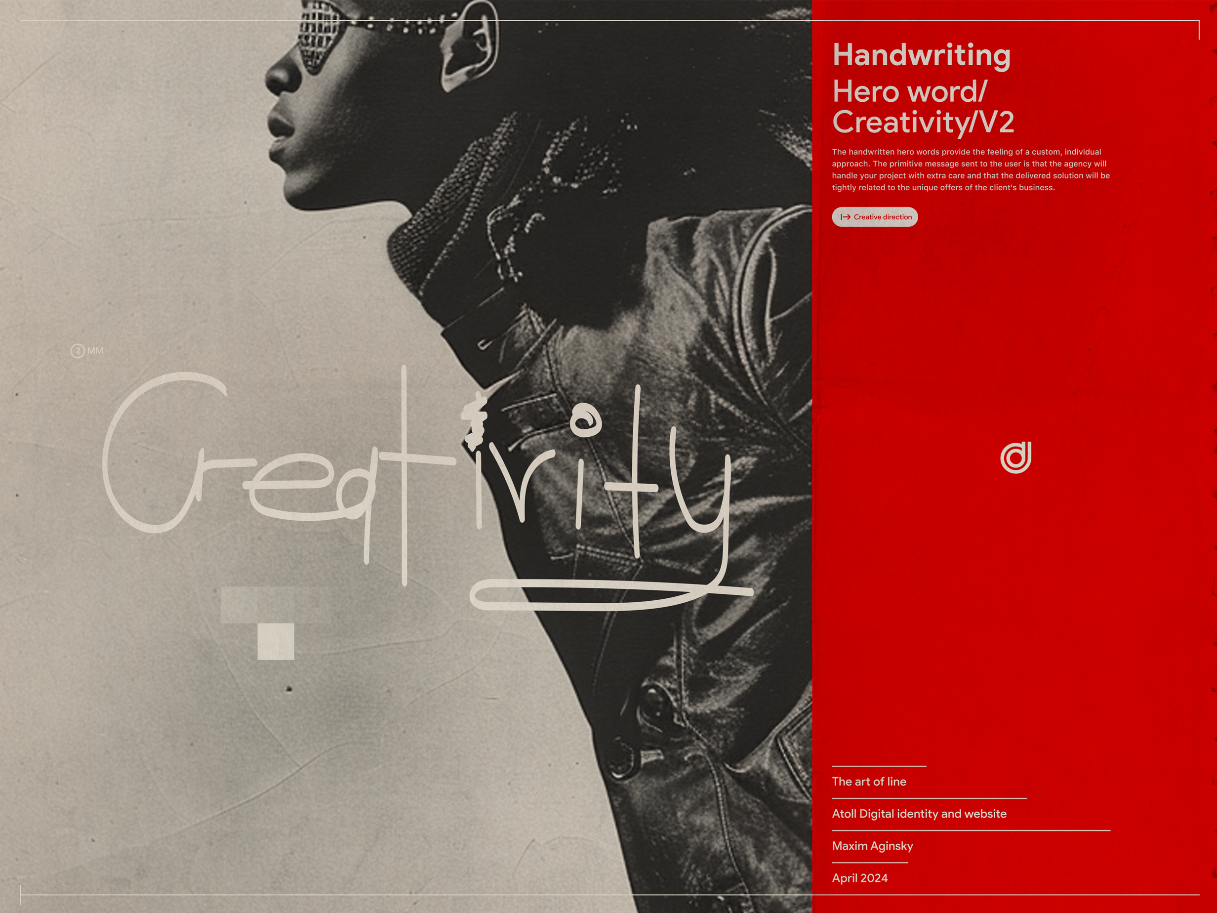
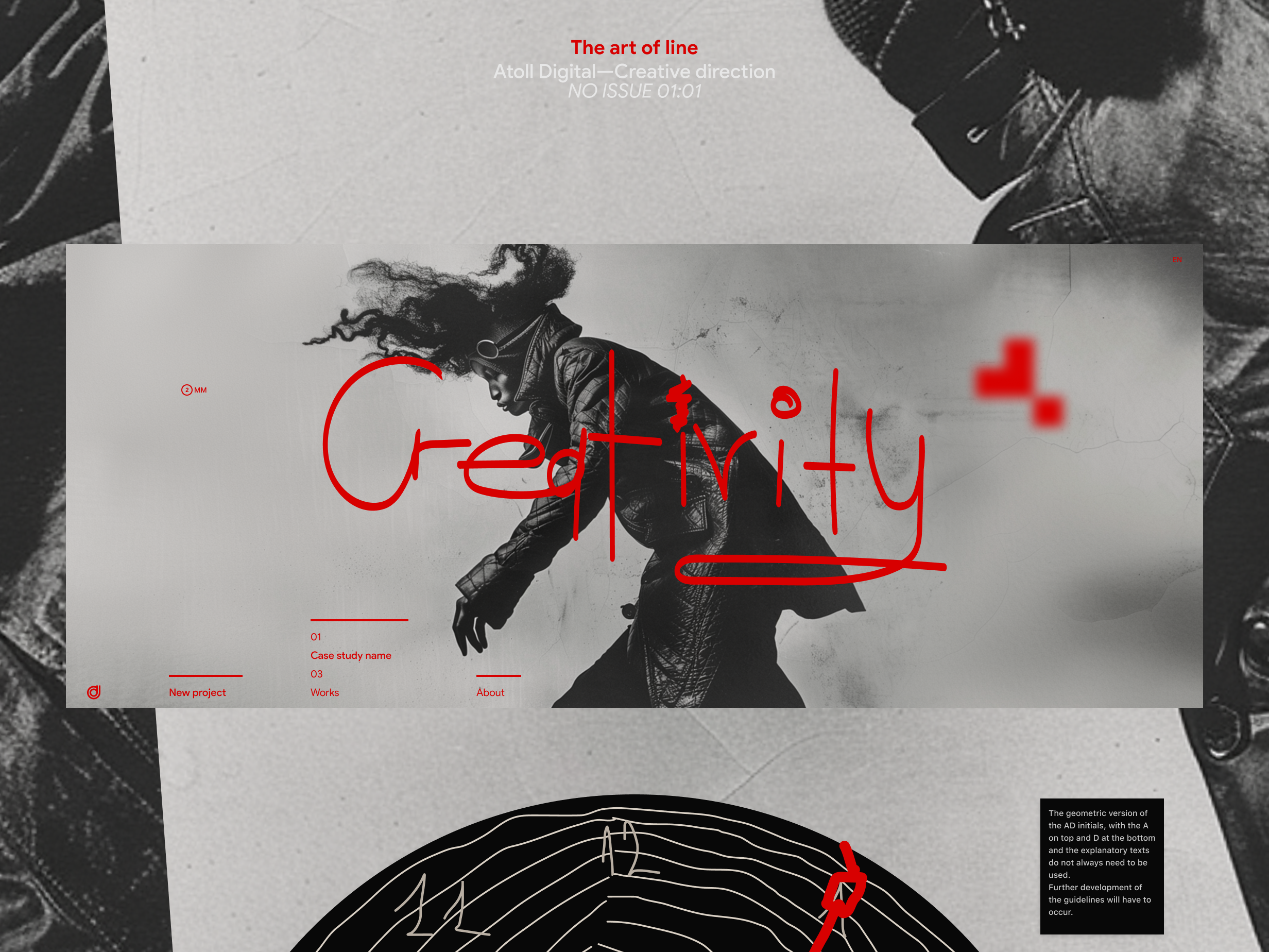
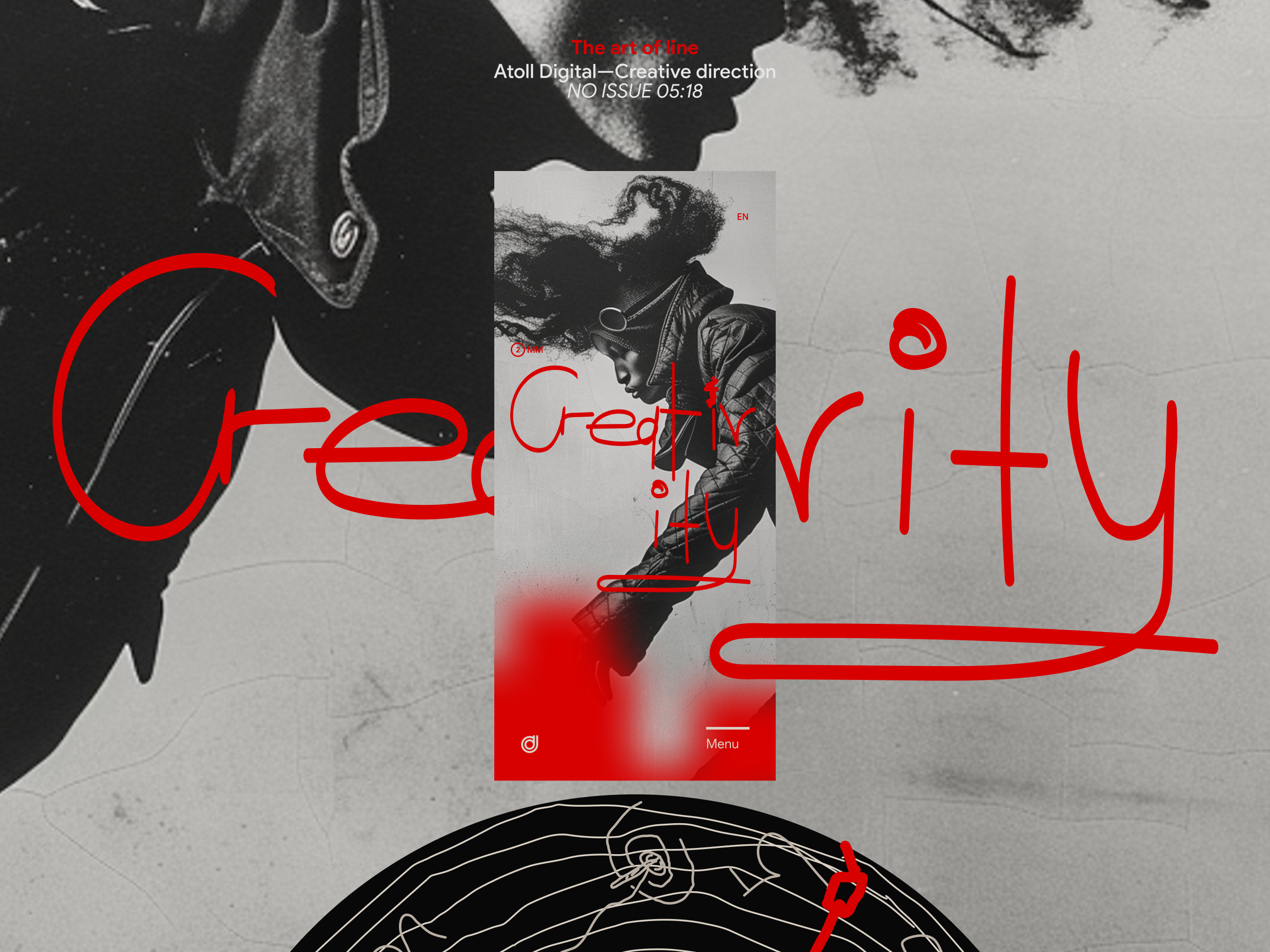
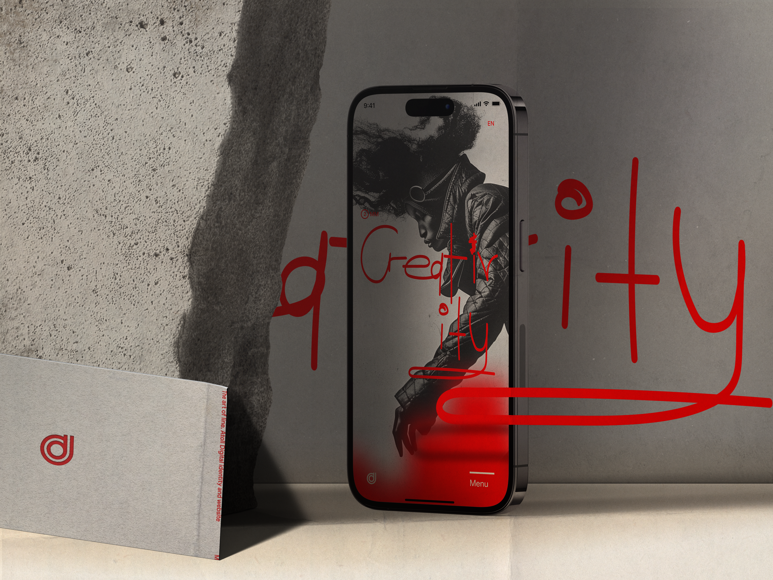
- Contour
- Handwriting
- Handwriting behind text
- First and second "i" in the handwritten word
- Word and symbol combination
- First and second "i" in the handwritten word + Word and symbol combination
- Emphasizing the brand's space
- Pixel Canvas
- Blurred pixel canvas
The power of a website lies in its transitions, where the first and last frames consist of great images.
Beginning of the color tokens development.
Emphasizing the brand's space & Pixel canvas
The geometric version of the AD initials, with the A on top and D at the bottom, emphasizes the brand's space.
Pixel is the smallest addressable element in a display device that can be manipulated through software.
We will use this concept to highlight the business's nature and add variety to the dynamic experience's static moments.
Also, it will be used as an effect of transition between pages and sections.
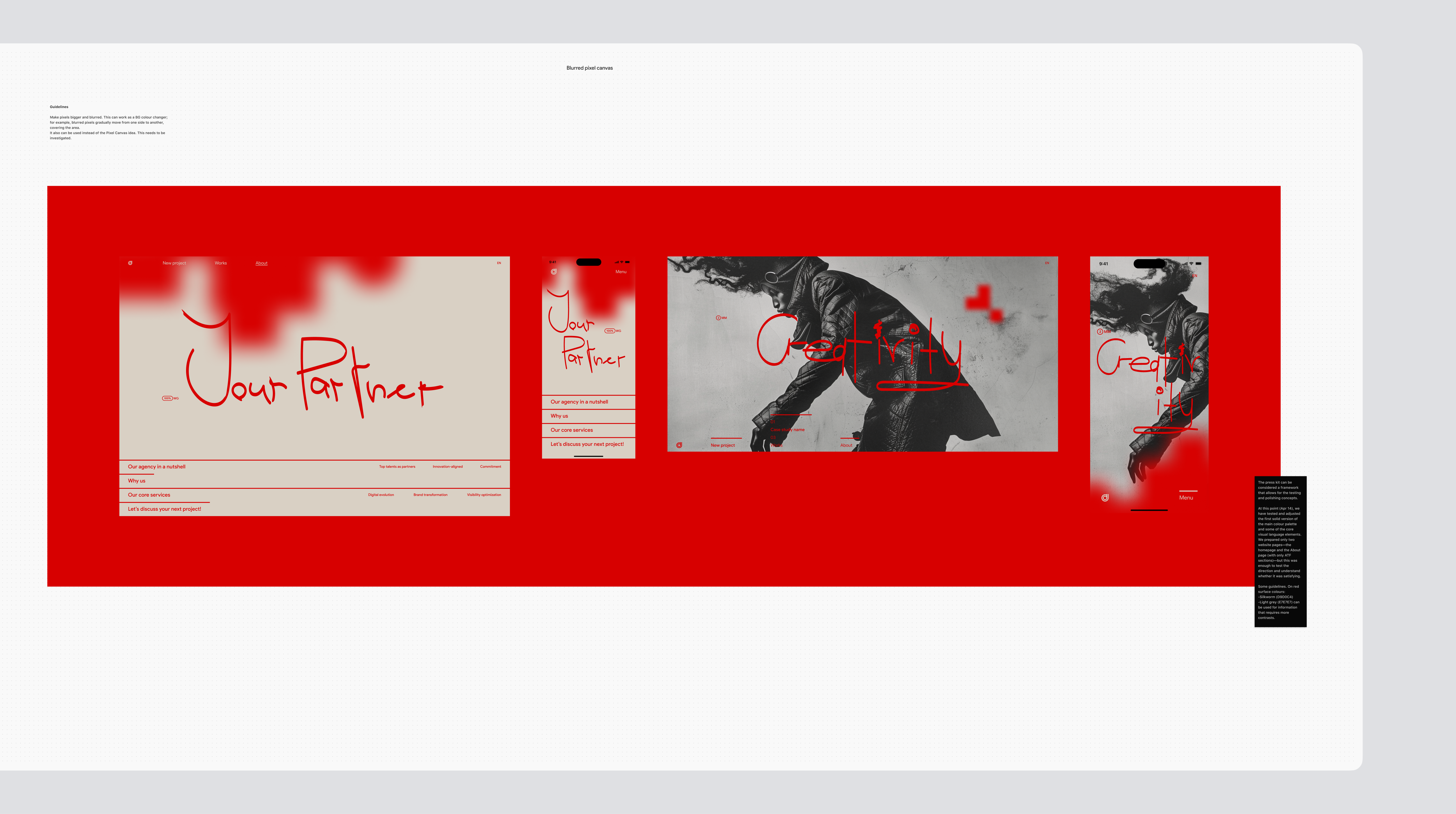
Blurred pixel canvas
Guidelines.
Make pixels bigger and blurred. This can work as a BG colour changer; for example, blurred pixels gradually move from one side to another, covering the area.
It also can be used instead of the Pixel Canvas idea. This needs to be investigated.
The press kit can be considered a framework that allows for the testing and polishing concepts.
At this point (Apr 14), we have tested and adjusted the first solid version of the main colour palette and some of the core visual language elements.
We prepared only two website pages - the homepage and the About page (with only ATF sections) - but this was enough to test the direction and understand whether it was satisfying.
Some guidelines. On red surface colours:
- Silkworm (D9D0C4)
- Light grey (E7E7E7) can be used for information that requires more contrasts.
Transitions. Principal concept. Digital
Creative direction.
The transition from the line to an object and vice versa represents a full circle. This is a very clear way to show user completion of a process and the start of a new one.
A clear edge outline of the information category (especially visual/a-going):
- simplifies the user journey,
- keeps the user focused,
- at the level of intuition, it helps to strengthen trust.
Here, the line is more like an assistant guiding the user through the process.
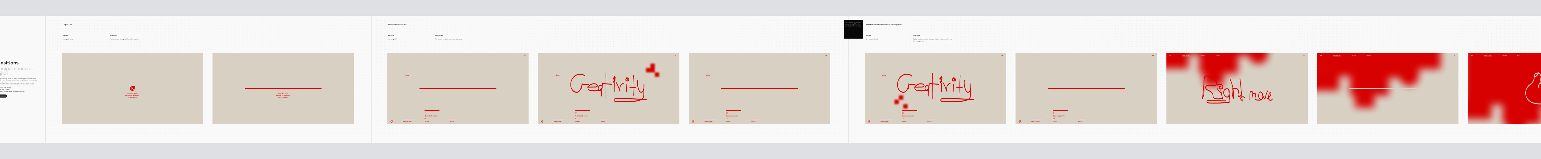
Interaction design. Scenarios
Interaction design is the discipline of creating intuitive interfaces that promote seamless interaction between users and products. It helps to develop a functional and efficient system and facilitates user engagement by providing a more enjoyable and satisfying user experience.
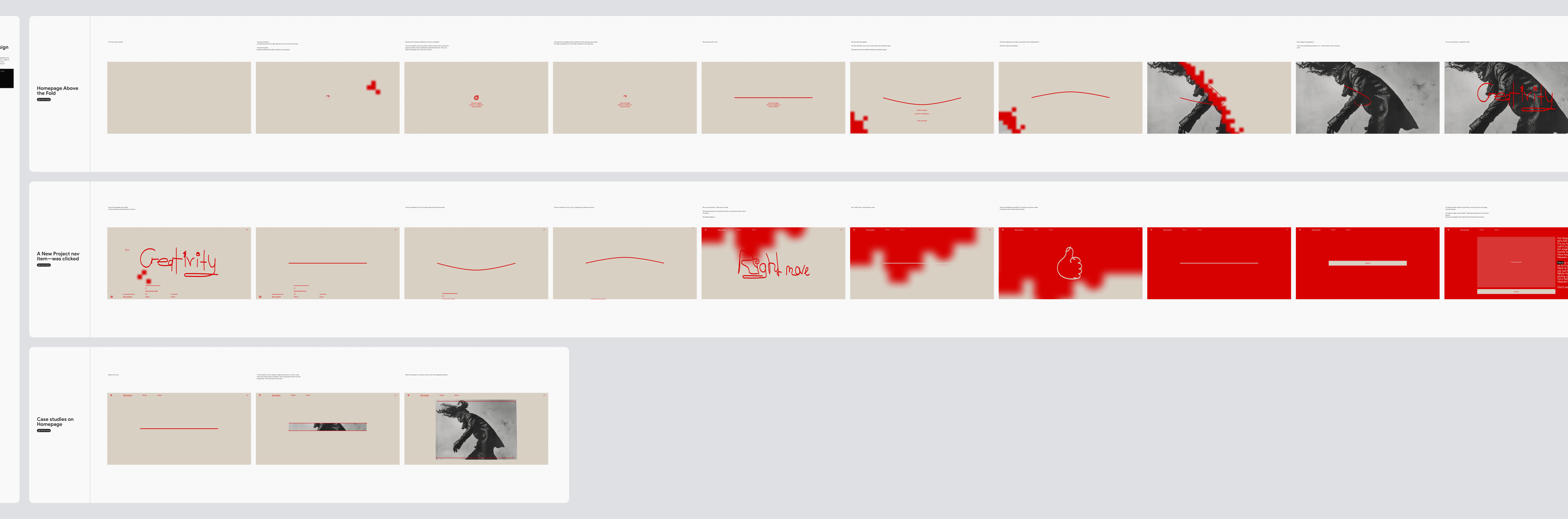
One-to-one
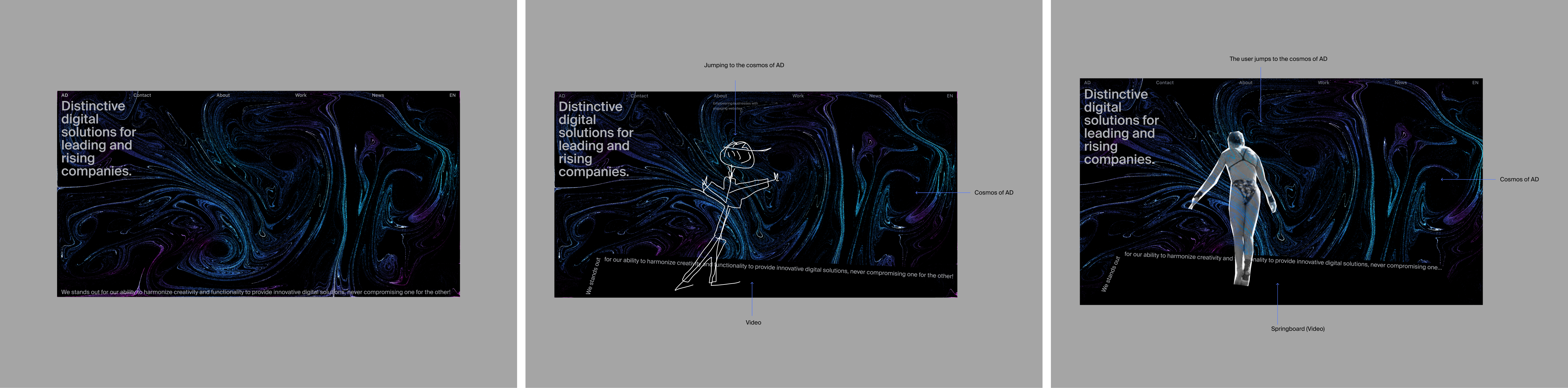
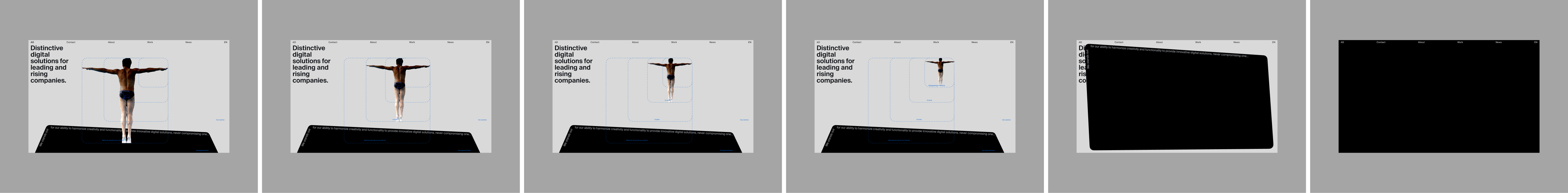
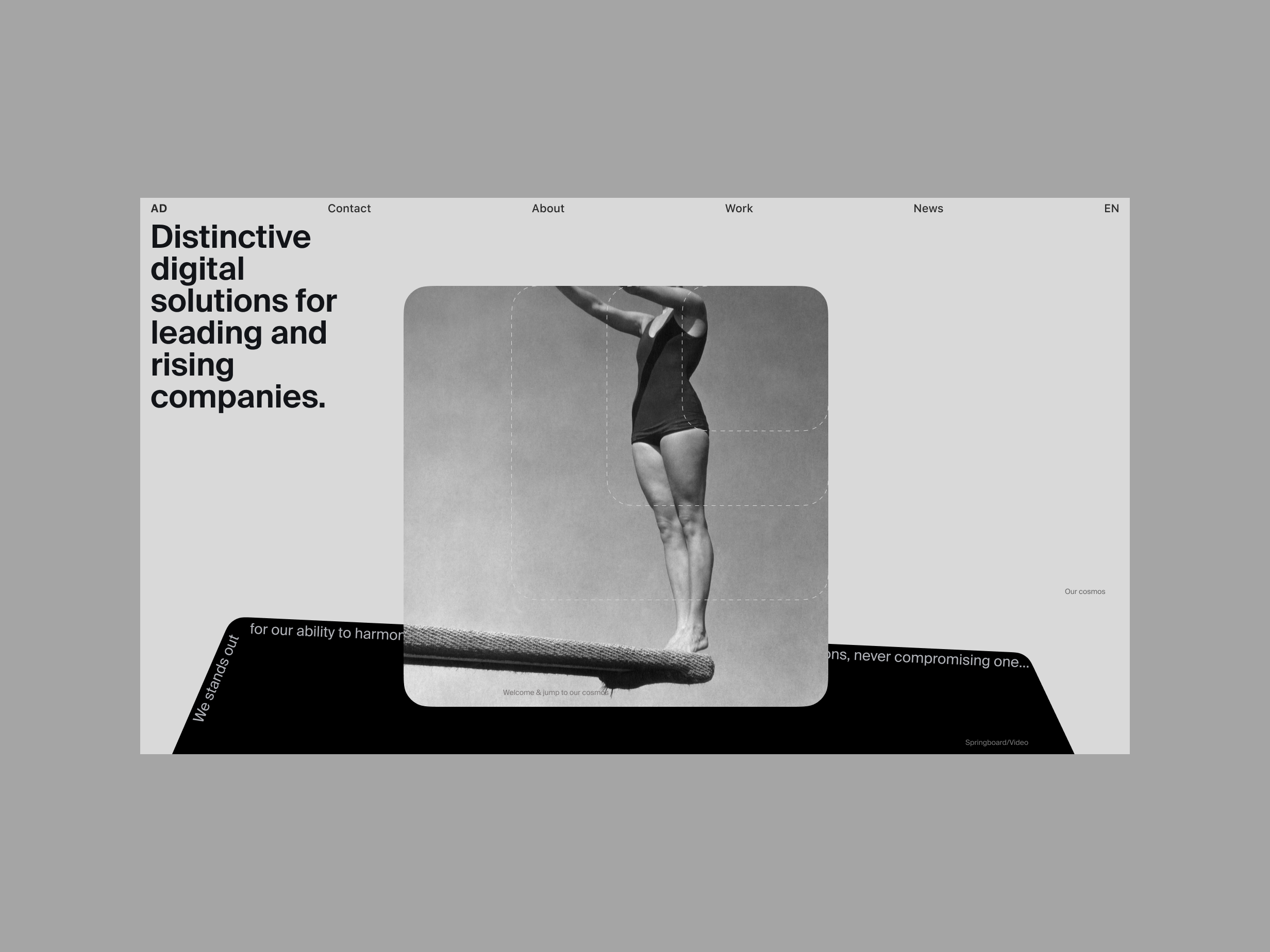
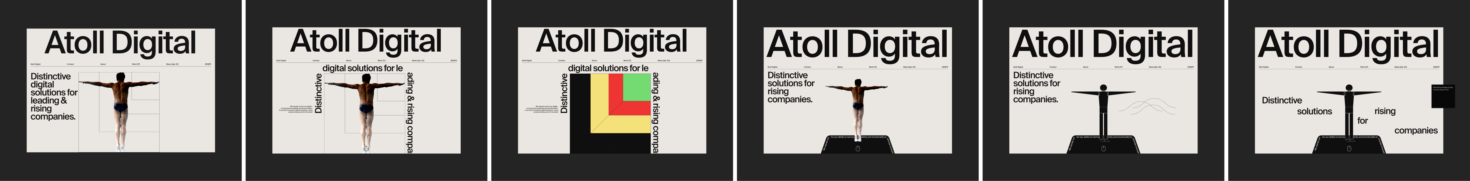
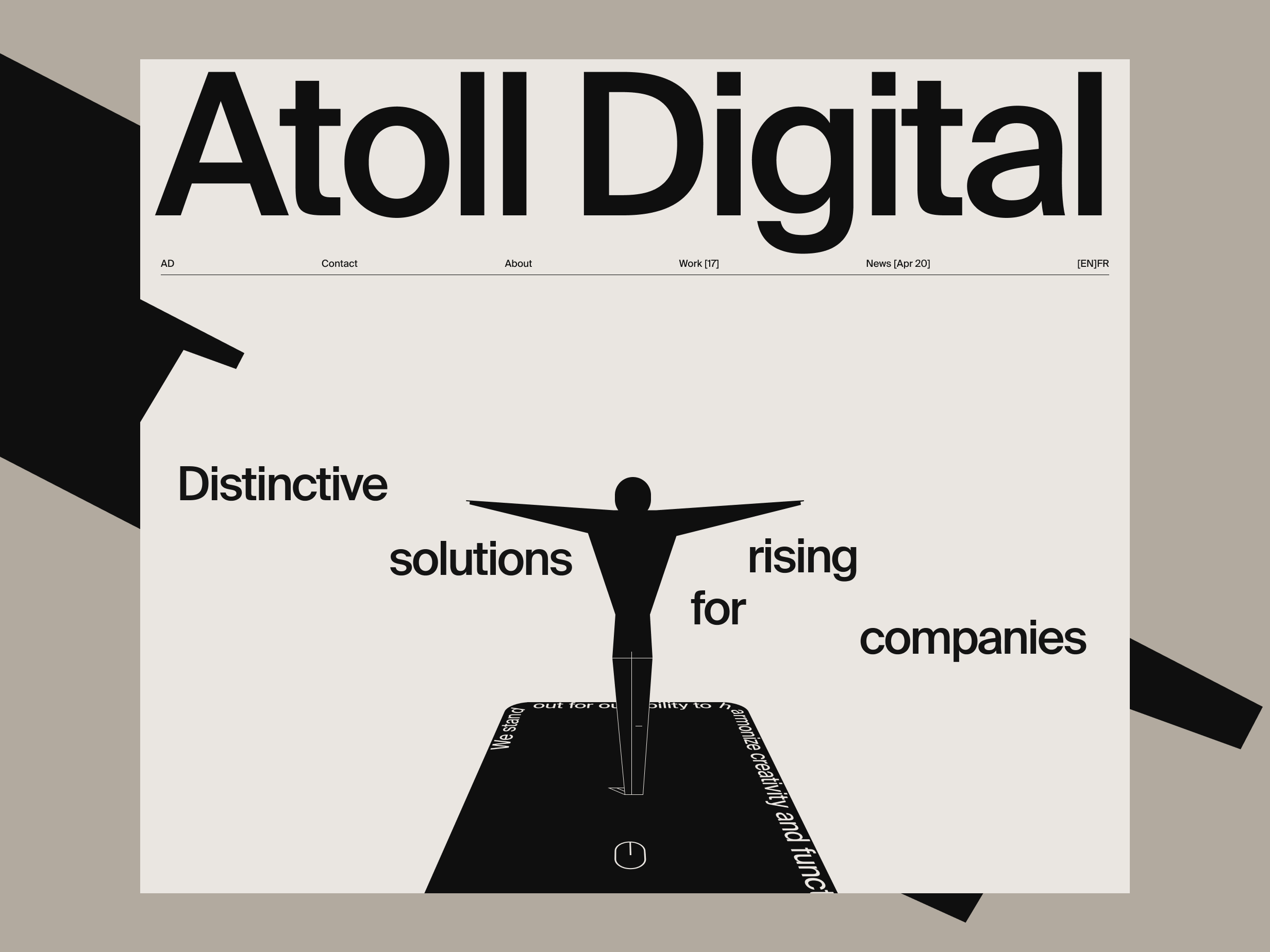
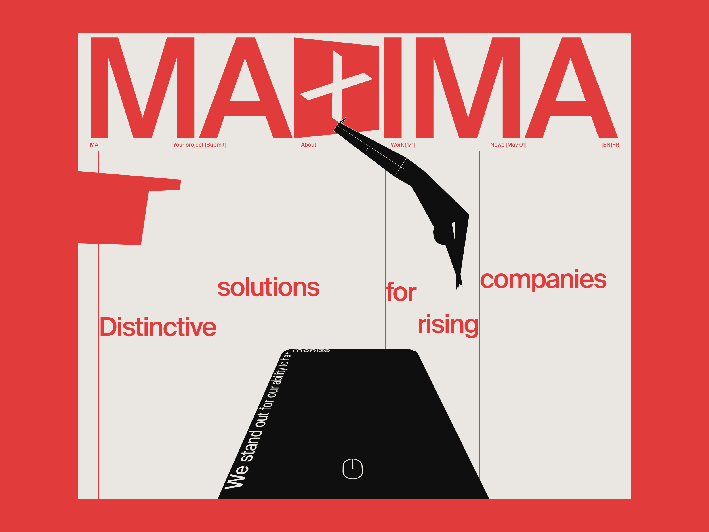
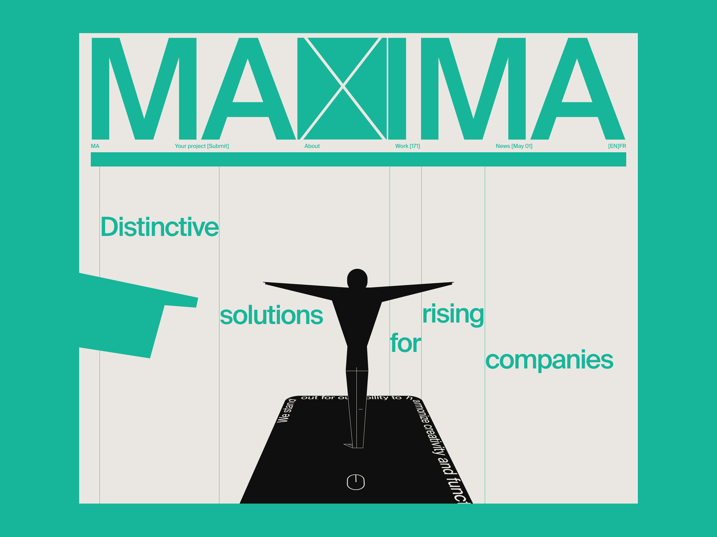
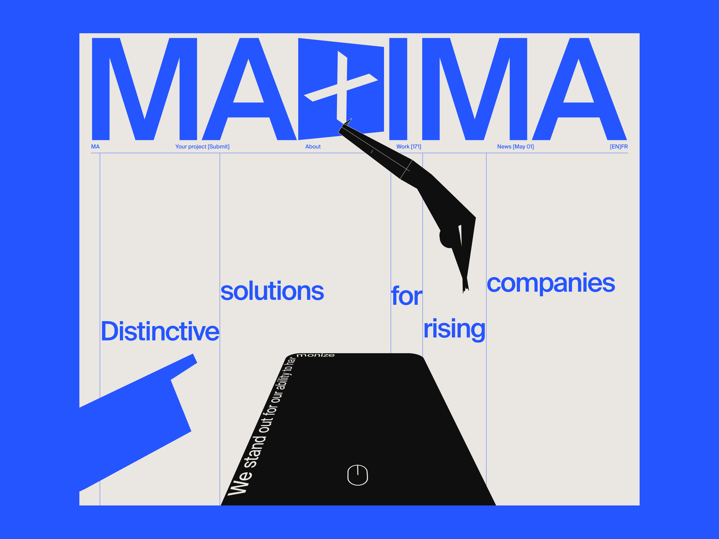
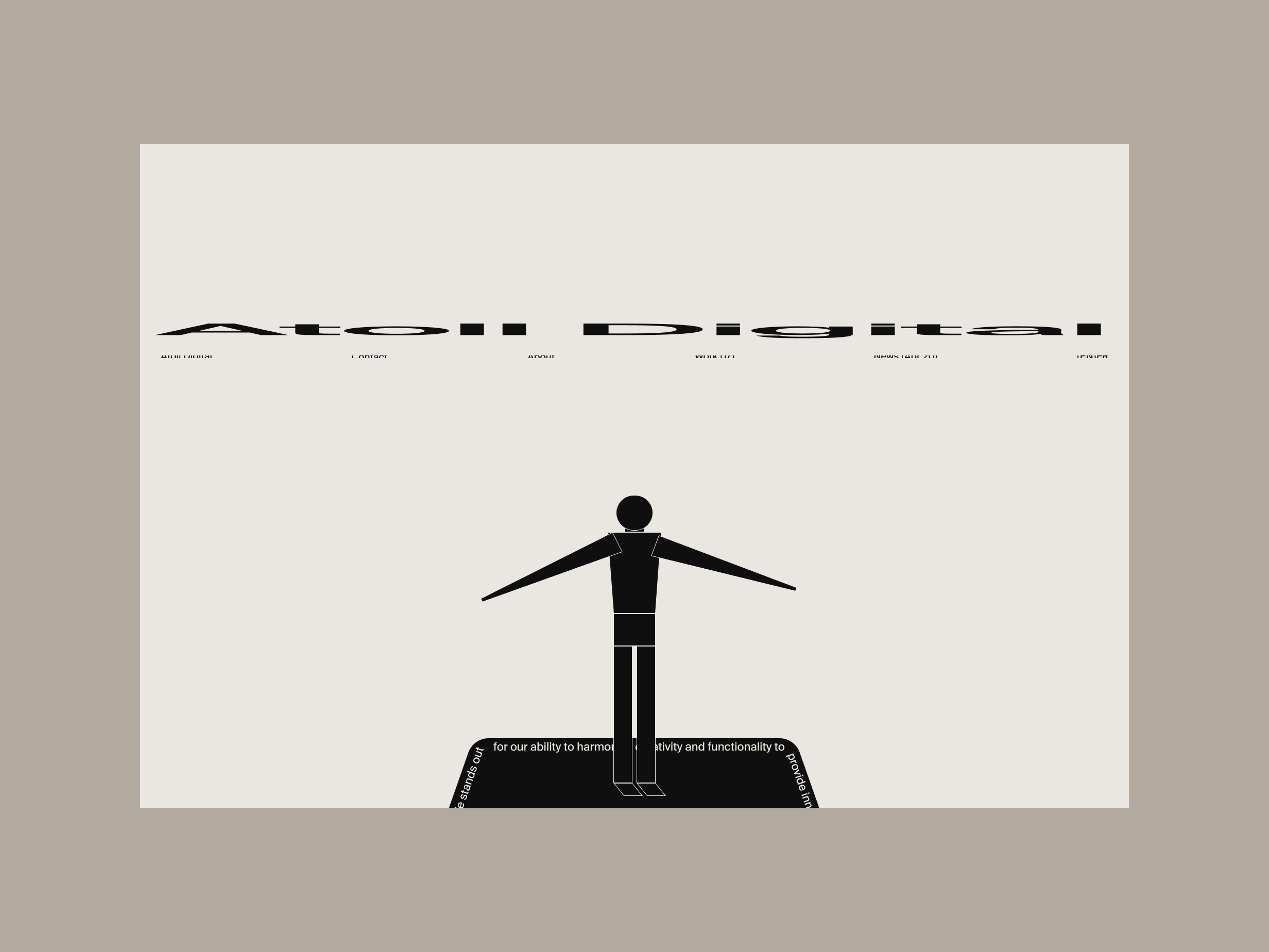
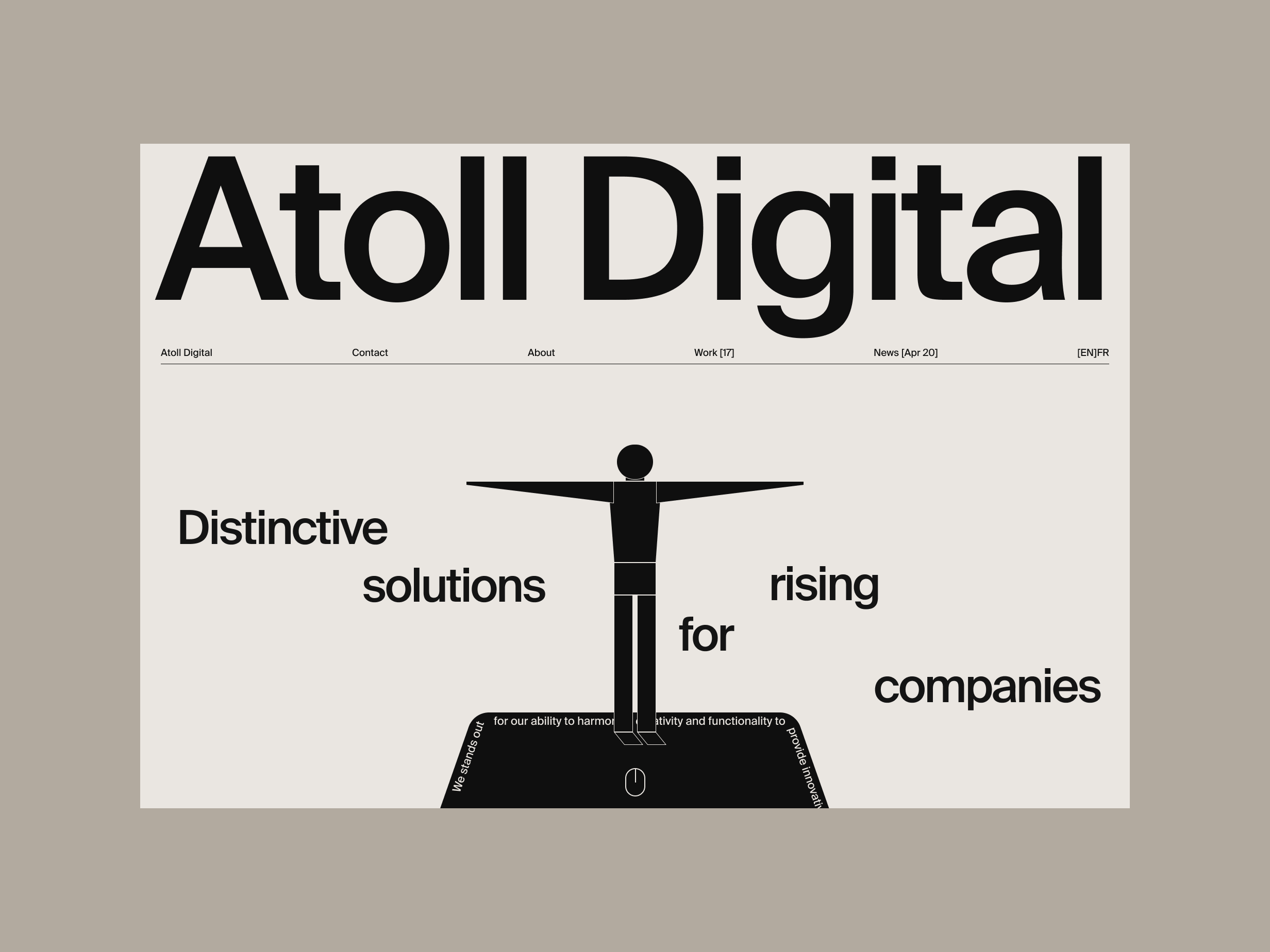
Homepage story. EXPL. ISSUE NO. 3 - Ap24
A good story is critical for any composition, and a website is no exception.
1. Exit (pre-scroll)
The appearance of a brave Marketing Manager.
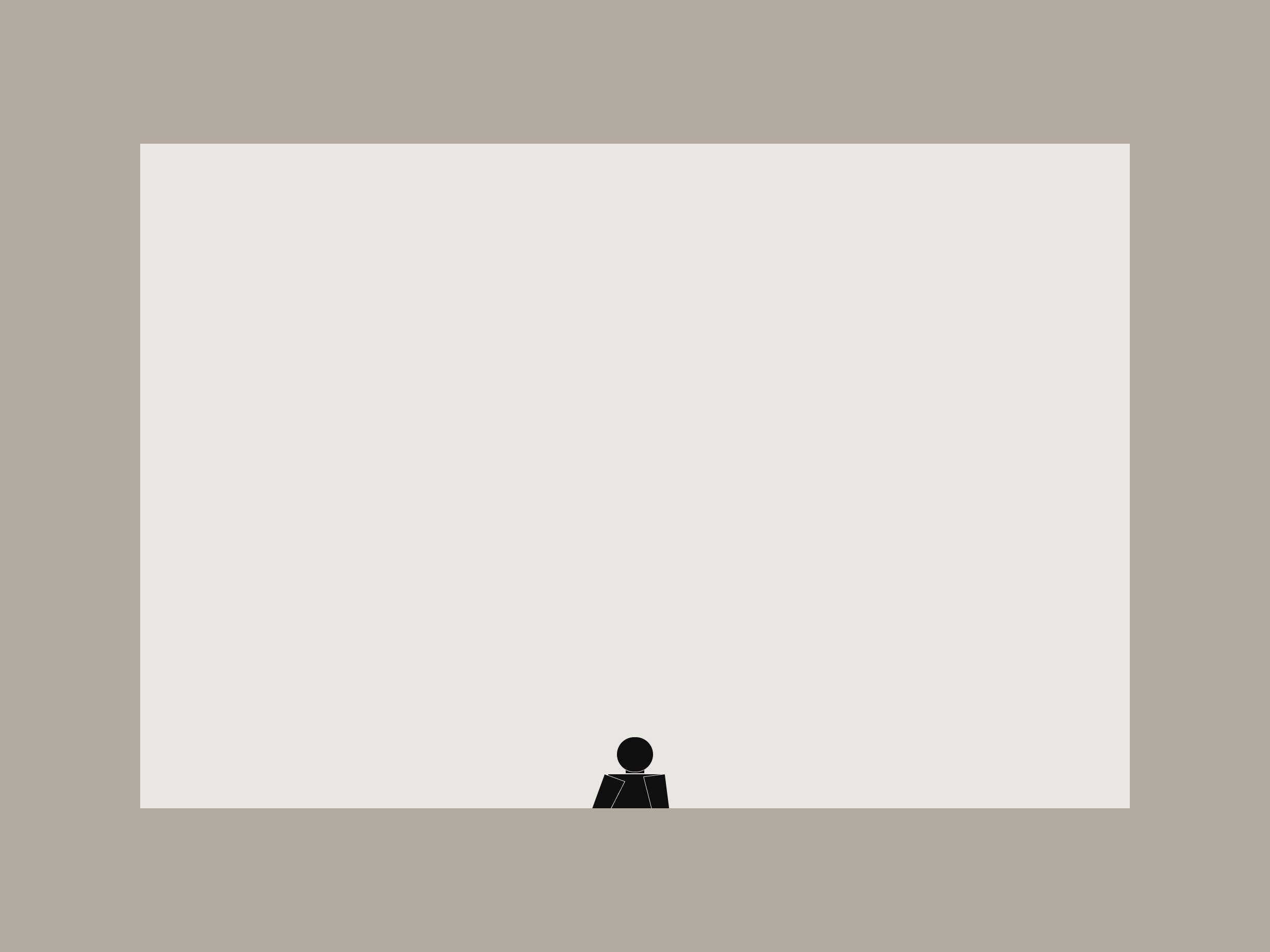
Spianboard appiarance.
The text line on the spineboard is animated.
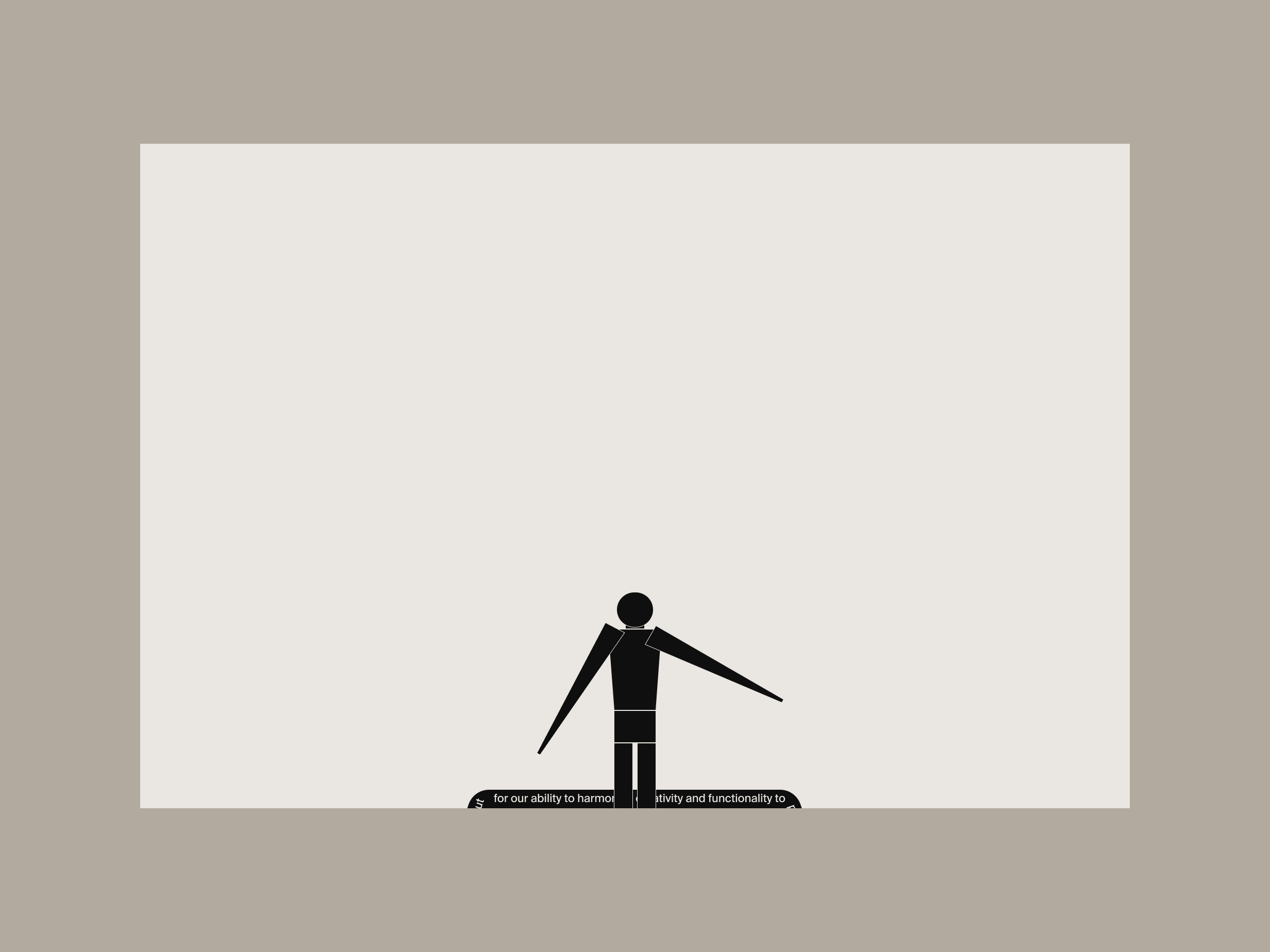
Elements appear as if they were lifted from a horizontal plane when their base is fixed on the plane.
It's because the manager figure is like a cut from paper; if a different figure or object is used, the animation pattern needs to be revised.
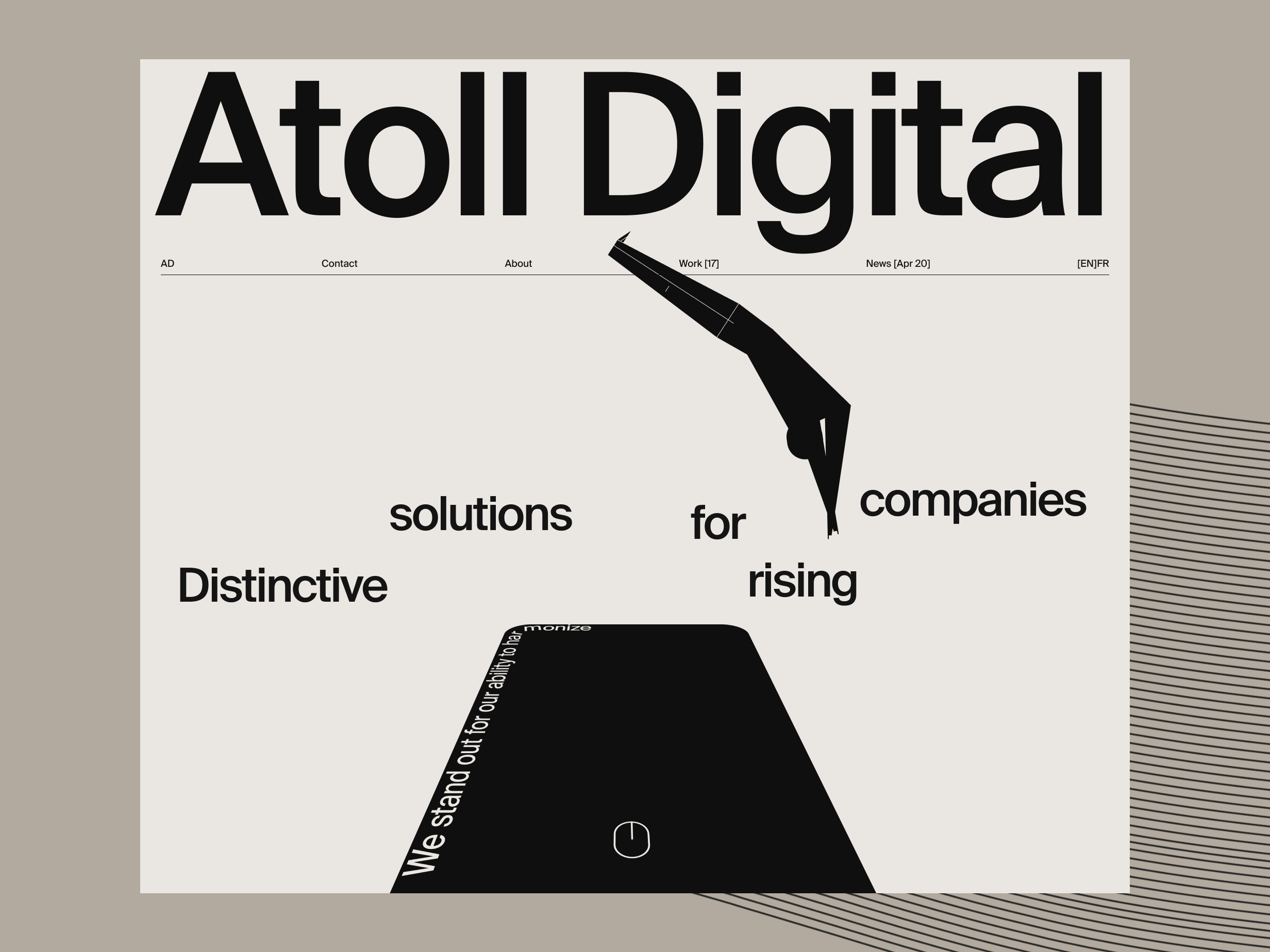
2. Jump (on-scroll)
The Marketing Manager jumps into the ocean of AD.
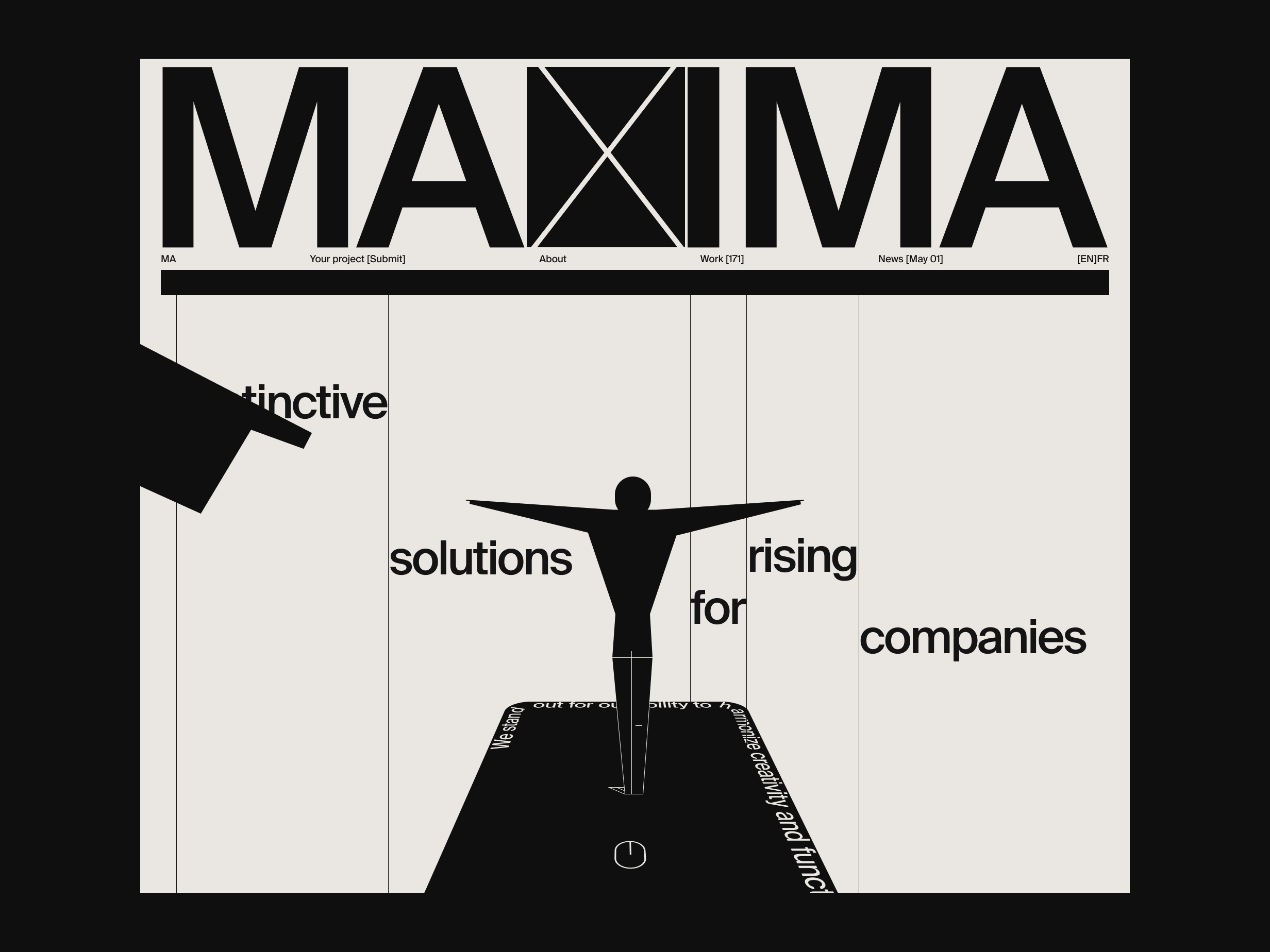
"Distinctive solutions for rising companies" - waves.
The springboard springs.
The springboard is the "About" section that transitions to the full screen after the Manager completely disappears into the ocean.
Mouse appearance.
3. About (on-scroll)
The transition is fully completed. The Manager is dissolved in the AD ocean.
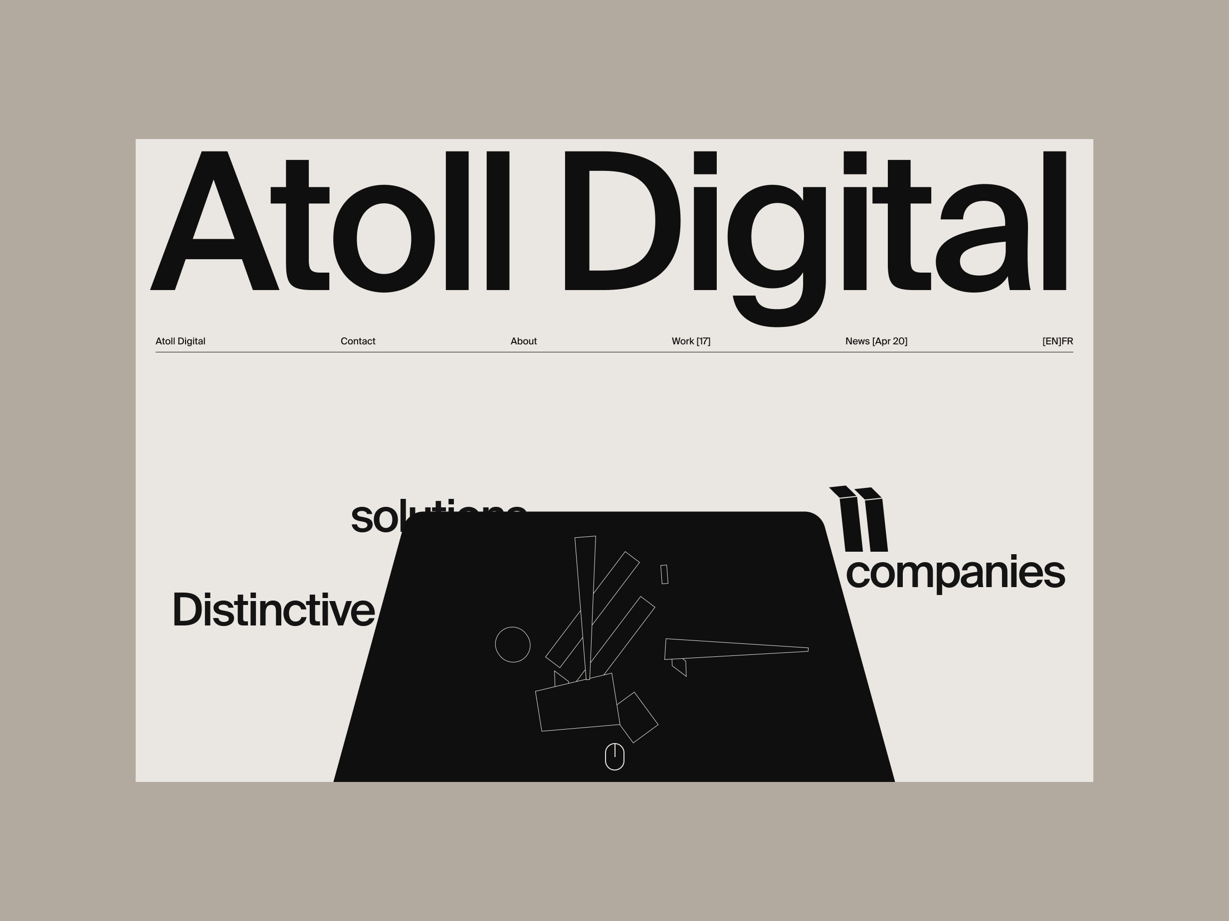
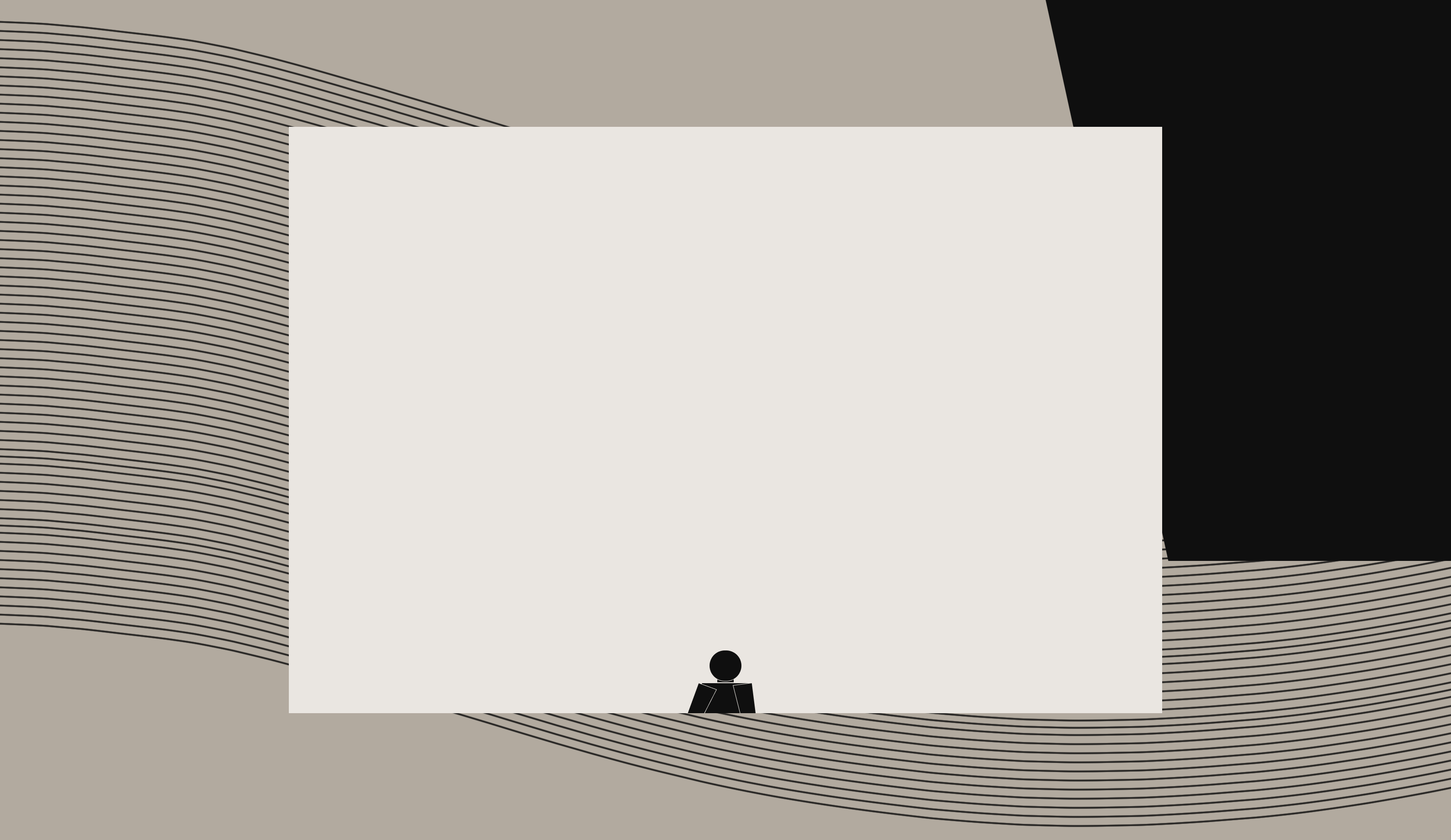
The figure becomes a square - video.
The video is playing.
EXPL. ISSUE NO. 2
This is a phase where the "One-to-one" concept crystallized.